Koroa House: a modernist Wānaka residence reconnecting its owners to their New Zealand roots
Framed by the decisive angles of the Southern Alps, Koroa House is idyllically positioned on a prominent street in Wānaka. Its site has a generous footprint within an urban area, only moments away from the lake's edge.
Originally from the deep South, Dravitzki Brown Architecture's Sydney-based clients sought a home to reconnect them to their roots, a sentiment that local architectural designer Alister Brown relates to.
"Like all of us Southerners, the South never leaves you," Alister muses.

The brief was centred around this sense of place and was articulated through a modernist, minimal design language. “They love modern, they love clean, they love minimal,” Alister adds.
"They wanted to create a sense of home," shares Katrina Dravitzki, co-owner of the architectural practice. “It was about creating a place where everyone could come back to and enjoy quality family time together,"
Meandering down Beacon Point Road, its wide streets are dotted with homes, forming a community joined by a penchant for the mountains. "We drive over the hill from Queenstown, and we immediately feel like we're on holiday," Katrina adds.

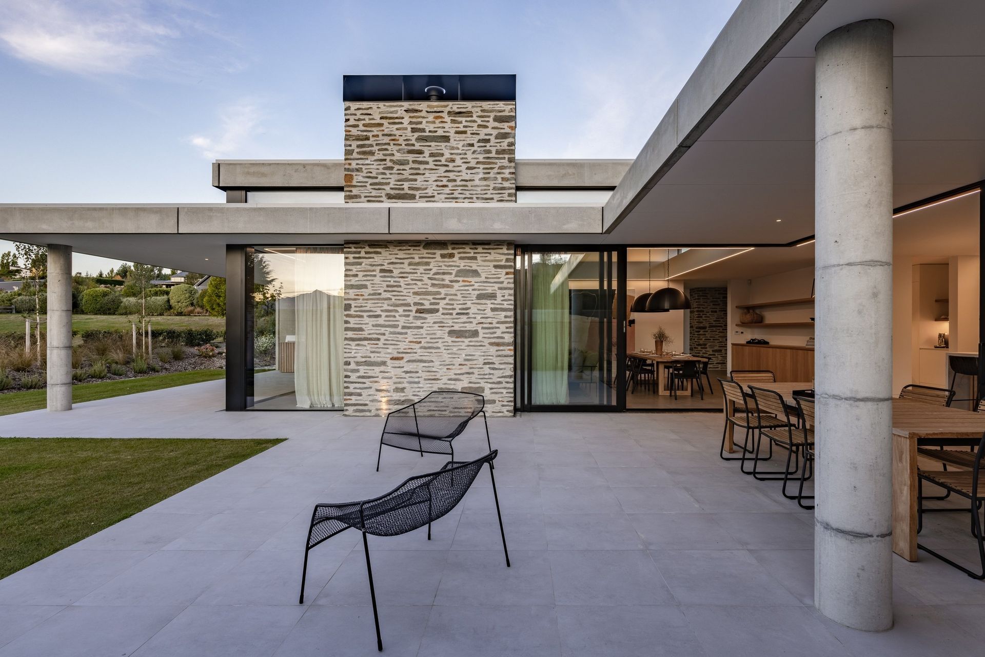
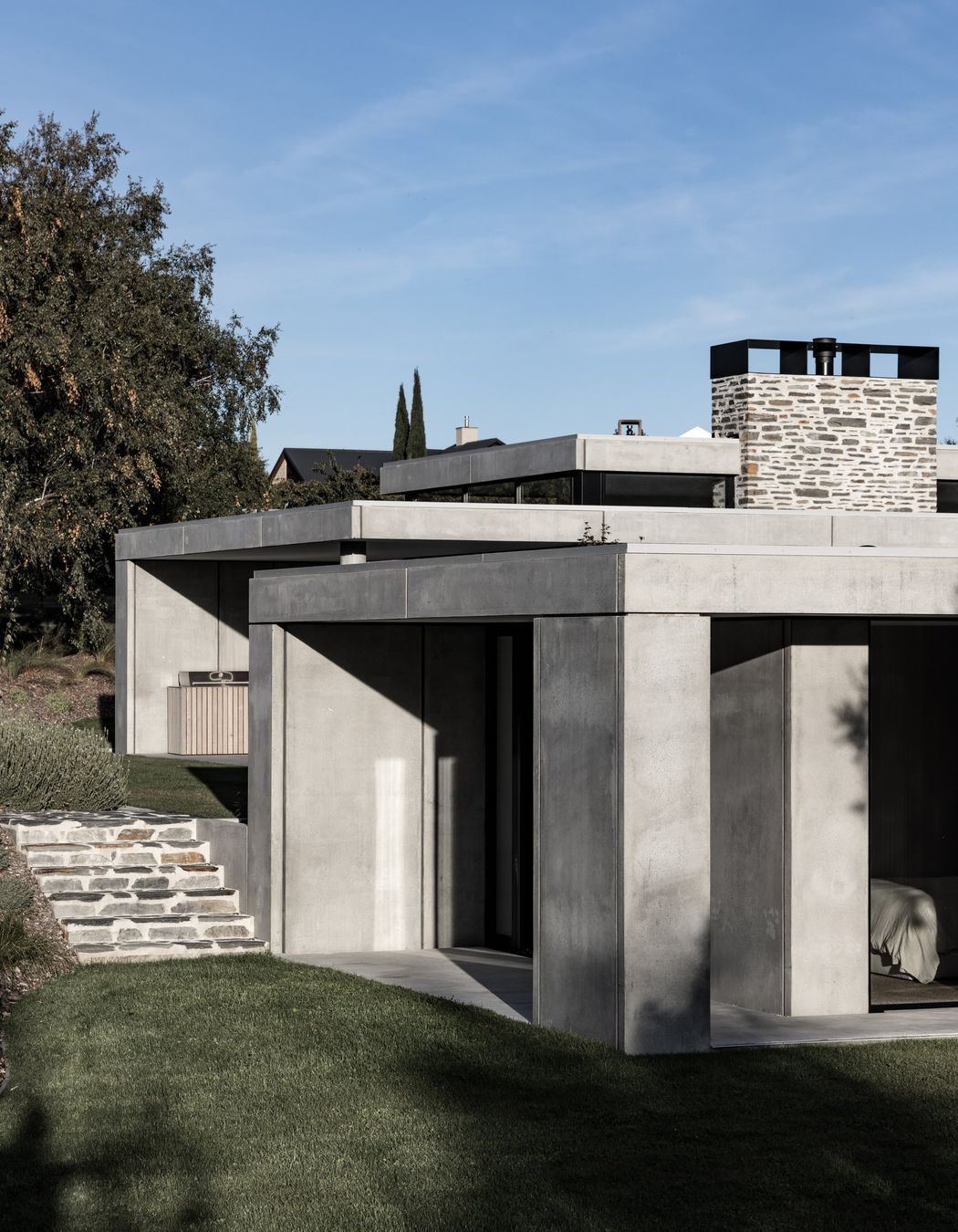
On arrival, the site slopes gently upwards, presenting the home with emphasis. A veneer of precast concrete panels forms rectangular shapes, complemented by the sleek lines of sliding timber screens and a smooth, flat roof. Beneath the concrete veneer, a layer of timber framing is hidden, filled with insulation to warm occupants. Similarly, a layer of pre-cladding under the cedar screens acts as a rainscreen, while their north-facing orientation provides shade.
"Integrated into the building is a track on the top and bottom that allows the screens to be manipulated and moved. You can pull them out of the way or move them in front of your glass for full privacy. It allows you to just adjust your building for the environment," Alister explains.


The visuospatial experience is layered but clearly comprehensible, and its exterior material palette is protective. Much like the clients, the home is sure of its style, and connected to the land.
In a clever use of the subtly sloping site, the ‘C’-shaped layout is graduated over three levels, anchored by a north-facing, central courtyard. The perspective allows mountain views to be found in nearly every room, while all day sun lights the central space. At the end of the driveway, the garage is neatly tucked into the slope's gradient, integrating with the land. A schist stone wall guides visitors toward the entry.

Inside, a softer spatial experience unfolds. “It's like coming into an oasis,” Alister explains, “it's got a very relaxed, calm, quiet feel.” The entrance opens onto a large glass panel, creating an immediate connection between the interior and exterior spaces.
The main bedroom wing sits on the lower level, shielded from the road while still capturing alpine views. The space is minimal in reflection of its purpose; its most distinctive feature is the swathes of glass visually connecting the room to the outdoors.

Moving through, the half-level marks the separation of the private and public spheres. Upstairs, on the third level, a tranquil living, kitchen and dining area, courtyard, and guest room await.
“One of the key design challenges was to get those mountain views without getting the urban sprawl. So the courtyard, being sheltered on the west, south and east, takes away that urbanness,” Alister explains. “It's the same inside the house. The 360-degree wraparound glass allows you to look at nature but not see the residential area.”
“I think a lovely part of courtyards is that they give you a sense of space, but they also open the house,” Katrina adds. “It gives you these little pockets of gardens that separate the various spots of the house.”


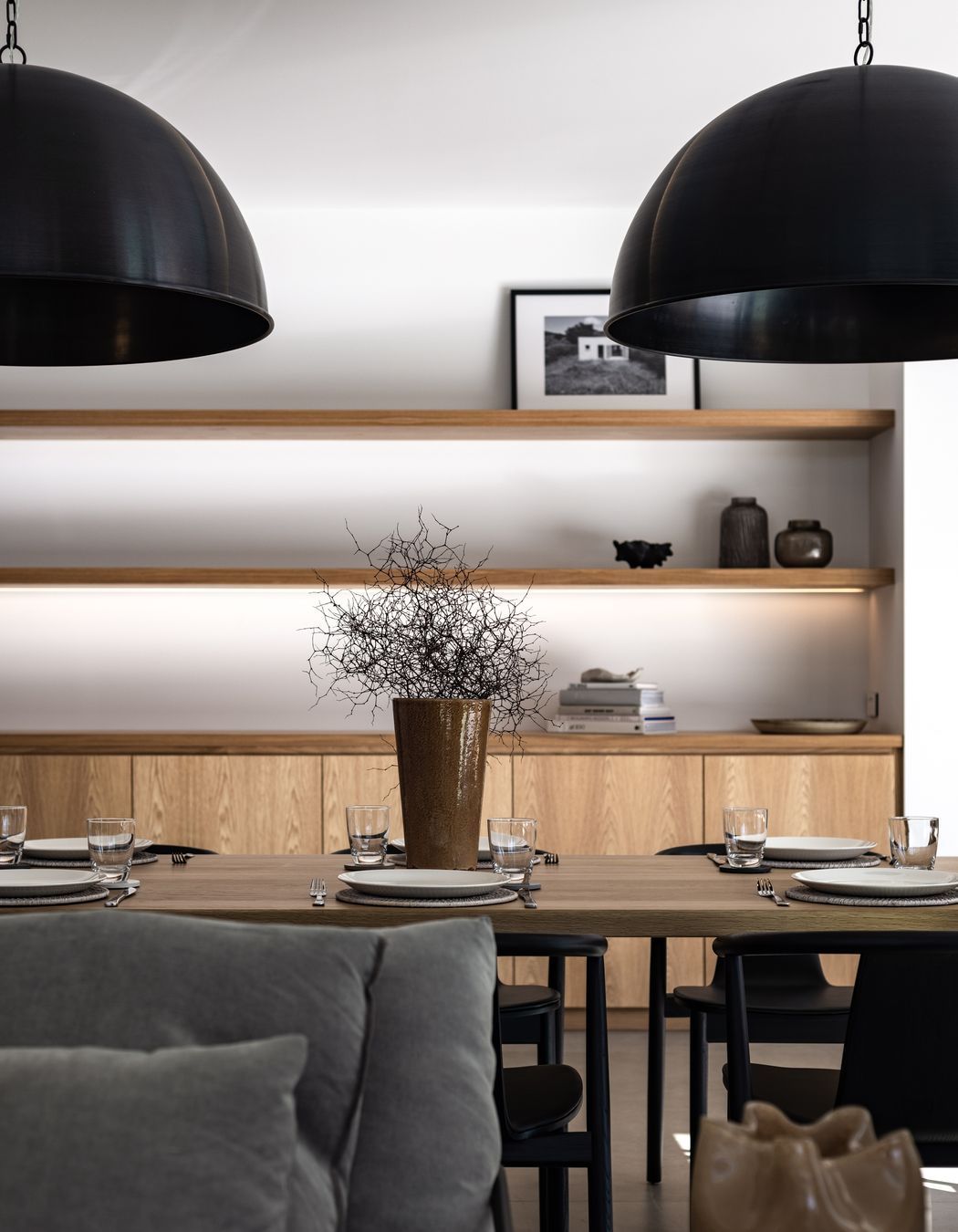
In contrast to the exterior palette, largely composed of concrete and stone, the interior materials are soft and warm. American oak features heavily throughout the residence, notably in the kitchen and bedrooms, while textiles are light and cosy. The two palettes are tied together through their minimalism, using limited materials wisely.


For Alister, the form of the building is particularly notable, characterised by clean, modern lines, while for Katrina, the lighting stands out. “This house is beautiful by day, but it really transforms at night. A key element in the brief was that the client really didn't like lots of downlights, so we created this really beautiful pelmet around the walls.” The pelmet is embedded with LEDs, curating ambient, diffused mood lighting in harmony with the interior palette.
"We all came together and really created something special."
