Light up your world
Written by
08 April 2020
•
13 min read
For most of us, the only time we really think about the lighting in our homes is when a bulb blows. However, proper lighting has the ability to transform the spaces we live in into something outside the box.
ArchiPro spoke to Gabrielle Peace of Lighting Revolution and Sam Walle of Darkarts Studio about what we should and shouldn’t do to create the ideal lighting scheme in and around our homes.
ArchiPro: What is the number one mistake people make when planning a lighting scheme for their home?
Gabrielle Peace: Taking advice from untrained sources, which could be anything from generic printed articles to cash and carry stores and even the local sparkie. Don’t get me wrong, most of these sources know a bit about lighting but generally miss the personal step of considering how you will use your home indoors and out. It’s common to end up with downlights everywhere inside and floodlights outside, which will not speak to the personality of the home or owner and can create glare.
Sam Walle: We see too many designs with a grid of downlights putting a blanket coverage of light onto the floor and not highlighting the unique forms or features of a space added to a project lovingly by a client, architect or interior designer. It is easy to accept that a salesperson or supplier can do a free lighting plan, but the designs are usually based on the above principles and with design fees hidden within the cost of the fitting.
AP: What “basics” of lighting should I be aware of?
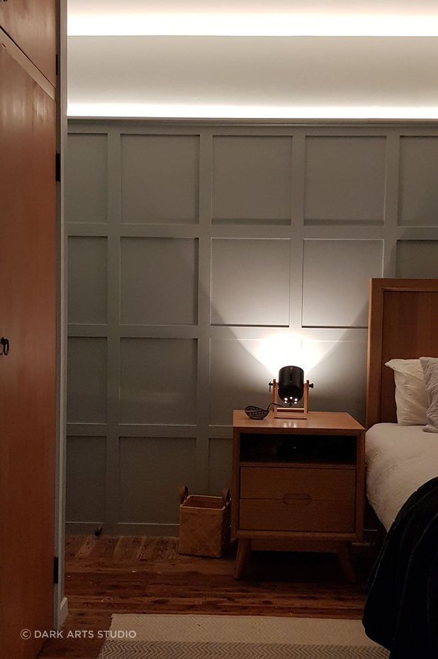
SW: Most people already know the basics of lighting but don’t translate their knowledge to the built environment. Accent Lighting—if you shine a torch at your chin you know the light source will be glary, put heavy shadows onto your face and highlight a couple of features. The same can be said about any directional “accent” light source in architecture; including spotlights and downlights. These are good for creating drama and attention. Diffused Lighting—similar to an overcast sky, diffused lighting will help to reduce shadows and show three-dimensional form. Light lines and panel style fittings are good examples of these. These are good for task activities and making a space appear larger. Colour temperature—is a type of thermal radiation and is measured in degrees Kelvin. Humans evolved outdoors and so our bodies are attuned to the natural “warm-cold-warm” colour changes caused by the sun’s elevation and intensity throughout the day. Imagine a piece of steel being slowly heated up. When the steel is colder it radiates at the “warmer” orangey-yellow end of the Kelvin spectrum. We use warm light in residential or hospitality projects because it is reminiscent of the setting sun or an open fire. It also aids relaxation by controlling serotonin and melatonin levels in the human body through receptors in the eye. Typically, we don’t use anything above 2700K in residential projects, but we have completed projects using 1800K, which is relative to the visual warmth of a candle flame. Getting back to our hypothetical steel, when it is very hot it glows a bluey-white colour, which we call “cold” in lighting terminology. Colder light is usually reserved for spaces that are used for daytime activities and for clean environments as it’s closer to the colour of daylight at midday. Normally offices are illuminated using 4000K, but we have seen a shift in the last few years to boutique style office spaces using warmer colour temperatures.
GP: Make sure you have well-illuminated walls and ceilings to make a space appear larger and more open. Use a juxtaposition of light and dark to create drama and more intimate spaces.
Make sure you put light directly above your work spaces, particularly if you don’t have pale walls where you are working to reflect the light to where you need it.
AP: How do I know what type of lighting is going to suit my needs?
GP: The best thing to do is define your needs first. Consider who is going to use each space and what tasks will be carried out there. Define where glare, which is essentially uncomfortable light, could occur and look to minimise it or eliminate it entirely. Similarly, make sure you have no unexpected reflections.
SW: If your need is a task light for performing an activity, refer to the torch and overcast sky example to imagine what effects the lighting will give in a space. Colour temperature also affects the appearance of materials and finishes, which you would have experienced when buying fabric in a shop. Test different colour temperatures against different materials. Timber finishes in particular look very different under warm or cold lighting. Consider that different decorative lighting will also provide different lighting effects. For example, an industrial shade will give a much more downwards-directed accent light in contrast to the diffused lighting effect of a chandelier which will shine light in all directions.
AP: What if I require a room to be multifunctional; can I still create a cohesive lighting scheme?
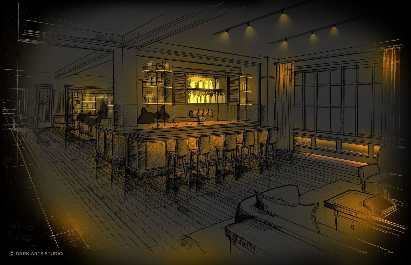
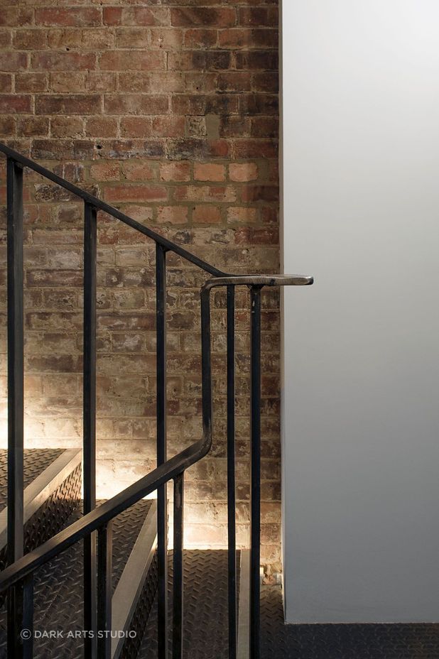
SW: Yes! Think about creating three different layers of lighting to give the most flexibility in any space and use dimming or switching groups to work between the three. Firstly, start with a very bright, uniform layer of light from diffused lighting or wide beam downlights. That will give you plenty of light to do group activities and tasks. Secondly, supplement this with a very strong accent layer from narrow beam downlights or spotlights. Use this layer to illuminate unique features, furniture groups and artwork. This layer provides drama and shadows. Thirdly, provide a feature lighting layer with something decorative like a chandelier. Think about other unique features you can illuminate such as a brick wall or something with some texture. Avoid colour changing light such as “warm dimming” or “Tuneable”. With multiple layers of different colours of light in a space it can look anything but cohesive. Pick one colour temperature and run that across all the light fittings in the space.
GP: Absolutely. Using switching and dimmers, you can create endless opportunities for functionality. With the advent of Casambi now, this can almost even be an afterthought but you do need to have enough luminaires to tune a response from their dimming and switching.
AP: What is the best way to light a small space?
GP: There is no perfect answer here. For example, if the space was a reading nook, then for most people, particularly younger people, a wall-mounted spot light above the reading zone would be sufficient to allow focus on the book. However, other people may also require some background lighting because it’s difficult for their eyes to switch between light and dark spaces. As a company, we largely do landscape lighting, so small spaces can be anything from vegetable planters, a patio, or above the BBQ. We’d approach all of these quite differently but start with illuminating the task area and areas of transit taking into consideration the aesthetic of the area and needs of the user.
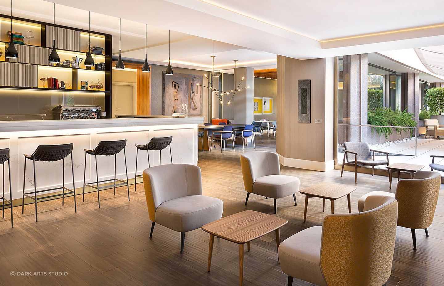
SW: If the desire is to make a small room feel larger, think about layering diffused lighting effects and applying lighting to vertical surfaces such as walls or bookshelves. Diffused lighting effects will evenly illuminate the floor, ceiling and walls, making the space appear cohesively brighter and larger.
AP: What is the best way to light a large space?
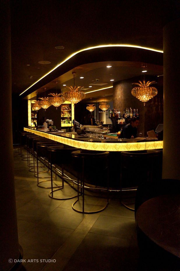
SW: Try to avoid using diffused lighting effects, rather try to create smaller pockets of space to give each zone a feeling of privacy and intimacy. We do this by using warm, localised soft lighting such as floor lamps or narrow beam accent lighting over a seating arrangement or zone. You’ll be amazed what one focussed downlight over a plush armchair can do in a large, dark space at night. To give the room some context think about applying decorative lighting to the extremities of the space, with either funky wall lights or ground-level uplights.
GP: We can be tempted to blanket the area with light, however, in a big space your field of view is broader, so it’s important to take into account whether you will be in a direct path of a light source. We’ve all had the experience where someone has put a flood light in the driveway or back yard and when it gets a little darker and you need the light sadly you are dazzled and can’t see anything anyway—avoid that at all costs. All of the other rules apply: person/aesthetic/task, but a space will be uncomfortable to sit in if you can see high-output light sources.
AP: When it comes to lighting the exterior of my home, what should I concentrate on?
GP: Get quality fixtures. Most of New Zealand is considered coastal and as such we have some of the most corrosive environments in the world. Similarly, parts of the country experience some broad temperature fluctuation from hot to cold. Also, make sure you talk to someone about designing a solution that encompasses your wants and needs. You might want that tree to be illuminated because it’s spectacular, but you may also need to be able to bring the bins in at night. Your friends also need to be able to find your letter box number if you are entertaining.
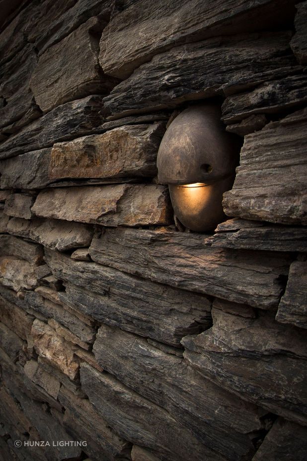
SW: Think about the focal points from inside and where putting lighting outside will give you more appreciation of your garden. Putting garden lighting in a corner of your property that you can only see as you walk past occasionally is both wasteful and unsustainable. The same can be said about most residential façade lighting (especially up/down wall lights and inground uplights which mostly just shine into the sky). External lighting often tends to be too bright, affecting New Zealand’s unique dark sky as well as neighbours and local flora and fauna. Your eye can manage navigating under moonlight so consider using much less light. Focus on the most important features only and that should provide enough light for navigation too.
AP: Do I treat an outdoor living space similarly to an indoor one?
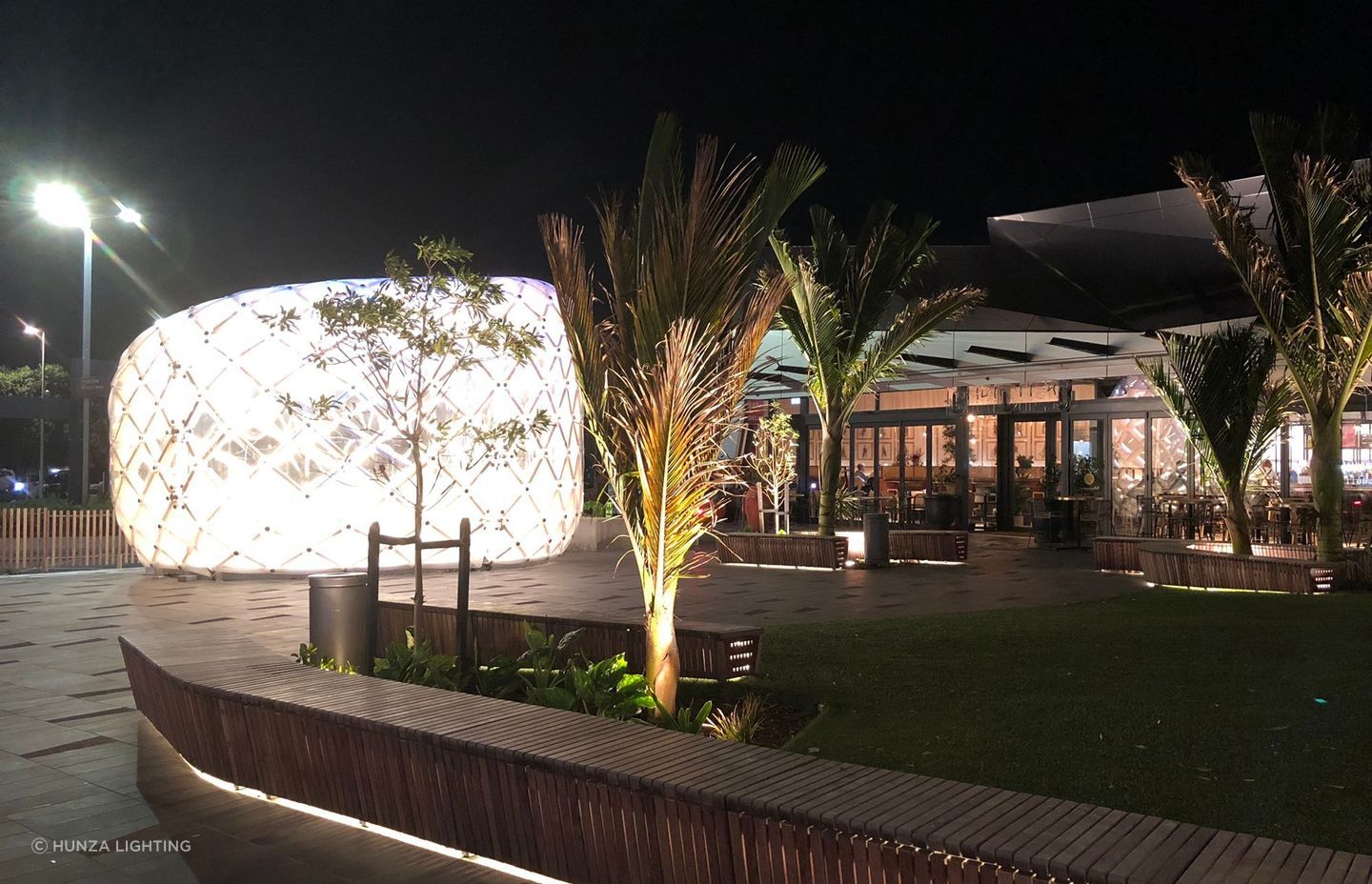
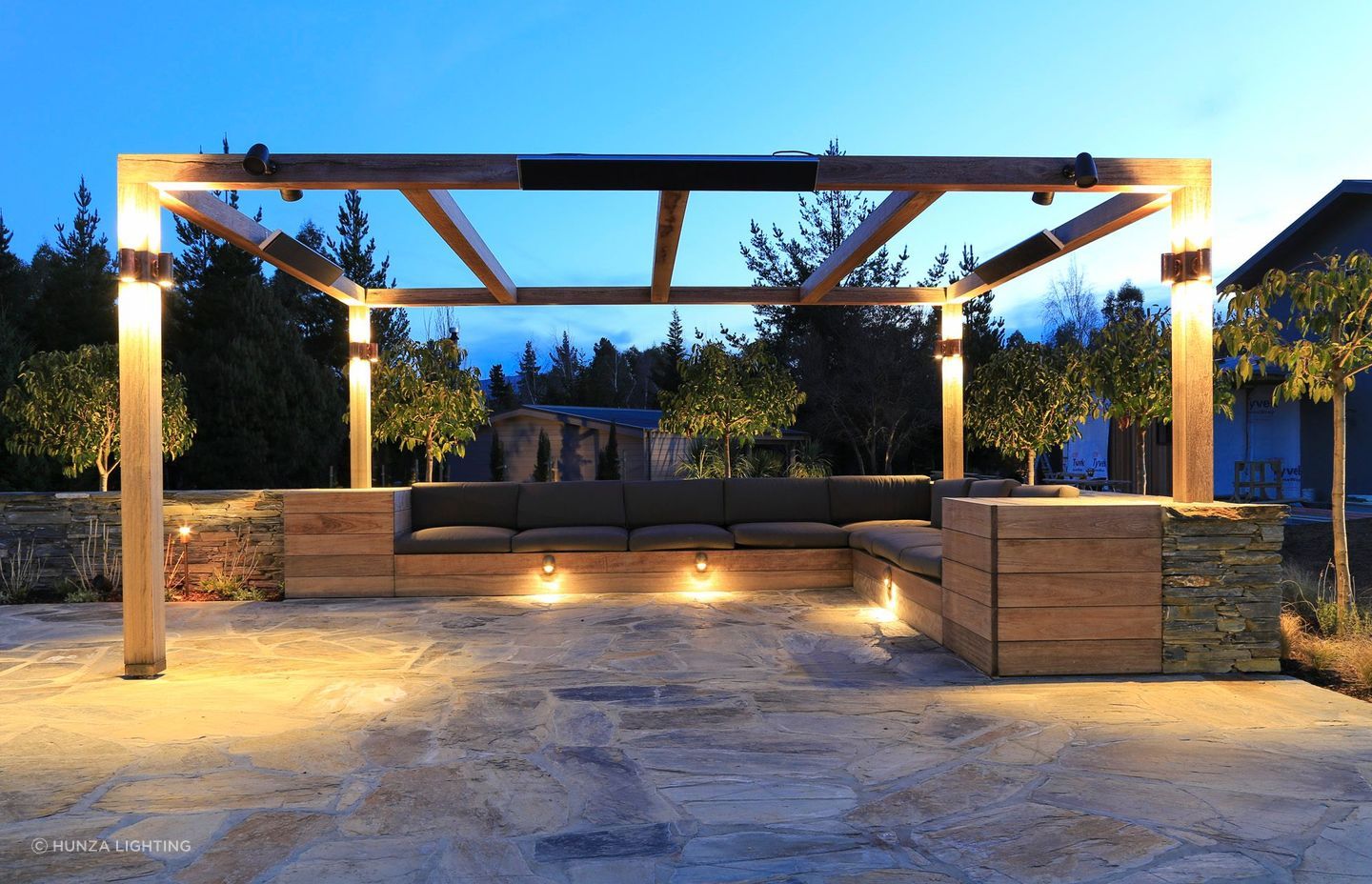
SW: Consider that the outdoor environment is already illuminated freely by the sun during the day and that most of the nighttime activities you will likely be doing in an outdoor living space will involve relaxing and socialising. We always prefer to think of the outdoor living area as an extension of the indoor space. The main difference is you don’t need lots of general lighting to bolster lighting levels during the day. For that reason, focusing lighting to just the important areas will make your space seem more luxurious. Did anyone ever enjoy sitting under a large flood light? We usually apply the same lighting philosophy presented earlier to illuminating a large space and provide a cohesive solution between outside and in. Reduce overhead lighting, which is unnatural to the eye at night and increase low level lighting in the form of floor lanterns, small uplights to walls or garden lighting.
GP: If it’s an extension of your living space then essentially yes but often trickier to light from the ceiling for obvious reasons. You have to spend the money on quality fittings or you’ll be back buying more fixtures before you know it. A lot of our business is replacing product that should have never been sold because someone decided to save cost. Best to get the right thing first time. Largely, exterior lighting is illuminating pathways and sculptural elements you can enjoy from inside and outside your home. There are a few task areas like the BBQ, the outdoor eating area, the washing line, where the kids play backyard cricket into the night etc, and of course, security lighting.
AP: What trends are you seeing in lighting design in general?
GP: The latest trend is the Internet of Things (IOT) and home automation control along with lighting systems to keep your circadian cycle in sync. It’s an exciting time to be in lighting with all of the new technological advances in design, both digital and mechanical and manufacturing.
SW: The shift to miniaturisation has already happened. We are now seeing a lot more flexibility from lighting such as new products that can change their beam shapes/angles, light colours and intensities. I think we’ll see a lot more of that style of lighting in residential projects in the coming years, as they allow homeowners to change their lighting schemes easily without adding additional fittings. Naturally there will be a movement to automated or voice-controlled smart homes. I’m actually working on a house now that runs fully off low voltage solar power and has full voice activation and automation.
AP: What product(s) are you particularly enamoured with this year?
SW: That’s a tough question as we specify both decorative and architectural lighting. For me the current architectural front runner is from ACDC Lighting (via Zumtobel Group) called “One”, which allows you to change the beam angle and colour of light from your phone. It’s a little bulky and commercial yet for residential lighting projects but its new technology. For decorative lighting I am loving the Henge range (via ECC). The architect in me has always been drawn to rough, raw materials such as the burnished steel and warm/burnished bronze and how they interact with light.
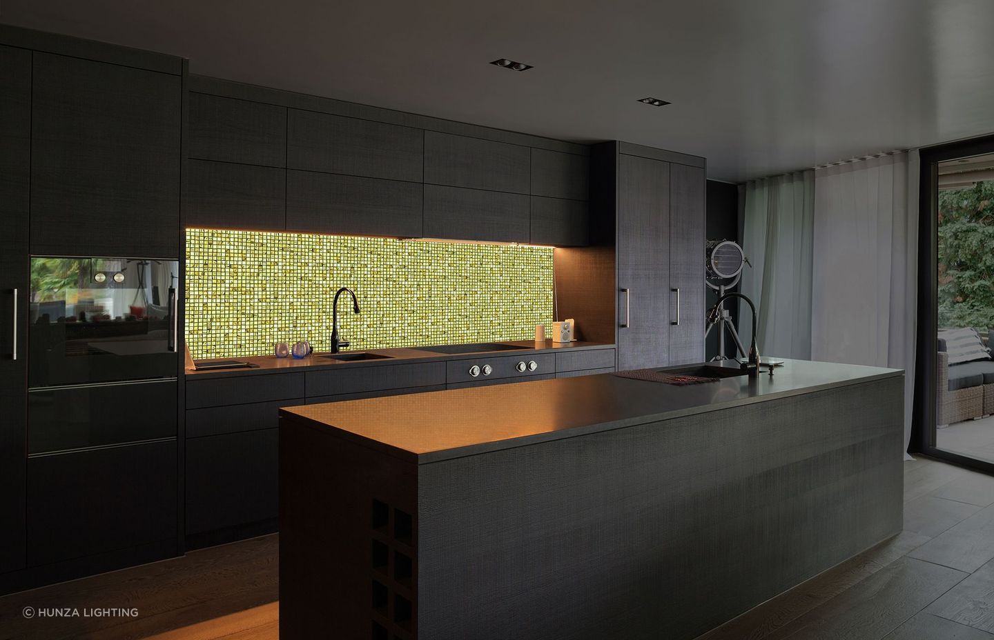
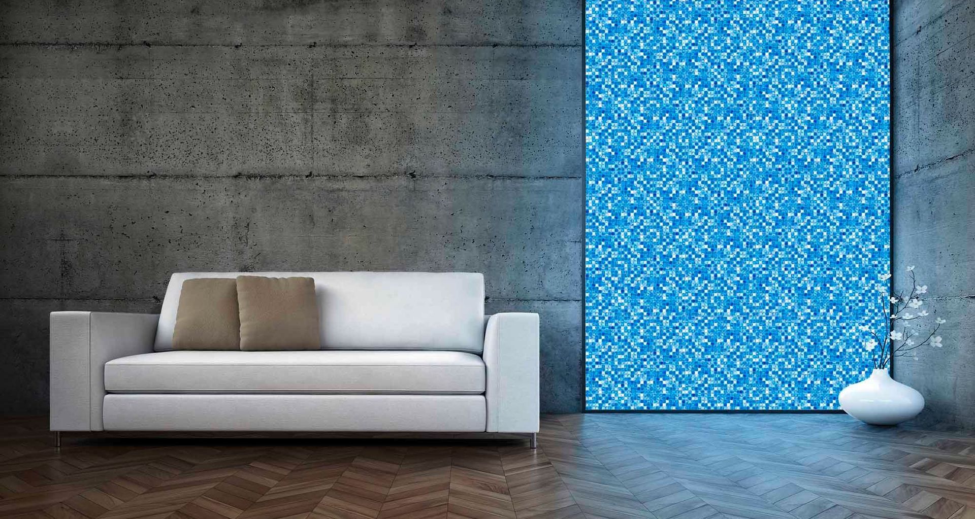
GP: Hmmmm, two things. We have the Volatiles, which is an Italian Glass tile with German smarts that is totally enamouring with it’s touch responsiveness and programmable scenes. It can be classy and subtle or vibrant and wow, so it suits any personality space. For outdoors, we have a luminaire that is built to give the integrity of life back to the plants we illuminate in landscape lighting.
AP: What is the one piece of design advice you give to all your clients?
GP: Solid Copper is the best material for our largely marine environment if you are not the type to enjoy maintenance. It will patina and then essentially last forever. We can upgrade the technology in copper fittings, they should never wind up in a landfill. It’s a real sustainable solution and we’ve been doing it for 25 years—before sustainable was ‘a thing’. Even if it’s not going to be your forever home, make a choice for New Zealand and for our future generations.
SW: Imagine how you will use each space at different times of the day or night and seek a lighting solution that can react to your individual lifestyle. There is no ‘single fit’ solution for illuminating a space. Work with layering diffused and accent lighting and different switches or control groups to give you flexibility between each layer. If you receive a design with a grid of lighting, ask what other layers are in the design (wall lights, uplights, vertical illumination etc) and how these are intended to be controlled or grouped to give you flexible scenes for any activity.
Learn more about lighting design for your home and garden.'
Top banner image credit: Volatiles, supplied by Lighting Revolution
