The Tasman talisman: a stunning pavilion home between bay and mountains

Aotearoa is renowned for its astounding natural beauty, which ranges from pristine white beaches, forests, and volcanic plateaux in the North Island to the spectacular peaks of the Southern Alps, fiords and lakes in the South Island. New Zealanders have consequently coveted the prospect of living in or around such natural marvels, popularly once they've retired or have become disillusioned with urban life.
But in most cases, they need to decide on a single biome or natural feature in whose shadow to set up roots. There are some places, though, where two or more can intersect; a lakefront home with a view of the Remarkables, or a site between a beach and a natural harbour.
In 2017, JTB (Jerram Tocker Barron) Architects were engaged to design a home with this rare distinction: a new build perched atop a ridge overlooking the Waimea Inlet just outside of Nelson, with views further afield to the Richmond Ranges and Mount Arthur. The clients, a discerning couple wanting to maximise the 360-degree vistas, purchased the wider site with a friend, which was later subdivided into three smaller sites.
One of these sites would eventually become Hoddy Road House – an expansive family home that takes advantage of the famous Tasman sun, and its spot at the intersection of mountains and sea, per the client's brief.

"It's a particularly unique location, so naturally the clients wanted to make the most of it," says Simon Hall, Director and Principal of JTB Architects, and the lead architect for the project. "The client's existing home was south-facing and didn't have a lot of sheltered outdoor spaces. So we moulded much of the design around remedying that."
The clients' intimate knowledge of the location – the prevailing winds, the various angles of the sun throughout the year, the quirks of the terrain – was also integral to JTB's design approach. This needed to be reconciled with the local 'coastal environment' regulations, which dictated the height plane and visual amenity requirements.
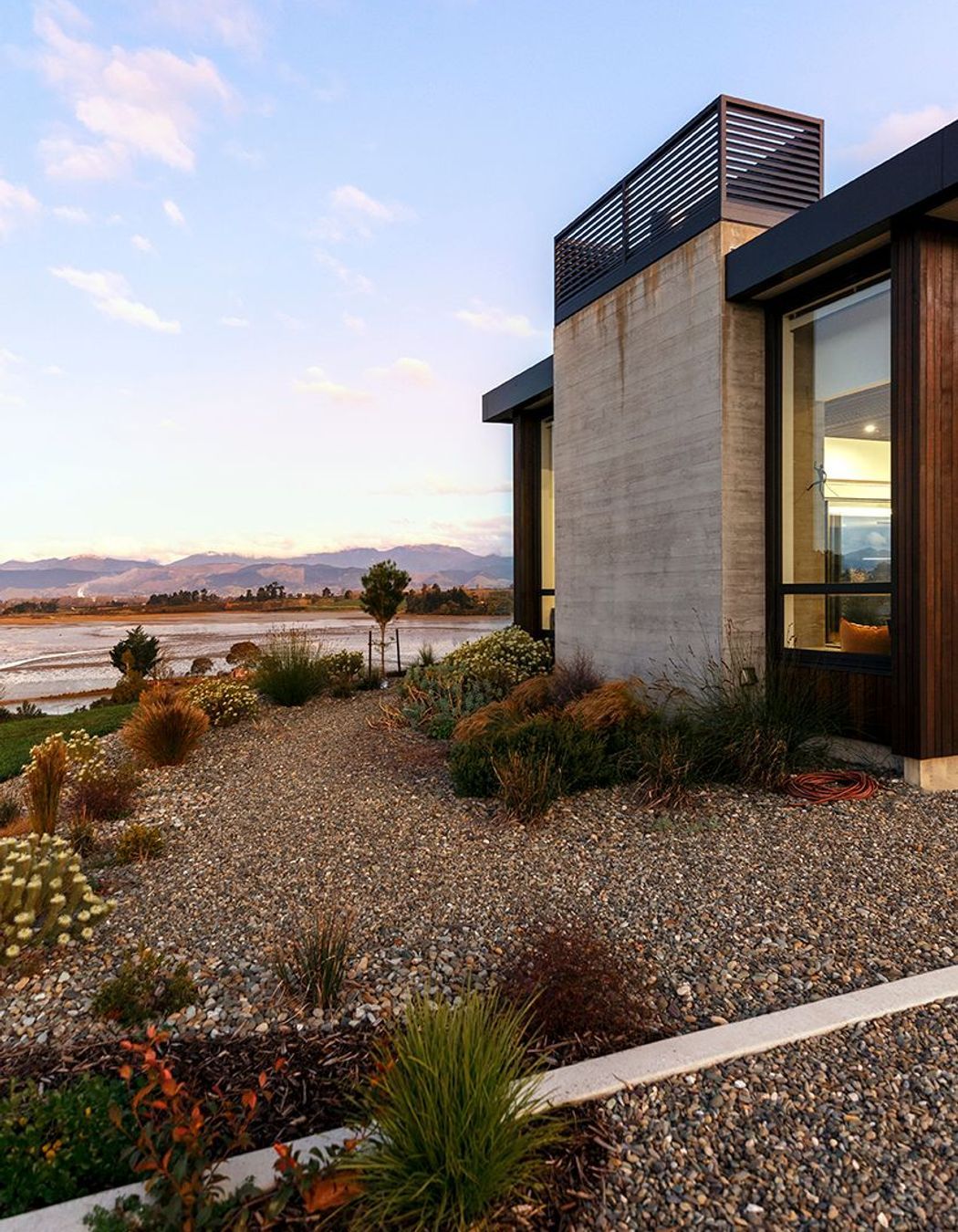
"The council is quite restrictive in this area in terms of the height and the recessiveness of the building," says Hall. "So we kept it relatively low-slung and reasonably recessive in colour, so it didn't dominate the ridge line when viewed from the coast."
The result: a long, low pavilion-like form that runs north-south atop the natural ridge of the site. "Throughout the form, there's a range of sheltered veranda spaces. "So there's a morning veranda on the east side, and a western veranda which expands to include a lovely outdoor living area."


The pavilion-centric design helped demarcate the 'public' spaces of the house from the 'private' spaces. The eastern and southern wings of the home house the bedrooms, while the two main living areas face north with additional views out to the east and west. This allows the clients to follow the sun or to seek shelter provided by the building, depending on the weather, Hall says.
"When approaching the front door, you're greeted with a striking 'entrance court' which features a large, dark-coloured wall," he says. "Upon entering, the flow of the interior directs you past the 'private wing' and into the primary living space. We did this by layering the pavilion forms to create the distinction between private and public, which influences how you navigate the building."
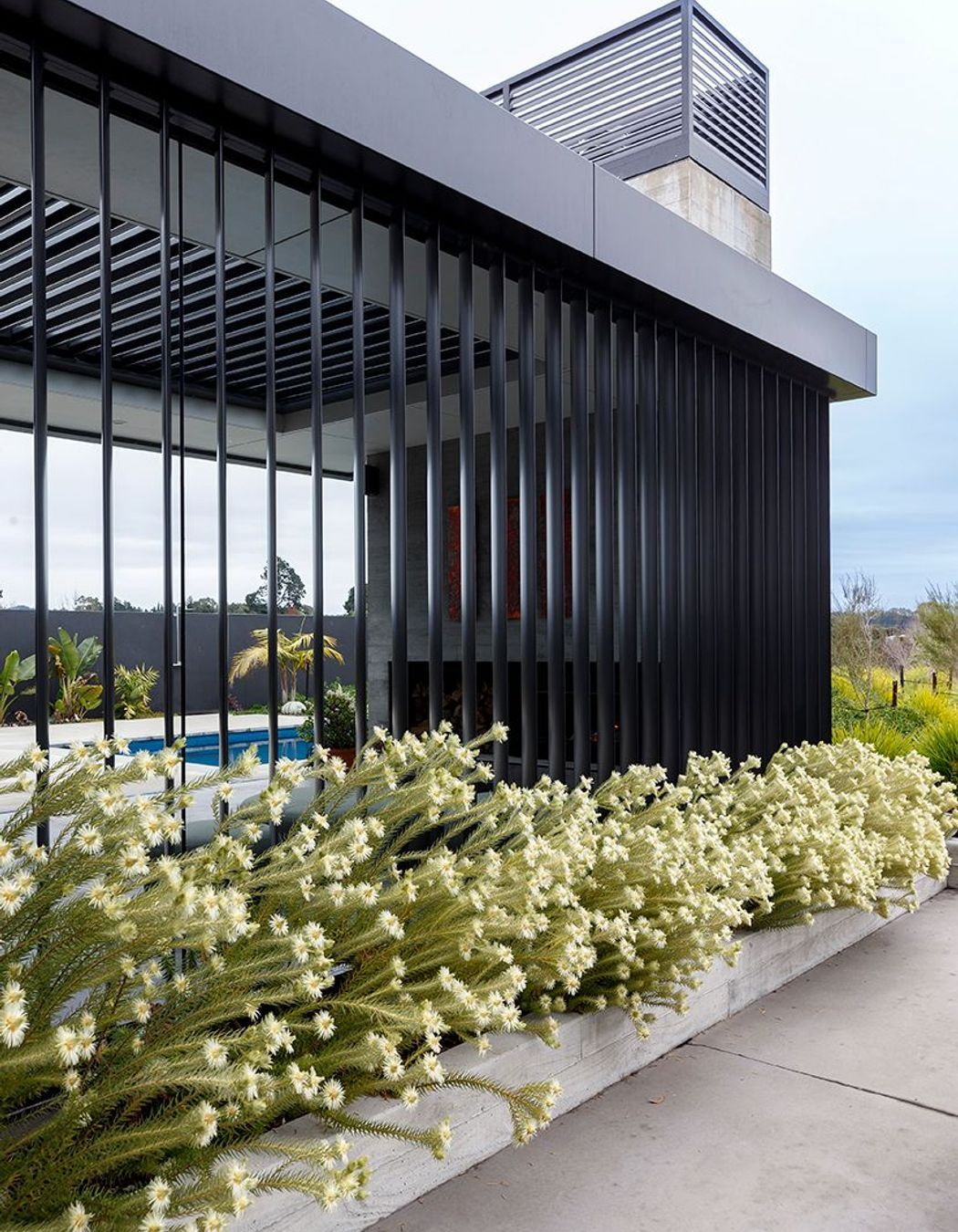
This philosophy of 'flow' extends to the outdoor living area, where a large feature exterior entry wall provides shelter and privacy to the pool area from both the main entry and driveway. "A generously proportioned, covered outdoor space with an outdoor fire and horizontal and vertical louvres provides a year-round space with a direct connection to the kitchen."
The materiality of Hoddy Road House was equally as important as the emphasis on its pavilion form, with each aspect of the design informing the other. The exterior was clad in darkly-stained shiplap cedar of variable width, with aluminium louvres throughout the form to help tame the often harsh winds blowing from the bay. Perhaps the most striking exterior feature, though, is the shuttered concrete.
"We were quite keen for each pavilion to be 'anchored' to the site – and we found that shuttered concrete was great for this purpose," says Hall. "And the nice thing about this material is that it subtly references the surrounding estuary, which has really nice grey, muddy tones – and when the sand that occasionally gusts up to the site, it combines to create some striking patterns."

The materiality of the interior was envisioned to provide a contrast to the outside, featuring materials that blend with the exterior finishes through the use of similar tiles and dark oiled cedar. "Using this cedar, we created a battened timber ceiling, which creates a variation of height in the main living area so it doesn't feel like one big room. We used height to create different spaces within that main living pavilion."
The standout characteristic of the home is how the interior and exterior spaces interact with each other: the ebb and flow of pavilion and veranda, sun-drenched living area and courtyard – all of which aim to capitalise on the outstanding natural beauty visible from all sides.
"The aim for me was getting the building oriented in a way that captures these views while also being sheltered, so you can really enjoy each space, whether indoor or outdoor," says Hall.
"And I think we definitely achieved that."
Learn more about JTB Architects and its recent projects.

