#3 House: The Joy of Creativity
Nestled on a rear site, the entrance to Studio2 Architect Paul Clarke’s home is unassuming as you move down a long drive that leads between two grand homes reminiscent of an Auckland of days gone by.
When the gate opens, you are treated to something special. Immediately, the haven-like grounds are consuming. To the west, a zen-like garden and landscaping compete with the dynamic form of this family home in which sculptured copper-clad skylights punch through the roof to draw light into the spaces below.
Arriving at the entrance to the home, the subtle nuances of this structure filled with art and meaning come to the fore. A symbol inset into the in situ concrete wall represents the three males in Paul’s family; himself and his two sons, while a square in the centre represents his wife Deb, “the heart of this home and family”, Paul explains.
Behind the boardform concrete wall, the entrance is tucked in a sheltered nook. The front door offers another glimpse into what’s ahead with a square cut out of coloured glass in the cedar-clad door; three triangular forms, one of each primary colour. The four triangles of cedar cladding to the door together make up the architectural symbol for a pivot door. “The primary colours are the basis of any artwork; they are the beginning—the basic requirements from which to begin,” Paul says.
Inside, directly above the entrance alcove the first of two sculptured skylights draws in light that falls in angular formations into the space. “The in-situ wall holes have been filled with coloured perspex extending and playing on the theme of colour.”
For Paul, who designed the house over a number of years after living in the former residence on the site for a decade before it was demolished, the number three offered a plethora of meanings that he incorporated into the design. “The number three invokes expression, versatility, and the pure joy of creativity. Three is also a time identifier as it represents past, present and future.”
In relation to the former, the home is a testament to the stories of Paul’s family’s life together. “It celebrates and embodies the memories of our lives and the experiences we have shared,” he explains. The footprint of the house also stays true to the elevation and volume of the original building on the site.
The site itself is capped by mature trees—a canvas Paul described as a domed oasis. In particular, a large oak tree extends its boughs over the rear of the site where one of the two pavilions extends, reaching out into the surrounds.
This, the single-level pavilion, houses the master bedroom and ensuite—a particularly spectacular space framed by greenery and which opens out to the elements with a glass door. “I’d always loved the idea of showering in nature and this offers that opportunity. There’s complete privacy here thanks to the trees.” The bedroom is wrapped in floor-to-ceiling glazing while above, the second sculptured skylight allows for an ever-changing play of light throughout the day, as well as providing views of the night sky from the bed.
To incorporate these sculptural elements, provide volumetric space and maintain the energy efficiency of the roof, a warm roof system from Viking Roofspec was installed.
“Paul was looking for a system that would provide improved thermal efficiency while at the same time offer the high level of aesthetics provided by the other materials within the project,” says Brendon Sutton, Sales and Marketing Manager for Viking Roofspec.
“Viking's WarmSpan Tray System was specified as it fulfilled all of these criteria. WarmSpan is made up of three components: the wide-span steel tray roof deck; Kingspan polyiso board; and, a waterproof membrane top layer, which in this case was Viking's Phoenix Super APAO torch-on system. WarmSpan has also been engineered to interface with other building materials, such as the copper-cladding on the skylights.”
Back at the entry, the transition into the main part of the home is created with a change in material from a polished concrete floor to Matai steps before moving back to concrete. Stepping down into the main living area, you are met with a second set of steps that leads to the master pavilion, “like an Escher 3D artwork. A glazed link between the two built forms creates a flash of transferral into the different zones.”
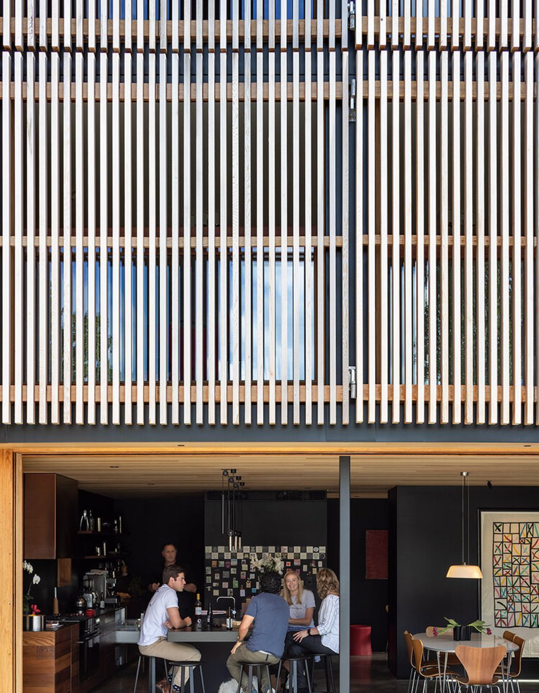
The kitchen and main living area is vast in proportion, capped with timber joinery and cedar ceilings. The cabinetry is crafted from the cedar weatherboards of the original home on the site. Black walls offer a refined simplicity while a magnetic blackboard wall in the kitchen offsets the rest of the space with a playfulness and frivolity.
Like every room in this house, the kitchen and living area double as a gallery in which the family’s art collection is displayed. The kitchen’s dark cabinetry is contrasted with a copper range hood cover that has been left to patina; dramatic markings that tell the story of the rising steam. A leathered granite benchtop sits next to a polished copper bar top offering a wealth of materiality and texture.
Glazing to the north draws in the landscape of mature trees, some of which date back to the 1940s. To the west, a covered outdoor room set on a vast concrete pad is framed by a water feature and a brazier set amongst extensive planting. “The running water creates a buffer, absorbing conversations."
The same is true for the pool, which is stepped down on the site towards the north and surrounded by planting—a buffer between zones that combined with the water creates two private, definitive outdoor areas in which separate groups of people can comfortably socialise.
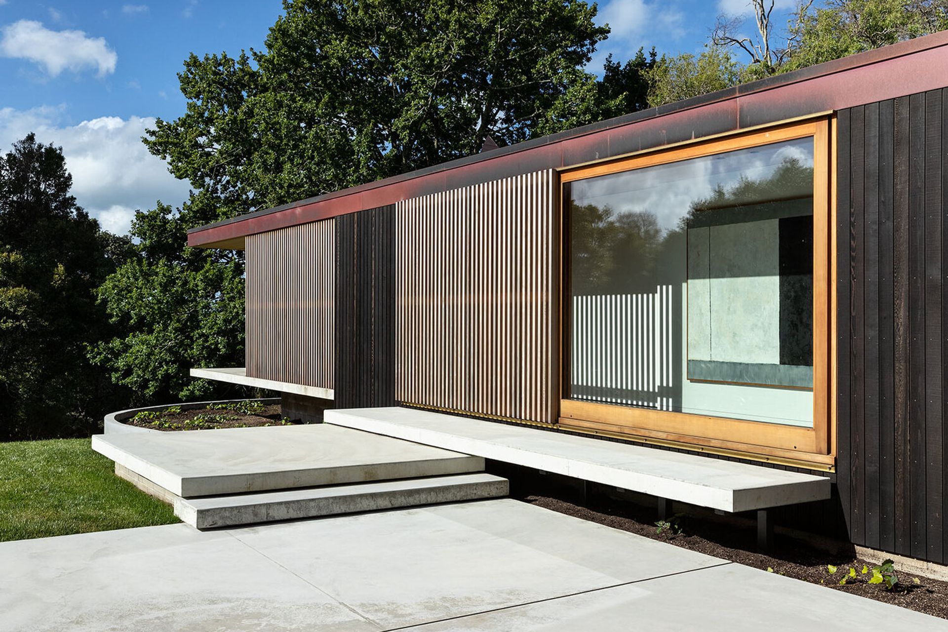
It was important that the home's exterior emanated the same sense of welcoming comfort as the interior and that guests recognise the sense of journey that brought them to this particular place. The interplay of vertical and horizontal cedar cladding and shutters juxtaposed against the long-run roofing creates a patchwork of textures that establishes a dialogue of their own.
“Past, present and future all exist within the home and I wanted to create an impression of that externally as well,” says Paul. “A good way to do that was with the cladding finish.”
“Dryden offers a range of stains and oils that not only offer superior protection but allow the timber to age naturally while mitigating ongoing maintenance,” says Jon Pearson, Dryden Manager for Dulux. “Dryden WoodOil is made in New Zealand and specially designed for our conditions. It is suitable to be applied to all species of timber and all wood surfaces, old or new, rough or smooth.”
Inside, Matai stairs and a sculptured handrail lead to the floor above that contains a guest bedroom and bathroom, a study and a second family lounge. Here, white walls contrast the black hues of the lower level and offer a fresh gallery space to showcase art. Moveable timber shutters allow for the manipulation of light and shade. Double hung windows crafted with stainless steel weights filled with lead gunshot allow the windows to fully open and create a balustrade of sorts—so you have the feeling of being in an outdoor room.
“A study perched in the southwestern corner behind the base of the stairs has a bay window for the dog to nap and family conversations. It has been named the ‘control tower’ as it is the viewing space for people coming and going from the property—a cantilevered glazed form pushed out from zinc cladding, and the only visible interior space from the driveway.”
On the third level two further bedrooms and a bathroom are housed along with a studio and storage area. “The ceilings craft the cross section of the building form, creating a volume celebrating the sense of space and the feeling of floating in the trees—it is private, intriguing and relaxed,” Paul says.
Light and shadow abound at every level, as works from the likes of Ralph Hotere, Colin McCahon, Allen Maddox and Elizabeth McIntosh offer moments of joy and colour against the stark black and white of the walls.
From the exterior, the two pavilions create an interplay of form; one wrapped in zinc and horizontal cedar, the other in copper and vertical cedar in a clear yet seamless delineation. The northern facade is defined by the transition of the operable timber shutters, a dramatic movement of form as the nine shutters across three levels offer myriad possibilities of configuration.
“I love that you can manipulate architecture to make it adaptable. Creating buildings that celebrate the memories of our lives and provide spaces in which to shape them is something special. For me, architecture is about experiencing spaces in a more joyful way.”
Words by Clare Chapman


