About
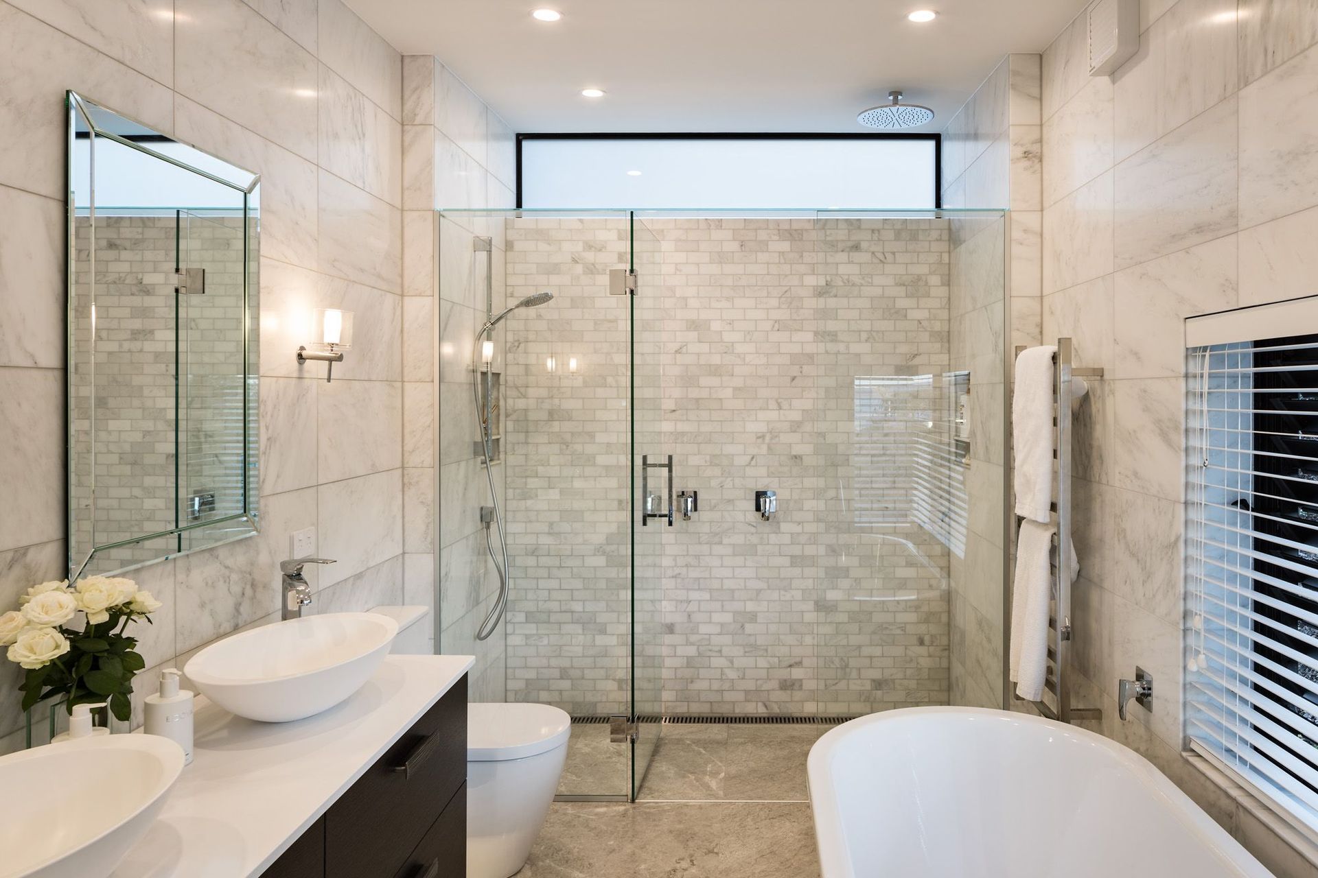
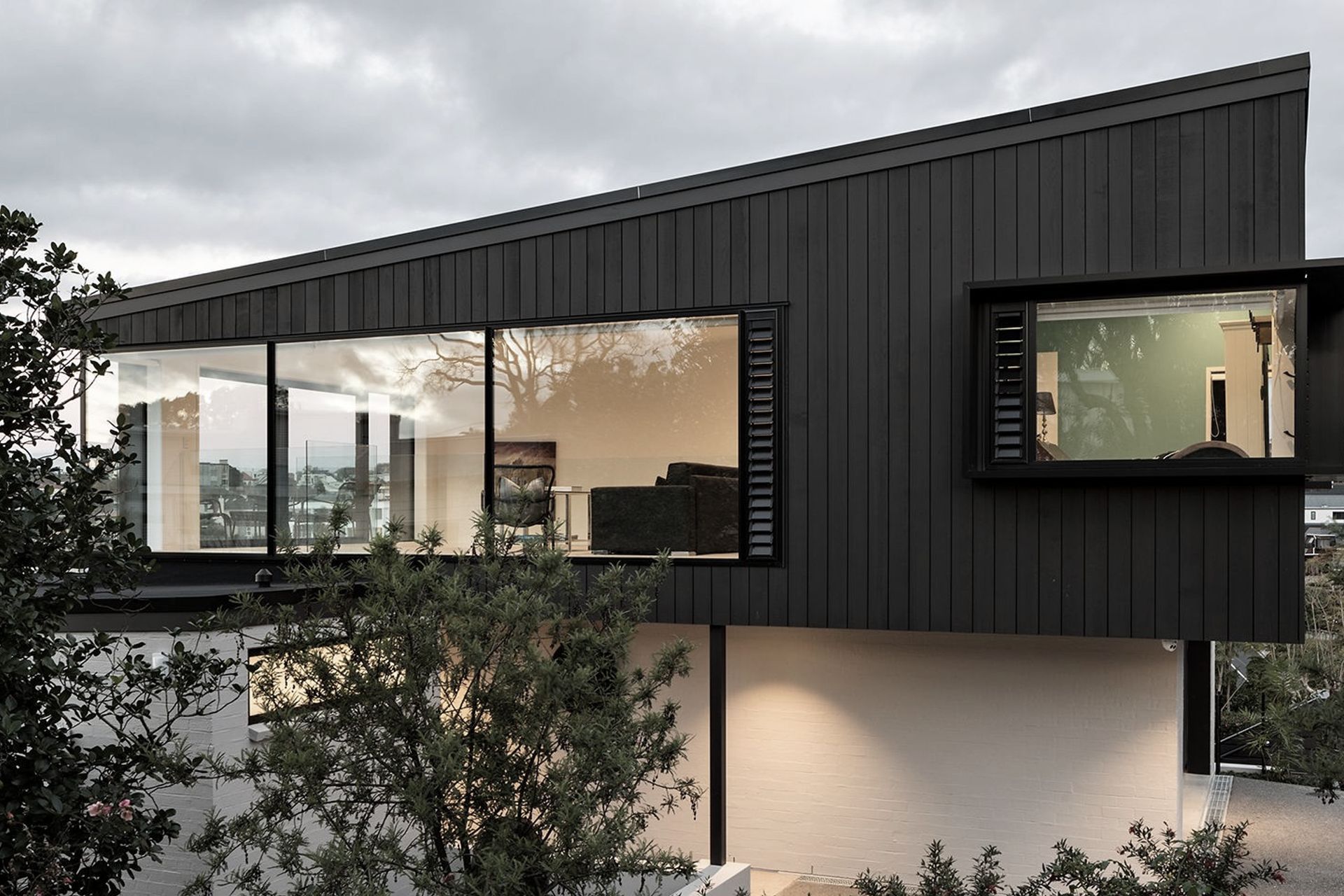
Dingle Road New House.
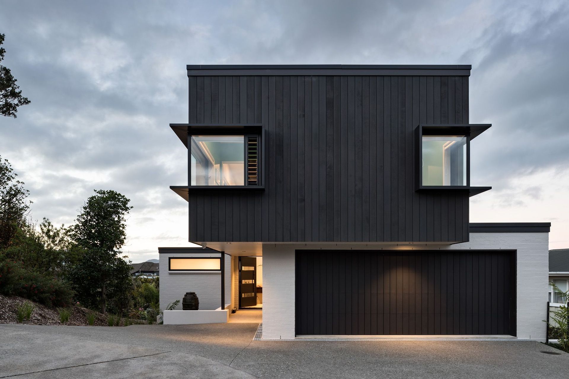
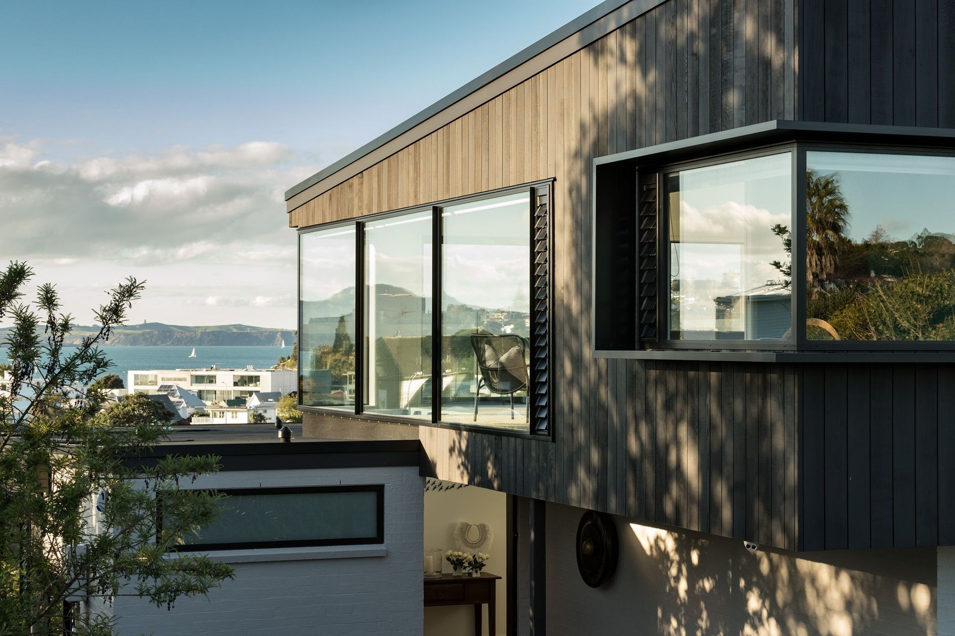
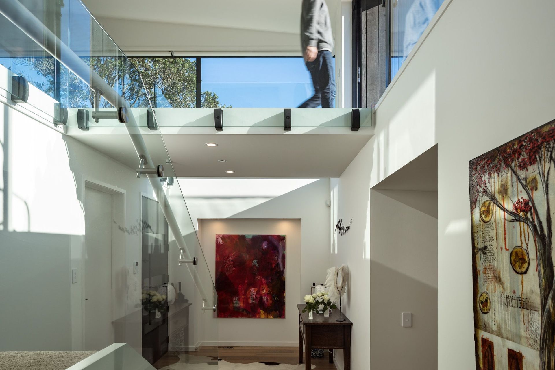
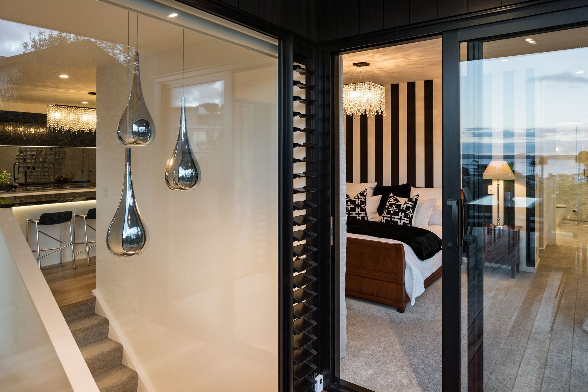
ArchiPro Project Summary - Elevated three-level residence in Auckland, designed to maximize stunning views of St Heliers and the Hauraki Gulf, featuring a blend of modern aesthetics and passive solar design for a comfortable, future-focused lifestyle.
- Title:
- Dingle Road New House
- Architectural Designer:
- Architecture & Design Ltd
- Category:
- Residential
Project Gallery
Views and Engagement
Professionals used

Architecture & Design Ltd. David Frost B.ArchDavid’s interest in composition and proportion began at university and ended up as the topic of his final year thesis project. That, along with his strong focus on the physical context, and his philosophy to reflect the character of the people who will be living in the buildings he creates or alters, forms the basis of his design philosophy.Since graduating from architecture school, he has worked in several architecture and interior design companies in London, Wellington and Auckland and he set up his own practice Architecture and Design Ltd in 2009.David worked for an architectural practice in London that specialised in Historic buildings, which is where he got his first taste for that kind of project. He worked on several 300-400 year old London buildings, doing renovations and additions. He still enjoys working with older buildings, as well as designing new buildings from scratch. David has done a lot of interior design work over the years; including residences, airline lounges, office fit outs, cinema complexes and restaurants. He finds this immensely helpful when designing buildings as he is constantly thinking about the interior and exterior simultaneously, looking at the building in context and how the furniture might be placed. This results in an integrated approach that flows from the interior to the exterior of his house designs, and often includes the landscape design of the outdoor spaces.
Year Joined
2020
Established presence on ArchiPro.
Projects Listed
9
A portfolio of work to explore.
Architecture & Design Ltd.
Profile
Projects
Contact
Project Portfolio
Other People also viewed
Why ArchiPro?
No more endless searching -
Everything you need, all in one place.Real projects, real experts -
Work with vetted architects, designers, and suppliers.Designed for Australia -
Projects, products, and professionals that meet local standards.From inspiration to reality -
Find your style and connect with the experts behind it.Start your Project
Start you project with a free account to unlock features designed to help you simplify your building project.
Learn MoreBecome a Pro
Showcase your business on ArchiPro and join industry leading brands showcasing their products and expertise.
Learn More

