About
Eden View.
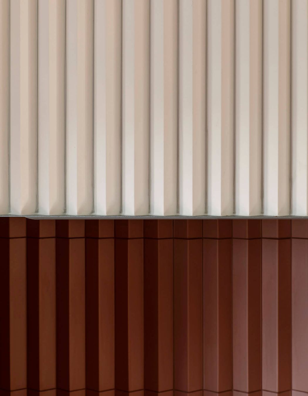
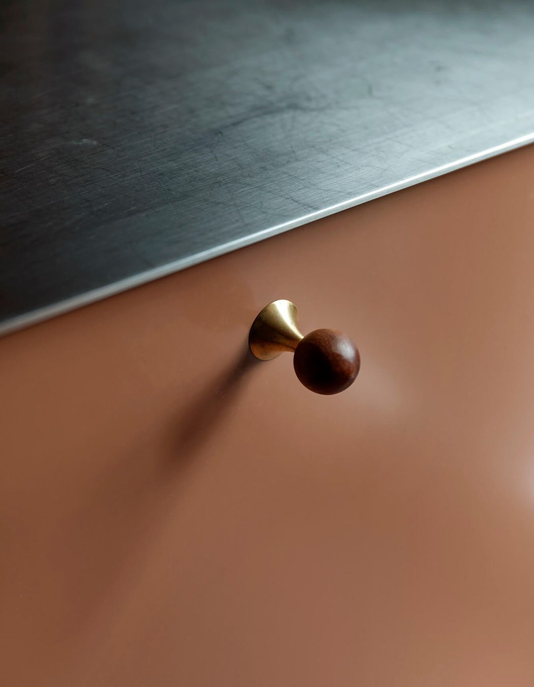
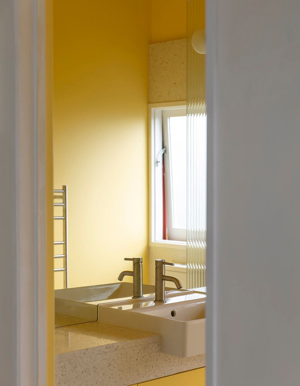
ArchiPro Project Summary - A revitalized townhouse kitchen and bathroom that harmonizes color and texture, enhancing spatial efficiency and mood, featuring custom-crafted details and a connection to nature through natural light and a lovely herb garden.
- Title:
- Eden View
- Architect:
- Pac Studio
- Category:
- Residential/
- Interiors
Project Gallery


Views and Engagement
Professionals used

Pac Studio. Pac Studio is an ideas-driven design practice specialising in architecture, interior design and special projects.
Founded
2015
Established presence in the industry.
Projects Listed
46
A portfolio of work to explore.

Pac Studio.
Profile
Projects
Contact
Other People also viewed
Why ArchiPro?
No more endless searching -
Everything you need, all in one place.Real projects, real experts -
Work with vetted architects, designers, and suppliers.Designed for Australia -
Projects, products, and professionals that meet local standards.From inspiration to reality -
Find your style and connect with the experts behind it.Start your Project
Start you project with a free account to unlock features designed to help you simplify your building project.
Learn MoreBecome a Pro
Showcase your business on ArchiPro and join industry leading brands showcasing their products and expertise.
Learn More


