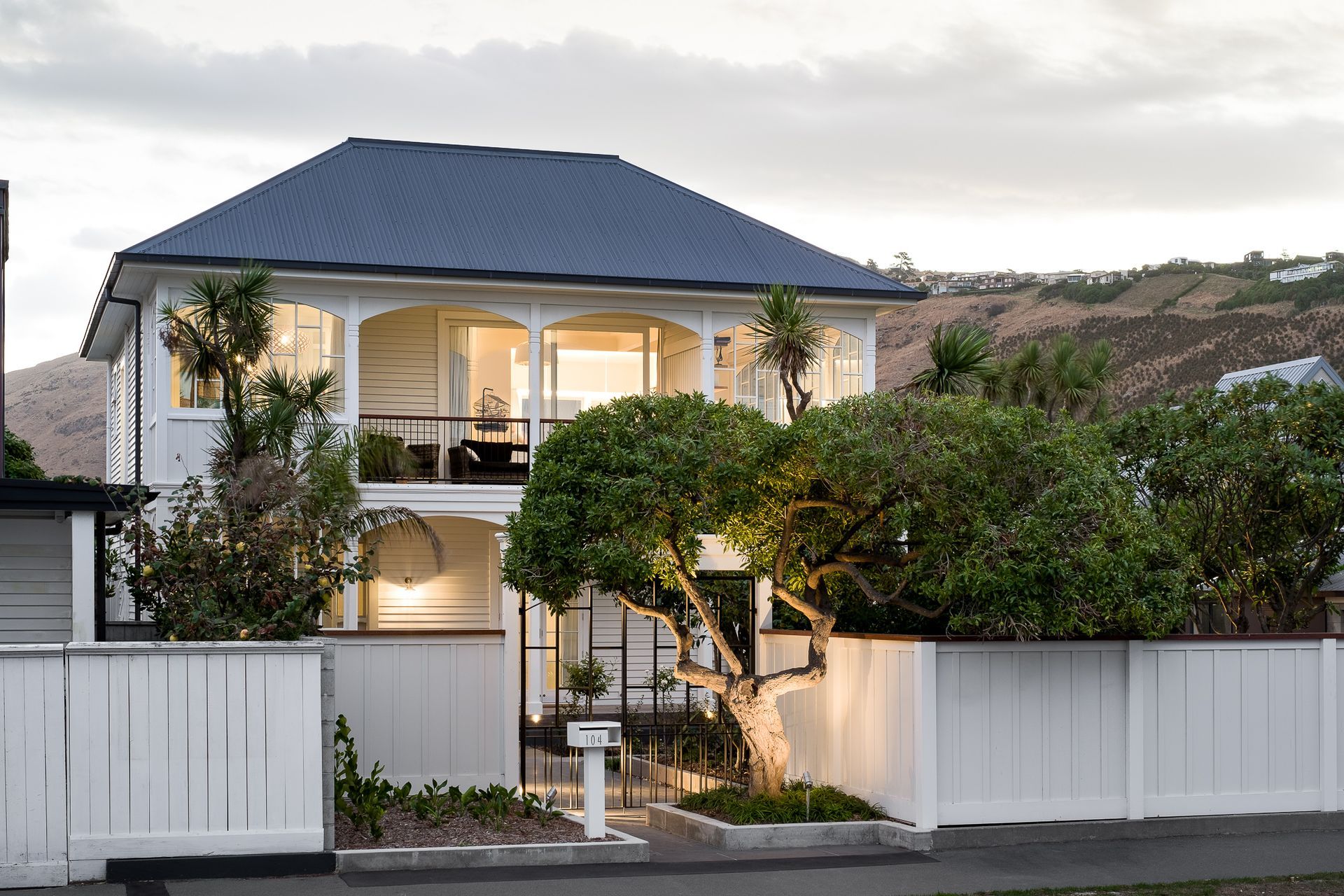
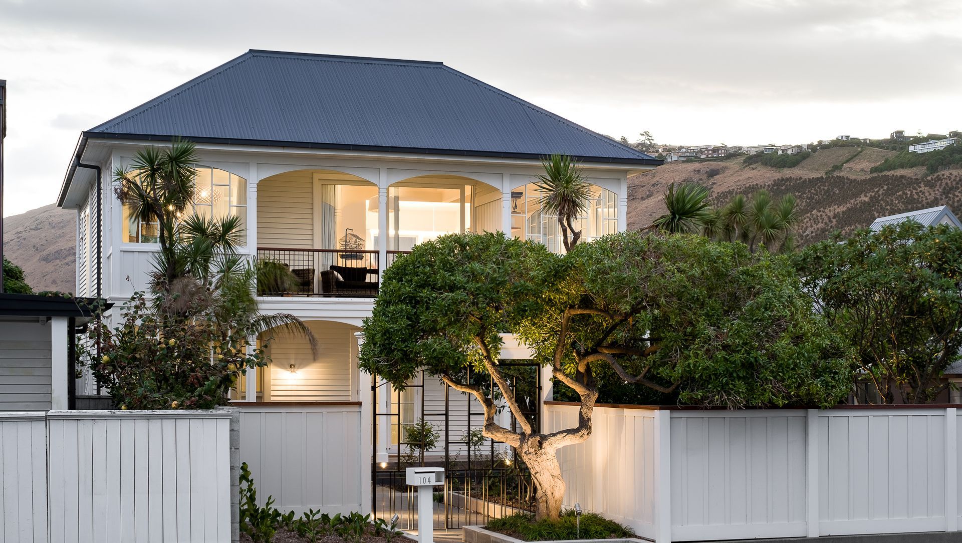
Built circa 1910, this elegant two-storeyed home on the Sumner beach front was designed in the Arts and Crafts style, devoid of the ornate detailing seen on villas of that time. Featuring wrap-around verandahs to capture the sea views, this home’s simple, pared-back design, detailing and craftsmanship has now been brought back to life.
“During the period when this house was built, Sumner was seen as a holiday destination – a satellite town of Christchurch – although it’s certainly not seen that way now. There were a lot of cottages built around that time, but the style and execution, given the bach ethos, was reasonably haphazard,” explains architect Ben Brady from Sumner-based practice, Linetype Architectural.
“This house is a slightly unusual design because it wasn’t super classical in layout,” he says. “It was built on the cusp of Arts and Crafts movement so it doesn’t have the ornate detailing you can find in a villa, but you can still see the craftsmanship. This was an exciting time for architecture because architects were really starting to think about what it was like to live in a house.”
Esplanade House is actually more typical of the type of home you might find towards the top of the North Island than Christchurch, suggests Ben. “It almost has a Treaty House quality about it, sited on a generous 835m² site with a large lawn out front and classic New Zealand native planting around it. However, over the past century, the home had inevitably been altered a number of different times, leading to a confusing layout.
“There is definitely a forensic component to restoring an old home, but that’s just one aspect,” says Ben. “It’s not just about discovering the fabric of the building, but what might have been in the architect’s mind at the time of designing it. There are two ways to approach the restoration: you can either create something new or create something authentic. I wanted the house to look like what it was meant to be but, first, that meant unpicking the mistakes.”
“The house wasn’t anatomically correct – it wasn’t perfect,” he says. “It will never be listed by the Historic Places Trust, for example, but there is still a lot to love. We needed to be pragmatic about what to keep or lose, and to gain a sense of what the owners loved.”
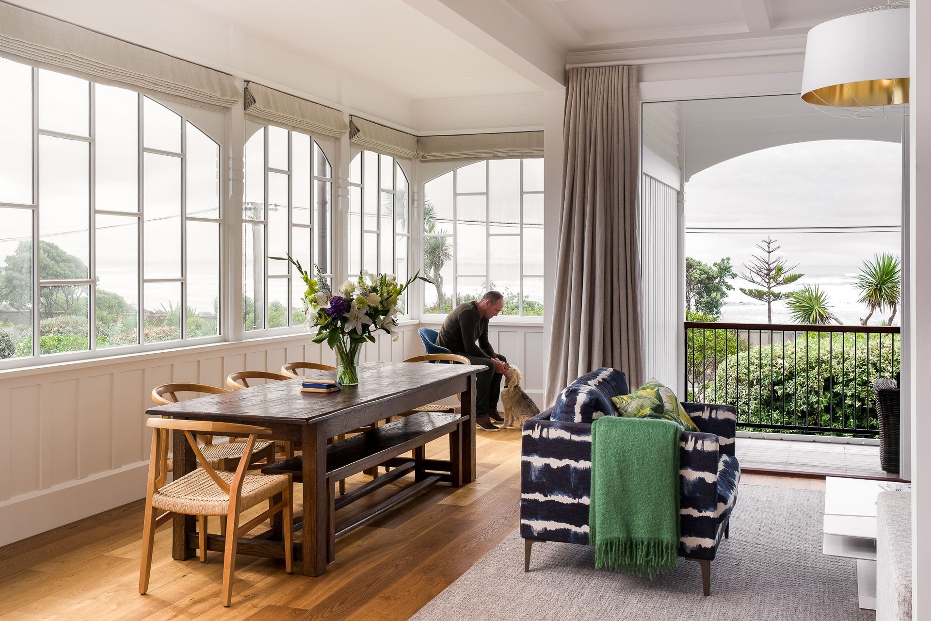
The architects deduced that the original house was mostly likely built as accommodation for a number of single adults. It featured two arched verandahs, but the northern corners on both levels had been closed off and needed opening up. Inside, a 3m floor-to-ceiling stud height, a grand staircase and significant stained-glass windows were key original features that the owners and architects wanted to keep, as was a large first-floor living room with sea views.
“We could tell that a major renovation had happened in the 1960s by the profile of the timber mullions, which were a lot heavier than earlier mullions,” says Ben. There had also been a lean-to inserted onto the rear of the house, some of the windows had been replaced and a number of details had been altered.
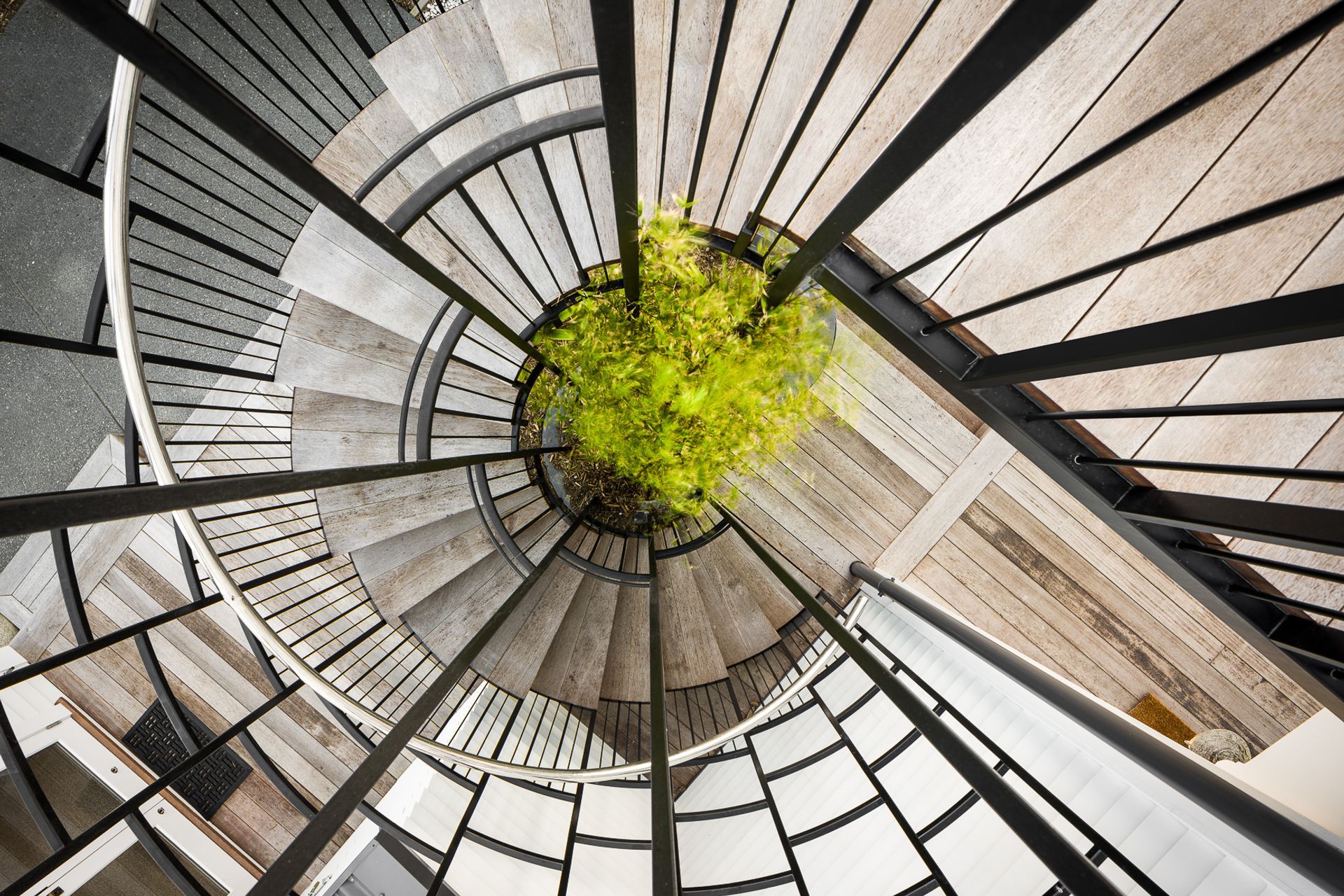
The homeowners – a working couple and their two teenagers – wanted the renovation to be a user-friendly design more suited to modern-day living and to perform better in this coastal climate. Insulation was inserted where possible and the single-glazed windows were replaced with double-glazed replicas. More outdoor space was added to the ground and first-floor deck areas, and a cylindrical spiral staircase with a bamboo planter growing up was inserted to link the areas. There is also a new addition to the garage, which caters to this coastal lifestyle, providing a home for the owners’ surfboards, paddleboards and so on.
A key feature of the house is the graphic window detailing with its ladder-style arrangement, which has been used throughout as a design concept and is particularly evident in the spiral staircase and the detail in the front entry.
The entry gate was also a key element that needed remedying. “It was off-centre to the front door and there was an established tree sitting in direct line with the entry, but we wanted the entrance pathway to be in line with the architecture so we tried to pull part of the architecture forward to emphasise that idea,” says Ben. “Now, it’s like you are entering at an earlier part of the building, it makes the entry more logical and the overall feel of the place is softer and a lot more consistent.”
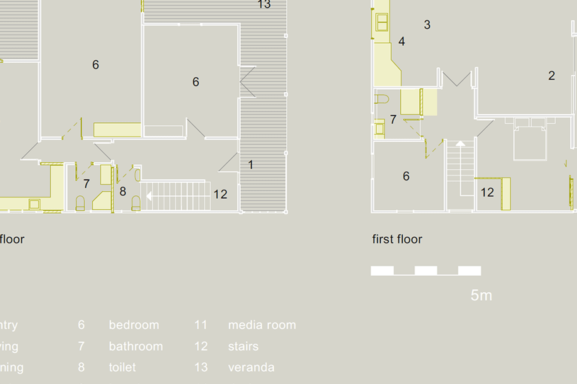
On the ground floor, the general arrangement of entry corridor with three bedrooms to one side, and a bathroom, laundry and stairwell on the other, is similar to the original layout but the middle bedroom has now been converted into a media room. This space can still be used as an extra bedroom for guests and now opens out to a new deck facing north-west. Each of the three bedrooms either opens out onto a deck or the front verandah.
Two-thirds of the first floor is now a versatile multi-use room, consisting of an open-plan kitchen, dining and lounge area and, now, with an office for home working. The lounge leads onto the front deck via new French doors that match the doors to the adjacent master bedroom. The kitchen and dining area now has its own deck leading to the spiral staircase.
Ben says that the existing bathrooms didn’t match the grandeur of the house, at only about two-metres square so, in the upstairs bathroom, a large cupboard has been transformed into a shower pod that protrudes into the space. Downstairs, the renovated bathroom has utilised some leftover space under the staircase.
“One of the interesting aspects of a project like this is that you end up with happy accidents because you are working with what’s there – things you can’t rip apart – that you wouldn’t normally choose to do from the start of a design,” says Ben. “You have to turn that craziness into a successful design. The bathrooms were like that, as was the tree out front, but they have added uniqueness and character to the house, which worked out really well for us.”
“We really just wanted to do the right thing with this house,” says Ben. “Today, there is a lot of work being done on these old houses to strip back and reveal the native timbers, but that wasn’t necessarily the intent of the original design. When restoring paint surfaces, you don’t want to make them appear too flat and sharp in an old house, because it‘s not just about the quality of the finishes but the chips, bumps and lumps that adds softness and character to the home. If everything’s too sharp, it becomes a bit Disney and fake.”
“And you can’t become too caught up in the smaller details – it’s the bigger ideas in a project that make the project more successful,” he says. “Part of what we like about old houses is the history and the story so restoring a home like this is really about retaining the right amount of feeling between the old and new that makes a big difference.”
Words by Justine Harvey.
Photography by Dennis Radermacher at Lightforge Photography.
Drawings by Linetype Architectural.
Interior design by Bridget Coles at Design + Supply Co.
Built by New View Construction.


