Fife St banner

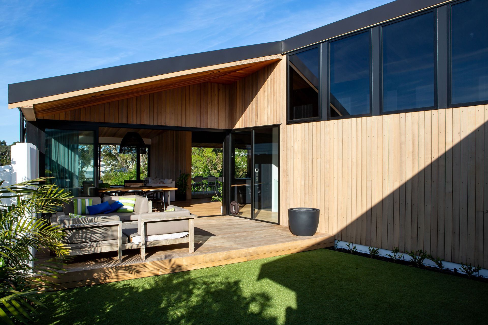
In the inner city suburb of Westmere sits an unobtrusive, low-lying cedar wall capped by a low-profile, hipped roof. Disguised by the cedar wall is a ‘stealth’ home, designed in response to the classic brief calling for an architectural family home for four, designed on a budget.

“The site originally housed a bungalow that can only be described as ‘very original’,” says architect Tim Dorrington. “The street is a mix of architectural styles and eras, so there was no requirement to replicate the existing house, which meant we were able to devise a plan that answered the clients’ brief for a home that provided a high level of privacy.”

The response was a suburban house that, in effect, turns its back to the street, presenting what appears, on first inspection, to be a blank facade but which is, in fact, a cleverly concealed garage door. Subtle planting provides a buffer between the house and the footpath, whilst still allowing it to connect with the street.

The low-profile hipped roof—which references the more traditional hipped roofs of the neighbouring properties—rises above a compressed u-shaped plan, with a cutout in the longer, north-facing side, providing an internal courtyard and admitting late afternoon and evening sun.

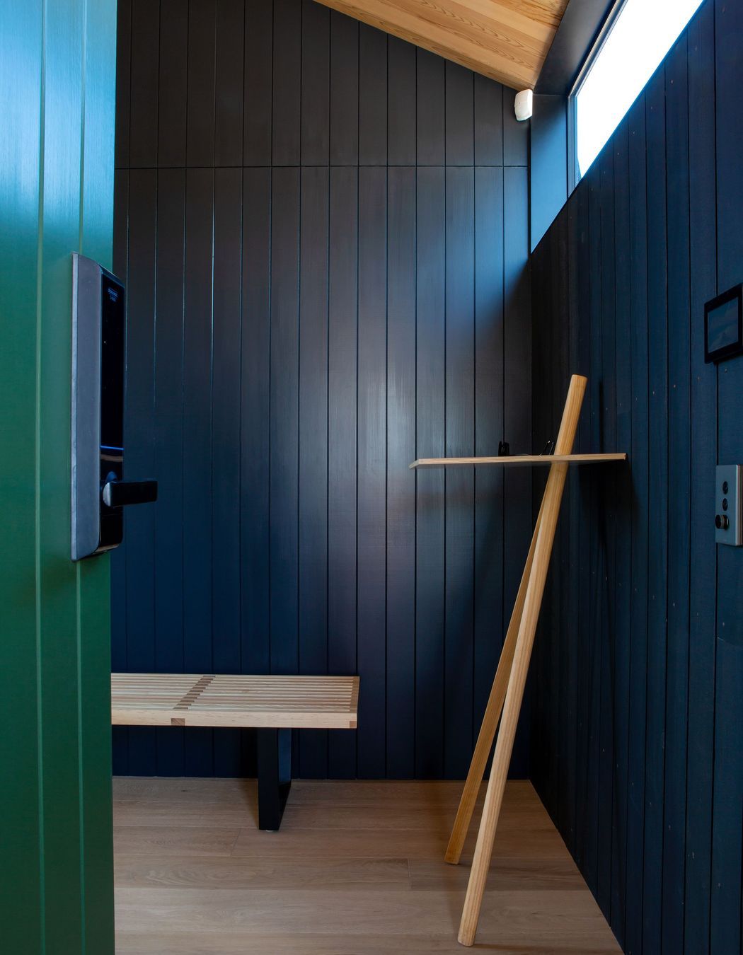
Entry to the house is via the southern facade. Beyond the front door the ceiling soars up to four metres-plus at the ridge above and is lined with cedar tongue and groove, which echoes the vertical weatherboard cladding and provides an airy, open entry.

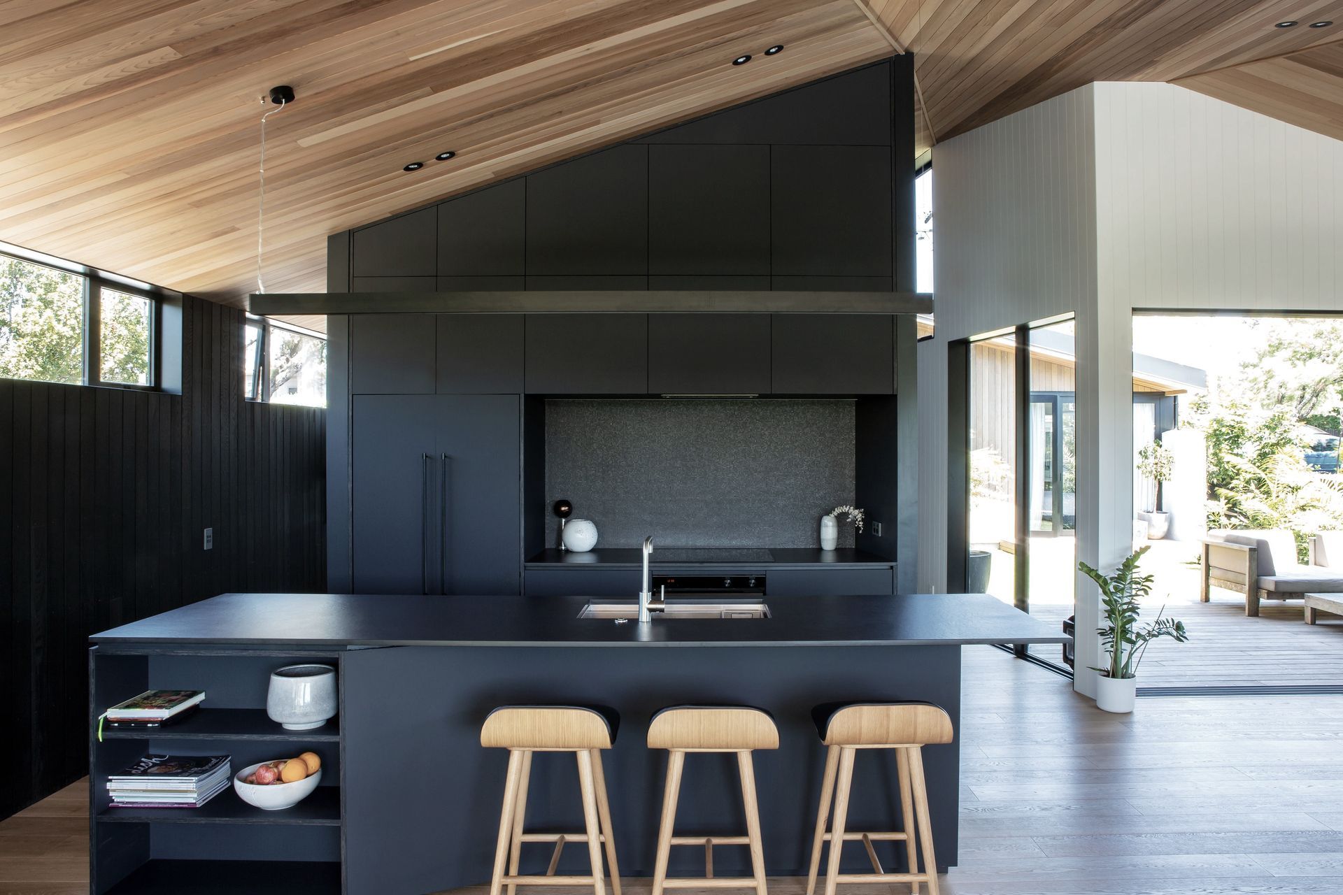
“A glazed corner window, opposite the front door, provides a peek into the courtyard without revealing too much of the rest of the space, which on this level comprises an open-plan living, kitchen and dining area at one end, with the main bedroom and garage at the other.

“This entry area also provides a hallway and includes a ‘hidden’ guest bedroom, laundry, guest bathroom and staircase to the lower level.”

Downstairs belongs to the kids, says Tim. Two bedrooms open off a central rumpus room and onto the pool area and backyard, which in turn offers access to the park.

“The location of the property, overlooking the park, was integral to the family’s decision to buy, as they are all into the outdoors and sports. The design allowed us to maximise this connection to the park by placing all of the major glazing on the north-eastern facade.

“Materially, there are two strong brick spines bracketing the long boundaries, with clerestory windows providing light and sun, as well as general privacy from the neighbours. The courtyard provides a green escape in the middle of the plan, while the rear covered deck overlooks the backyard, pool and the park beyond and is in turn connected to these via a generous external staircase.”

The combination of the soaring ceiling plane and the bank of windows to the east draws visitors down the hallway from the entry towards the view. Formal planning has been broken down to create a flow of spaces with various orientations and ambiance.

While the living area is physically removed from the backyard by virtue of being located on the upper level, clever planning of the programme has heightened the visual connection. Likewise, the external staircase, with its deliberately low incline angle, creates a much more natural ‘slope’ effect, making traversing it relatively effortless, again setting up the sense of connection to the backyard and swimming pool.

“The position of the staircase to the side, as well as its incline, work to ensure that ample light also penetrates into the rumpus room and children’s bedrooms.

“Overall, the material palette and sense of light help to create a living experience that is calm and comfortable—a countermeasure to the sometimes hectic nature of daily life.”

Words by Justin Foote
Photography by Emma-Jane Hetherington

Dorrington Atcheson Architects
Auckland

About the
Professional

Twenty years of experience coupled with an enduring spirit of youthful enthusiasm is the yin-yang balance that makes Dorrington Atcheson Architects a team that has produced so many award-winning buildings for their clients.

While every project calls for a fresh eye and an innovative approach, directors Tim Dorrington and Sam Atcheson also draw upon their considerable experience within the New Zealand marketplace.

Specialising in residential design, but with a proven track record in retail and office environments, this boutique company has quietly made their mark on the built environment, winning several NZIA awards.

Their methodology is highly collaborative, so while DAA favours contemporary design that takes its cue from mid-century modernism, its role is not to dictate but to engage with the requirements of home-owners and clients. Responding to site, budget and idiosyncrasies is all in a day’s work.

This honest approach is reflected in the materiality of their buildings where natural products are celebrated. Dorrington Atcheson Architects design functional spaces with measured proportions, a simplicity of structure and just enough surprise to delight.

At ArchiPro we recognise and acknowledge the existing, original and ancient connection Aboriginal and Torres Strait Islander peoples have to the lands and waterways across the Australian continent. We pay our respects to the elders past and present. We commit to working together to build a prosperous and inclusive Australia.