Kōri Ice Cream
By Architects EAT
Stemming from ancient traditions, the concept of omotenashi refers to Japanese hospitality. Focused on care rather than expectation, omotenashi differs from western notions of service in that it’s often intangible and never transactional, and is performed without expecting anything in return.
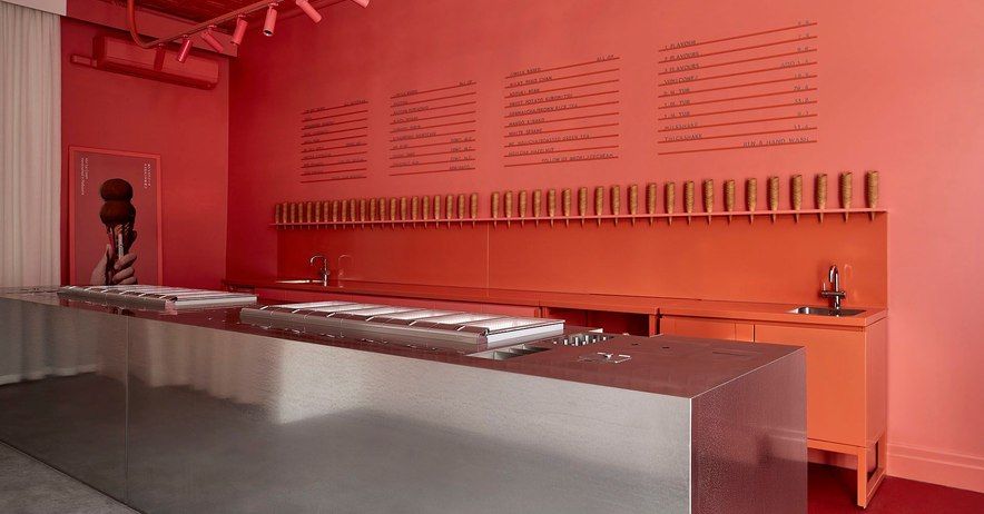
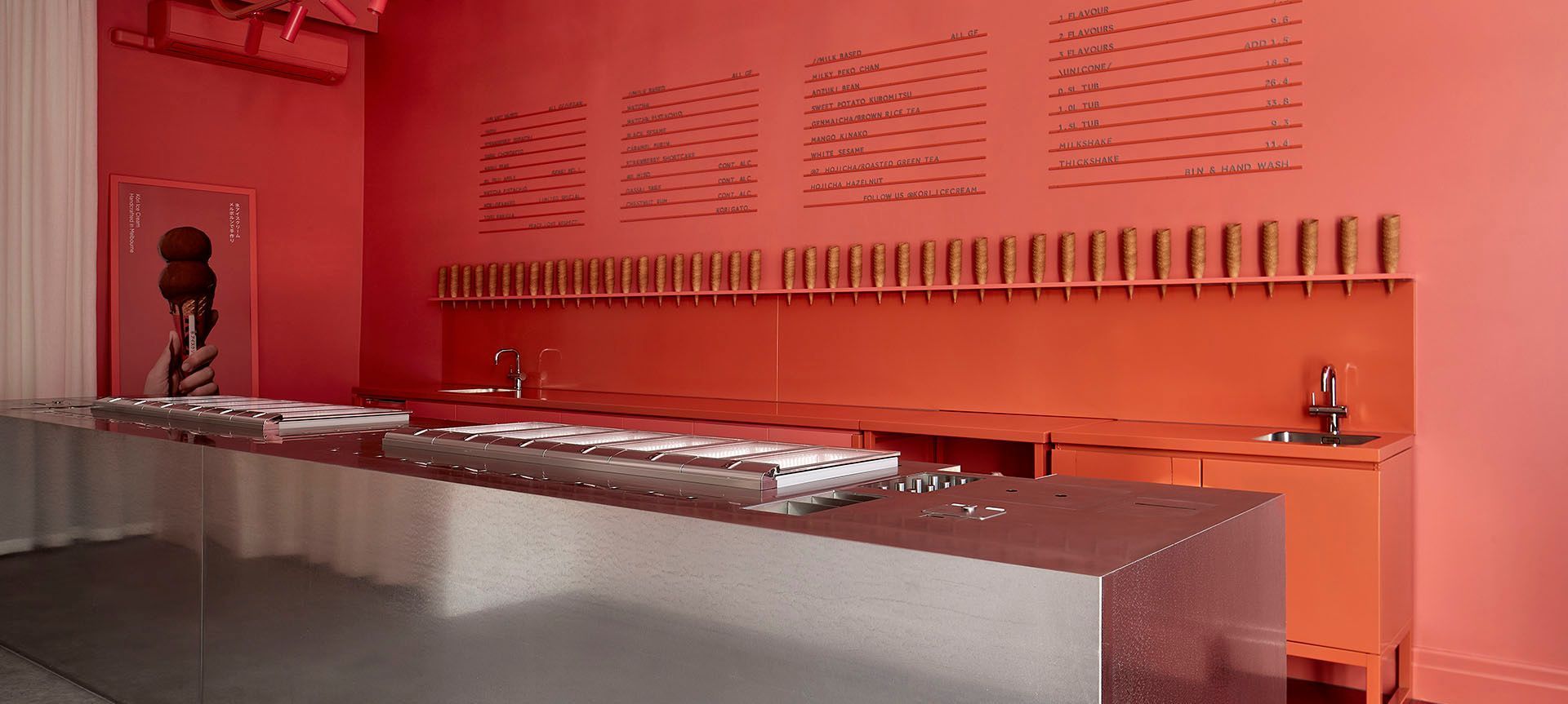
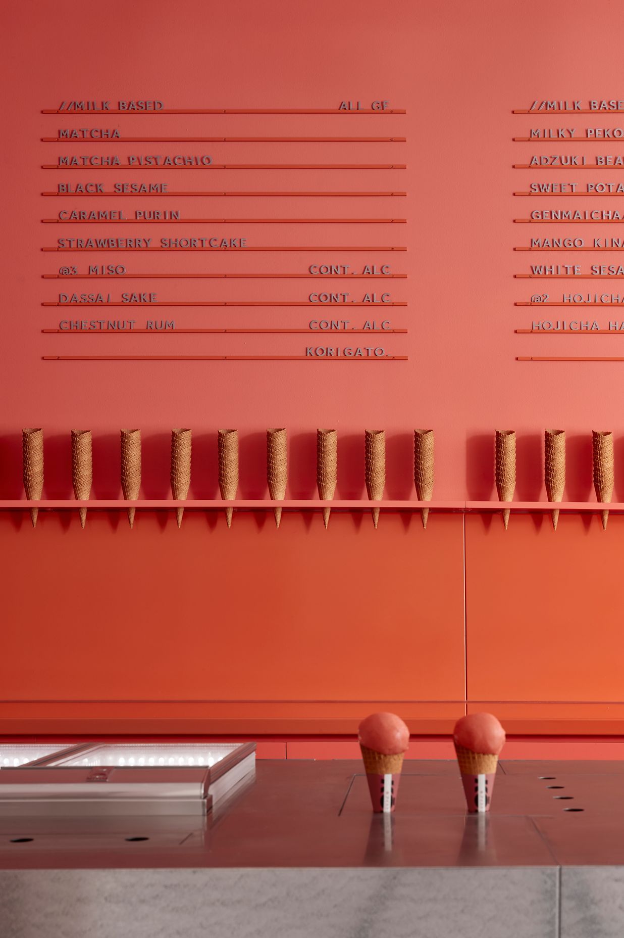
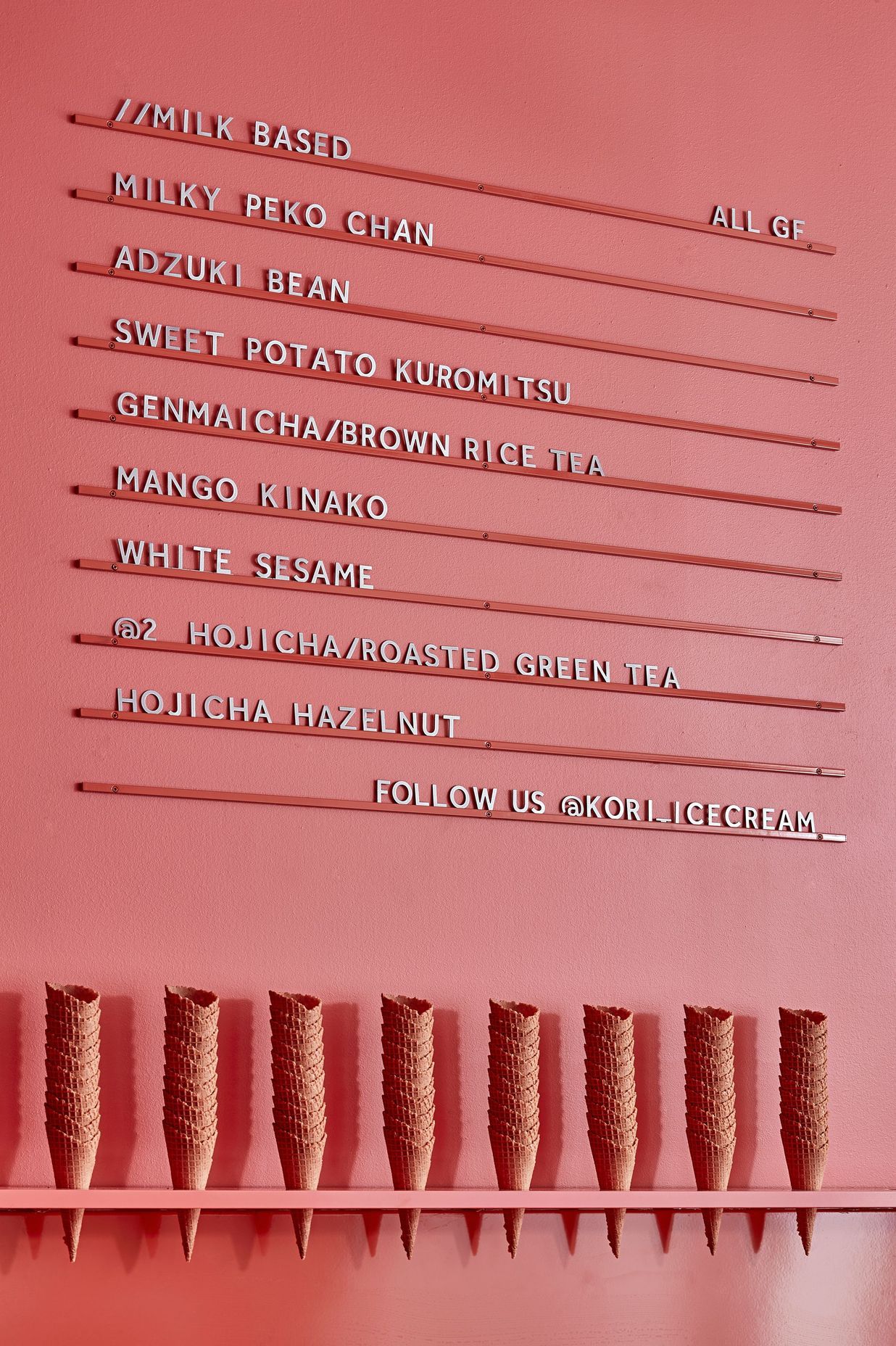
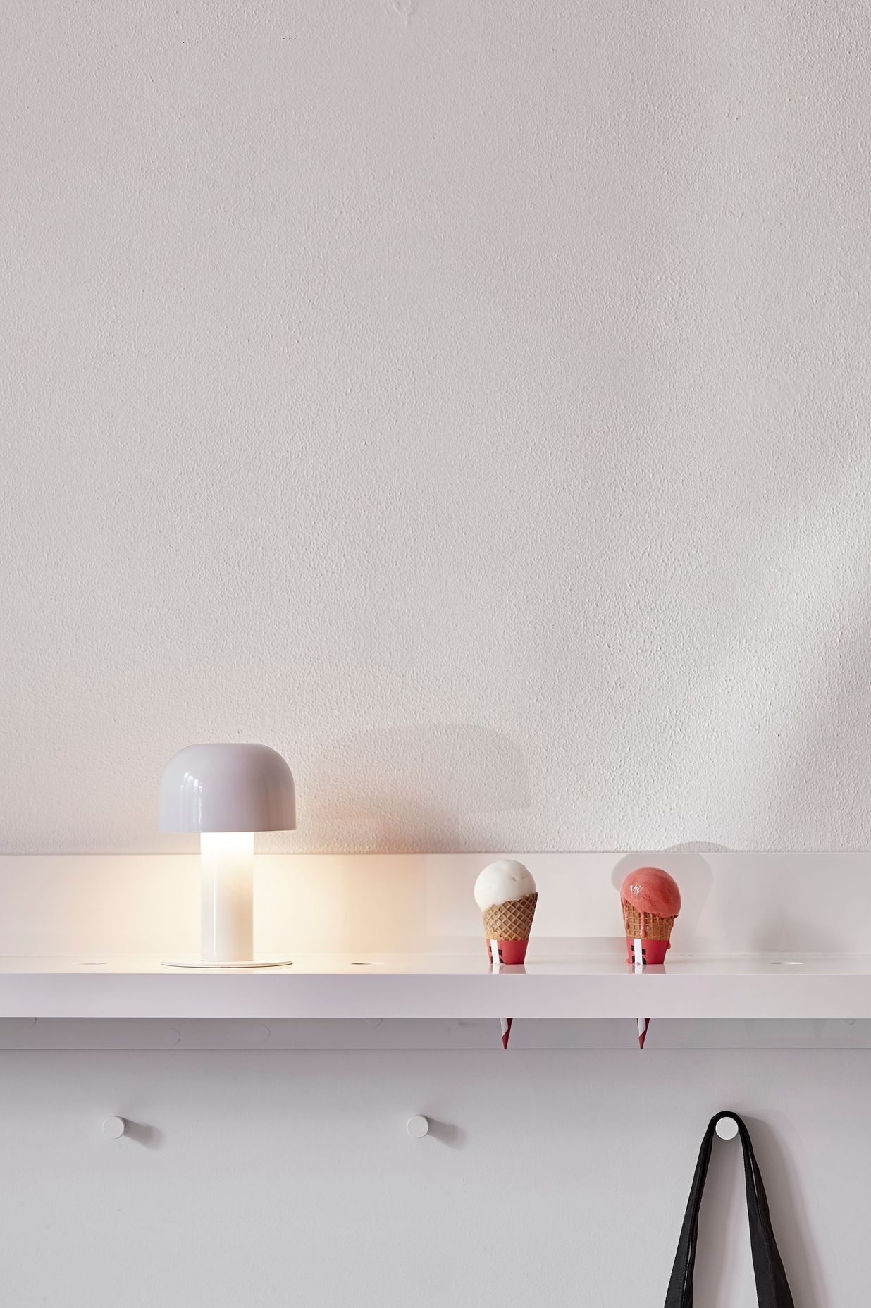
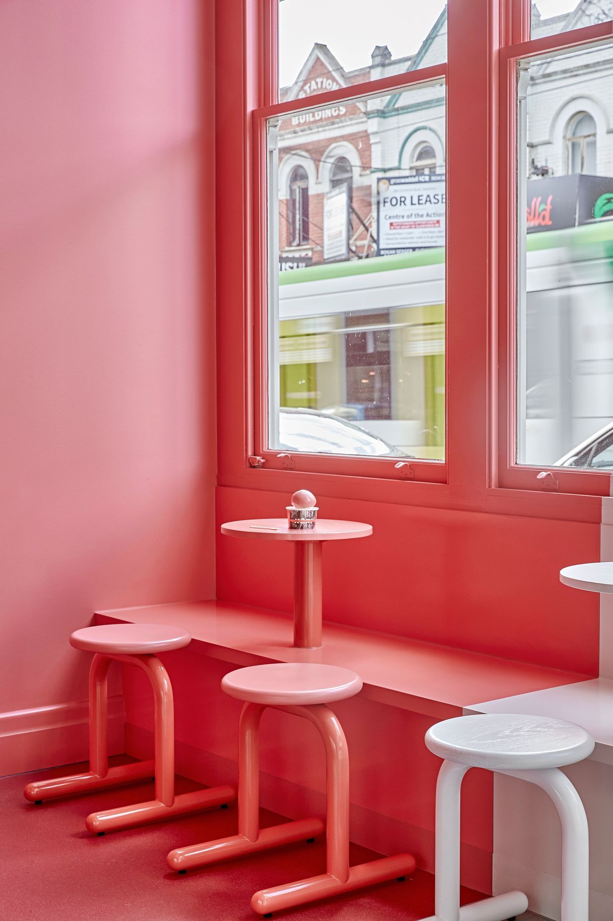
Kōri Ice Cream transports Japanese omotenashi to Melbourne’s vibrant Glenferrie Road. Although the hospitality is traditional, the interior decor is anything but. Housed within a heritage building, stepping into Kōri Ice Cream is akin to entering into a piece of art, with the eclectic approach an apt fit for an ice creamery that dishes out flavours such as miso, sweet potato, and sake.
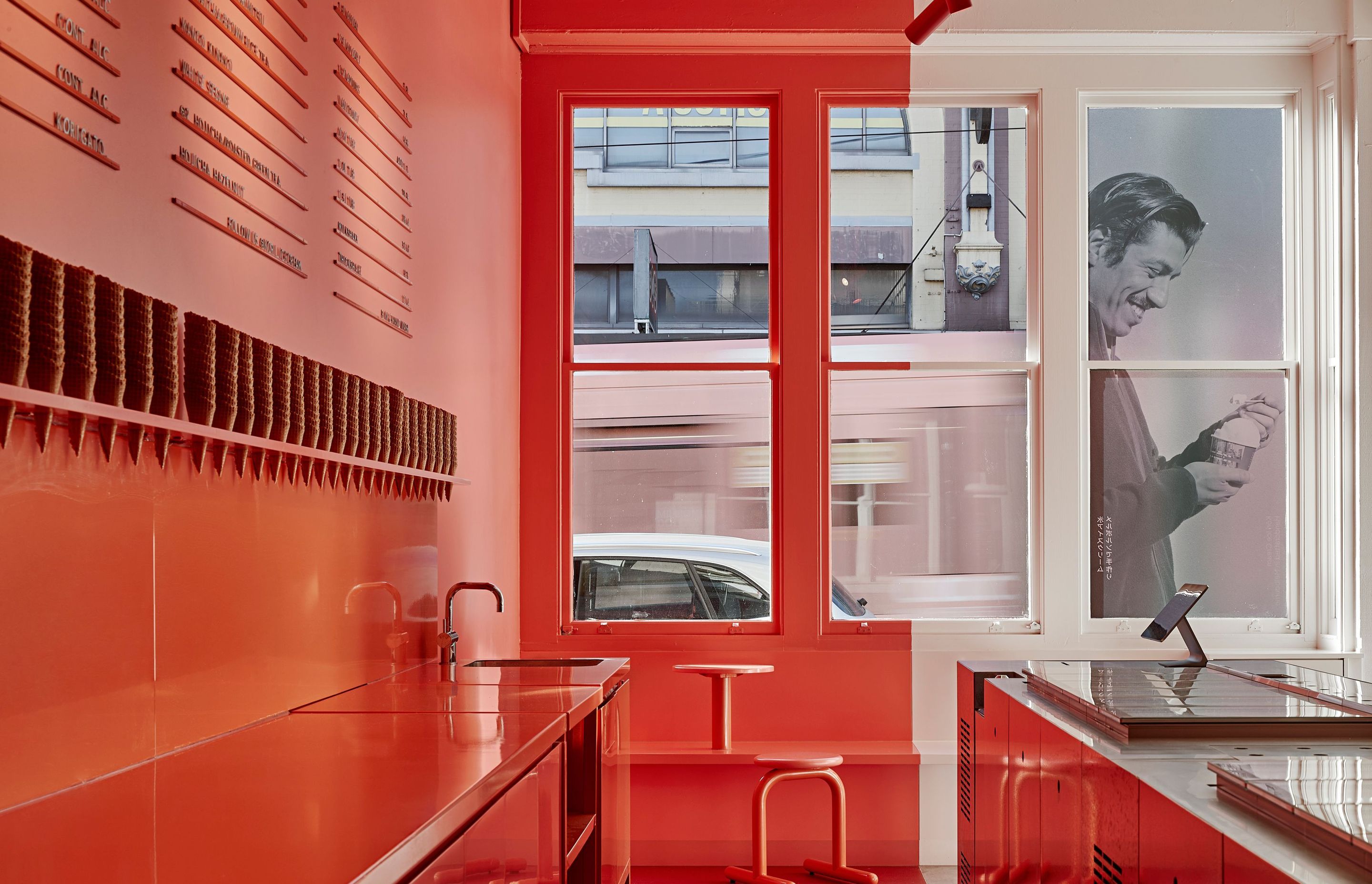
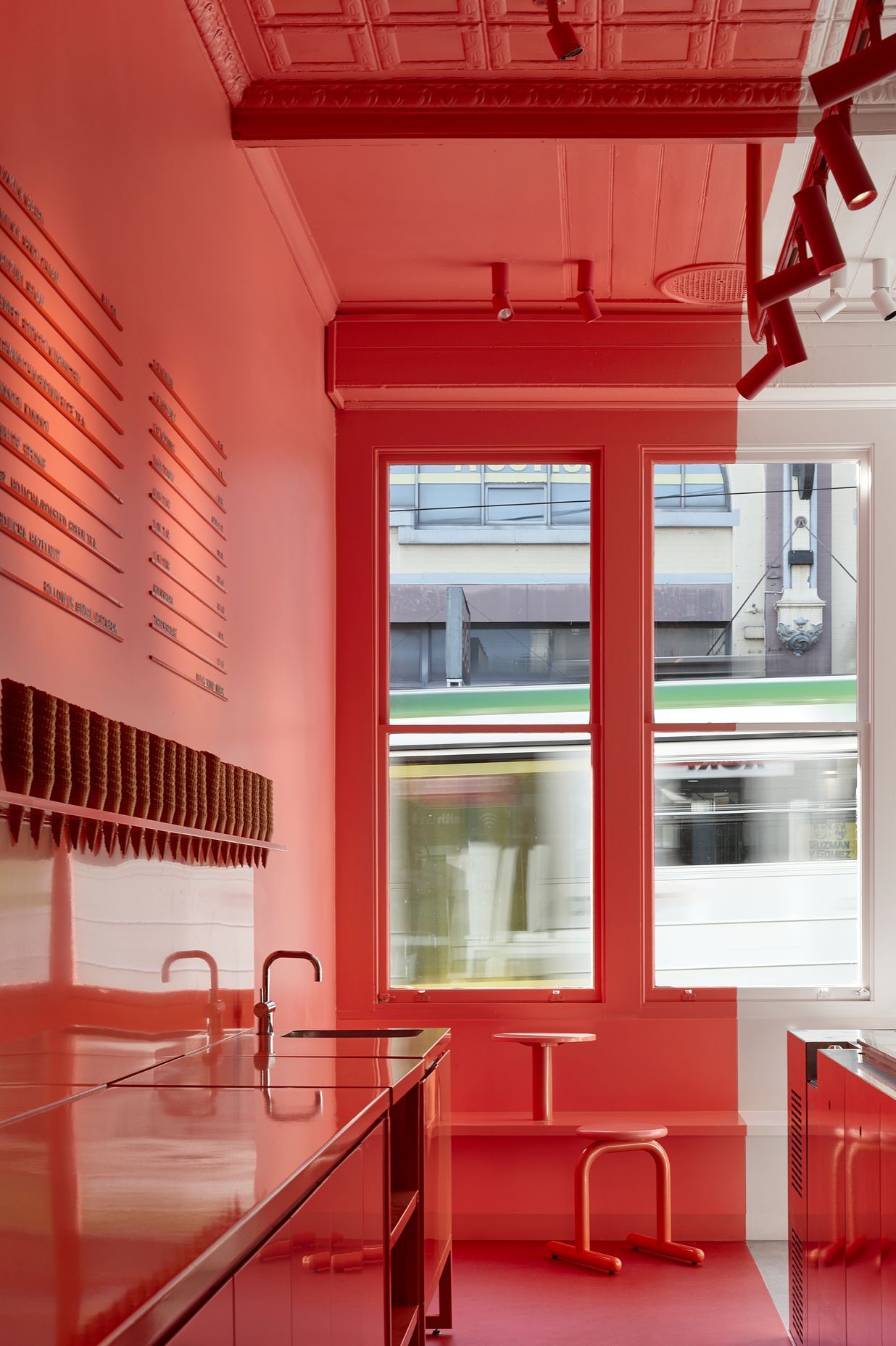
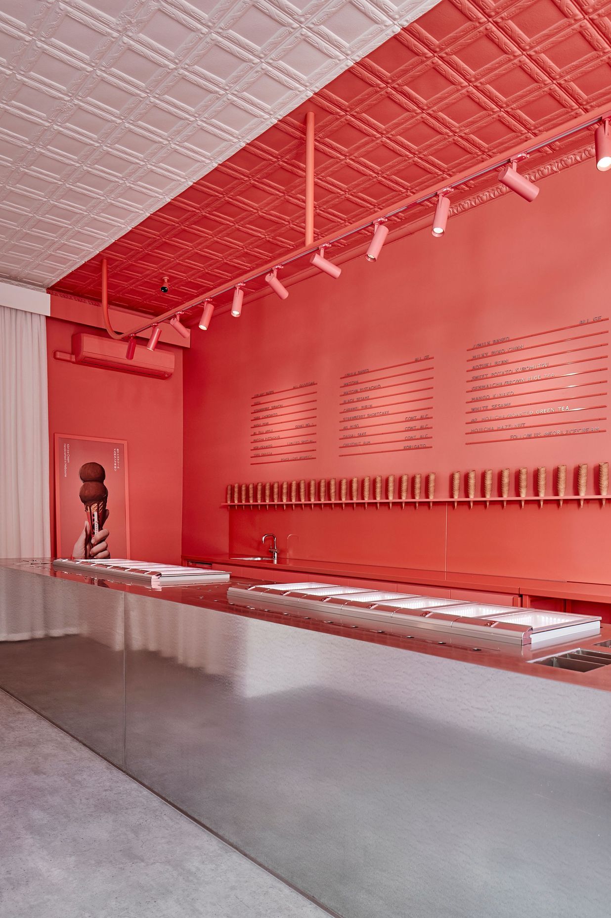
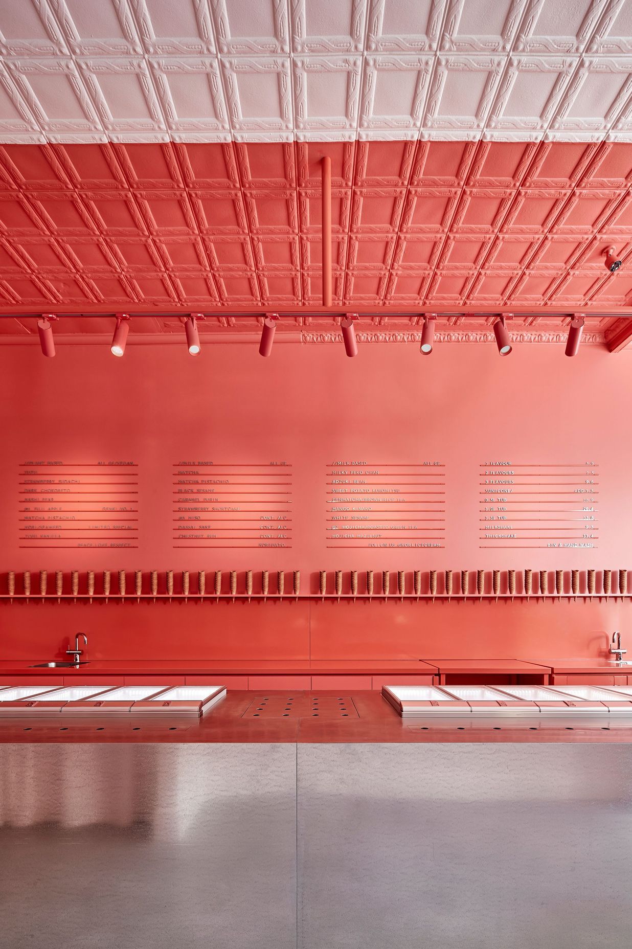
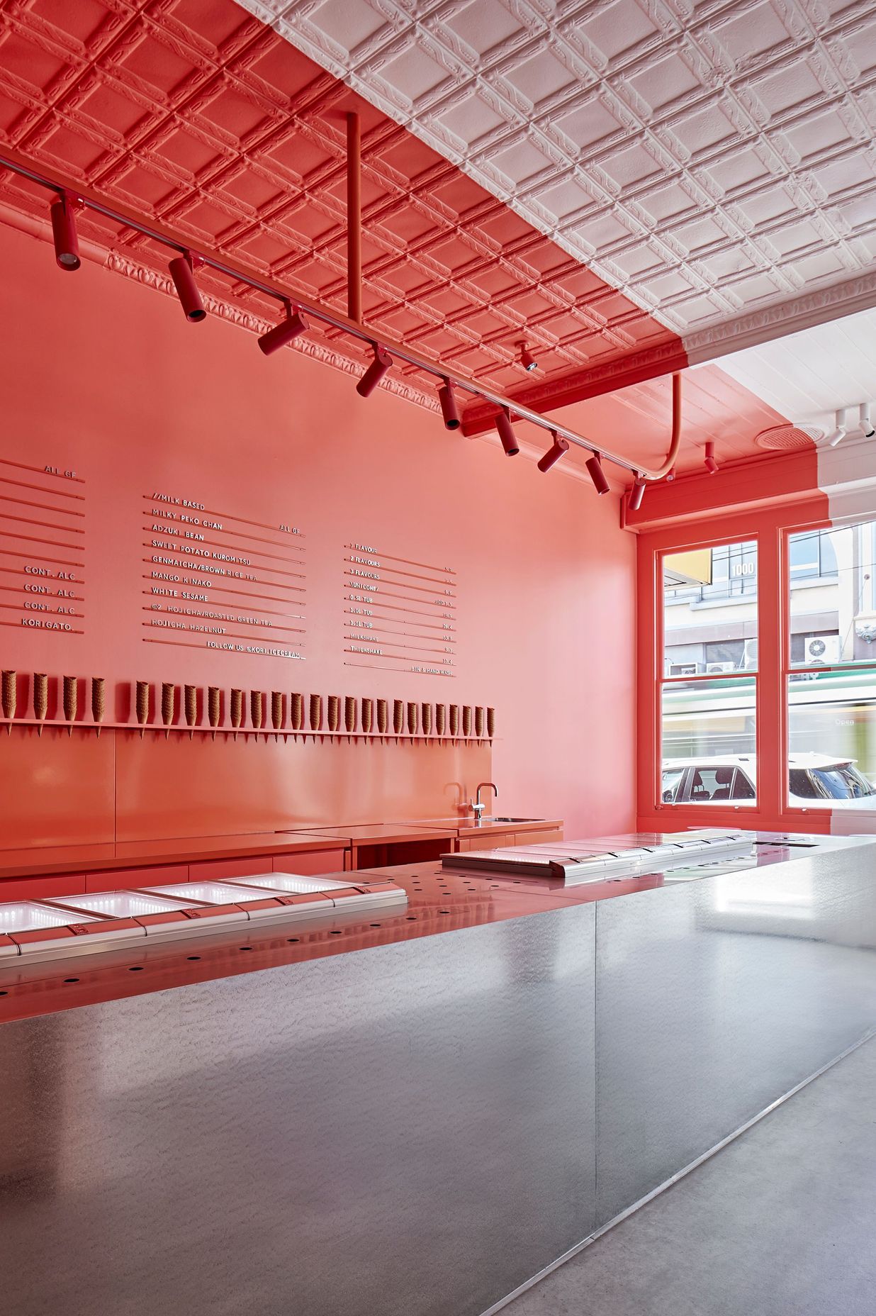
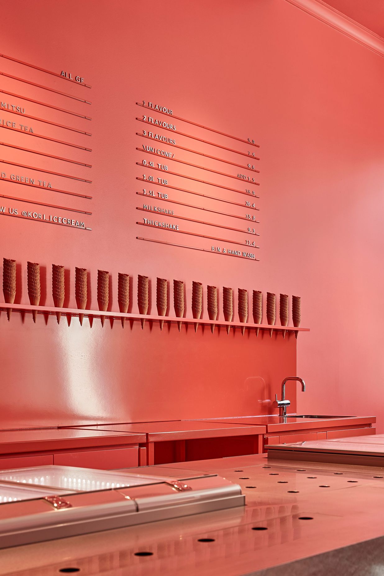
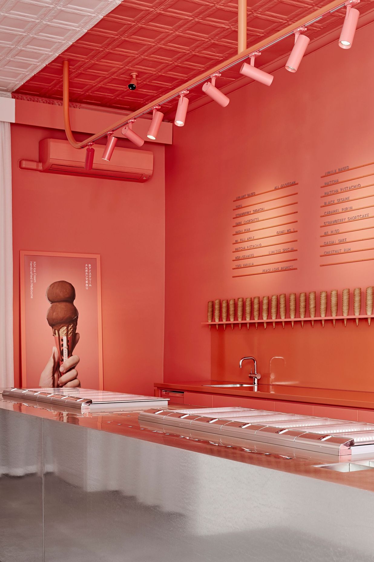
“We wanted something contemporary and playful, yet sensitive to the streetscape,” Janine Kariyawasam, project lead at Architects EAT, tells ArchiPro. Supported by Director Eid Goh, while working in tandem with the graphic design team at Principle Design, a striking colour palette of red and pink transports visitors off the street and into a temporary universe. Dramatic delineation takes place within, with the space cut in half by a red stripe, echoing the Kōri logo on the exterior. The colour palette will continue onto the facade, with the grey exterior set to feature the emblematic stripe.
Despite the typically stringent requirements of heritage buildings, there was a largely positive response from the council to the proposed facade alteration. “It is a really contemporary approach to treating the outside of a heritage building,” notes Isabella White, of Architects EAT. “We went through a process of explaining the idea behind it and how contemporary approaches can actually highlight heritage buildings.’” Janine echoes the notion that using contemporary design ideas to draw attention to the heritage allows the building to have a second life and be celebrated. “It really allows the building to be highlighted and lets it get the attention it deserves,” she says.
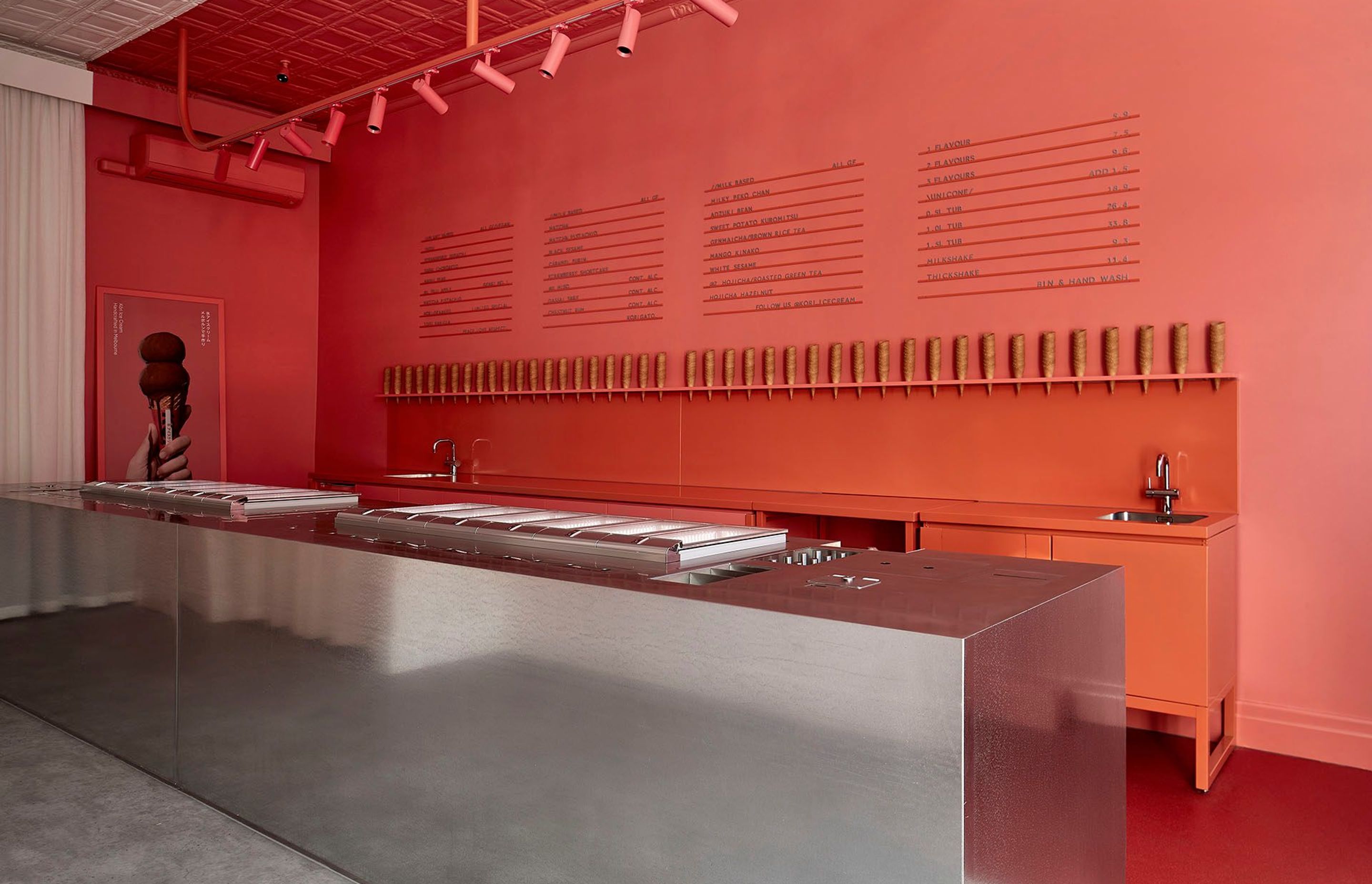
While interior design usually tends to follow branding in the order of operations, the development of Kōri Ice Cream saw both components work in collaboration from the onset. “It was an evolution in terms of interiors and branding,” Janine explains. Both Principle Design and Architects EAT fed off each other; the progression of the logo with the central red stripe is reflected in the long steel counter design.
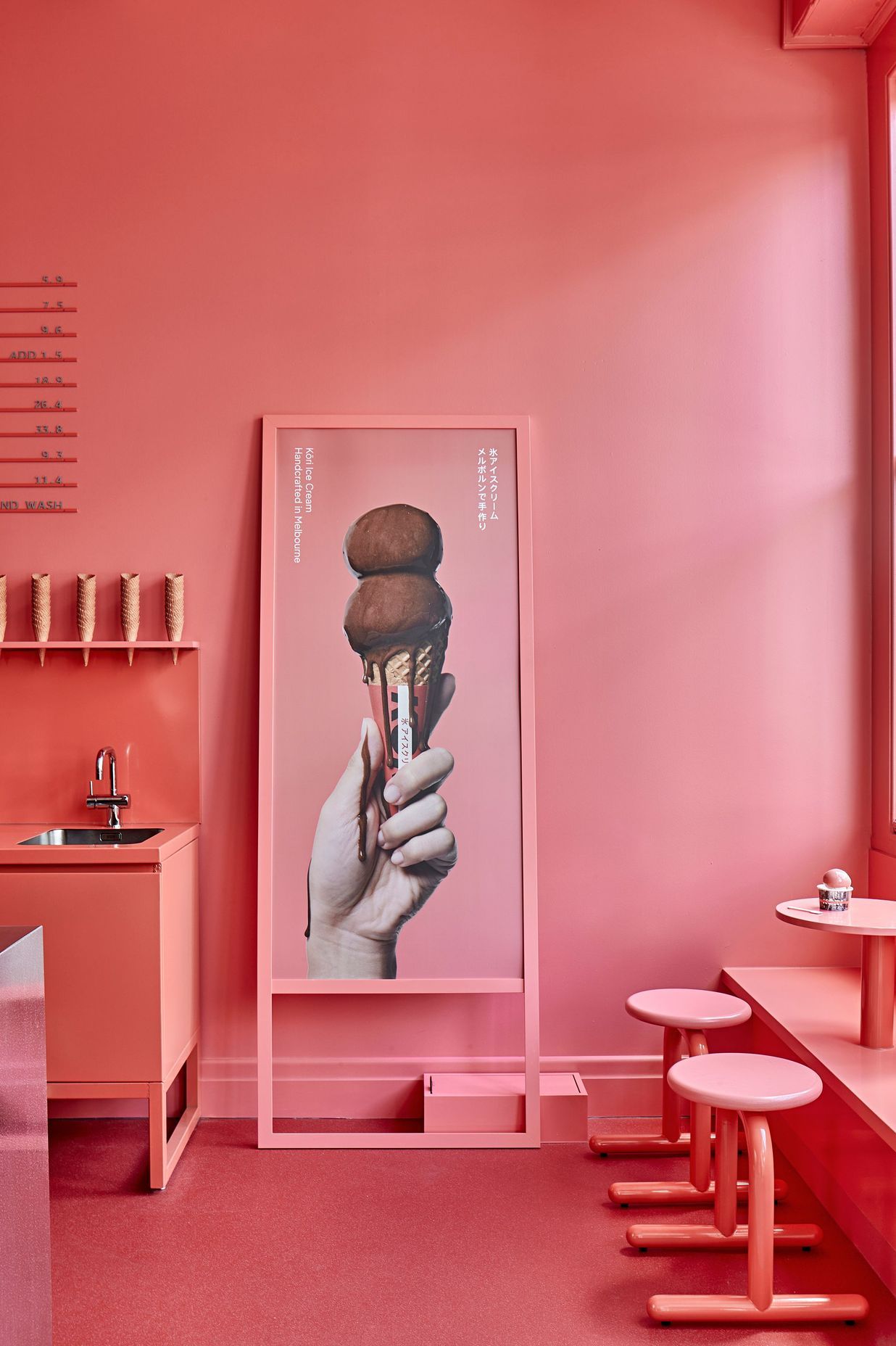
In turn, Architects EAT played a role in influencing the colour palette of the store. “We wanted to bring in a subsidiary colour to contrast the Kōri red proposed by Principle Design,” says Janine. “We thought that a pinkish tone would add that secondary colour that the brand really needed.” With both the co-founders of Kōri and the graphic design team welcoming the suggestion, the proposed secondary pink tone was subsequently incorporated into elements of the branding. “It’s actually quite unusual for each party to put their egos aside a little bit and get involved in the process.” The dialogue was a welcome one, with Kōri Ice Cream benefiting from the expertise of both parties.
The Japanese hyperpop movement and kawaii culture served as inspiration for the striking interiors, with street art and curbside poster art acting as reference points. “The bold outcome can be interpreted as an art installation, it feels temporary and maintains the building’s integrity,” says Janine.
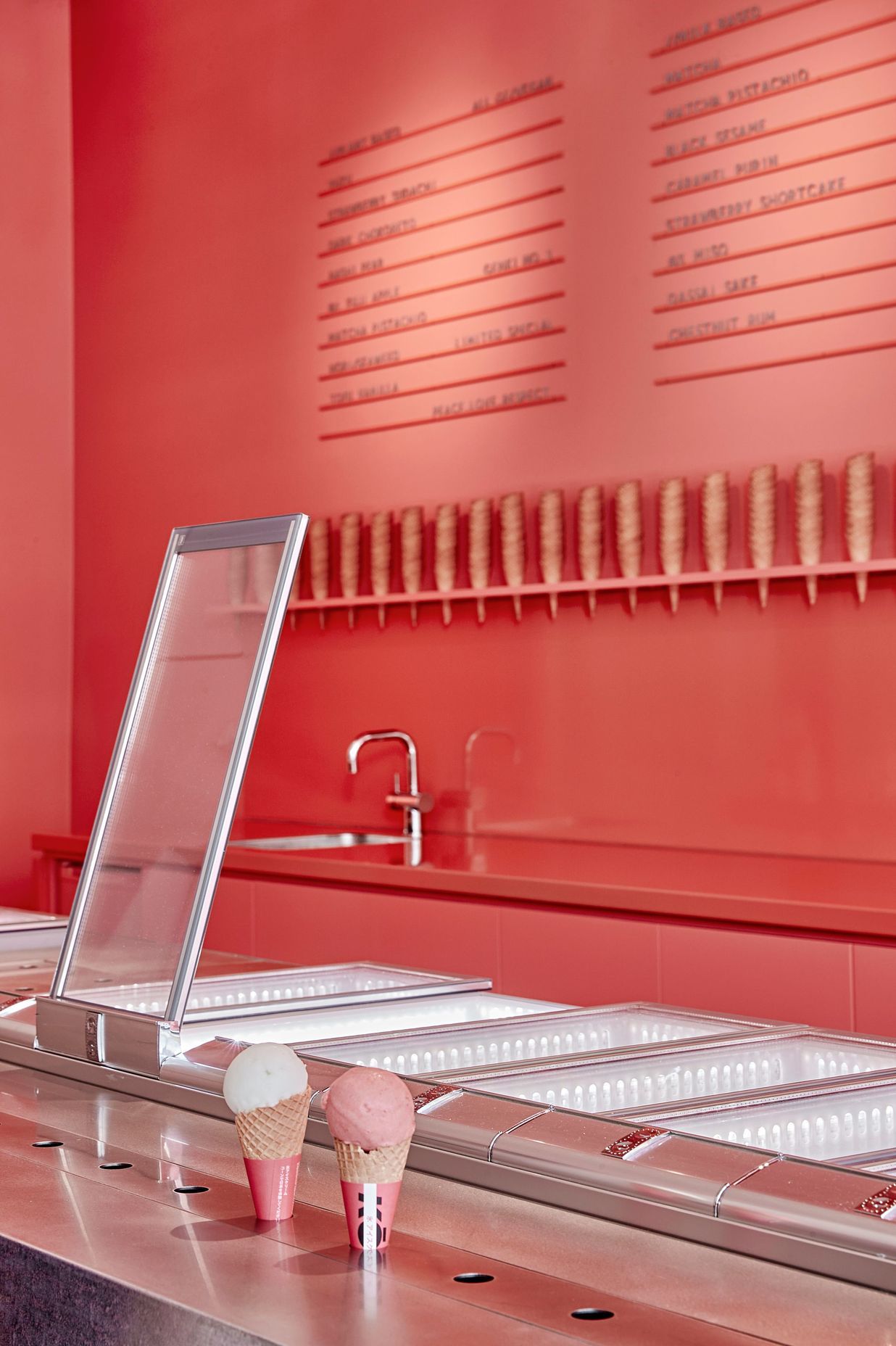
Despite the relatively narrow block and small surface area available, meticulous planning and a thorough understanding of the customer journey makes every element of Kōri Ice Cream feel like an immersive experience. A veritable cabinet of curiosities, the seemingly monolithic steel countertop that anchors Kōri Ice Cream plays host to operational necessities and provides much-needed storage space without making the space feel cluttered. Made out of galvanized and stainless steel, it was designed to look like a fridge tipped over.
The design is inherently connected to omotenashi, with the surface left deliberately unobscured by glass panes or barriers, with the intention of facilitating eye contact. “The person serving doesn’t have to turn around to get anything; everything is contained in the counter. From washing a scoop to handing over the ice cream cone, eye contact is maintained with the customer,” explains Janine. “That connection isn’t broken until the customer leaves the store.”
Designed to amplify the theatrics of human interaction while providing a unique, visually immersive experience, Kōri Ice Cream takes a contemporary approach to eastern traditions. The result is a space befitting of the eccentric flavour palette while adding to the spirited nature of the street on which it sits.
Words by Tanisha Angel
Professionals used in
Kōri Ice Cream
More projects from
Architects EAT
About the
Professional
The places we design play host to the scope of human existence in all of its beautiful, messy and extraordinary glory.
- ArchiPro Member since2022
- Associations
- Follow
- Locations
- More information

