O'sullivan Kitchen
By Fisher & Paykel Appliances

CONCEPT DESIGN:
“If it was a singular idea, it would have to be of privacy and nurture,” the architect says. The site is long and narrow and the design builds to the extremities of the site, blocking out the neighbours and drawing the focus inwards and towards the view. The house follows this linearity with bedrooms running the along the southern side edging a courtyard with a swimming pool and leaving the kitchen dining and living spaces to settle at the western cliff edge.
The owners of this home have two children in primary school, and it was important to them that this felt like a family home, a home they could make a mess in, relax in, play in. So while the spaces are large, the whole house, and the kitchen in particular, feels cosy and accessible.
This is partly because the large kitchen has been thought of as a series of zones which are used at different times of the day or for different situations. The dining end of the kitchen, with seating at the island and close to the fridge, is used as a breakfast bar. Later in the day when the kids are home from school, the opposite end is utilised more often, the pantry flung open, arranged so the kids can make themselves a snack before shuffling off to the snug sitting area that steps down from the kitchen.
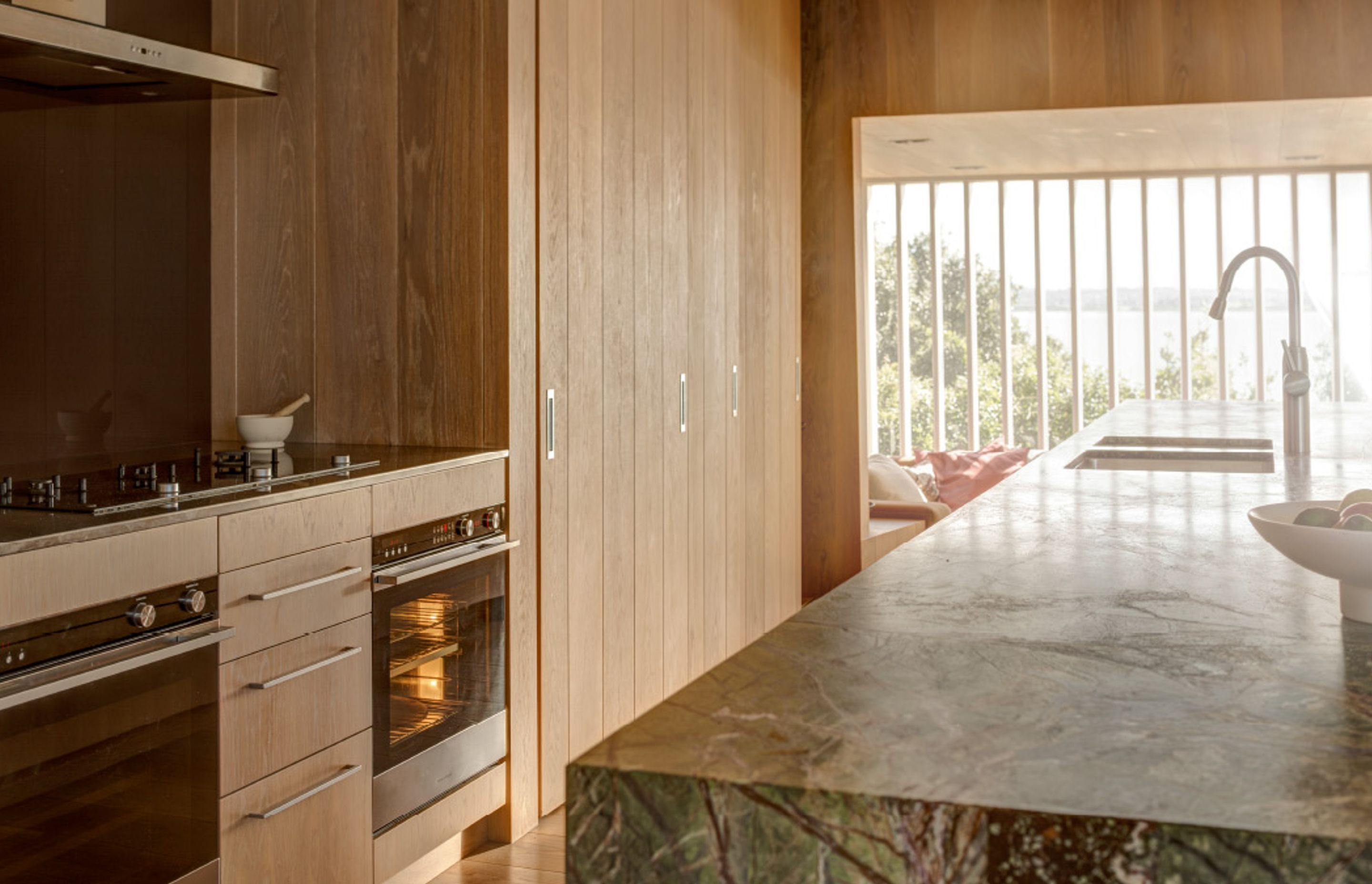
The centrepiece of this kitchen is the huge, green marble-clad island. The island is a large rectangle with the front face folded back to one corner to create the overhang at one end. The fold also saves this huge insertion from overwhelming the space; this small geometric twist elevates the benchtop to sculpture.
The deeply-veined green marble sets up an alluring material palette. The cabinetry and walls are wide American oak planks, inspired by Albert Frey’s mid century LA home, that feel rich and soft against the marble. Stainless steel, for durability, has been used for the benchtop where the CookSurface is placed, and behind this the clients’ requested dark aubergine back-painted glass to add an additional material. Michael O’Sullivan explains the moment when the pantry is open where the green on the island starts to connect with the greenery outside, “there’s a green slice of marble, a green slice of pohutukawa canopy. That pohutukawa is the magic thing.”
DEVELOPED DESIGN:
The layout was developed by thinking of the scenarios that the family would use the kitchen for, from rushed midweek breakfasts to huge cocktail parties. Rather than a working triangle which focuses on a single person completing a single task, the kitchen groups tasks together and provides flexibility to respond to different amounts of use.
A good example of this is how the family uses the single Tall DishDrawer™ for their day to day dishes – positioned to the side of the sink near the pantry for easy loading and unloading of glasses and lunchboxes – but for large parties or dinners, they have a dishwasher to take this additional load.
While the pantry can be closed and hidden, most of the time it is left open and becomes part of the kitchen. It was designed for being left ajar with horizontal windows designed in the pantry’s back wall. These have the important purpose of linking the house to the mature pohutukawa tree behind and its considered detailing connects this functional area with the same language as the rest of the kitchen, diminishing any difference between the areas.
The pantry’s skew from the rectilinear layout of the kitchen is also important. Practically it has the advantage of creating a pantry space with shelving close to the door at the cooking end and a deeper space at the far end which the family use as a small office. The fanning out of the plan in the pantry also replicates angles which run throughout this space from the fold in the island to the slanting dropped skylight that hangs over the living space.
DETAIL DESIGN:
The detailing of this kitchen has been deliberately straightforward. None of the appliances have been integrated into the cabinetry. The architect preferred to expose them honestly in the layout, which can also make the kitchen more useable and easy to navigate. Flexibility is seen in the appliance choices. The innovative CookSurface has retractable trivets which allows this area to be a smooth glass surface – doubling as bench space when not in use – when required for cooking, the trivets are electronically raised to sturdily hold a variety of pots, pans and woks on its tines.
Professionals used in
O'sullivan Kitchen
More projects from
Fisher & Paykel Appliances
About the
Professional
Fisher & Paykel has been designing products to change the way people live since 1934.
Our design philosophy is underpinned by a curiosity about people — how they live, what they do and how they use things.
This approach has helped us understand the dynamic nature of modern living, and to challenge conventional appliance design to consistently deliver products that are intuitive, timeless, and beautiful to use.
KITCHEN PERFECTION
At Fisher & Paykel, we design products according to three key principles — Ultimate Kitchen Solutions, the Beauty of Choice and Design Freedom — so you can create Kitchen Perfection.
ULTIMATE KITCHEN SOLUTIONS
To create the perfect meal, you need a suite of products working seamlessly together to create a beautiful kitchen experience. Cooking and cooling solutions that respect ingredients through the Mastery of Temperature. Exceptional dishwashing and ventilation solutions that deliver perfect results every time.
THE BEAUTY OF CHOICE
All homes are different, they demand different architectural and aesthetic responses. The Beauty of Choice is the ability to choose the perfect product style and integration option to create your perfect kitchen — for complete functionality without compromising design.
DESIGN FREEDOM
As the heart of the home, the kitchen serves as both a practical, multi-functional space and an architectural statement. Design Freedom is the ability to customise a kitchen layout with work zones that exactly suit how you want to live, cook and entertain, and personalise design details to achieve a highly considered, bespoke design.
- ArchiPro Member since2015
- Follow
- Locations
- More information


