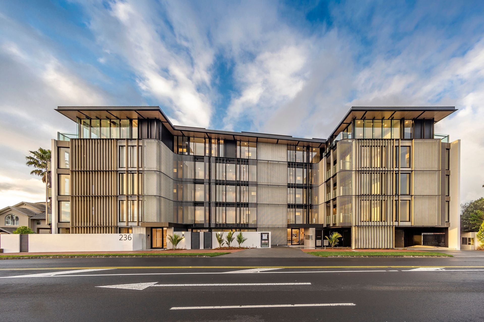
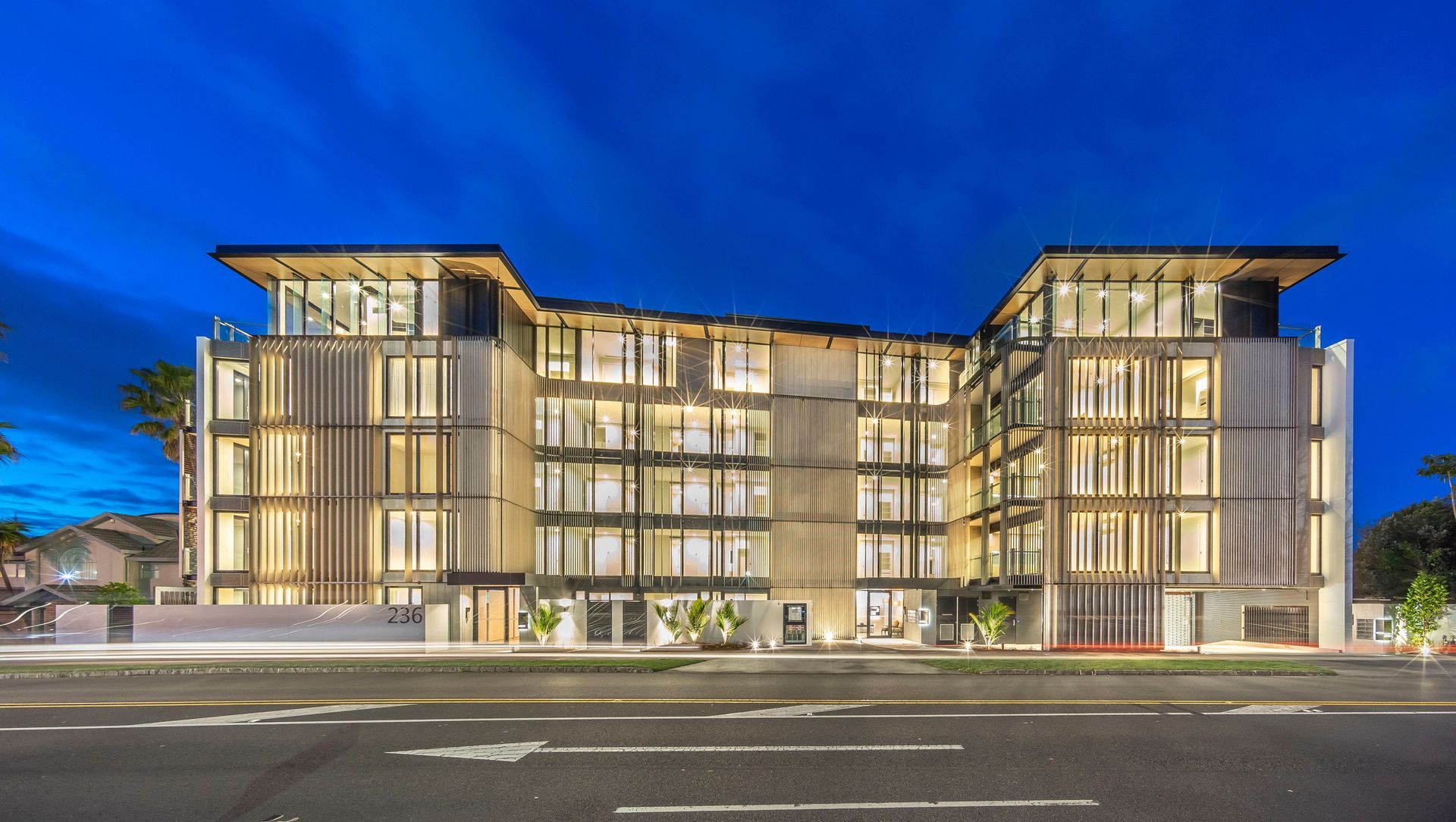
On a ridgeline in an area previously dominated by standalone dwellings on large sections, a five-storey building shimmers in the darkness—an intricate, glowing form lit from within. Yet, while dominant at night, this apartment complex is anything but during the day.
On Kepa Road in Auckland’s Mission Bay, the Outlook development comprises three buildings that house 43 apartments of differing sizes and that sit atop 75 underground car parks. The building marks an historic sea change in the area’s history as one of the first to be built under the changed zoning rules of the Auckland Unitary Plan.
“Mission Bay was identified as an area that could accommodate higher density developments to a maximum of five storeys—a dramatic departure from the suburb’s heritage of standalone homes—and as one of the first in the area, Outlook had to tread carefully to offer density in a manner that didn’t dominate the surrounding area and the six immediate neighbours,” architect Simon Elvidge of MAP Architects explains.
“With a height limit of 16 metres now allowed—within which we could create five floors with 2.6m ceiling heights—this project was always going to be dominant due simply to its sheer size in relation to the surrounding houses. In order to obtain a Resource Consent, we had to demonstrate that the building would sit comfortably within the existing context of the area.”
To achieve a sense of harmony between the existing residential vernacular and this pioneering high density development, the site was carefully considered with various options put on the table in the early stages of design. The final plan allowed for 75 underground car parks located in a staggered basement that lowers with the site as it drops away to the north from its highest point on the southern, Kepa Road boundary.
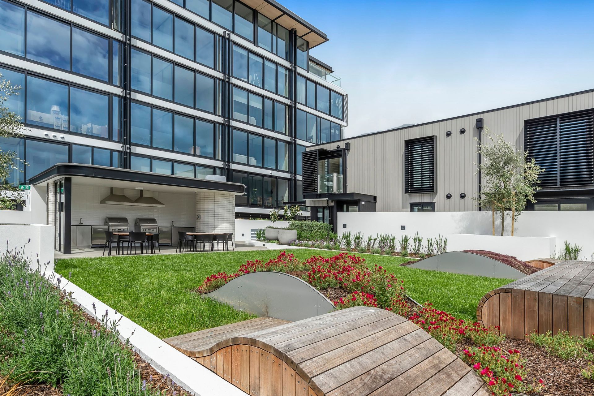
The southern boundary became the most logical site for the main five storey building, while two double-storey standalone buildings, each housing five apartments, are sited to the north leaving space for a large central communal landscape and garden area as well as private gardens for each of the apartments in the front two buildings.
“By reducing the height and scale of the development at this end of the site, we’ve been able to create a buffer between the buildings and the six immediate neighbours that abut the site. From the start, we managed the development to ensure it didn’t dominate their outdoor spaces or impinge on their privacy. This went a long way to diminish the perceived scale of the development from this side of the site.”
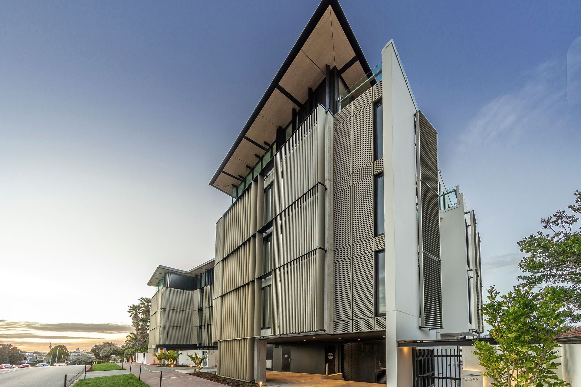
On the southern facade the same sense of reduction was a key part of the design and a requirement of obtaining consent. “To reduce its dominance on the Kepa Road boundary, our response was to break the building into two parts; a four-level base and a much lighter, more intricately detailed penthouse on the top level.”
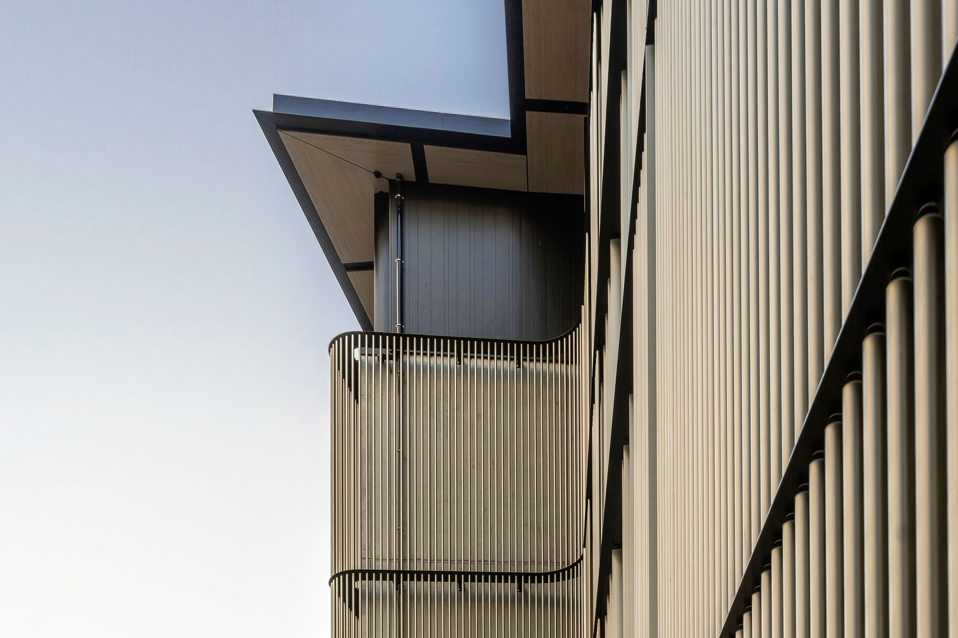
The lower four storeys incorporate extensive detailing in the form of bronze anodised aluminium screening configured to create a striking vertical pattern as well as to provide privacy from the street and light control. “We wanted to retain a high proportion of glazing on the southern elevation and by using the screens we were able to achieve that, but more than just being functional they are intended to provide a lighter, more fine-grain residential feel.”
The screens stop at the junction between the fourth and fifth storeys and give way to glass panels that pull the vertical pattern up to meet oversized timber eaves that extend out giving the building a silhouette and another visual cue to the residential vernacular.
In contrast, the northern facade is entirely glazed to maximise the experience of the northern sun and views out to Rangitoto and beyond. “High performance glass was used to maximise privacy and solar gain.” The lower two buildings offer a different facade entirely, both clad in vertical shiplap cedar.
To make the most of the available space, it was decided that traditional balconies wouldn’t be incorporated, rather “conservatories in the sky” as Simon refers to the Juliette balconies with glass balustrades that give way to sliding glass panels that can be opened completely to create a space of some intrigue. “Really, these are internal spaces, which is why we’ve referred to them as conservatories, but when they’re completely opened up they are akin to a covered balcony and allow for effective ventilation and a sense of being outdoors while in what can only be described as an internal space.”
The developer’s brief from the outset was to design an apartment complex that would appeal to empty nesters or those that were downsizing and wanted a home in the same area, without the maintenance of a larger section.
“This was an important part of the brief as the design had to maximise connection with the green spaces and outlook and provide easily accessible places to enjoy the gardens and entertain family and friends.
“A central communal barbecue pavilion was designed that sits within dynamic landscaping designed to appeal to young and old with gently rolling features that are safe but inviting for children to play amongst; there’s something about children playing on mounds, they love that king of the castle-type play.”
Boffa Miskell worked on creating a landscape design that would attend to various factors, including fostering a strong sense of community by providing a landscape that allows for residents to come together and creating an appropriate link between the development and the neighbouring properties.
"Because this is one of the first developments along this ridgeline the stepping down of the scale worked well to ground the development within the urban context and maximise opportunities for the spaces to connect with the wider landscape. These visual connections to the landscape spaces and beyond help to draw people into the communal garden spaces," Boffa Miskell's Michael Hawes explains.
"The 'waves' in the central, communal garden in the form of the timber structures, some planted, some not, offer an element of choice and fun; they allow for residents and visitors to sit, to recline, to slide or to climb depending on age or sense of adventure. This choice and ability to engage supports a refined but casual atmosphere in the space. Adjoining the central garden are the private outdoor areas of the garden apartments. Their relatively low walls offer the opportunity for meetings of chance; to speak over the fence in the manner in which neighbours living in standalone houses may.
"The planting chosen incorporates a mix of native and seasonal plants, citrus and olive trees and herbs. These were selected to provide opportunities for people to connect and engage with the landscape and gardens. Ultimately, the final design aims to engage the community of residents and to encourage them to spend time in the space, and in the process to develop a sense of community while enjoying the outdoors."
Internally, two material ranges were available to purchasers, both of which were driven by a connection to the idea of Mission Bay and Kohimarama being beachside communities. Whitewashed timber flooring and grey-washed natural timber veneer cabinetry in the kitchen are key features of both ranges.
“From an architectural point of view, we put a lot of work into increasing the efficient use of space because the apartments are reasonably compact in size. A lot of time was spent ensuring amenities were suitable especially in the kitchen, laundry, wardrobe and storage areas.”
For this unassuming site on a ridge where just three standalone houses were originally sited, the 43 dwellings that now stand in their place are a stride into a new era of high density living in suburban Auckland. At night they become one, a singular glowing object that stands tall yet projects a lightness of form.
“There is really strong interest in this type of living, and there are a lot of positives for people wanting to remain in the neighbourhood they currently live in, with easy access to their friends, family and wider community while enjoying maintenance-free apartment living.
“I anticipate that these ridgelines will become much more densely populated over the coming years as we carefully knit high density living into the suburbs.”
Words: Clare Chapman
