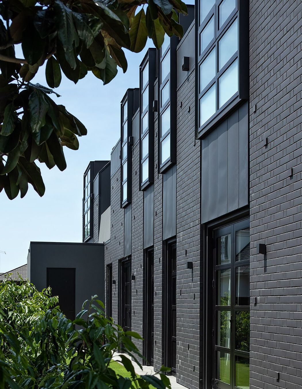
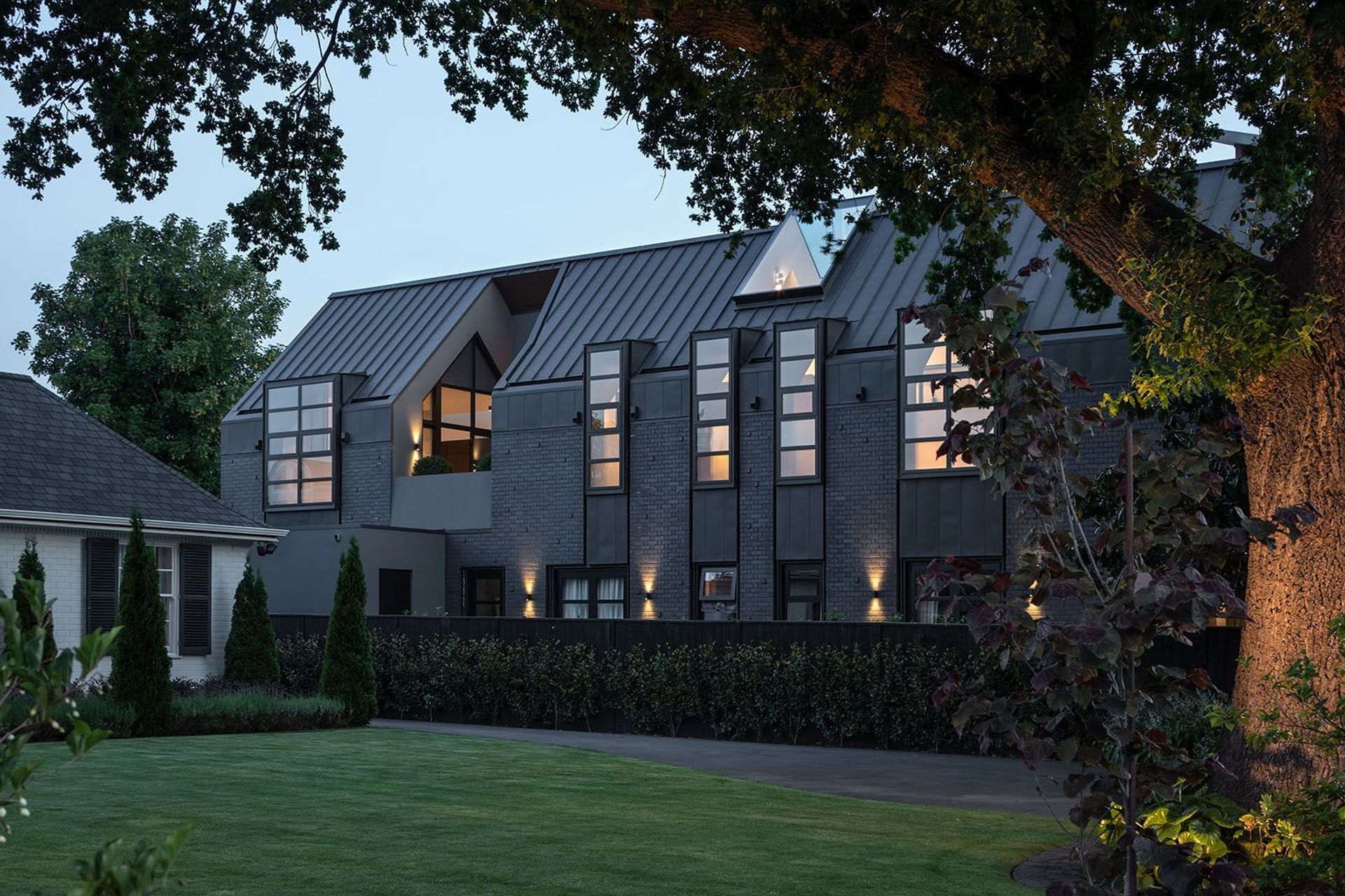
Under the cloak of darkness, this city fringe home adjacent to the Avon River is lofty and light, its interiors turning outwards, floating weightlessly atop a shrouded form. But when the sun ascends, its duality becomes clear and a weighty, dark facade carves out a form industrial in intention yet familiar in its classic single-gabled structure.
Located on Park Terrace within walking distance to central Christchurch’s heritage and arts precincts and immediately opposite the western edge of Hagley Park, this home sits at the intersection of a developing vernacular in an area newly zoned for intensification. The site is sandwiched between an original home and a four-storey, multi-unit residential complex.
Post earthquake, this area has seen significant transformation with many of the original buildings lost to irreparable damage. On this site, the original house was demolished, with the current owners purchasing a bare section zoned for three dwellings. The blank canvas of this vacant site presented architect Phil Redmond, of Phil Redmond Architecture + Urbanism (PRau), with an opportunity to consider, investigate and explore a vernacular lacking in context.
“From the beginning, this project was about investigating loss: the loss of an archetype; the loss of adaption amongst the tabula rasa of post-disaster Christchurch. How can a project designed upon a clean slate embody time and adaption?” Phil says.
“The brief called for a two-storey, three-bedroom home constructed as a gabled form. The concept of the gabled form is industrial in itself, so this project became about investigating the concept of adapting that heavy industrial form into a residential townhouse for fringe city living. The resulting building is a dichotomy, contradictory and schizophrenic in nature.”
Introverted, the house reveals little to the outside while subtly creating intrigue. Its materiality and hue are drawn from loss, adding weight and silence to the form, that by day presents little to the passer by.
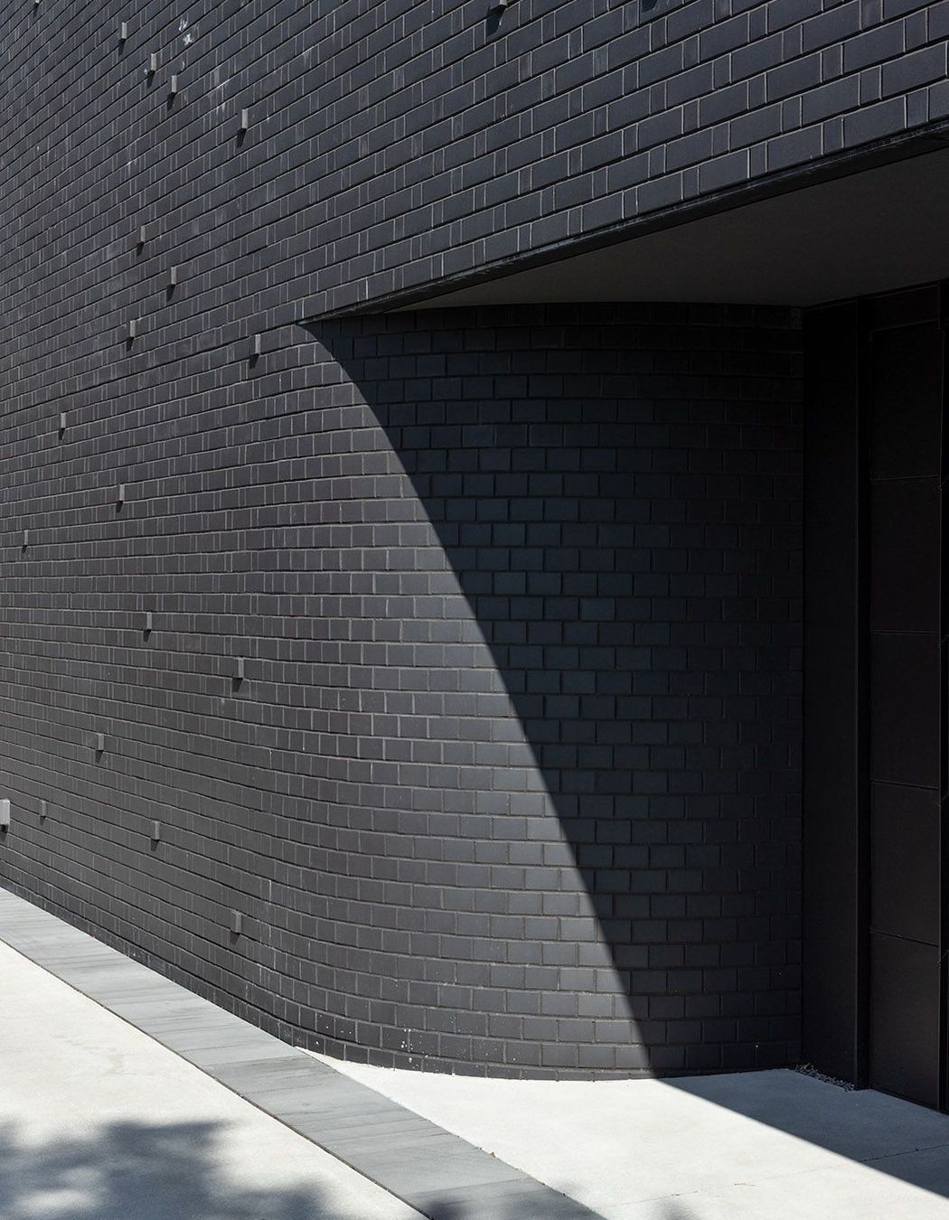
Arriving at the home’s entrance on the southern facade, the visitor is confronted with a burgeoning boundary; a vast, dark sheathe of materials, constant in their depth yet offering a textural tonality that plays with the intensity, creating an unexpected rhythm.
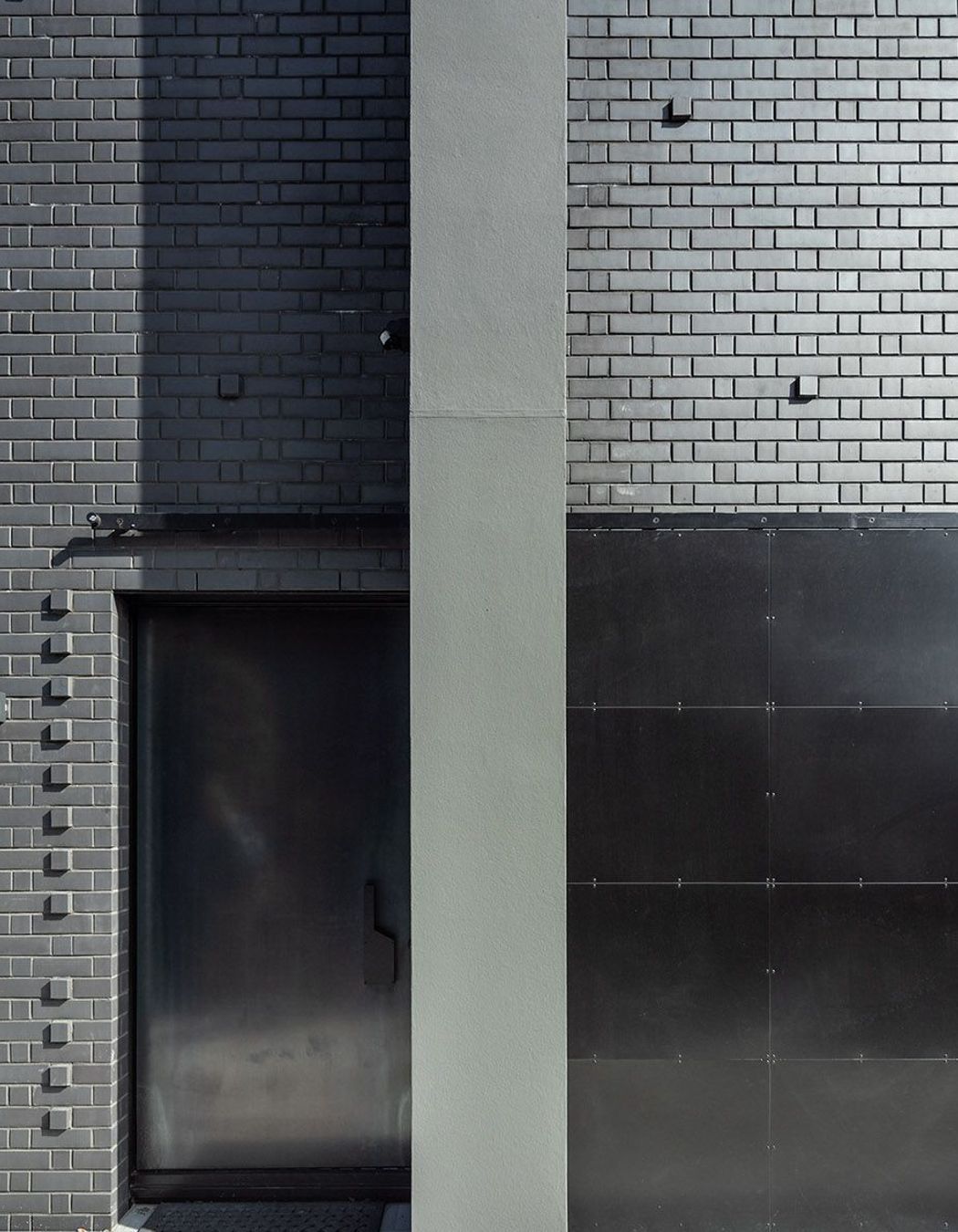
The black brick that makes up this windowless facade is laid in a Flemish bond pattern in which the stretcher of one brick is placed next to the header of the next in an alternating formation with random headers pulled out to articulate the sense of movement.
Here, the front door is located behind an industrial-style, hot-rolled steel barn door that slides effortlessly across the bricks to conceal the main entrance. When rolled open, it reveals another bespoke hot-rolled steel door, demure in its invitation to enter the interior. However, these doors play a key part in introducing the visitor to a distinct material palette and a sense of the unexpected: references to a sense of once was in a new building.
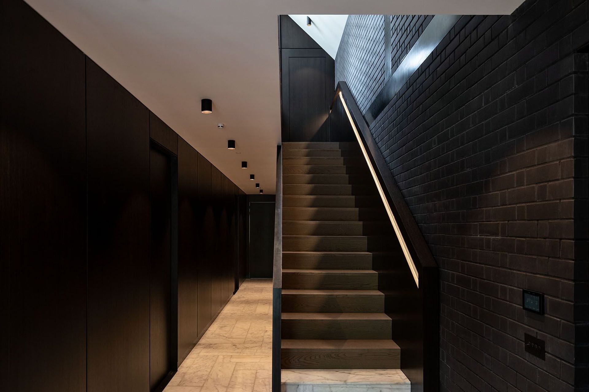
Stepping into the entrance foyer, the visitor is offered three choices; to move to the left and through into a sunroom that opens up to the front garden looking across the street to weeping willows that border Hagley Park, to ascend the stairs to the right leading to the upper level, or to continue past them into a corridor that acts as the spine of the home – a spacious area that gives little away aside from an offering of texture and juxtaposition of colour. Here, hot-rolled metal presides, running the length of the corridor adjacent to the stairs – within which a storage cupboard and powder room are concealed, their pivot doors intentionally difficult to distinguish from the rest of the panelling due to their lack of obvious hardware.
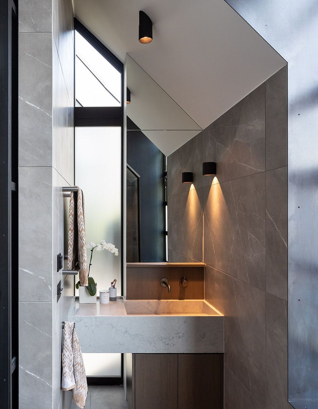
The second and third bedrooms, both with ensuites, are also housed on this level, again with their entries concealed to the unfamiliar, creating a continuity of passage – another moment created in the vein of the unexpected. “Part of the intention here was to introduce an element of the unknown,” Phil says.
At the end of the corridor is the laundry and, behind it, a garage is pushed out of the gabled form, to the northern side of the house, where there is room for a second property to be built on the site – a requirement of the zoning for this city fringe area where intensification is the aim. “This site was actually earmarked for three properties but we were able to apply for resource consent for two and that was approved, so this property was built to the front of the section, leaving room for a second dwelling to be developed at a later date at the rear.”
It is the front of the section that offers the real glory though; while on a relatively busy thoroughfare road, the other side is dominated by green, with willows hanging over the waters of the Avon and park beyond.
All aspects of this house are informed by the intention to maximise the expansive greenery that abounds here, despite its city fringe location. In the front garden, a simple paved patio looks directly across to the willows. Here, again, a sense of history and intrigue are poetically emphasised, with the black brick still the dominant feature, yet broken up with gridded joinery on both levels. On this western facade, the random pull out bricks offer an extended feature – enhancing the movement and shadow from the dappled light thrown on this wall as sunlight moves through the boughs of a large tree on the neighbouring property. But it is the unexpected details that preside in the form of a seemingly random nook carved out of the form. “Perhaps it was once an old entrance door, perhaps not. It is a space that references the possibility of what could have been in a residential townhouse,” Phil says. Immediately above this nook, designed only to create intrigue and to question, is a small deck, an open-air space just large enough for a person to stand, with an access door off the main open-plan upstairs area.
Ascending the stairs, the visitor’s imagination is once again appealed to. Here, the black brick of the exterior facade is wrapped around into the interior, climbing up the southern interior wall to become a predominant feature on both the interior and exterior facets of this building.
Here, though, the brick is juxtaposed with other textures – a sculptured, boxed timber handrail whose detailing is illuminated by recessed LED strip lights. “Above, hot-rolled steel panels run across the brick wall, intonating what could have been – perhaps they cover what might have been original beams,” Phil says. “The design language here is about creating different moments – how do you create a sense of history in a new building so the home has these moments cut out of and sculptured into it.”
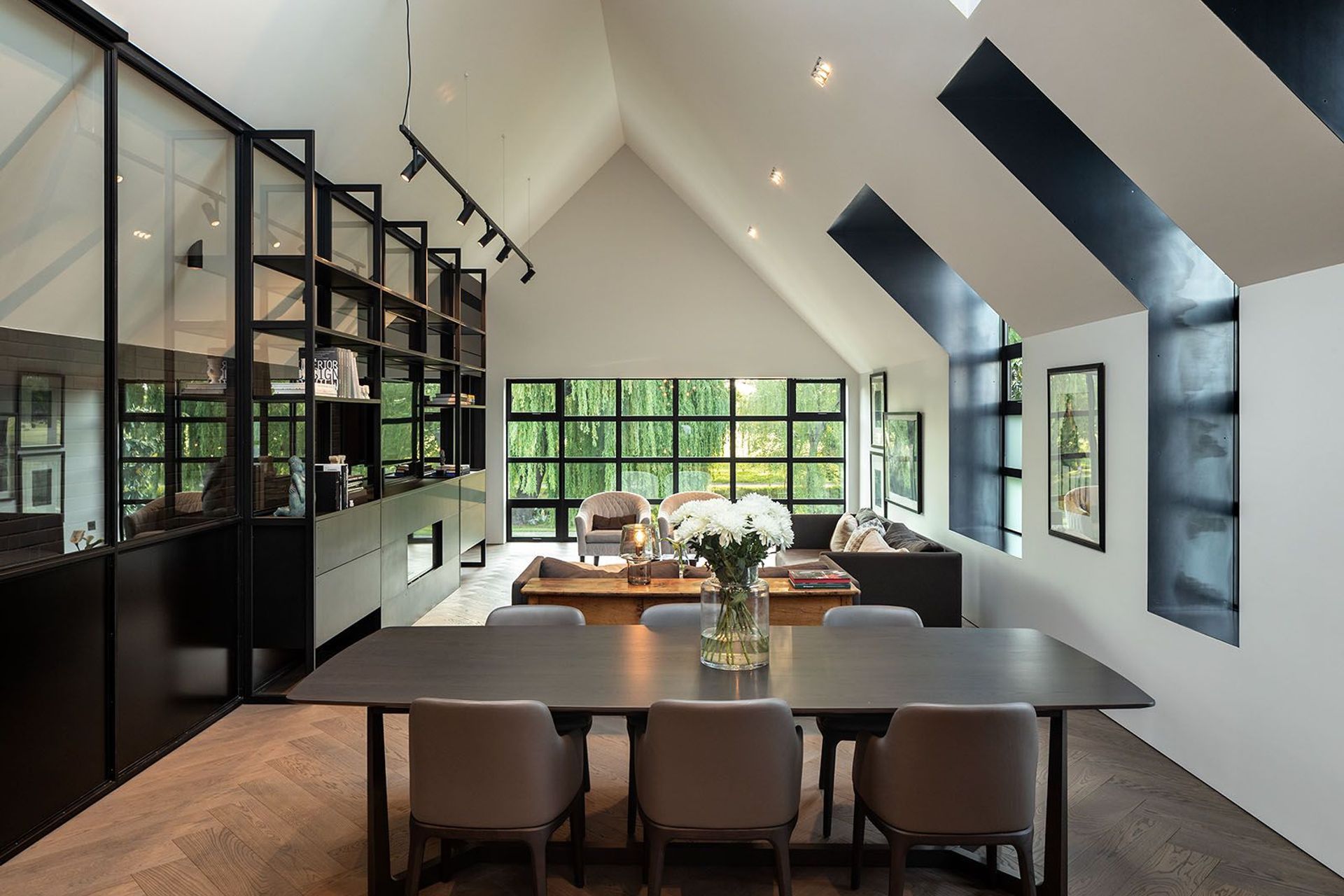
Reaching the top of the stairs, the language changes. Here, the palette offers a boldness where white prevails, juxtaposed with the rich black of the brick, steel and dark features throughout the room.
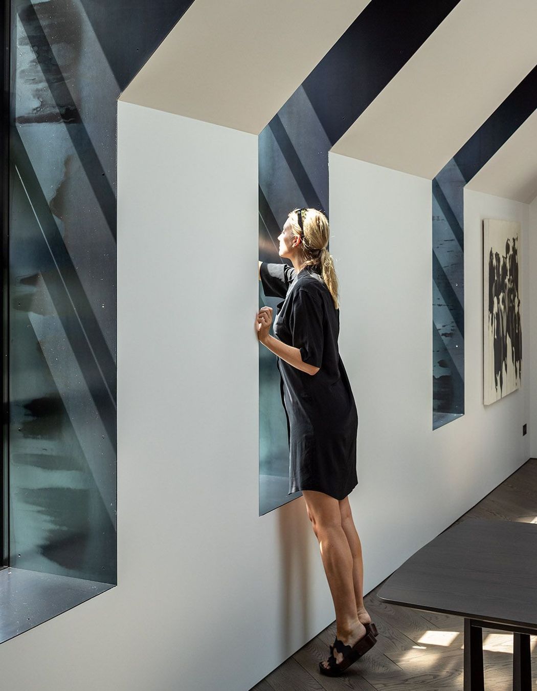
The upper level was designed to work as an apartment, with no real need to leave this area, Phil explains. “Designed for a mother with grown children who predominantly live away from home, the upper level incorporates all the main living areas, including the master bedroom, separate toilet and an ensuite.” Llight and landscape abound in this space, with a large skylight window wrapping around the skillion roof greeting you on arrival at the crest of the stairs. “The northern facade is punctuated by a series of steel-lined dormer windows framing glimpses of borrowed landscapes from the neighbouring properties,” Phil explains.
“At the western gable end of the living space, a large gridded window frames a tight view of the willow trees in Hagley Park and of the Avon below. This window was carefully considered in dimension to ensure only those aspects of the view we wanted to capture were, with the infrastructure of the road and traffic removed from sight.”
At the rear of the open-plan area, the kitchen is formed by way of two islands – one incorporating the sink and the other the cooktop – the only visible elements of the kitchen, with the rest concealed behind bespoke oak cabinetry.
The other, southern, wall of the upper level consists of a glazed wall separating the living area from the stairwell, while offering a connection with the visible black brick of the wall behind it. In front of the glazed internal wall, a bespoke steel shelving unit houses an Escea fire and the media centre.
To the rear of the kitchen, a courtyard is carved out of the gabled form, separating the open-plan area from the intimate areas of the upper level, the master bedroom and ensuite.
Both upstairs and down, the flooring is laid in a herringbone pattern, with the downstairs flooring a Carrara marble, and the upstairs European oak – materials linked by the formation in which they are laid.
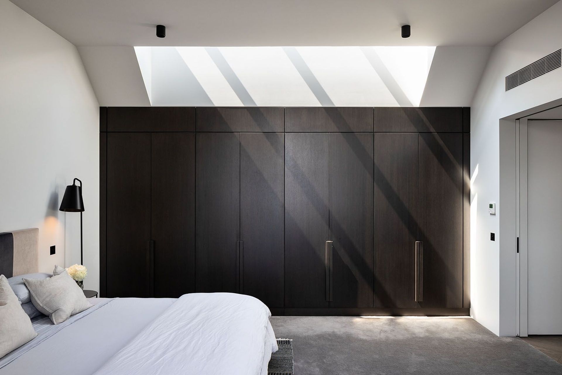
The master bedroom is the only room to incorporate a skylight on the southern facade, which draws in a softer light and accentuates a sense of calm in this intimate area. Here, a bespoke oak wardrobe system extends one length of the room, while the ensuite is tucked away on the other. From both rooms, the willow trees of Hagley Park are visible across sitelines that stretch the length of the home, while retaining a sense of privacy in relation to the rest of the upper level.
When darkness falls, it is the voluminous intricacies and intrigue of the upper level that turn outward; illuminated they become the focus, shredding the weight of the shell that encloses them and offering an insight into the exploration of what once was, what could have been and what is, in a new Christchurch whose design language continues to deepen.
Words by Clare Chapman.
Photography by Simon...


