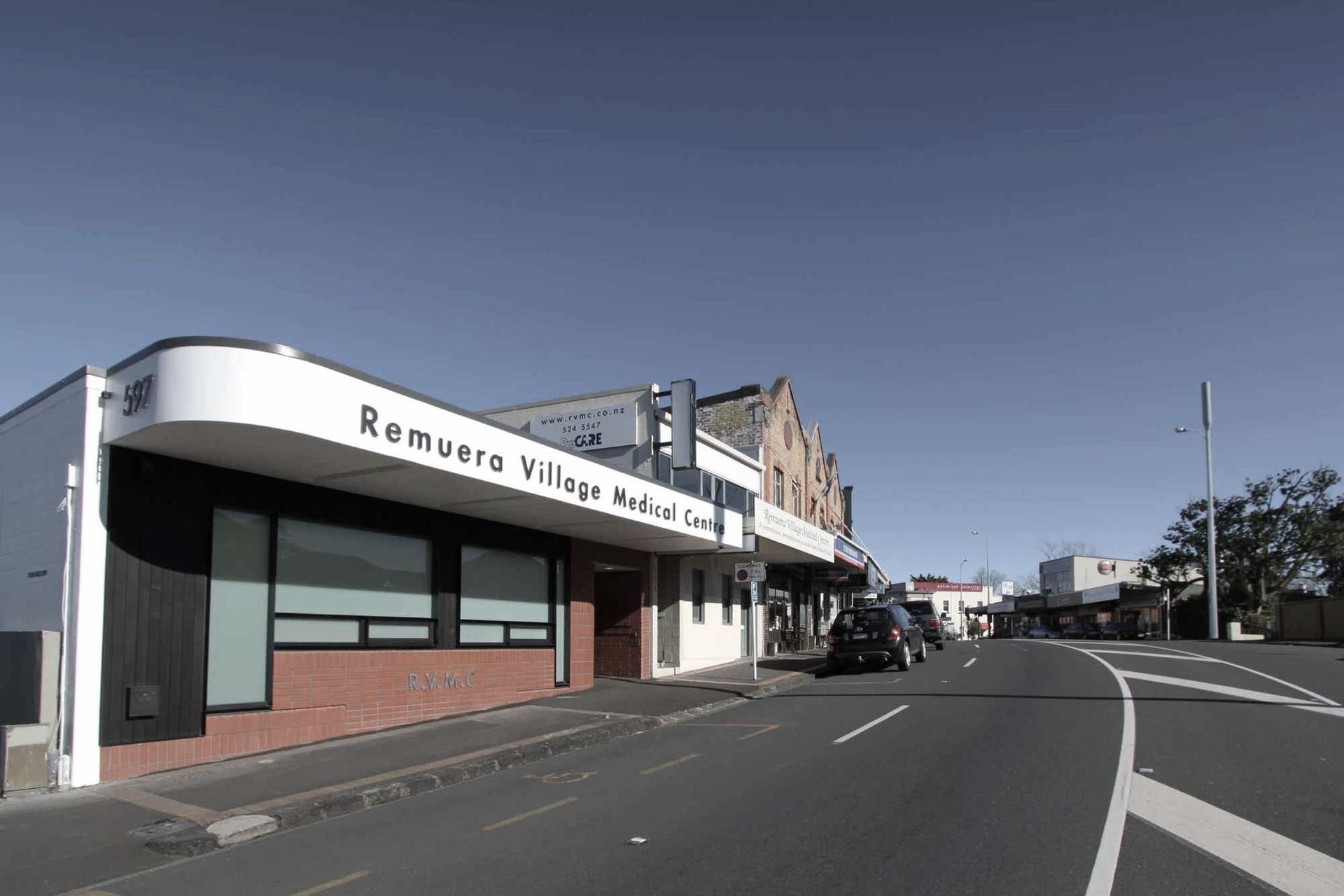
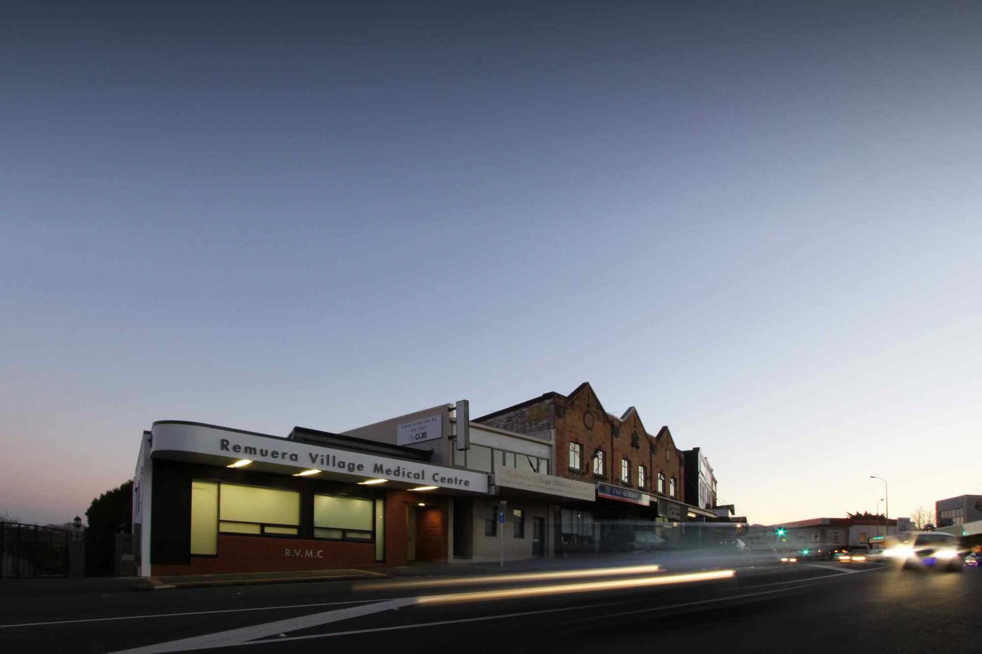
A substantial alteration to a Gummer Ford Bank building, R.V.M.C. demonstrates a contemporary interpretation of local construction methods.
R.V.M.C. is a substantial alteration to an existing Community Medical Centre. The Centre provides primary care to the local neighbourhood. As part of the alteration brief it wished to expand its services to include minor surgery, additional nursing services, travel health facilities and more doctors. Given that the facility is strategically located along a road over endowed with medical facilities, the successful re-use of existing space has become critical to future proofing the value of the centre to the local community. Together with the clients (Both the Medical Centre and the Landlord shared responsibility for developing the property), we developed the brief from the initial request for “better flow” to a more holistic model that facilitated the inclusion of natural light and air into what were previously and are normally sterile and windowless spaces.
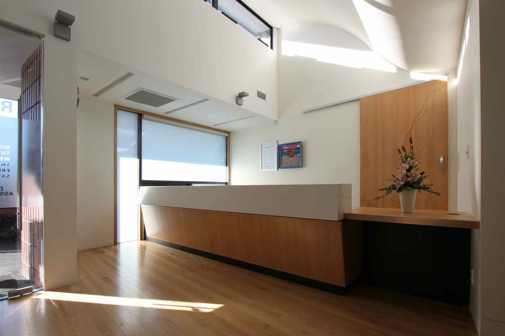
The three basic tenants of the brief became: 1: an increase in reception and waiting space to cope with increased demand on the facility, thereby increasing “flow.” 2: The landlord specifically required that the exterior look of the building be simultaneously contemporary and suitable to the local village. 3: the addition of one consulting room, two extra nurses spaces and a minor theatre room. Our reaction to this brief had to take into account the following site parameters: 1: We could only add an additional 20 M2 of floor space to the site before going over our coverage limits. 2: The existing structure is subject to strict single story height limits. 3: The medical centre is spread over two tenancies, each owned by separate landlords, only one of which was happy to accept changes to base build. These tenancies had to be fire separated. Our strategy for providing the above was to provide a new public entrance as close to the ‘middle’ of both tenancies as possible, and (against standard practice for medical facilities) redistribute the rooms requiring greater privacy to the perimeter: An existing and redundant loading bay was filled in to become a light filled reception area and the main waiting area now forms a central “public” spine to the centre. In terms of program, the central reception and waiting space meant that two new doctor’s rooms and the nurses rooms were pushed to the perimeter of the existing building. With privacy controlled by blinds, window location and/or translucent glazing, all the rooms occupied by staff during the day for long periods of time now have access to natural light, air and views. Minor surgery, a nursing ‘Dirty Room’ and a small waiting area for parents with (noisy) children were redistributed along the adjacent property, now accessed by an additional fire door and stairs.
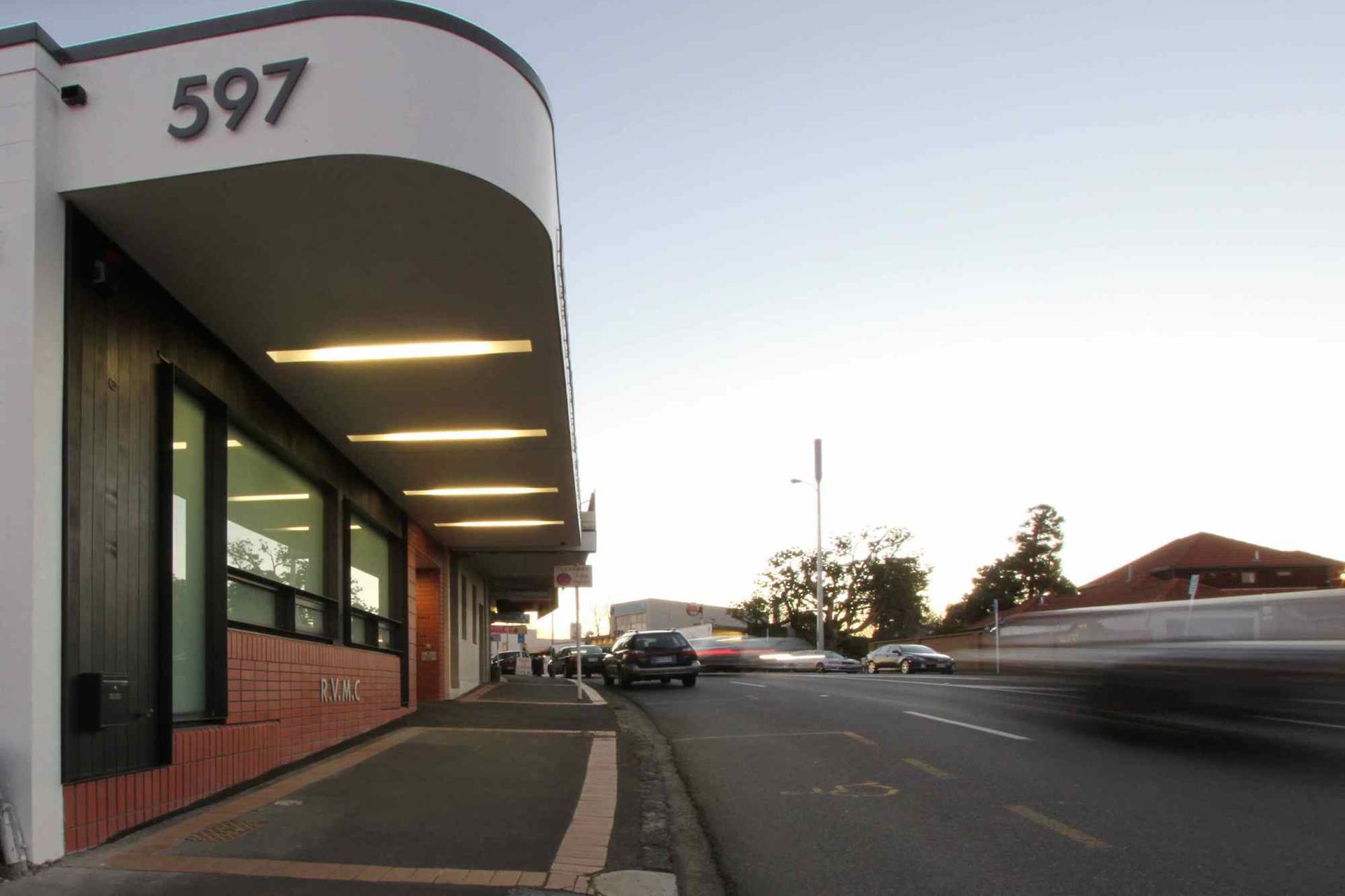
A new facade was composed under a heavy new verandah canopy from which was scalloped light fittings and a ‘lantern’ space over reception. This lantern has been specifically designed to allow sunlight in during the winter months, shade the building in summer and to ‘curve’ northern light into the depths of the building. Existing skylights in the waiting area and the access stairs to downstairs service areas, were articulated to provide variation and interest to an otherwise long, narrow space. The facade is composed of stack bonded brick, articulated to define signage and entrance requirements. Its formal properties are drawn from buildings adjacent and further along Remuera Road. Glazing has to be translucent for privacy and sun protection, but it has been arranged in such a way as to provide depth and interest to the composition. By modifying the depth and thickness of the glazing system from the ordinary, as well as the use of a timber strip along the top and side, the solidity of the Medical Centre is underlined. Feedback received from the client and the public indicates the project has not only been a highly successful for the practice itself, but is also successful in the broader context of the neighbourhood. By making simple changes to an existing structure, and utilising natural light and ventilation, RVMC has effectively gained a new lease on life and provided the local village with a strong, high quality public building.
Feedback received from the client and the public indicates the project has not only been a highly successful for the practice itself, but is also successful in the broader context of the neighbourhood. By making simple changes to an existing structure, and utilising natural light and ventilation, RVMC has effectively gained a new lease on life and provided the local village with a strong, high quality public building.
