Located in a rural Waikato community, Shibui House is a four-bedroomed family home with one of New Zealand’s most beautiful garages – a sculptural faceted form covered with cedar shingles.
For Tane Cox of Red Architecture, stripping away the complexity of the design was key to creating the simple but stunning architecture of this home. Sited on a 5,000m² lifestyle block in Tamahere, between Hamilton and Cambridge. Shibui House has one of the most distinctive garages in New Zealand – a sculptural, asymmetrical gabled form covered with cedar shingles.
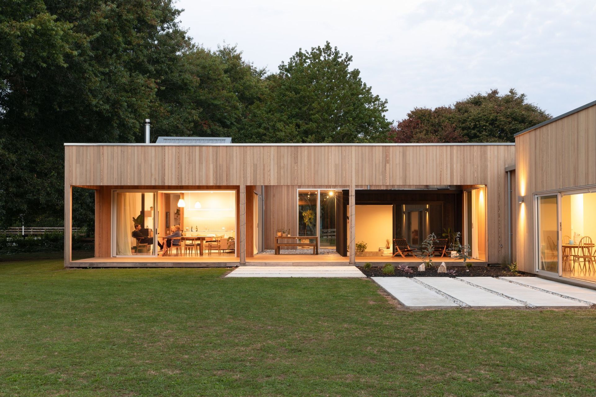
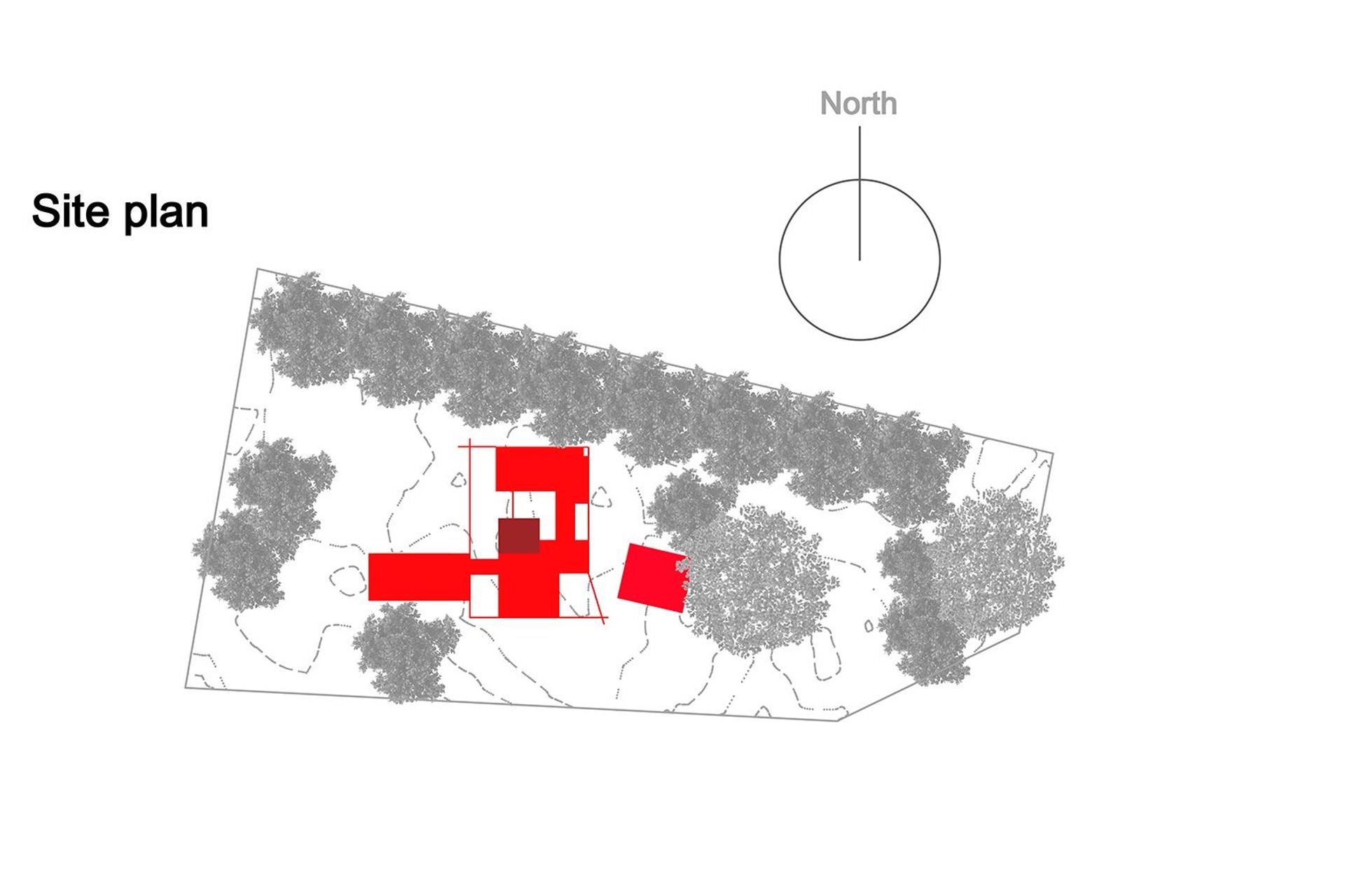
“The shingled pavilion is like a rock with chamfered edges,” says Tane. “We wanted to create a sculptural, playful form for the garage and storage – to offset the main dwelling and provide some interest when you approach the house.” This angular structure contrasts the main pavilion, a boxy form that contains the main living areas and has a smaller box tacked on the side that operates as a children’s bedroom. A folded section in the roof also creates a fold in the ceiling, which softens up a large, flat area of roofing and relates well to the folds in the garage roof.
Built for Ben and Nicky Lee, and their family, the property is situated in a well-established upmarket area in Tamahere. “We wanted to contribute to the area by designing a refined and sophisticated home that also reflects the owners’ personalities, who are young and interesting. So, while we wanted everything to be formal with even symmetry and so on, we didn’t want it as formal as what you’d typically see within this neighbourhood.”
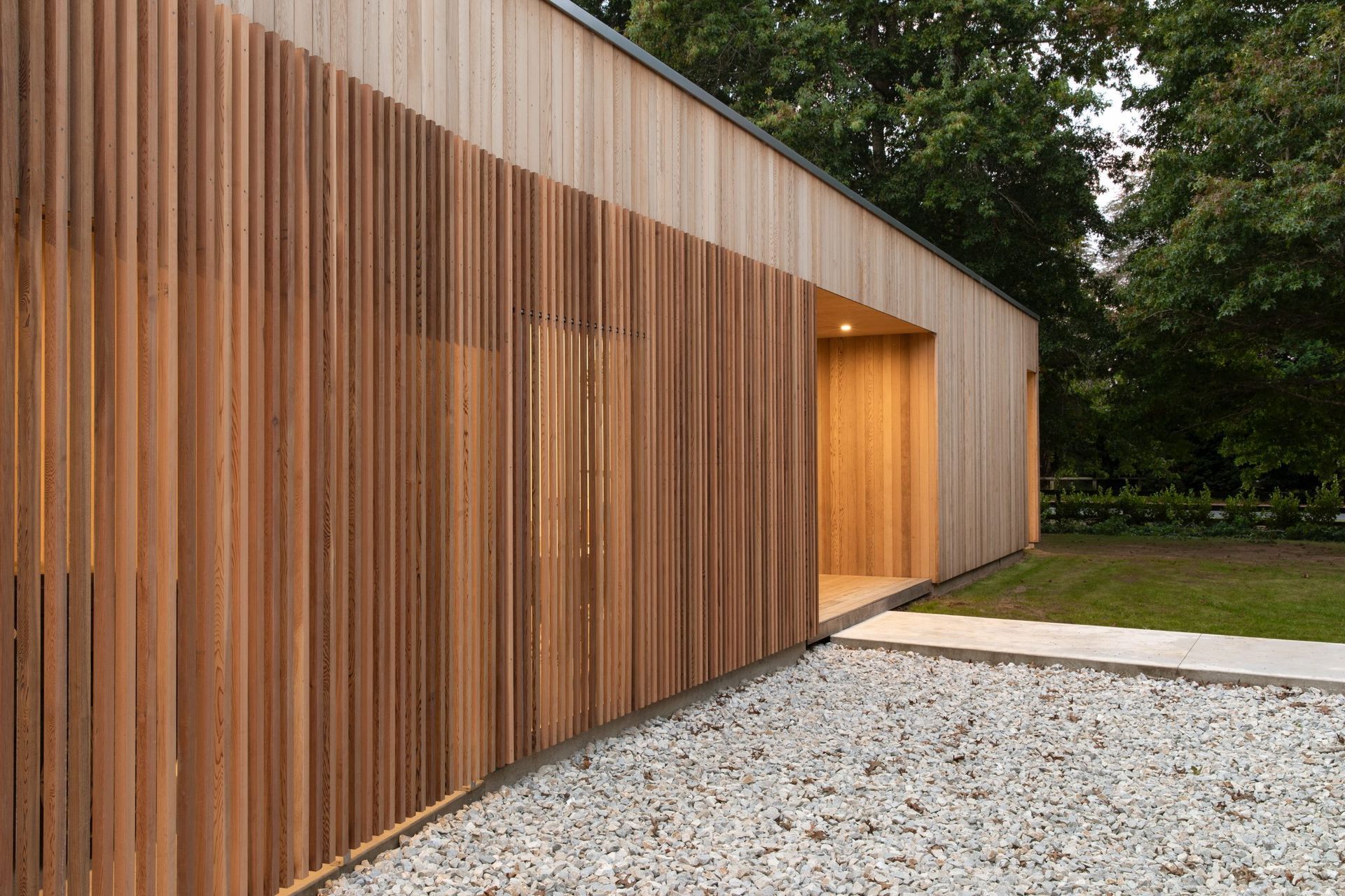
However, the owners didn’t want this modern house to appear too sharp or clinical either. “Our intention was to soften the strong, sharp edges of the whole form,” explains Tane. “We clad it with cedar shingles to help soften its formality, creating a feathered/textured look – like a feather cloak. It was also an opportunity to use a roofing material as a wall cladding, and it also details really well at the roof-to-wall junctions.”
Shingles are a traditional method of cladding that has been used for centuries and is particularly prevalent in rural Scandinavia and many North American colonies. Warm and inviting, in today’s context, timber shingles help to make a contemporary house fit into its location. Pre-coated with protection against the elements, they age and weather over time and will look quite different in 10 years’ time, lightening up to a silvery grey colour and developing a patina.
“Our clients are prepared to look after the house, which is important because timber cladding is a commitment in terms of maintenance,” says Tane. “But they are really engaged in their home, whereas some people would want to clad it and never think about it.”
While the design of Shibui House has its complexities, it is also quite simple at the same time, explains Tane. “Once we had designed it, we looked at how we could pull things off,” he says. “The Japanese term ‘shibui’ explains the house really well and some of the decisions we made, rather than it being anything cultural.”
The house’s strong but minimal composition is stripped of adornment, but Tane suggests that the intention of the design was never to be Japanese-inspired but, rather, the description came after and was about finding a vocabulary to describe the home. Simply speaking, ‘shibui’ is synonymous with Japanese design and means ‘the aesthetic of studied restraint’ – the art of knowing when to stop a design to achieve simplicity that’s balanced with complexity, while avoiding being complicated or contrived.
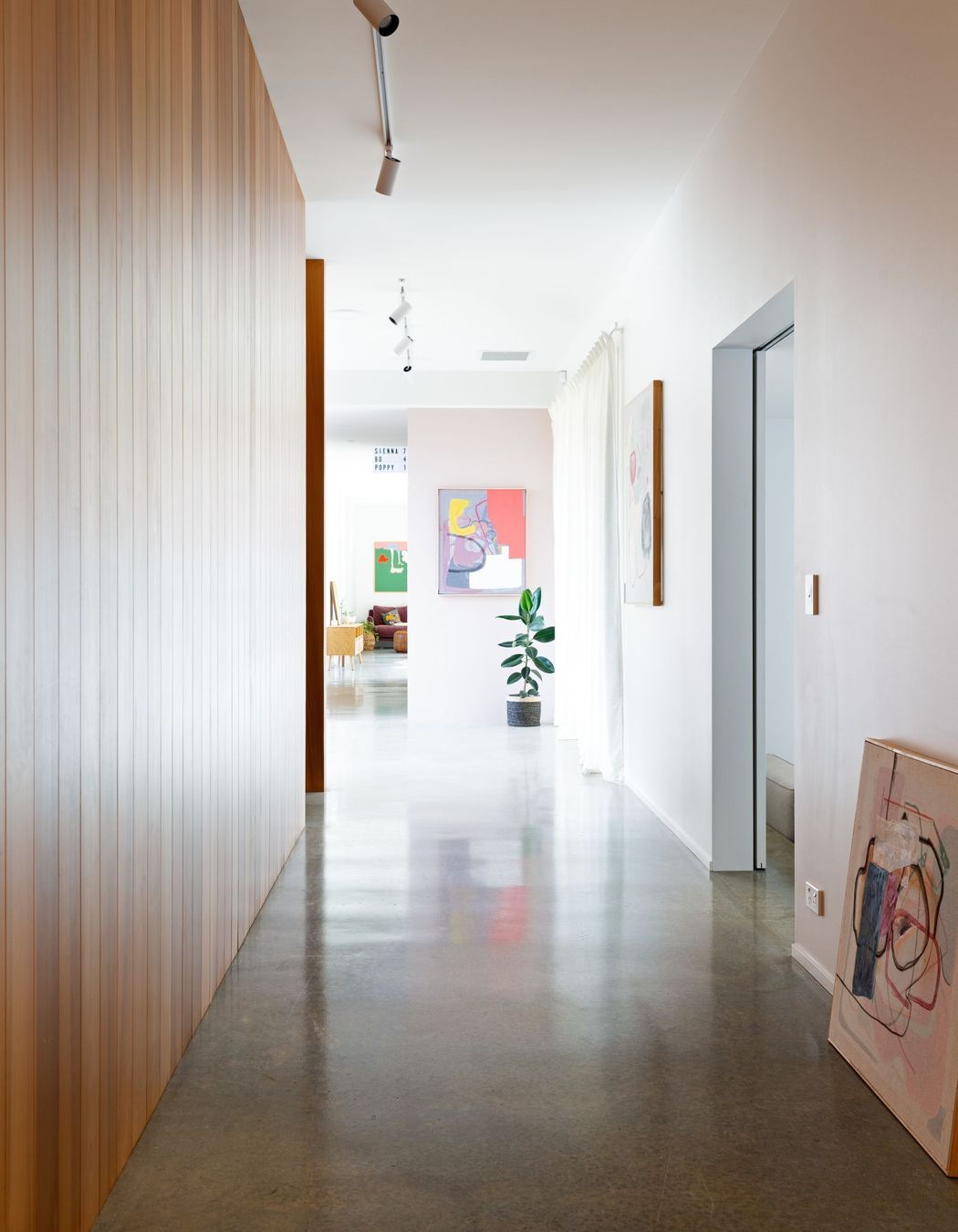
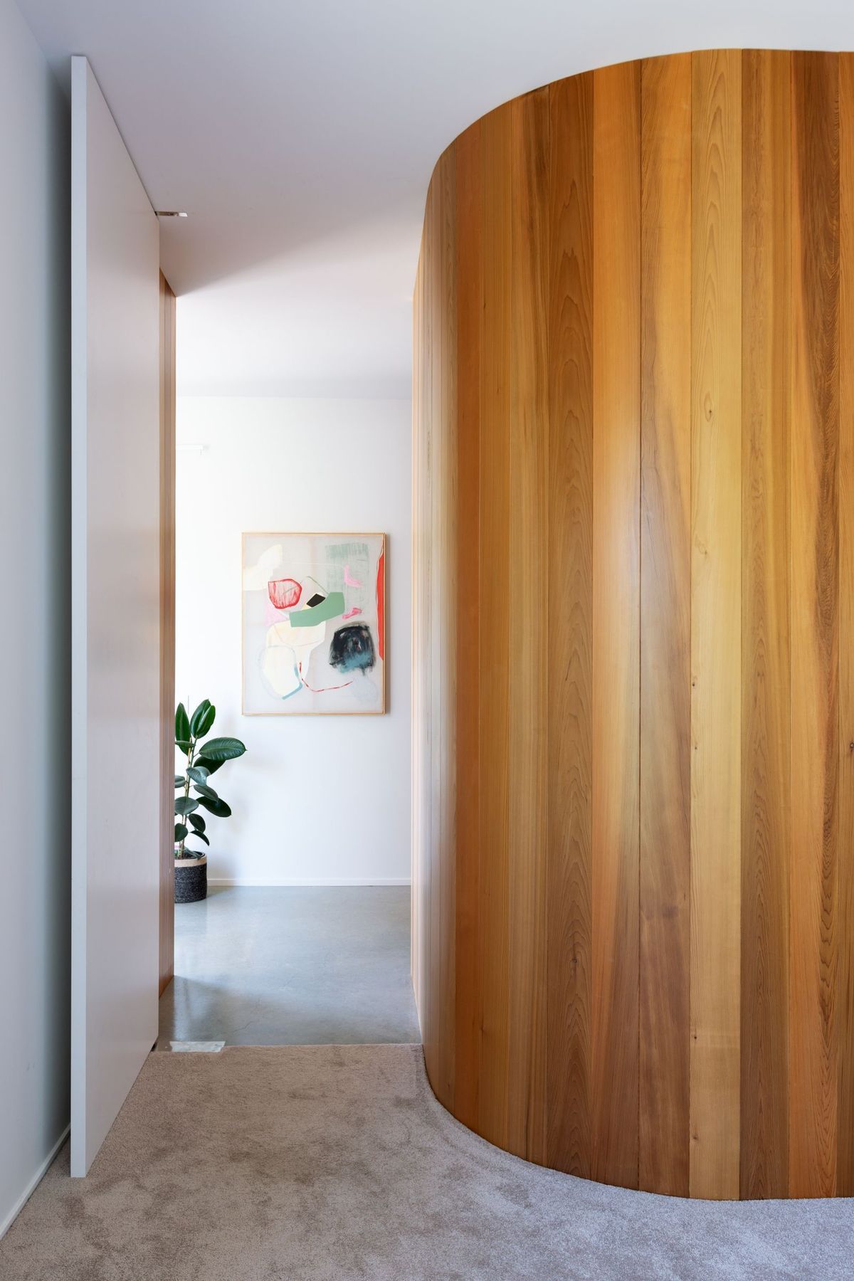
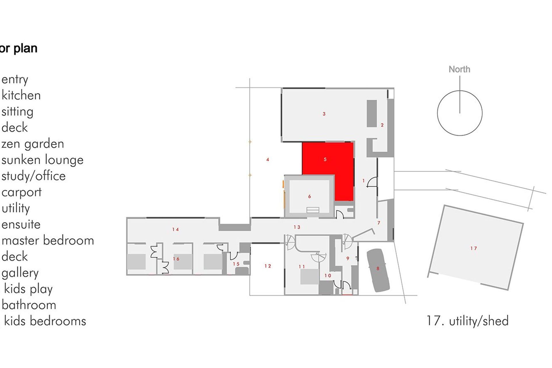
The design aims to create a sense of anticipation and a journey from entering the property via a long path to the home, then through the interconnected interior spaces. The main box contains the living areas, a hallway/gallery space and a car port. “One of my favourite elements of the design is the hallway, which is more like a gallery because you don’t see the internal doors as they are inset into the walls and appear like openings,” Tane explains. “Throughout the house, we’ve used a mixture of sliding and pivoting doors, which have worked really well with what we were trying to achieve.”
While the house is large, with four bedrooms and two-and-a-half bathrooms, it was never supposed to be a grand home. “We tried to ensure that its scale and volume makes it spacious enough to feel comfortable, without getting lost in it or feeling overly flamboyant,” says Tane.
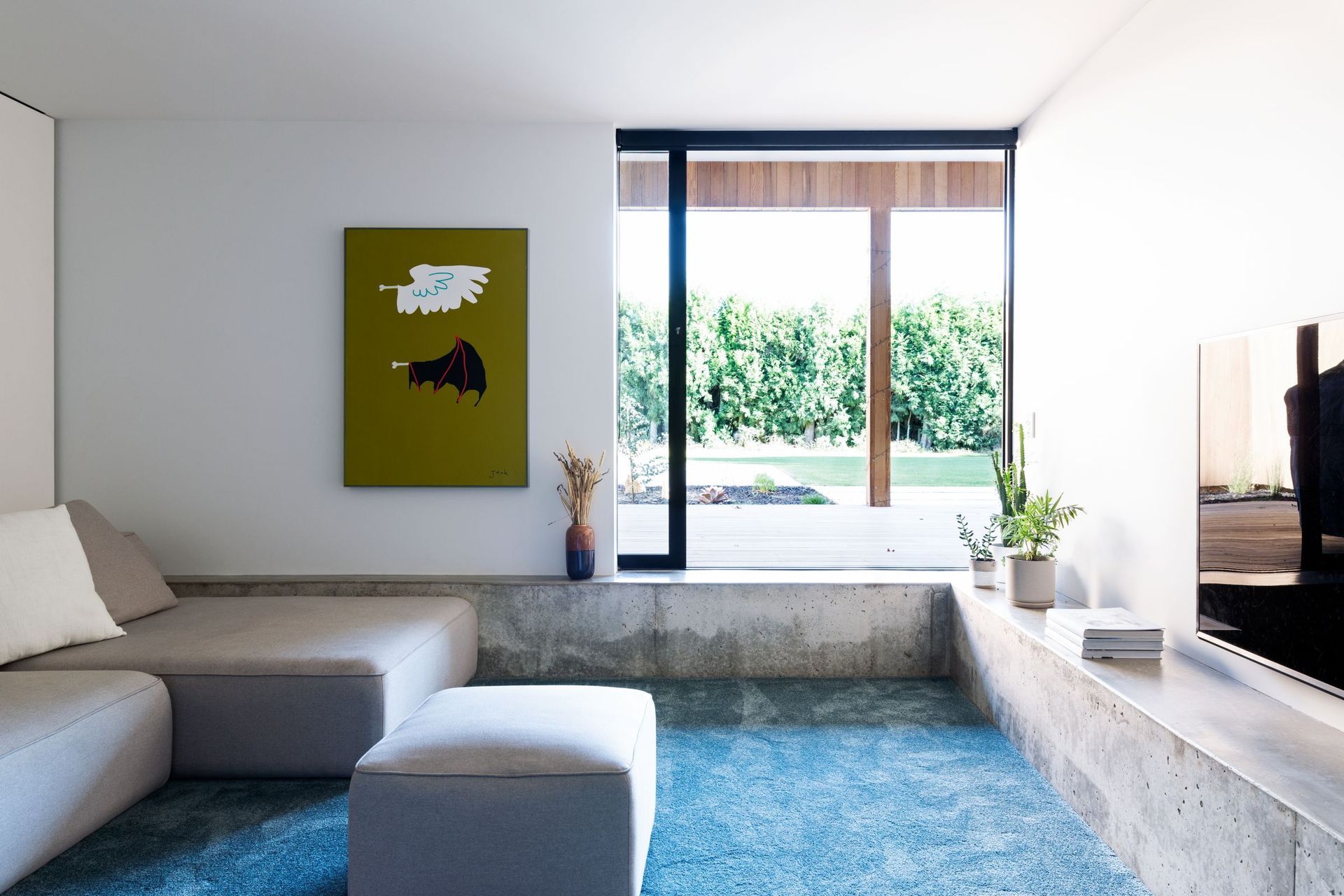
Key highlights of the interior include a warm but minimalist kitchen and a sunken lounge with built-in concrete benches that overlooks the front verandah. “The snug was an opportunity to bring some of the construction into the house. We normally design homes that are modern and have everything in the construction covered up, so it was nice to achieve a modern aesthetic but also celebrate what the building is made up of, rather than covering it up. The concrete seating provides somewhere to sit and read, and it also creates a threshold where you gain a sense of a height change, which transforms the way you see the interior,” Tane says.
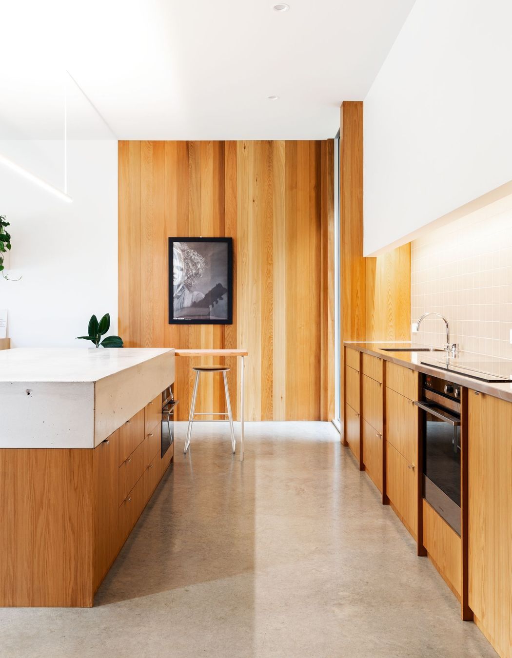
The kitchen is long and strikingly simple, with cupboards kept below the eye level to create a strong form that is minimal and refined. “We wanted to create a very accessible kitchen so everything is at a low level. We had the luxury of space with parts of the kitchen, including the fridge and pantry cupboards, hidden out of the way. The island becomes quite sculptural and its face is flush with the end of the breakfast bar that sits at one end, so you’re not just looking at a row of stools under the island. The owners say it’s very successful and lovely to work in.”
A courtyard garden helps to blend the house into its surroundings and brings natural light into the central area of the house, with the rest of the home laid around that. A large covered deck leads out from the main pavilion. “Outside, we have embraced the column. People think they don’t like them but when you have an open, clear space, there is often nowhere to stand. We discovered people gravitate towards posts and lean on them, so we have strategically integrated columns into the home, rather than thinking of them as an obstruction or ‘in the way’,” he says.
In terms of performance, the home has a heavily insulated slab, ensuring good thermal mass, whereby the concrete absorbs heat from the sun during the day and releases it at night. To avoid overheating in the summer, the house has been modelled for passive cross-ventilation and the large overhanging verandah provides plenty of shade. Being located in a rural location, the home has been designed to harvest rainwater.
One of the lovely things about Shibui House is that it is surrounded by mature trees, bedding the building into the site and making it feel as if it has been there for years. “When we designed the house, we saw that the trees were blocking some of the sun coming into the home but, rather than cutting them down and opening the site up, we decided to keep them. We worked the design around the trees and brought in extra light by installing skylights, as well as clerestory windows over the dining area to draw morning sun in from the east.”
Tane says that having The Parsons Project manage the build was instrumental to the project’s success. “They were able to commit to the design and see the whole idea through – from the early stages through to the end. The main challenge for us was adhering to a strict budget, while sticking to the design intent, but we are very happy with what we have achieved.”
Words by Justine Harvey.
Photography by Larnie Nicolson and Jonny Davis.

