Located within the beachside settlement of Te Onepoto/Taylors Mistake on the northern Banks Peninsula, this modest home was designed as the primary residence for a young family of four.
“Taylors was an exercise in balancing quality living with budget constraints, all on a steep East-facing site,” says Aaron Jones, Design Director for Urban Function Architecture.
“We determined from the outset that to effectively reconcile the budgetary requirements with the build cost, we would need to ensure as light a footprint as possible was touching the ground—in order to minimise the amount of ground works required—and also to keep the overall square meterage to a minimum.”
Entry to the house is via the upper level, so a small cut was made into the site to create the best possible position in order to maximise the view. The house has a footprint of just 75m2 but comes in at 150m2 over the two levels, with open-plan living/kitchen and study on the upper level and bedrooms and bathrooms on the lower level.
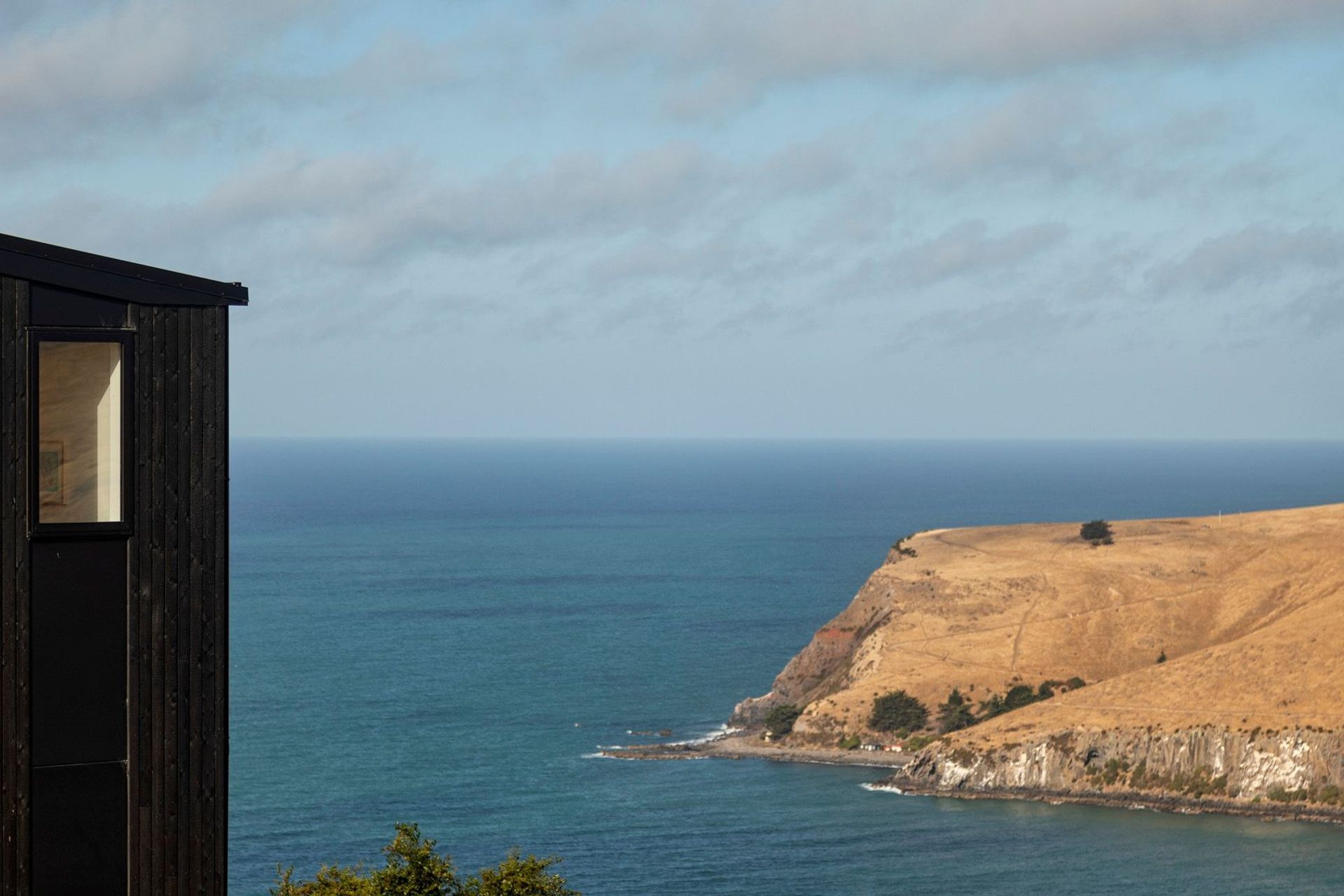
“We positioned the house and set the height of the upper level living spaces to capture views out across the headland and down into the bay below, while minimising the outlook towards neighbouring properties.
“The orientation is east-facing, with entry from the west, so a raked ceiling with high-level windows ensures late afternoon sunlight penetrates into the building envelope before the sun dips behind the headland.
“Balanced against these high-set, west-facing windows, the roofline slopes downwards—from 3.6m to 2.4m—towards the bay, following the contours of the site and creating a more intimate spatial experience on the view side of the property, without compromising the overall sense of volume.”
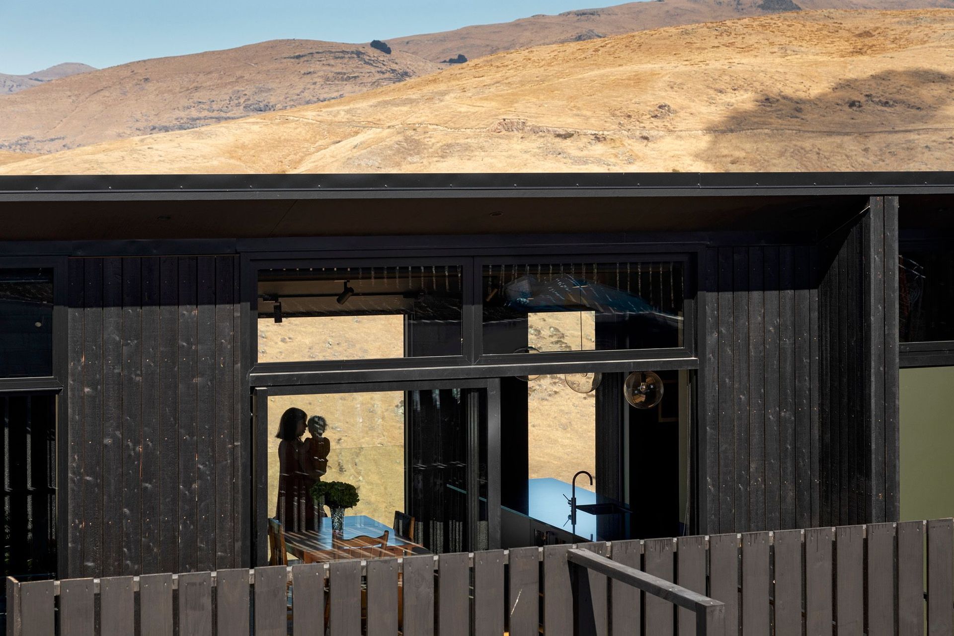
In reference to the many caves that can be found across the headland—and at the specific request of the client—the walls and ceiling of the upper level have been painted black to recreate the feeling of being inside a cave looking out over the ocean. The engineered oak flooring and oak timber accents in the kitchen, along with the natural timber decking add a touch of warmth and help soften the otherwise moody interior.
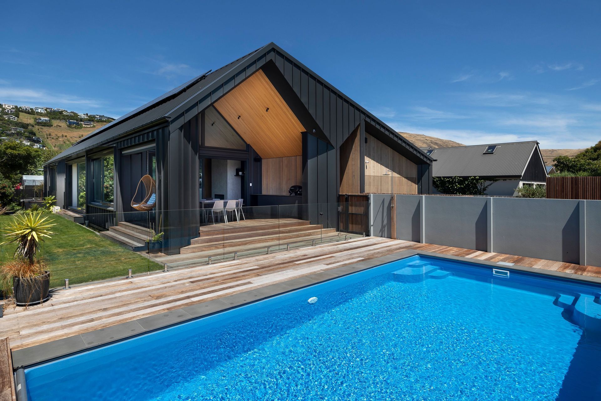
The theme is extended to the exterior of the property which has been clad in charred larch, which imparts the same aesthetic as stained cedar but requires less ongoing maintenance, a big plus on a steep hill site.
To add a sense of lightness to the structure, the facade is punctuated by numerous windows, helping to create a sense of transparency, thus lifting the interior from being heavy and oppressive to being welcoming and cocooning.
“We wanted to create an experiential journey through the interior,” says Aaron. “That sense of always moving towards the view, towards the light and so, creating the sense of there being multiple points of access was integral to that.
“Flanking the kitchen are two floor-to-ceiling windows, one directly opposite the entry and the other at the top of the stairs leading up from the lower level. With the first, the moment you enter the home you are presented with a vignette of the view, immediately drawing your attention through the space. While the second gradually reveals the view as you climb the stairs, in a sense almost as if you were scaling the headland at which you are looking.”
Words: Justin FootePhotography:
Right Angles Photography


