Taylors Mistake House banner

Located within the beachside settlement of Te Onepoto/Taylors Mistake on the northern Banks Peninsula, this modest home was designed as the primary residence for a young family of four.

“Taylors was an exercise in balancing quality living with budget constraints, all on a steep East-facing site,” says Aaron Jones, Design Director for Urban Function Architecture.

“We determined from the outset that to effectively reconcile the budgetary requirements with the build cost, we would need to ensure as light a footprint as possible was touching the ground—in order to minimise the amount of ground works required—and also to keep the overall square meterage to a minimum.”

Entry to the house is via the upper level, so a small cut was made into the site to create the best possible position in order to maximise the view. The house has a footprint of just 75m2 but comes in at 150m2 over the two levels, with open-plan living/kitchen and study on the upper level and bedrooms and bathrooms on the lower level.

“We positioned the house and set the height of the upper level living spaces to capture views out across the headland and down into the bay below, while minimising the outlook towards neighbouring properties.

“The orientation is east-facing, with entry from the west, so a raked ceiling with high-level windows ensures late afternoon sunlight penetrates into the building envelope before the sun dips behind the headland.

“Balanced against these high-set, west-facing windows, the roofline slopes downwards—from 3.6m to 2.4m—towards the bay, following the contours of the site and creating a more intimate spatial experience on the view side of the property, without compromising the overall sense of volume.”

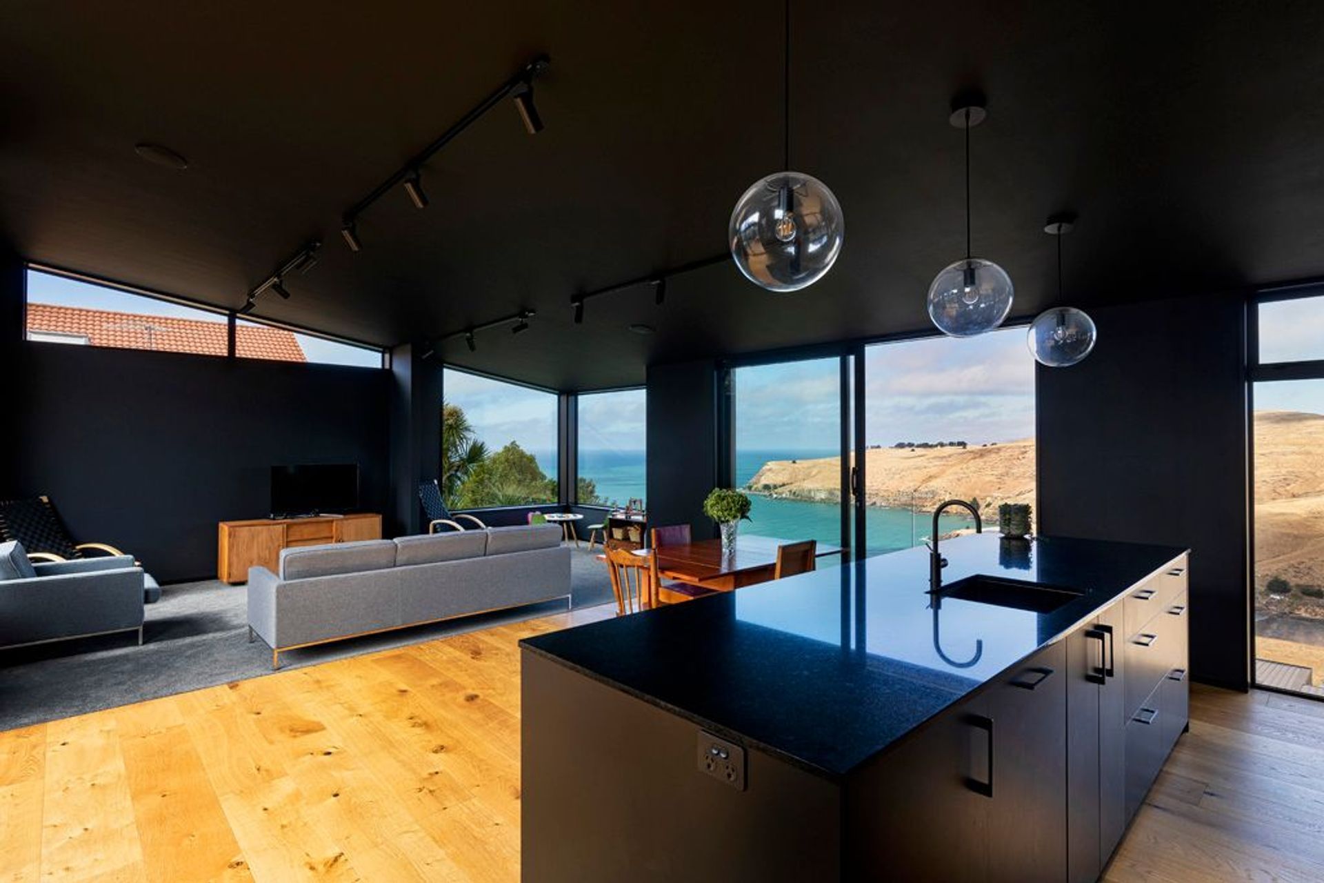
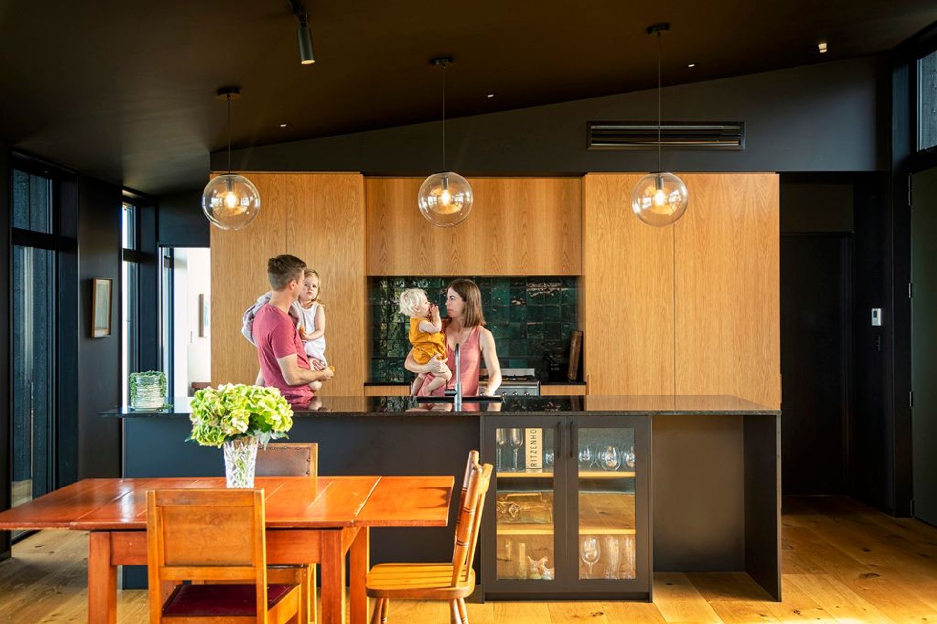
In reference to the many caves that can be found across the headland—and at the specific request of the client—the walls and ceiling of the upper level have been painted black to recreate the feeling of being inside a cave looking out over the ocean. The engineered oak flooring and oak timber accents in the kitchen, along with the natural timber decking add a touch of warmth and help soften the otherwise moody interior.

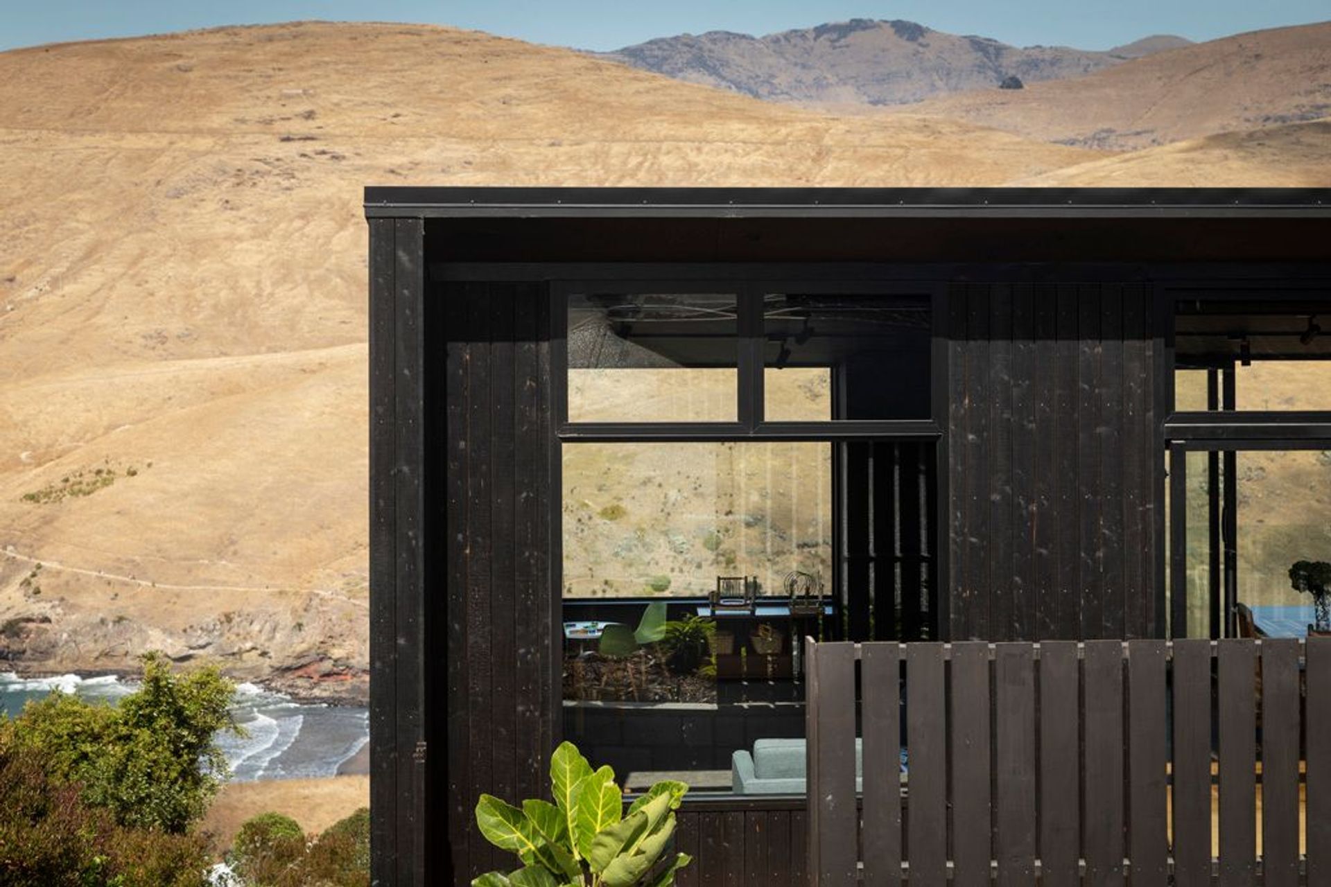
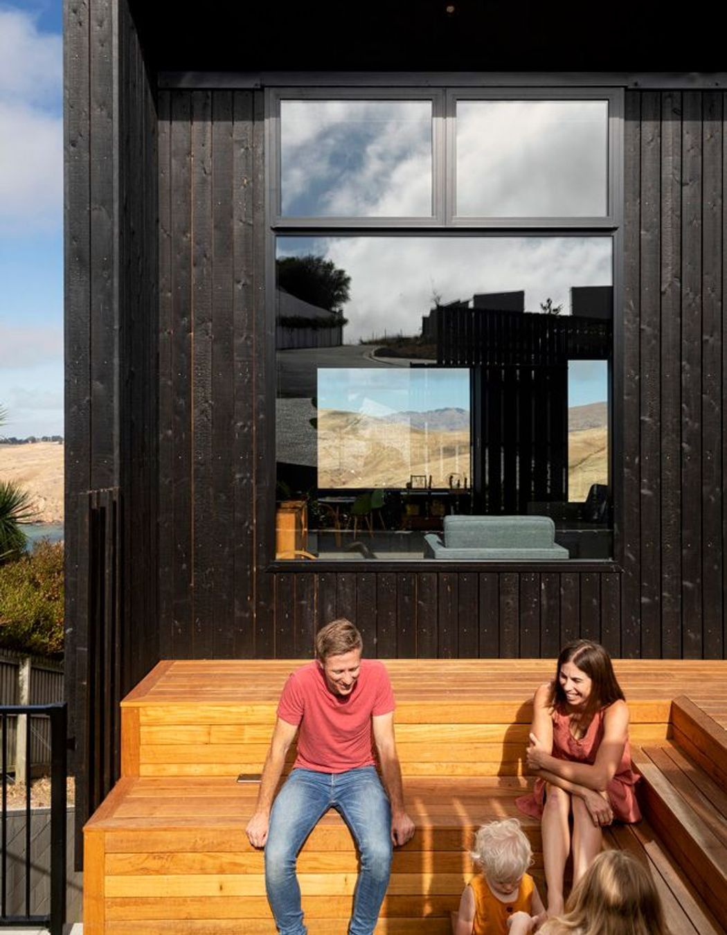
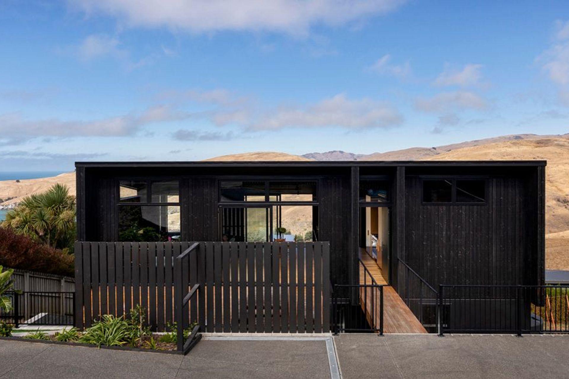
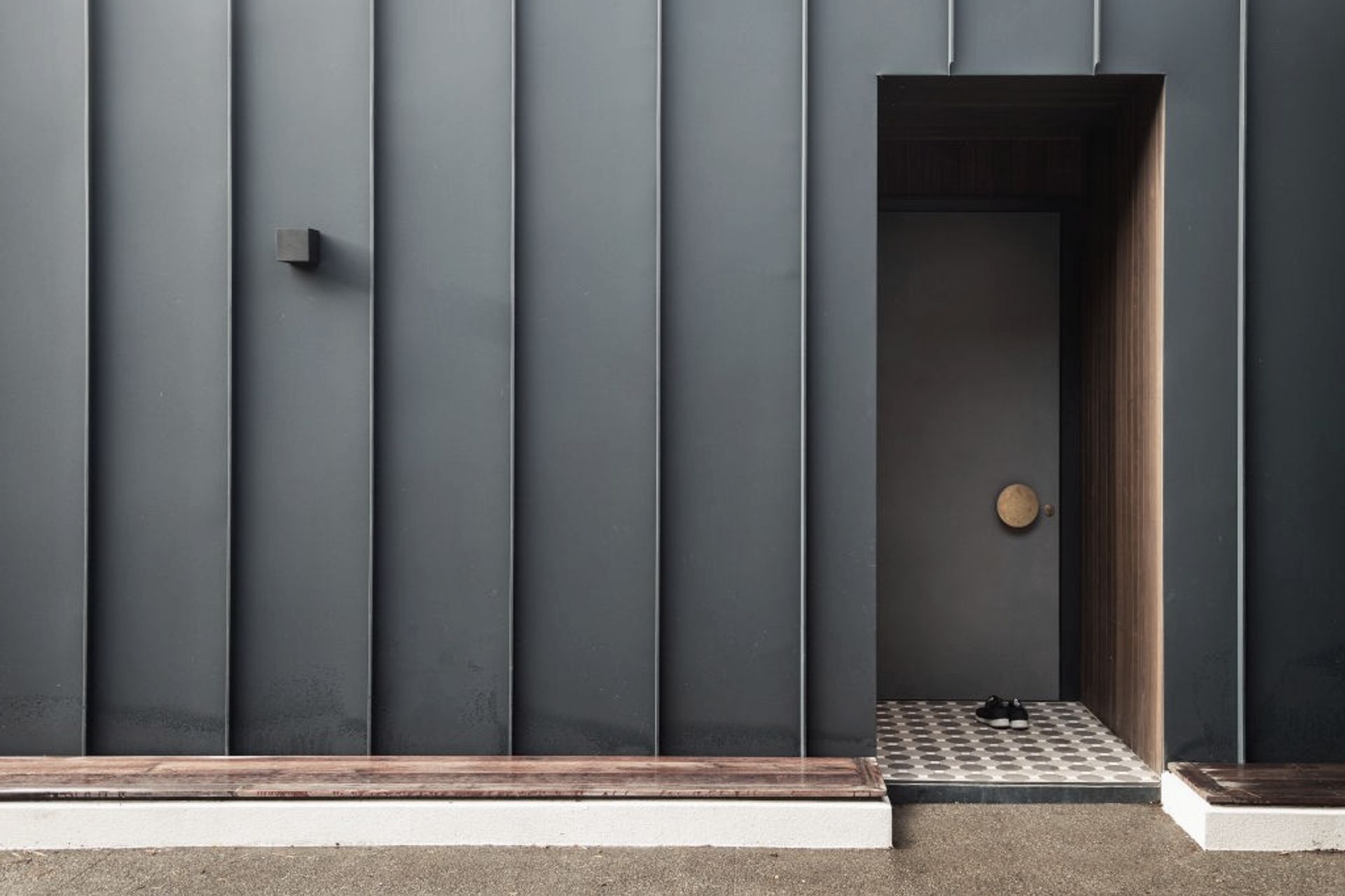
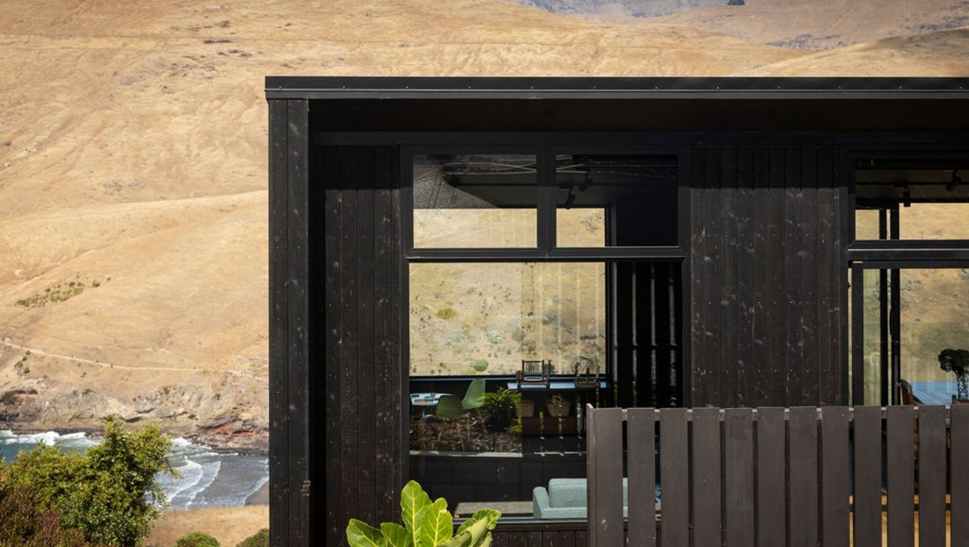
The theme is extended to the exterior of the property which has been clad in charred larch, which imparts the same aesthetic as stained cedar but requires less ongoing maintenance, a big plus on a steep hill site.

To add a sense of lightness to the structure, the facade is punctuated by numerous windows, helping to create a sense of transparency, thus lifting the interior from being heavy and oppressive to being welcoming and cocooning.

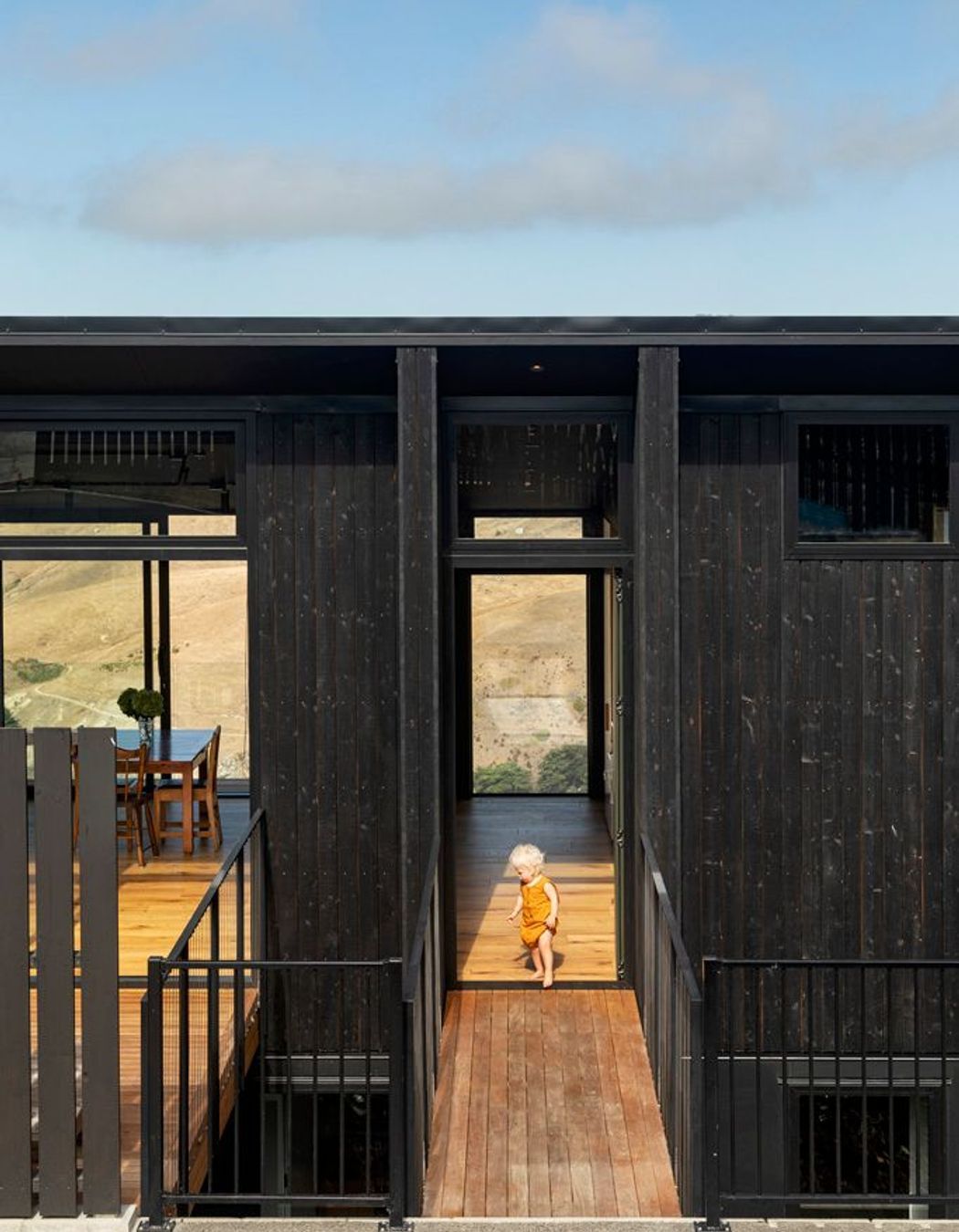
“We wanted to create an experiential journey through the interior,” says Aaron. “That sense of always moving towards the view, towards the light and so, creating the sense of there being multiple points of access was integral to that.

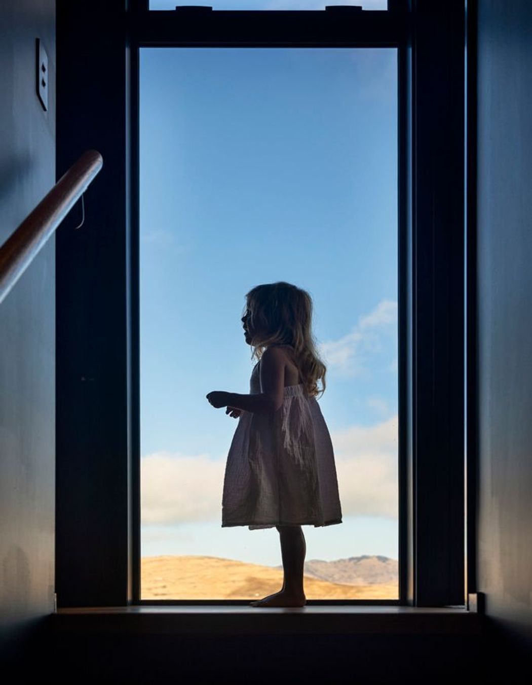
“Flanking the kitchen are two floor-to-ceiling windows, one directly opposite the entry and the other at the top of the stairs leading up from the lower level. With the first, the moment you enter the home you are presented with a vignette of the view, immediately drawing your attention through the space. While the second gradually reveals the view as you climb the stairs, in a sense almost as if you were scaling the headland at which you are looking.”

Words: Justin Foote
Photography: Right Angles Photography

Awards and
recognition

Urban Function Architecture
Canterbury
Visit Website
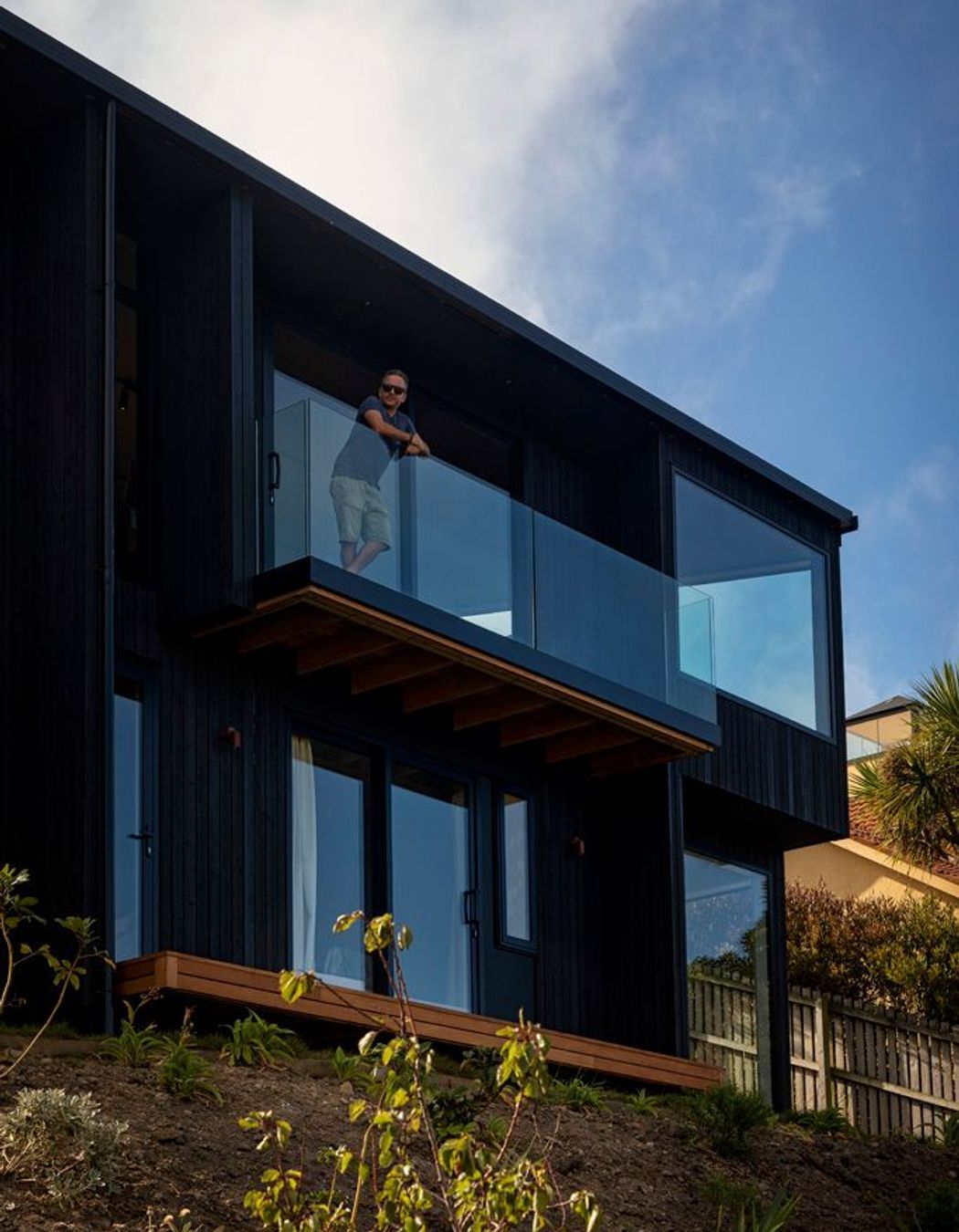
Situated on a steeply sloping site on the northern Banks Peninsula, this house was designed to sit lightly on the land.
An exterior of charred larch cladding helps minimise the need for ongoing maintenance.
At the request of the owners, the walls and ceiling in the living area have been painted black to impart a sense of being inside one of the many caves found in the area.
In response to keeping the footprint as light as possible, an air-bridge links the parking pad to the front door.
The East-facing facade features large-scale glazing to maximise views out across the bay and adjacent headland.
An intimate outdoor area allows the family to make the most of the afternoon sun.
Floor-to-ceiling windows frame the wide-reaching views.
Engineered oak flooring and oak accents in the kitchen add warmth to the otherwise dark colour palette.
High-level windows on the West-facing facade help admit late afternoon sun into the interior before it sets below the surrounding hills.

Professionals used in
Taylors Mistake House

About the
Professional

Urbanfunction is a design collaborative based in the central city of Christchurch, New Zealand that draws on a range of skill and experience to deliver a diverse range of residential and commercial architectural projects both at home in beautiful Aotearoa and internationally.

Design director Aaron Jones formed both zerobag and urbanfunction on his return from years of working abroad in Melbourne and London.

With 20 years experience in the industry, Aaron draws on a range of global experience. From technical detailing and construction in stadium building to design, detailing and marketing of high end residential and commercial projects for both client and developer. 

The importance of Architecture and design within society, we believe is everything. As space, light and visual context affect mood and function within ourselves and those around us, it is critical we live within well considered environments. Considered not only for the purpose of which a building or product is to function but also to it's own environment and surroundings. This forms part of the core philosophy as to how we approach design.


At ArchiPro we recognise and acknowledge the existing, original and ancient connection Aboriginal and Torres Strait Islander peoples have to the lands and waterways across the Australian continent. We pay our respects to the elders past and present. We commit to working together to build a prosperous and inclusive Australia.