The Chef's Kitchen
CONCEPT DESIGN:
Originally the kitchen was a pokey little thing at the back of the house. One of the first decisions they made was to move it to the front of the house and make it a central feature in a relaxed open plan living space. You might assume that cooking for hundreds of people during the week would put them off entertaining from home, but then, what are eight people for Sunday lunch when one’s used to dozens?
Their kitchen was all about sociability and everything has been designed to allow multiple people to cook together in the space or chat with friends while tending the stove. Carl and Natalia’s absolute requirement for the kitchen was that it needed to be functional with plenty of bench space and room to work. Big, deep sinks and semi-professional appliances mean that while this is a domestic kitchen, it’s robust enough to handle intensive cooking.
Beyond utility, the couple also had clear ideas about the look and feel. Owners of the much-awarded Engine Room restaurant, their approach to food and cooking is all about seasonal produce. There is no artifice to their food; theirs is food that you immediately understand and can’t help but devour – perfectly executed riffs on traditional dishes and clever tweaks of classics. There is an honesty and unpretentiousness to their cooking, and they wanted their kitchen to reflect this approach.
Nothing too glossy, nothing too precious. They were after a slightly rustic but contemporary space that was refined, but not perfect, which also connected easily to their garden outside.
Helpfully the kitchen was positioned so that alongside the kitchen are wide bifold doors that let out onto the deck complete with outdoor table and a wood burner oven. In the corner fig trees fill up the windows with greenery; in summer, they can lean out and pluck a fig straight from the tree.
Plywood with a delicate grain was used for all the cabinetry with routed cutaways instead of handles, handmade and hand-glazed olive green tiles form the backsplash behind the sink, and dark grey sandstone on the bench helped to anchor the space.
DEVELOPED DESIGN:
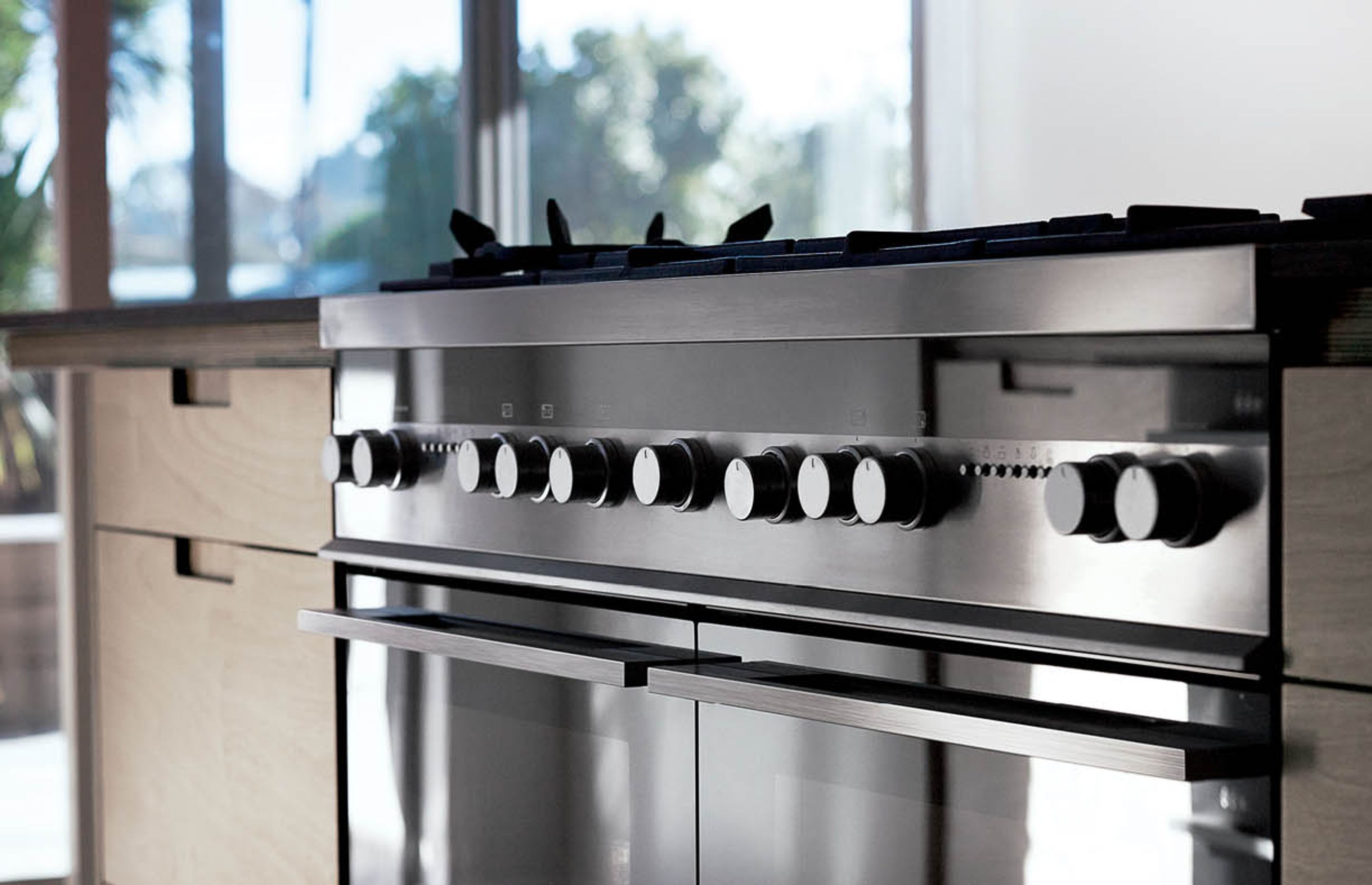
The chefs still see the three points of the kitchen triangle - the fridge, the cooktop, the sink - as important, but they admit their own kitchen is more like the working square once you include the second fridge unit of the CoolDrawer™. This kitchen has different zones that all work together. At the core of the kitchen is a generous cooking zone complete with a Fisher & Paykel 120cm Duel Fuel Freestanding Cooker. In behind, a wide deep sink is joined by a 60cm Double DishDrawer™ to create a washing up zone. The ActiveSmart™ Fridge, and alongside, a walk-in scullery create a storage zone. A CoolDrawer™ at the end of the island near the table marks out an entertaining zone.
The island is the central element to this space. At 3.6 metres long, it is substantial enough to allow meal prep to happen alongside cooking, while guests gather and share a drink. Hovering lightly above, a plywood shelf sheaths over the top edge of the VentSurface™ Island extractor, providing handy storage for the couple’s large pots and pans and also shifts the scale of the kitchen within the high-stud space.
The couple chose the grunty semi-professional 120cm Duel Fuel Freestanding Cooker because gas was what they were used to and comfortable with. Carl says, "It's habit, I guess. We understand it." He explains there is an unconscious ritual in lighting the gas, heating the pan and adjusting the flame that they enjoy. The cooker is integrated into the island, which means Carl and Natalia don’t need to turn away from their guests as they cook. The dual ovens mean these chefs can have different dishes baking simultaneously.
Because the couple work nights in their restaurant, most of their dishes are only a few coffee cups and plates for toast which means the DishDrawer™ gives them the flexibility for small loads during the week, but can also handle large crowds when they entertain.
DETAIL DESIGN:
Natalia and Carl demand a lot from their appliances. They are used to the power and responsiveness of their restaurant kitchen, and yet they wanted an elegance and subtleness for their home kitchen. They found this balance in the semi-professional range of Fisher & Paykel products, which live up to their expectations while also fitting in seamlessly into the domestic environment. The details to make the appliances fit seamlessly into the cabinetry and benchtops balance precision with their authentic and rustic aesthetic.


Professionals used in The Chef's Kitchen
More projects by Fisher & Paykel Appliances
About the
Professional
Fisher & Paykel has been designing products to change the way people live since 1934.
Our design philosophy is underpinned by a curiosity about people — how they live, what they do and how they use things.
This approach has helped us understand the dynamic nature of modern living, and to challenge conventional appliance design to consistently deliver products that are intuitive, timeless, and beautiful to use.
KITCHEN PERFECTION
At Fisher & Paykel, we design products according to three key principles — Ultimate Kitchen Solutions, the Beauty of Choice and Design Freedom — so you can create Kitchen Perfection.
ULTIMATE KITCHEN SOLUTIONS
To create the perfect meal, you need a suite of products working seamlessly together to create a beautiful kitchen experience. Cooking and cooling solutions that respect ingredients through the Mastery of Temperature. Exceptional dishwashing and ventilation solutions that deliver perfect results every time.
THE BEAUTY OF CHOICE
All homes are different, they demand different architectural and aesthetic responses. The Beauty of Choice is the ability to choose the perfect product style and integration option to create your perfect kitchen — for complete functionality without compromising design.
DESIGN FREEDOM
As the heart of the home, the kitchen serves as both a practical, multi-functional space and an architectural statement. Design Freedom is the ability to customise a kitchen layout with work zones that exactly suit how you want to live, cook and entertain, and personalise design details to achieve a highly considered, bespoke design.
- ArchiPro Member since2015
- Follow
- Locations
- More information


