The Royce Hotel, Melbourne
Once a glamorous car showroom for Rolls Royce, this Moorish-style building in St Kilda Road, Melbourne, has undergone a number of renovations. SJB Architecture & Interiors was responsible for its ‘rebirth’ in the early noughties. This time, the brief was to remodel six suites on the first floor as prototypes for a new direction. A new owner, who spends a considerable amount of time in London, often staying at some of the finest boutique-style hotels in Mayfair, was keen to inject a similar elegance and style Down Under.
“We wanted to offer that high-end feel, while still respecting the original fabric of this heritage building,” - Andrew Parr, Managing Director of SJB Interiors.
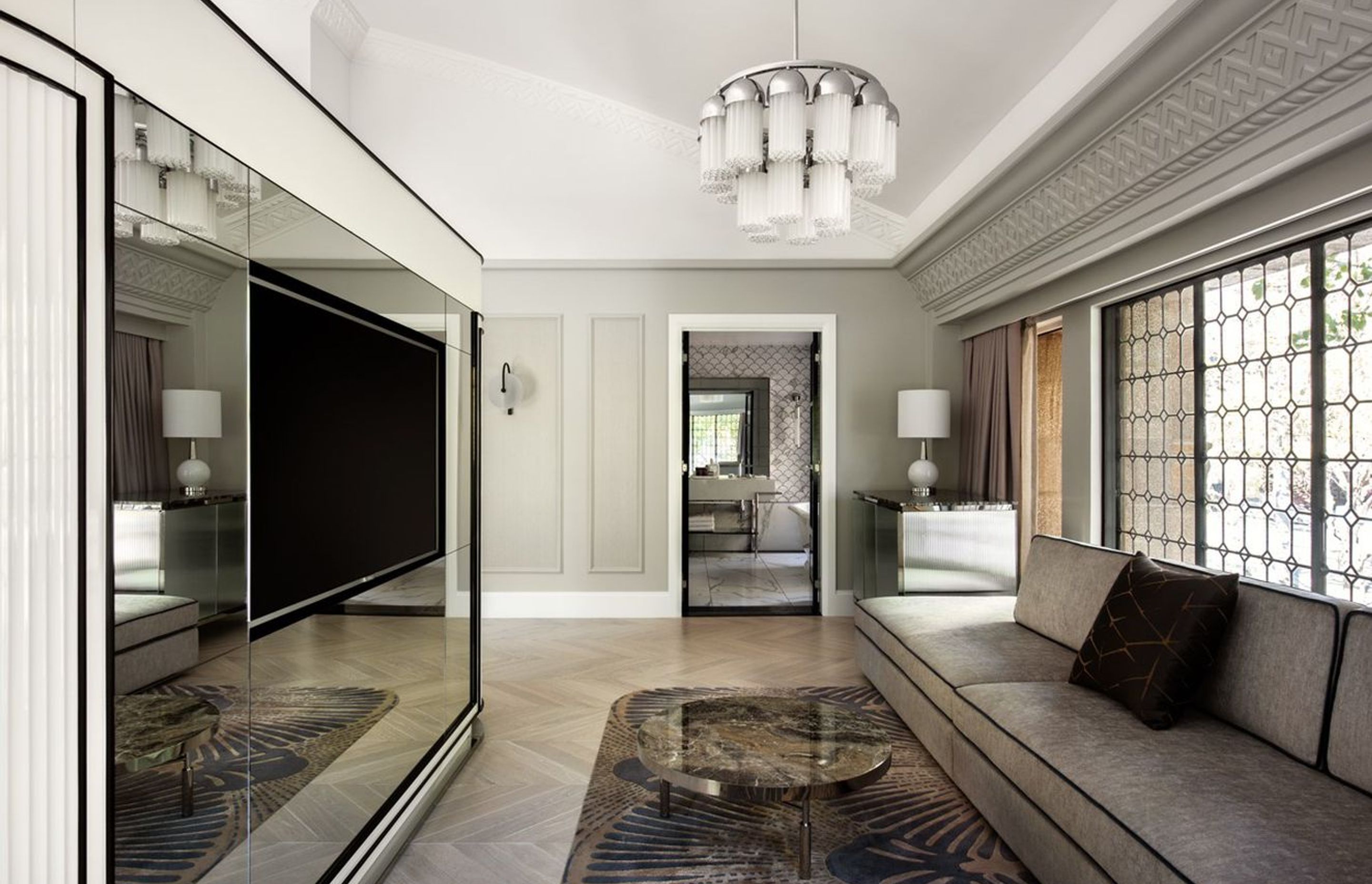
This level-one wing not only benefits from the western light, but also the many period features, including leadlight windows and dramatic decorative vaulted ceilings. “It’s an unusual building, not quite Spanish, leaning more towards Moorish,” says Parr, pointing out the distinctive, almost abstract relief detailing in the plasterwork. And rather than creating six identical suites, each one is slightly different, ranging from the more classical to the more contemporary. Finishes and fabrics were inspired by details from the 1920s, such as fluted or reeded glass. And the Zepel fabrics have a velvet touch and surface interest. “I’m always mindful of how fabrics look close up as much as when you first enter a room,” says Parr.
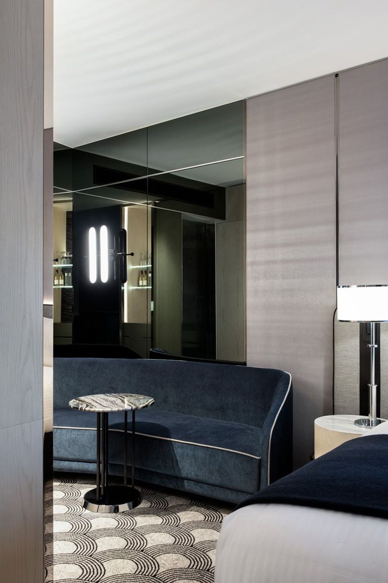
The ‘Tower Room’, as with the other suite of rooms, including the ‘Classic’ and the ‘Presidential’, takes its design cues from the late 1920s when the showroom was built. Soft edges, chrome finishes and sumptuous fabrics from Zepel feature strongly in soft furnishings, lounges and armchairs. Padded bedheads, upholstered walls and two-tier layered curtains further cocoon those fortunate to stay. And as expected from someone of Parr’s talent, ‘the devil is in the detail’, with velvet-piped edges on lounge suites and soft furnishings. Parr used a number of Zepel fabrics for this project, including Zepel’s ‘Baron’ for the armchairs and lounges, together with Zepel’s ‘Pathfinder’ for bedheads. The block-out fabric for the windows also came from Zepel, from the ‘Starbright’ collection.
When selecting fabrics, Parr is mindful of a number of important factors from their appearance to their capabilities. “When you’re working in high-traffic areas such as hotel rooms, fabrics need to achieve the 50,000-60,000 ‘rub test’. Jeans are notorious for the wear and tear,” says Parr. The continual caressing of chairs, particularly when they’re covered in a Zepel velvet is also expected, as in the luscious petrol blue used for a number of pieces. Taking a lounge suite to be cleaned offsite may be possible when it’s in someone’s home, but removing key pieces from a hotel room means a loss of revenue on a significant scale, with rooms unable to be used by guests until pieces are returned. “The fabrics have to be robust, even though they may appear delicate to the touch,” says Parr.
The ‘Classic’ room, which is fully carpeted, also picks up its design cues from the art deco period. An organic-shaped chaise covered in a black and white tweedy-style Zepel fabric ‘Baron’, would fit comfortably in Coco Chanel’s boudoir. “It’s only close up that you fully see the pattern, very subtle,” says Parr, who was keen to frame this piece in hues of pale oyster-coloured walls and drapes. “Sometimes, it’s important to play down key pieces with neutral drapes, but that doesn’t mean these have to be lacklustre,” says Parr, pointing out the subtle art deco-style relief in the curtains.
The ‘Presidential’ suite, located on the northern edge of the western wing, could easily fit comfortably in Mayfair. Overlooking the expansive school grounds of Melbourne Grammar, this corner suite is truly ‘luxe’. Bathed in light, the bedroom is ‘veiled’ from the sitting area by cream fluted lacquered joinery. Nothing has been spared, including an impressive 1920s-inspired chandelier and a customised hand-tufted rug, set into a parquetry timber floor, all designed by SJB Interiors. The bathroom is as equally decadent with marble finishes and fluted glass screens. As with the other suites, the colour palette is quiet and sophisticated, with ivory and black accents building on that 1920s fashion glamour. Chrome bedside lamps also nod to the roaring ’20s, but designed by Parr to have a contemporary edge.
While Parr was keen to create an exceptional level of design for these new suites, he was also mindful of delivering a fit-out that would hold up to the rigour of everyday use. “Maintenance of rooms can be expensive if the design isn’t carefully thought through,” says Parr, referring to the chrome edges on the tables. And although there are strong references to the building’s history and its architectural style, the idea from the outset was to move forward from the past. “We wanted to build on The Royce’s history and remind people of its dazzling past,” he adds.
Text by Stephen Crafti.
Products used: Armchairs and lounges - Baron, Bedheads - Pathfinder Collection
Window treatments: Starbright block-out fabric
Interior Designer: Andrew Parr
No project details available for this project.
Request more information from this professional.
Professionals used in The Royce Hotel, Melbourne
More projects by Zepel
About the
Professional
Zepel is a textile brand designed in Australia and Europe that sources the highest quality drapery and upholstery fabrics to suit our active lifestyles and harsh climate. Using the latest technologies and an extensive laboratory testing program, Zepel provides fabric solutions for any environment, commercial or residential.
- ArchiPro Member since2021
- Follow
- Locations
- More information
Why ArchiPro?
No more endless searching -
Everything you need, all in one place.Real projects, real experts -
Work with vetted architects, designers, and suppliers.Designed for Australia -
Projects, products, and professionals that meet local standards.From inspiration to reality -
Find your style and connect with the experts behind it.Start your Project
Start you project with a free account to unlock features designed to help you simplify your building project.
Learn MoreBecome a Pro
Showcase your business on ArchiPro and join industry leading brands showcasing their products and expertise.
Learn More