From mine site to city: Inside BHP’s reimagined Perth workplace
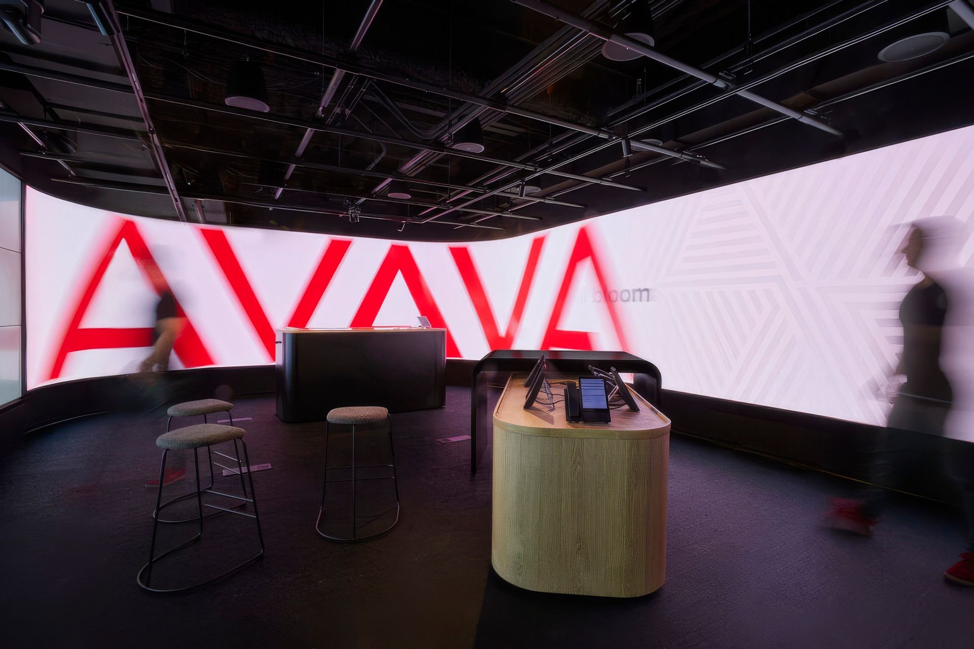
In the lobby of BHP’s headquarters in Perth, someone has just stepped off a flight after two weeks on site, red dust still clinging to their boots, heading straight into the office for a meeting before going home.
Designing for that moment became an unlikely starting point for Woods Bagot’s transformation of the company’s global offices overlooking Elizabeth Quay. The project spans 18 floors and 40,000 metres in the city’s tallest building, yet its ambition is disarmingly human. It asks how a workplace can feel equally welcoming to someone arriving from a remote mine site as it does to those who work in the city every day.
“This whole project was about the significance of belonging and connection within the BHP community itself,” shares Woods Bagot principal and architect Eva Sue. “They were very keen on making sure that there was equity between employees, and that drove a lot of the design decisions.”
That idea of connection and equity arrived at a pivotal moment for the organisation. After a decade in the tower, changing work patterns and a post-pandemic shift in workplace culture meant the company needed something different. Floors were consolidated into a tighter footprint of 18 levels, and rather than move to a new building, the decision was made to remain where they were.
The choice had immediate environmental consequences. Retaining the existing building delivered an estimated 35% reduction in carbon compared with a typical new build workplace. From there, the design team pushed further. The finished fitout achieved a six star Green Star rating and diverted 97% of construction and demolition waste from landfill. Elements of the previous interior were carefully audited, repaired and repurposed wherever possible
Yet sustainability was only one layer of a much larger story.
“The idea was about celebrating the people and places at the core of BHP operations,” Eva says.
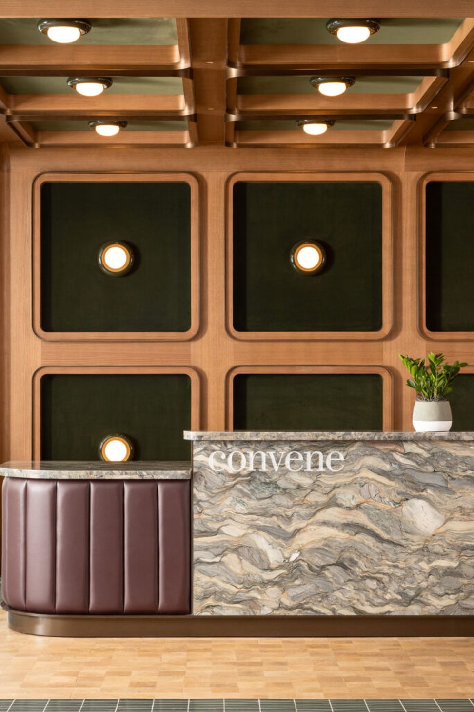
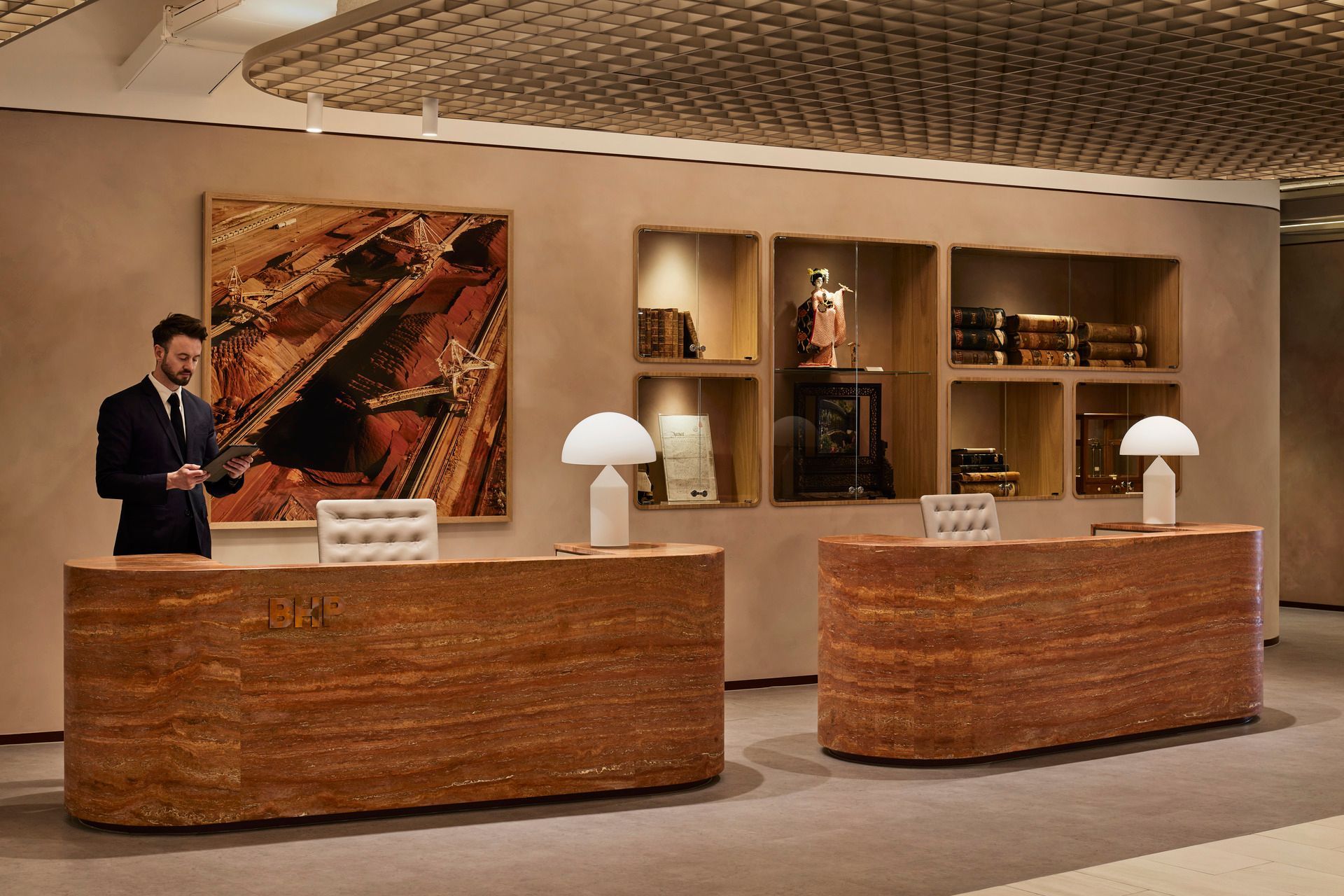
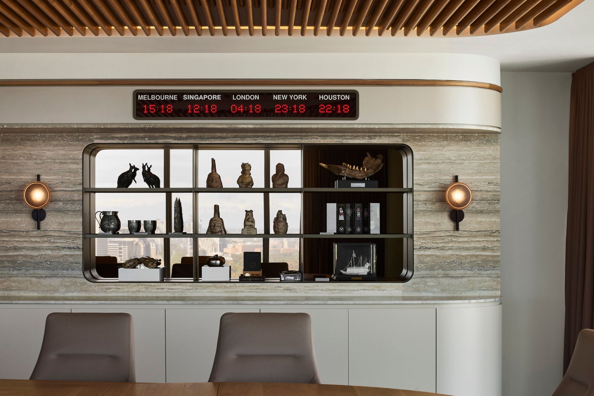
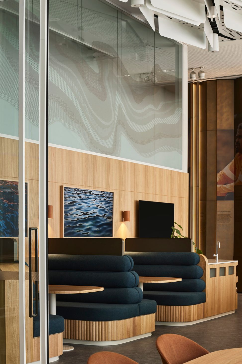
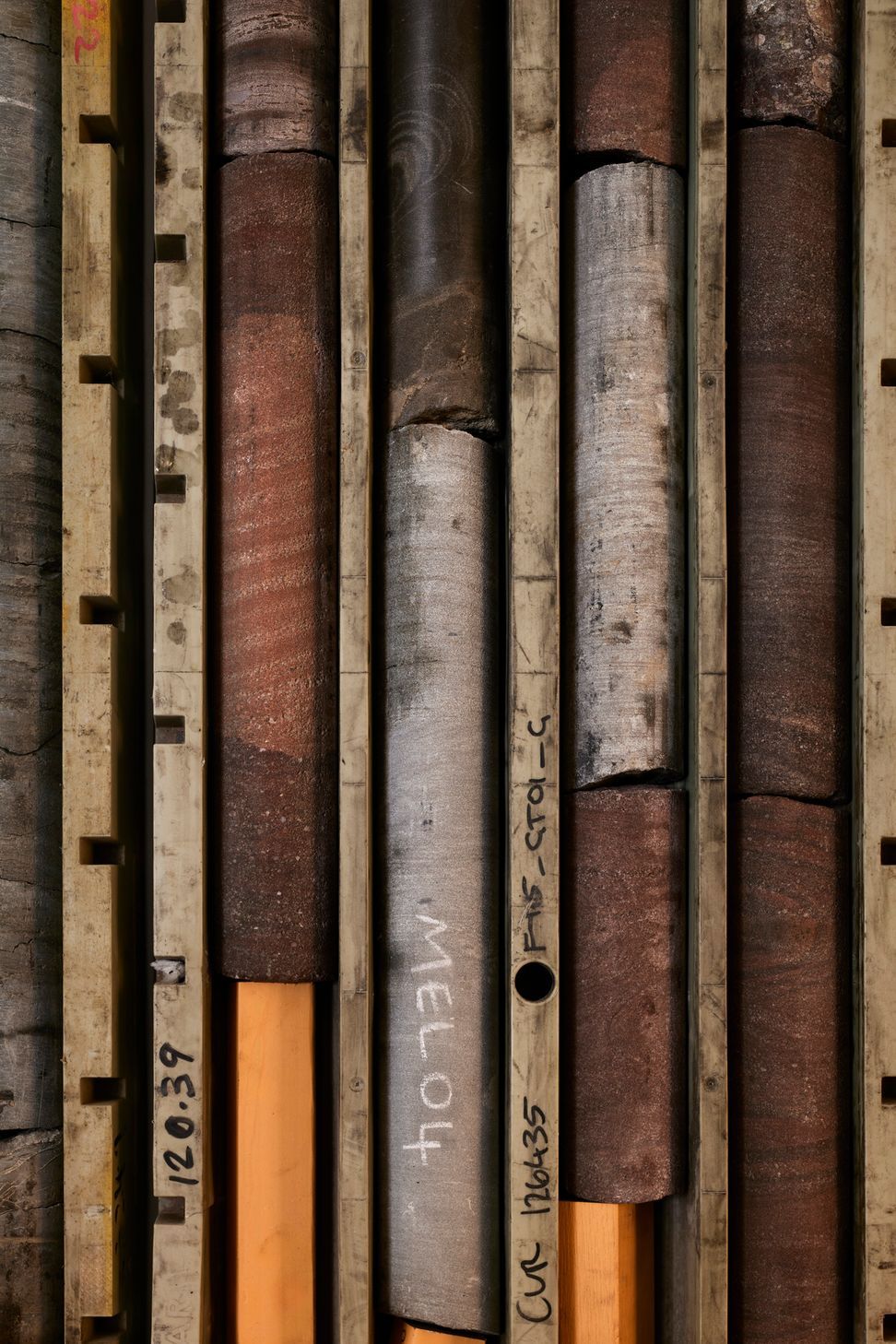
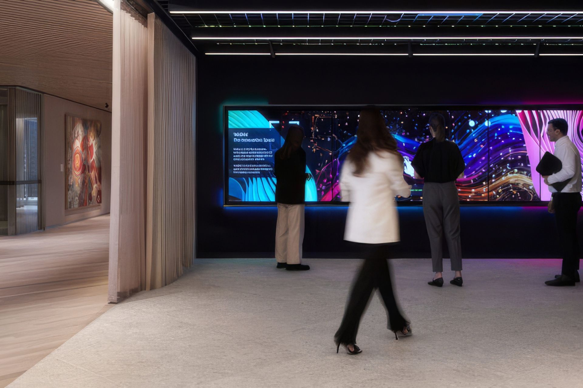
Photographs taken on site by workers themselves became part of the creative starting point. Vast skies, iron-rich earth, machinery and landscape informed a palette that moves between rusted reds, mineral blues and softer tones of country. At a macro level, the design team spoke about four themes. Site, country, port and city. These threads guided the organisation of the workplace and its material language.
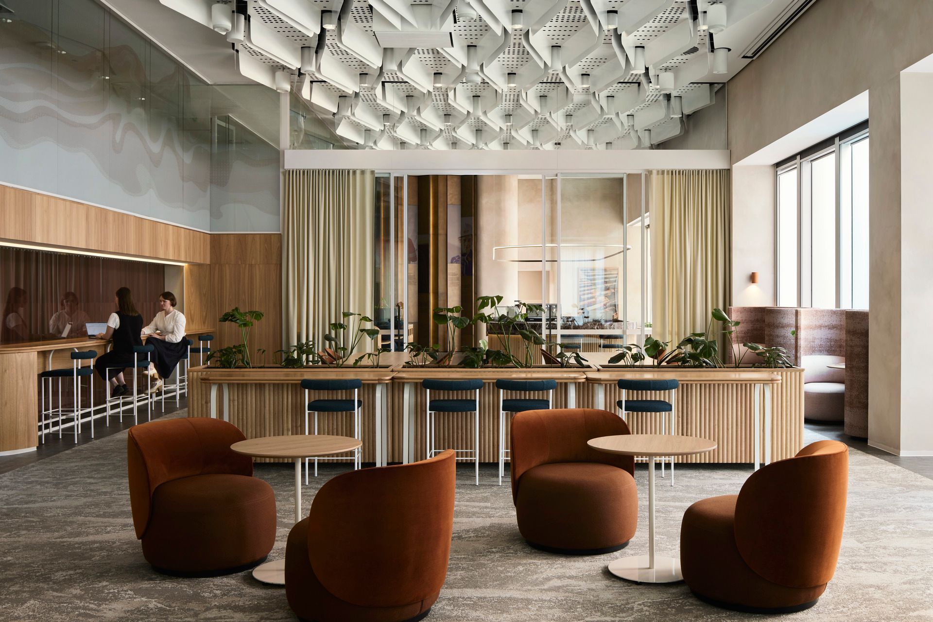
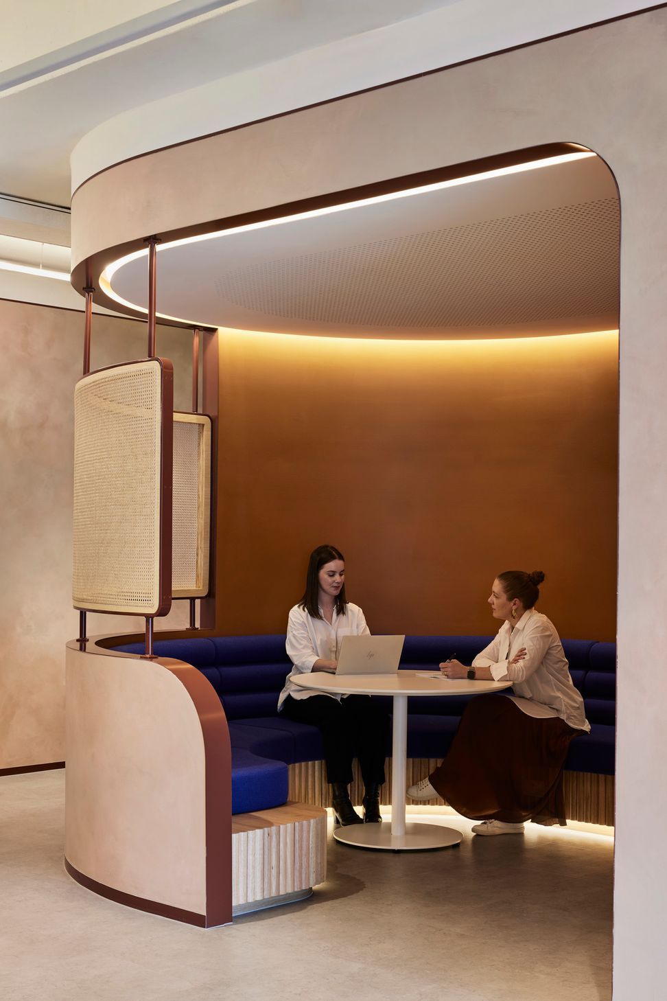
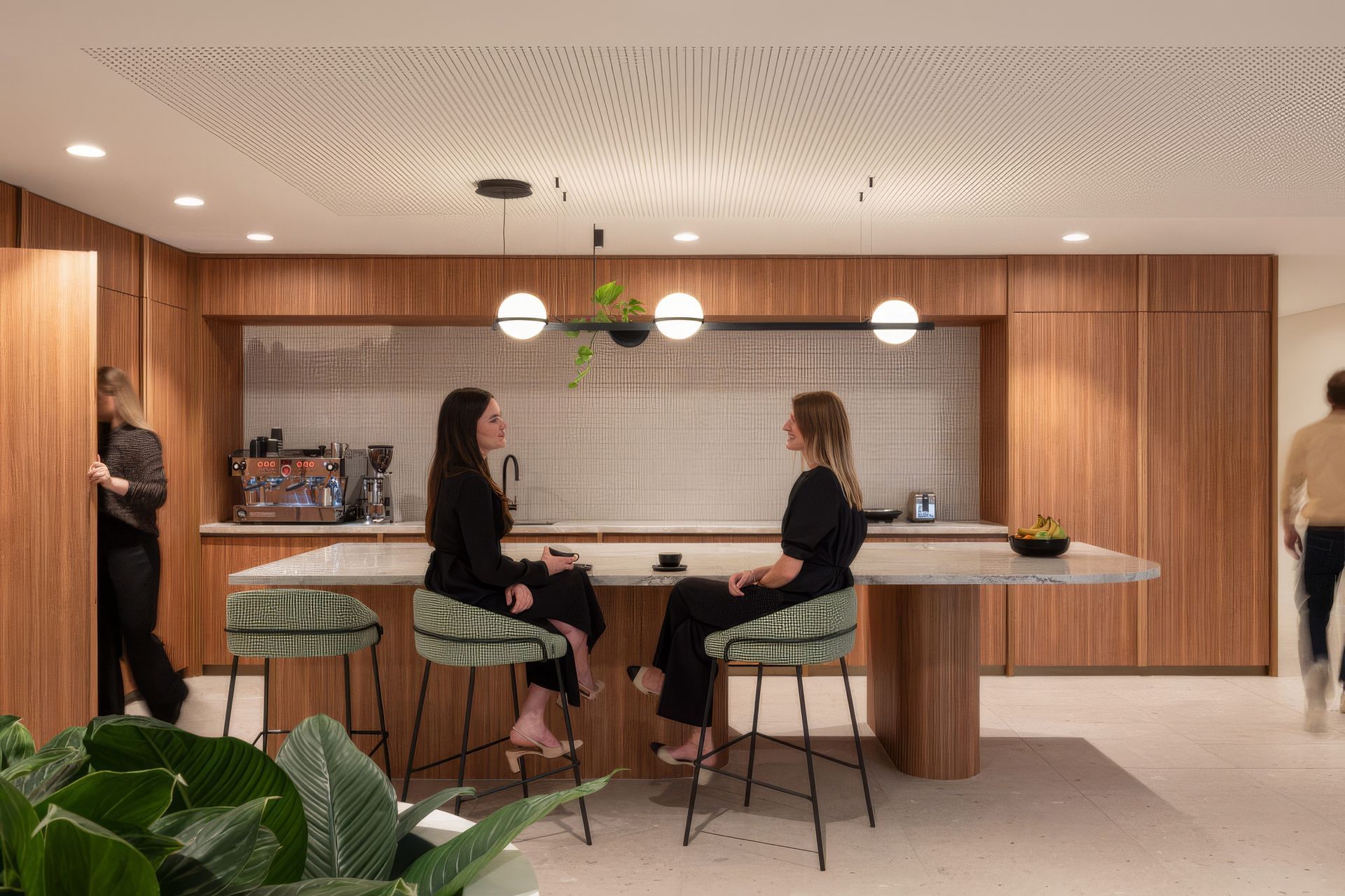
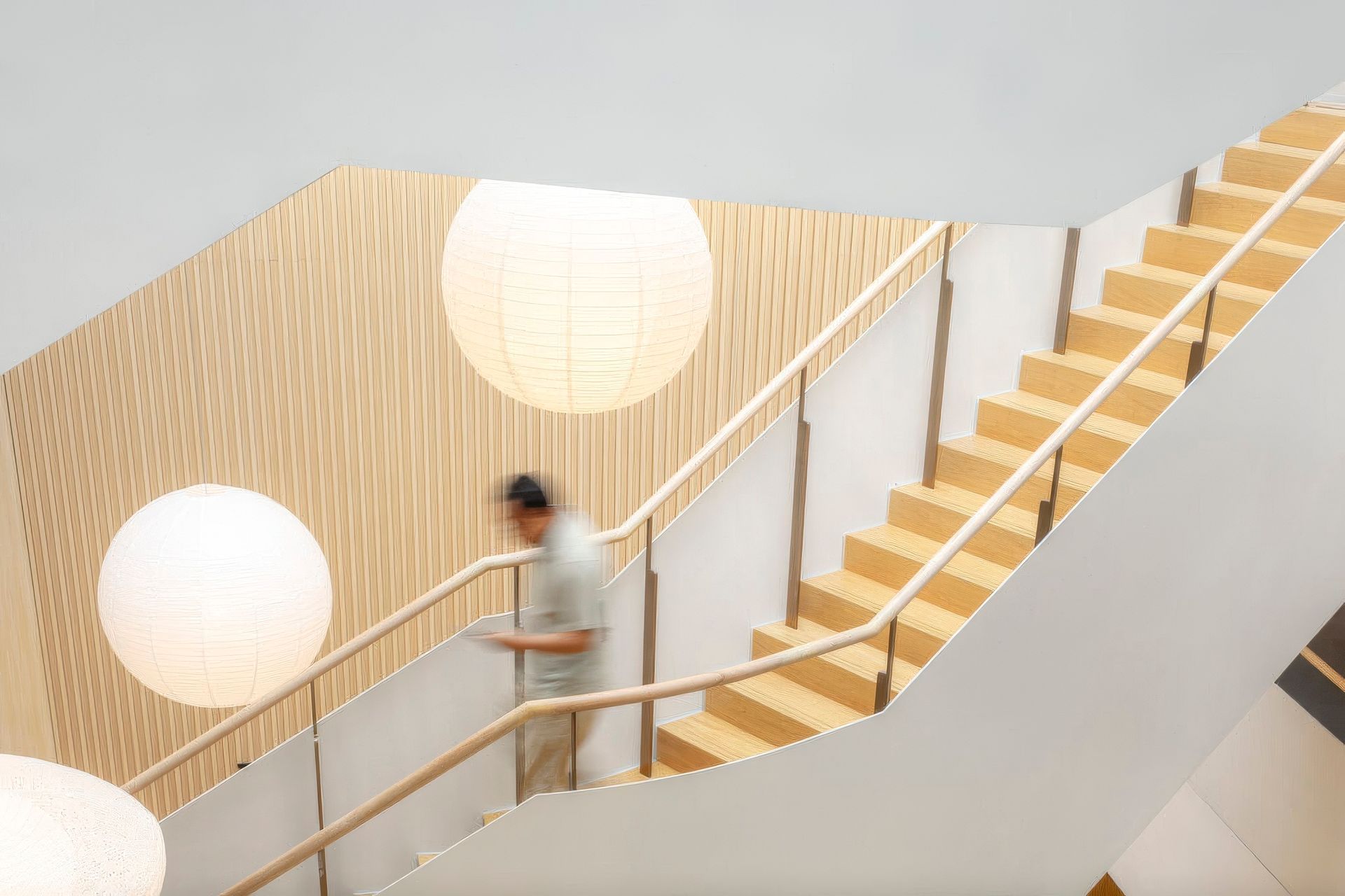
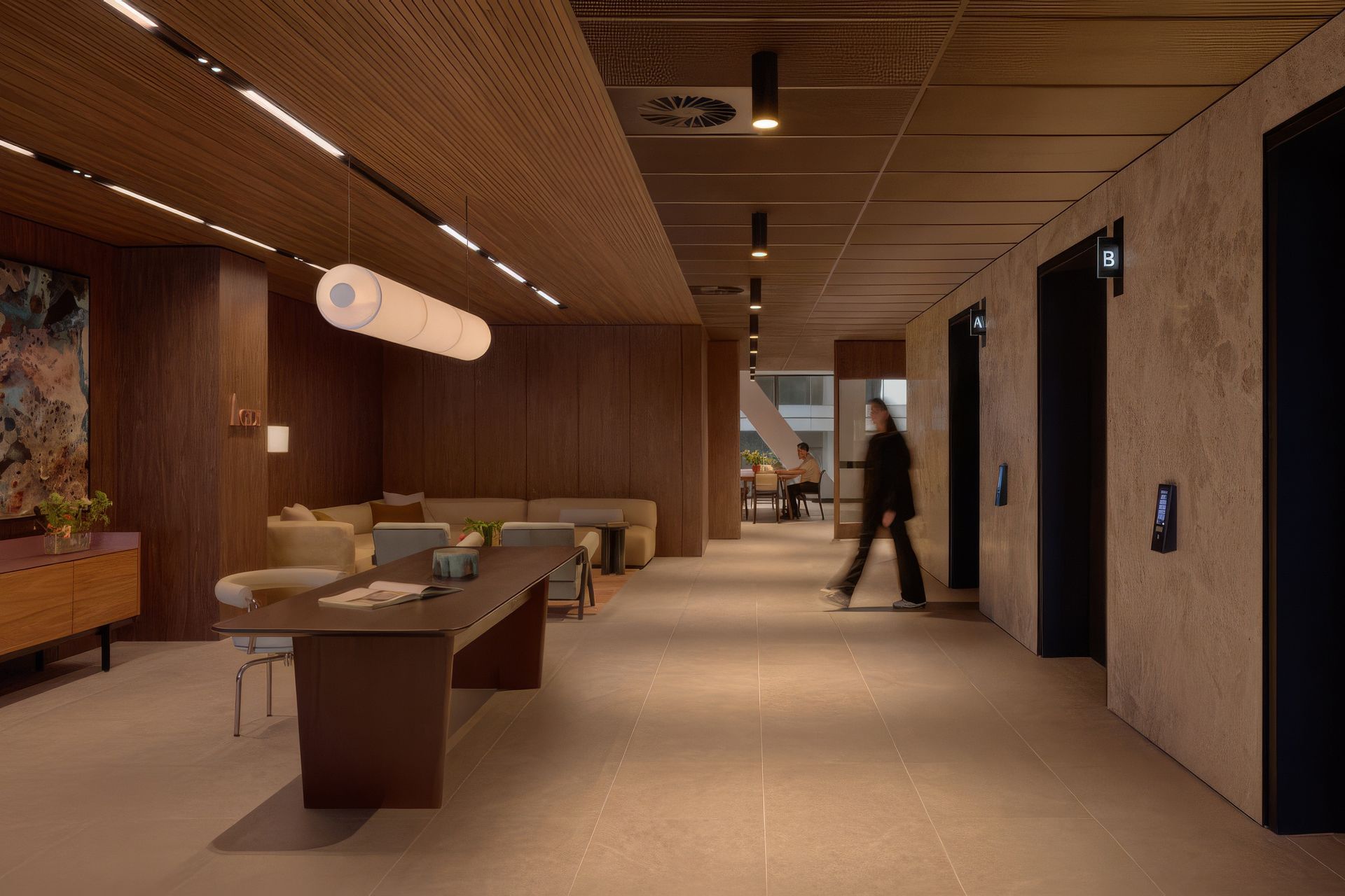
To create a logic across the 18 levels, the building was reorganised into a small vertical neighbourhood. The floors are divided into four villages, each containing a mix of active, quiet and social spaces. Every village includes a generous kitchen known internally as a crib space, a reference borrowed directly from mining sites. Staff move easily between floors using a network of internal stairs that thread through the tower, encouraging chance encounters and informal collaboration.
Architect Ashleigh Lyford describes the logic behind the planning. “We moved the arrival floor to the middle of the stack on level 34, then introduced new stairs from the lower floors —28 right up to 34—and then down from the high-rise levels as well, so that employees can move through the floors without using the lifts, which can get quite congested.”
The top floor, level 45, then became the social heart of the building. Once an underused upper floor, it now hosts wellness rooms, lounges, meeting areas, a library and spaces for town hall gatherings. Curtains can open the large communal zone or soften it into quieter corners. Workers arriving from remote operations can spend an entire day there if needed, surrounded by daylight and views stretching past Kings Park toward Rottnest Island on the horizon.
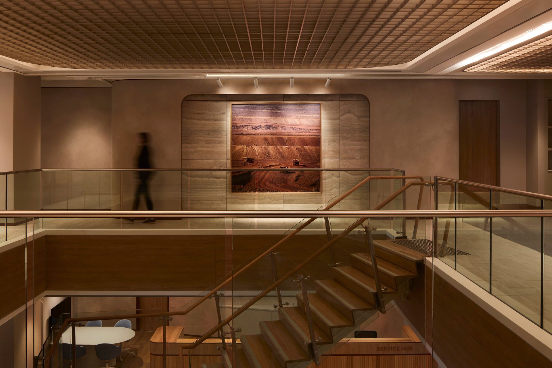
Throughout the project, the team balanced sweeping gestures with deeply considered details. Old internal stairs were retained and reworked with timber handrails and integrated lighting. One stair was carefully dismantled and repositioned to improve circulation through the centre of the floor plate. Even small pieces of the previous fitout found new lives. Laminated locker fronts became hidden structural noggings inside new partitions. Shards of reclaimed jarrah floorboards were transformed into wayfinding elements designed in collaboration with Studio Ongarato.
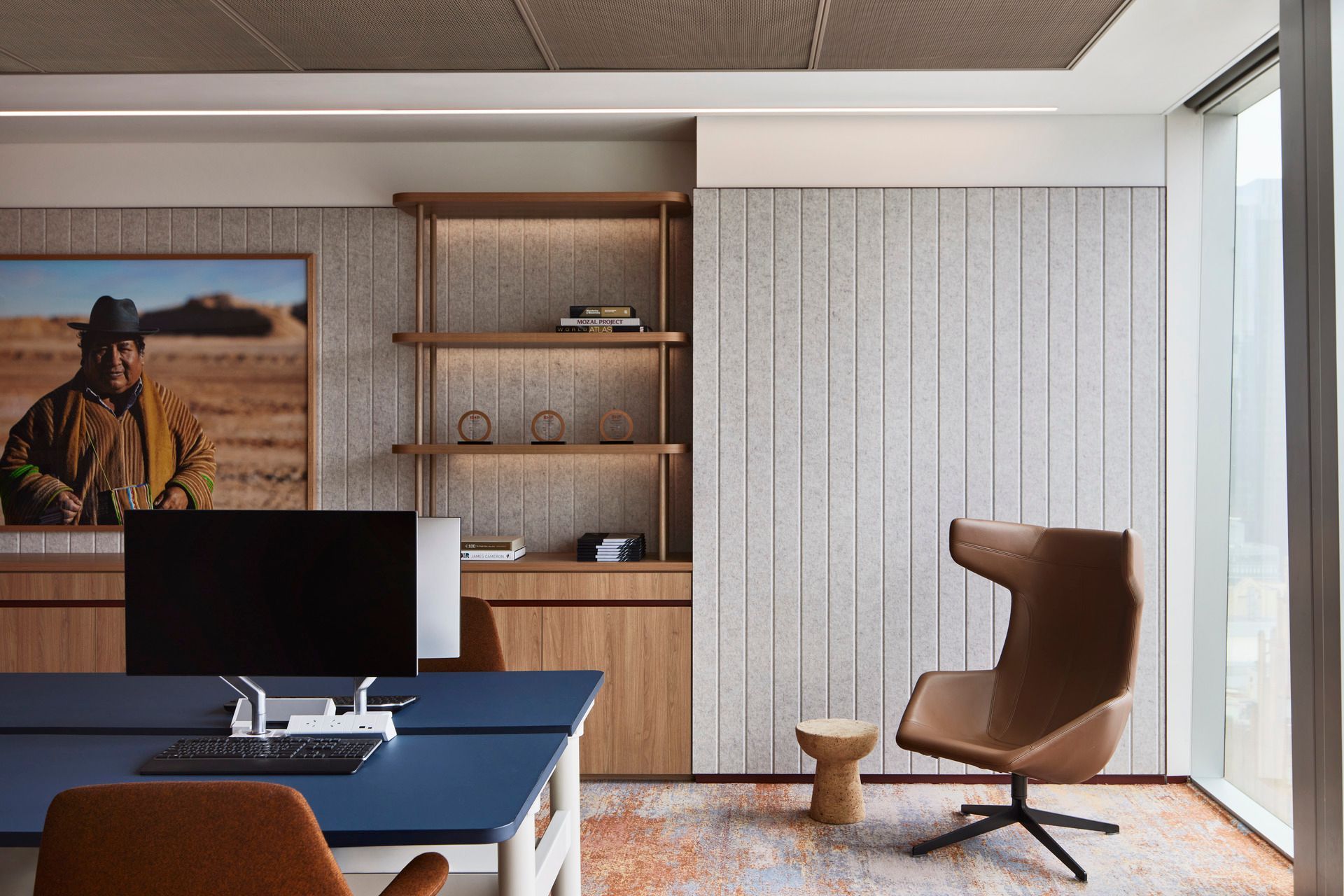
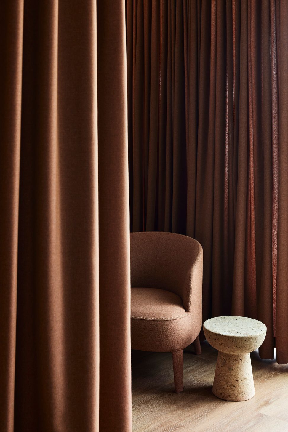
Within the spaces, there was a deep consideration for human-scale moments: the feel of a bespoke timber handrail; the way flooring organically shifts underfoot as you cross into another zone; and how carefully considered planting softens borders and creates privacy. Anything that people touch and feel was treated with high attention to detail and materials were chosen for their tactility and resilience in the workplace setting.
“We had to have a very, very rich palette,” shares Eva. “At an early schematic design presentation the client actually said, ‘Wow, this is the most sophisticated use of colour and texture that we've ever seen in an office building!’”
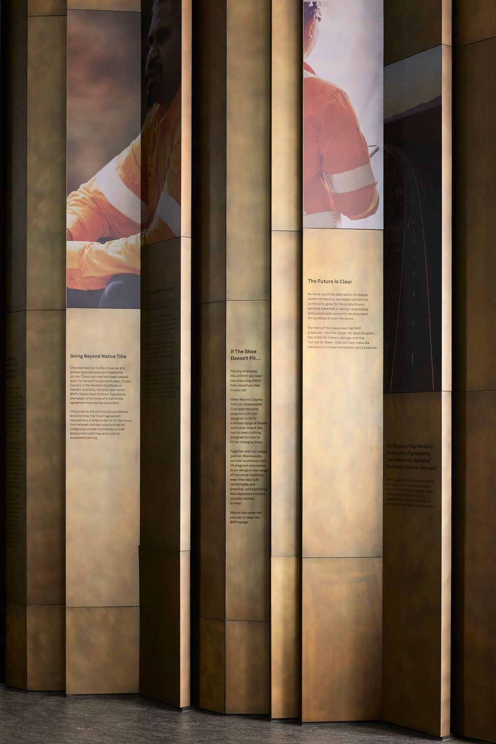
Art also plays a powerful role. Western Australian artist Chris Pease created suspended karlis shaped like birds, painted with markings drawn from family iconography. Nearby, a monumental rug translates one of his paintings into layered fibres, colours and carved textures that stretch across the floor.
The material richness is grounded and tactile, chosen to work just as well for someone arriving in steel-capped boots as for someone stepping in from a boardroom.
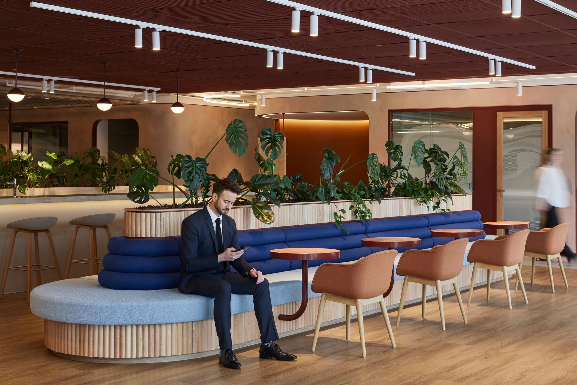
Carpet tiles are laid in shifting patterns that signal subtle transitions between collaboration areas and quiet zones. Perforated screens define intimate corners while allowing daylight to pass through deep into the floor plates. Mature planting softens the edges of the workspace and was grown in advance so that the interiors felt alive from the moment staff arrived.
The result is a workplace that is both expansive and personal. At any point across the 40,000 square metres there are moments of retreat, conversation, concentration or pause.
Perhaps the most important response has come from the people using it every day. Staff and visitors speak about the atmosphere before they talk about the architecture. Eva says they describe it as warm, familiar and unexpectedly comfortable.
“People say they feel comfortable in the space and they do not quite know why, and that sense of familiarity is exactly what we were hoping to achieve.”
Words: Joanna Seton
Backed by a ten-year history of co-authorship and collaboration, client and designer have an established relationship of trust and understanding, working together on the brief for the workplace refurbishment.
“Forged through a decade-long partnership built on mutual trust and respect, our ongoing collaboration with BHP has been integral to shaping our approach and driving the success of every project,” says design lead and Woods Bagot Regional BHP Leader Emma Smith.
“Beginning with a deep understanding of BHP’s values, global standards, and operational methodologies, we seamlessly align our efforts and vision from the outset.”
‘Brave’ was the keyword that guided the team for the Melbourne headquarters, beginning with the reduction in the overall workspace from five to two-and-a-half floors. The smaller space needed to support a weighty brief, with themes emerging from stakeholder engagement including: connection to site, embedded sustainability, and respect for diversity and inclusion.
The Melbourne headquarters represents a unique proposition as the only Australian BHP office with no associated asset within the state. Consequently, the HQ needed to forge a sense of connection to the land through the interior design, with the textural and tonal scheme representing an abstraction of the geologies and striation of BHP’s sites.
“It was about creating a connection to site through the spatial design and material palette,” says senior interior designer Simone Lockley.
“When we talk about connection to site in Melbourne, it’s about connecting to the global business and ensuring people who are typically CBD-based can engage with what the organisation is doing on the ground through the design.”
The resulting space is a poetic expression of physical land sites, legible in the subdued, earthy tones, soft detailing, and organic inserts. W-B worked with branding and wayfinding experts Studio Ongarato, who built on the brief and created flamed copper room signage and privacy decals inspired by cartographical patterns.
The planning strategy was based around organic forms that sit in the middle of the floor plate, creating a meandering circulation path to mimic the topography of the land, as well as providing legible, inclusive paths of travel,” says Lockley.
Forms and finishes have been pulled from the terrain, with the colour palette drawing inspiration from BHP’s global portfolio of commodities. The textural painted walls by local artisans Scanlan and Makers are hand-applied with a satisfying terrestrial quality to evoke the tones of the earth, while the cooler contrasting blues and greens of upholstery and joinery evoke the metal oxidisation process.
“One of the successes of our Melbourne office is how well the design reflects BHP’s assets, mission and core values, expressing our brand identity through the interior design,” says BHP’s Principal for Design, Property and Workplace Kylie Holton. Employee safety and wellbeing are BHP’s highest priority, both onsite and off, and this is reflected in the warm and transparent interior plan with dedicated wellness spaces for retreat and quiet reflection.
Storytelling was an important part of the design narrative, and the space serves as a repository for memoranda and materials, both from site and from the...