About
Tunnel House.
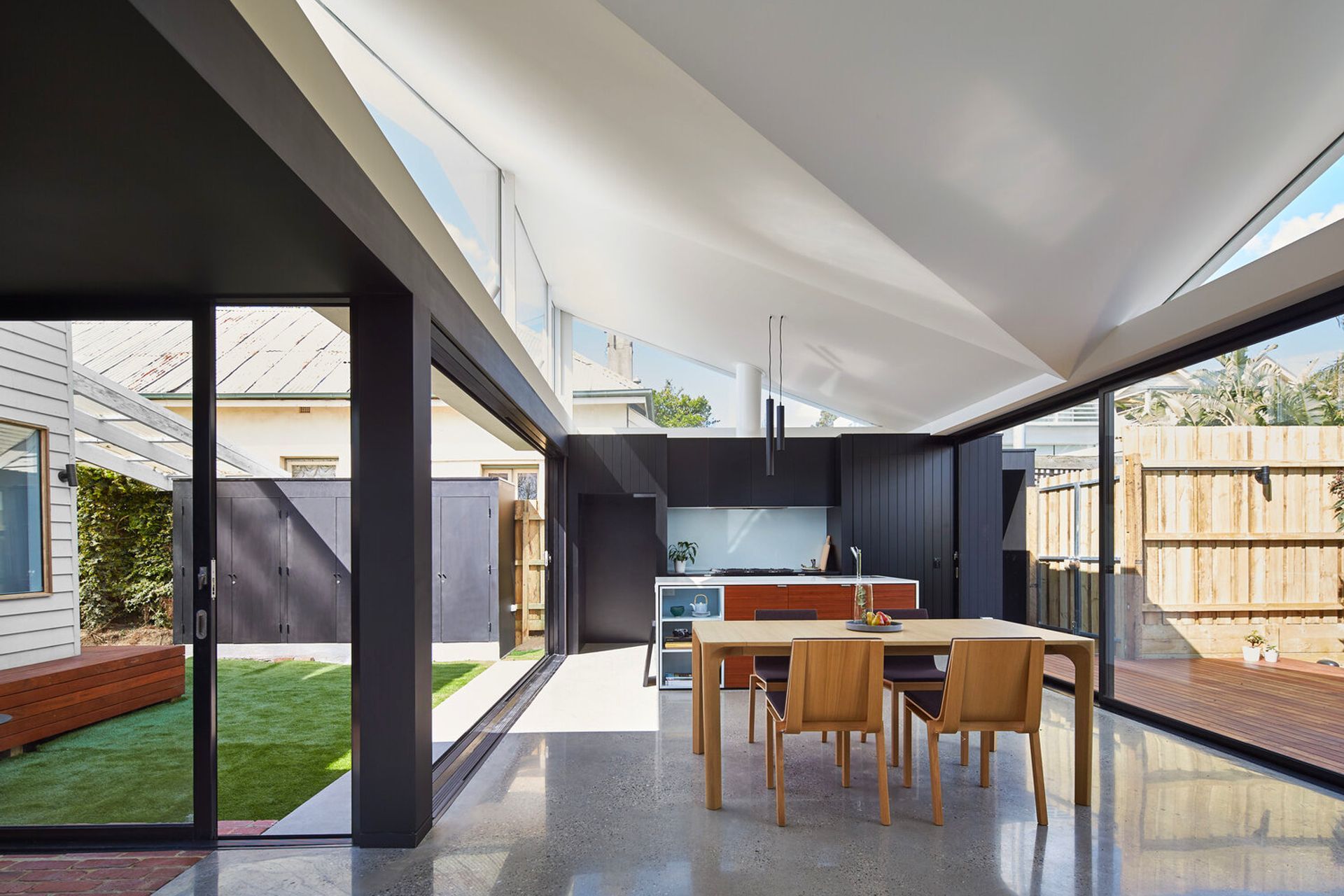
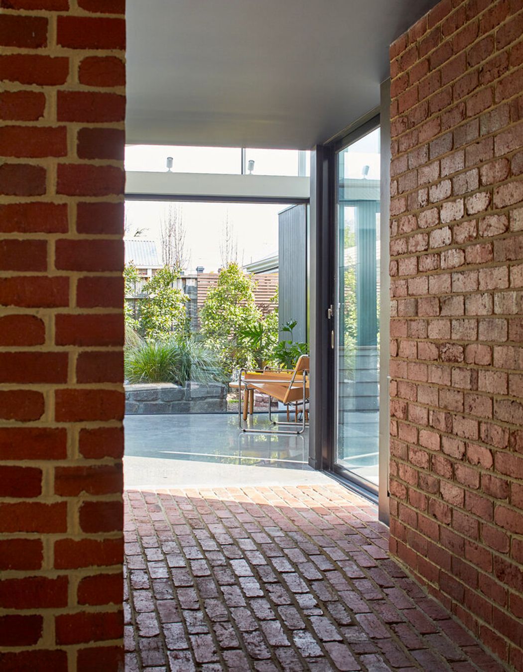
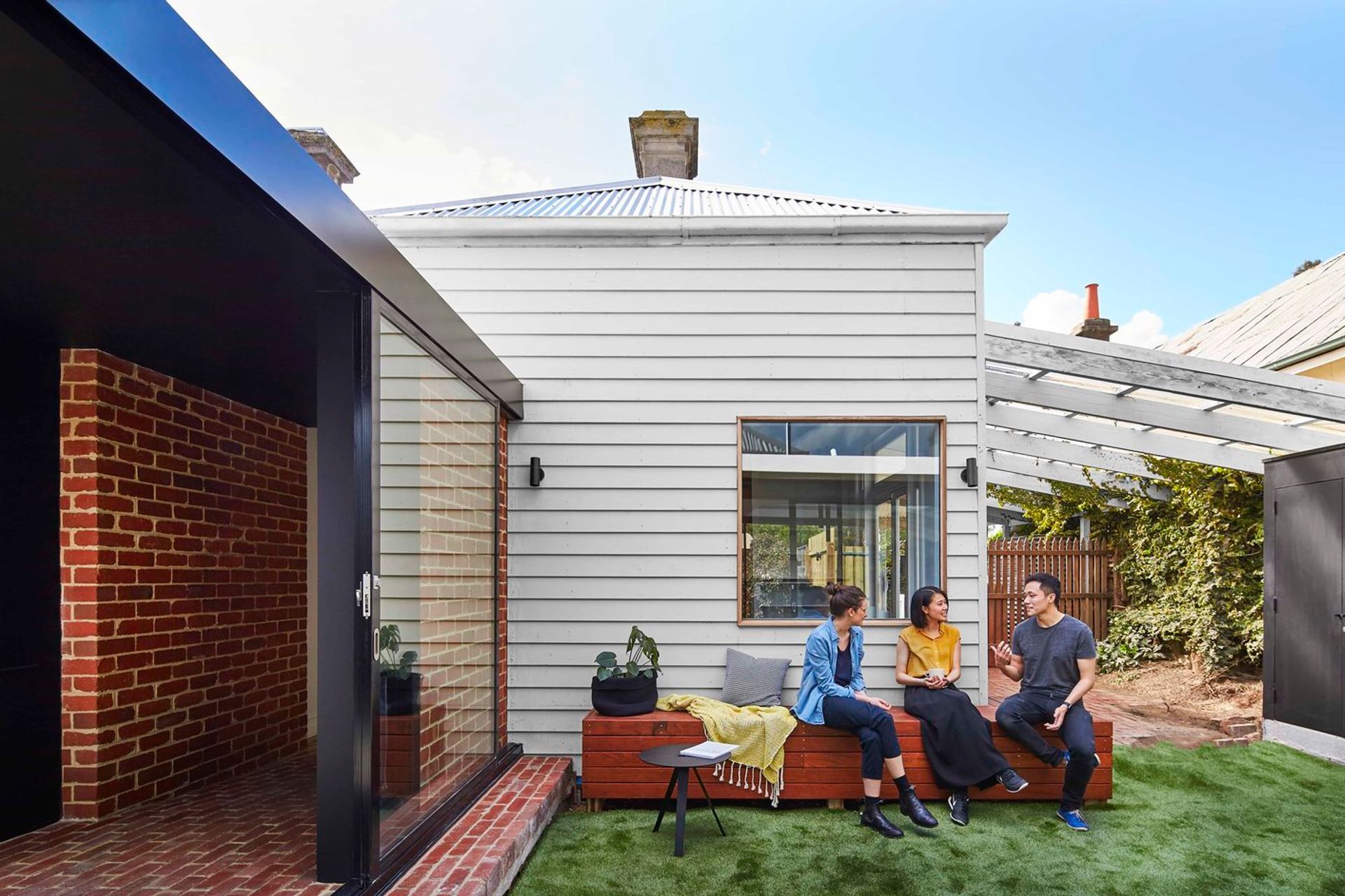
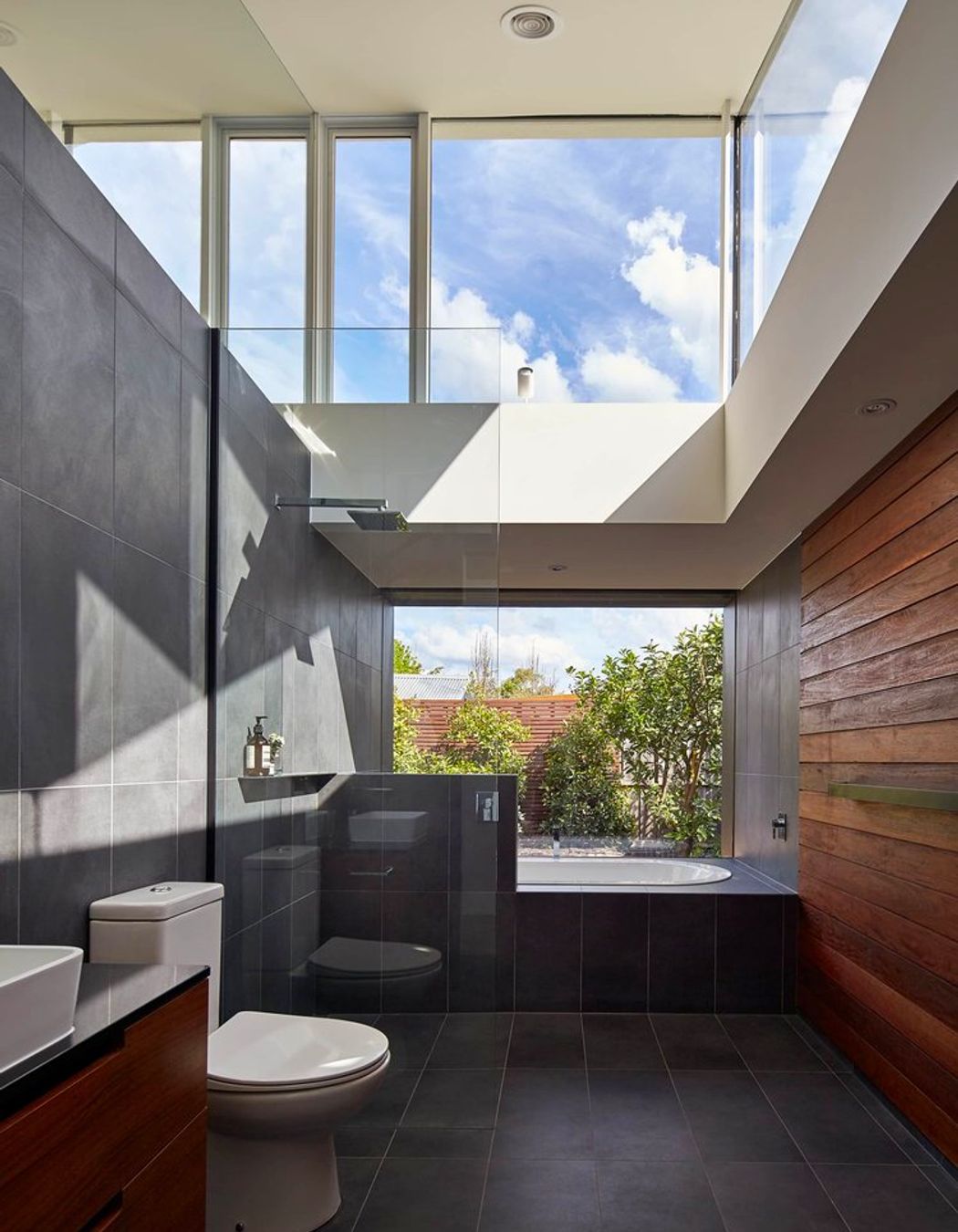
ArchiPro Project Summary - A transformative renovation of a double fronted cottage in Hawthorn, featuring a new standalone living area that enhances natural light and connects seamlessly with the garden, creating a harmonious indoor-outdoor living experience.
- Title:
- Tunnel House
- Architect:
- Michael Ong Design Office
- Category:
- Residential/
- Renovations and Extensions
Project Gallery


Views and Engagement
Professionals used

Michael Ong Design Office. Michael Ong graduated from the University of Melbourne in 2009 with a Masters of Architecture.
Michael Ong has won the Intergrain Timber Vision Award for Peppercorn House (residential category), has been named in Italian Architectural Journal CASABELLA as one of its international architects under 30, The Guardian listed Michael as one of the upcoming architects and is the SOYA Award winner for the Architecture and Interior Category.
Michael’s work has been published both nationally and internationally. Most notably, his conceptual silo regeneration work in MARK magazine, Dwell Asia ( where he was selected as one of the seven experts to discuss the future of design), Monument and HOUSES magazine to name a few.
Michael Ong Design Office is an award winning architecture studio based in Melbourne, Australia.
Our design process is driven by a strong focus on quality and the benefits of good design. A process which is grounded by thoughtful design ideas and rigorous analysis of site, context and brief.
Our buildings create spaces to form intimate and highly responsive connections between its landscape, building and inhabitants. We are excited by the simplicity and beauty of everyday spaces and objects, and we explore concepts that turn the ordinary and common into rich, textured and expressive.
At every scale, we greet each project with an open mind and our innate sense of design curiosity to realise buildings that are enriching and inspiring. We always collaborate with our clients brief and budget to realise a thoughtful, unique, complete project.
“Michael’s first home shows a real feeling for space and materials. His silo project and in particular his experimental kitchen is indicative of his need to explore design.” – Brian Zulaikha [former president of Australian Institute of Architects and director of TZG Architects]”
Year Joined
2023
Established presence on ArchiPro.
Projects Listed
10
A portfolio of work to explore.

Michael Ong Design Office.
Profile
Projects
Contact
Project Portfolio
Other People also viewed
Why ArchiPro?
No more endless searching -
Everything you need, all in one place.Real projects, real experts -
Work with vetted architects, designers, and suppliers.Designed for Australia -
Projects, products, and professionals that meet local standards.From inspiration to reality -
Find your style and connect with the experts behind it.Start your Project
Start you project with a free account to unlock features designed to help you simplify your building project.
Learn MoreBecome a Pro
Showcase your business on ArchiPro and join industry leading brands showcasing their products and expertise.
Learn More


