A warm and welcoming family home oozing elegance and charm
Written by
06 November 2023
•
4 min read

Right next to Centennial Park, this grand family home nestled in the eastern suburbs of Sydney features the stunning detailing of its Queen Anne legacy, and a history to match.
In the early 1920s, the original owners decided to add a grand ballroom for their five daughters to be married in, which became one of the key spaces to transform when the house recently underwent a contemporary renovation.
The project, undertaken in collaboration with MCK Architecture, and built by Sydney Beach Homes, sought to blend the contemporary spaces with the home’s historic bones, and features an injection of colour and texture that brings vibrancy, integrating the new interiors with the existing spaces.
Ann King Design was introduced to the project to work with the architects to bring colour to the interior and exterior, add soft furnishings throughout, specify joinery and floor finishes and consult on feature lighting.
Designer Ann King had worked with the owners of this property on their previous home, and when the time came to renovate, expand and update this home, the owners once again engaged Ann's services.
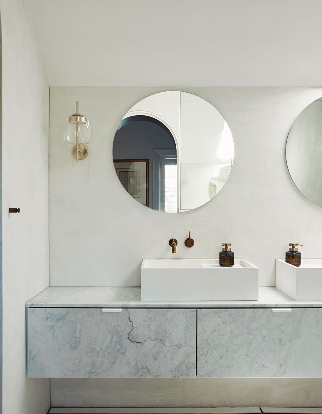
"The home was well-kept and loved, in very good condition, but it needed an injection of colour, a bathroom upgrade and an improved footprint," says King.

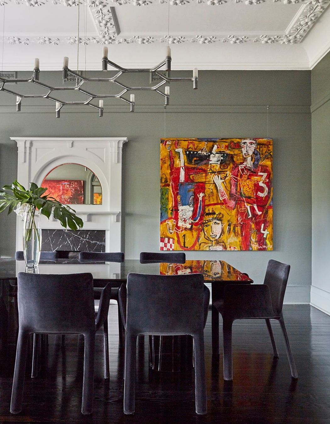
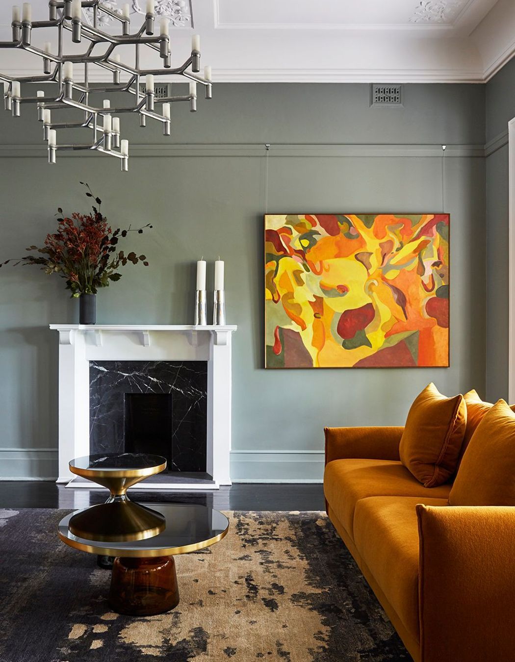
The home needed to support the busy lives of the young family and facilitate ease of living and functionality. The floorplan was adjusted to accommodate new rooms, a change that resulted in a generous four-bedroom, five-bathroom home with a formal dining area, kitchen, servery, butler's laundry, informal and formal living areas, a children's retreat, separate studio apartment and a triple garage.
Colour was the crucial starting for each space, and the clients weren’t afraid of pushing the envelope.
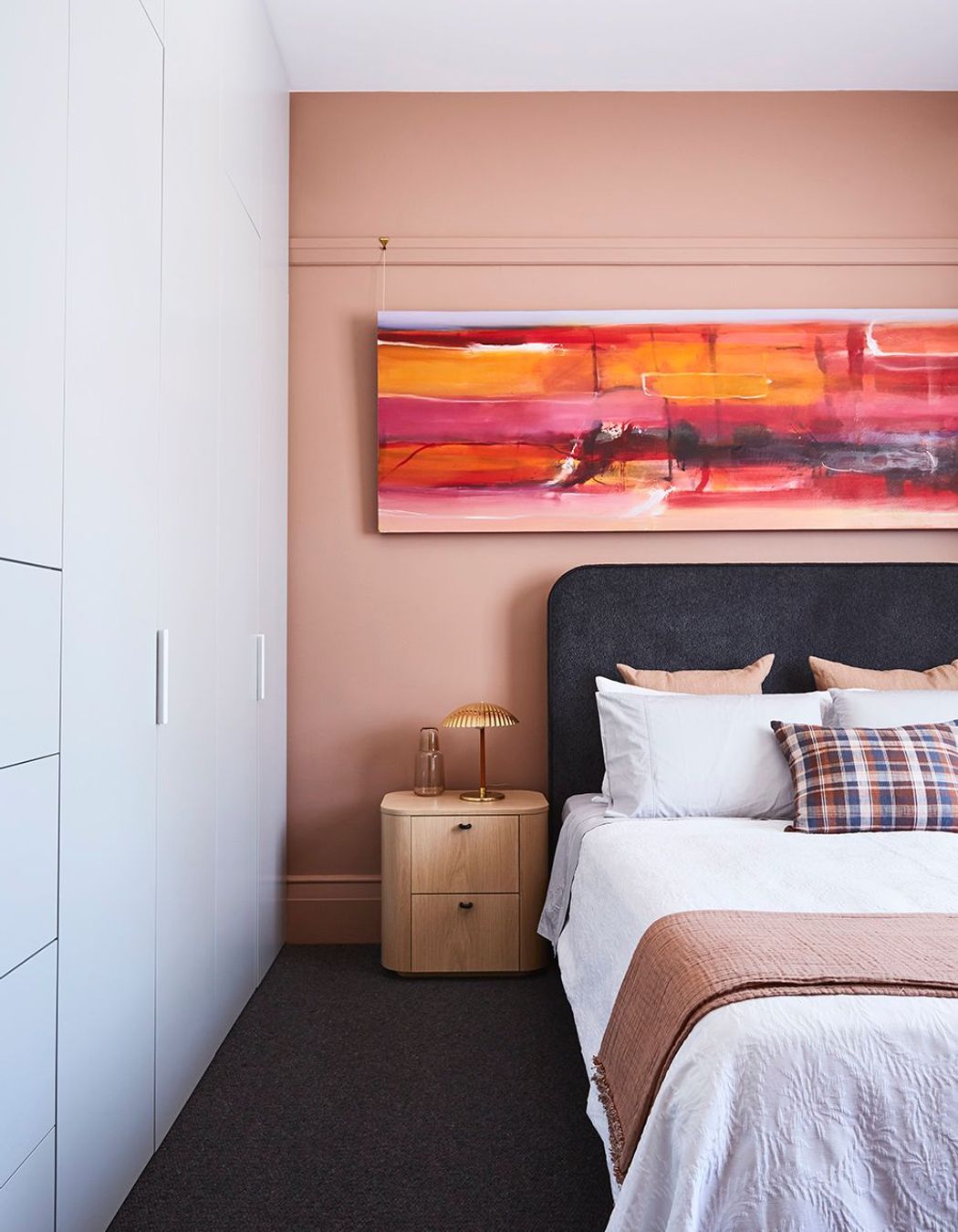
“The owners didn’t want a cold, grey and white home. Rather, the colour needed to set a backdrop for the client’s amazing art collection which was vibrant and varied,” says King. “The scale of some of the pieces also added drama to areas and focal points for decorating furniture and colour in the related space.”
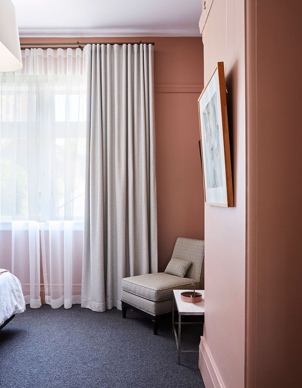
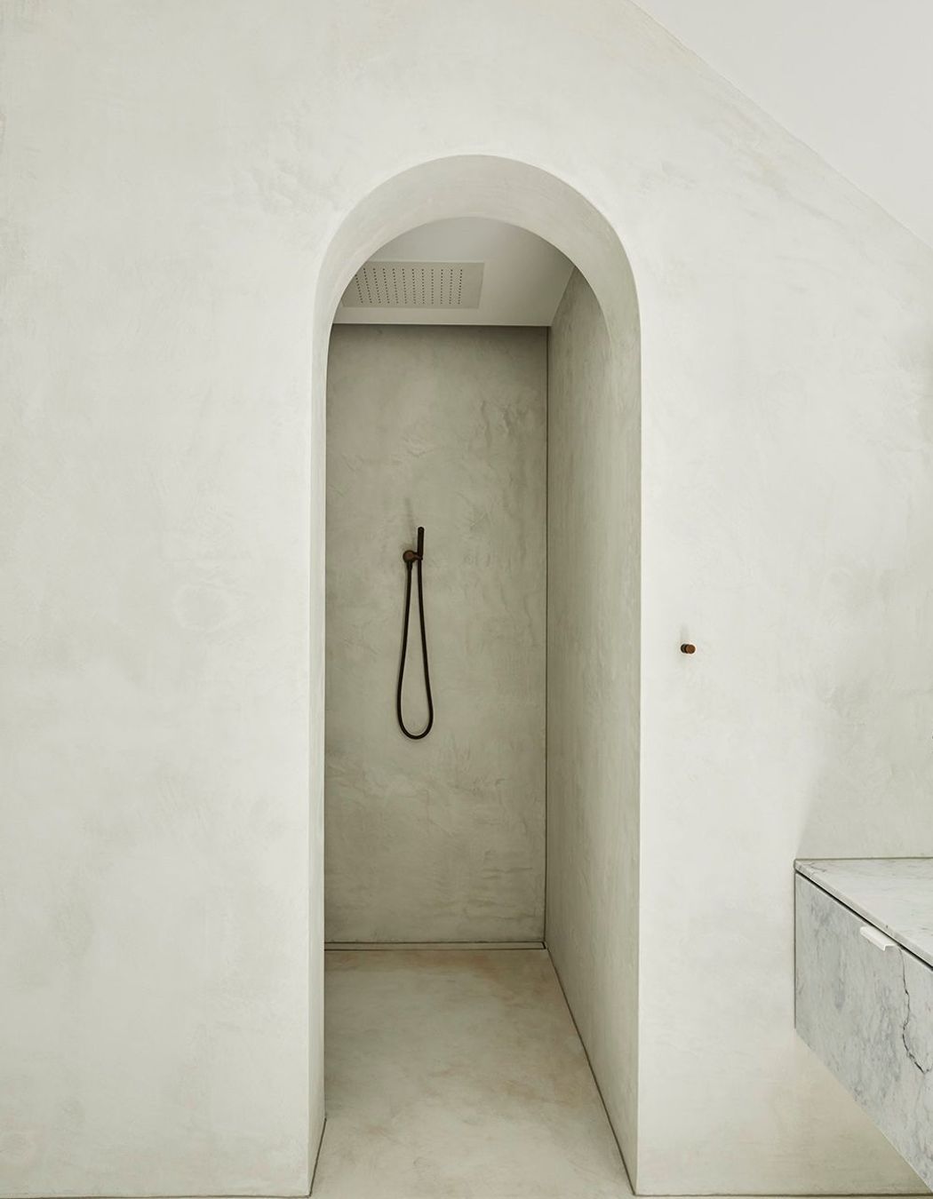
King selected a matte colour palette of burnt oranges set against green-grey walls, both of which offset the base arrangement of earthy hues and black. Concrete elements appear throughout and ground the design scheme, and furniture was chosen around the various uses of the spaces.
The clients' art collection and the unique architectural shape of the home largely influenced the tone King set out to achieve; curves are reflected in furniture, while monochromatic or neutral joinery and surfaces were given interest through the use of tactile materials.
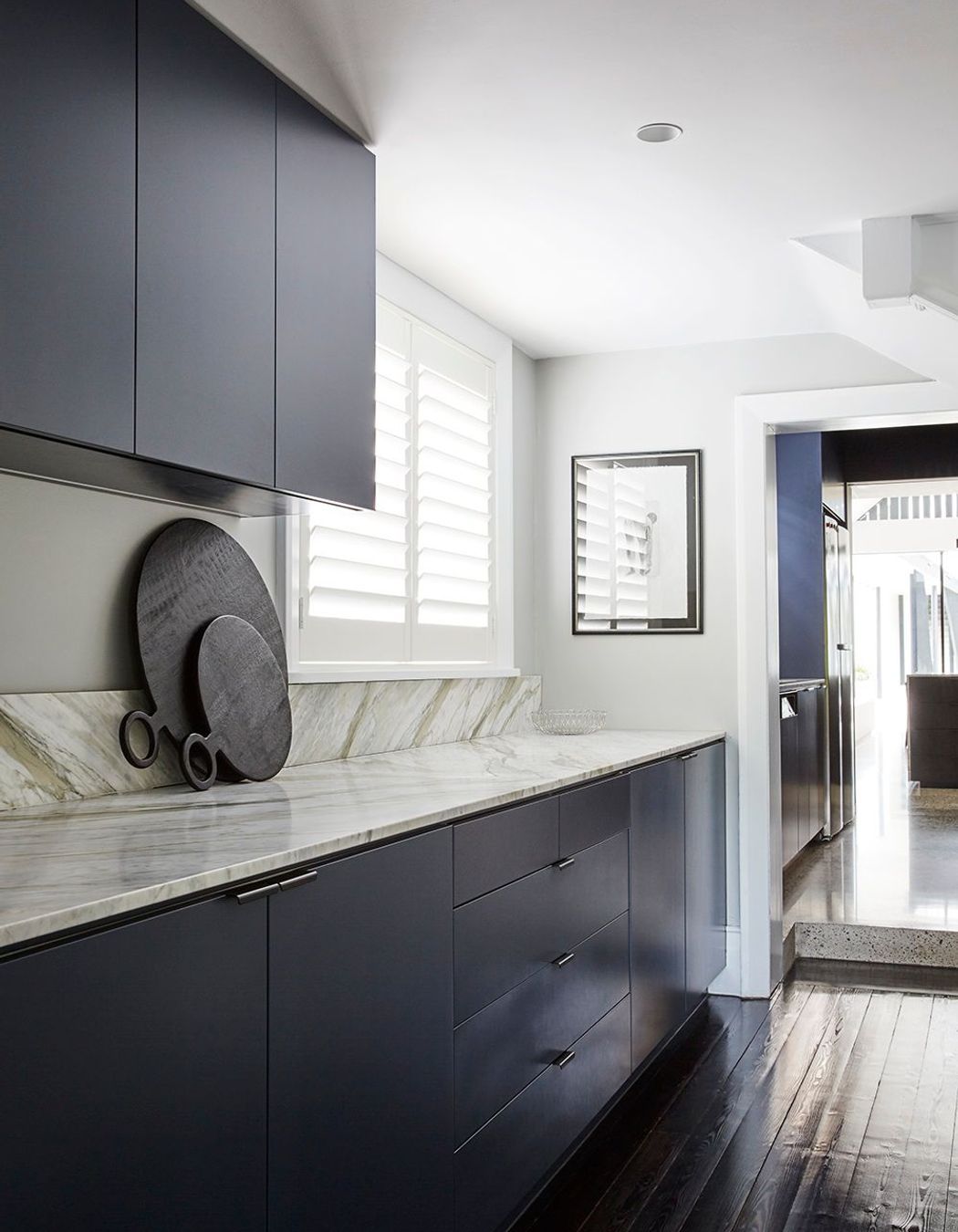
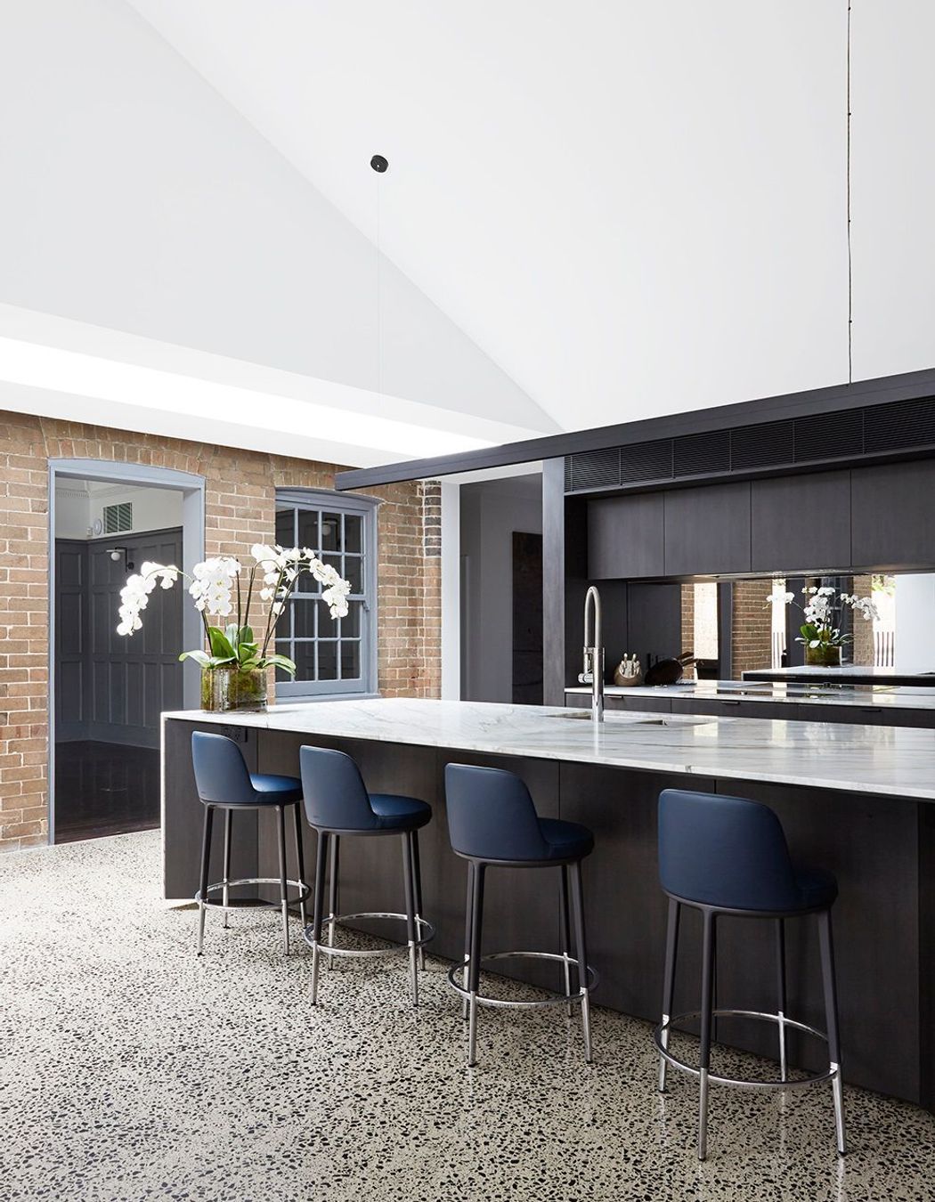

In the family lounge, which was once the ballroom, a curved upholstered sofa was commissioned to suit the proportions of the room, and was designed to stay looking neat, while reflecting the curves in the domed ceiling above.
Whereas in the formal lounge, a more glamorous feel was desired.
“We wanted a more opulent feel with glass tables reflecting the modern chandeliers, soft velvet sofas with an injection of colour to bounce off the green undertones in the walls, and plush seating that means guests will feel comfortable to stay and enjoy the space.”
Visual texture throughout was also key. A great example of this is the stunning 4.2 metre chandelier in the stairwell, custom-made by Yellow Goat Designs to inject a modern aesthetic into the traditional staircase.
This chandelier is one of Ann's favourite design features of the home, followed closely by the other lighting pieces. “The 32 lanterns and a recessed LED wash light over large-scale artworks hanging on the walls. Installation took two days, four people and a custom-built scaffold!”
The home’s design was so successful, the Sydney Beach Homes project was recently listed as a finalist in the Master Builders’ Association awards, but was particularly special to King because she enjoyed working with the client and architects.
“The architects were fantastic at transforming the various spaces while injecting a new life into the modern additions that respectfully nodded to the older part of the home. The home itself is grand in its proportions and the new spaces had a transformative effect on the older part of the home where we aimed to blend the old and the new: it was a perfect balance.”
See more work by Ann King Design on ArchiPro
