Explore the look: Stillwater Seven
Written by
27 September 2022
•
3 min read
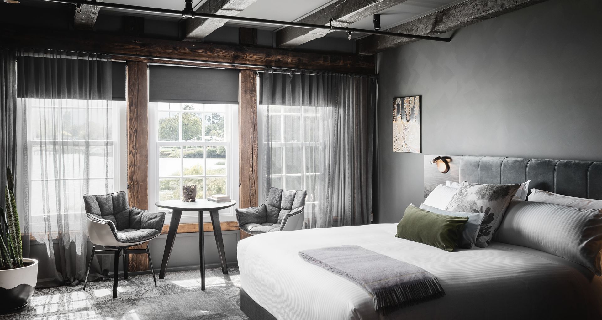
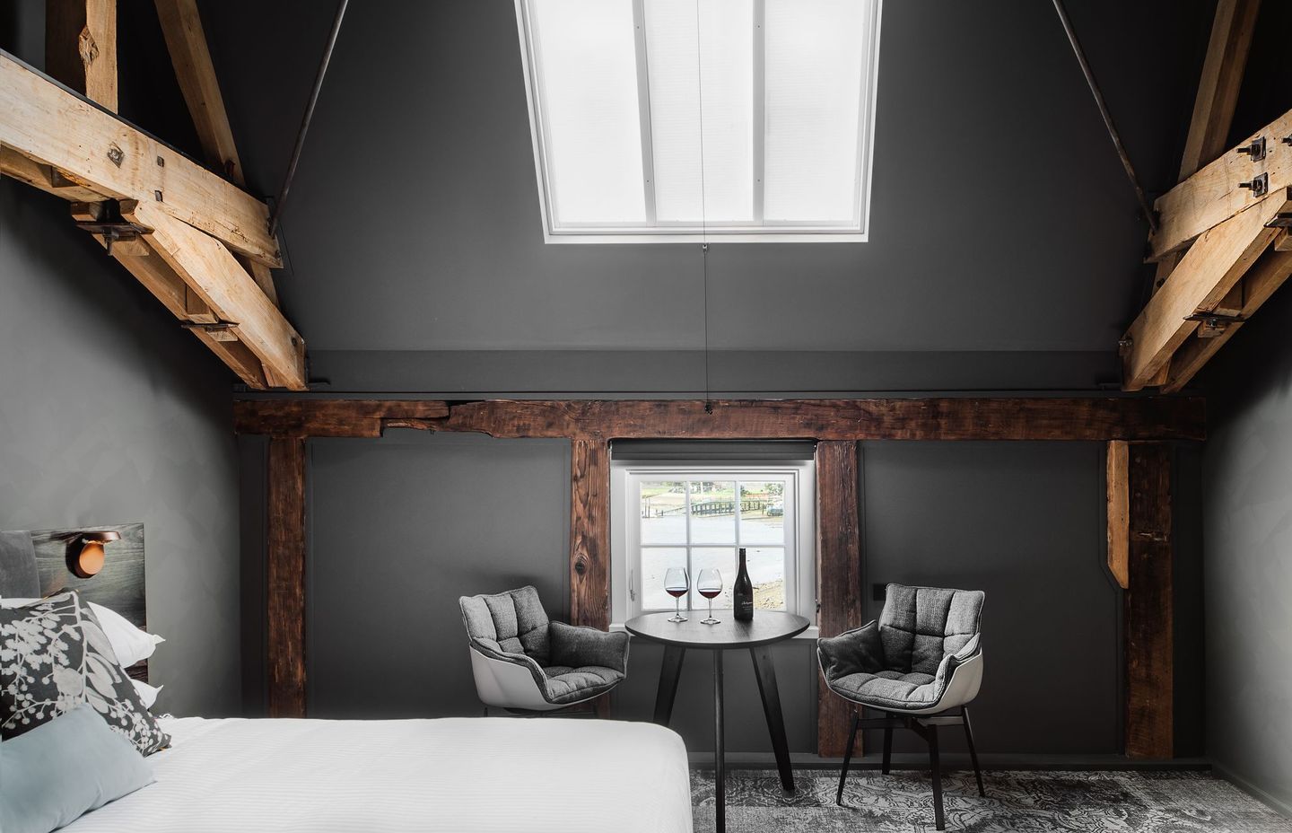
The land on which Stillwater stands is steeped in 200 years of Tasmanian history. Overlooking the Esk River and the city of Launceston, the flour mill-turned-hotel and restaurant was reimagined by architecture and design firm, Cumulus Studio, in 2019. The upper floors were transformed into seven luxury suites while the lower level is home to an award-winning restaurant, with careful consideration given to honouring the heritage of the property.
To acknowledge the property’s survival of a major fire and two centuries of Tasmania’s harsh weather, the concept of regeneration led the design approach. Corrugated iron and oregon trusses that had escaped the fire feature throughout, while a rich palette of raw timber, deep colour and tactile finishes reference the landscape of Australia's island state. Guests will find custom-made A.H Beard beds and bespoke furniture by Simon Ancher in each suite.
Lessons in design
Apply these decorative techniques to your own home or project to recreate your favourite elements of Stillwater.
Make a statement with carpet
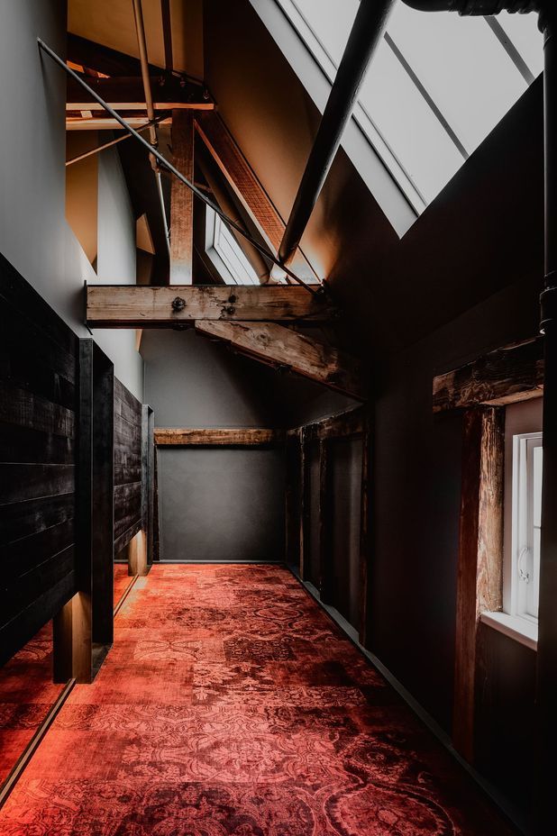
When carpeting a space, many decorators’ first instinct is to opt for something neutral. However, Cumulus Studio chose to make a statement by framing bold red carpet as the hero design feature. To successfully recreate this effect, ensure walls and ceilings are kept to a single colour and decorative elements reduced to a minimum.
Establish a sense of youth with colour
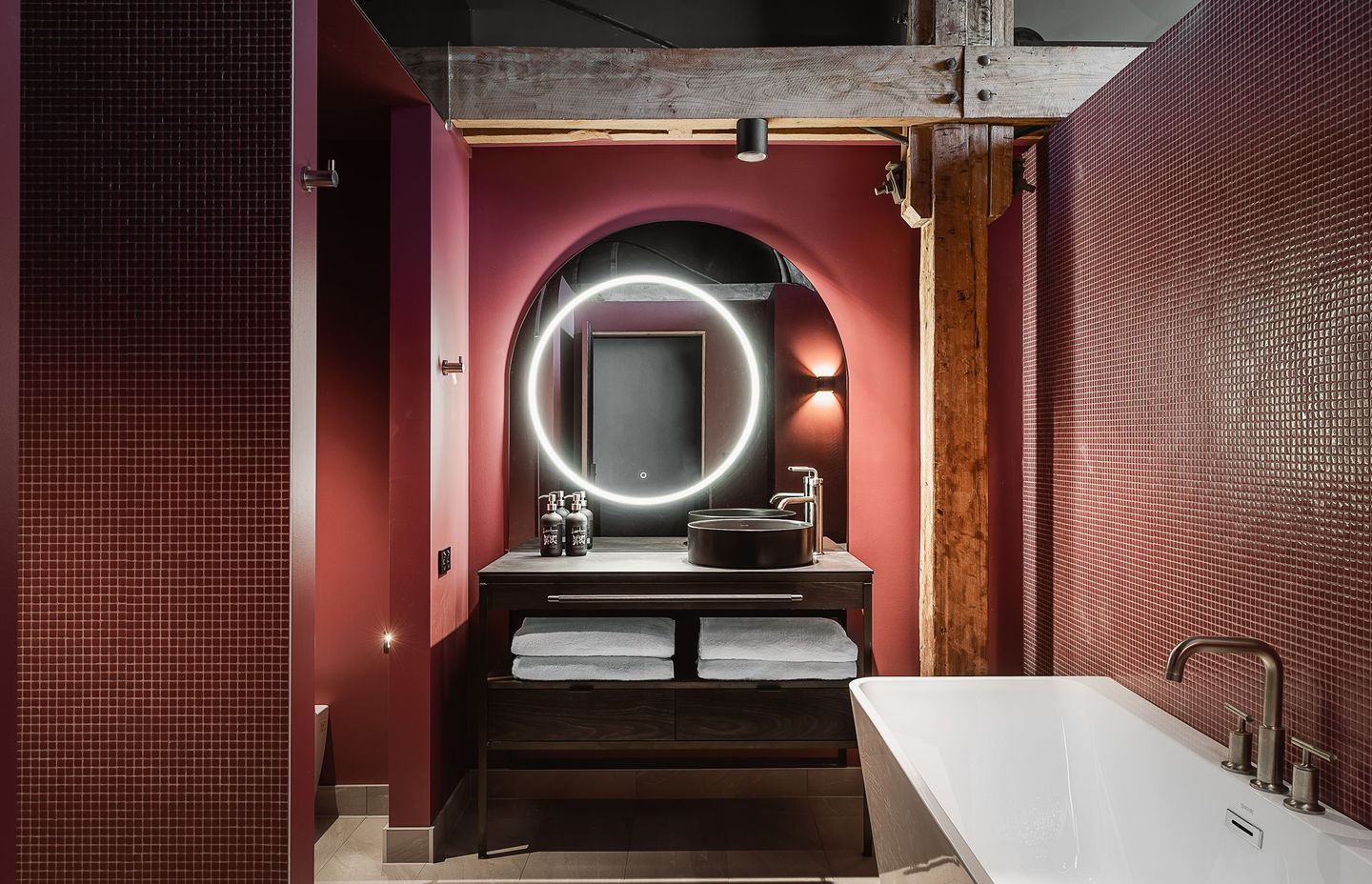
Any interior dressed entirely with unexpected colour is a delight to behold. At Stillwater, the bathrooms are dressed entirely in green or pink, only the vanity and existing timber beams deviate from the rule. Using colour this way feels fresh, young and fun. Get the look at home by matching your wall and ceiling paint to your tiles and tapware.
Use dark colours in smaller spaces
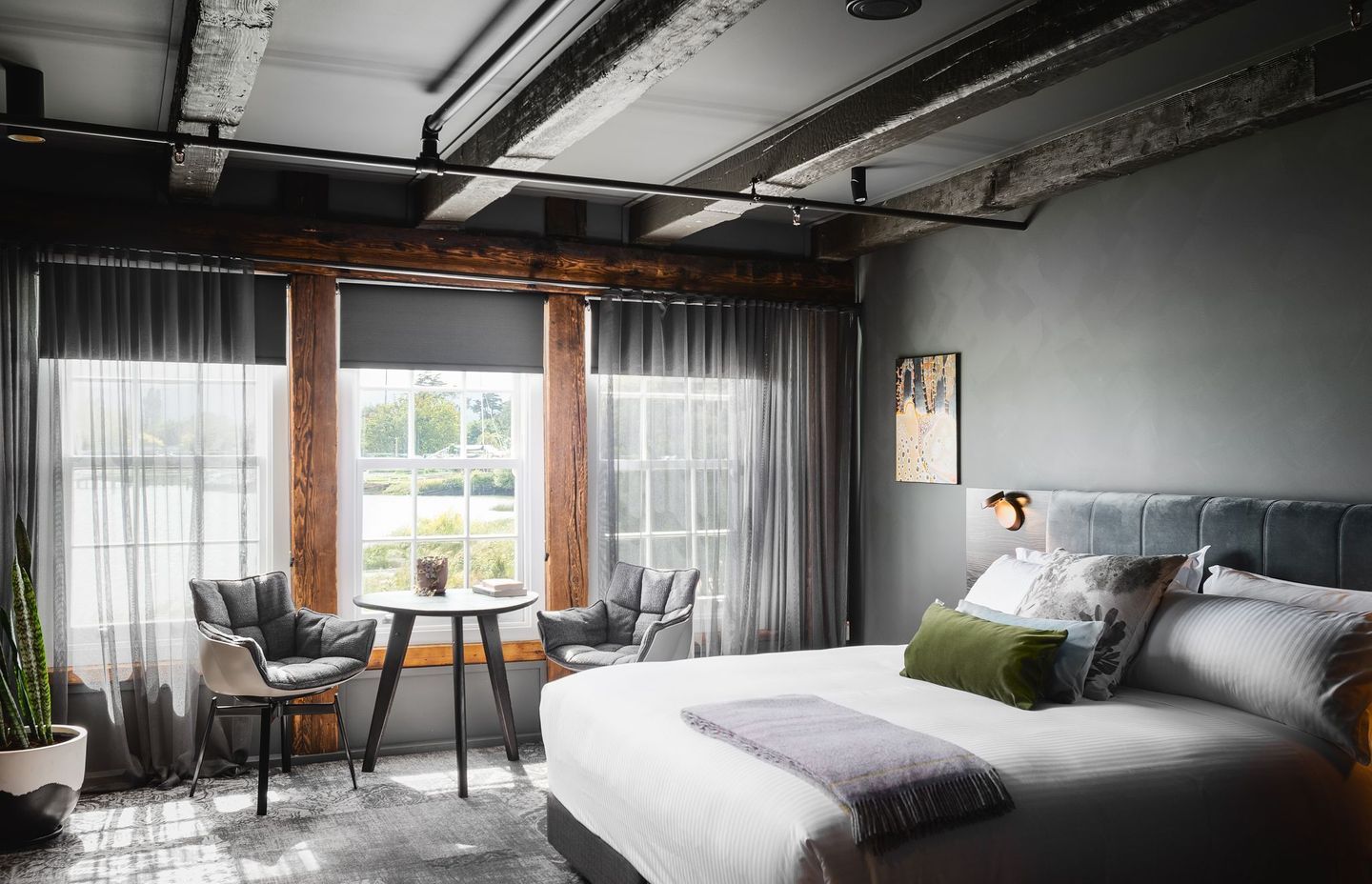
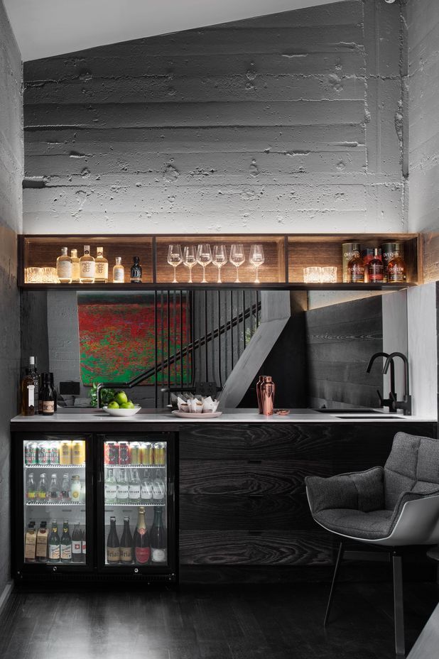
Many designers will advise homeowners to white-wash small rooms to create the illusion of space, but a similar effect can be achieved with dark colours – with the added bonus of creating a cosy atmosphere. The trick is to ensure the walls, ceiling, flooring and furniture upholstery are all the same hue. This allows the furniture to visually recede into the background, while the walls seamlessly flow into the ceiling, establishing a sense of height and space.
Shop the look
Feeling inspired? Consider introducing these gorgeous products to your own home to create a similar interior scheme.
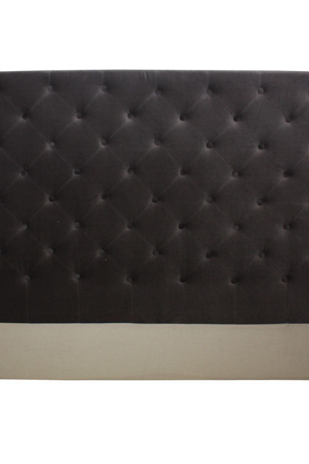
A plush velvet bedhead is a versatile bedroom piece that sits well in French, country and contemporary interior design themes with ease.
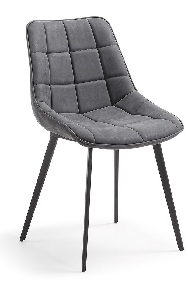
Upholstered for comfort and designed with timeless appeal, this rounded chair can function as a dining or desk chair.
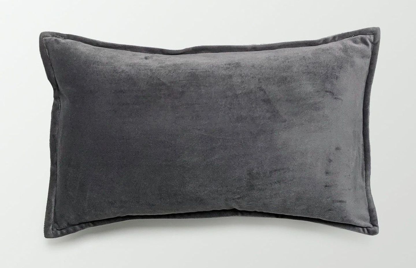
No bed or sofa is complete without a few throw cushions. Elevate a simple rectangular shape by selecting a cushion with opulent tactility, such as velvet, wool, leather or suede.
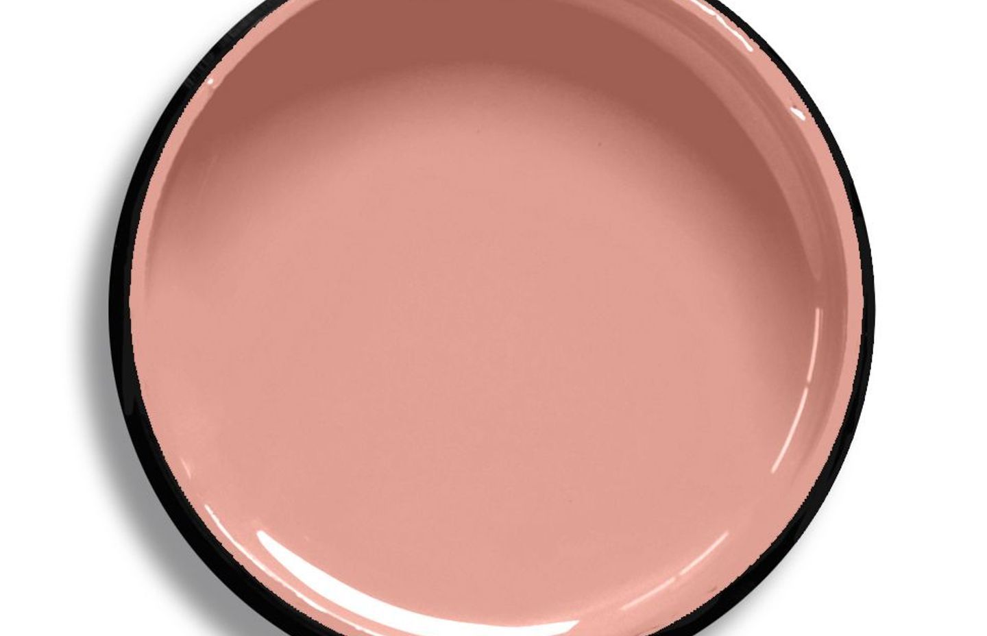
‘My Pink’ interior paint is a pale coral rose colour that is pleasant and mild, making it the perfect accompaniment to colour-matched tiles in a monochrome bathroom or ensuite.
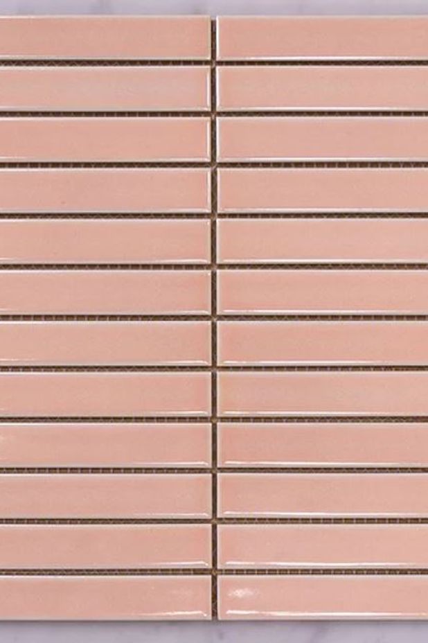
A glossy mosaic tile will add texture and light to a bathroom or ensuite awash with a single colour.
Browse more beautiful commercial projects on ArchiPro.
