An innovative home and income on a sunny, tree-filled site
Written by
14 August 2022
•
4 min read
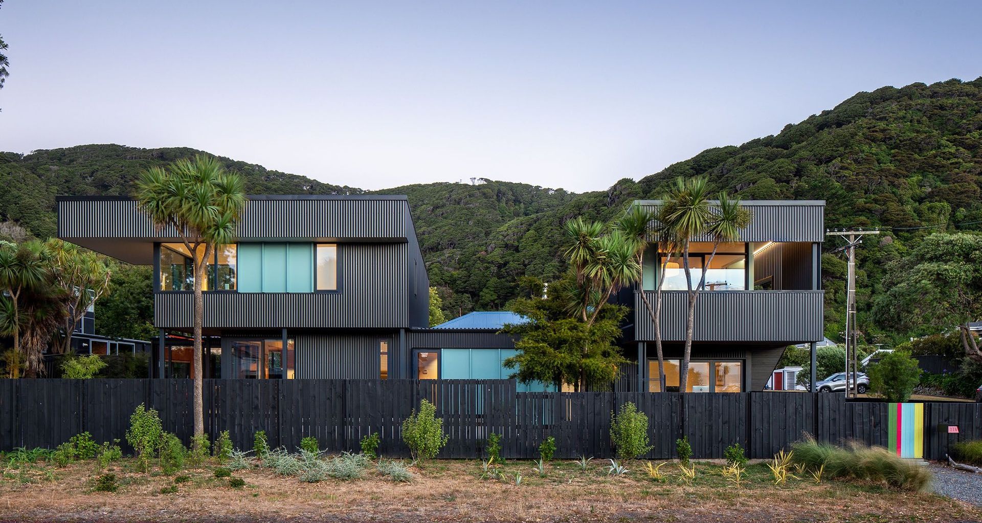
The new owners of this leafy corner site in Wellington’s Eastbourne were keen to unlock some income potential as part of the build of their new home. Gerald Parsonson of Parsonson Architects says it would have been easy to pop in a couple of units side by side, but he had a better idea.
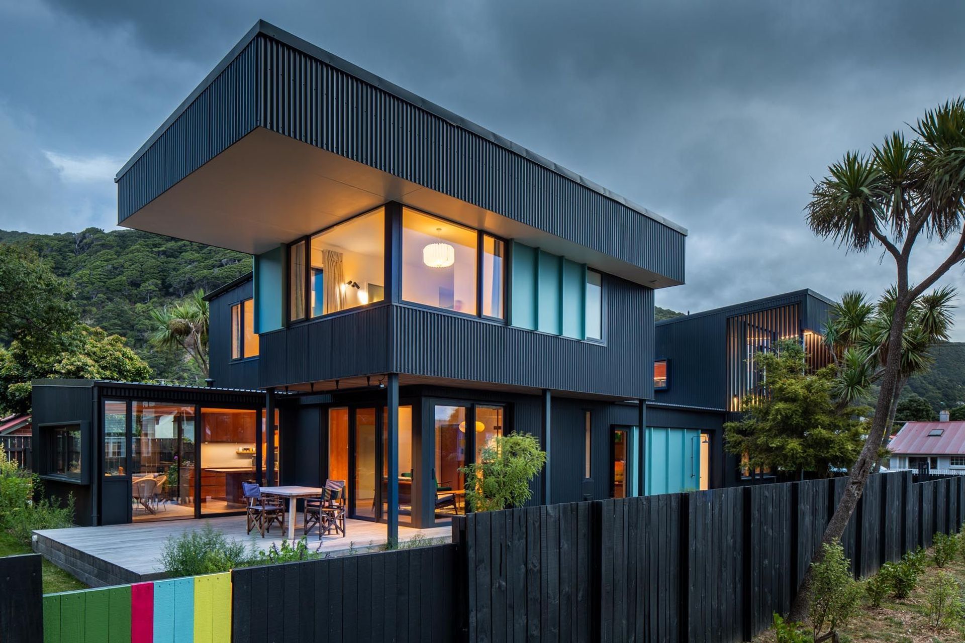
“We looked at the site, the trees and the way it was all laid out,” he says. “We thought if we located the main house down below, we could place a unit on the southwest corner and it would get all-day sun and lovely views of the harbour. We also popped up the bedrooms of the main house in the northwest corner, to get a view up to the hills beyond.”
Gerald says issues to deal with included privacy and complying with fire regulations for the two dwellings. “But it felt nice to do it this way rather than to do conjoined townhouses; otherwise that way one side never gets any light. It was a little more complicated but it has a lot of benefits. It has ended up as a really sunny studio, and the separated forms break down the size of the structure.”
That design also meant that most of the mature trees on the site could be saved including cabbage trees, totara and pōhutukawa. They make the property feel established and embedded in its Eastbourne surroundings. “This used to be mainly holiday houses for Wellingtonians,” says Gerald. “Now as a suburb, it’s really low-key. There are some beautiful bush-covered hill sites with lovely views, and a large plateau towards the sea.”
The property is only a block back from the water, and the homeowners had been keeping an eye out for a suitable spot for a while.
“They were trying to find something in the area where they could build something from scratch. They lived close by in quite a large house at the foot of the hills and wanted something a bit smaller and with the potential for a home and income. They’d been watching for years and when the site came up they thought it was perfect.”
Gerald says there was an old neglected house here. “It was built in the early 1900s. It was just left, and was totally overgrown with trees hanging over the house. That was relocated.”
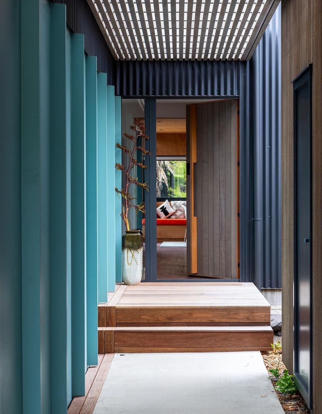
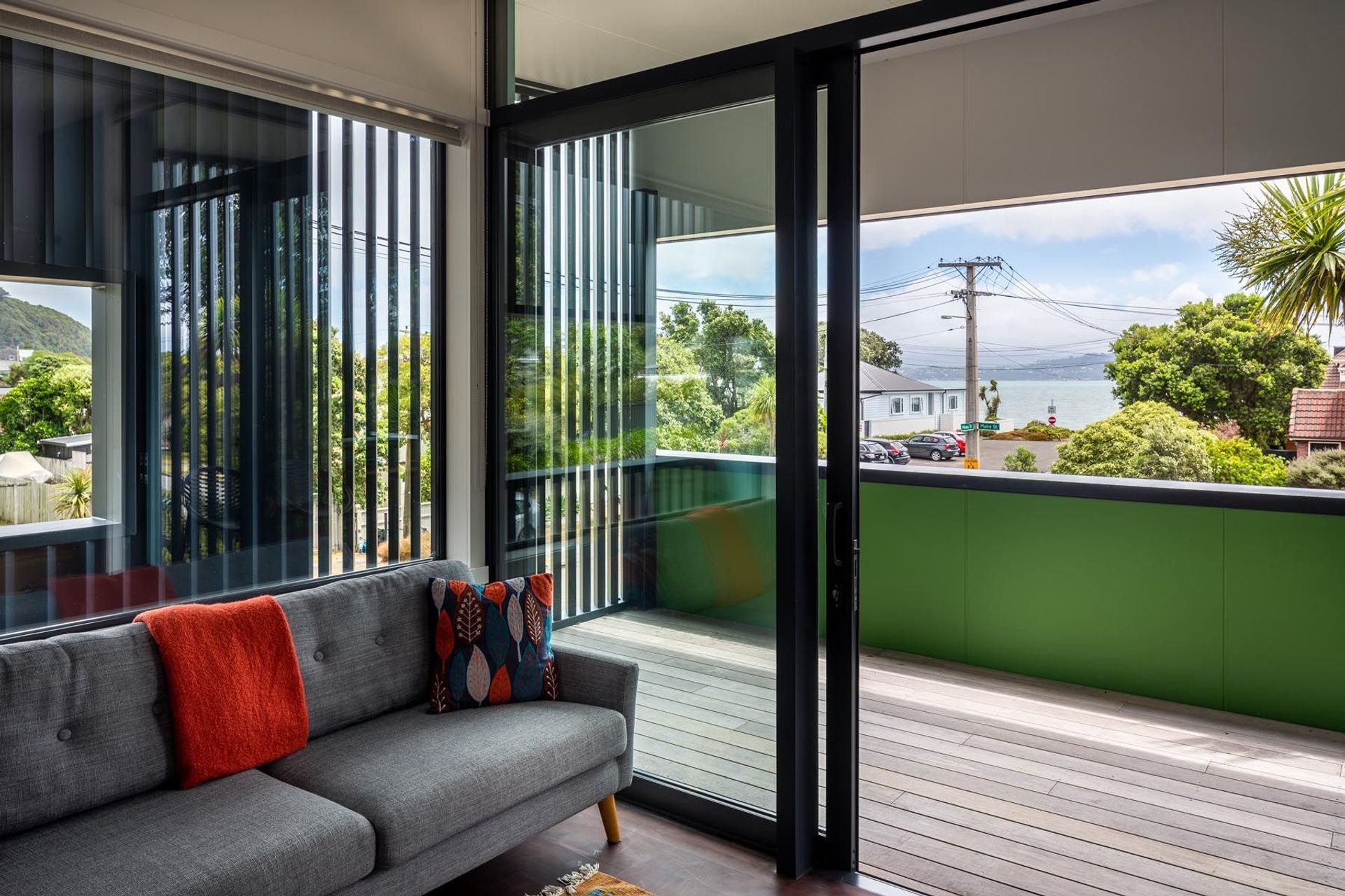
The new house follows the sun. Gerald says that was especially important to one of the new homeowners who tracks it around the house. “By facing the main living area north we could get the sun coming in, and we put a window seat there so they could sit in the window.”
Another aspect of the brief was a second living space. Next to the lounge area is a TV/den space with sliding doors. “So you can close it up and listen to music or watch something. But most of the time that's all open so there is that flexibility.”
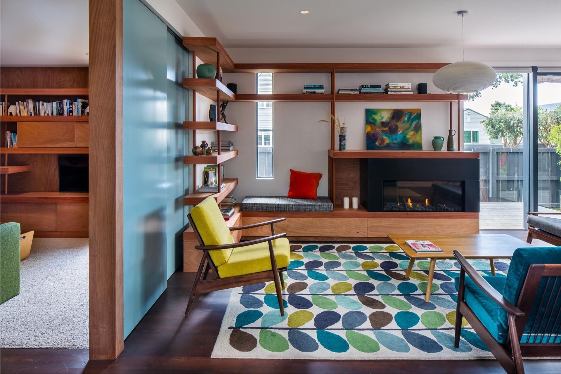
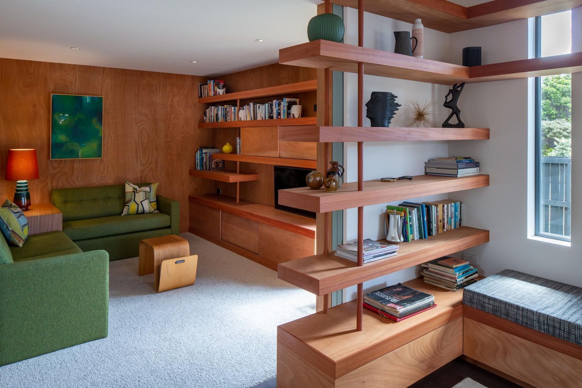
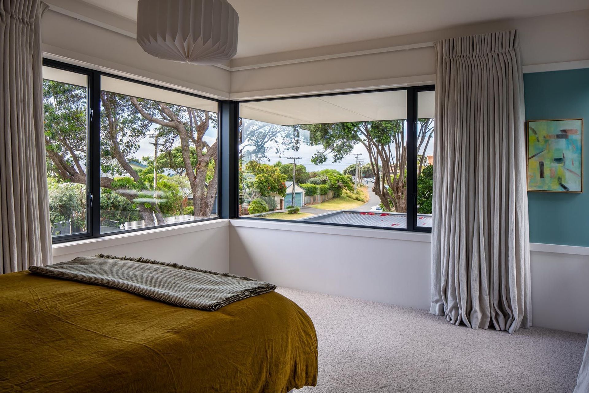
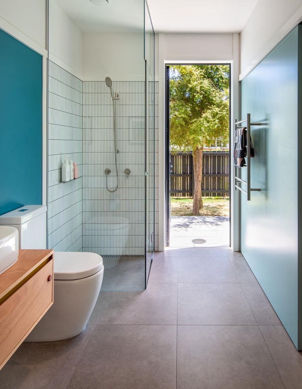
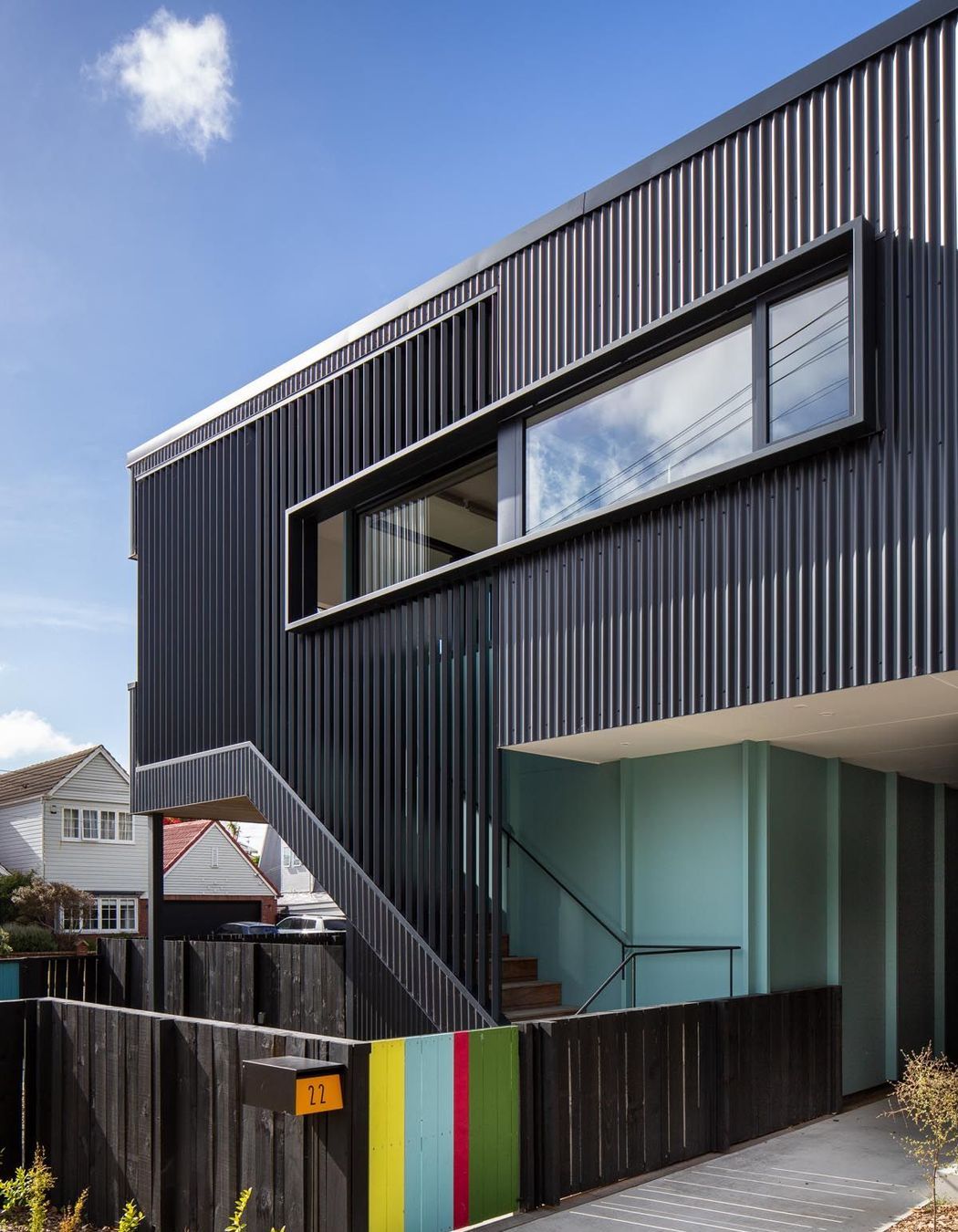
Colour plays a strong part in connecting the house to both bush and beach. “There are bush-clad hills in the background and we wanted to relate to that so we’ve got dark cladding which runs vertically.”
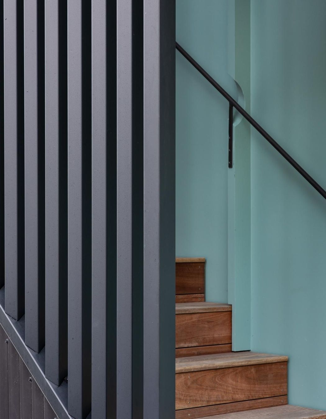
The pale blue exterior accent colour was the client’s choice. “It was green initially to relate to the hills,” says Gerald. “It was definitely a collaboration. We put up a few different colours and settled on this blue. They were quite open to really bright colour so we've used it on the gates and the letterboxes, just little splashes of colour going through.”
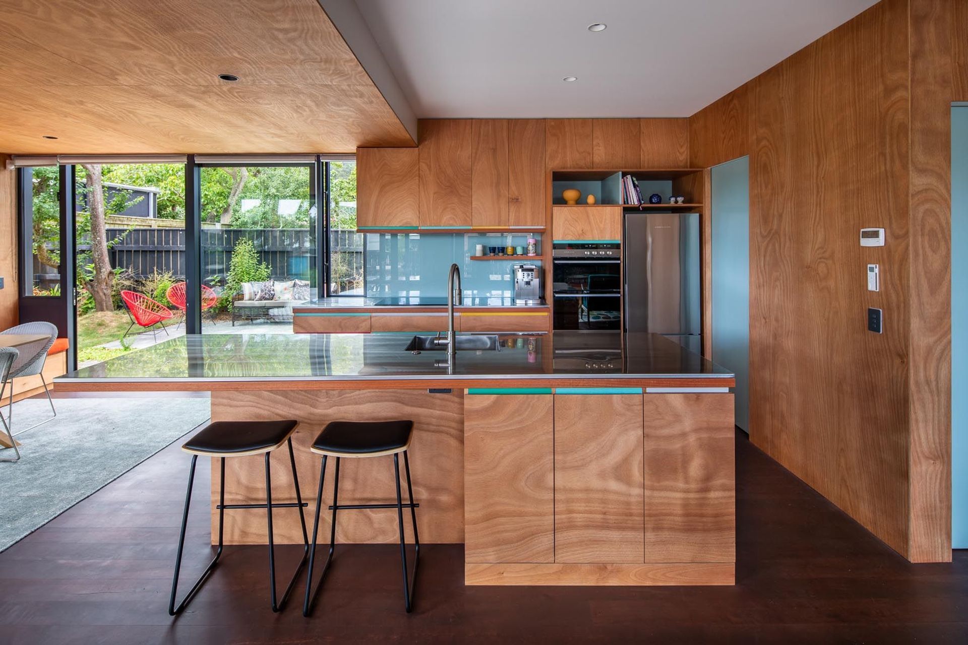
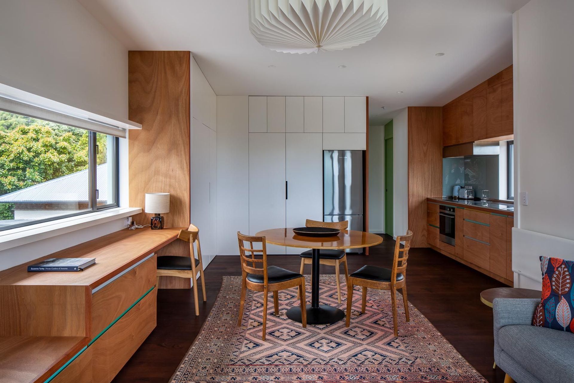
That goes for the interior, too. “We wanted natural materials, something that had the feeling of a cabin and not just a suburban house. The floors are a stained timber to get a rich, dark feel and the clients really liked the idea of using plywood offset with simple colours. The exterior blue we took inside onto different surfaces, and the indents in the cupboards and the interior joinery have got colour going on. But overall it’s quite calm with off-white and plywood. It's quite casual and relaxed. And that was the intent.”
Discover more projects by Parsonson Architects.