There is an extraordinary diversity to the stone found in the natural world. Shaped by geological forces and the elements over the course of millions of years, each fragment carries something of its origins in its colour, texture and form. Some are smooth and rounded, their edges softened by water and time. Others are angular, their fractured surfaces revealing the mineral compositions within. Rarely do stones from vastly different geological environments find themselves alongside one another. Except in terrazzo.
If anyone knows the creative potential that lies within the interplay of the natural and the manufactured that makes terrazzo such an interesting architectural material it’s Fibonacci, Australia’s leading terrazzo designer and manufacturer. Through decades of passionate commitment to the infinite possibilities of combining otherwise unrelated materials and a deep understanding of how their individual characteristics can contribute to an entirely new composition, Fibonacci has developed two new colours, First Light and Dune.
Designed to address the need in the design industry for terrazzo options that sit harmoniously in spaces where an atmosphere of calm and grounding is desired, these two warm neutrals complement Fibonacci’s existing extensive range of colours.
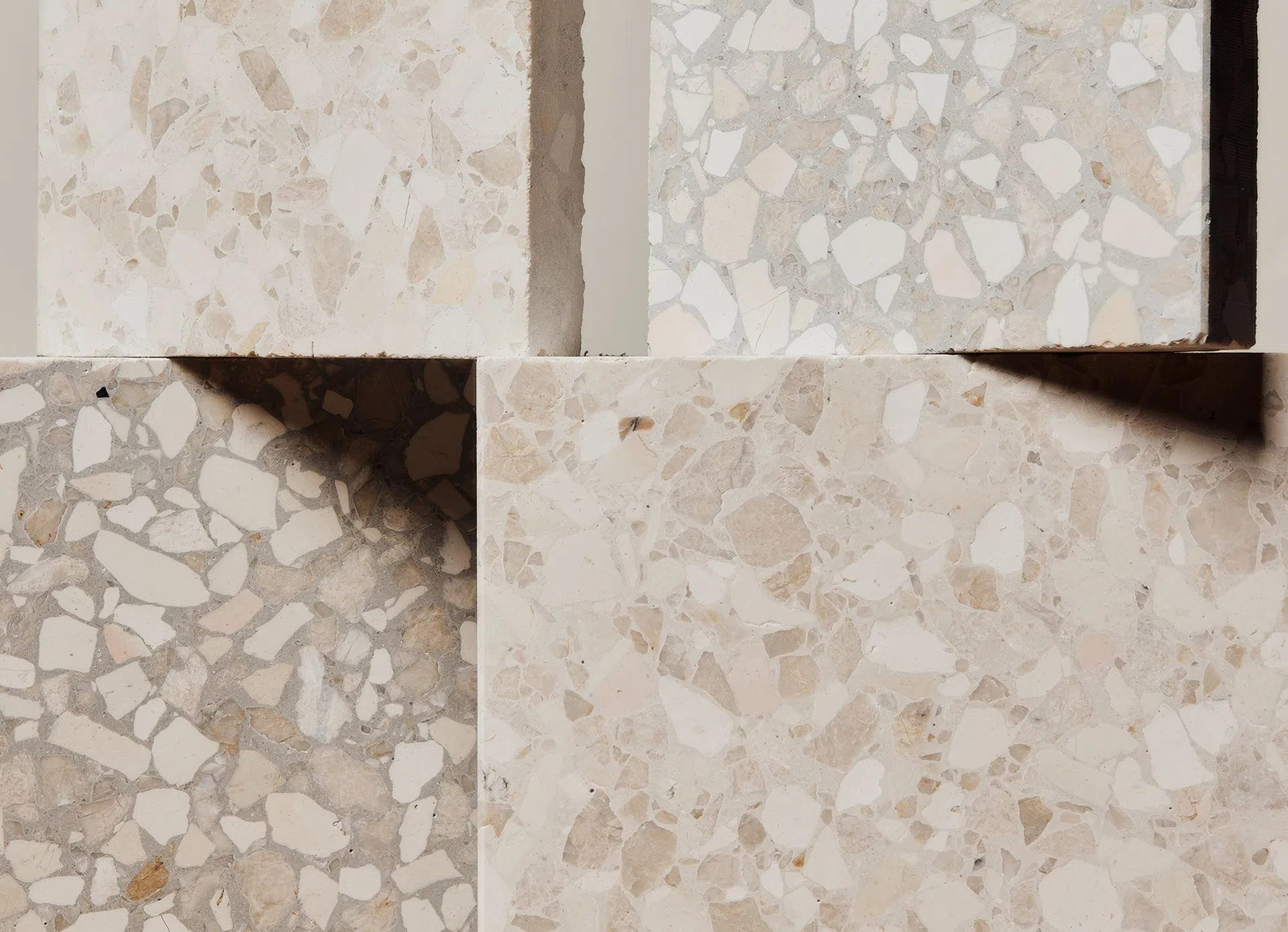
DUNE.
FIRST LIGHT.
Essentially the same yet atmospherically unique
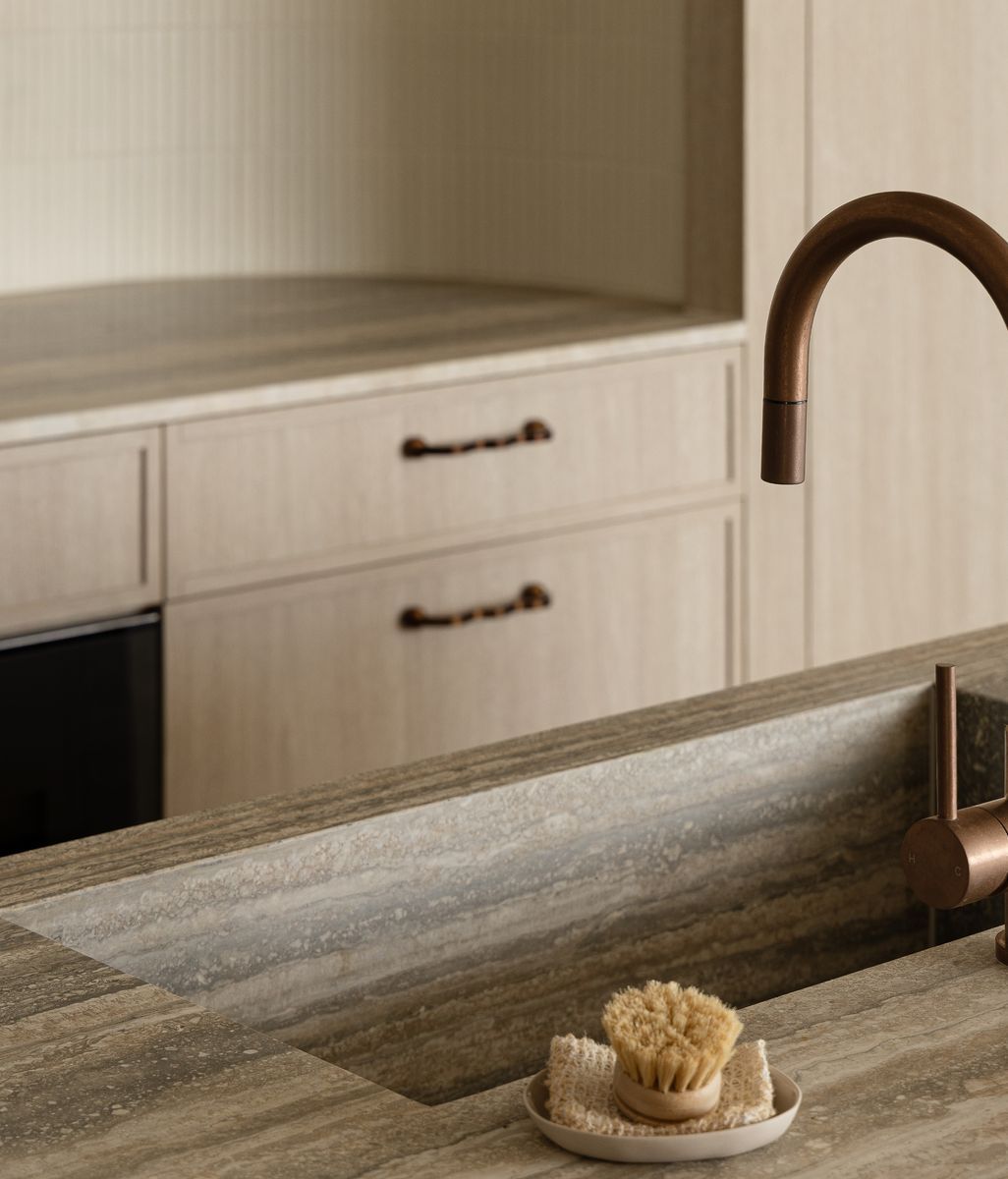
At first glance, the two appear quite different. First Light is pale and warm, with a soft, almost luminous ground through which fragments of blush, cream and fawn emerge, punctuated by smaller pieces of darker stone. Dune is more subdued, its cooler, greyer base lending greater definition to the warmer aggregates and creating a composition in which the individual fragments become more pronounced.
Look more closely, however, and something rather unexpected becomes apparent. The stones themselves are identical. Every fragment, from the larger, rounded pieces to the smaller, sharper aggregates, belongs to the same carefully considered composition. The difference between First Light and Dune lies entirely in the base pigment.
Against the paler ground of First Light, the warmer aggregates appear to merge gently into the surface, while the darker fragments provide points of contrast. In Dune, those same stones take on a different character. The greyer base creates a stronger distinction between the individual elements, drawing attention to their varied colours, shapes and proportions.
Fibonacci's approach to developing its terrazzo colours begins with the careful selection of the Italian sourced aggregate itself. Stones with different geological origins, colours and physical characteristics are brought together in combinations that would rarely, if ever, occur naturally. Their proportions, scale and distribution are considered alongside the colour of the base, with each adjustment affecting the appearance of the finished material. In this way, the process is akin to a painter who painstakingly blends base colours until they achieve the subtle yet exacting tonal variation they’re striving for which ultimately gives their artwork depth, bringing a flat surface to life.
Shifting perceptions through scale
There is another dimension to the way these two colours are experienced – scale. Seen from across a room, the individual fragments begin to dissolve into an overall impression of colour and texture. Move closer and the composition reveals itself in greater detail: the irregular outlines of the stone, the subtle differences in tone, and the contrasts between the rounded and angular forms.
In First Light, this movement between the overall surface and its individual components is softened by the warmth of the base. Dune, with its cooler ground, makes the distinction between aggregate and surrounding material more overt. The result is two vastly different sensory experiences, despite being essentially the same.
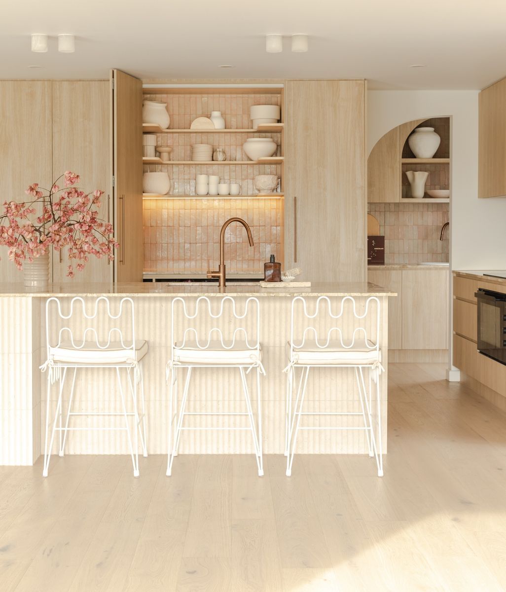
For architects and interior designers, these two new colours present an opportunity to explore continuity and contrast within a material palette. Used independently, each establishes its own character. Placed together, their shared aggregate composition offers tonal consistency with a subtle playful shift, adding a sense of dynamic aliveness and just the right amount of visual tension.
Whether used across the floor throughout a whole house to create a cohesive colour narrative, or placed selectively for moments of surprise or unexpected delight, what First Light and Dune demonstrate is the strength that comes with subtlety. Impact doesn’t necessarily have to come from bright colours or bold gestures. In fact, as every good designer knows, achieving simplicity is as much an art as it is a science. As the saying goes, sometimes less is more, and this is especially true when you let the materials speak for themselves.
Be one of the first to explore the collection only on ArchiPro.