The interior design of Commercial Bay's Sky Lobby balances the warmth of a welcome with corporate finesse

Positioned in the heart of Auckland's city centre, Commercial Bay comprises five connected towers, joining to form a waterfront precinct centred around the Commercial Bay retail centre. Of these, the PwC tower, designed by Warren and Mahoney Architects, stands as New Zealand's tallest office building with an estimated value of $580 million. So, with first impressions paramount, the furnishing design for the lobby was not a task to be taken lightly – but Space Studio was well placed to deliver.
"Space Studio's ethos is 'inspired design, delivered'," shares Tess Bowden of Space Studio. "It encompasses both the design and procurement aspects of our business. We aspire to create memorable, holistic, authentic spaces that are fit for purpose and celebrate the essence of a place."
The brief called for a furnishing design that reflected the lobby's position and function within the form. Rather than a passing passage, the design needed to support connection and heavy commercial requirements while being flexible, timeless, and appropriate for a corporate context. "The high frequency of occupation of the lobby makes it a key piece of infrastructure for developing a well-integrated and vibrant office community," adds Bowden.


Space Studio looked to the region's topography for inspiration. Its undulations comprise the Auckland volcanic zone, and though their molten slopes are now lush and green, their scale is ever-present against pockets of villa-filled suburbs. It's a contrast that bears a serendipitous resemblance to that of Commercial Bay, the tallest office building in both the region and the nation.
"We were inspired by the solidness and grounding presence of mass forms, combined with timeless furniture selections that suited the vast scale of the architecture," Bowden shares. Closing in from macro to micro, the material palette drew from the surrounding gardens, using softer, muted tones appropriate for the tower's corporate identity.

While the large, open-plan space was appropriate for the scale of the building, the designers needed to create distinct but flexible zones that accommodated a variety of uses. "Combining food and beverage services with quieter working zones and meeting spaces took a lot of planning, review and consideration."
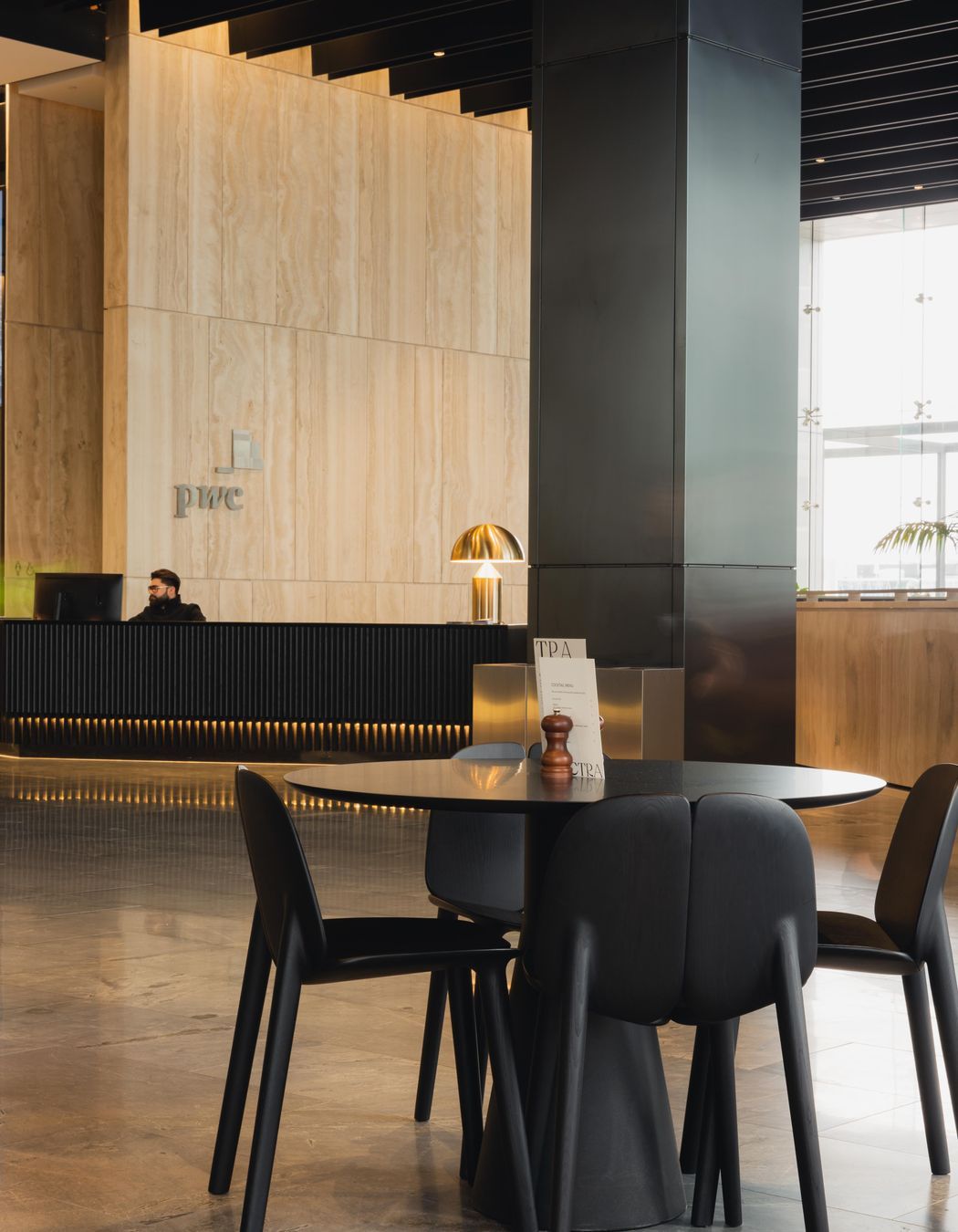
Upon arrival, the Sky Lobby feels light, airy and welcoming. Its organisation is comprehensible, with clearly defined zones based on its various uses: wait zones for visitors anticipating a meeting, lounge zones for longer conversations, and two food and beverage zones to facilitate both seated meals and quick coffee catch-ups. "It's a space that celebrates connectivity and coming together," shares Bowden.

Working with principal architects Warren and Mahoney, landscape architects Outside In, and a number of suppliers, the design elements, material selection, and placement retain the feeling of space, ensuring the architecture shines.
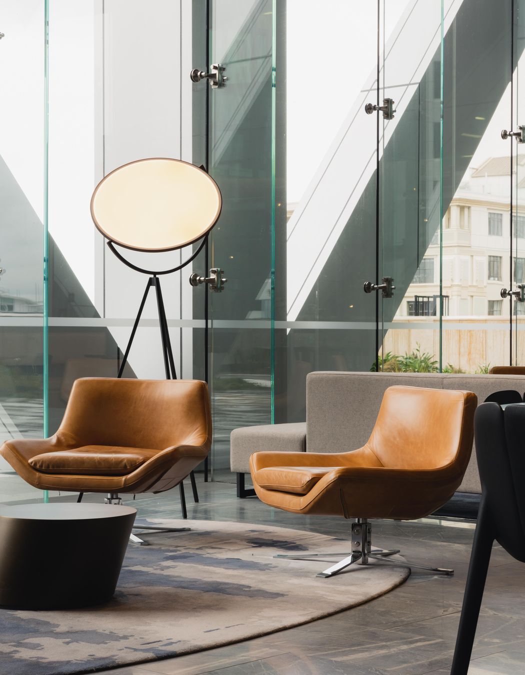
Materials are both soft and hard-wearing, with inviting fabric sofas and leather accent chairs. The colour palette continues this motif of contrast, using complementary, warm mustard and beige tones with deeper navy and black accents. While ample natural light floods through the glazing, film-style, tripod lights are carefully dotted around the lobby in anticipation of the evening.

"The scale of this project really sets it apart. Auckland hasn't previously seen a lobby of this proportion. Having been lauded internationally, this lobby is the crown jewel of lobbies in New Zealand," shares Bowden.
"We often measure the success of a project when we return and see the spaces we have created being used at various times of the day. The Sky Lobby is vibrant, bustling and busy, and we love seeing people come together and enjoy the space as we imagined they would."
