Butcher and The Farmer - The O2 Arena.
ArchiPro Project Summary - Butcher and The Farmer: A 160-seater casual dining restaurant at The O2 Arena, featuring two levels, two bars, and an open display kitchen, designed by Design Partnership Australia to embody a farm-to-table ethos.
- Title:
- Butcher and The Farmer - The O2 Arena
- Interior Designer:
- COOOP
- Category:
- Commercial/
- Interiors
- Completed:
- 2019
- Client:
- Seagrass Boutique Hospitality Group
- Photographers:
- Seagrass Boutique Hospitality Group
Butcher and the Farmer's Story
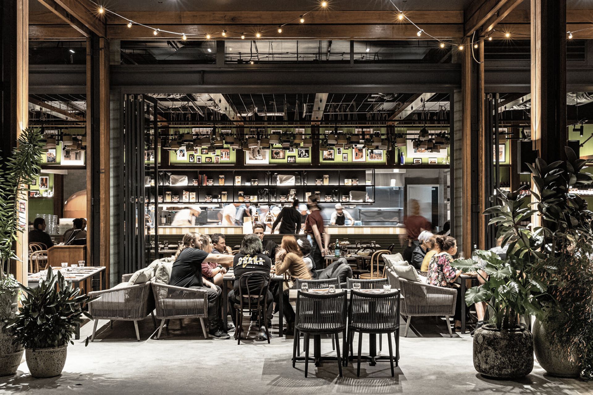
The concept of Butcher and the Farmer O2 London was built around the contemporary interpretation of a marketplace and the community. A Marketplace is a place where public markets are held for buying and selling but apart from the transactional value of it all, it is also where social interaction and chatter leads to the exchange of ideas and opinions and a sense of community. A Community being a group of people that share similar ideas that leads to friendships and appeal where something much more than tangible transactions are valued. In light of this, the experiential proposition is largely around a more affordable, casual and informal environment.
Welcome to this type of space at Butcher and the Farmer, a space seemingly brought together by a range of informal merchants with a range of honest raw produce within an authentic and raw interior space. A space where no designer had a hand, but rather where the unity and balance of materiality was informed by the nature of the produce and community.
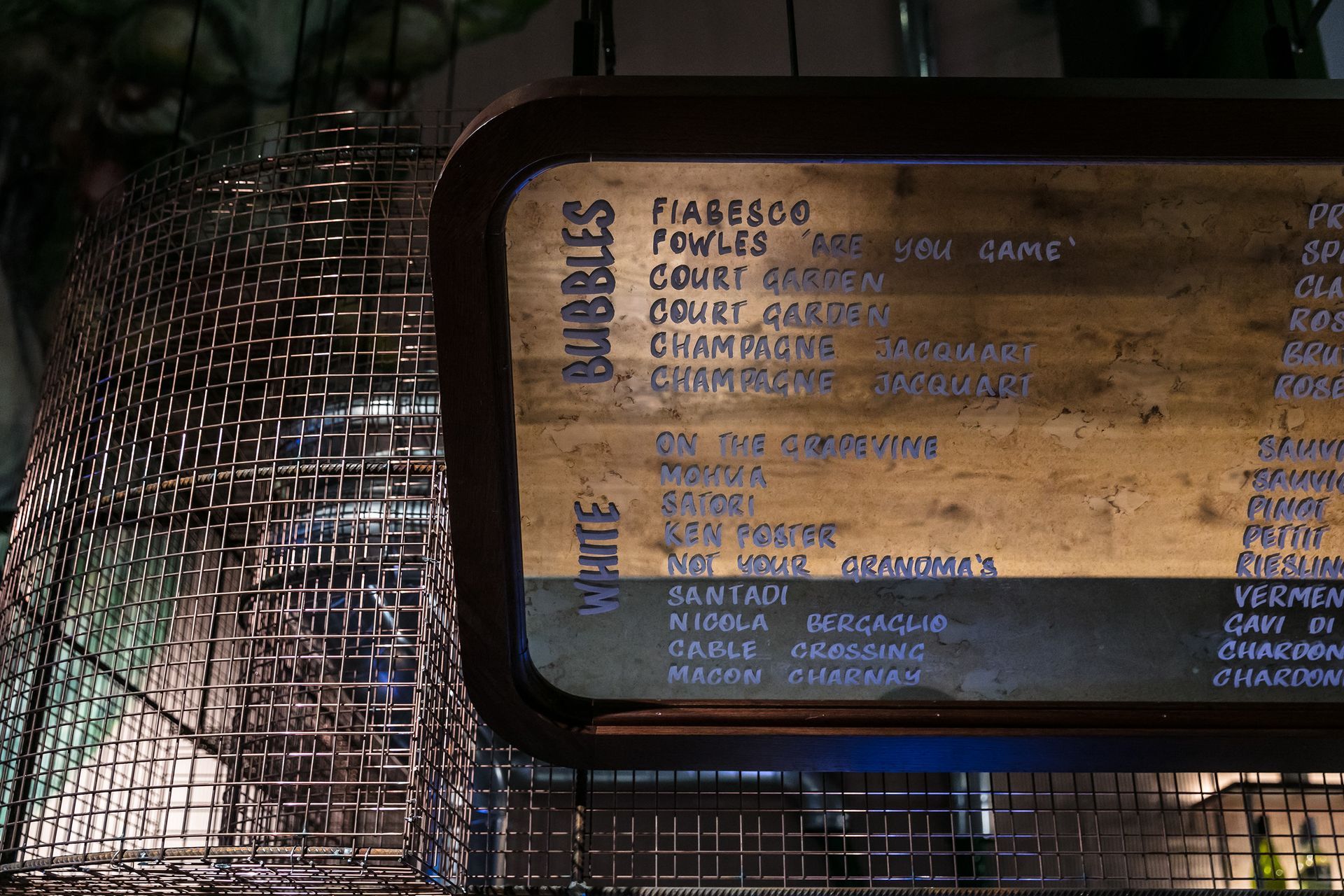
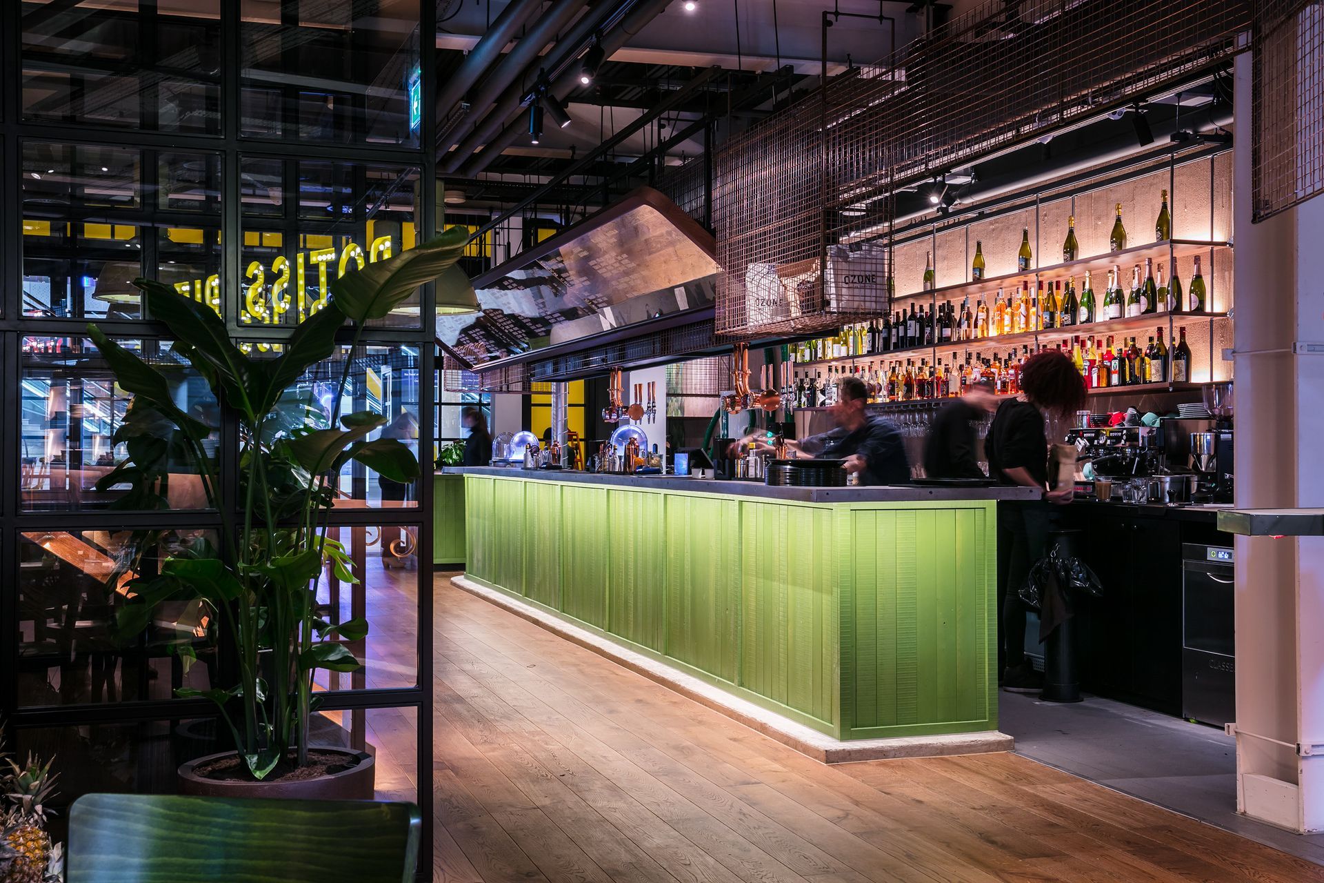
Additionally, careful consideration was given to the local-made and hand-crafted features and the process of creating the objects to be materialised with care, honesty and unforced. Van Der Merwe comments “Our value system has changed in the last decade to value the qualities of the sustainable, considered slowly created objects over the mass produced fast made product where time is no more money than artichokes are angels"
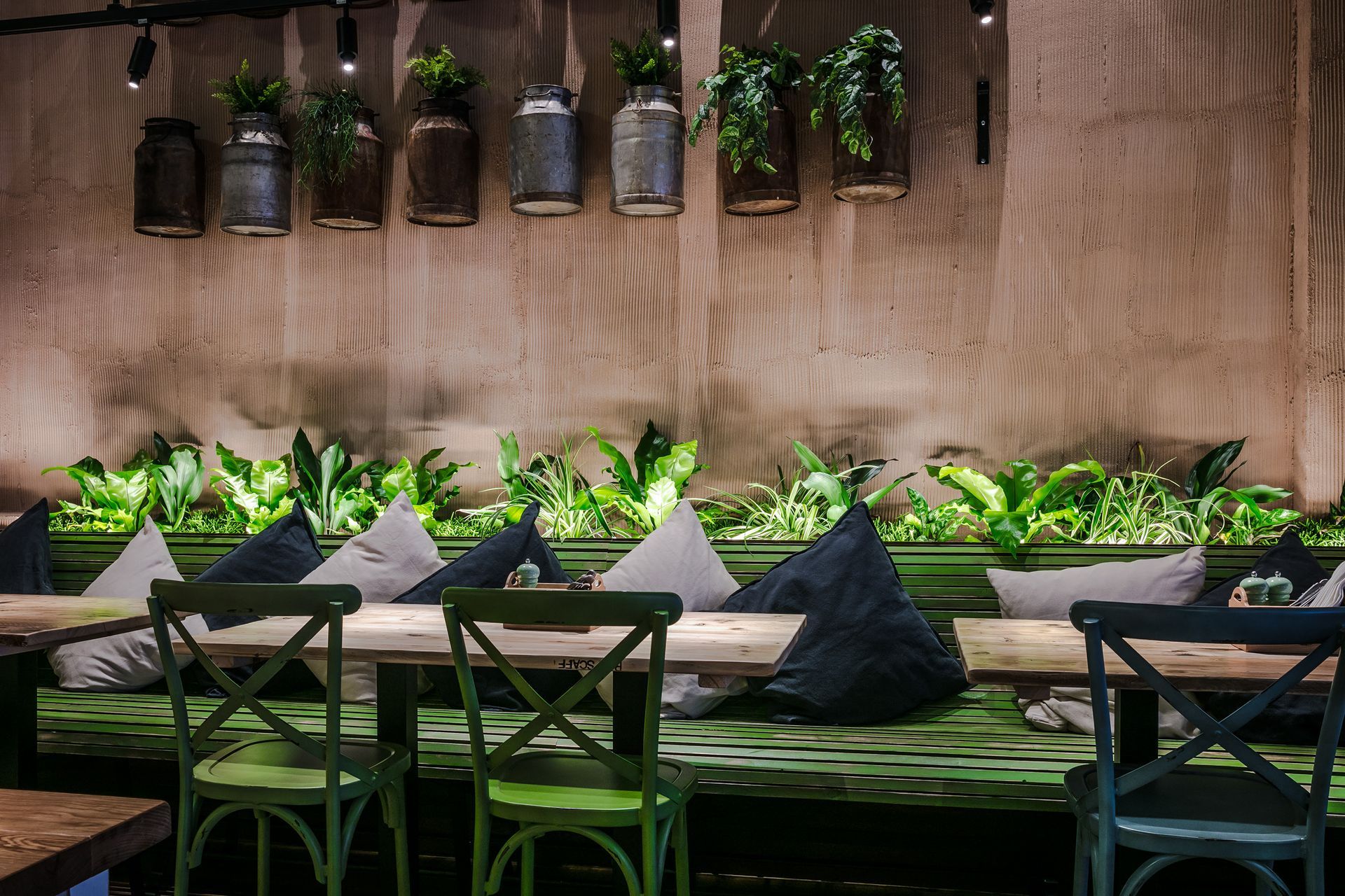
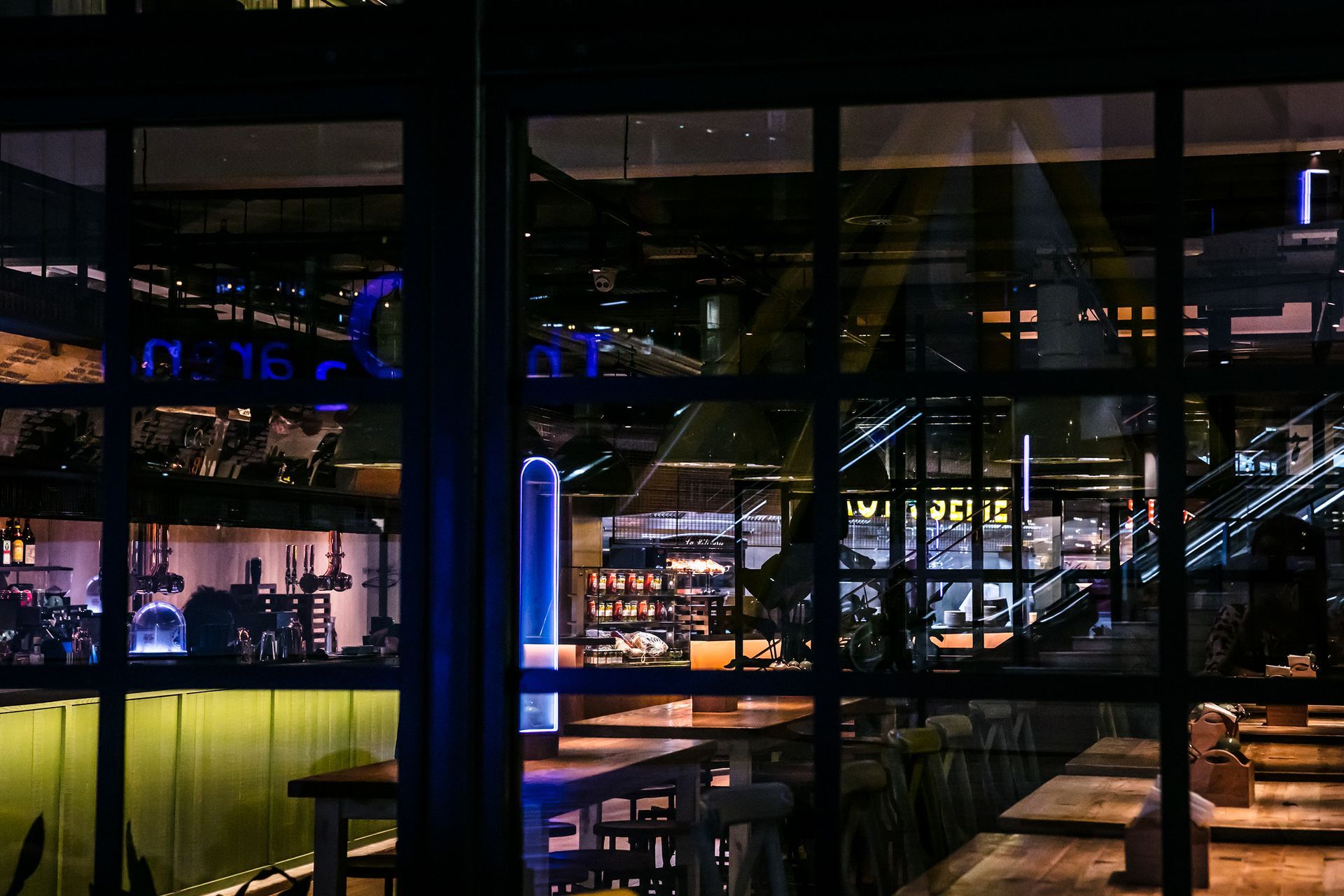
In essence, the design of the restaurant was aimed at delivering an interior space that kept the design tacit, as if the designer was never involved and as if the chefs and merchants had a particularly good eye for materials, texture, proportion and the found object.
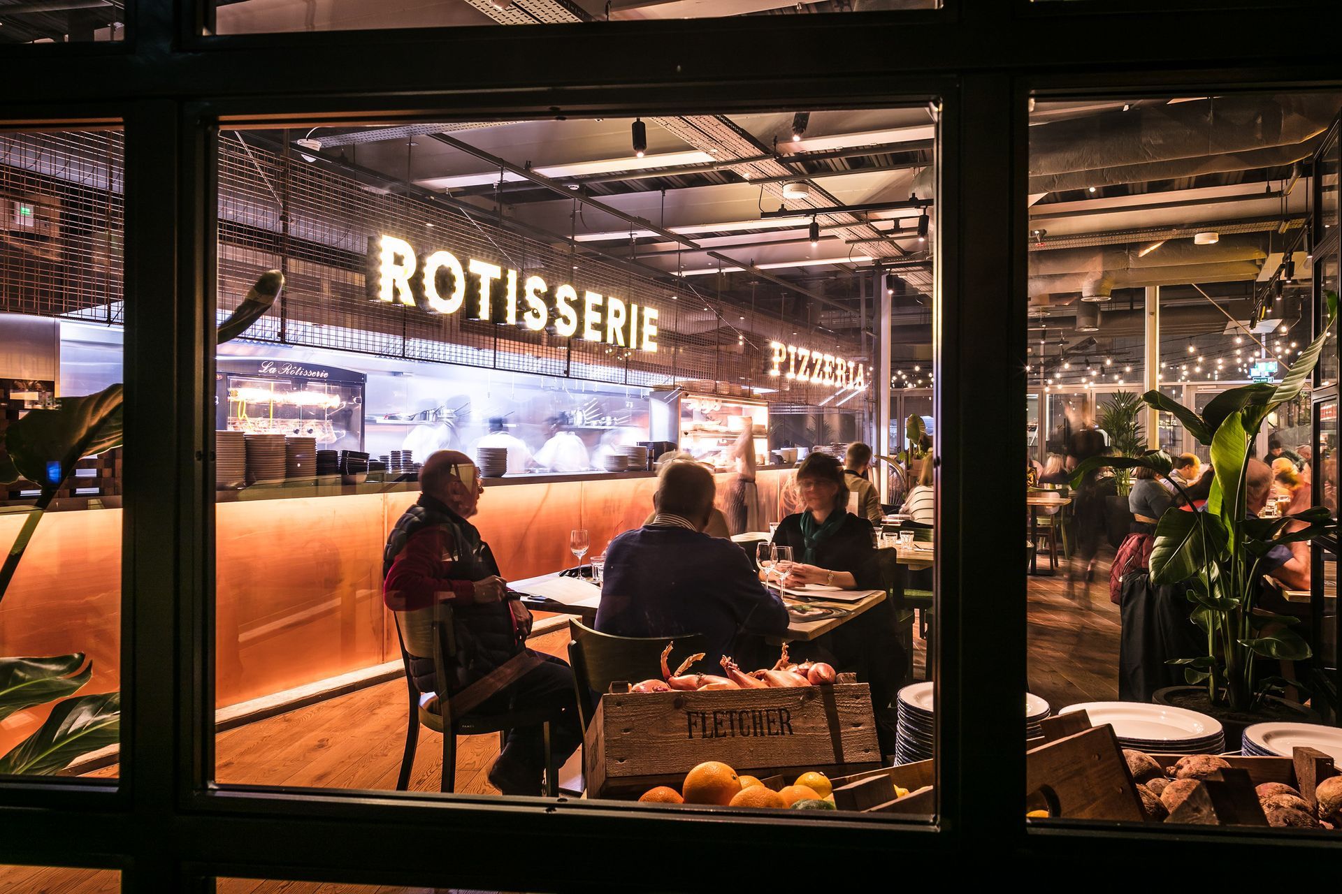
All tangible objects that could be branded such as crockery, furniture and lights were handmade with dedication and love by a number of great artists and artisans.
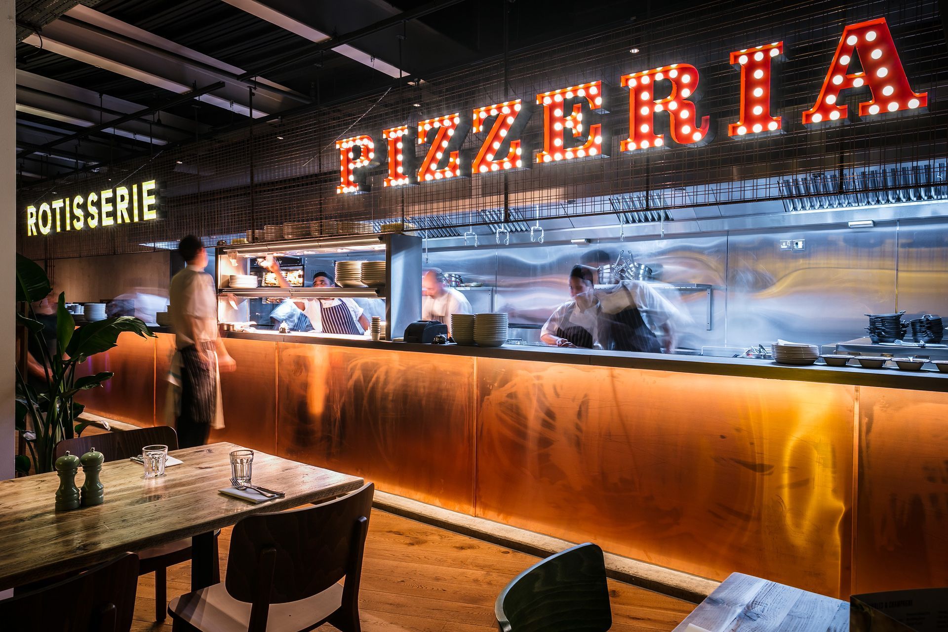
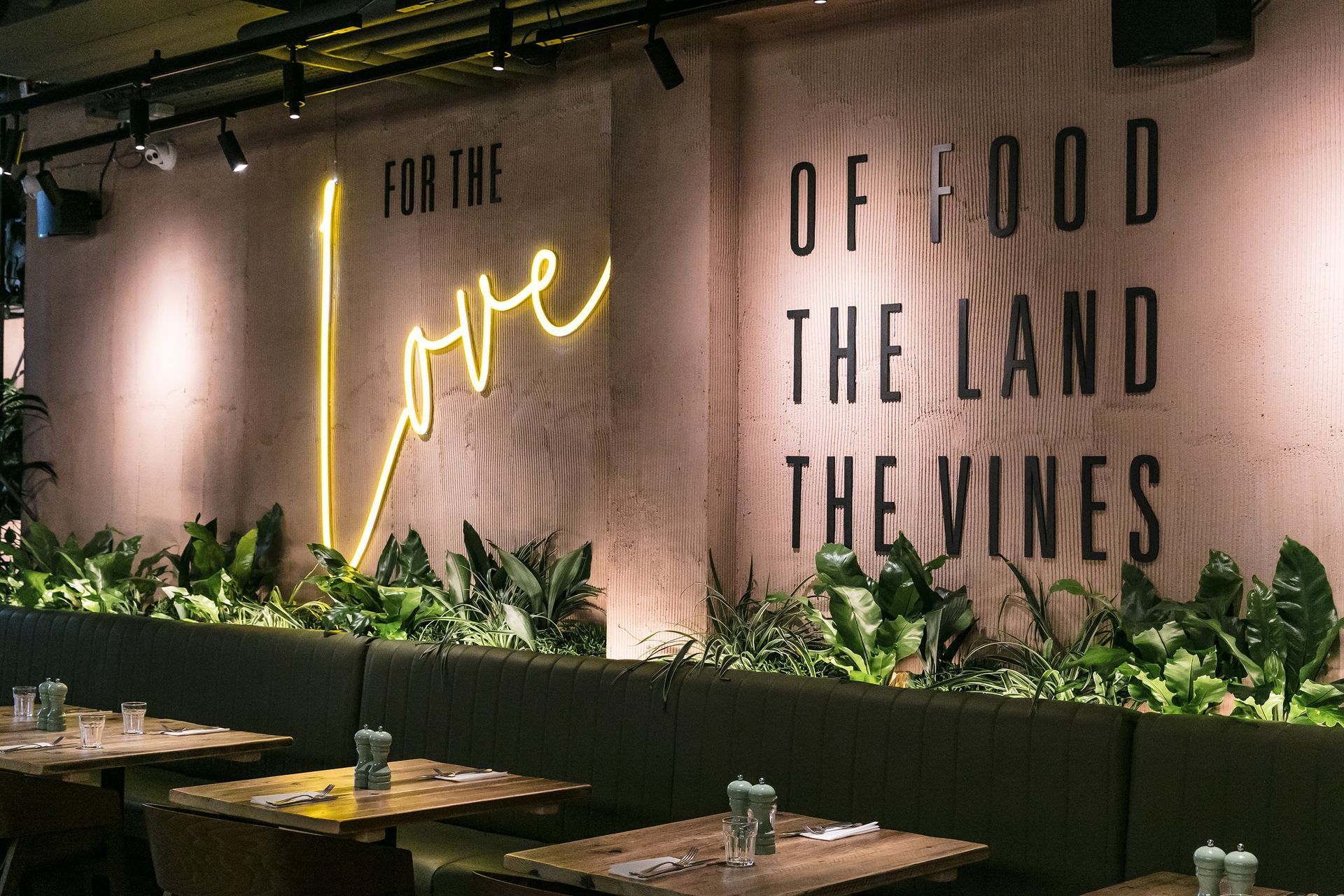
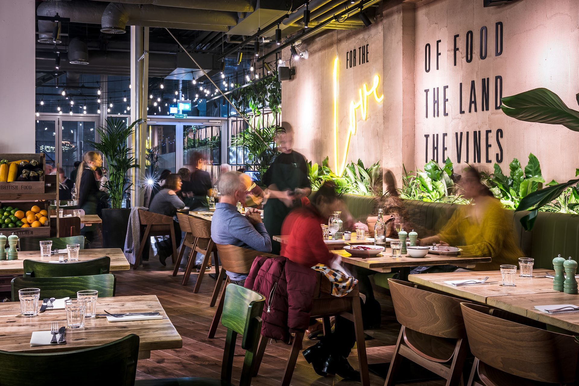
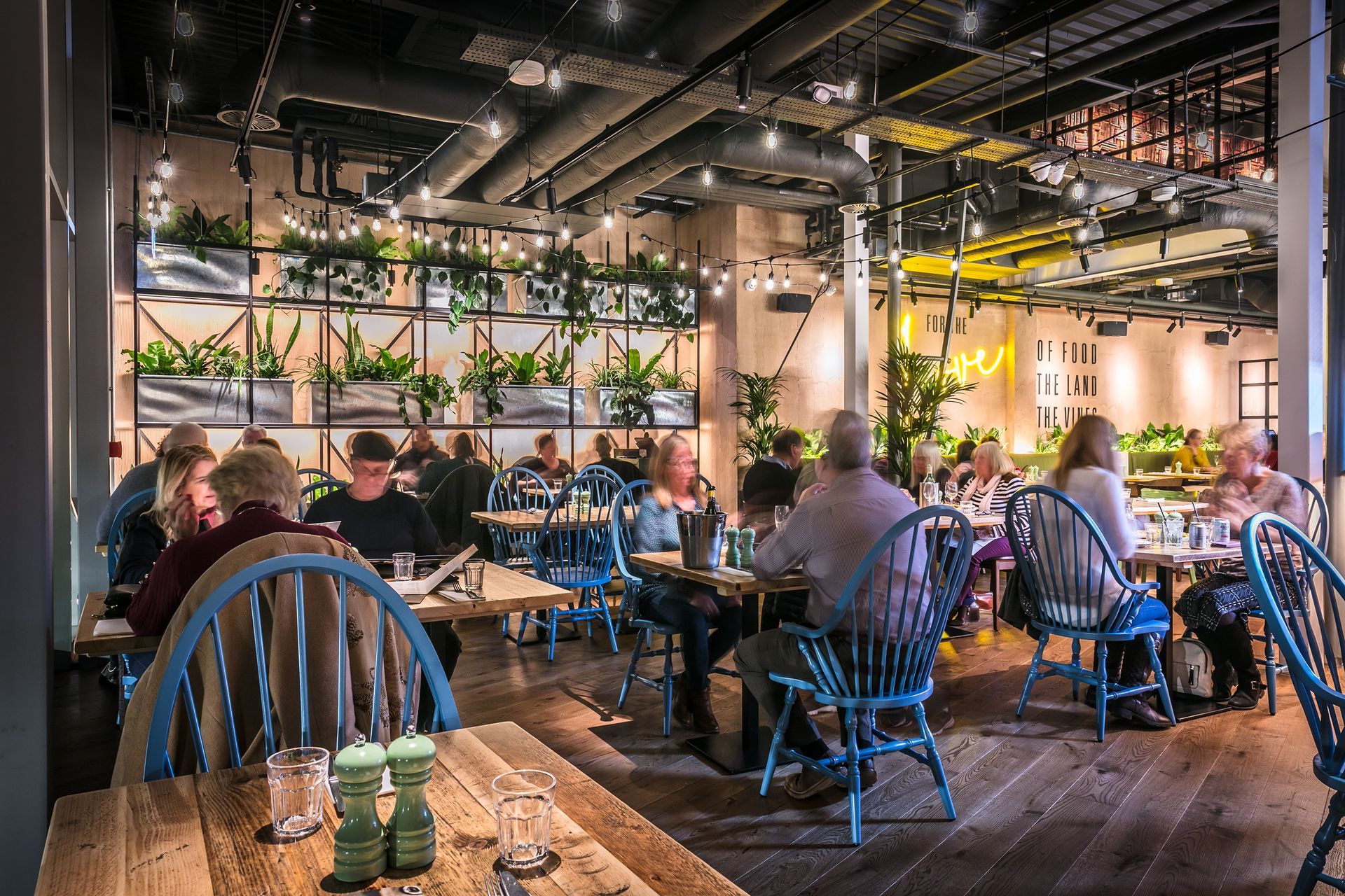
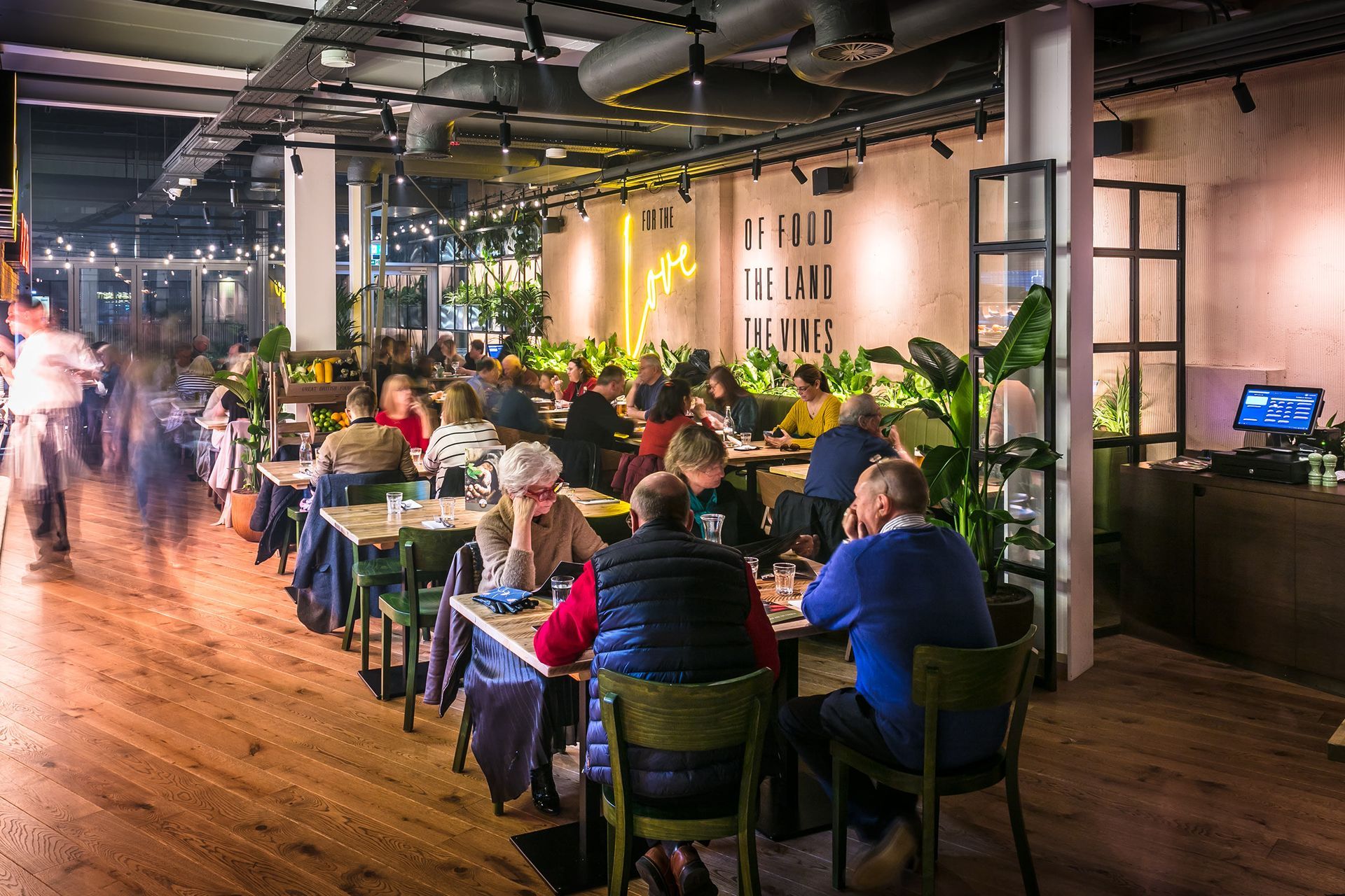
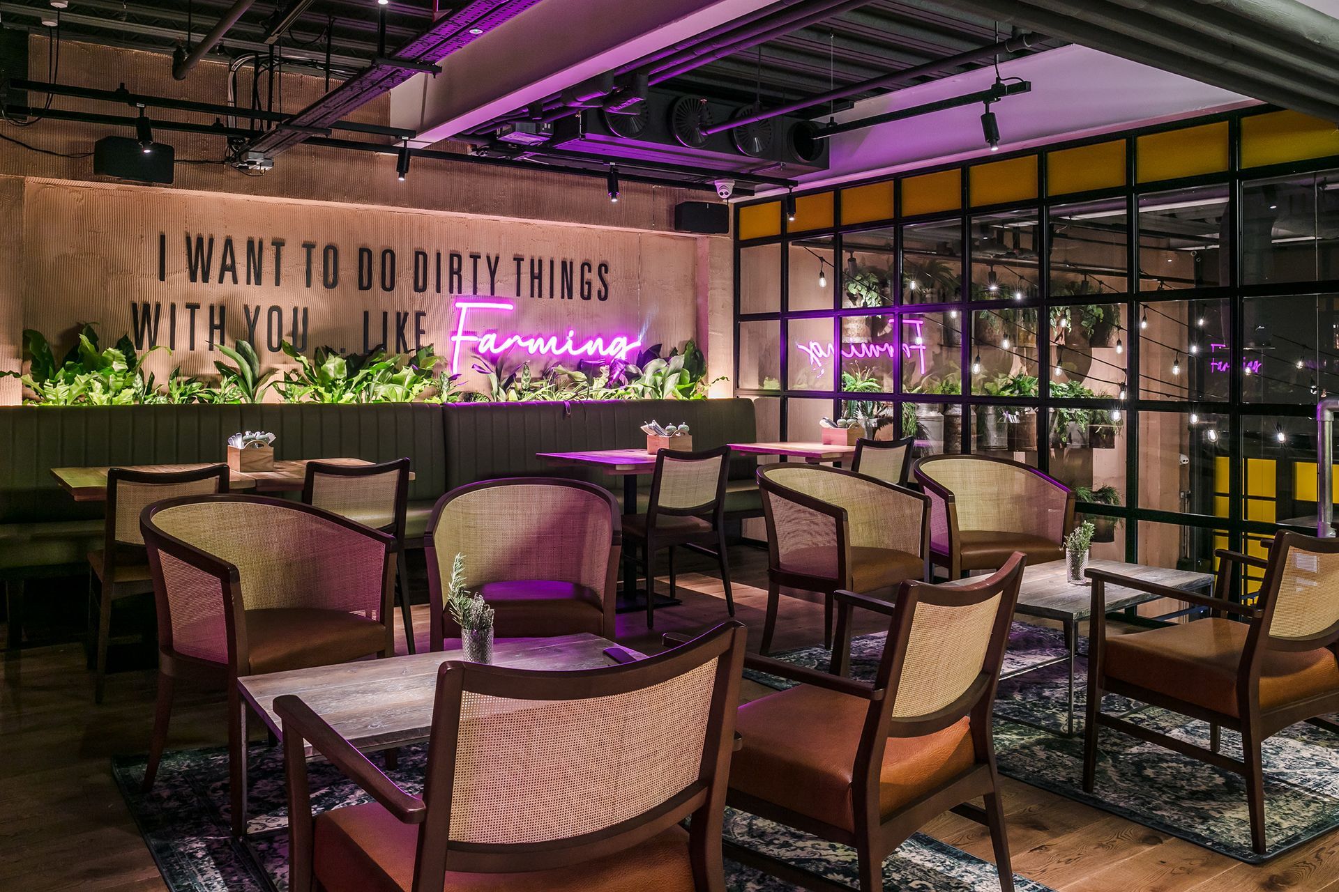
For example, against a layered palette of copper, brass, solid and painted woods and raw steel are quirky hand painted sayings highlighted with neon in places to give the space a sense of intrigue and the allure of a bygone era when reading and traveling was romantic and time for eating and enjoyment was the essence of life and not a mere action for survival.
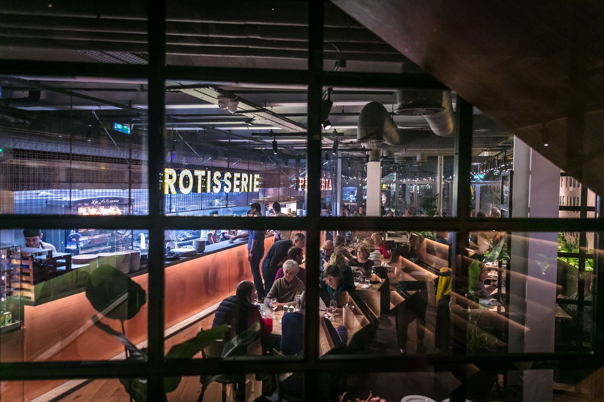
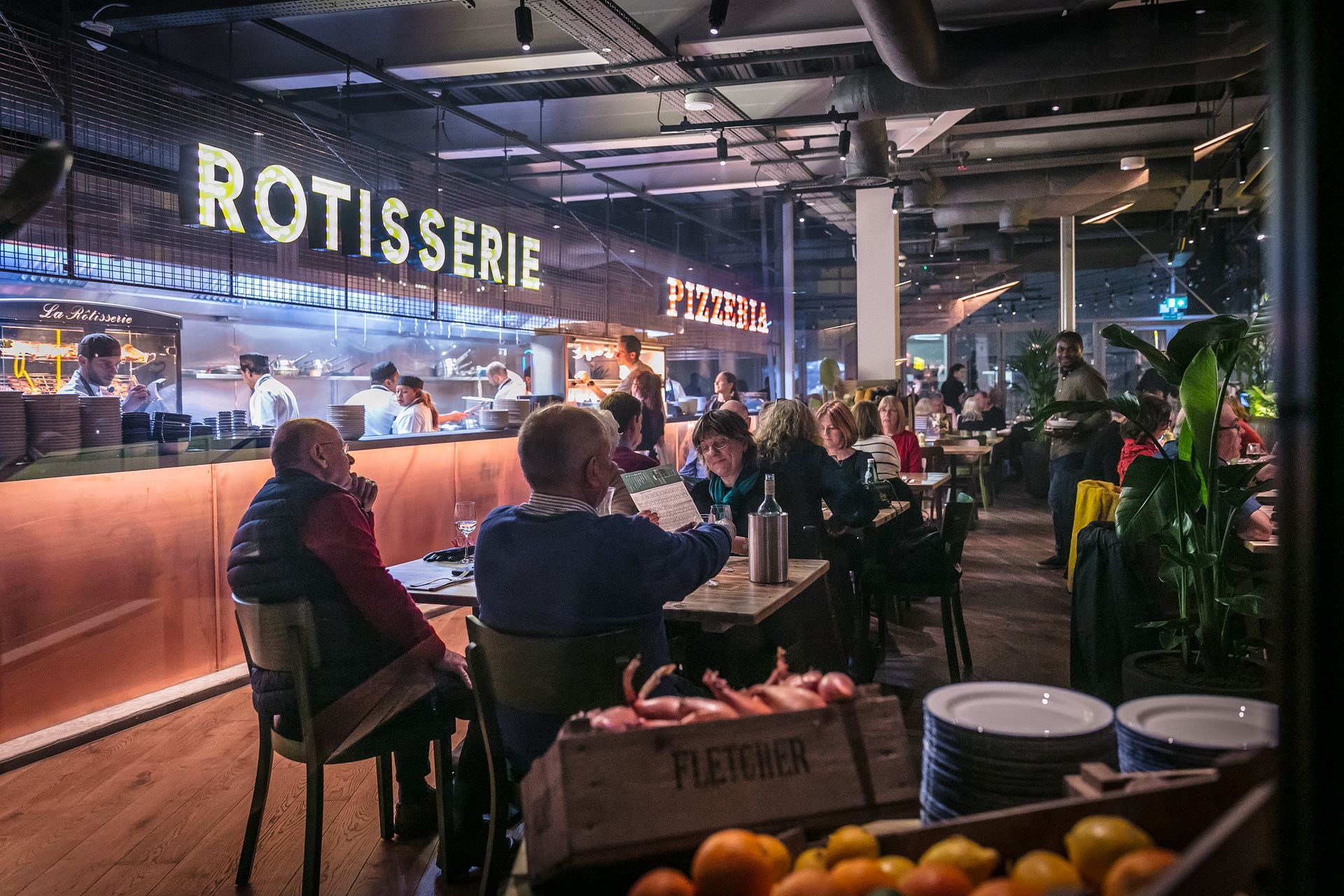
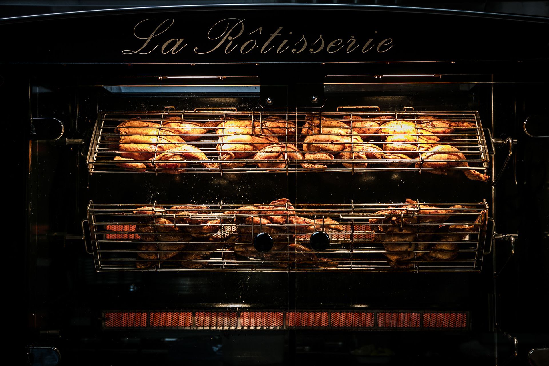
Butcher and the Farmer : " For the Food, the Land and the Vines"
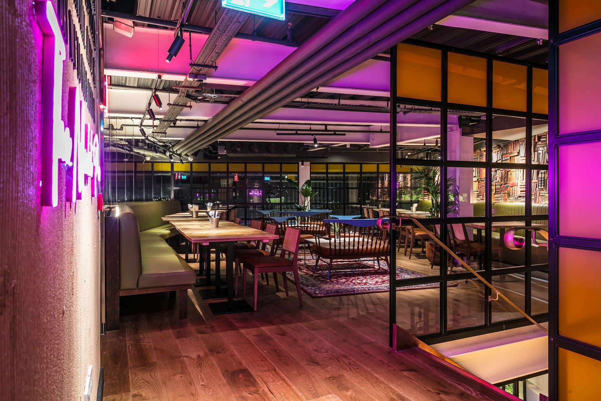
"Every successful restaurant, similarly, are conducive spaces used to socialise, tell fascinating stories and entertain the people that come to them.” – Roberto Zambri.
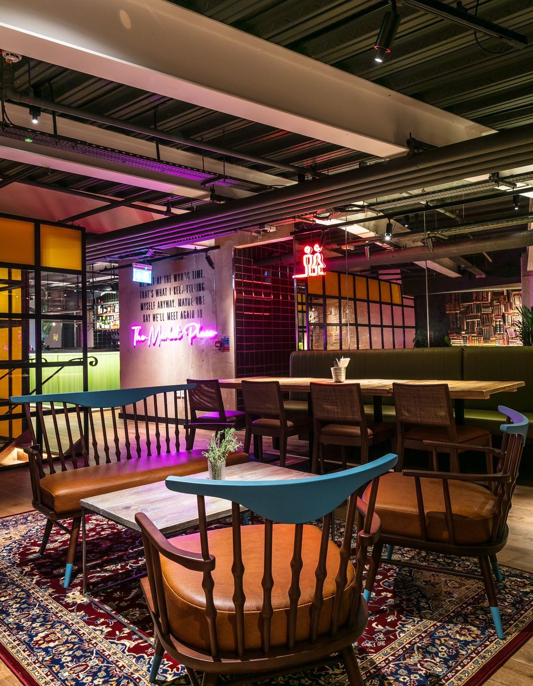
Designer, Van Der Mere comments: “At Butcher and the Farmer London we have sought to incorporate an intrinsic sense of simplicity, honesty and transparency into our restaurant design, in which notions of community and an Australian marketplace play a strong part. We hope customers will appreciate the harmonized and welcoming atmosphere we have developed, and we look forward to welcoming them into this new space.
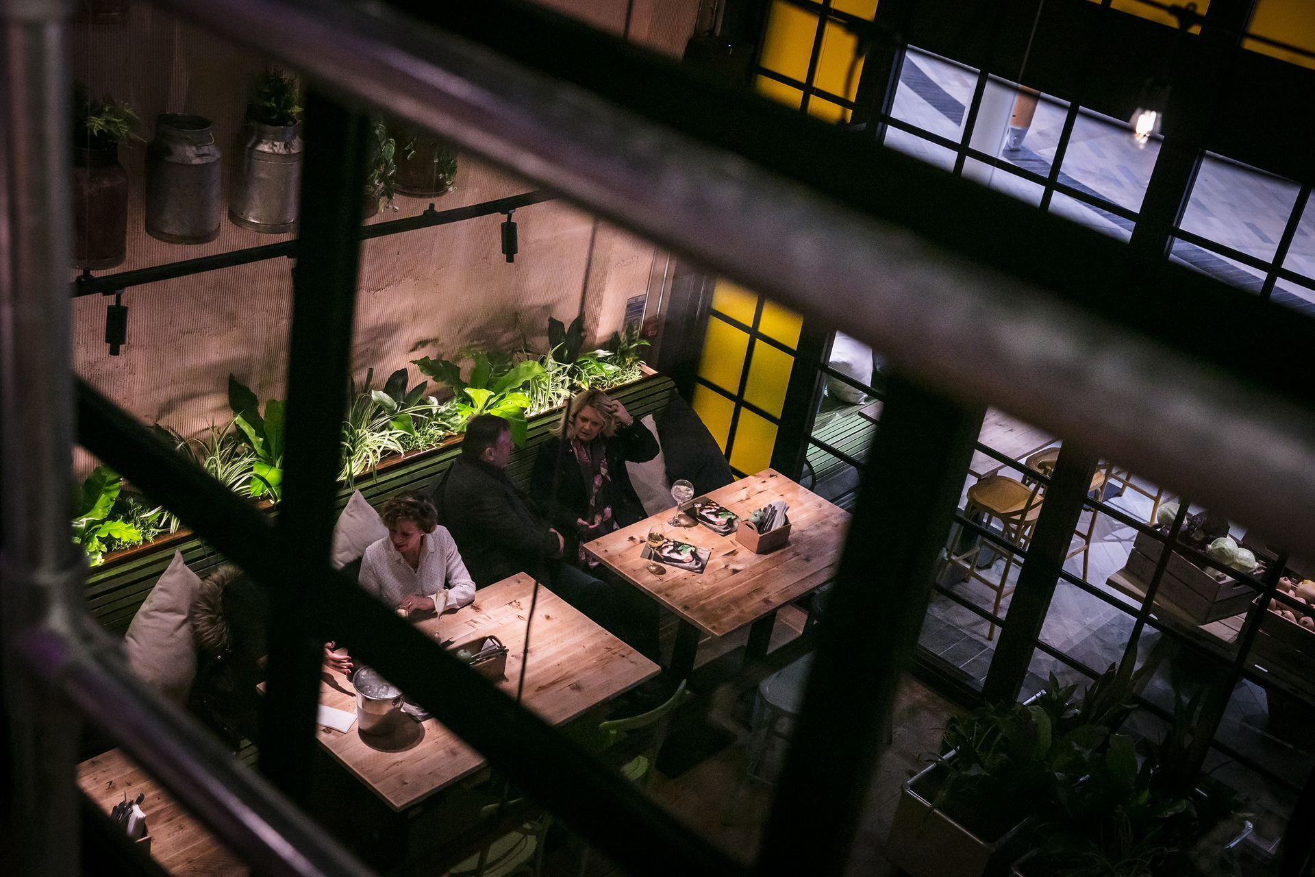
Concept work and development. Renderings of Butcher and The Farmer O2 London Arena | By Design Partnership Australia

Founded
Projects Listed
COOOP.
Other People also viewed
Why ArchiPro?
No more endless searching -
Everything you need, all in one place.Real projects, real experts -
Work with vetted architects, designers, and suppliers.Designed for Australia -
Projects, products, and professionals that meet local standards.From inspiration to reality -
Find your style and connect with the experts behind it.Start your Project
Start you project with a free account to unlock features designed to help you simplify your building project.
Learn MoreBecome a Pro
Showcase your business on ArchiPro and join industry leading brands showcasing their products and expertise.
Learn More


