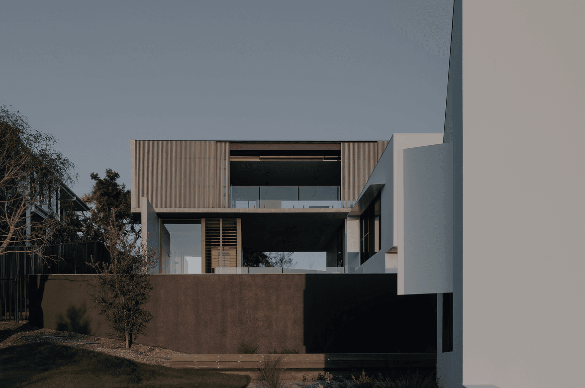
Bond’s Papatoetoe Kitchen.
ArchiPro Project Summary - A complete redesign of Bond's kitchen in Papatoetoe, transforming it into a contemporary, spacious area perfect for culinary pursuits, featuring carefully selected materials and tiles, all delivered on time and within budget.
- Title:
- Creating Bond’s Contemporary Kitchen
- Bathroom Renovation:
- Ideal Renovations
- Category:
- Residential/
- Renovations and Extensions
- Building style:
- Contemporary
- Photographers:
- Ideal Renovations
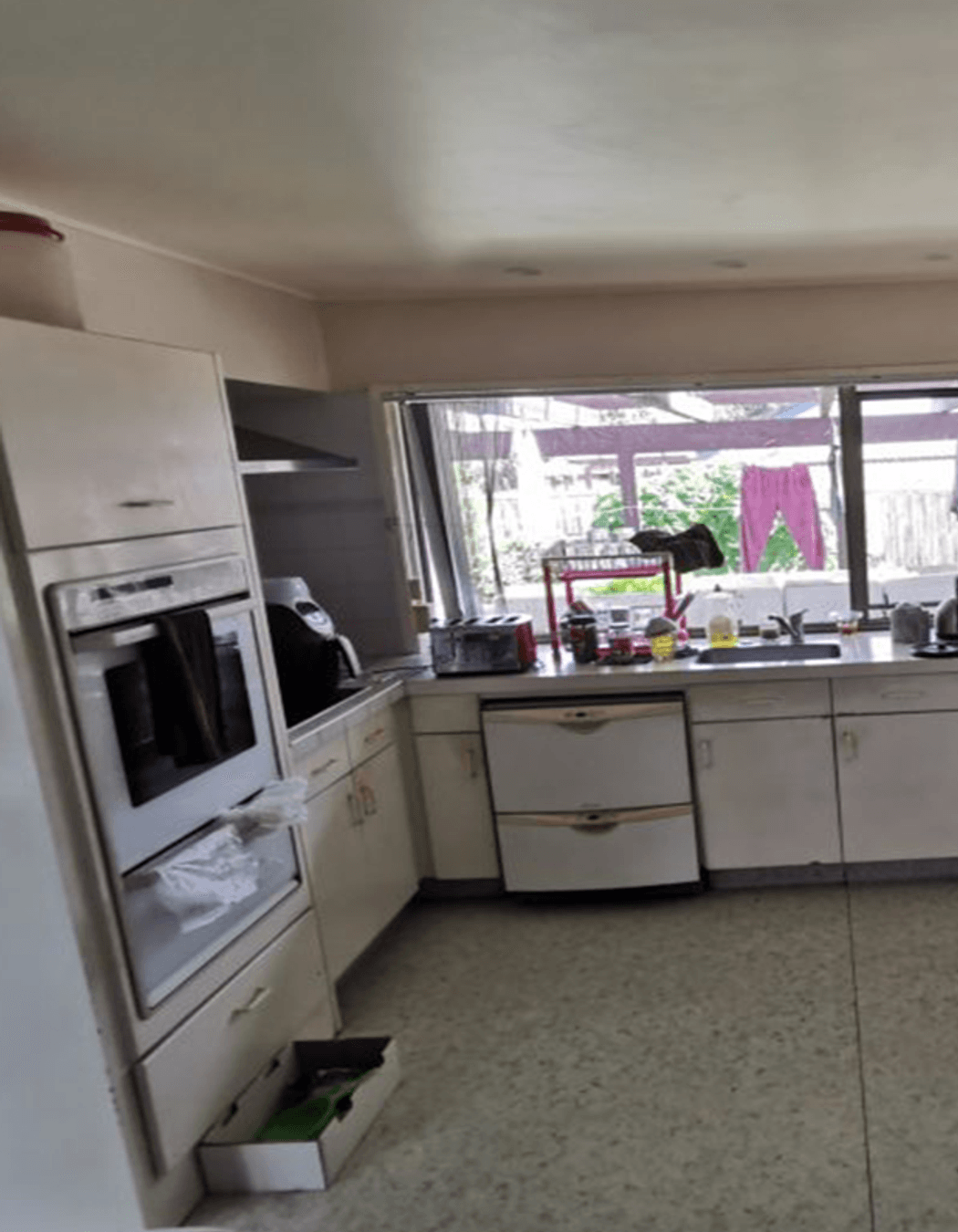

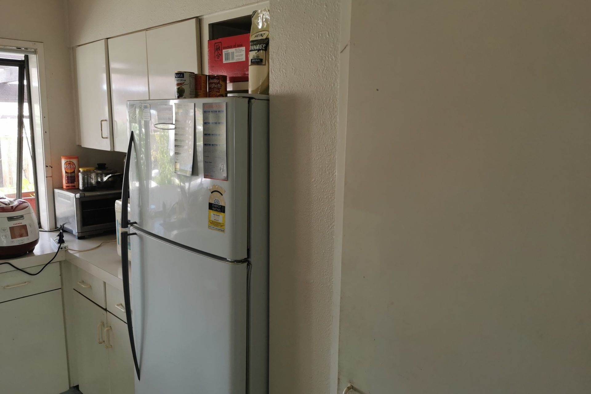
BEFORE THE RENOVATION
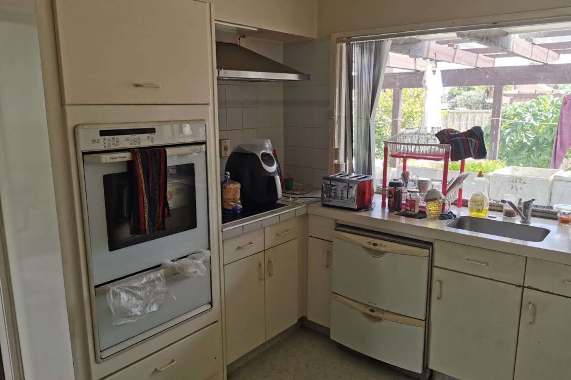
We were given very thorough requirements which helped us to create the entire design and scope of the project. We were told we had to change the flooring and layout with the objectives to modernise and create space including working areas and storage.
To be further generous with space, the client also wanted to raise the dropped ceiling to accommodate larger cabinets and remove the wall partition to make way for a double door fridge. The kitchen also needed better extraction, lighting and a new paint job.

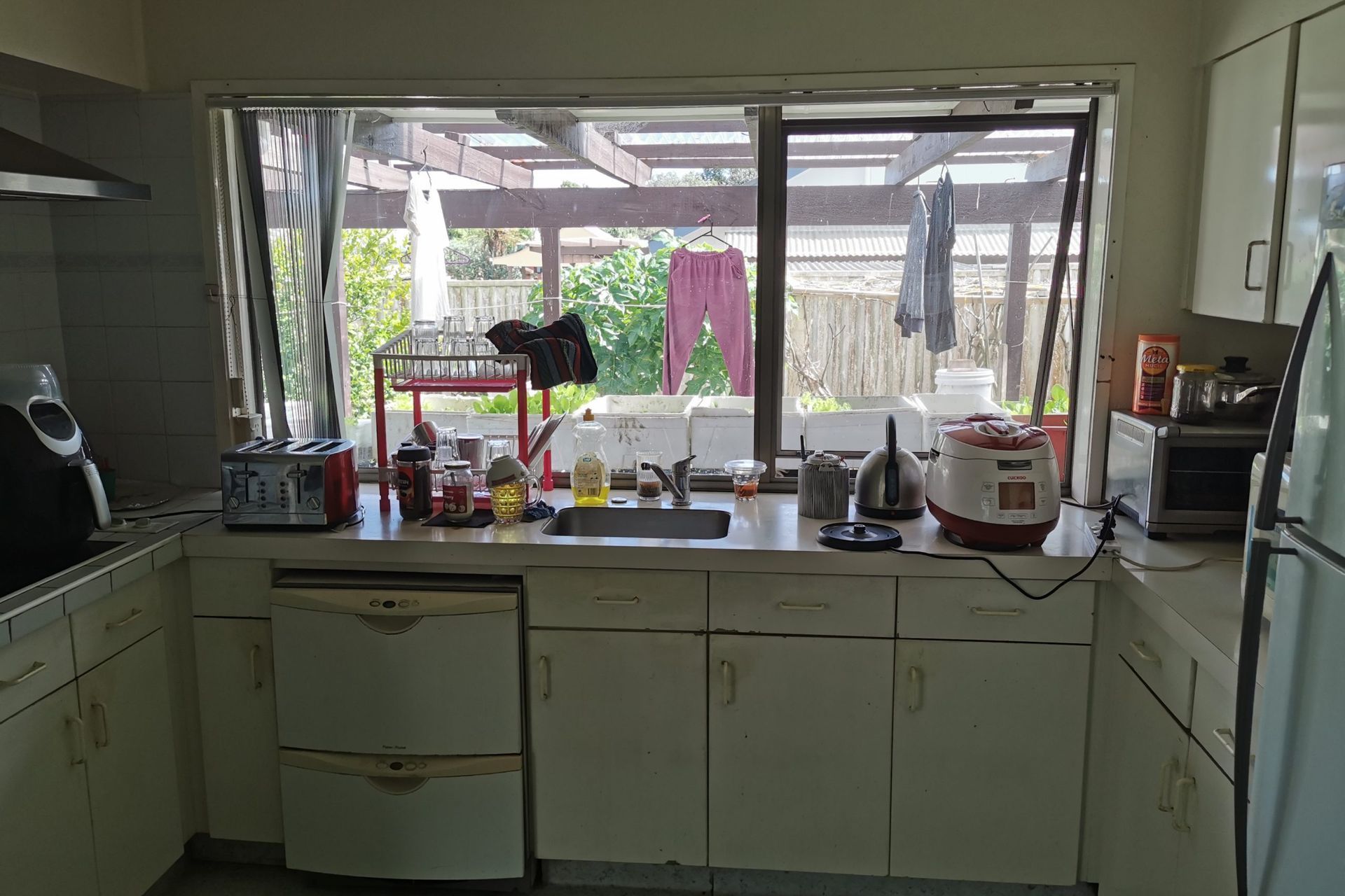

AFTER THE RENOVATION
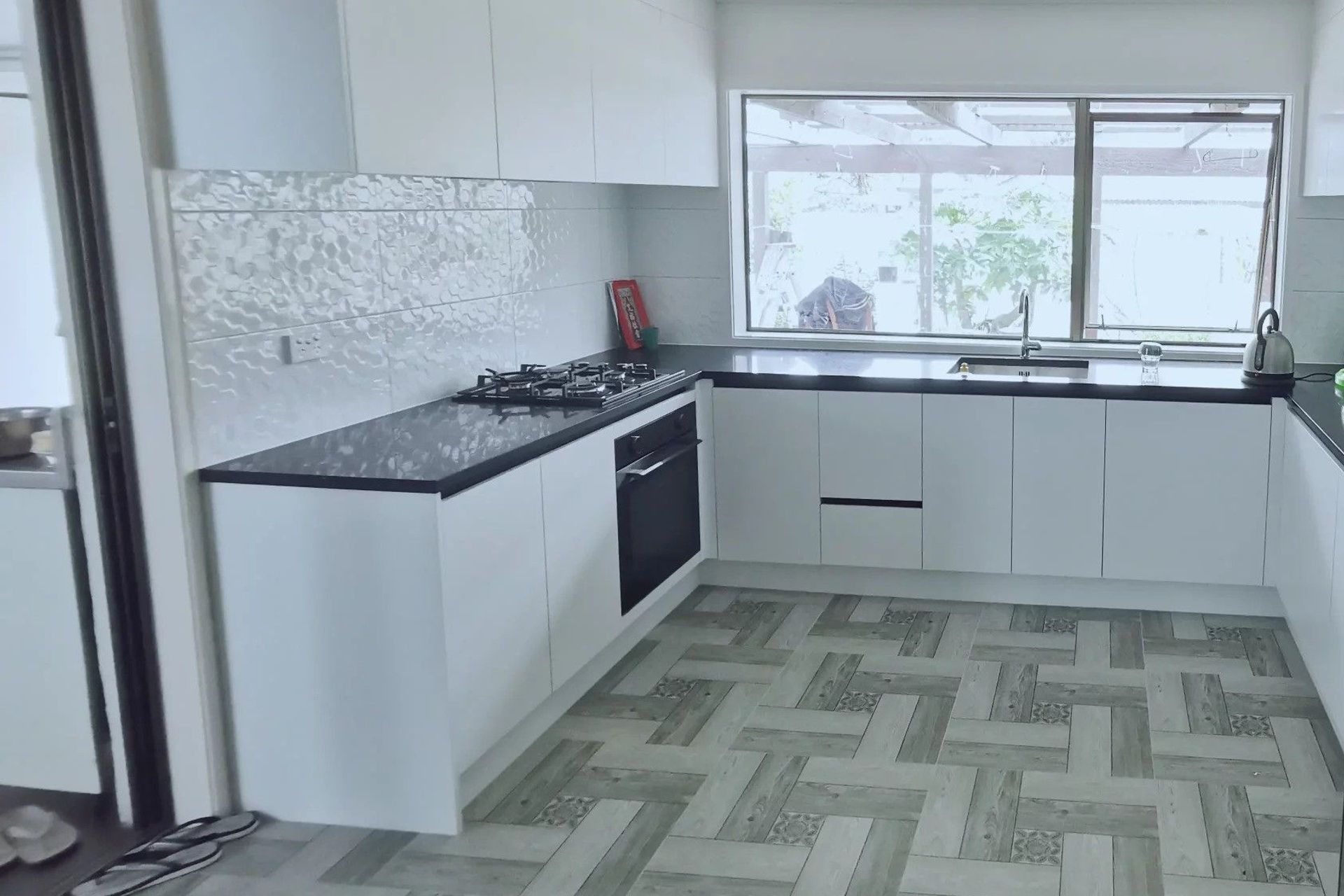
Overall look & feel
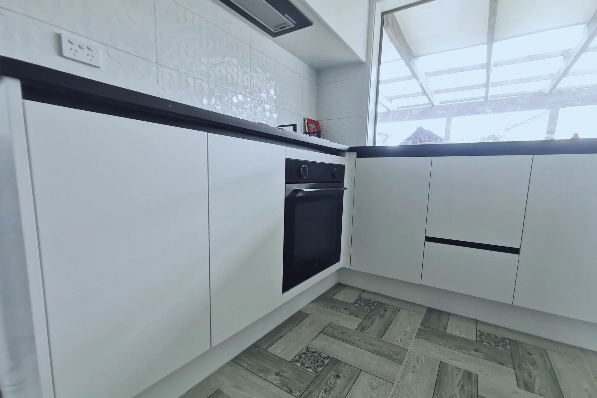
The underlying theme of “modern and spacious” runs throughout the kitchen we designed. By raising the dropped-down sections of the ceiling, changing the flooring and adding a U shaped kitchen counter – we expanded the same space to appear visually generous. The entire room also appears more illuminated with the new paint and lighting added. The space for storage, working and moving is also much larger while remaining easy to clean and maintain.
Kitchen Materials - Countertop
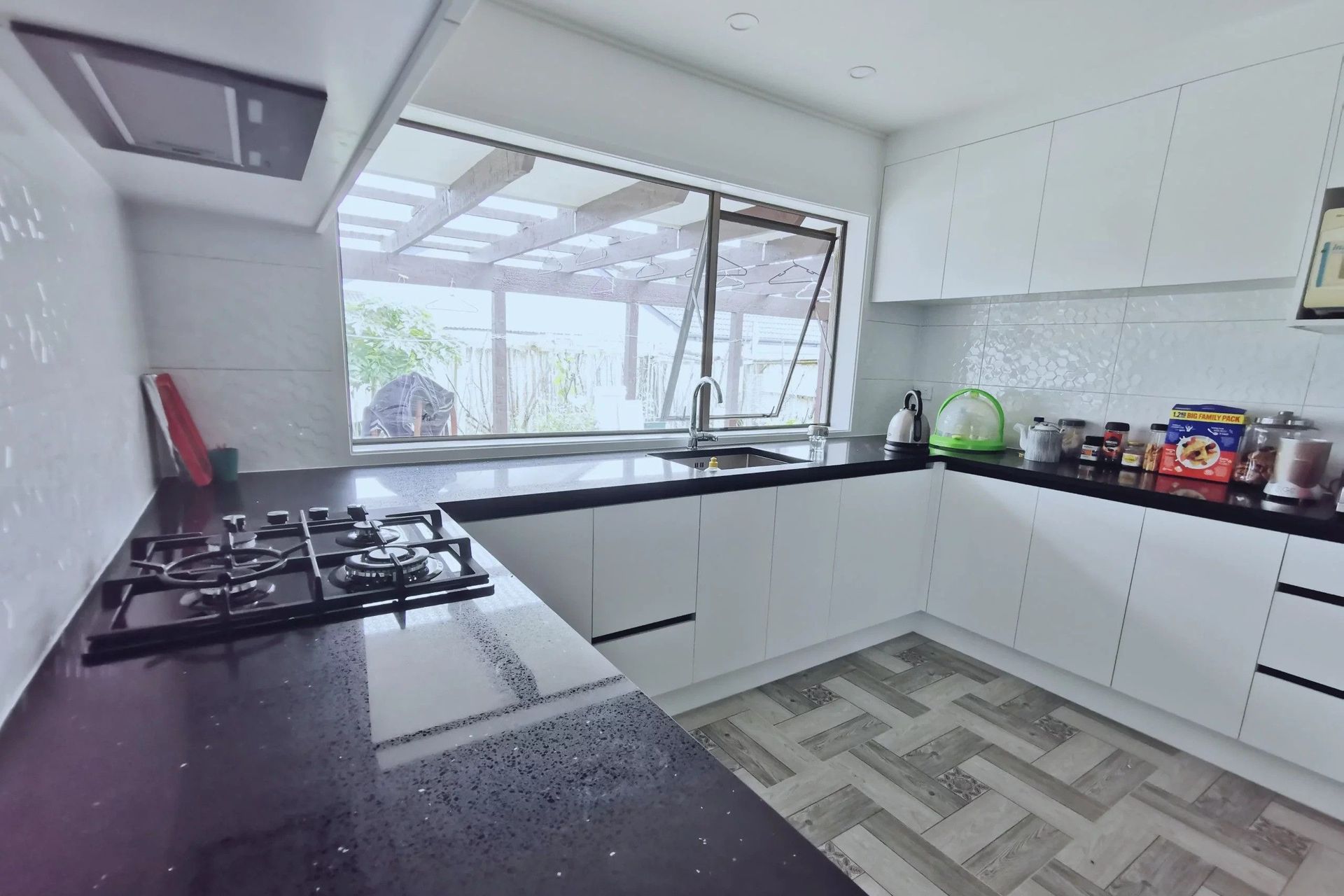
The star of the show is the U-shaped 30mm thickness engineered benchtop from Uniquartz that we installed. This is a “Diamond Black” colour that fits perfectly where a darker looking surface is needed. The dark grey background has inset flecks of black and silver bringing the surface to life by adding contrast and dimensionality. This is durable and easy to maintain making it the perfect choice for family kitchens.
Kitchen Materials - Walls & Flooring
The feature wall is a 30mm x 60mm tile splash-back made of Novo White Hex Gloss supplied by Tile Space. This is a decorative 3D ceramic tile in a rectangle format with a hexagon pattern making it uniquely appealing and super easy for cleaning.
The flooring is 60mm x 60mm floor tiles from Value Tiles & Flooring. With a patterned tile look that emulates timber flooring. We also repainted the interiors with a matching shade of Dulux white on white interior paint which is renowned for its quality and long lasting finish.
Kitchen Storage & Cabinets
We installed large cabinets underneath the U shaped benchtop for easy accessibility and maintenance. The U shaped large benchtop also provides plenty of storage area for everyday kitchen accessories like the toaster, rice cooker and air fryer.
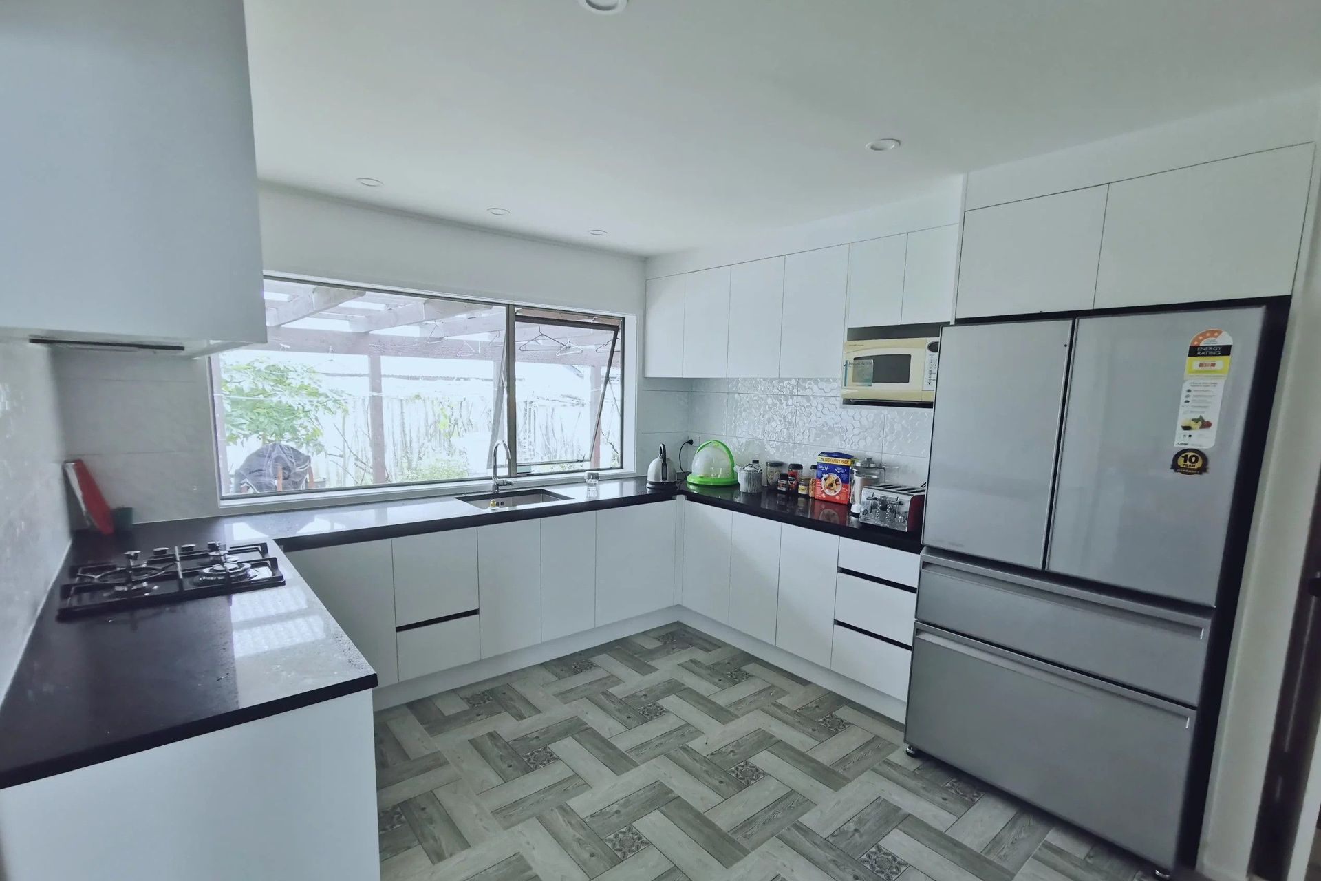
We created a storage area above the fridge cavity and installed wall hung cabinets by raising the low ceilings and making use of the extra space. We also added a cavity for the microwave giving it a neat look.
The cabinetry material is an 18mm Melteca board MDF material in “Snow Drift Satin” to match the white shades. For the cabinets and drawers, we used Hafele (a premium German supplier) with soft close runners and handle-free design for a smooth finish.


Kitchen Fittings & Appliances
We put a large black stainless steel sink from Trade Depot to match the countertop and add to the luxurious look of the kitchen. The undermount sink design has a seamless edge giving more space, a neat finish and ease of cleaning with a simple wipe. We added an Acquatica all pressure mixer from Renoarts.
We created space for double door fridge by removing the old pantry partition wall and raising the ceiling. A gas cooktop was installed replacing the old electric cooker and letting our client pursue her masterchef dreams! The extractor which previously vented through the roof was impractical and messy so we replaced it with a neat in-set extractor which vents correctly through the wall – completely removing all grease and cooking smells from the house.
We also installed brand new power double sockets repositioned to the new kitchen design for easy accessibility and practicality. Entirely new LED downlights from Phillips now illuminate this beautiful new kitchen.
Overall outcome
Our client was absolutely ecstatic with the result – not only did we deliver on practicality and design, the amount of space they had gained was generous! By removing the partition wall and raising the ceiling, we reinvented the concept of space for this kitchen. The choice of tile patterns were much loved for their uniqueness and practicality. We were able to deliver their dream kitchen well within budget and packed with high quality materials and accessories. Our client has 5 investment properties and want us to renovate those in the new year!
The whole kitchen has a 5 year warranty and the accessories and interior painting have a 7 year warranty. The appliances come with a 2 years supplier warranty as well.



Year Joined
Projects Listed

Ideal Renovations.
Other People also viewed
Why ArchiPro?
No more endless searching -
Everything you need, all in one place.Real projects, real experts -
Work with vetted architects, designers, and suppliers.Designed for Australia -
Projects, products, and professionals that meet local standards.From inspiration to reality -
Find your style and connect with the experts behind it.Start your Project
Start you project with a free account to unlock features designed to help you simplify your building project.
Learn MoreBecome a Pro
Showcase your business on ArchiPro and join industry leading brands showcasing their products and expertise.
Learn More
