About
Croydon House.
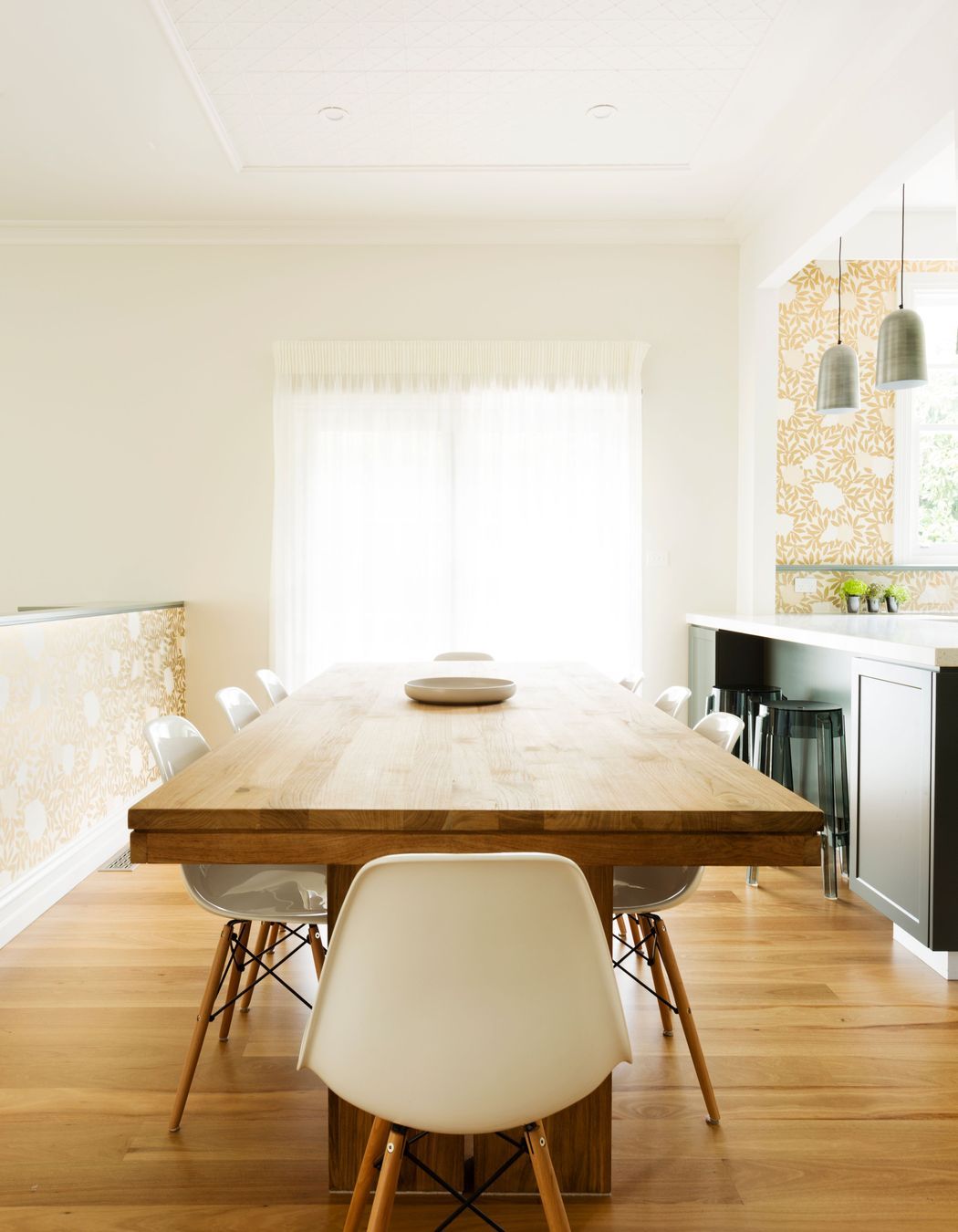
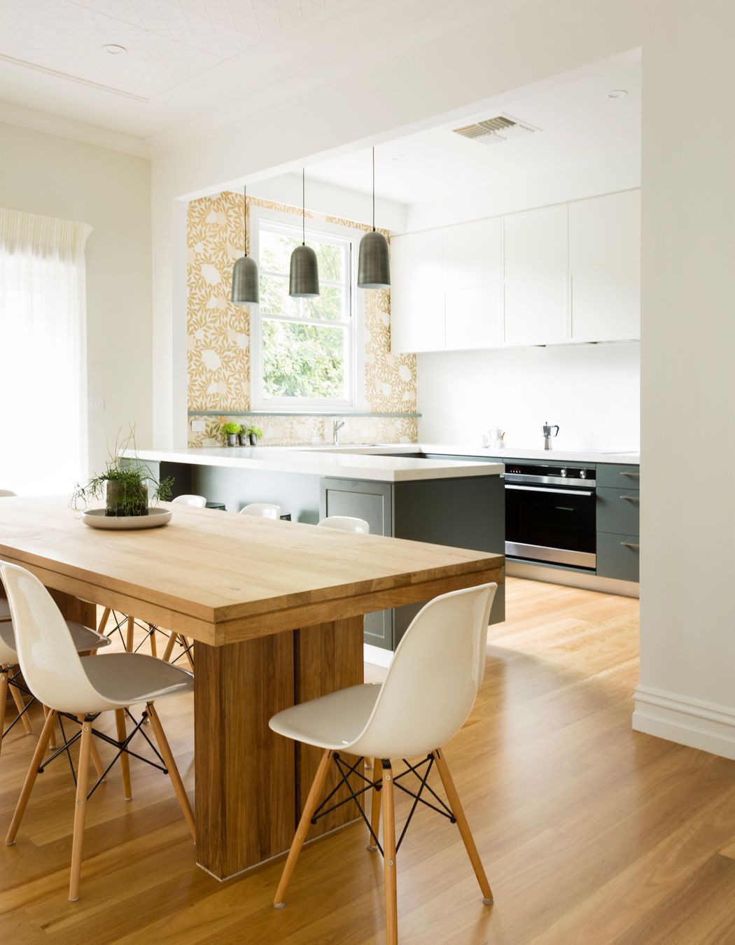
ArchiPro Project Summary - Revitalization of a 1930s Croydon home, transforming the kitchen, dining, and living spaces with contemporary design, enhanced natural light, and improved functionality while honoring the home's heritage.
- Title:
- Croydon House
- Interior Designer:
- Meredith Lee Interior Designer
- Category:
- Residential/
- Interiors
- Photographers:
- Elizabeth Schiavello
Project Gallery


Views and Engagement
Professionals used

Meredith Lee Interior Designer. Our Studio Team
With Meredith overseeing each project, we take our clients’ briefs and use our extensive design and management skills, suppliers and trades to deliver.
It brings us great joy to see how our clients’ lives are improved by the changes we make to their homes.
Our diverse living and family situations mean we can relate to our varied client briefs.
Founded
2014
Established presence in the industry.
Projects Listed
17
A portfolio of work to explore.

Meredith Lee Interior Designer.
Profile
Projects
Contact
Project Portfolio
Other People also viewed
Why ArchiPro?
No more endless searching -
Everything you need, all in one place.Real projects, real experts -
Work with vetted architects, designers, and suppliers.Designed for Australia -
Projects, products, and professionals that meet local standards.From inspiration to reality -
Find your style and connect with the experts behind it.Start your Project
Start you project with a free account to unlock features designed to help you simplify your building project.
Learn MoreBecome a Pro
Showcase your business on ArchiPro and join industry leading brands showcasing their products and expertise.
Learn More


