Petersen K91 bricks deliver immaculate modern minimalist style in Brighton
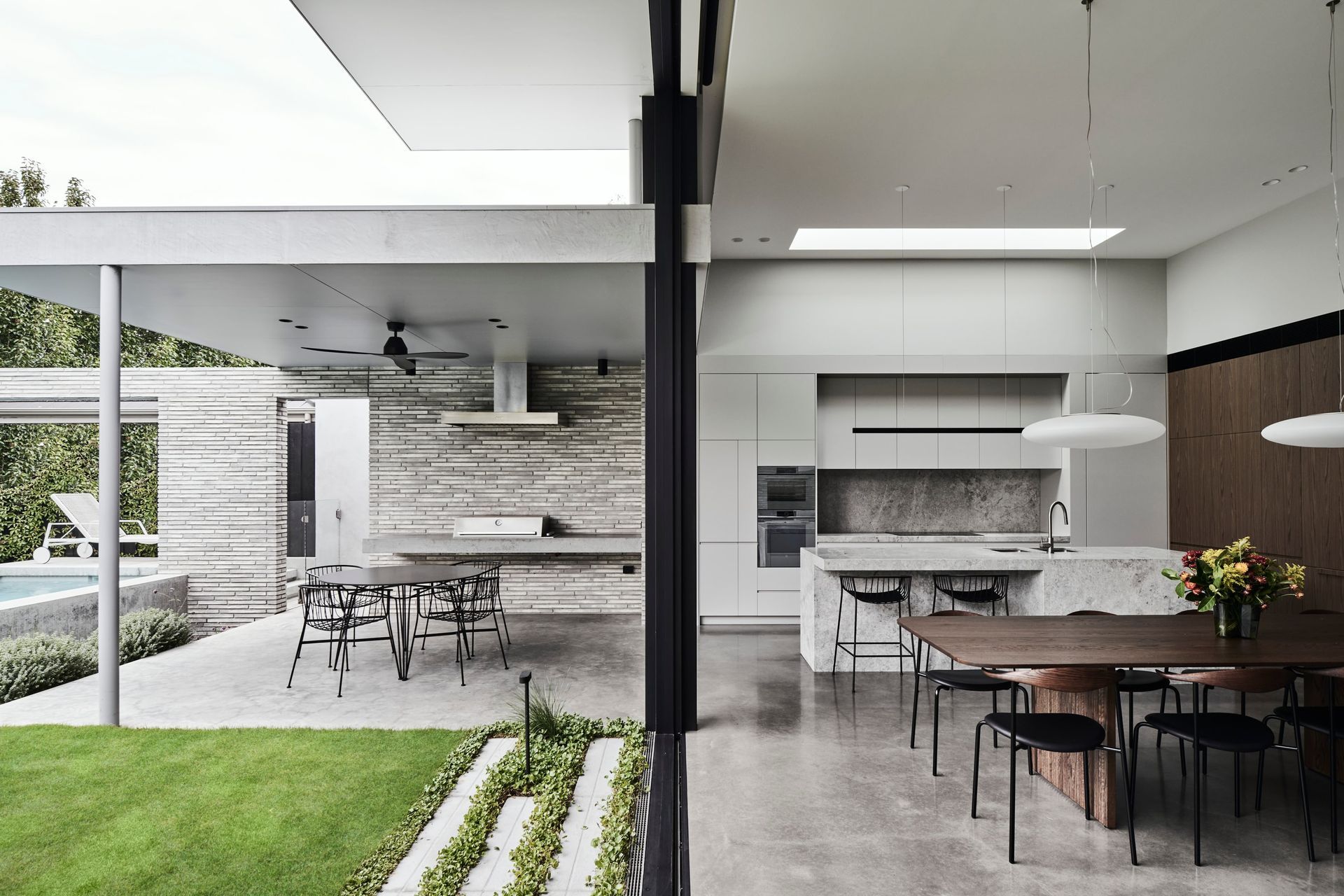
Brighton Residence is a light-filled home with a central courtyard and strong indoor/outdoor connection. Its focus on functionality and simple forms, with a well-resolved, thoroughly detailed and executed design, required exceptional skill to deliver.
For Julie Hanson, home owner and interior designer, selecting long-time colleague Kate Perry, of Kate Perry Architects, along with Build 2 was an easy decision, creating a formidable team who more than delivered. From the extensive design brief – modernist, light-filled home with clean lines, high detail, high ceilings, single storey with a pool – the end result is a thoughtful, immaculate home with a hint of restraint.
“Kate and I had robust discussions about what I wanted and what Kate was able to achieve to meet the constraints of living in an urban environment. She has a great sense of how spaces should work and flow and came up with many options in terms of meeting my design brief,” reflects Julie.
Inspired by Modernist and Danish design, minimalism was key, as were the strong outdoor connections and a calm, welcoming, neutral palette. This inherently led to the selection of high-end materials, which is where brick became the hero, with all other materials falling in place around it.
The brick of choice was the one Julie had carried around with her for some time: the Petersen Kolumba™ (K91). Julie originally saw Petersen’s D91 bricks used on a Herbert & Howes design, which led her to Robertson’s Building Products, and then to the Petersenmagazine, where she was drawn to the image of a fireplace using Petersen Kolumba™ bricks.
“And that was it. I really wanted it to be a calm space, and that brick was so soft and textural. And I was drawn to the dimensions of Kolumba™, which worked really well with the idea of the brief for a modernist home – emphasising the elongation of the building. I’d also been following designers who kept interiors minimal and restrained, and this brick enabled that … and we were really happy with the result,” says Julie.
Julie wanted the bricks taken from externals to internals, not only fitting her low maintenance requirements, but giving that indoor/outdoor feel, creating a seamless flow from space to space.
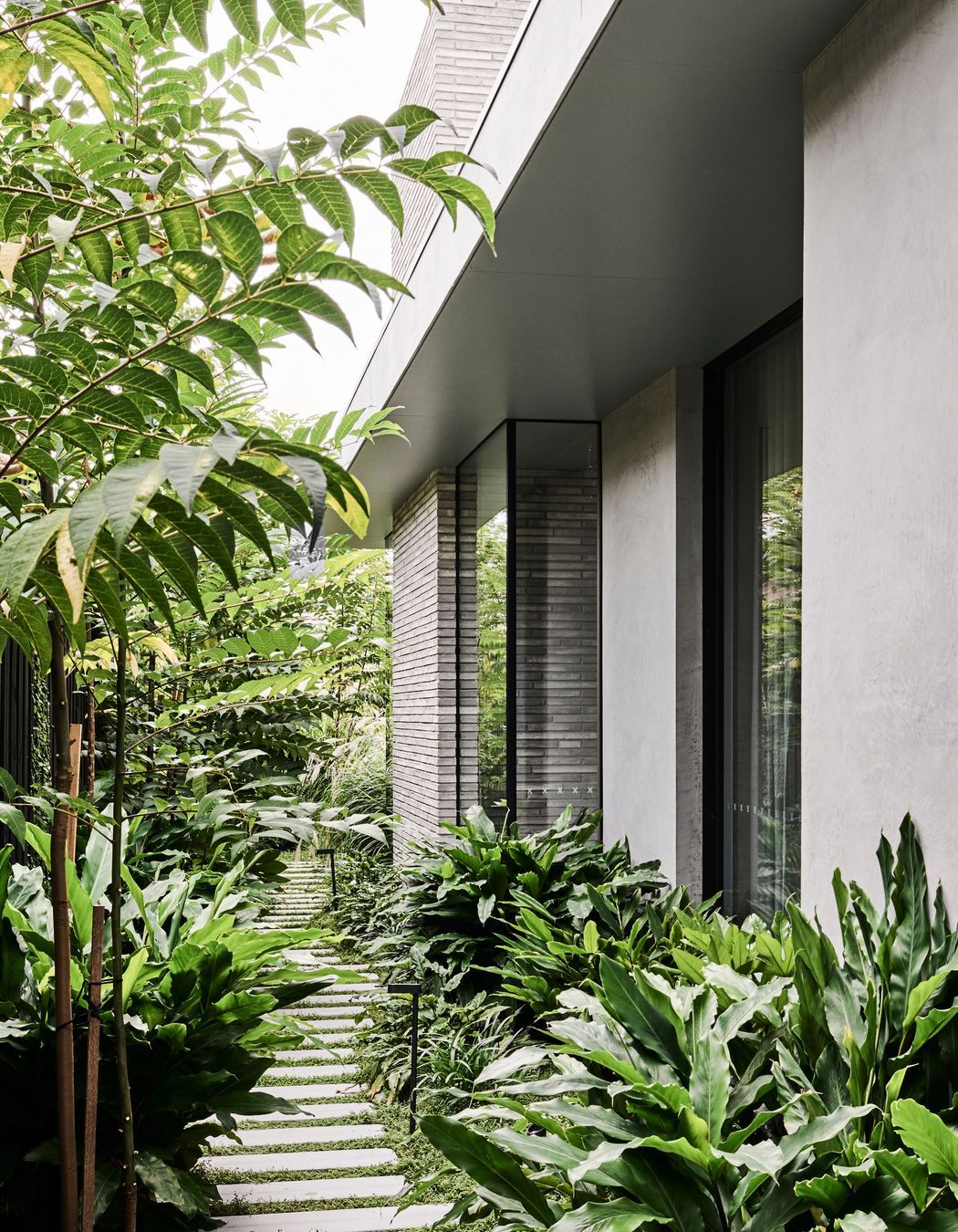
The warmth of the Kolumba™ bricks greets you at the front and wraps into the hallway, where you look straight to the external courtyard’s backdrop of Petersen bricks. And in the rear family room the fireplace design is recreated with a 3.8m chimney of Kolumba™ bricks.
“It’s such a beautiful material, really luxurious – everything the house needed; it gave it a bit of dressing but was subtle, so perfect for what Julie wanted. We felt it was so precious, and if you use it everywhere you can sometimes lose that. So it was a balancing act - not using it everywhere and diluting it, but using it in enough spots so it’s a key feature because it is so special and textural,” adds Kate.
After looking at multiple site references, Julie selected a random bond with recessed mortar lines to emphasis the length. Working with skilled bricklayer Al, the end result is perfect, really celebrating the character-filled, tactile quality of genuine handmade bricks, each with its own thumbprint.
“When I saw the bricks I thought, ‘How do we best use these?’ They are not like a standard brick in dimension or texture. We had to rewrite the rule book a little, to get the most out of them. The bricklayer was fantastic, he had a natural feel for how to use it, even though the proportions are different. So that was a key thing, if we didn’t have a great bricklayer, they could’ve taken short cuts and ruined the effect; it was brilliant he was on board,” recalls Kate.
Along with the bricks, there’s a warm, calm grey palette of cement render and polished concrete, walnut furnishings and timber floorboards, and glass. Lots of it.
The generous use of glass and the courtyard space brings the garden in at every opportunity. In fact, every pivot point has a view, so you always feel like you’re both outside and inside. Acre Landscape Design provided the initial concept drawings bringing life to the pre-defined garden spaces and adding key features like the blade wall over the pool and the minimalist pool fence.
“You don’t feel like you’re on a residential block in Brighton, it’s hard to tell where you are. The garden asserts itself throughout the building and softens the hard edges. I designed the garden footprint with importance equal to that of the other rooms in the brief. They were not merely space ‘left over’ after the building was designed,” explains Kate.
This minimalist design came with challenges, but Christian and his Build 2 team delivered.
“Christian had a lot of input into how to get great details, and when he set out the slab he had the brick size in mind. So, we could proportionally get everything working out from that and minimise brick cuts and work to full bricks in height. And then thinking about the opening where the brick meets the window, how do we not have joins lining up so your eye is drawn to that? We wanted the horizontal flow of the brickwork; it was all scientific – there’s a lot of hard work and thought involved,” comments Kate.
The design and build process took three years, all through Covid. And despite its associated construction delays, supply price-hikes and lockdowns, the result is incredible. While Julie and her family spent lockdown in Red Hill, Kate and Build 2 continued with weekly site meetings:
“Kate and Christian from Build 2 really held the fort during Covid and I’m eternally grateful.”
Thoughtful, considered design really sets this home apart, but collaboration was also key. Every trade was exceptionally skilled, on the same page and knew what they were trying to achieve:
“Each trade was very good and was able to show what they could do and how to best do it and I think the building just absorbed all that. The builder, in particular, took what was hopefully a great building and made the details all work, so it took it to the next level. If I didn’t have a great builder involved it may not have hit the mark– everyone was working together,” concludes Kate.
And that is a hallmark of success.


