While Coromandel Peninsula is arguably one of New Zealand’s most beloved holiday spots, there are few willing to brave the tortuous gravel roads to get to the northernmost point, Otama Beach. But those who do are amply rewarded; the secluded north-facing beach is pristine and quiet, even at the height of summer.
For one Bay of Plenty couple, a section amongst the small row of houses that are seated against the hill overlooking the beach was the perfect spot for them and their extended family to really get away from the hustle and bustle and settle in for long, lazy holidays at the beach.
Their brief to Lloyd Hartley Architects was simple: to create a large, warm, welcoming holiday home for an extended family that really makes the most of the stunning coastal location.
But Ben Lloyd and Mike Hartley say that accommodating a large brood didn’t mean an ungainly, large design.
“What we wanted to create was not just an enormous house that looks out onto the beach, but a home that actually has moments of intimacy, and a space that works equally well for two people, as it does for 20,” says Ben.
A rather special element of the project was that the pair worked in collaboration with their first employee at Lloyd Hartley Architects, Jeremy Brick, of Studio Brick Architects. His father and father's partner were the clients, so he had great insight and a personal relationship to the project.
“We were already halfway there in terms of understanding some of the family dynamics and that gave us an opportunity to really explore those a little bit further than we would sometimes be able to do,” says Mike.
In response to the need for togetherness and privacy, a home was created with a series of spaces that allow people to come together but then also disperse when necessary. Three exterior gathering areas serve this purpose; breakfast can be served on the sheltered back deck on the hillside of the house, while an evening deck with views of the sea is perfect for dinners. Downstairs, another covered outdoor space allows a gathering spot for family and friends.
The form of the home nestles into the curves of the hillside behind, thereby creating those opportunities for pockets of outdoor shelter, which allow guests to enjoy the sun and hide from the breeze at different times of day.
Shaped like a neat dart, the bach’s sculptural quality juxtaposes against the warm materiality of the exterior.
Ben says there was an intentional dichotomy between the contemporary shape and traditional bach materiality that makes the home both modern in its function, and casual and warm in its feel.
“The exterior materials were chosen to be as natural as possible and to blend into the environment. The cedar cladding on the upper level is stained with Dryden’s wood oil in ‘slate’ because it's inherently a silver colour that will weather over time really nicely, settling the home into the environment.”
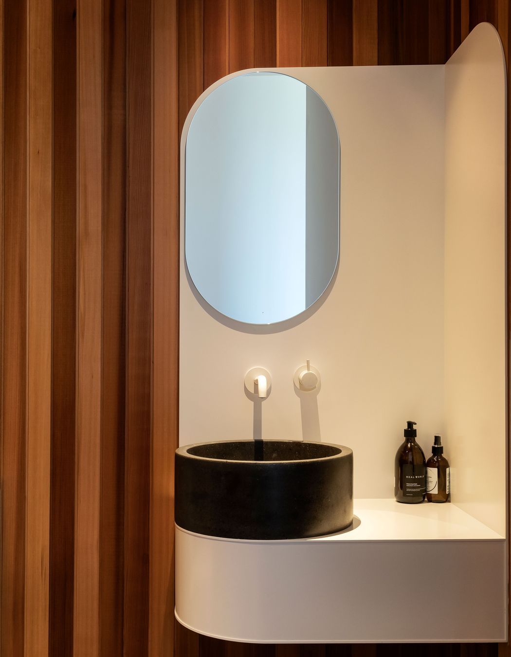
The interior materiality also avoids a crisp, white aesthetic; materials were chosen in earthy, deep and dark tones, creating interest and depth.
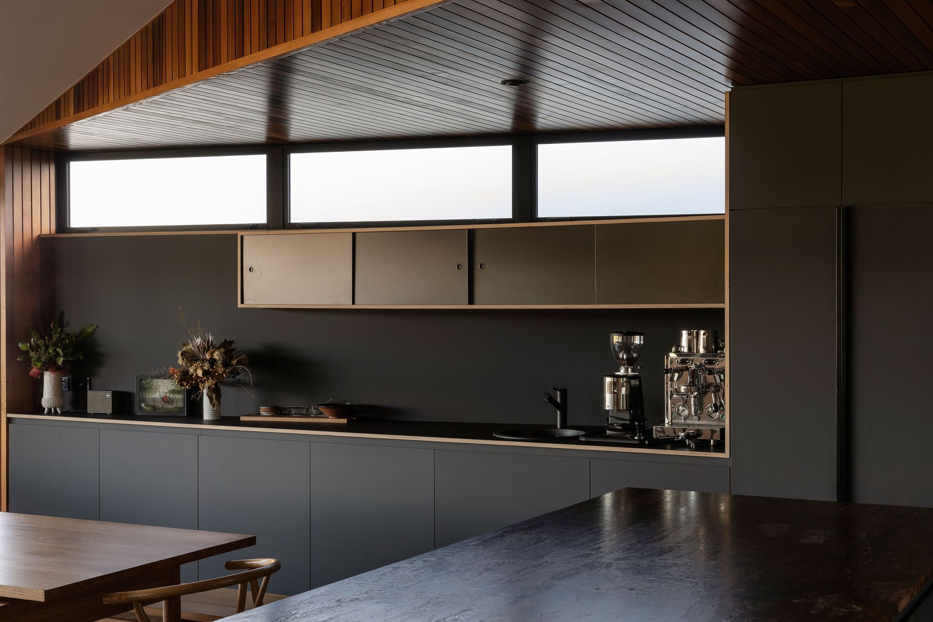
In the kitchen, the clients fell in love with a deep bronzite benchtop, which then informed other material choices.
“We were able to find materials that resonated with that almost Caravaggio-like quality so that the dark black of the cabinetry, and the light oak of the floor, and then the warmth of the cedar coming through really evoke that richness of materiality and texture,” says Mike.
But in the downstairs bathroom, the owners decided to do something a little more glamorous.
“There was almost a ‘magpie’ aspect to some of the materiality in the house; in the downstairs bathroom there’s an amazing gold tile, and the client just saw it and loved it – so we get these moments of incredible kind of intense, sparkly light, and it's pretty fun!” says Mike.
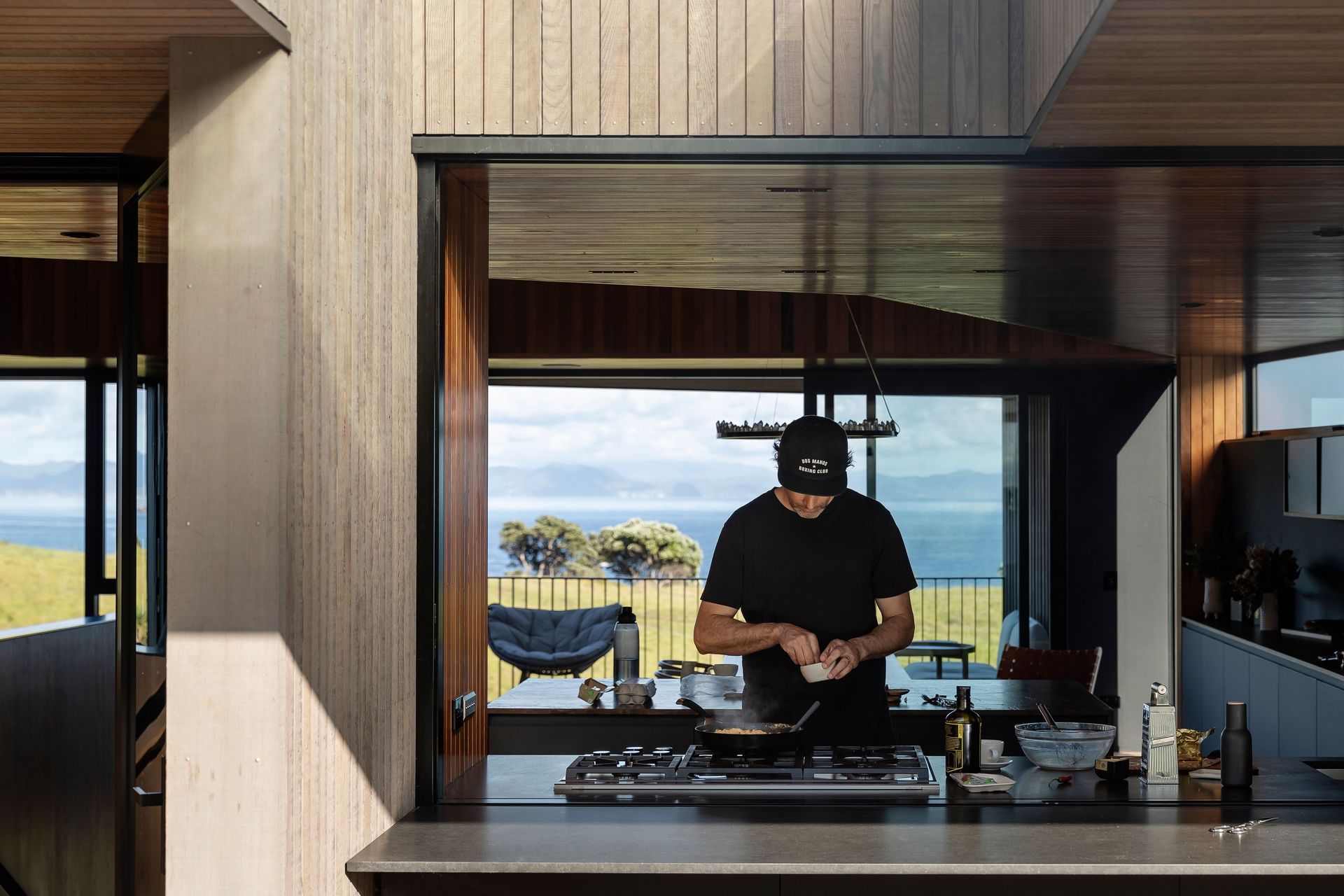
The guest bedrooms share the downstairs bathroom, while the living and kitchen spaces take in the jaw-dropping views upstairs. The master and en suite are tucked out the back of the first floor, taking in the morning sun and hillside views.
Mike says this spatial arrangement really says a lot about the clients and the overall success of the project.
“The clients were really generous in terms of giving over the public spaces to those views down the beach and this just reflects the type of people they are.”
Ben agrees: “The success of this home is that it works incredibly well for the clients and reflects their generosity of spirit. It's tailored to their needs and how they host people and how people occupy the home. It's been amazing to see it being used in the way it was planned; and it really embodies the clients and who they are.”
Project in collaboration with Studio Brick Architects
Photography by David Straight
Winner - HOME Magazine - Rural Home of the Year 2021


