Look to the hills
Central Otago is renowned for its spectacular mountain scenery – and there are rules in place to ensure it stays this way. Houses are designed to nestle into the landscape, not make a bold statement. But, as this project shows, it's not only the passing tourists who benefit from the strict design criteria. Simple, straightforward architecture can be the best response to the sweeping landscape, putting the focus firmly on the views.
Architect Michael Wyatt was contracted to design this holiday house on a site that has views from rolling foothills to the Remarkables mountain range in one direction and Coronet Peak in the other.
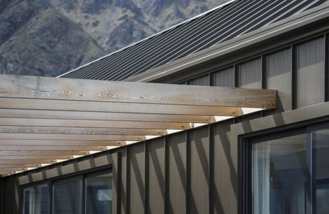
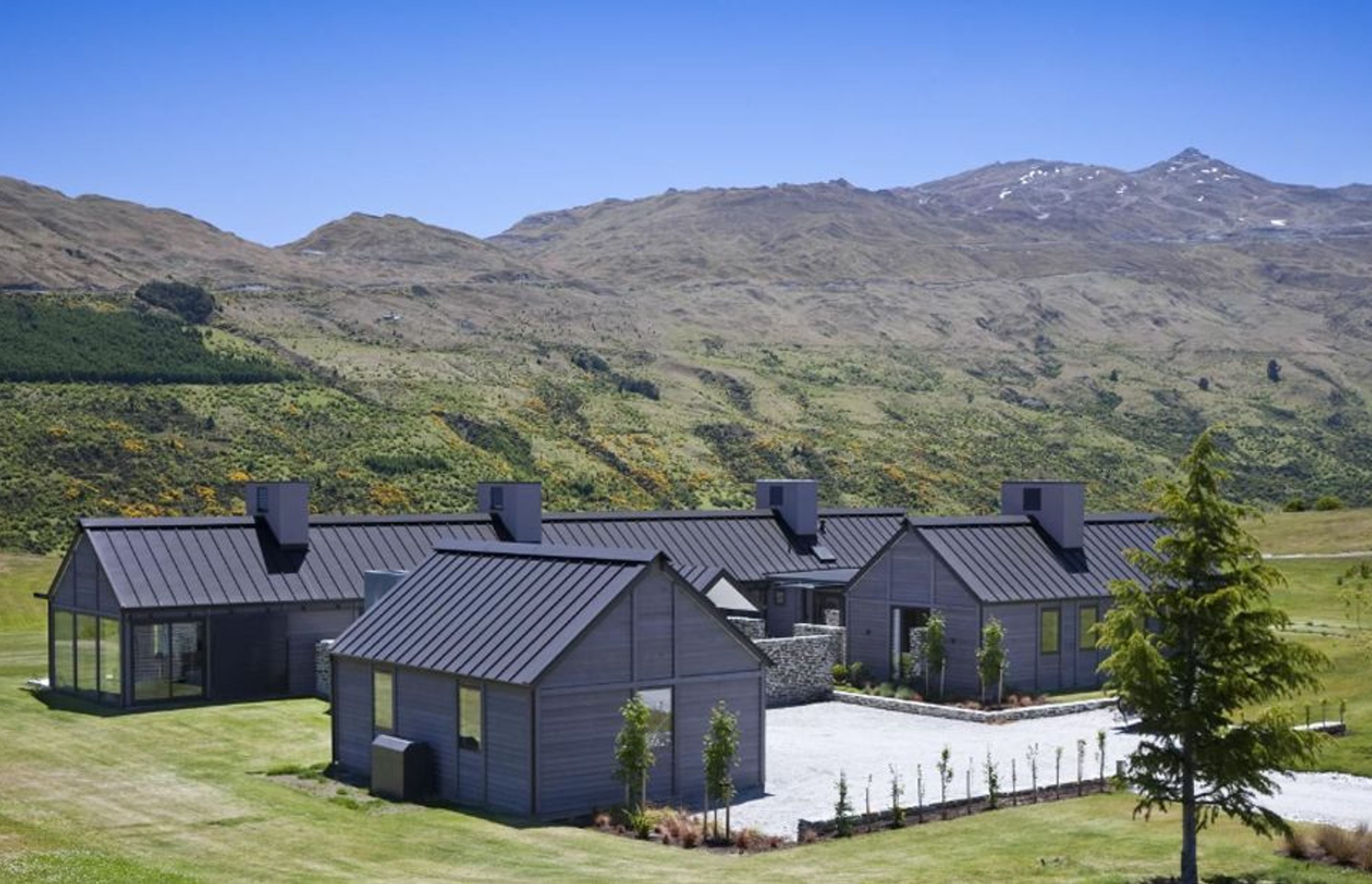
"The clients wanted the house to have a simple pitched-roof form, which fitted with the local covenants," he says. "It was also a way to contain the budget. For the same reason, we chose dark-stained weatherboards, rather than stone, for the cladding."
Wyatt says the property is effectively a compound, comprising three gabled pavilions and an enclosed courtyard.
"Making the building a collection of three major roof forms instead of a single monolithic shape is not only more interesting visually – it also allows more natural light to enter the interior, and it provides for sheltered outdoor living areas."
Entry to the house is through the walled courtyard on the south side of the house. The walls feature bagged schist, similar to early goldmining huts in the region.
An elevated platform with a canopy that has the same pitch as the roofing enhances the sense of arrival. Its dramatic form also signals the entrance, says Wyatt.
"Walking across the courtyard provides a more intense experience of the site – you are not bursting straight into the house. Rather, there is an initial visual connection with the broad sweeping landscape, the rolling hills and the mountains beyond. For this reason, also, there are no rose gardens or picket fences – the entire design is focused on the house's wider surroundings."
The east-west axis of the main pavilion containing the living areas, guest and master suites, maximises the outlook. The main living area at the far western end has views out in three directions.
"Every other room in this volume has a double aspect," says Wyatt. "This provides views of the mountains to the north and south. With the sliding doors open on both sides, there is also plenty of cross ventilation to help cool the house in summer."
To ensure the interior is also shaded from the intense summer sun, the architect added an inverted L-shaped steel framework to the long northern elevation. Blades attached to the frame shade the interior.
"The blades can be moved if required, but are currently positioned so they don't compromise the view of the tops of the mountains when people are seated," says Wyatt.
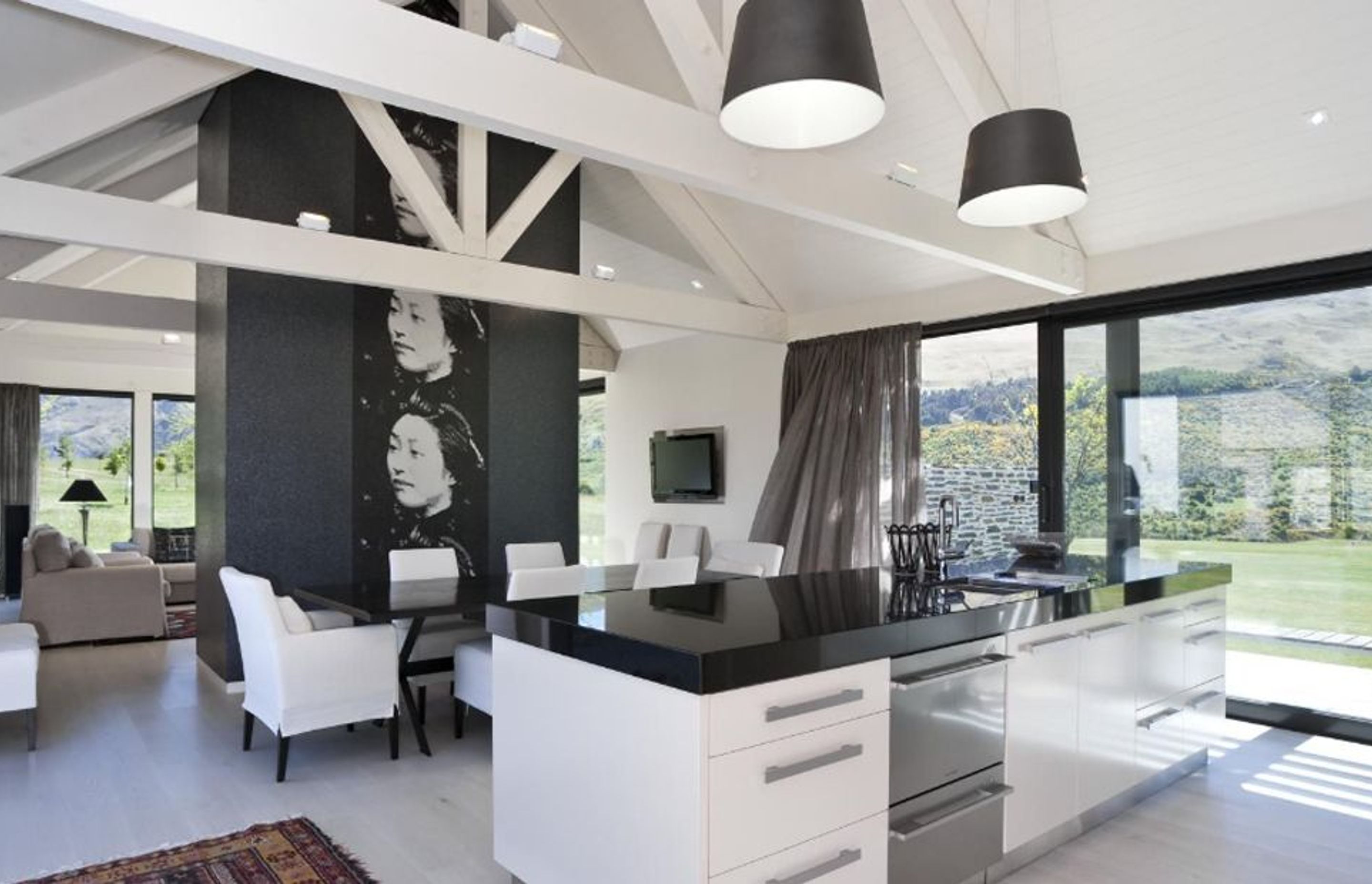
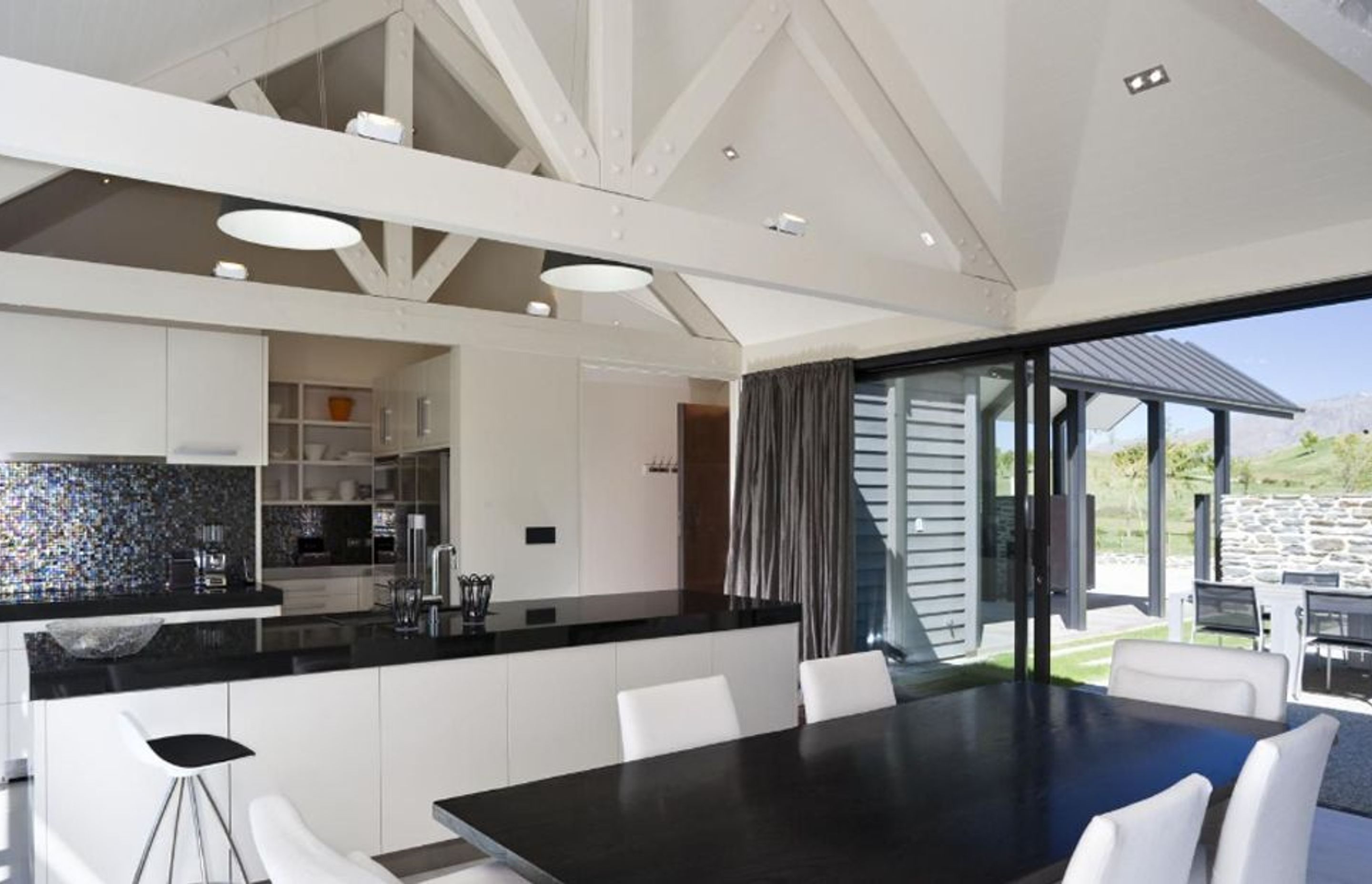
A light, airy interior defines the main living pavilion, which features exposed, white-painted trusses reminiscent of old warehouses and rural buildings. Blonded wood flooring and white-painted sarking on the ceiling further enhance the feeling of lightness and space. A central chimney, covered in a dark wallpaper, serves as a room divider that helps define the formal living space and dining room.
"The chimney provides a degree of separation, yet still allows for a very open, flowing space," says the architect.
Interior designer Rhonda Allen of Flagstaff Design introduced contemporary furnishings that complement the architecture, but don't interrupt the view.
The kitchen was also designed to provide a clean, uncluttered look. Sleek white cabinets are paired with Black Pearl granite benchtops and an iridescent mosaic tile splashback. A scullery situated behind the rear wall provides additional storage and keeps cooking and cleaning utensils hidden from sight.
The master suite, guest suite and a media room are positioned at the opposite end of the main wing. This part of the house links to a second pavilion via a short hallway.
"Providing a flat roof on this linking element ensures a separation of the main roof forms," says the architect.
The smaller wing contains two bedrooms with ensuites – the third pavilion provides garaging. Wyatt says there is a separate entry for the bedroom wing, which can be closed off if required.
The property, at 111 North Ridge, Queenstown, is part of the Touch of Spice Private Villa Collection, and is available for short-term rental.
No project details available for this project.
Request more information from this professional.
Professionals used in Look to the hills
More projects by Wyatt + Gray Architects
About the
Professional
Wyatt + Gray Architects is an award winning New Zealand design practice that pursues quality, style & value in its architecture.
The team enjoy opportunities from continued learning, keeping up to date with the latest construction techniques & recognise the importance of sustainable design & inform clients of opportunities where it could enhance a project.
We believe that the success of any project rests on the ability to realise a clients goals and our priority is to listen carefully to the needs of the client & respond with a well developed and innovative solution.
- ArchiPro Member since2014
- Associations
- Follow
- Locations
- More information
Why ArchiPro?
No more endless searching -
Everything you need, all in one place.Real projects, real experts -
Work with vetted architects, designers, and suppliers.Designed for Australia -
Projects, products, and professionals that meet local standards.From inspiration to reality -
Find your style and connect with the experts behind it.Start your Project
Start you project with a free account to unlock features designed to help you simplify your building project.
Learn MoreBecome a Pro
Showcase your business on ArchiPro and join industry leading brands showcasing their products and expertise.
Learn More