About
Modernist Twist.
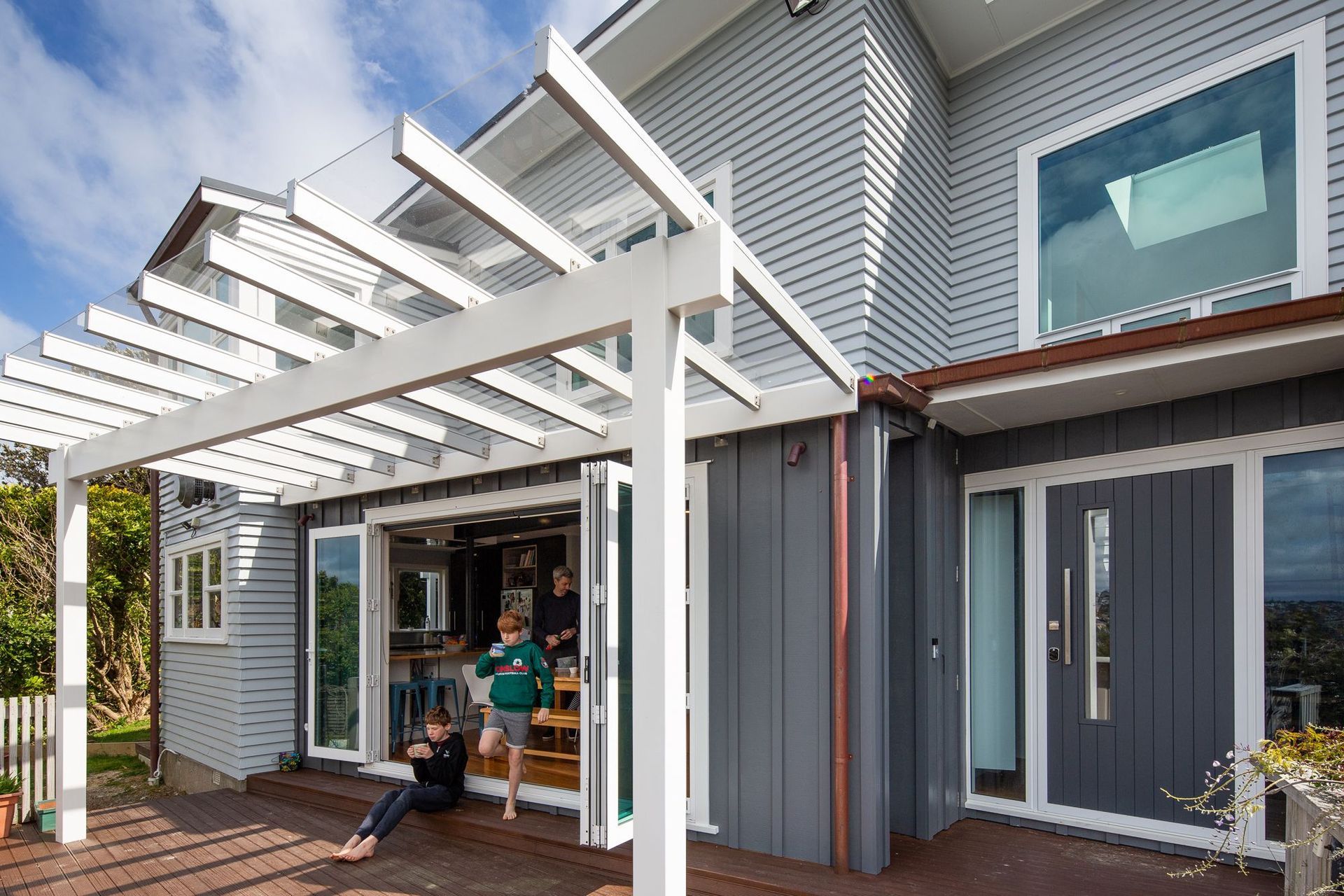
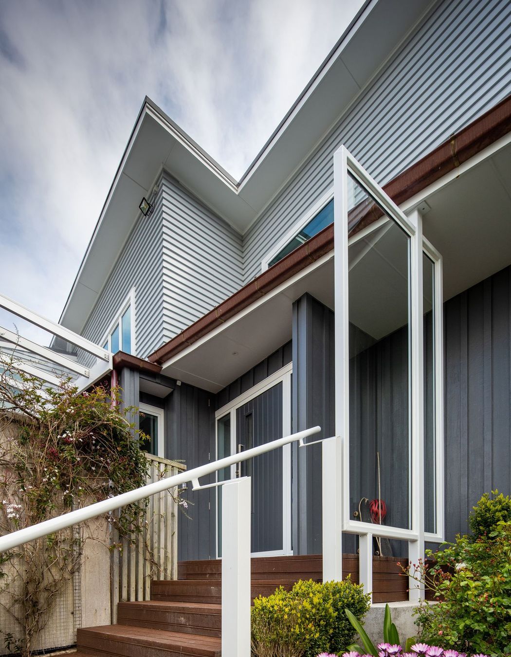
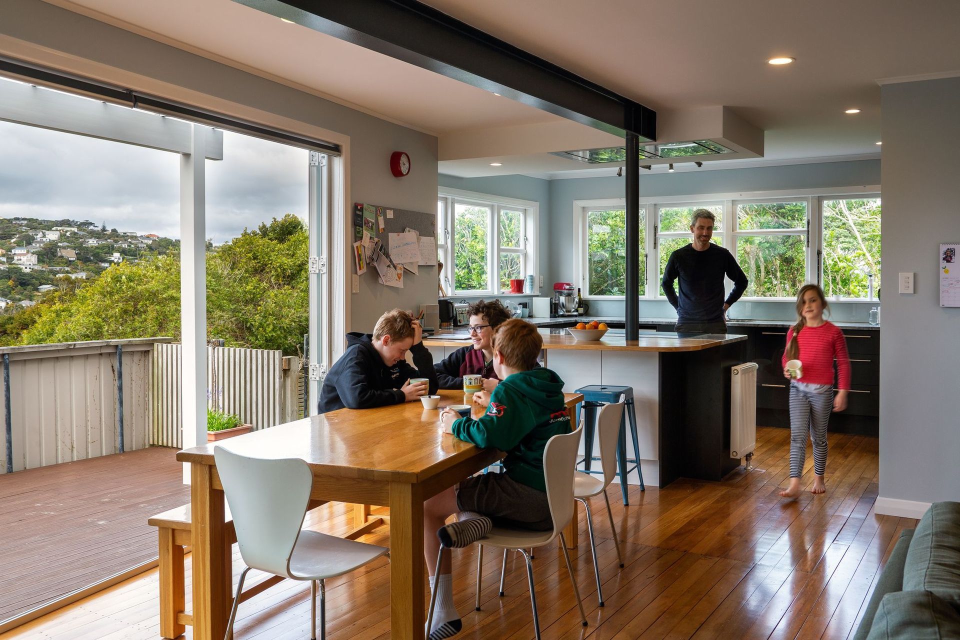
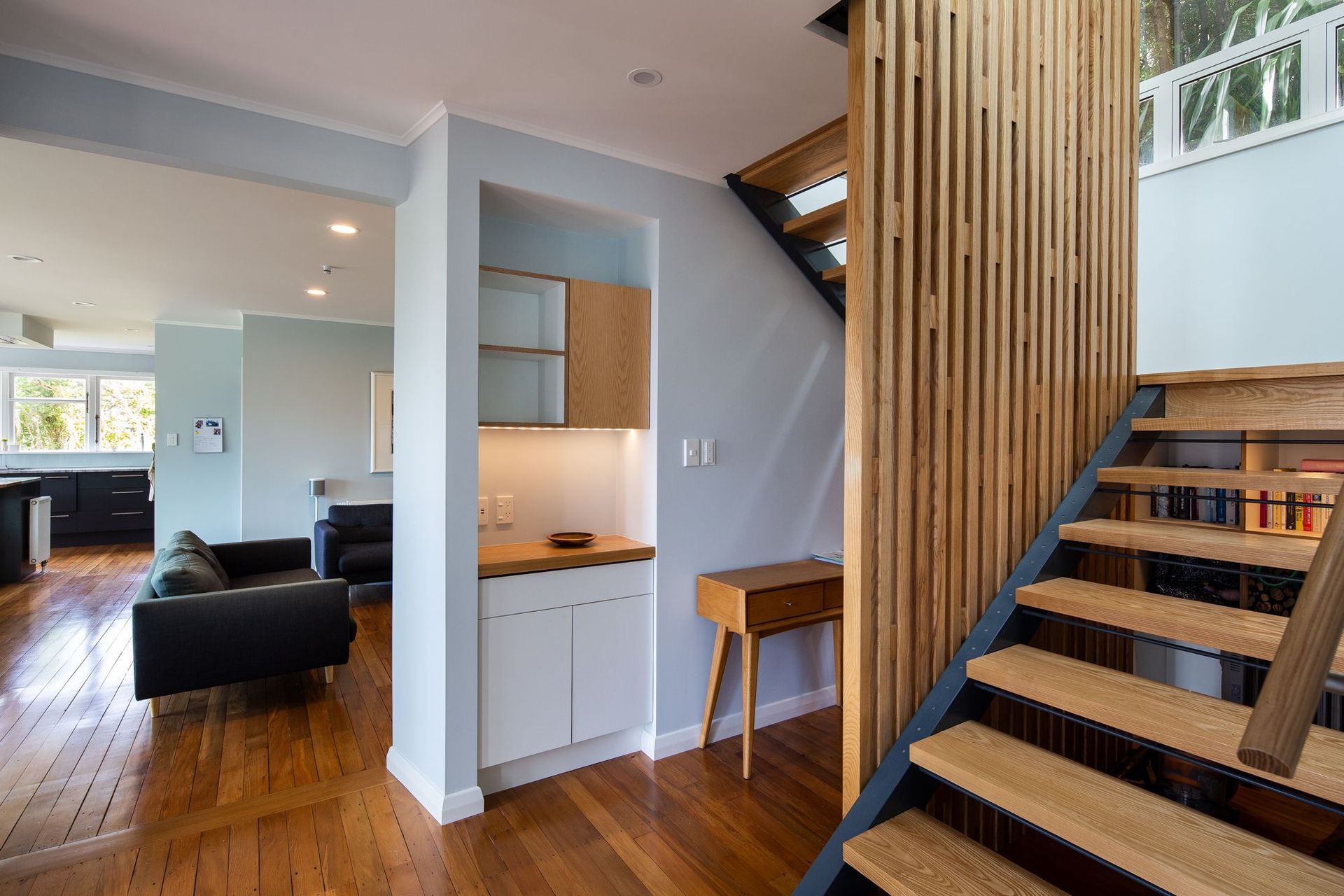
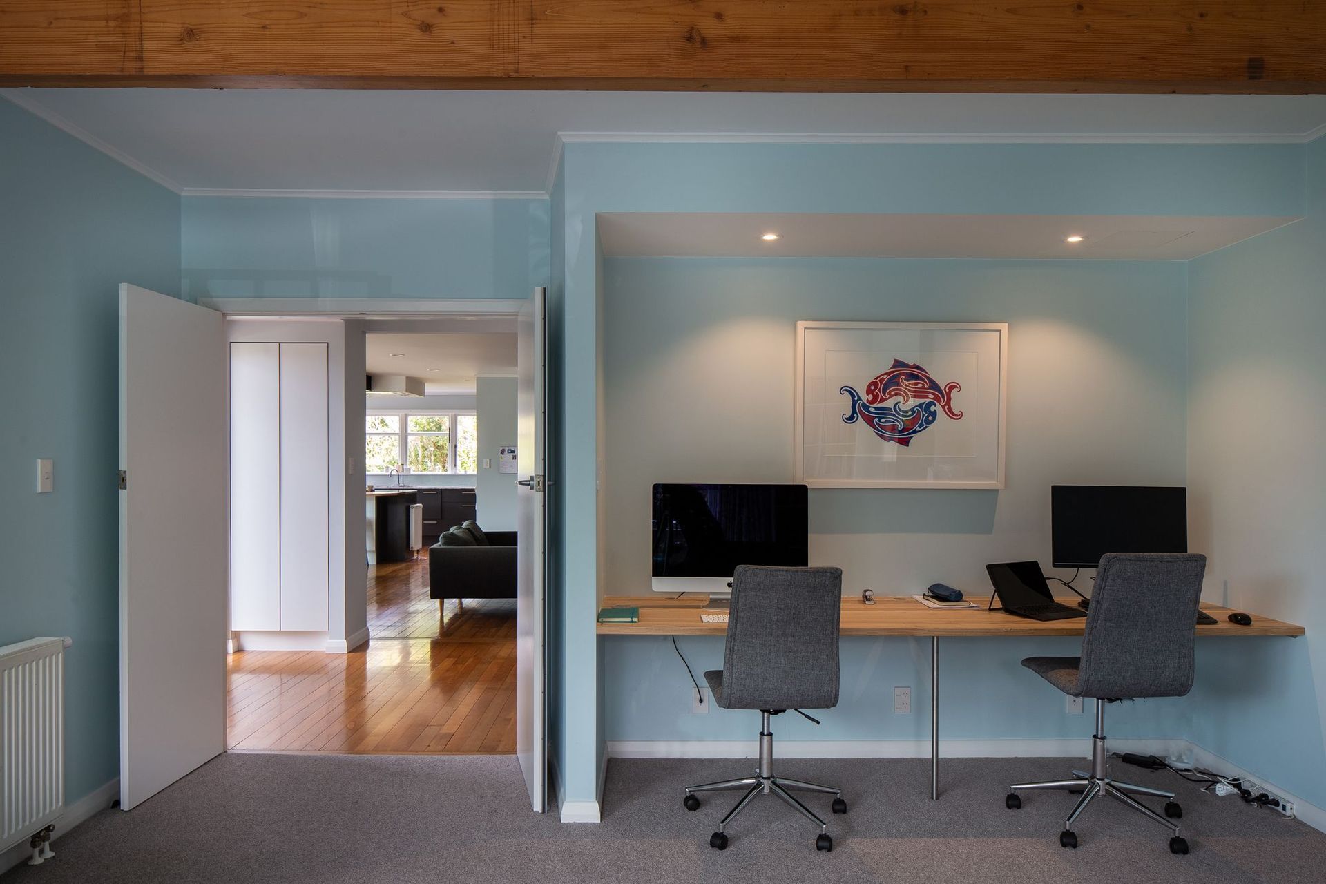
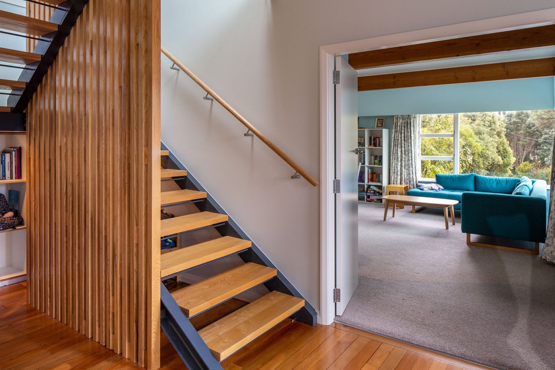
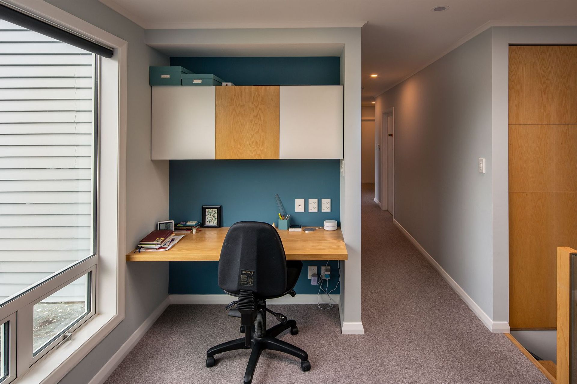
ArchiPro Project Summary - A mid-century modern house reimagined with a cohesive design, enhancing circulation and connectivity while preserving its unique character and integrating modernist elements for a light-filled, functional living space.
- Title:
- Modernist Twist
- Architect:
- Wright & Gray Architects Ltd
- Category:
- Residential/
- Renovations and Extensions
Project Gallery

Views and Engagement
Professionals used

Wright & Gray Architects Ltd. Wright & Gray Architects Ltd is a Wellington-based, 8-person practice working locally and throughout New Zealand.
Directors John Wright and Travis Gray have over 50 years of experience between them.
Our residential work includes high-value renovations, new houses and multi-unit housing. Commercial and institutional work includes offices, industrial, healthcare and education.
We believe that adaptive reuse of existing buildings is a key to sustainability, and we have vast experience in the end-to-end renovation and repurposing of both housing and commercial buildings.
The range of our projects is diverse, but to each and every one we bring the same strong ethic of service.
We are "Architects who listen".
No two Wright & Gray projects look the same. We work closely with our clients to design buildings that are a great fit with their aspirations, location and their means.
Our clients say that we are great to work with, and many come back to us again.
They tell us that the appreciate the quality of our design, good communication, the respect for their budget, and our experienced oversight of their building projects. The finished results often exceed their expectations and provide many years of enjoyment and delight.
Year Joined
2021
Established presence on ArchiPro.
Projects Listed
19
A portfolio of work to explore.

Wright & Gray Architects Ltd.
Profile
Projects
Contact
Project Portfolio
Other People also viewed
Why ArchiPro?
No more endless searching -
Everything you need, all in one place.Real projects, real experts -
Work with vetted architects, designers, and suppliers.Designed for Australia -
Projects, products, and professionals that meet local standards.From inspiration to reality -
Find your style and connect with the experts behind it.Start your Project
Start you project with a free account to unlock features designed to help you simplify your building project.
Learn MoreBecome a Pro
Showcase your business on ArchiPro and join industry leading brands showcasing their products and expertise.
Learn More


