About
Mr Pickles.
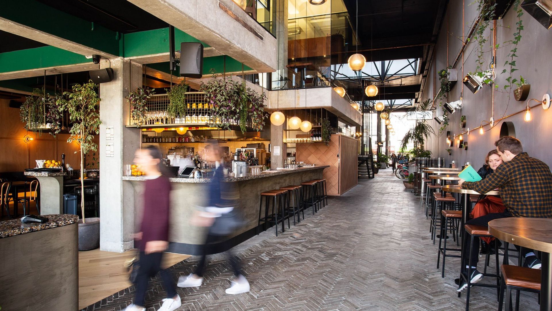
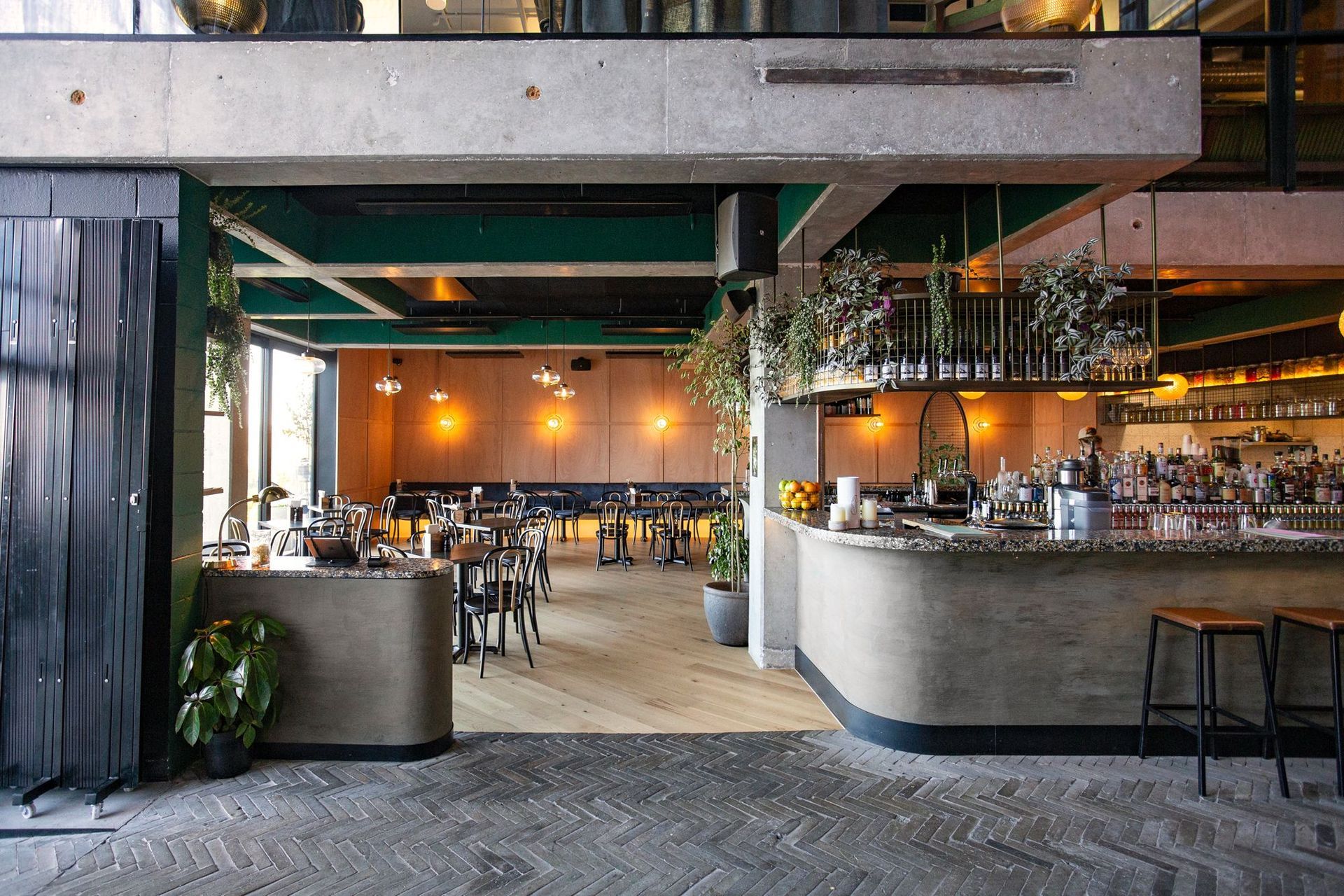
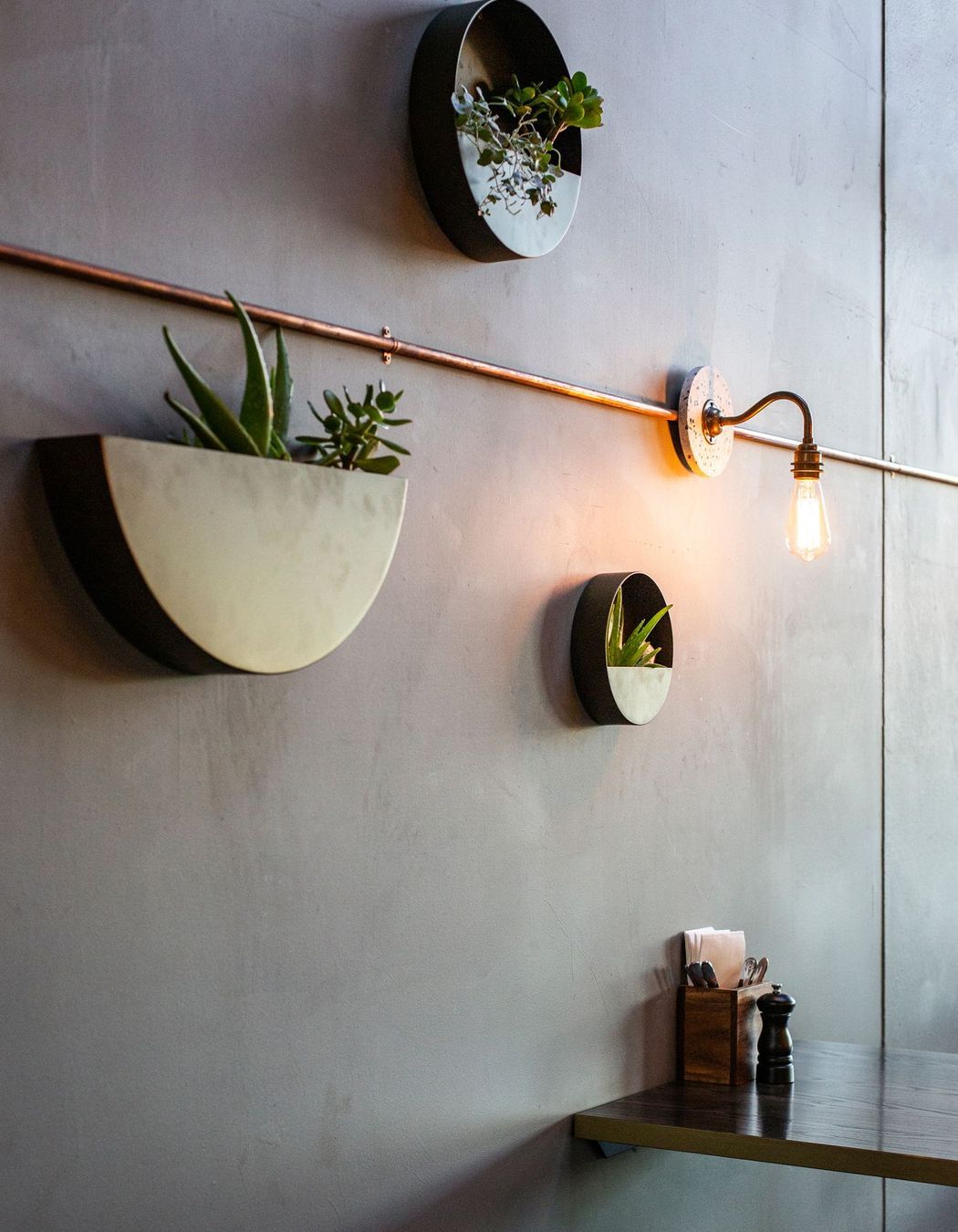
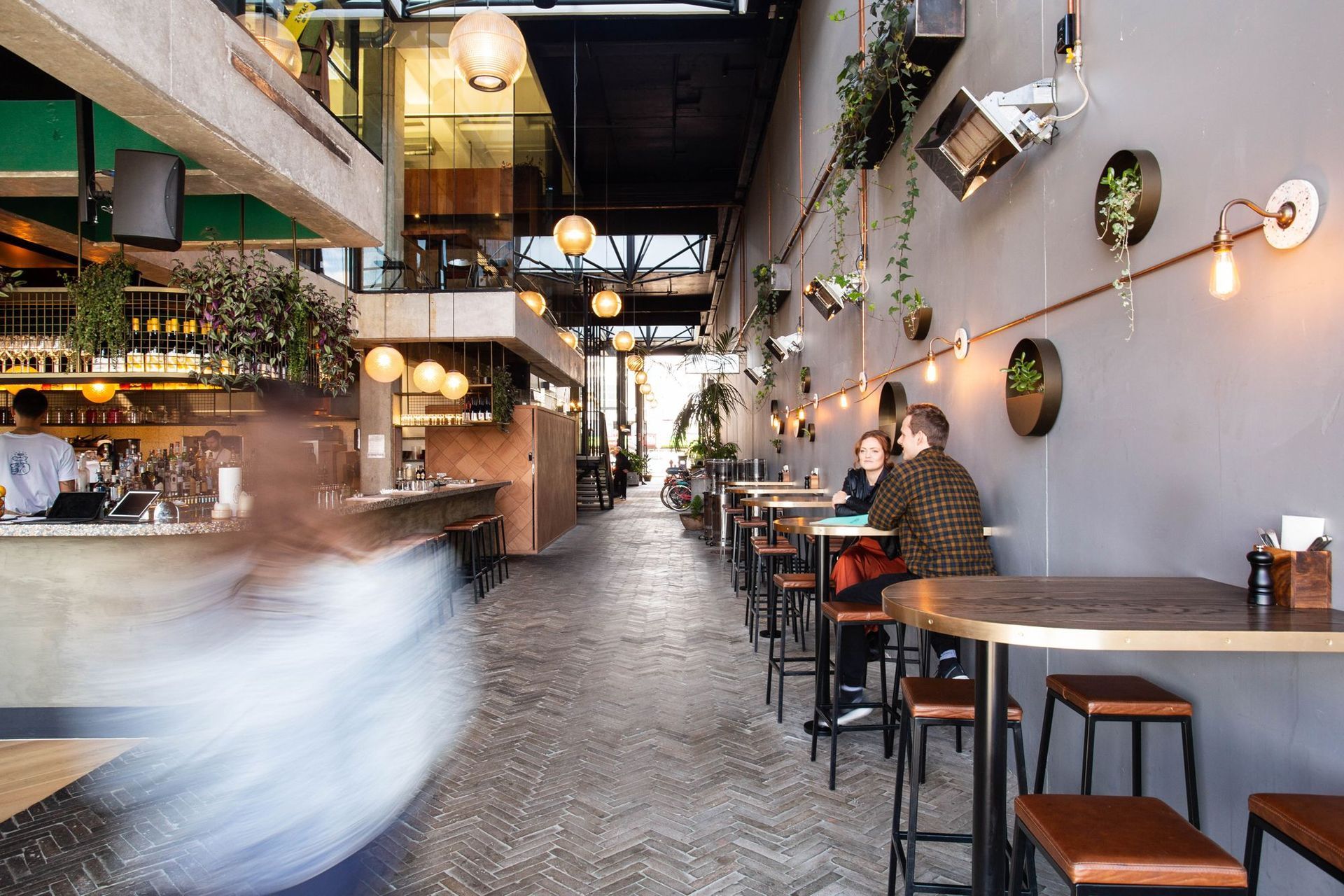
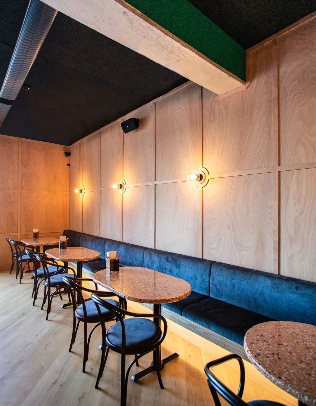
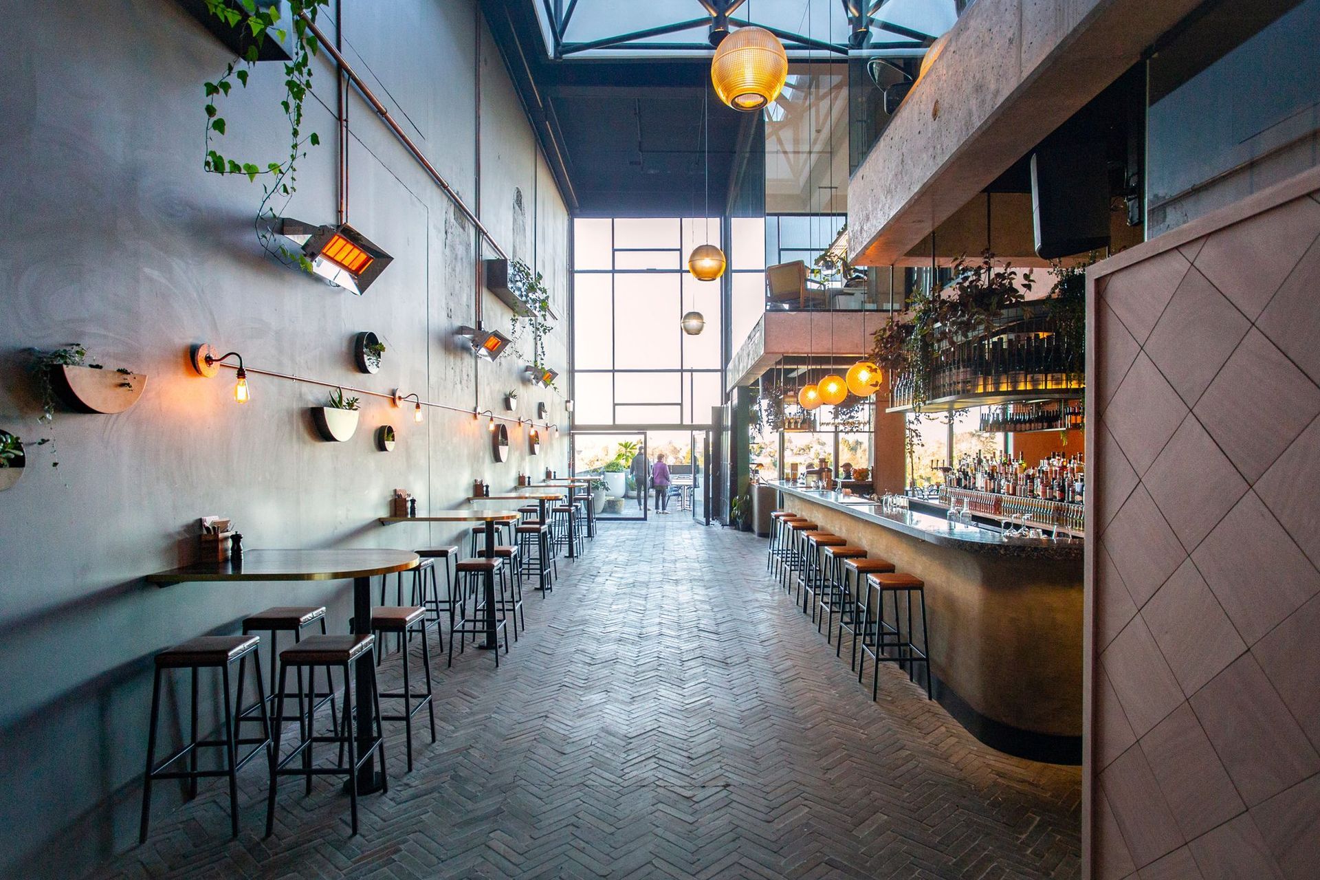
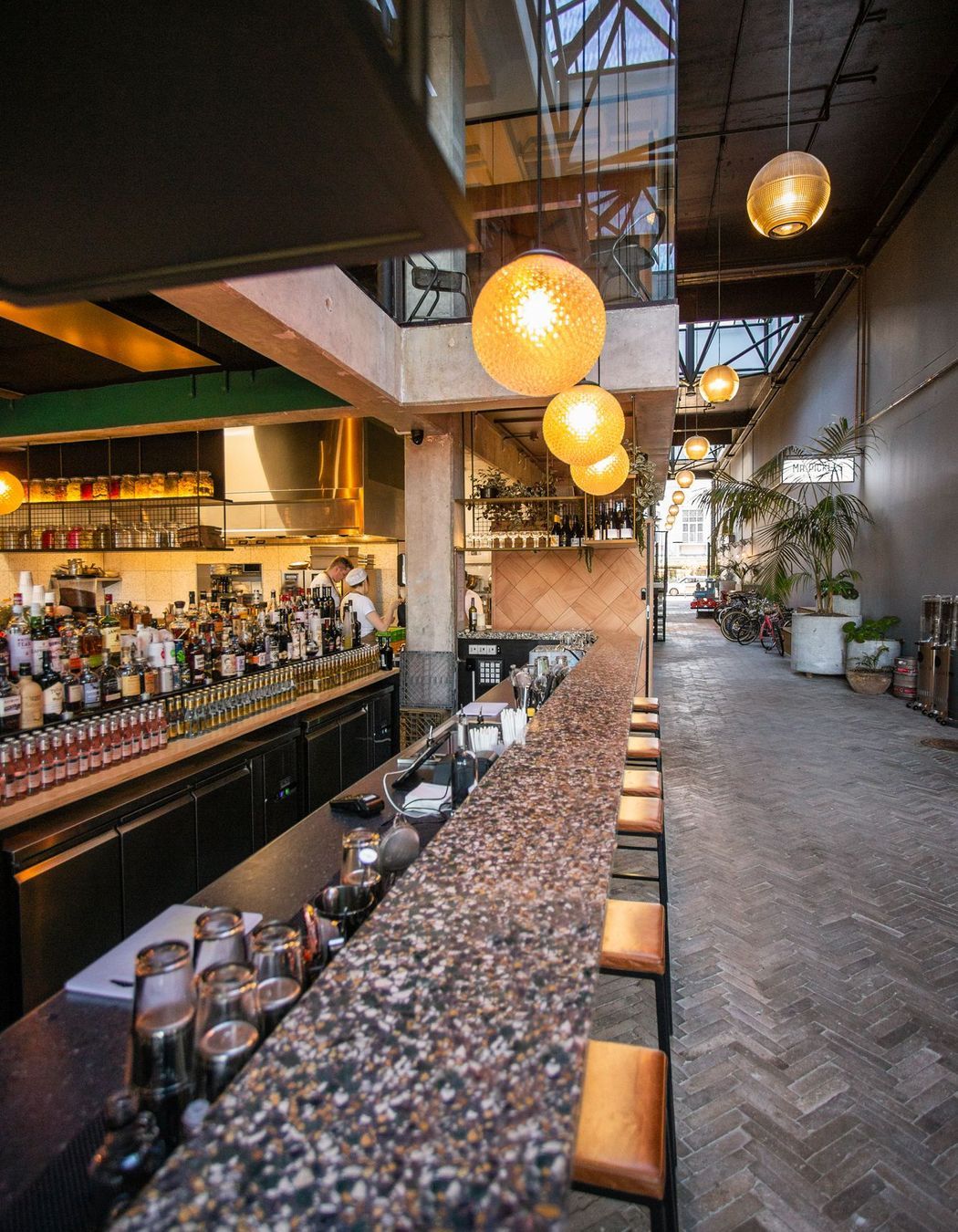
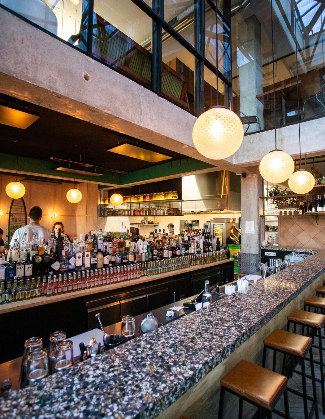
ArchiPro Project Summary - Mr Pickles is a casual bar and eatery located in The Riverbank Lane, Hamilton. Mr Pickles offers an experience of contrasts - light and fresh in the day, moody and refined at night.
- Title:
- Mr Pickles
- Interior Designer:
- Designwell
- Category:
- Commercial/
- Hospitality
- Region:
- Hamilton Central, Waikato, NZ
- Completed:
- 2018
- Photographers:
- Jess Koretz
Project Gallery
Views and Engagement
Professionals used

Designwell. We design commercial interiors with a focus on workplace, hospitality & retail, health & wellbeing, public and education. We design beautiful spaces that work.
Our clients are workplace changers, hospitality innovators, city developers and inspiring entrepreneurs who recognise the value of good design.
Founded
2017
Established presence in the industry.
Projects Listed
34
A portfolio of work to explore.

Designwell.
Profile
Projects
Contact
Other People also viewed
Why ArchiPro?
No more endless searching -
Everything you need, all in one place.Real projects, real experts -
Work with vetted architects, designers, and suppliers.Designed for Australia -
Projects, products, and professionals that meet local standards.From inspiration to reality -
Find your style and connect with the experts behind it.Start your Project
Start you project with a free account to unlock features designed to help you simplify your building project.
Learn MoreBecome a Pro
Showcase your business on ArchiPro and join industry leading brands showcasing their products and expertise.
Learn More