Custom Board Form Concrete Panels give a warm nod to The Works’ industrial heritage
The Works is more than just another addition to Melbourne’s tech hub in Cremorne. It’s an innovative and collaborative workplace, now home to Reece, its executives, and its team, and a critical resource centre supporting its extensive network of branches, trade professionals, and customers.
Once home to the Rosella factory, Rothelowman’s reinvigorated building design, combined with Futurespace’s deeply thoughtful fit-out, will more than see The Works support Reece into 2030 and beyond.
This more than six-year journey for Reece, and four for Futurespace, has culminated in an ultimate sense of fulfillment. There is an overwhelming sense of space, colour, and movement; a definite buzz and a sense of activity. Most gratifying of all, for both Reece and Futurespace, is seeing every design element effortlessly speaking to Reece’s culture and vision:
“It’s one of the best examples of a corporate design meeting business strategy because it represents Reece’s future and goal to be the leading supplier and educator in the market,” says Gavin Harris, Director of Futurespace.
A multi-purpose design with a connection at its core.
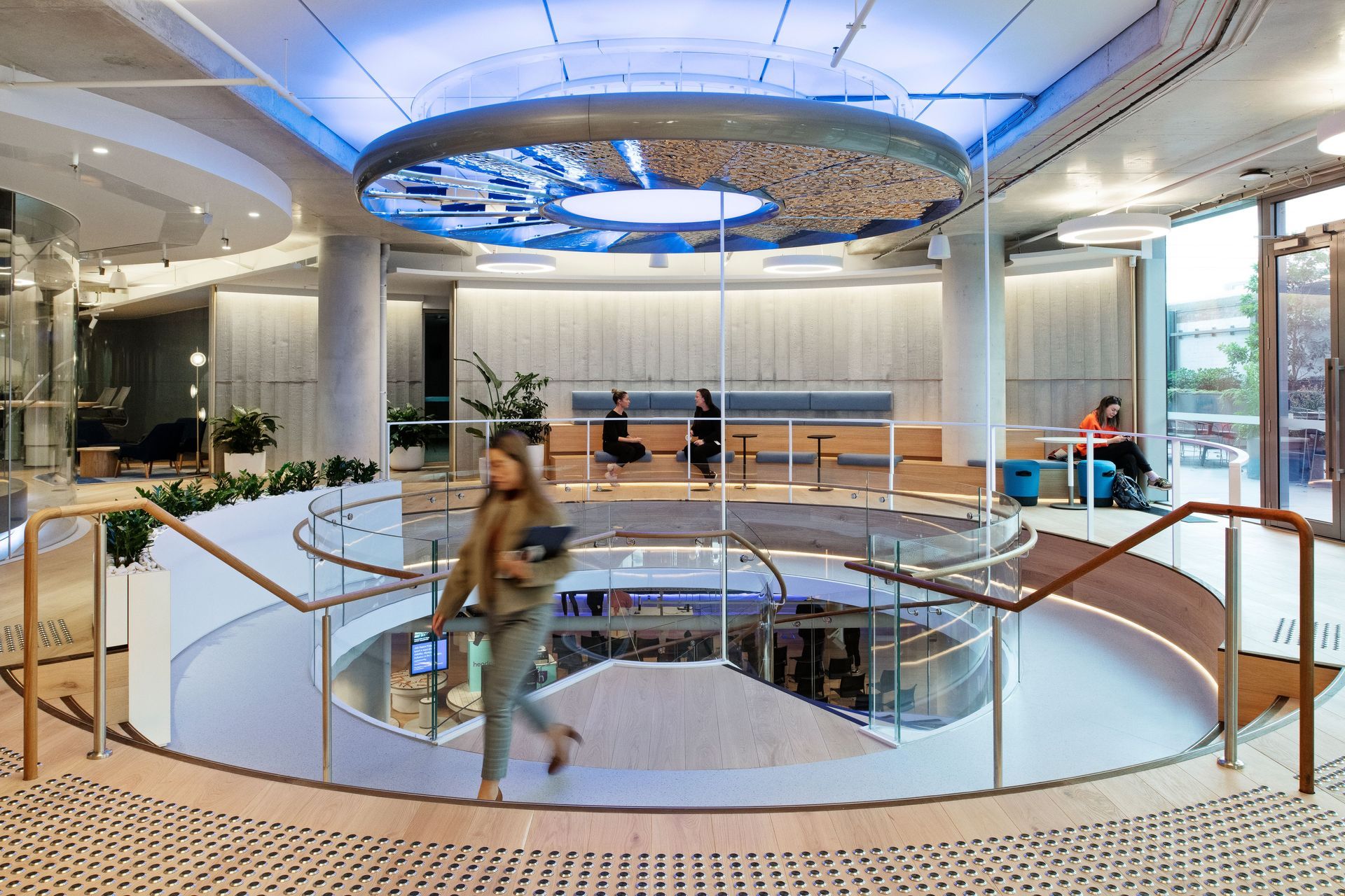
Not surprising really, given that Futurespace is renowned for its strategy-based designs. The key priority was connectivity, courtesy of two spiral stairs stretching all the way through the building, the first white helix stair from the ground to level one, and the second more heavy-duty industrial pipeline stair, from level two to level 6.
“We looked at the placement of the communication stair in a number of studies, right from when Rothelowman designed the building, to allow and enforce that connection as you travel through the building. As you move around the stair, with its circular landing, you look at the floor and see who’s there. So, if people are working in the office three or four days or less, you design to magnify every touch point or every moment, you can see the rest of your team,” Gavin comments.
Flexibility was also front and centre, as we inch towards post-pandemic times. What’s obvious from the design is a lot of layering to easily accommodate people’s changing behaviours.
“Everything we design has purpose, or multi-purpose, so you layer over different uses, and that’s the best way to use space,” Gavin remarks.
The ground floor is, indeed multipurpose, designed for a range of activities, from events, training, product launches, and education, to showcasing emerging technologies. And from the moment you step in the door, your mind is focused on where you’re going, care of a themed airlock, complete with water sounds, Reece messaging, and pipework. A concierge desk, rather than a traditional reception desk, greets you, reflecting that growing trend of weaving a hospitality experience into modern fit-outs. While a ground floor café can be used as is, or changed into a breakout space as needed.
Up the white helix stair to the second floor, another concierge point greets visitors at the customer and business brand partner floor, which also contains training rooms, a social content studio, a health and wellness space, a yoga room, quiet respite rooms, and a first aid station.
These first two floors reflect multi-purpose design at its best, and clearly position Reece as the leading knowledge source in the market.
Floors two to six are tailored to its workforce, containing meeting rooms, quiet spaces, libraries, open collaboration nodes, and media rooms of varying sizes. And on the top floor (level 6), a large café lunch area opens out to an agile working space on the balcony.
From ground to level 6, the space is punctuated with backstories and thoughtful connections.
This is particularly evident in the material palette selection where core building materials dominate, including concrete panels, polished concrete, and metals, from copper to brass and stainless steel. This gives more than a gentle nod to Reece’s key product offering of plumbing, heating and cooling systems, irrigation, pumps, and water filtration systems.
But it’s the way the materials are used that makes this design sing.
Custom curved Board Form panels soften the core materiality.
Take, for instance, the beautiful Board Form panels of Concrete Veneer, supplied by Robertson’s Building Products. Not only fitting to The Works’ industrial building style, but the thin panels of Board Form Concrete Veneer also speak to the building’s history as the Arnott’s factory. What’s immediately evident, and special, is they’re curved as, indeed, is every shape and form in The Works’ design. This softens the core materiality and creatively references the shape of the core elements in Reece’s product portfolio.
“We used the concrete because it has an industrial feel, and then we wanted to bring the natural elements of timber, or grain, to it to give it that connection. So we worked closely with Peter Robertson to create the custom panels we were looking for and did the casting, so that was a real treat,” Gavin explains.
Peter Robertson worked alongside Futurespace and builder and project partner, Schiavello Construction, to understand the design intent, then presented Gavin with planks of Oregon timber to select the desired knotting. To provide variation, several different master moulds were created from the timber, three boards wide, each piece milled to provide the ideal radii then shot blasted to bring out the desired texture.
A number of samples were produced to arrive at just the right radii, size, and texture, then the timber was made into panels and installed Schiavello.
“It’s a really great result, the light looks good on it, and it's got the right kind of shadow. I wanted that feeling of warmth, industry, and handmade touch, and that’s what it has. Peter Robertson supported us really well, he was so patient with me looking at the timber because I wanted the right grain, and finding the tolerance we have to play with because it was straight panels going on a curved wall design.
It was all about patience and marking out, so there has to be a lot of confidence. We did shop drawings, the tolerance in his moulds was very good, and it was a good example of maker and designer talking to each other and understanding the product’s positives and negatives, and designing to them,” Gavin says.
Injecting a more than subtle reference to Reece’s product offering.
There is heavy use of Reece products throughout the building, including underfloor air conditioning, circadian lighting on the floors, touchless door entries, as well as heavy use of biophilia and planting throughout the entire space.
Another nice connection to Reece is the clever use of metals in different ways on each floor to add warmth, softness, and character to the design and serve as a wayfinding device. Most striking to the brand partners and customers as they enter the ground floor is the screen made of 100mm copper pipes, which gives a gentle nod to copper pipes being Reece’s highest-selling product, elevating it beyond something that’s used every day. A thoughtful, subtle touch for when network representatives visit.
Reece moved into the new space in April this year and hasn’t looked back. And what an amazing journey it has been. For Futurespace it’s one that will long be remembered, for all the right reasons:
“It’s always a joy to see work coming to fruition, the end result, and taking a client on a journey where the client believes and trusts in you to take them places beyond their comfort zone. Seeing people behave the way you thought they would and being comfortable to move things around and make them their own, and have a buzz in it. Reece definitely has a buzz,” Gavin concludes.
Designer: Futurespace
Client: Reece
Product: Custom Board Form Veneer
Photography: Nicole England


