In the heart of Wanaka near the lake, a utilitarian bach is futureproofed to grow and adapt over time. Subtly infused with nostalgia, this quiet timber-clad home carves out its own unique personality with gable and half-gable roof forms slipping past one another to create three courtyards that bleed out into the landscape.
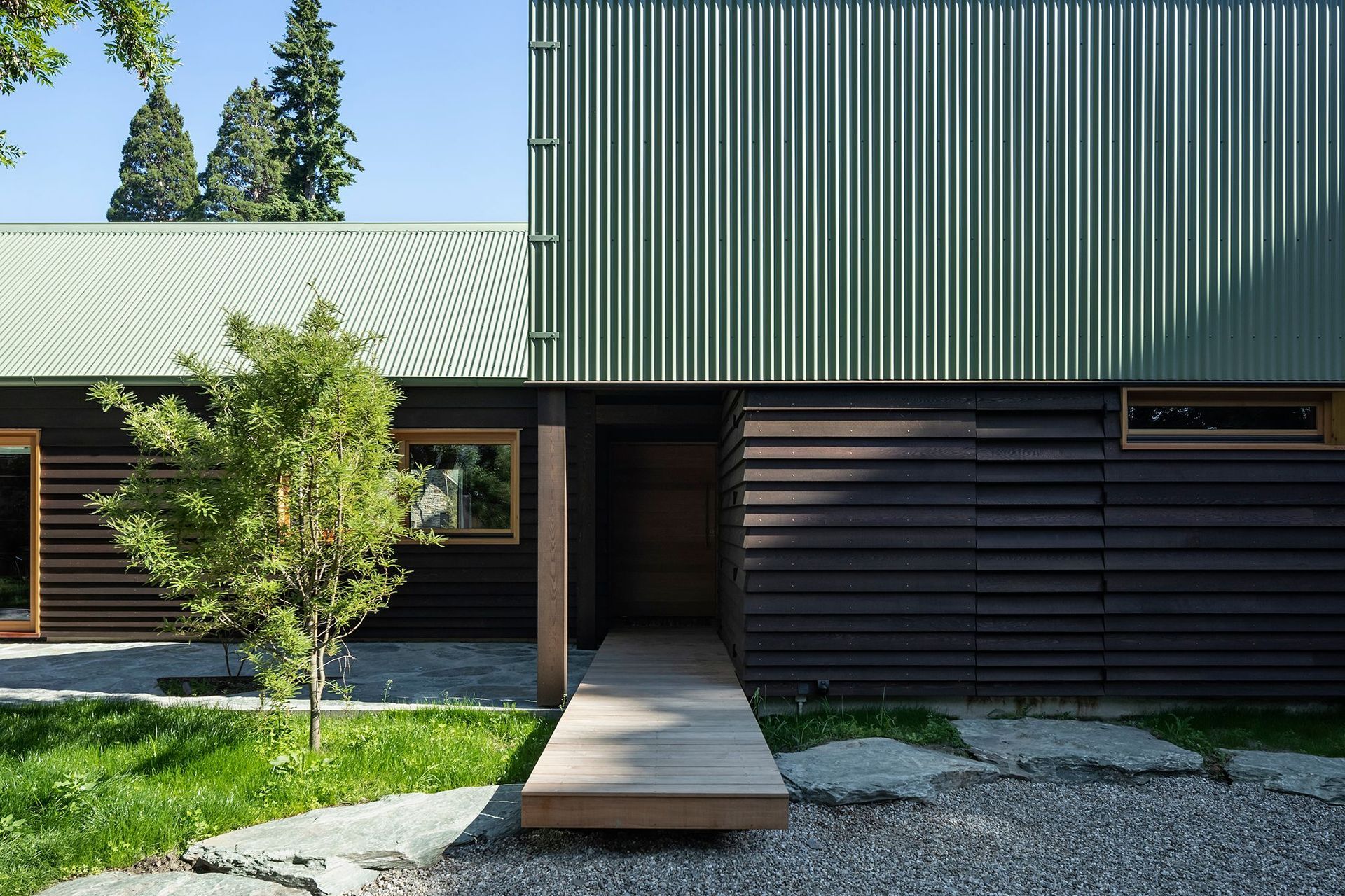
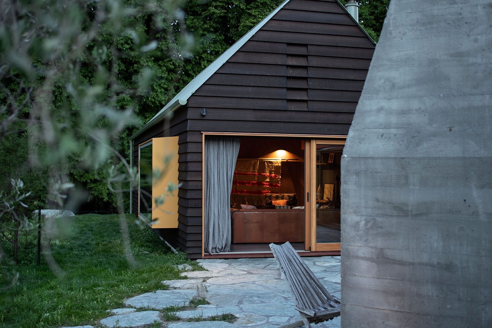
Chocolate brown weatherboard cladding, sage-green metal roofing and mustard-yellow windows could be a recipe for 70s kitsch, but Steven Lloyd and his collaborator, Aaron Paterson of Pac Studio, have thrown these ingredients into a shaker and managed to pour out a subtle and modern concoction.
“This home is not ostentatious—it’s not a gin palace—it’s designed to fit on a tight site and for a lot of people to stay,” says Aaron. “Ten people can occupy the various bunks and sleeping areas.”
Designed for a Dunedin family, a doctor and a restauranteur, with grown-up children and friends and family who like to visit, it’s not a small home at 150m² but neither is it a large home for the number of people who occupy it. “All things considered, it’s a tiny, multi-generation house, with a bunkroom and two double bedrooms and you can chuck a few extras bodies on the sofas in the lounge.”
What elevates this seemingly simple holiday home are the quirky elements of the form, the intense attention taken in the detailing and the note of nostalgia, which seems like a deliberate intention to make the owners or visitors feel instantly ‘at home’ in the tradition of Kiwi bach living.
Along with the natural earthy colours of the exterior, the interior materials are familiar with southern beech, recycled kauri and rimu, plywood and terrazzo, along with blackened steel elements and dark concrete flooring that dissolves into the grassy surrounds. “There’s a lot of work in making something feel natural!” Aaron jests.
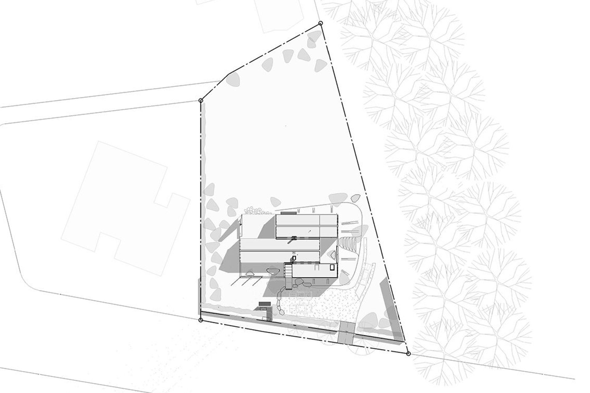
Sited near Wanaka town centre, being uncomfortably close to the neighbours forced the architects to plan the site with privacy in mind. They also needed to take into account a big bank of trees to the north that could have blocked out the light, while, during the winters, the leaves disappear to create dappled light and interesting shadows.
“Aaron and I walked the site in winter, paced out the shadows and found that spec of sunlight that would make the ideal place to site the house,” explains Steven. “Our design developed from the idea of a courtyard home that breaks out into outside courtyards. One of our first ideas was the mustard-coloured steel pop-out reading window in the lounge that you can sit in and look at the view over the lawn, because it’s the longest and sunniest view in the house.”
On the western side, a house and olive grove are in sight but kowtow before the magnificence of the Southern Alps, while Mt Roy can be seen from the kitchen, dining and lounge areas. The south-facing frontage sits adjacent to Mt Aspiring Road so there was a need to blank out the sound of the road.
This home comprises a triumvirate of forms; two gables and a chisel roof form slipping past one another in plan to create three enclosed courtyards, each with their own purpose and character. The chisel form creates a blank wall facing the road, which has been soundproofed from traffic noise. The northern courtyard off the main living area has an in-built outdoor fireplace with a chimney and an Argentinian BBQ, providing the perfect spot for an afternoon glass of wine; the southern courtyard has a working garden, including a fig tree espaliered on a frame made from reinforcing steel; while the north-east facing courtyard can be accessed from the two bedrooms and the bunkroom.
Around the home, the landscape is minimal and softly defined with ad-hoc planting. “We didn’t want prissy planting,” says Aaron. “We wanted to feel like the house was bleeding into the landscape, informal and natural, while the driveway is like an old medium strip – a ‘non-thing’ really – that dissolves into the landscape.” Along the driveway’s edge, the earth has been sculpted up to the ground level of the building, with flat slabs of rock forming the steps leading up to the southern entry. Here, the landscape flows down so it feels like you’re on a hill with the house is planted on top. At the edge of the chisel form, an entry boardwalk floats over large stones before disappearing under the chiselled roof to form a semi-enclosed walkway.
Wanaka Crib relates to a previous collaboration, Point Wells House, by the same design team. The homeowner saw the design, admired the gable form and the attention to detailing, before commissioning PAC and Steven Lloyd Architecture. The detailing on the crib has been executed with precision by Dunlop Builders, with plenty of subtle details you need to search for, such as the super-thin clips on the gable edges of the corrugated steel roofs, an air vent discretely blended into the weatherboard cladding on the chisel form, invisible doors hiding the gas system and the ski storage room, and internal gutters with snow guards to prevent snow from freezing the pipes (snow sits on top of mesh and drips down into the channel).
Designed around how the owners live and entertain, the house has plenty of storage and a self-contained four-bed bunkroom for friends to stay, or should anyone want to Airbnb the space in the future. “The owners love cooking and dining and there are plenty of examples of ‘them’ in the house, including the artworks and artifacts they have collected over the years,” says Aaron. “Nearly every piece of furniture means something to them, including a dining table from one of their restaurants in Dunedin and the couches come from a lodge they once owned.”
“In the open-plan space, the internal view is not of a TV set but the kitchen hob,” adds Steven. Here, the kitchen island is constructed in mild steel and rimu with a striking verde marble benchtop that looks like pounamu (green stone). “This home feels familiar—you feel like you’ve gone back in time, especially with the sage-green roof and mustard-coloured timber joinery, but it makes the house feel instantly lived in as a result,” says Steven. Much-loved artworks have been carefully curated throughout the home, while the corridor walls are left free, with the effect of drawing the eye up to the steeply angled roof and a high triangular window that looks out towards a large oak tree in the garden.
“We like the materials and details to speak for themselves, rather than being ornamental—in that way we are modernists,” adds Steven. In the living space, the fireplace sits over a thin-edged, polished mild steel plinth, which complements the steel joinery in the kitchen. “You can see the inner workings of the fireplace—it’s exposed and unfinished and looks a bit Steampunk,” says Aaron.
While Wanaka Crib isn’t a passive house, it was designed for comfort and energy efficiency. “Heating the home is the winter isn’t a problem, because there is a lot of sun due to the positioning of the building, the heated slab and everything is tightly wrapped inside and out,” says Aaron. “It has a double-glazed thermally broken joinery suite with lock doors that seal the building up. When you turn the handles, you can hear a suction noise like on the Starship Enterprise. It’s like a vacuum seal and, when it’s hot, you just open the doors into the corridor and the kitchen to create a nice temperature through cross ventilation and a ceiling fan; and the gable vents make a huge difference too. Even on the hottest day in Wanaka and the house has been closed up, it can be cooled in minutes.”
With energy efficiency, future proofing and a timeless quality, this crib is certainly destined to age well. “We have clustered the building forms so there is enough site to add more elements in the future, such as covering the courtyard, and there is enough room for a pool and pool house to be built into the garden,” explains Aaron. “Basically, it’s an ad-hoc building that can deal with future things.”
Words by Justine Harvey.
Photography by Simon Devitt.


