A graceful expression of old and new
Written by
16 January 2024
•
4 min read
On a leafy street in Melbourne’s Hawthorn East, this home appears similar to many of its neighbours – intricate cast iron lacework and details reminiscent of its construction in the late 19th century. As you venture beyond the front door, though, an unexpected dance of past and present becomes apparent.
Built in the 1890s, the layout of the original house was typical of its time: four bedrooms at the front, with a kitchen at the back.
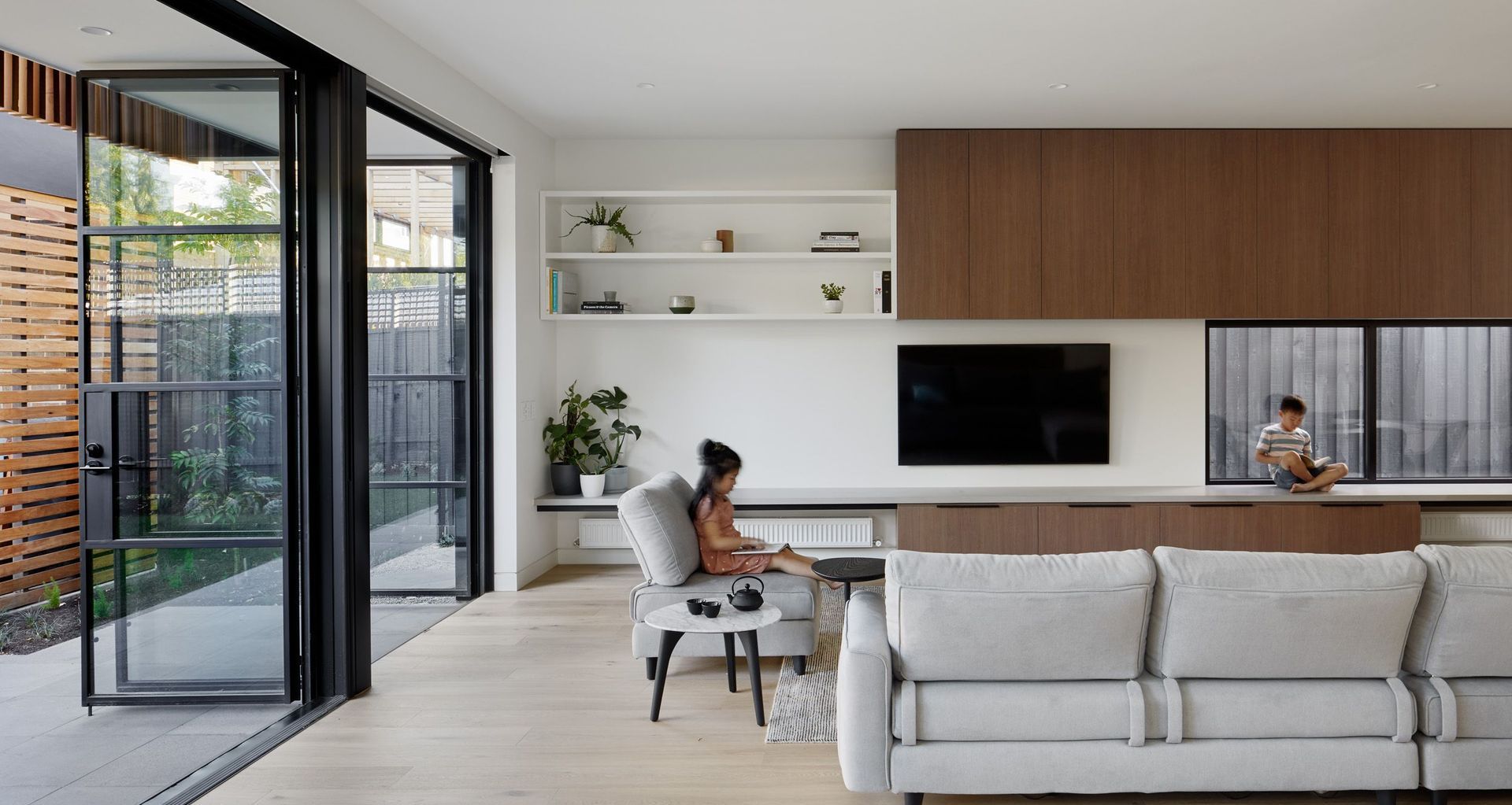
"Being a family of four, including two young children, the clients really needed more bedrooms and more bathrooms. But mainly, they wanted a new kitchen, living and dining area so the family could gather – somewhere to spend most of their time," says Anthony Chan, director of Chan Architecture.
With the original structure reinvigorated with new flooring, fresh paint, new windows and insulation, one of the four rooms was converted into a bathroom and powder room, with another turned into a dedicated playroom for the two children.
"These rooms at the front still have a period feel to them, and a lot of our projects are like this – they respect the history of the building in the original structure," says Chan, while new sections of a home often celebrate modern design. "It's always a challenge when you're doing extensions from old to new. How far do you go; do you go super minimalist, do you want it to be more abstract, or do you take elements from the period features of the original home?"
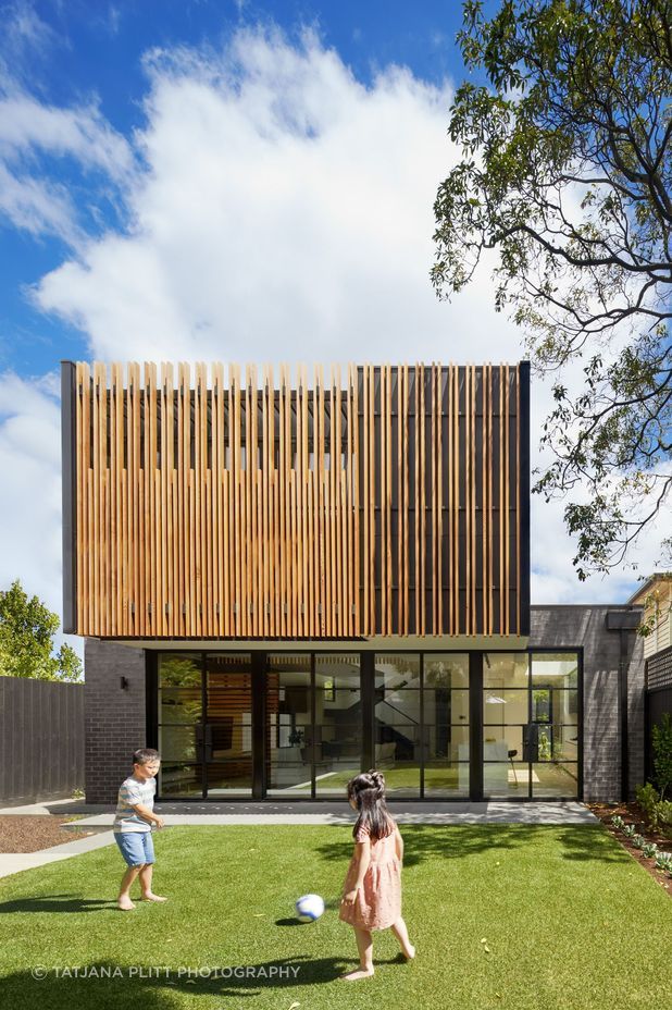
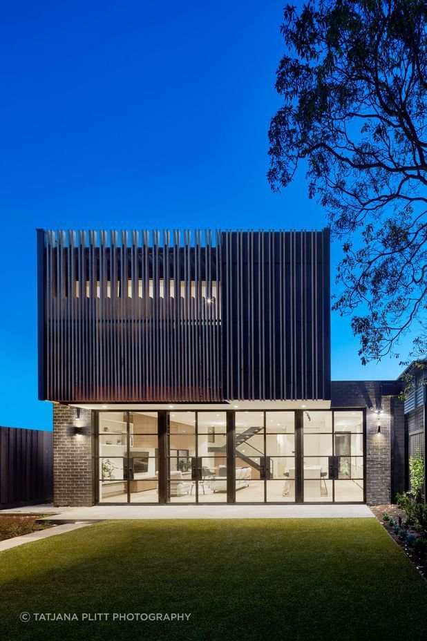
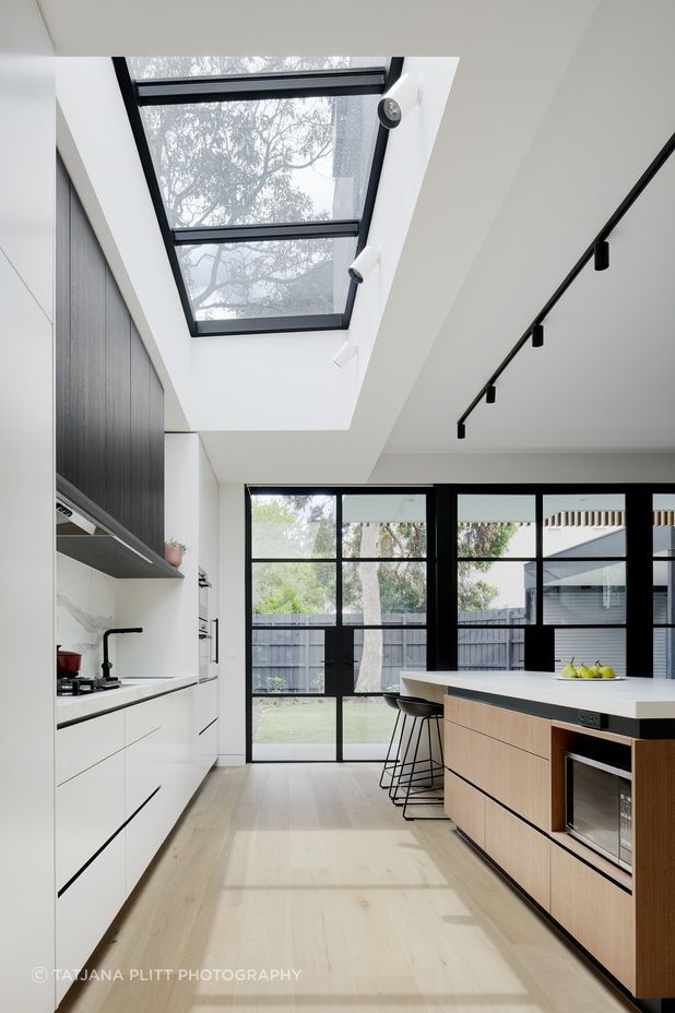
In this case, the brief was for the extension to be modern, spacious, and to welcome the natural light.
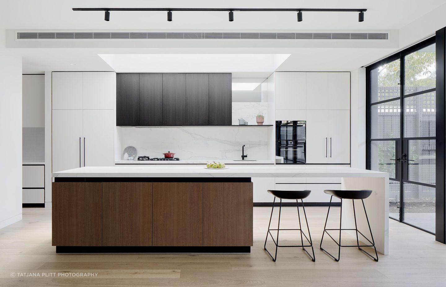
"The kitchen was really important; it was probably the most important room in the house for the client. They wanted it to be generous, light-filled, have lots of storage, and be a robust, working kitchen because they love to cook."
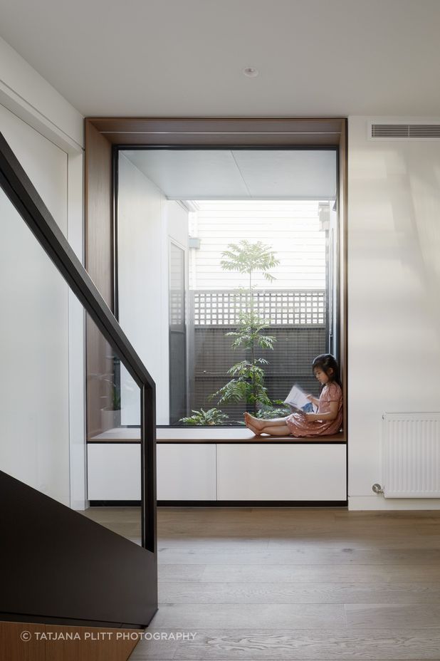
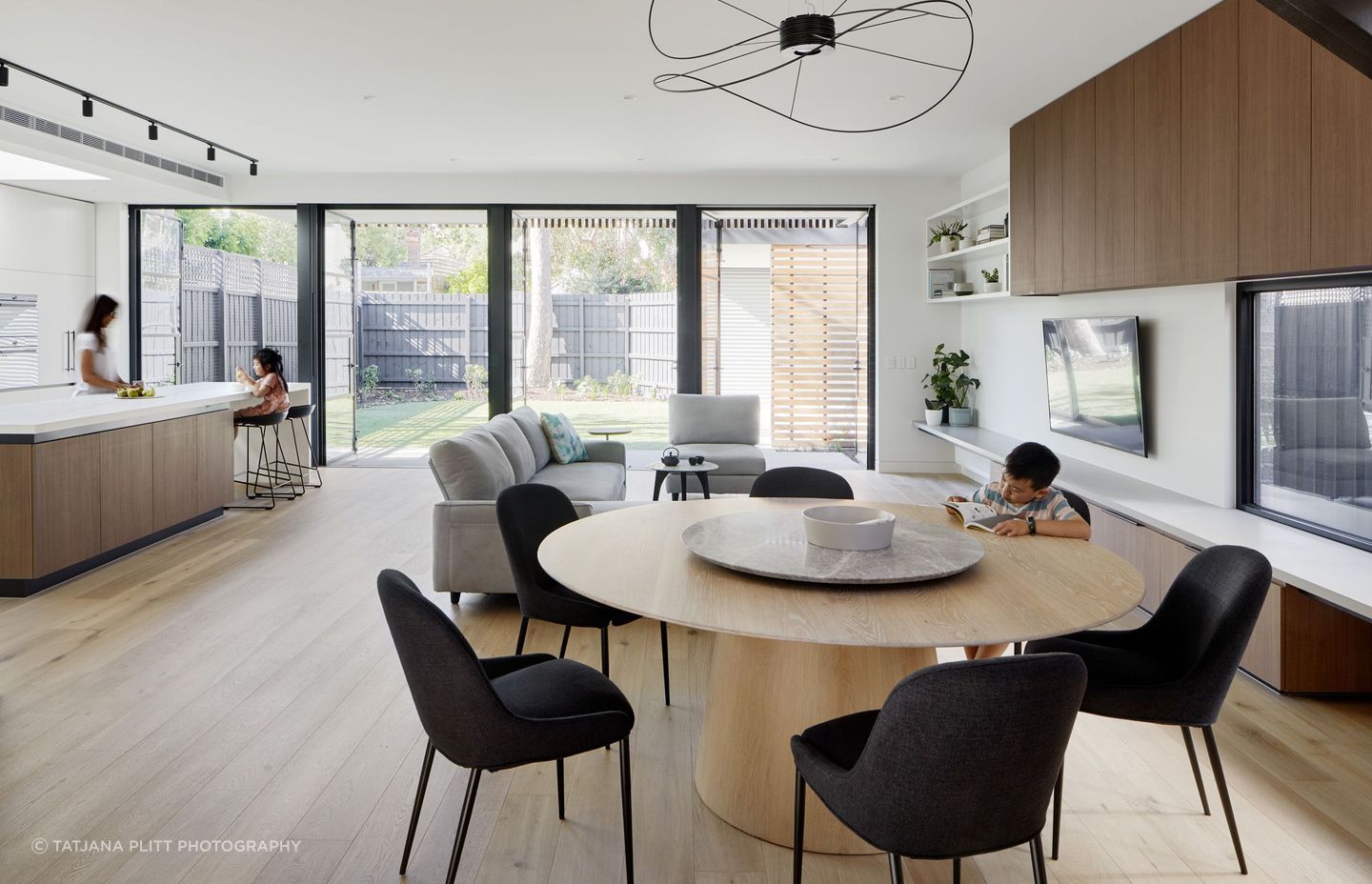
There was also a priority for the open-plan space to have moments of intimacy – a reading nook with a large window overlooking an internal courtyard has been added where the extension meets the front of the home, the round dining table encourages conversation, and a bench that runs the length of the space can be enjoyed as seating or shelving.
A pared-back palette of white, black, and timber allows the natural light to be amplified throughout the space, with the engineered oak flooring and timber accents bringing warmth and texture.
"It's not all black, white or timber – it's balanced," says Chan. "I find often that when you're designing interiors, it's like when you're cooking – finding just the right balance and making everything work together is about playing with the finishes, colours and details."
I find often that when you're designing interiors, it's like when you're cooking – finding just the right balance and making everything work together is about playing with the finishes, colours and details.
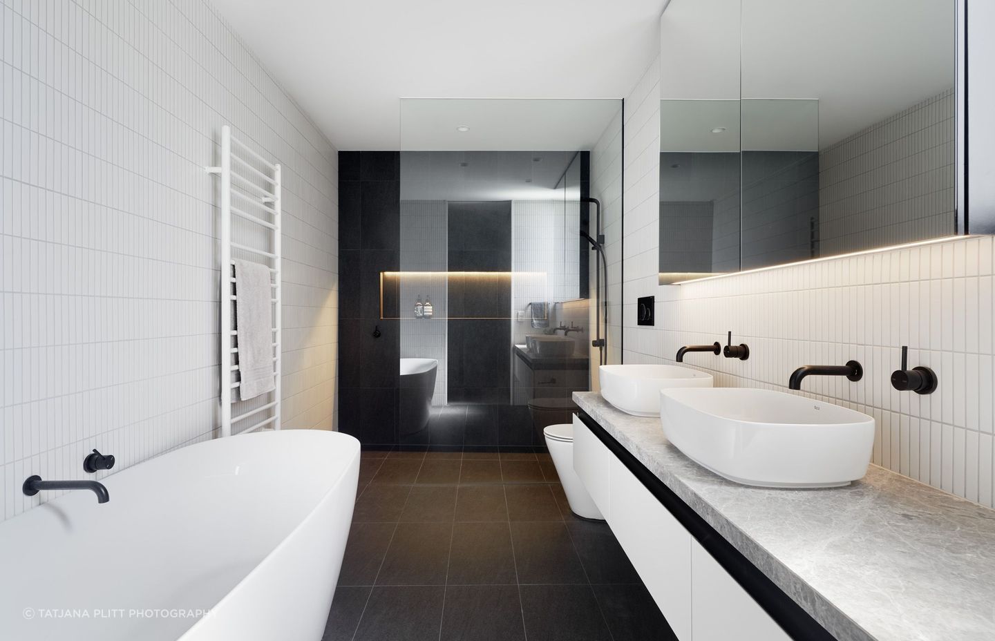
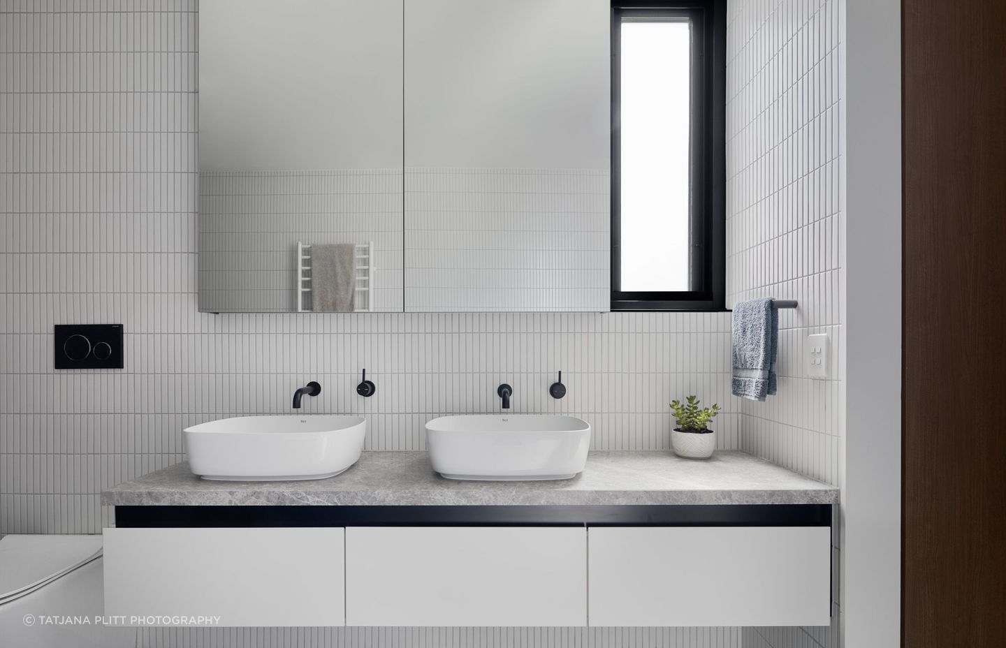
Upstairs, the master bedroom and ensuite borrow a similar palette with a monochromatic scheme of black and white in the bathroom. For privacy, vertical timber slats have been added to the exterior – doubling as a visual feature.
"When you're upstairs and surrounded by neighbours, you need privacy screens. But you need to think about the expression of the building, so we often try to use this as an opportunity to create individuality," says Chan.
Installed at alternating heights and closer together in areas where more privacy is needed, the timber slats speak to the interior materiality of the extension and complete the visual identity of the home's rear. "It's an expression of the rear facade that brings practicality and visual appeal, without making it look like a privacy screen."
Beyond delivering his clients a beautiful home that will continue to serve the family into the future, Chan's favourite aspects of the project were the unexpected, individualised requests that brought personality to the home.
"There are lots of little idiosyncrasies within the house," he says. "For example, the clients love collecting magnets from every country that they travel to. So, upstairs in the study, we have a magnetic wall for them to display their magnets.
"The whole project was really tailored to the client and their memories, artwork and collections of different things. They've also become some of our greatest advocates."
With an emphasis on respecting the heritage appeal of the original home, Roseberry Street House has been elevated into modern times with a considered renovation and an extension that enables the family to connect and enjoy the backyard that extends beyond.
If you're searching for an architect to revive your heritage terrace home, such as Roseberry Street House or Neville Street residence, get in touch with Chan Architecture to learn more.