Colorsteel Moodboards banner

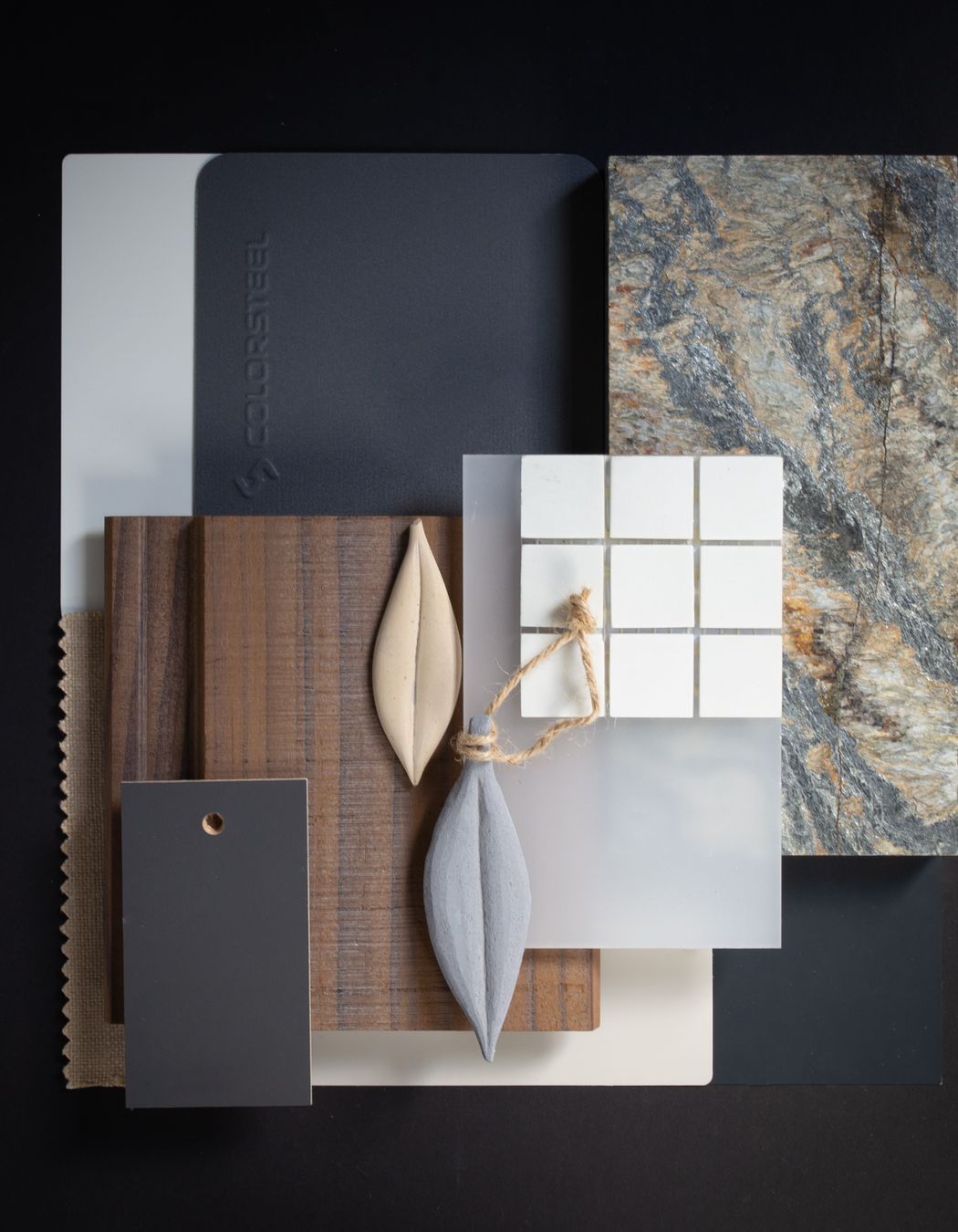
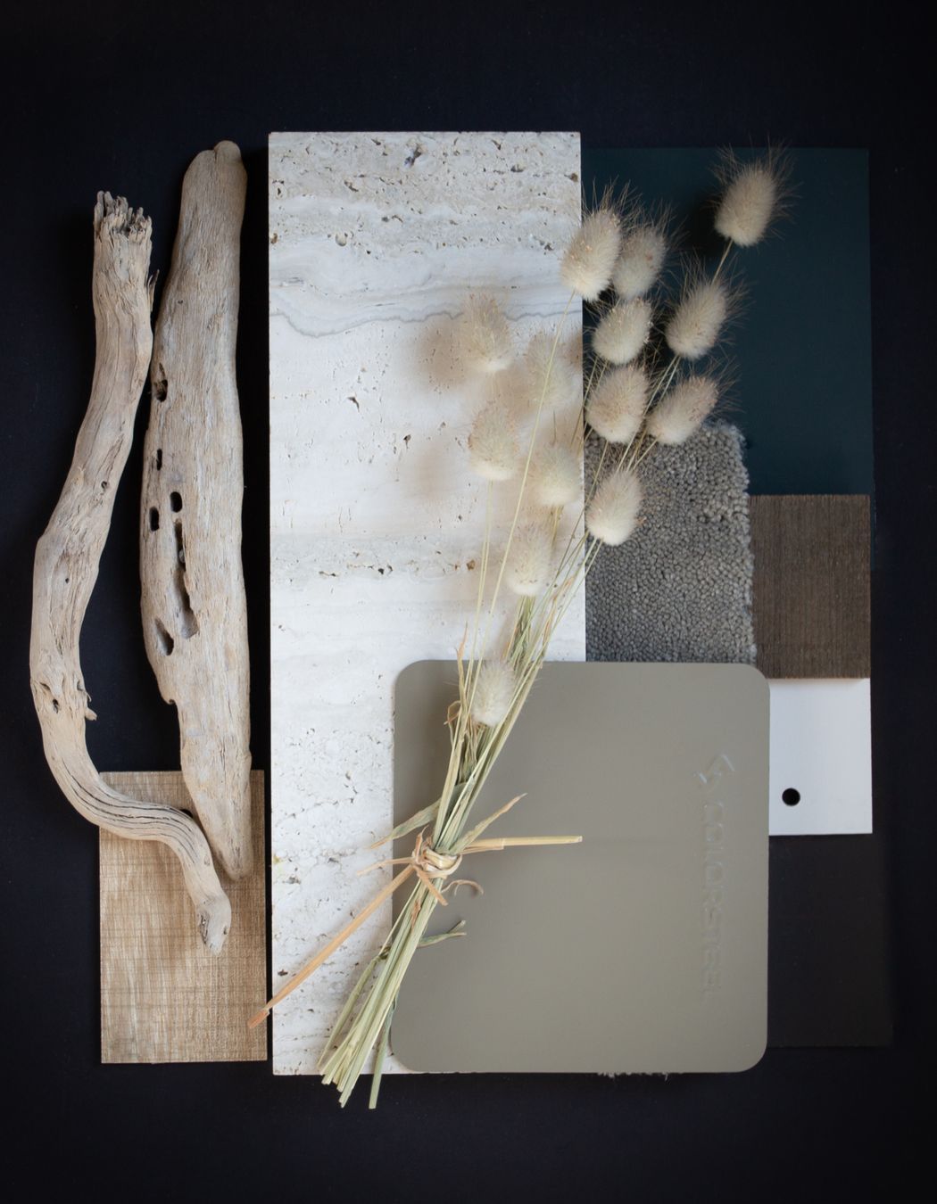
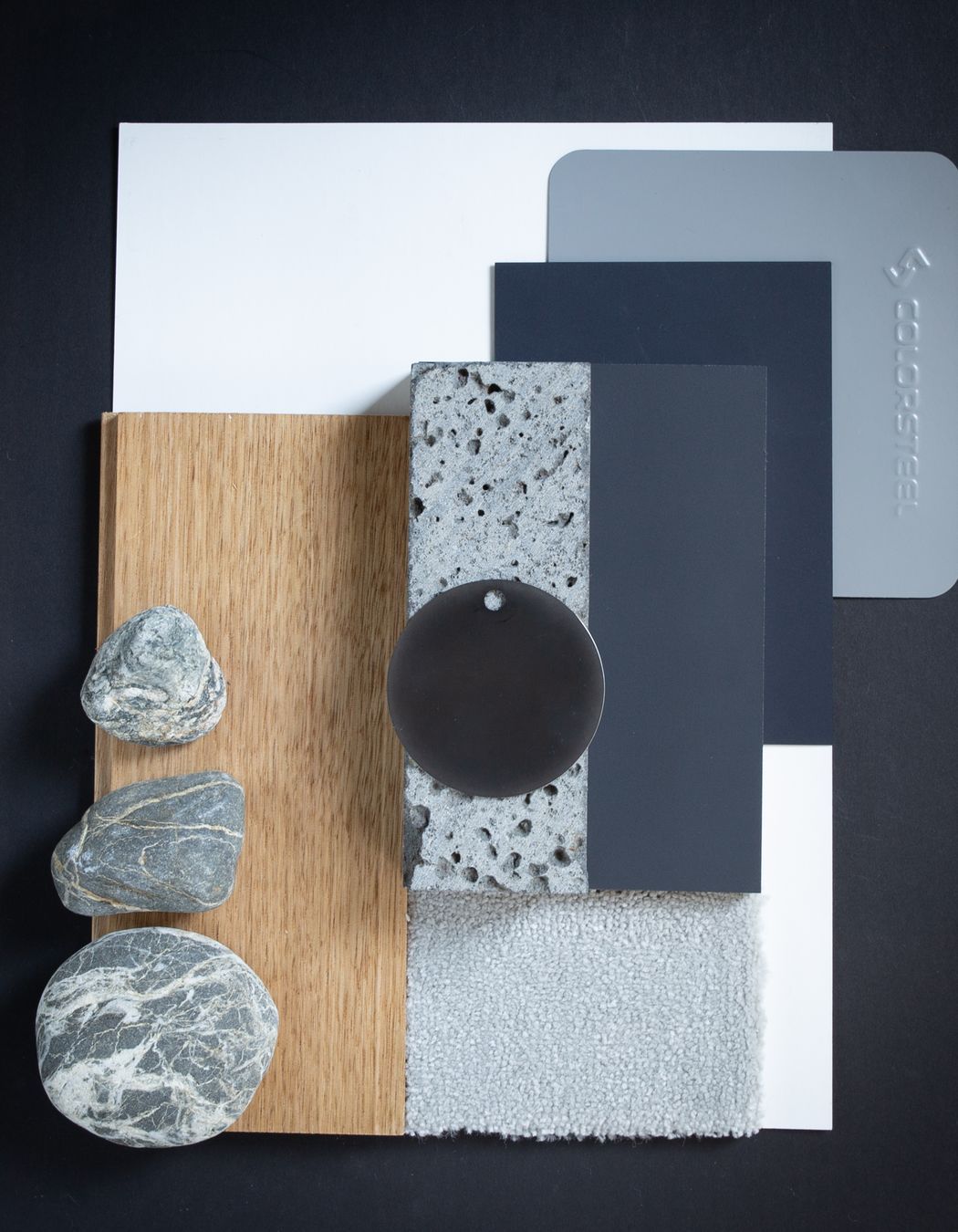
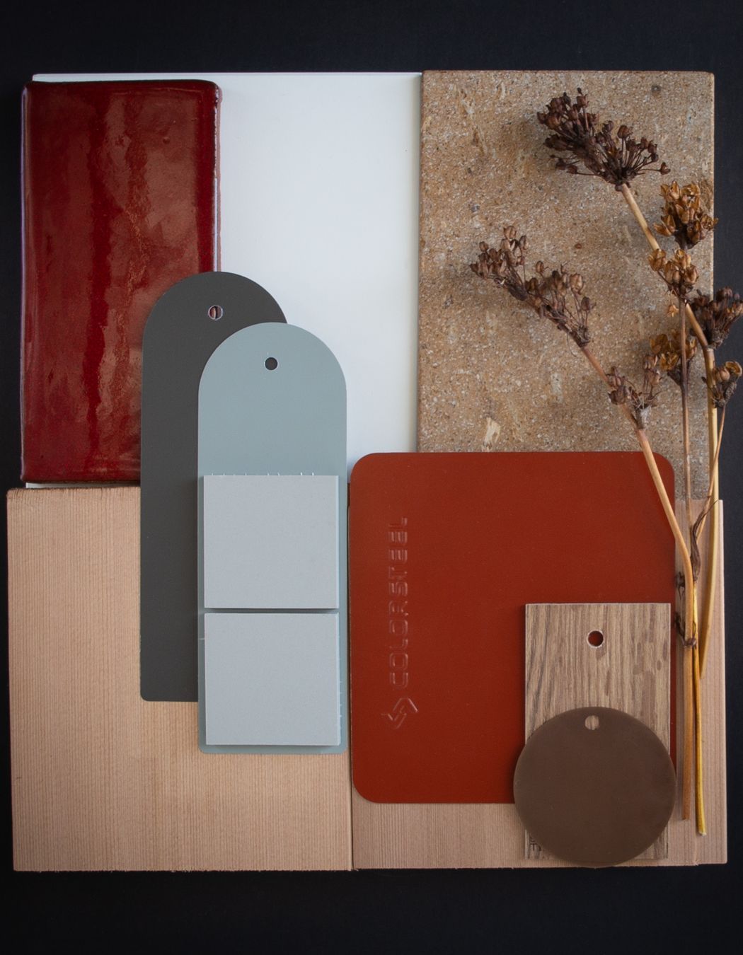
A collaboration with Colorsteel NZ allowed us to experiment with their full colour palette range and develop ideas of how these could be combined with both internal and external finishes for an architectural home. As Architects we see our buildings having a deep connection between the inside spaces and the outside envelope. Within our curated mood boards, there is a beautiful fusion between the two, they are intended to tell a story as you journey through the home.

For each Colorsteel NZ colour we developed a narrative about what the type of house would be, who would be living there, and what sort of New Zealand landscape or history it would be a part of. Using local and sustainable materials to compliment the colours ensures that they feel cohesive with the environment - whether natural, rural or urban.

Day Architects
Auckland
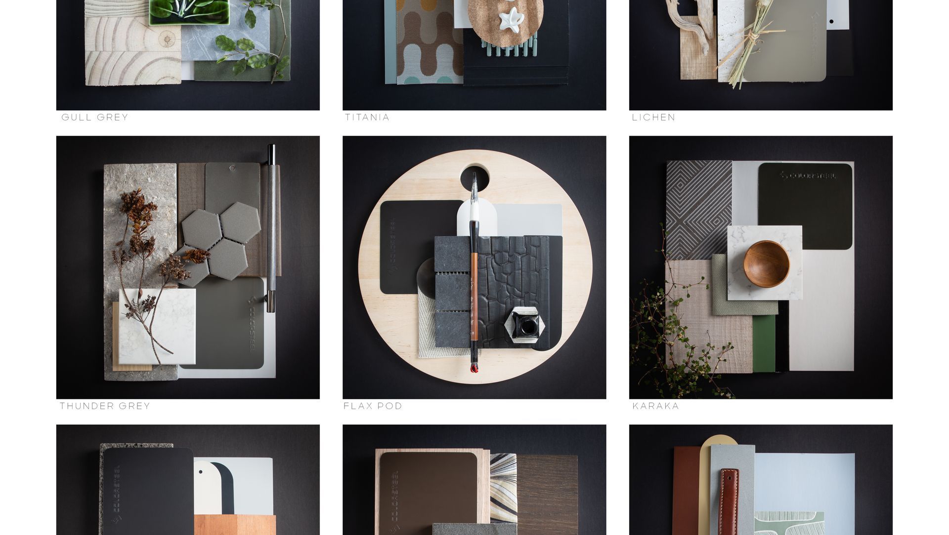
Colour: Flaxpod Matte is paired with aged brass tiles, rich walnut floors and linings, and textured basalt stone. The palette is designed is with the contemporary urban environment in mind. Matt finishes of the interiors and exteriors contribute to an environment of understated luxury with a grounded connection to the land.
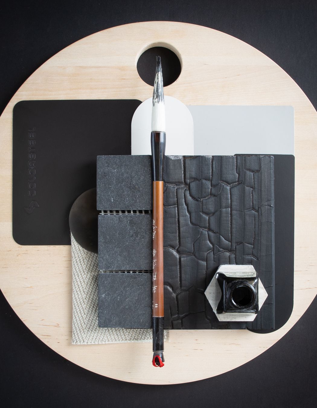
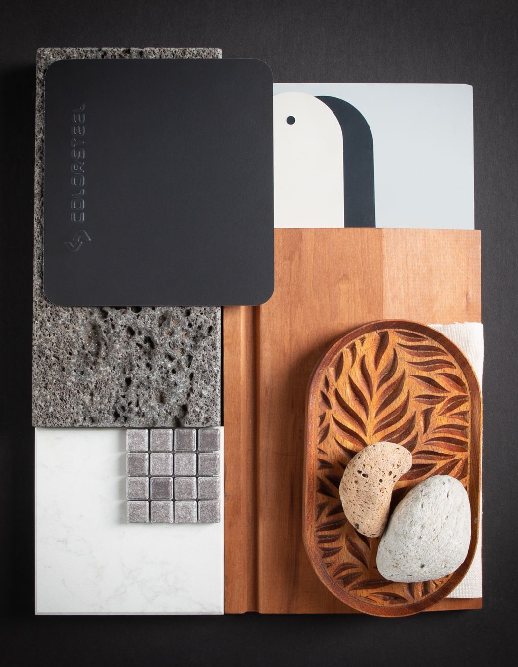
Colour: The Flaxpod palette takes its inspiration from beach walks, and the finds that the sea delivers at your feet. Whether charred timber, dried leaves, shells or seafoam that veils the black sand. This clean refined and low maintenance palette is for an environment that needs to withstand harsh elements well, allowing one to feel safe and warm inside.
Colour: Ebony is that moment - the silhouette of the land against the ocean or fiord as it plunges into the sea. Not for the faint hearted, it has a distinct identity that holds its own against other bolder colours or architectural forms. A contemporary home that is not afraid to stand out.
Colour: The Ironsand palette draws its inspiration from the shifting colours and textures of the black sand beaches. With weathered cedar cladding, oiled finishes and natural stone, this is a palette for those who love to bring the outside in with traces of sand on your feet.
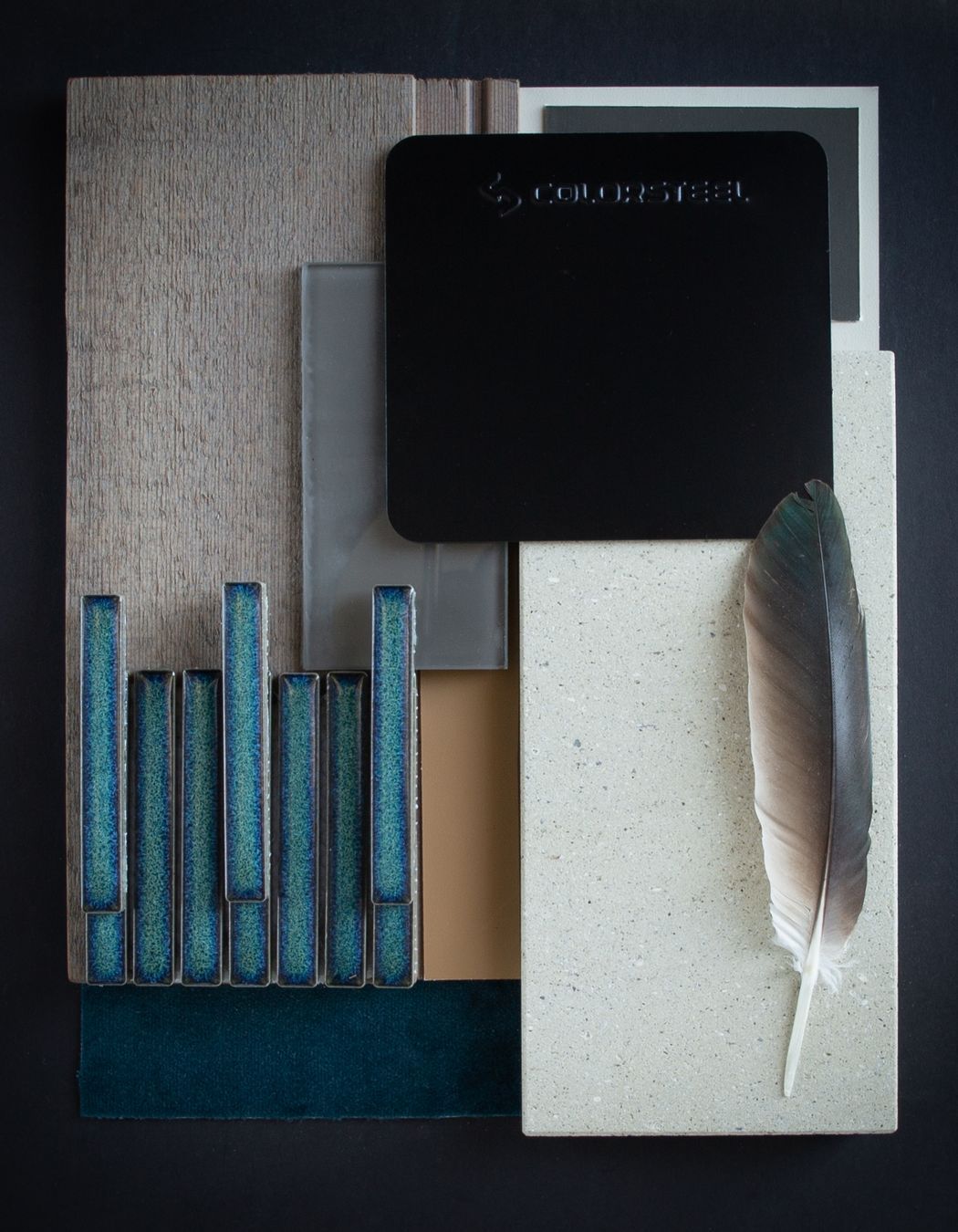
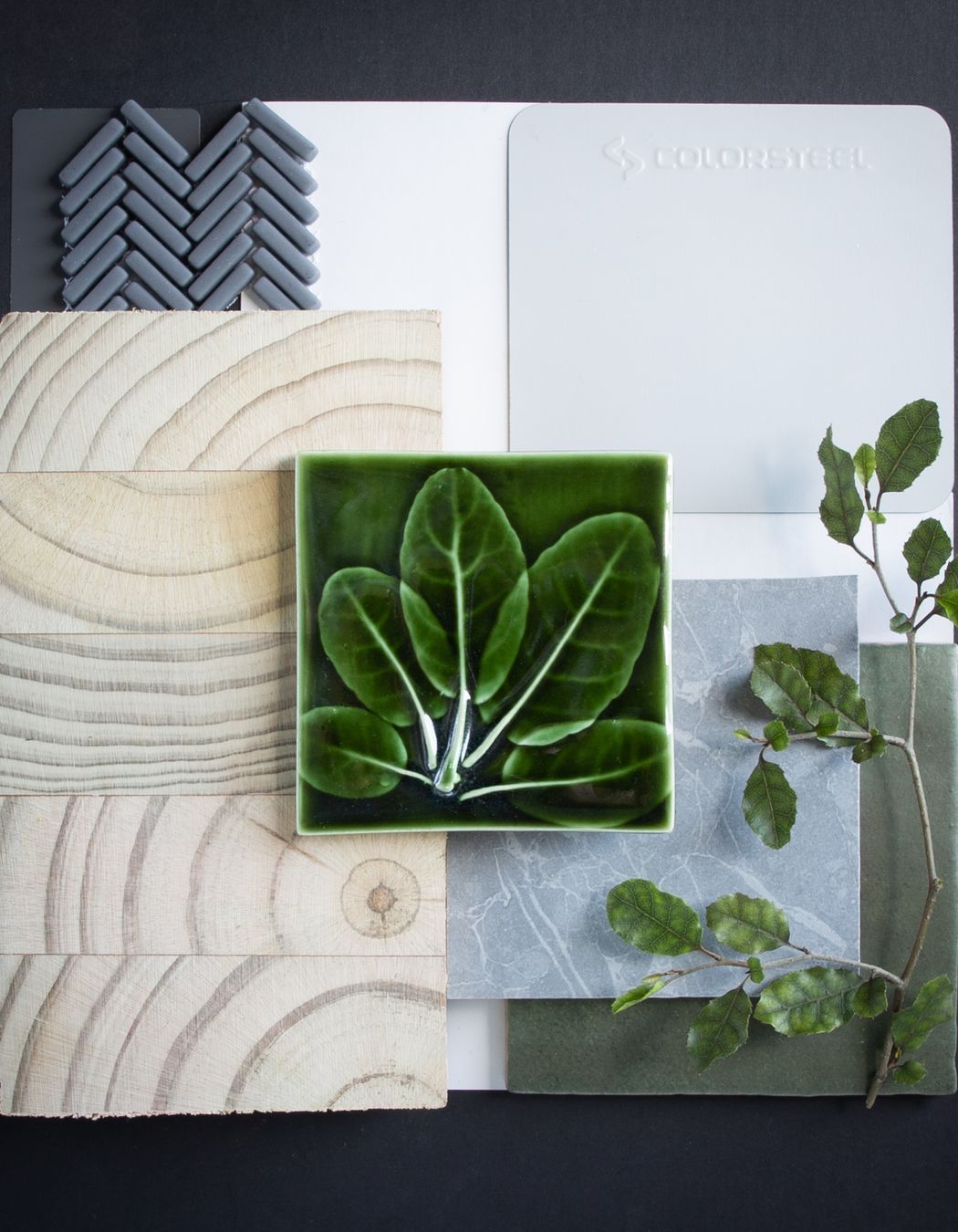
Colour: Karaka has a deep green base which pairs well with weathered timbers, and tones of grey and white. They are reminders of the different shades within the bush, the feathers of our native birds or the glimpse of the sky between the tree ferns. Whether for a home in the bush, or just one that wants to feel in tune with its environment, this deep green has a permanent place in our landscape.
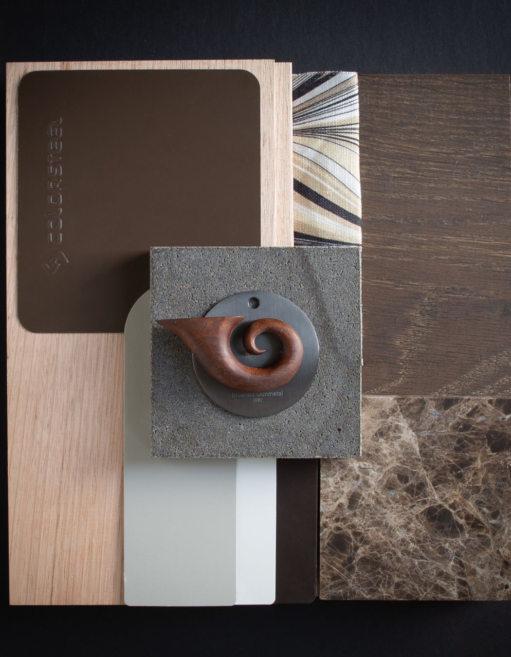
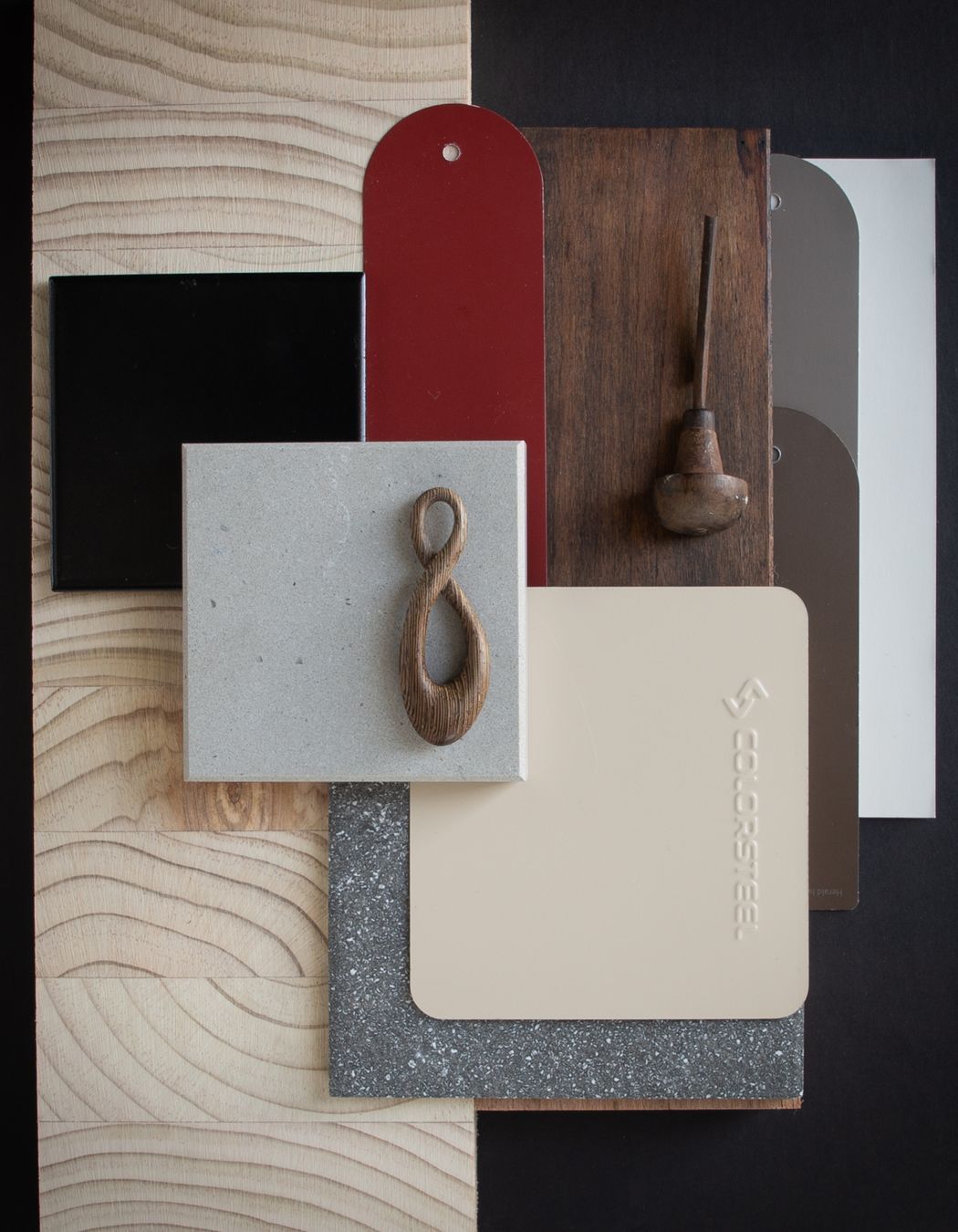
Colour: Lignite reminds us of the fantails white, dark and light brown feathers, and the way in the built world that we often see this in the seasonal growth rings of timber. This palette is for the hand-made house, the deep brown of Lignite works well when layered with brown stone, a range of different hand carved timbers, and cream accents.
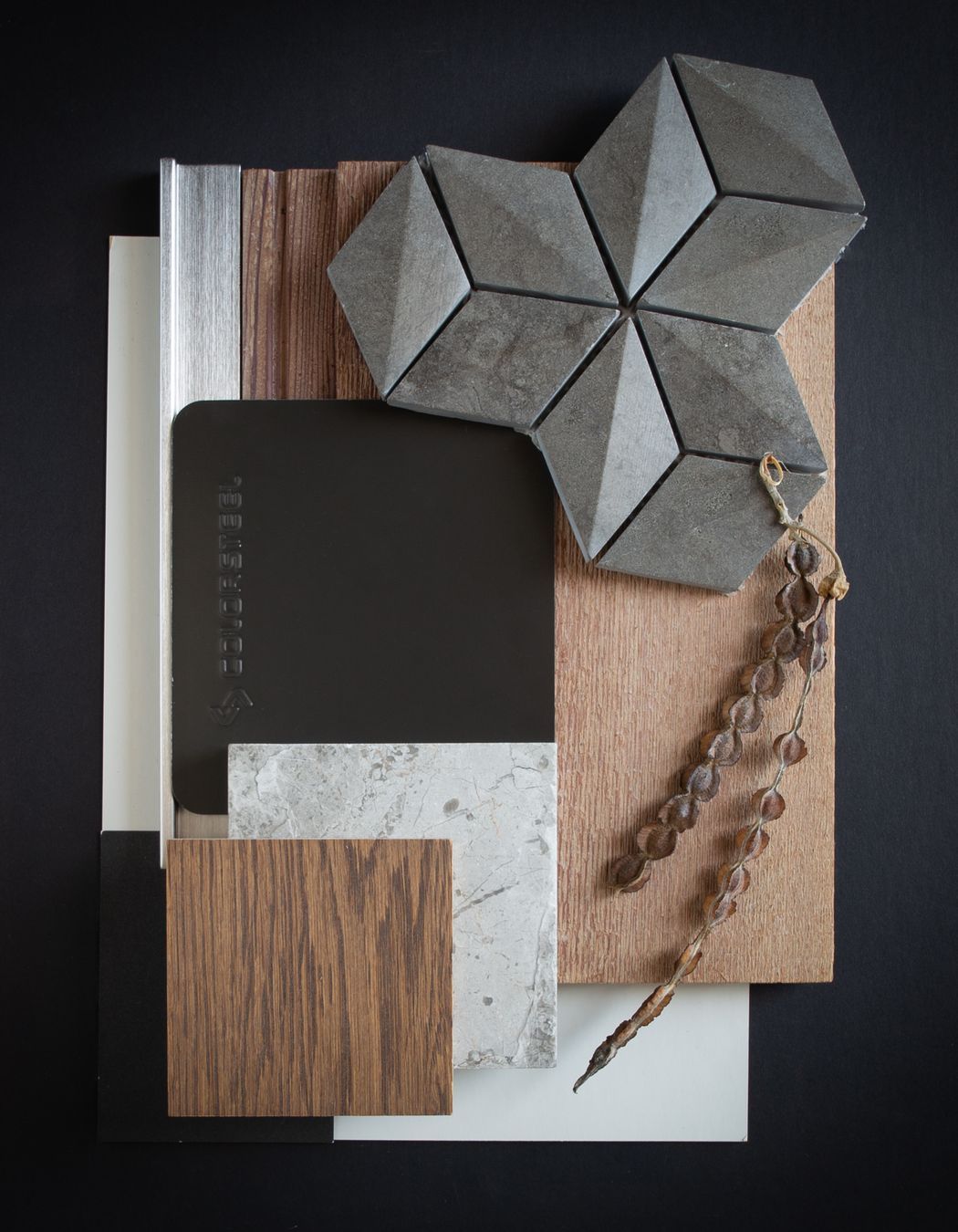
Colour: Thunder Grey. In this palette the textural contrast of Rough split stone, with graduations of gentle greys and whites, is combined with warm accents. Inspired by the graduations of shades in NZ native bird feathers, such as the Kaka, Thunder Grey creates a home that is contemporary yet warm and tactile.
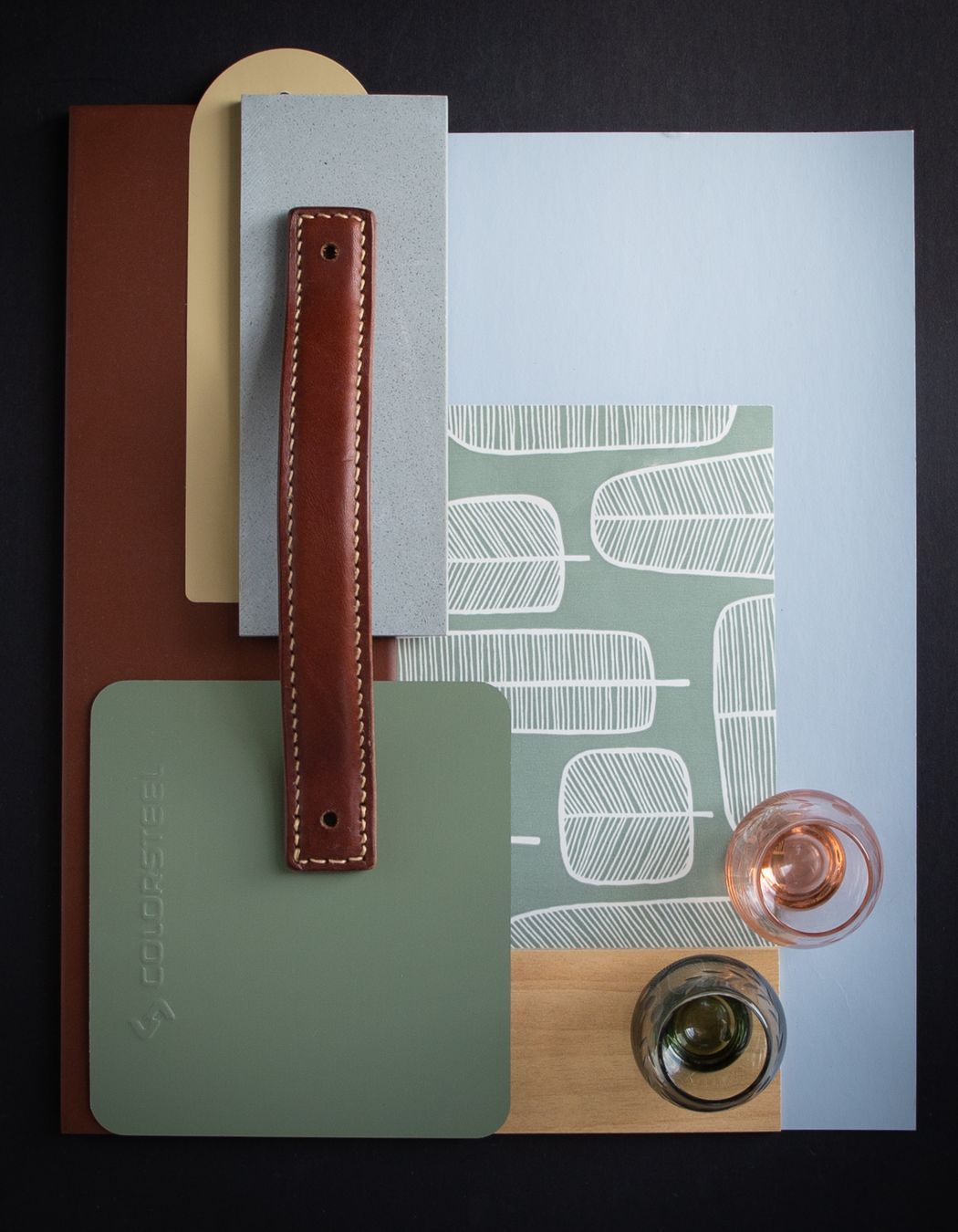
Colour: Mist Green immediately transports us to a time when pastels, terracotta and wallpaper were in their heyday. Perfect for a historical home renovation or a sweet little bach by the sea. Pour your favourite beverage and you are all set for a great weekend, this is a time worth reliving.
Colour: Gull Grey has that feel of discovery when you arrive at a waterfall or river after a long walk. It can be layered with both fresh greens and natural moss greens, NZ made radiata pine laminated beams and NZ handmade tiles, it marks a home as a place of arrival. This palette celebrates a home nestled in the bush, a place where one is refreshed and calmed by the peaceful environment.
Colour: Permanent Green has a connection to history and is a reminder of frequently used roofing colours of the past. Today, when combined with crisp white paint, duck egg blues and soft greys, it is a fresh take on a classic combination, and one that respects a legacy that blends well with its environment.
Colour: Snowstone Matte offers a contemporary approach to sustainability. Reducing the cooling load of a home through its light colour (yet low surface reflectivity) it is great for an eco home that has a focus on using natural materials and that has a thermally responsive design. FSC larch cladding or linings (that weathers to a soft natural grey externally over time) cork on the floor and natural linens are all tactile materials that are good for both the home owner and the environment.
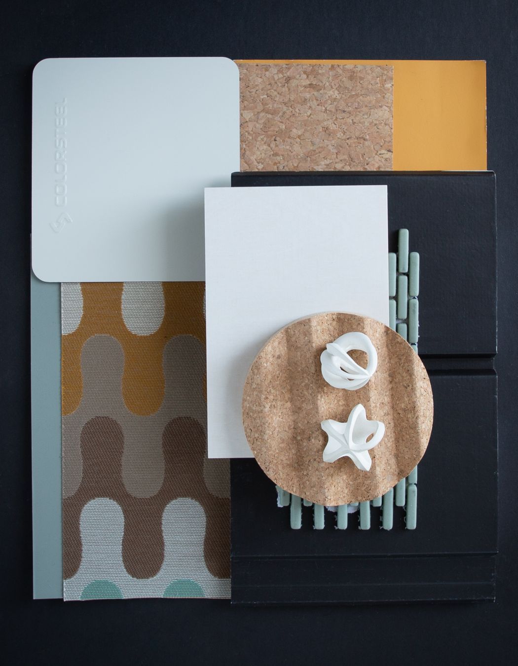
Colour: Titania is a clean white that reminds us of manuka flowers, orchard blossoms, or a mountain daisy in the tussock. In this palette we have combined the warmth of orange and yellows, natural cork, sage accents and inky paint finished Abodo weatherboards. The abundance and celebration of spring.
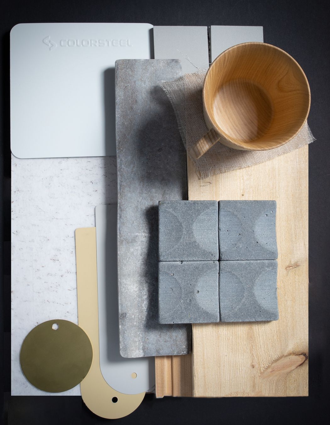
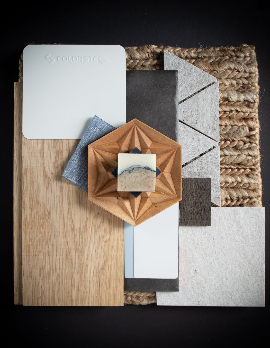
Colour: Cloud has the fresh feel of summer, white beaches and blue sky days. It naturally lends itself to sandy textured tiles, chambray blues and oiled timbers weathered by the sun. Great for a bach where you wash off the sea salt at the end of the day, or a home where you want to feel on holiday year around.
Colour: Desert Sand reminds us of our connection to the land, a connection to heritage. This palette is designed to incorporate the colours of morning light over frost, the stained red of berries and rosehips, natural grains of timber in New Zealand made laminated beams, and the warm weathered browns of branches in a winter landscape.
Colour: Slate blends with a suburban environment well. In this palette it is paired with warm neutrals, natural timber, and New Zealand schist. Its chameleon ability to work with both cool and warm colours, opens up opportunities for the home owner to personalise their spaces with a soft interior palette as a contrast to a cooler tones of the external cladding. A gentle home in which to make and create.
Colour: Windsor Grey works well with South Island Beech timber and New Zealand Blue stone. This colour changes with the light, from the cool grey in morning light a deep blue in the setting sun. Contrasting it with warm orange timber tones, whether in the landscape that surrounds the building or beautiful native timbers within, allow it to truly glow in a cold climate.
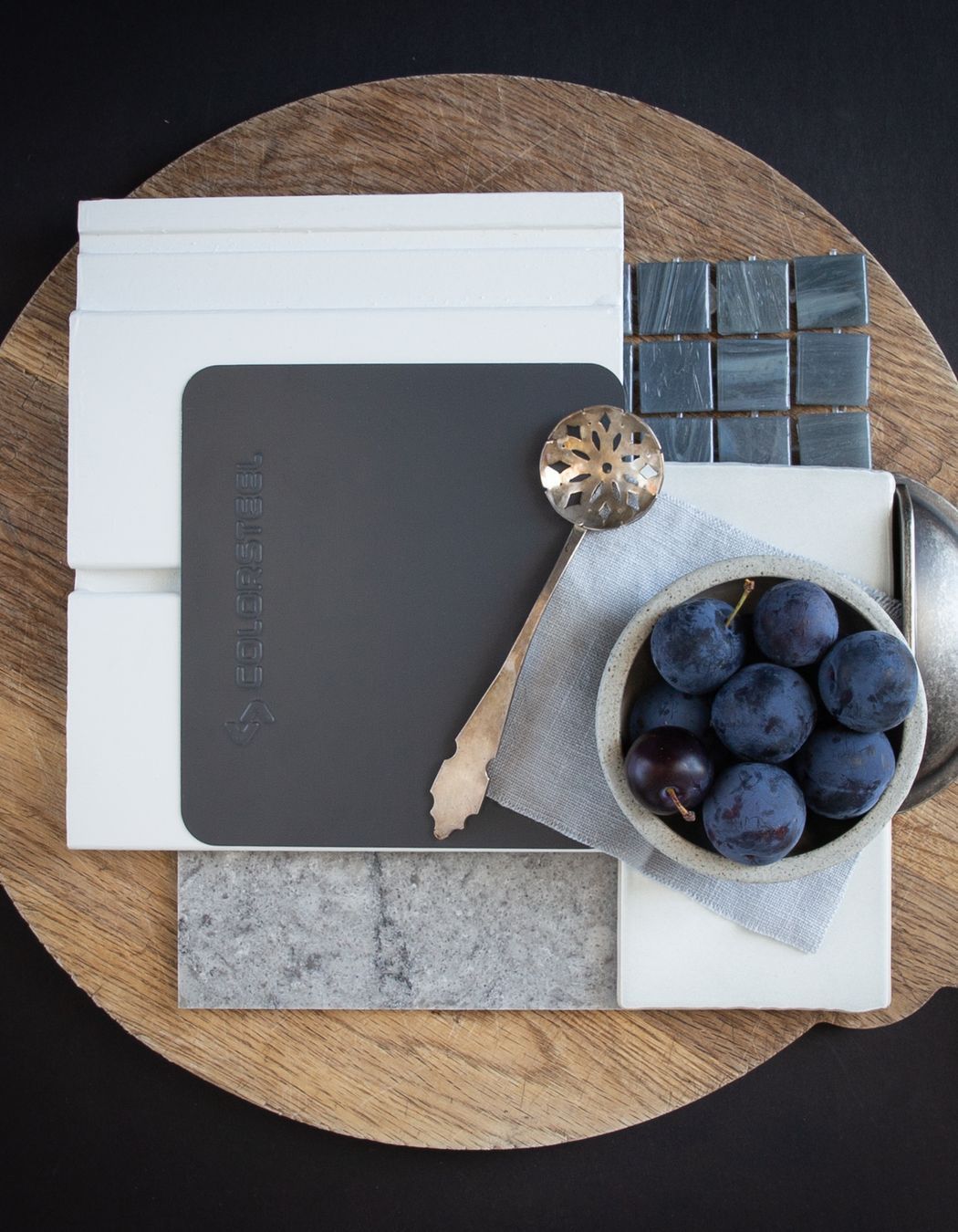
Colour: Grey Friars is a much loved roofing colour with a hint of blue. This palette is designed with a cottage in mind, with the weathered oak kitchen table at the heart of the house, blue tiles, a cool grey benchtop to make pastry, and a white weatherboard exterior. A home where the patina of daily life adds to its character.
Colour: Tidal Drift Matte works well in many environments with its low reflectance finish. The cool grey, the colour of distant hills on the horizon, pairs well with warm stained Abodo cladding and honed New Zealand stone. The colours of a tidal beach influence this palette. Warm neutral tiles and accents that pick up the colours of dried pohutukawa leaves or shells, creates a home that works well with the ebb and flow of family life.
Colour: The New Denim Blue palette is designed with a cheerful new home in mind. The blue pairs beautifully with sealed strandboard flooring or panels, fresh whites and soft grey tiles or stone. Add beeswax candles + low VOC finishes in paints or sealants, and you have a fresh healthy home that makes you feel good everyday.
Colour: Lichen brings to mind driftwood, grasses on the sand dunes moving in the sea breeze, and a coastal home that is in tune with its environment. Natural limestone, deep greens and sage accents create a calm palette for a relaxed family home by the sea..
Colour: Sandstone Grey is a cool grey reminiscent of shadows on snow. In this palette they are offset against warm oak flooring, in a similar way to the evening sun warming the mountain ranges at the end of the day. The grains in natural stone, soft grey carpets, and clean blues create a cool fresh palette reflective of mountain regions and lakeside homes.
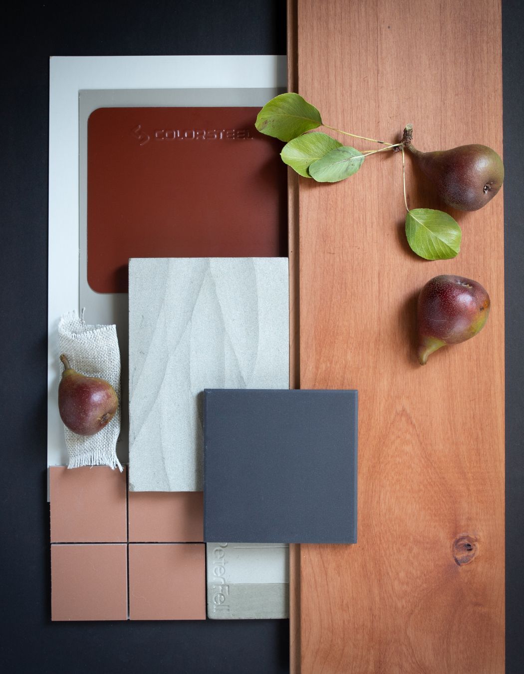
Colour: Pioneer Red is a bold warm red, it can be used many ways: as accents, for the roof, or for the entire house. In this option we designed a house where the strength of the colour feels right at home when paired with the warm tones of NZ Hinuera stone, cedar, NZ handmade tiles and set against autumn foliage.
Colour: Scoria’s warmth is paired with NZ South Island Cherry beech. This palette is designed with the farmhouse in mind, an orchard outside and earth damp from the rain. Warm modern finishes are contrasted against light greys and natural linens. Combined with a farmhouse table and a bowl of freshly picked fruit and you have a home that feels right for its land.

About the
Professional

We create homes not houses. A home is where you feel most comfortable. Where you rest, live and laugh. Where you grow, celebrate and make memories. Our approach is to understand what home means to you and bring that space to life. At Day Architects, we design spaces for living. Architecture that connects you and your family to the community and environment around you. We do this with appreciation and understanding of your dreams, your lifestyle and your budget.

We believe great architecture should be accessible and designed for everyday life. Our strength lies in creating sustainable site-specific homes and bespoke renovations that frame your way of life and give families room to grow. We also design community projects, residential new builds, alterations, customised interiors, from both small to large commercial and residential projects.

We take client care seriously, and are there throughout your project to bring your dreams to reality. Working with us is a truly collaborative experience. Understanding our clients and their objectives is a very important part of the process and is fundamental to what we do. That’s why we place a high emphasis on listening, asking the right questions and enjoying quality discussion, to advance your goals and ultimately design architecture that truly fits your life.

NZIA Practice, NZGBC Member (NZ Green Building Council).


At ArchiPro we recognise and acknowledge the existing, original and ancient connection Aboriginal and Torres Strait Islander peoples have to the lands and waterways across the Australian continent. We pay our respects to the elders past and present. We commit to working together to build a prosperous and inclusive Australia.