Hasselt University.
ArchiPro Project Summary - Contemporary renovation of Hasselt University library to enhance functionality and aesthetics for a vibrant student experience.
- Title:
- Hasselt University
- Manufacturers and Supplier:
- Flokk
- Category:
- Community/
- Educational
- Building style:
- Contemporary
- Photographers:
- Peter Van de Wile, Studio Laroue

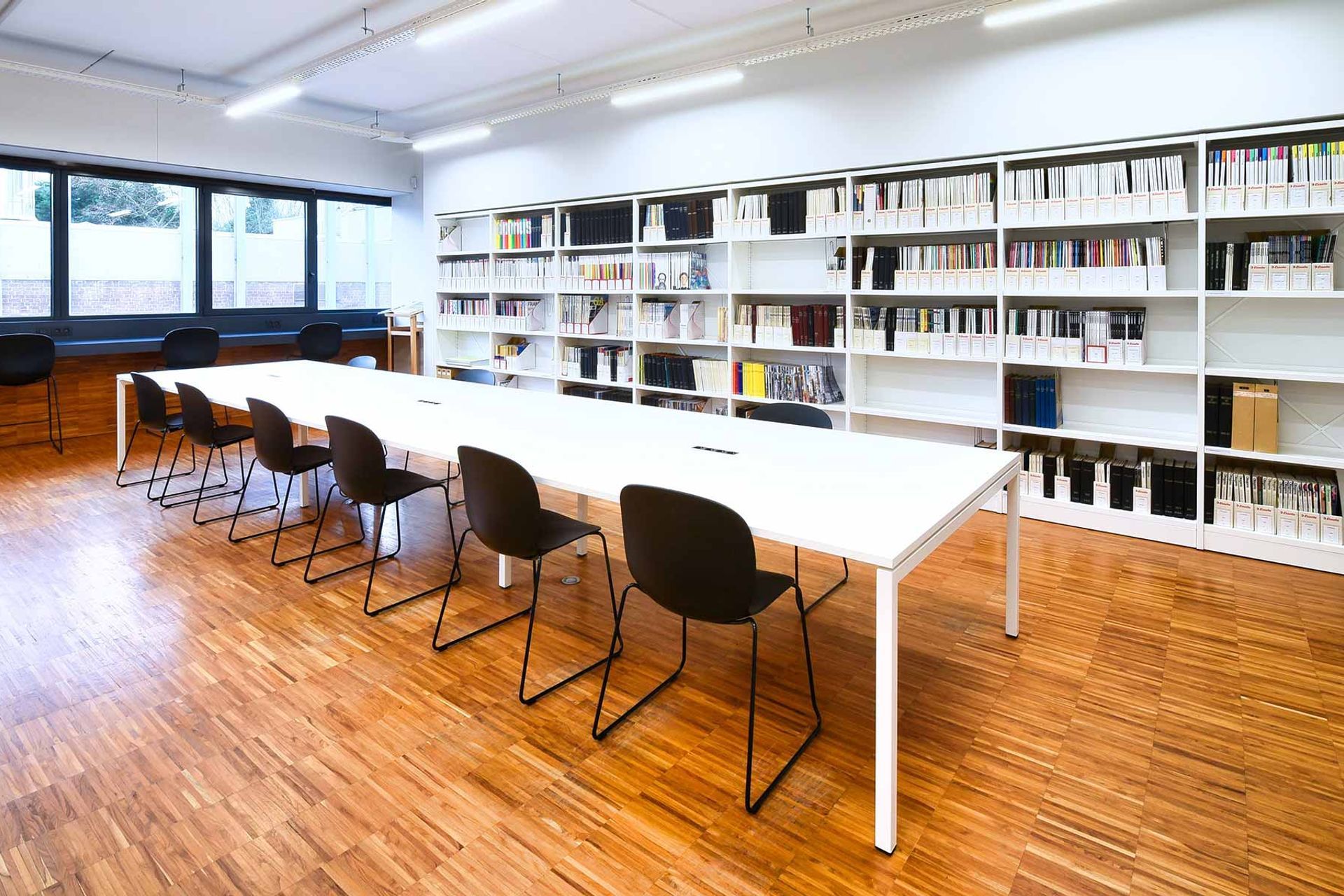
The objective of the redesign was to provide a fresh modern library for students to study in a relaxing and pleasant environment. The project featured several significant measures, including:
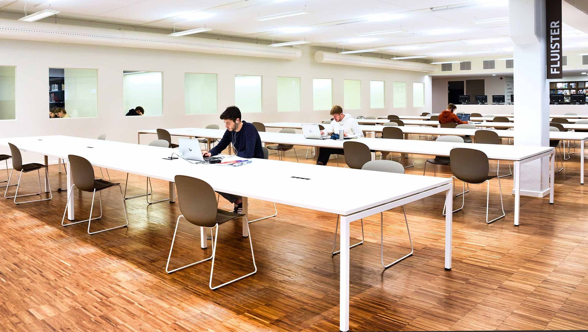
- Creating three noise zones: a group work zone, a whisper zone and an absolute silence zone.
- More workspaces (from 210 to 350), by creating a more efficient library lay-out as well as archiving more than 1 km of books and journals.
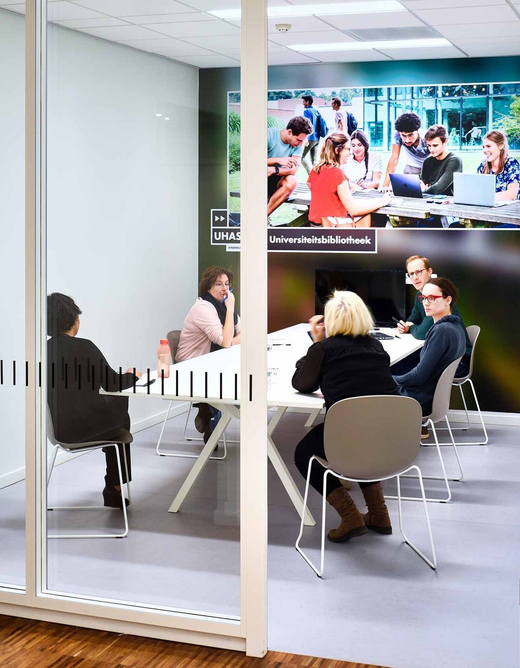
- More group work areas (from 3 to 10).
- A new floor coating, at least one power plug point per workspace, more storage space for students and improved ventilation.

As well as these architectural improvements to the layout and composition of the workspace, a whole new range of seating was introduced for the students. Speaking about this decision, Pieter Lernout, Head Librarian, University Library of Hasselt said: “In order to meet the needs of all visitors, the University Library invested deliberately in more working and seating comfort. The purchase of new, ergonomic furniture played an important role in this.”
Working with and on the advice of furniture provider Puur Office, and after a two week trial period, the university installed over 350 new chairs by Flokk brand Profim: 304 Profim Noor chairs in 2 colour combinations in a majority of the library spaces as well as 48 Profim Noor Up chairs, the taller Profim Noor variant, perfect for higher workbenches.
A collaboration between designers Form Us With Love, Stokke Austad, Grønlund Design and the Flokk internal design team, the Profim Noor is a modern classic Scandinavian design, where strong ergonomics combines with functionality and aesthetics. With the long hours students spend seated, the Profim Noor was a natural choice, offering a supportive and comfortable shape.

In each combination the university opted for the sledgebase leg option, helping the reduce noise from movement and making it easily stackable. From the wide range of colour options available, the university easily found the right colour to match the interior design aims of the project.
Speaking about the colour and material choices, Peter continued: “W deliberately chose black chairs in our 'architecture corner', to give that place a bit more 'cachet'. We also opted for black for the stools, so that they look good with our black library racks. With he remaining chairs we chose a "clay" colour in order to create the most peaceful learning environment possible.”
Upon completion of the library, the university received very positive feedback from students on the overall redesign of the workspace, but especially the new seating, in both terms of its functionality and appearance.

Featured Products

Year Joined
Projects Listed
Responds within

Flokk.
Other People also viewed
Why ArchiPro?
No more endless searching -
Everything you need, all in one place.Real projects, real experts -
Work with vetted architects, designers, and suppliers.Designed for Australia -
Projects, products, and professionals that meet local standards.From inspiration to reality -
Find your style and connect with the experts behind it.Start your Project
Start you project with a free account to unlock features designed to help you simplify your building project.
Learn MoreBecome a Pro
Showcase your business on ArchiPro and join industry leading brands showcasing their products and expertise.
Learn More


