About
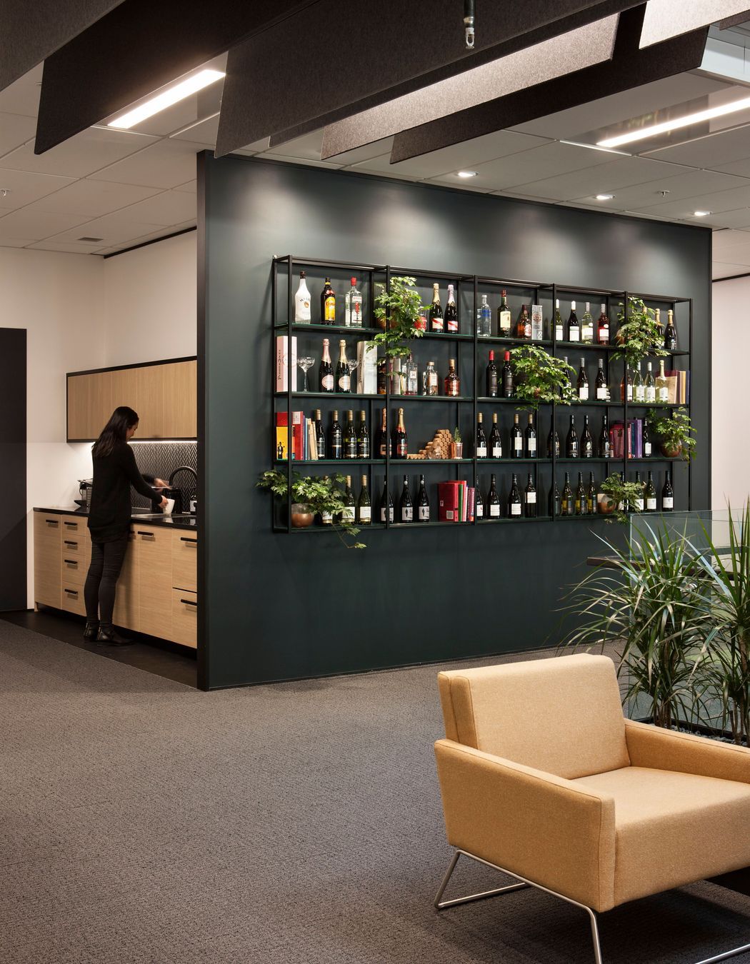
Pernod Ricard.
- Title:
- Pernod Ricard
- Architect:
- GHD Design
- Category:
- Commercial/
- Office
Project Gallery


Views and Engagement
Products used
Professionals used

GHD Design. At GHD Design we are committed to innovate for positive impact, inspire creativity and foster collaboration to co-create a more integrated built environment, that not only provides a sense of place, but ignites a sense of community.Leveraging our unique methodologies across architecture, interior design, landscape architecture, fit-out management, planning and engineering GHD Design goes beyond problem-solving, using clever design to get to the root of the challenge, creating a better, more sustainable built world for generations to come.
Year Joined
2015
Established presence on ArchiPro.
Projects Listed
43
A portfolio of work to explore.

GHD Design.
Profile
Projects
Contact
Other People also viewed
Why ArchiPro?
No more endless searching -
Everything you need, all in one place.Real projects, real experts -
Work with vetted architects, designers, and suppliers.Designed for Australia -
Projects, products, and professionals that meet local standards.From inspiration to reality -
Find your style and connect with the experts behind it.Start your Project
Start you project with a free account to unlock features designed to help you simplify your building project.
Learn MoreBecome a Pro
Showcase your business on ArchiPro and join industry leading brands showcasing their products and expertise.
Learn More


