The Cube banner

Having previously experienced Korean apartment life, the decision to go small was neither daunting nor unfamiliar. Plus, with Hutt City Council’s proposed plan changes to promote densification, the ability to downsize on-site meant staying close while allowing the next [growing] generation to move into the family home. A beat-up double garage in the back corner of the property provided a perfect platform for redevelopment.

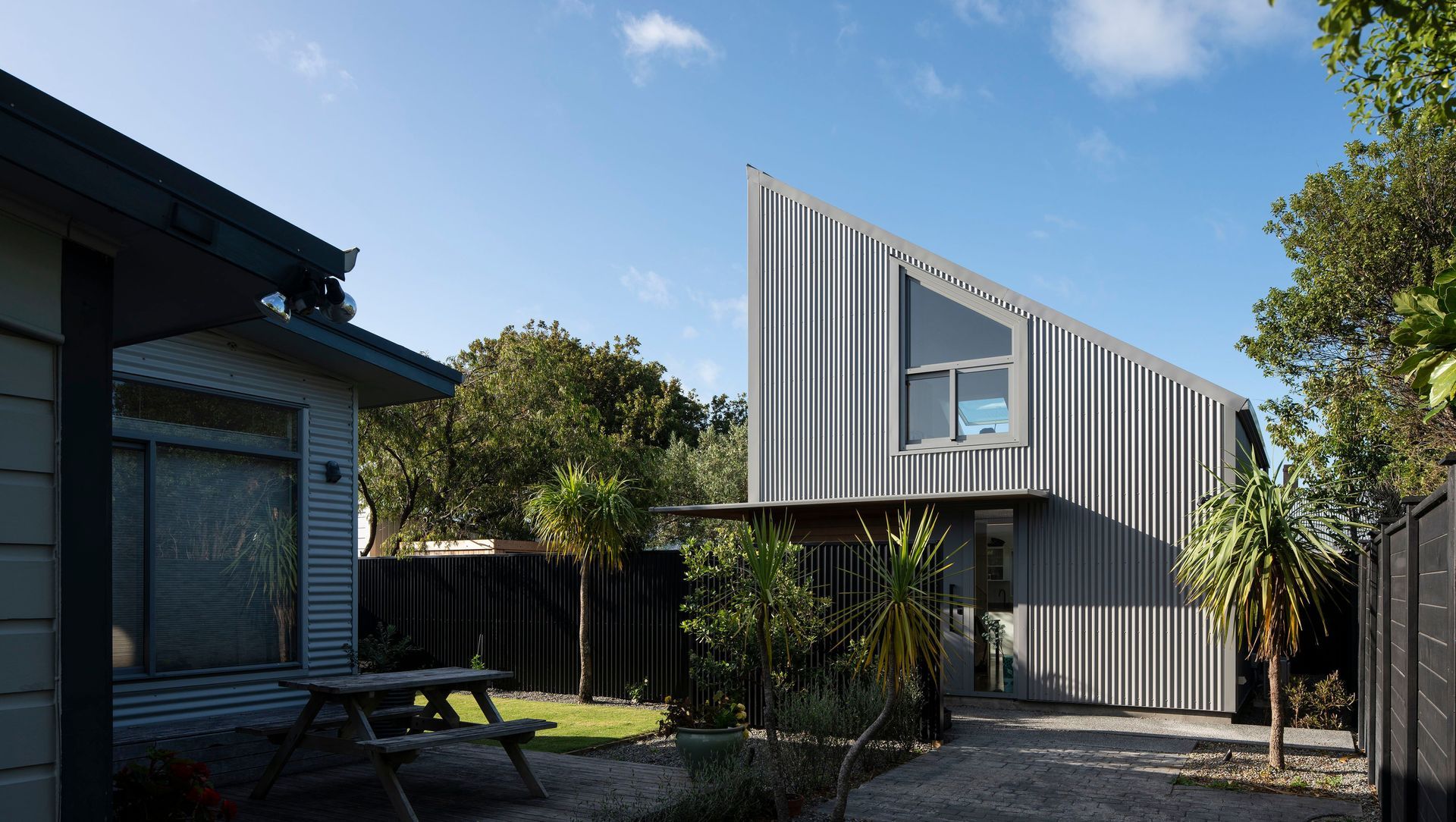
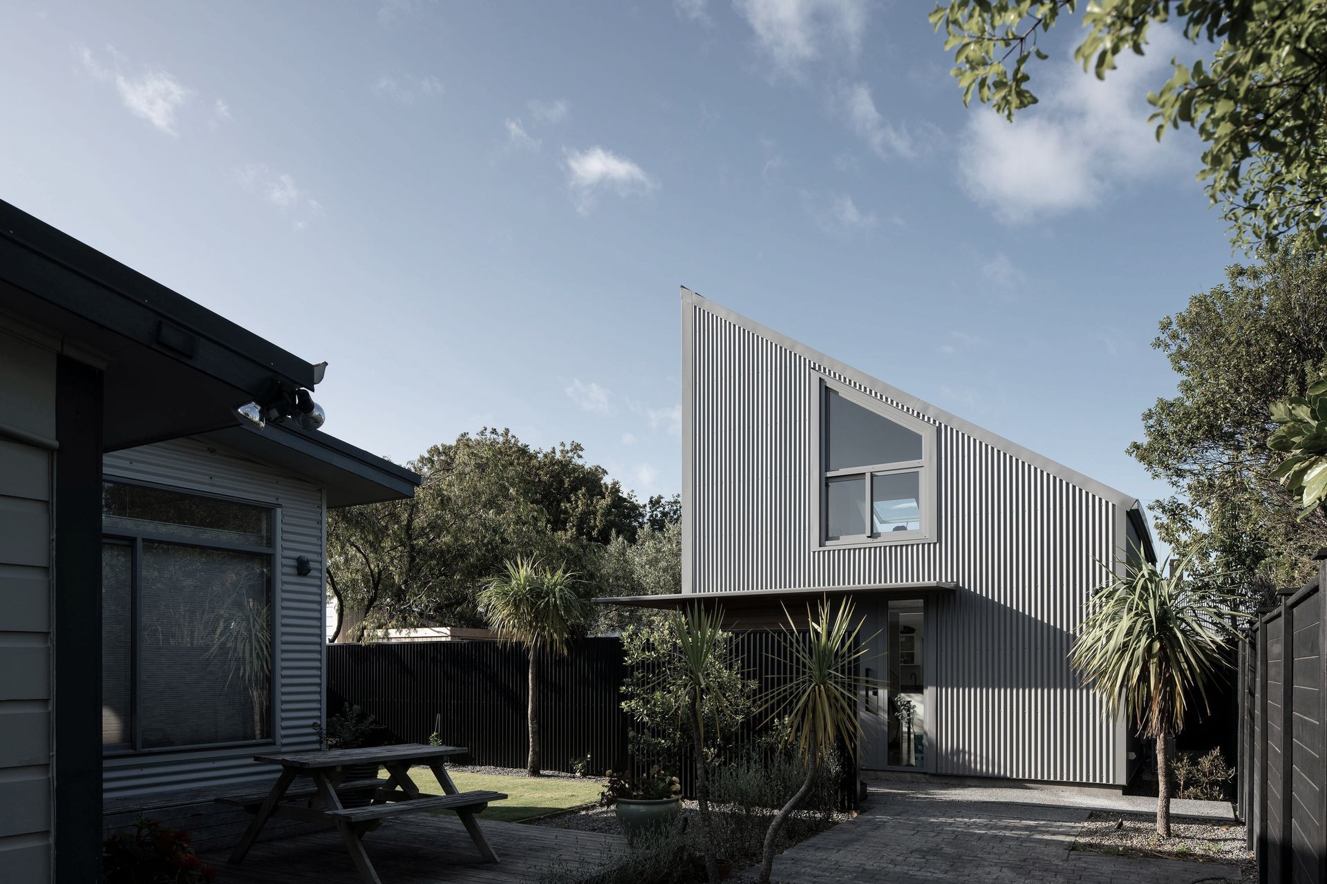
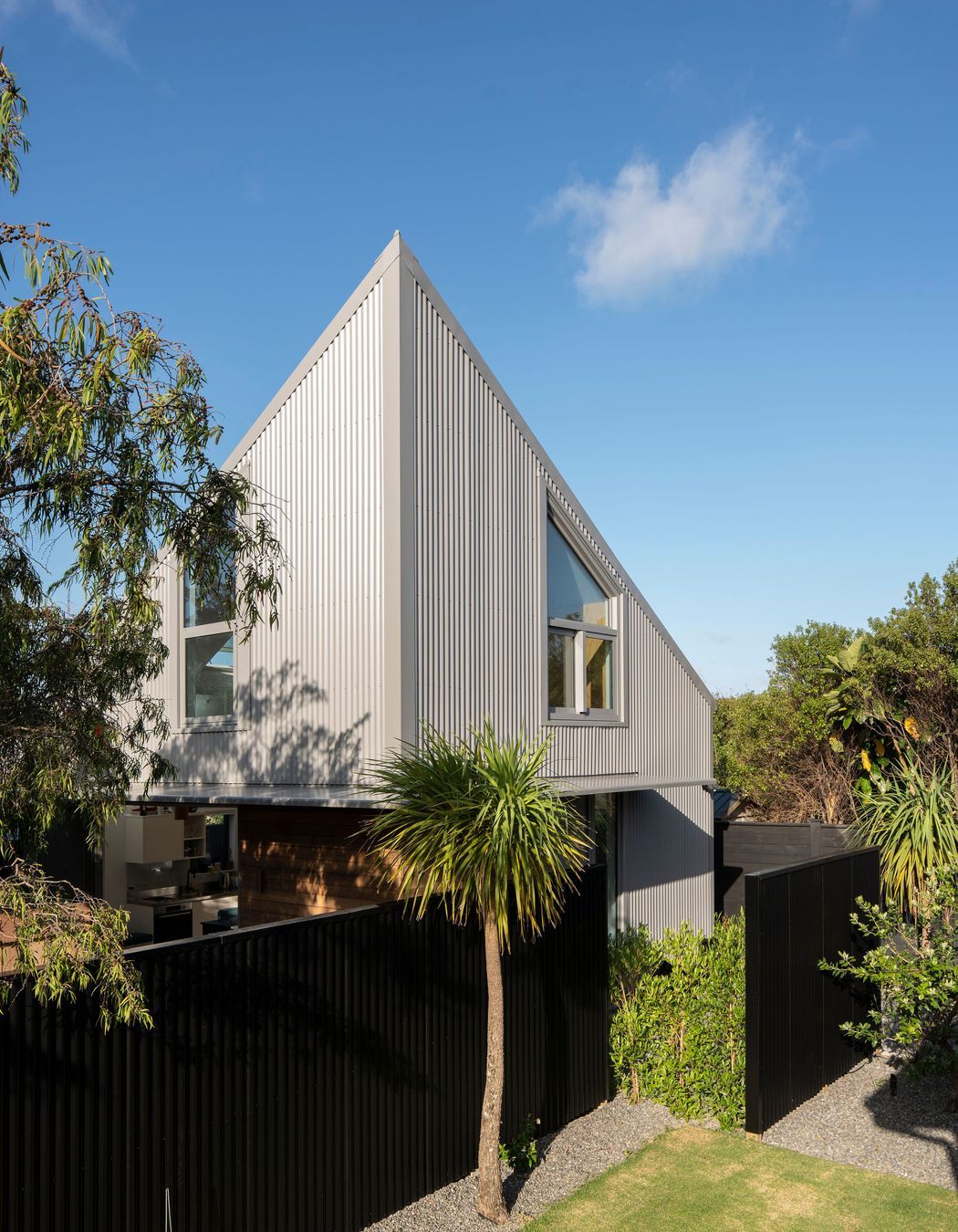
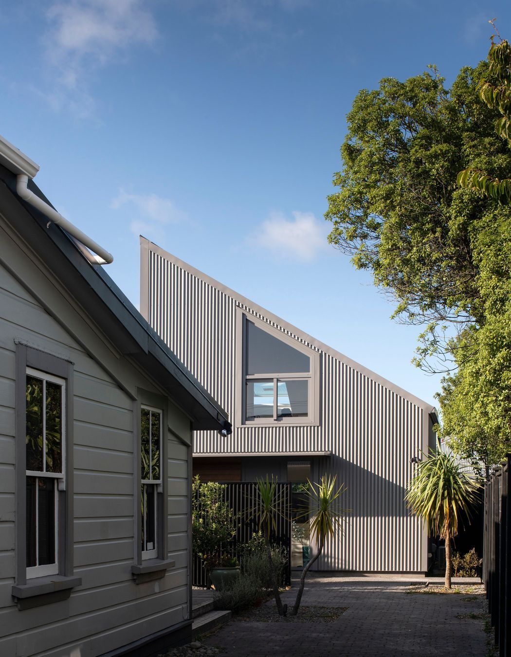
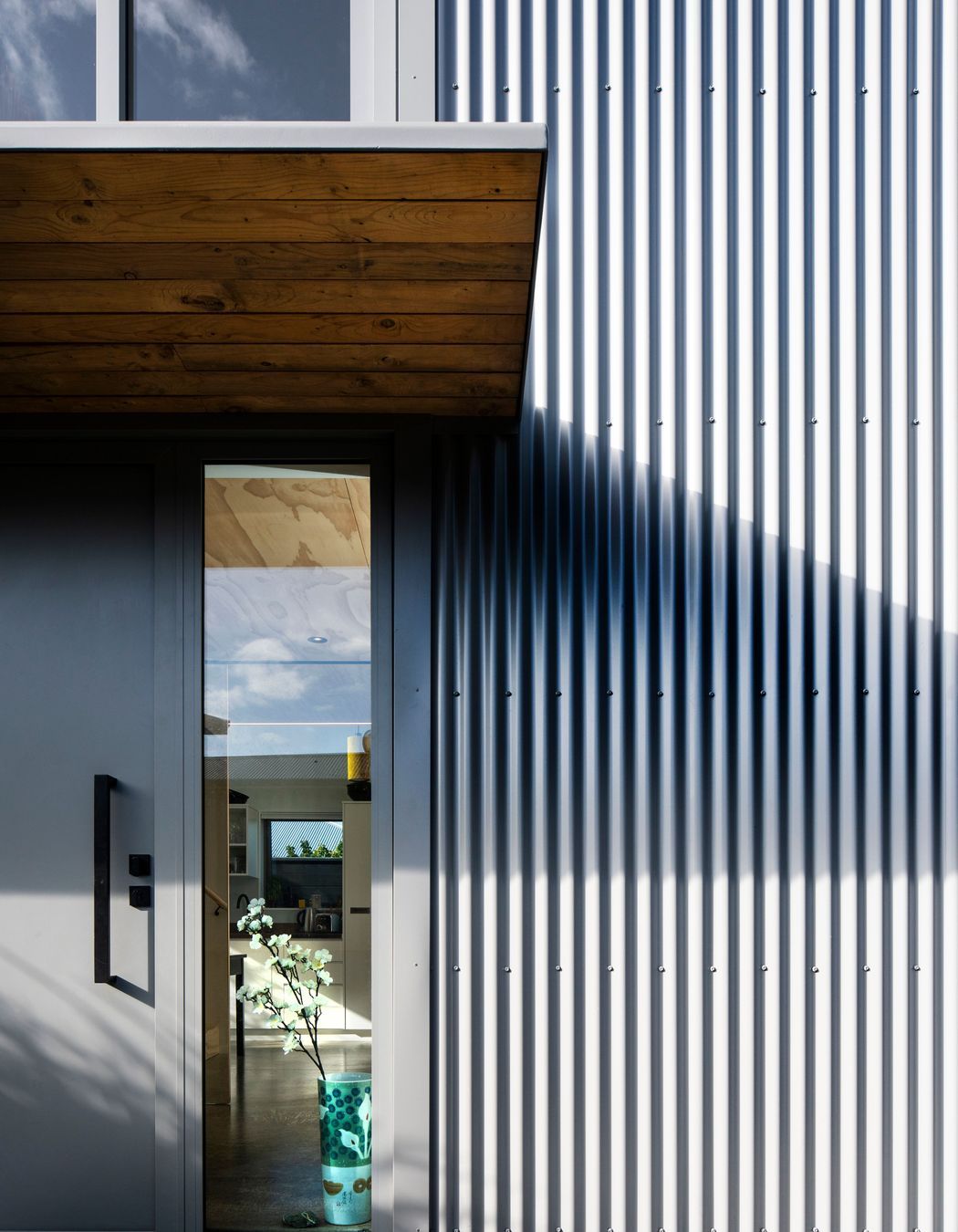
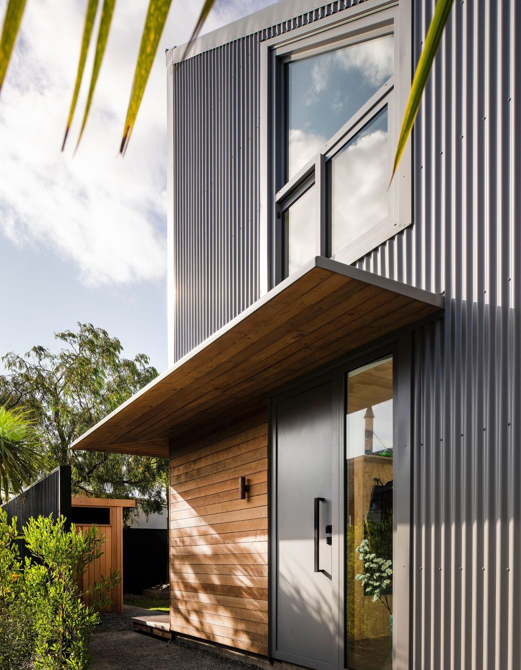
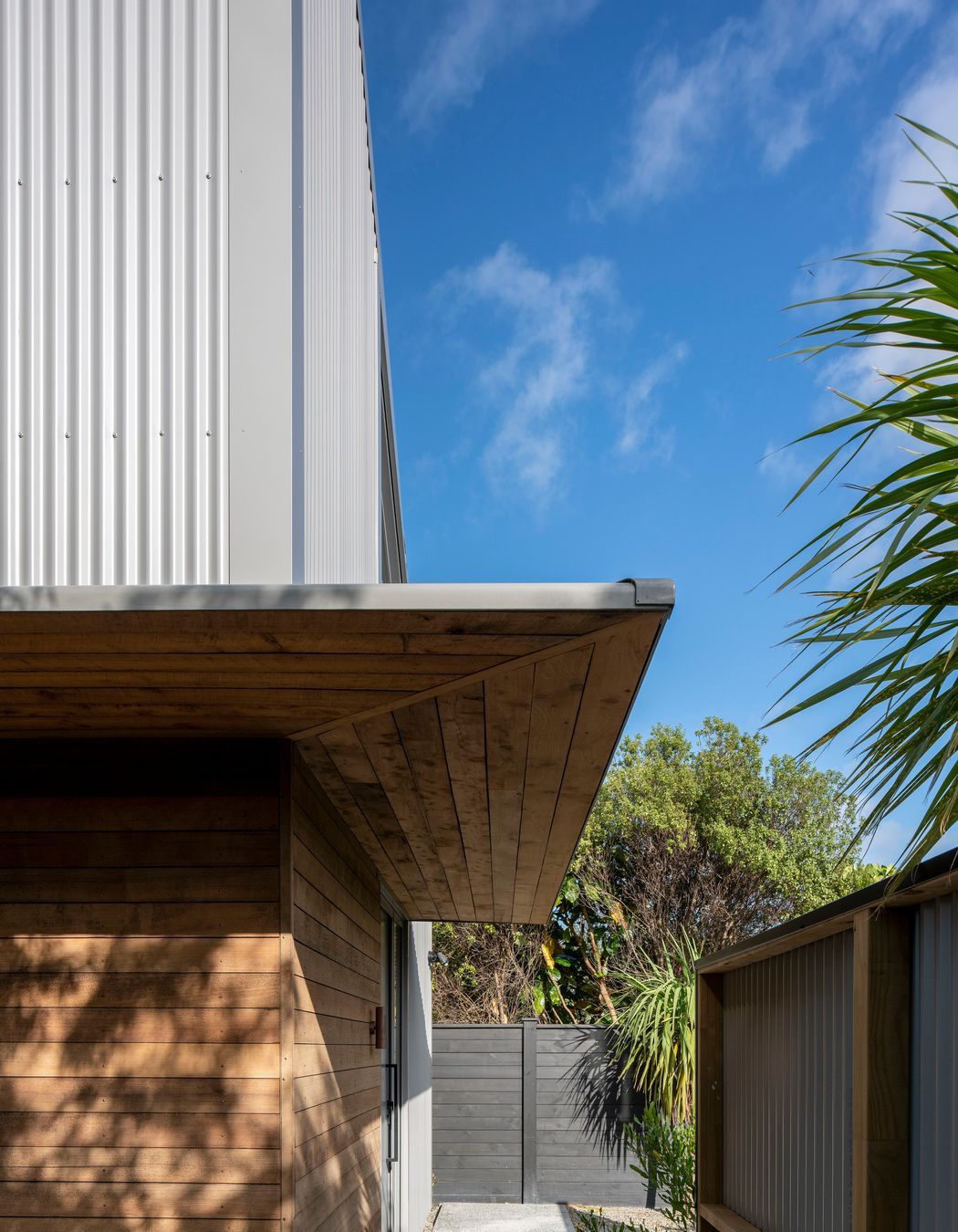
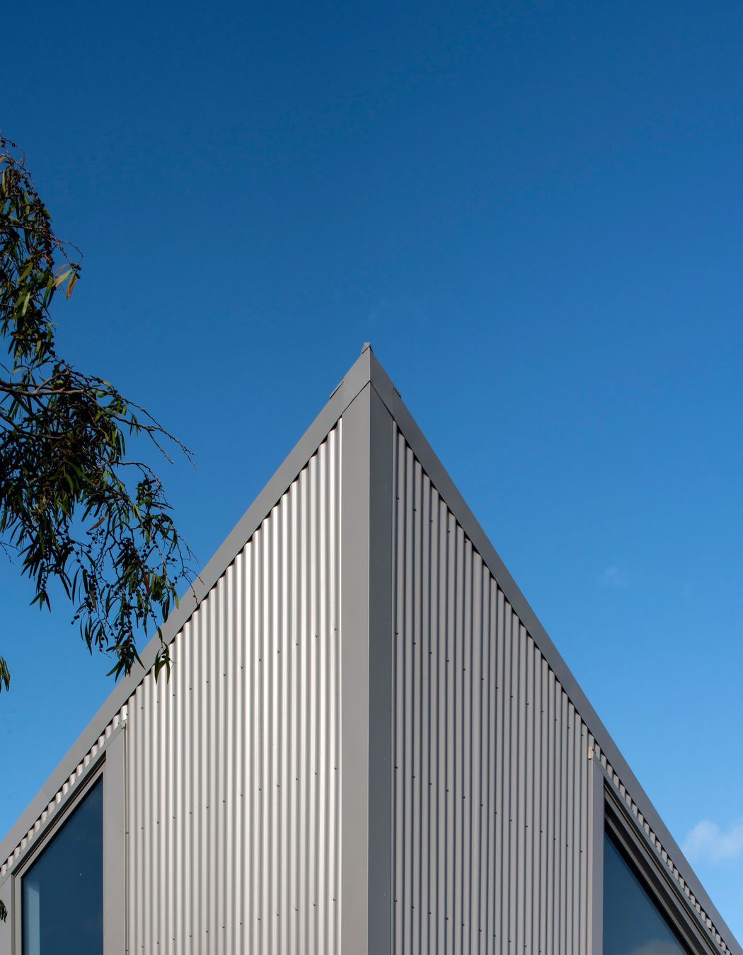
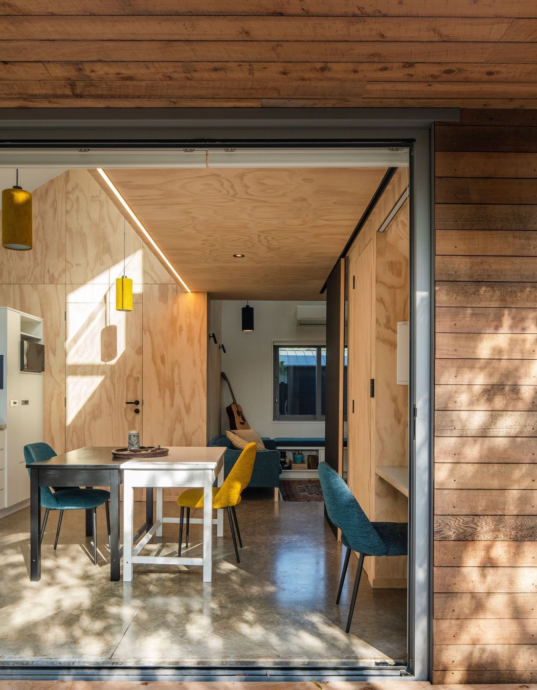
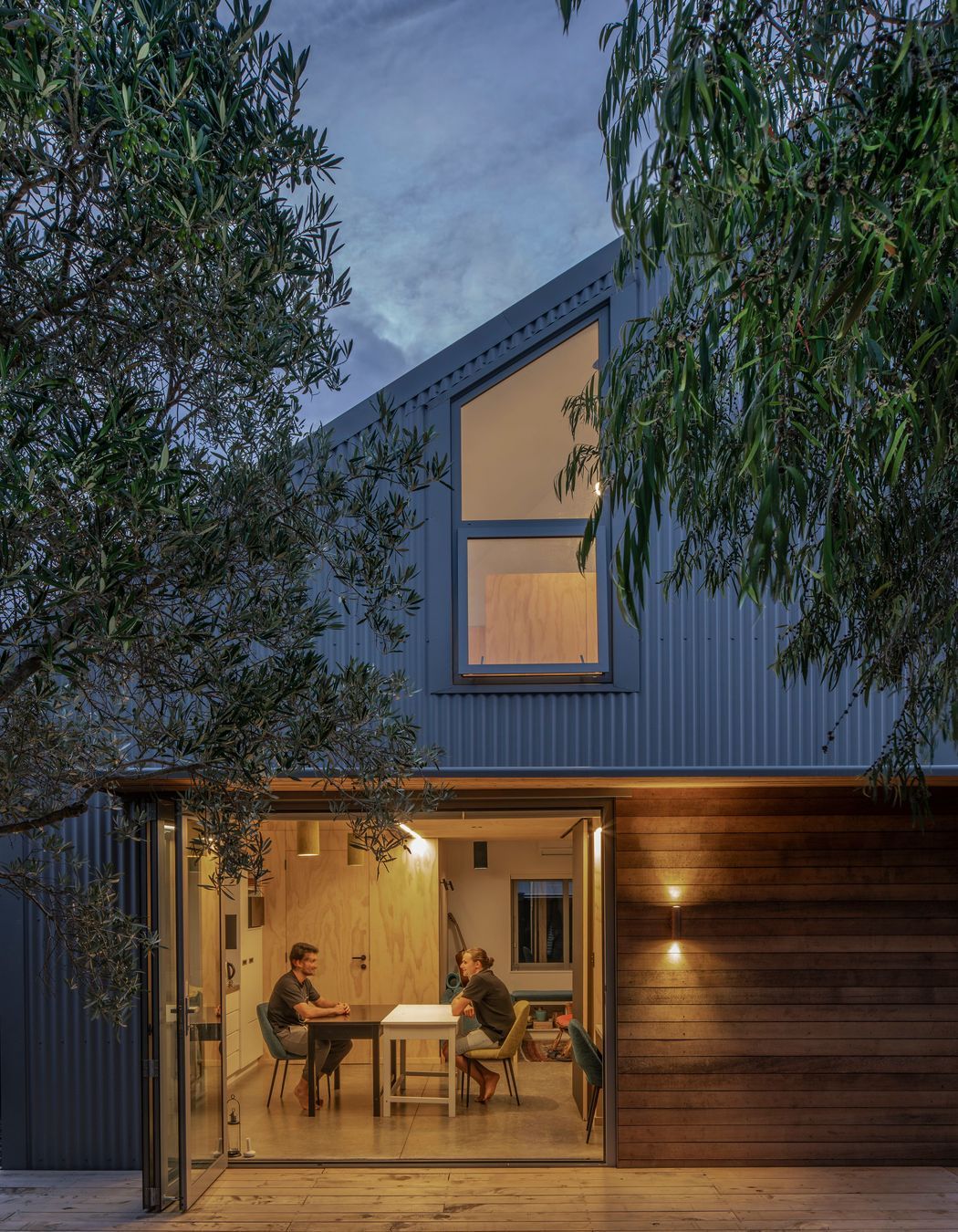
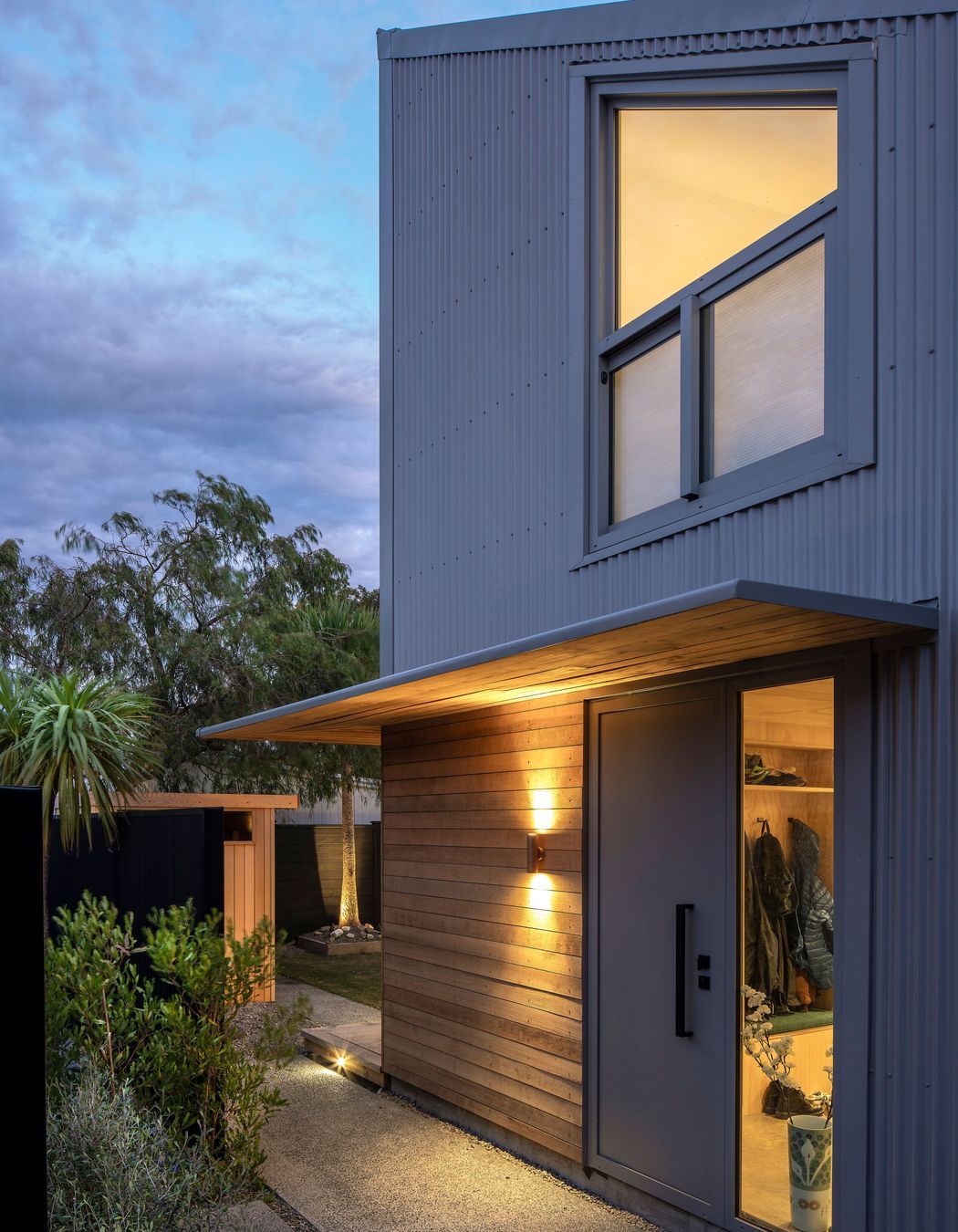
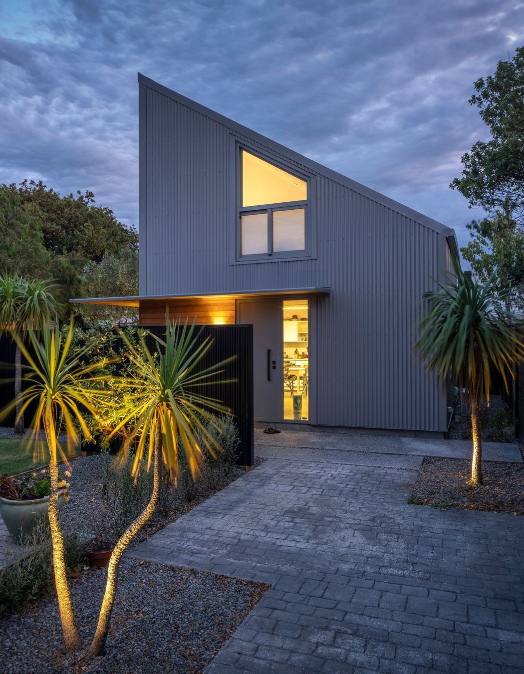
By playfully adopting motifs from its surroundings, the resulting 48m2, self-contained studio sits naturally (albeit bodly) in context. Its slim steel awning recreates the curved verandah canopies of the neighbourhood villas; its soaring peak nods to gable finnials… even the vertical corrugate connects to the horizontal cladding of the villa extension, a recent contemporary. And rich recycled timber siding gives a rustic, grounded and tactile quality to the otherwise lofty and geometric form.

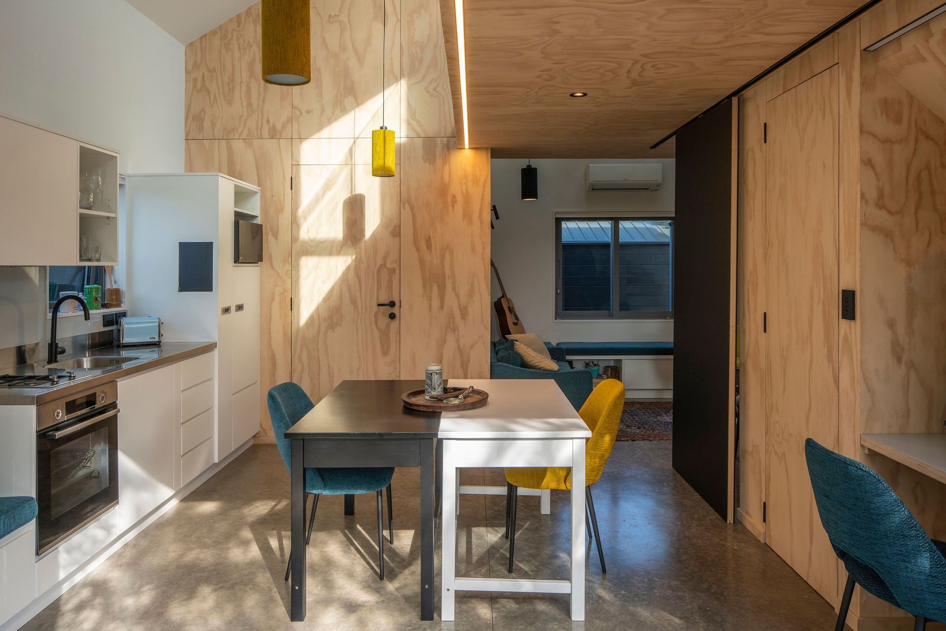
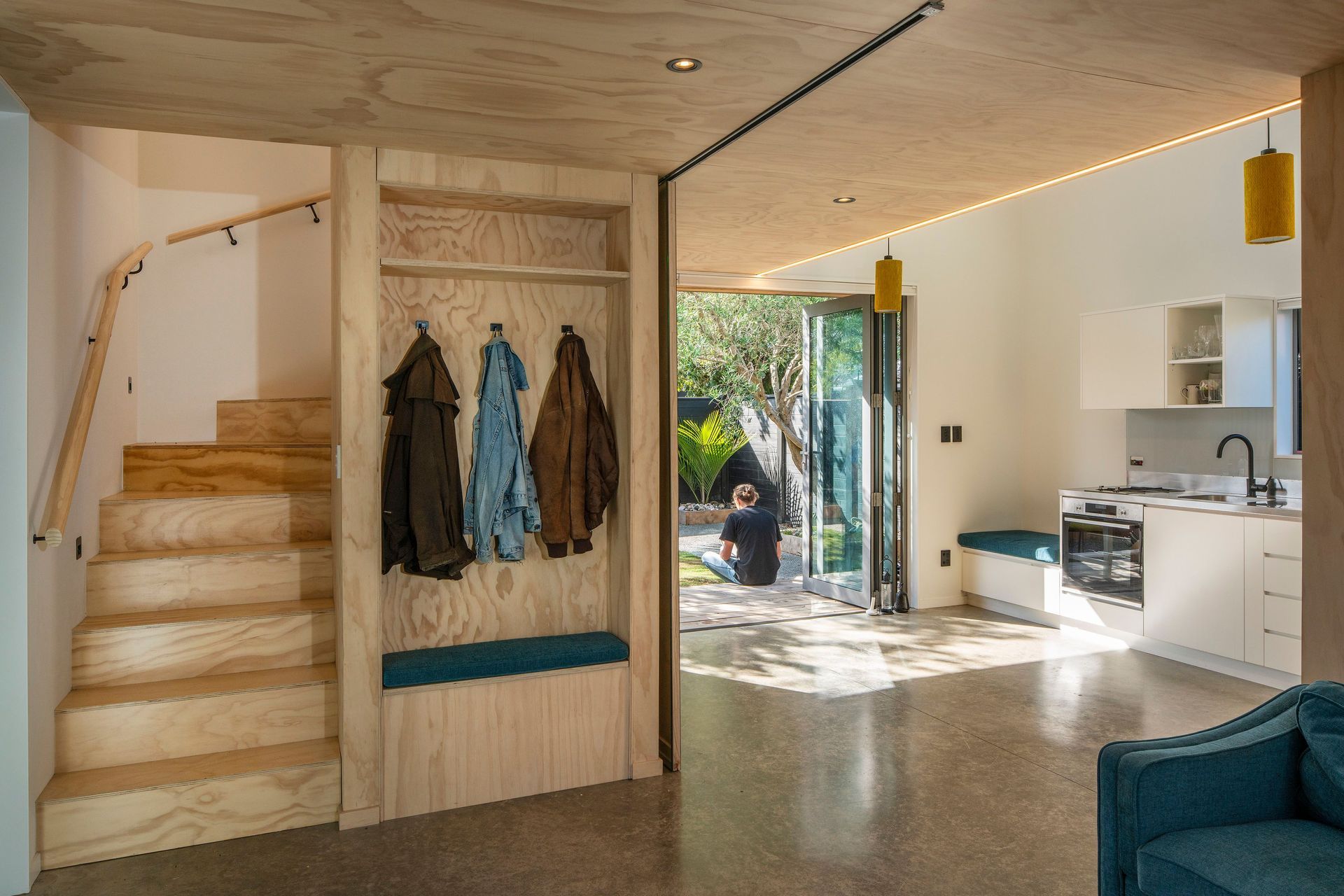
At 36m2, the ground floor works hard to accommodate bathroom, kitchen, living, circulation, and concurrent work-from-home activities, where private tutoring requires spatial separation from other goings-on.

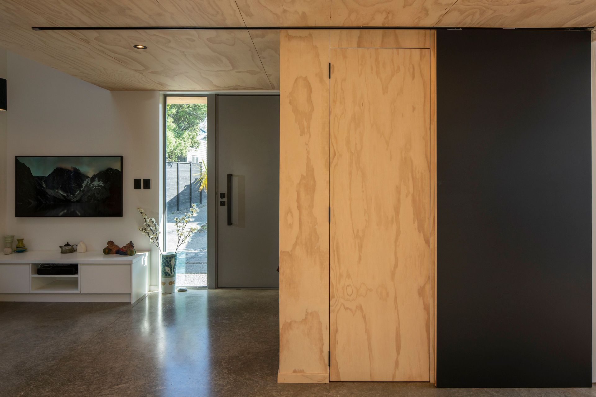
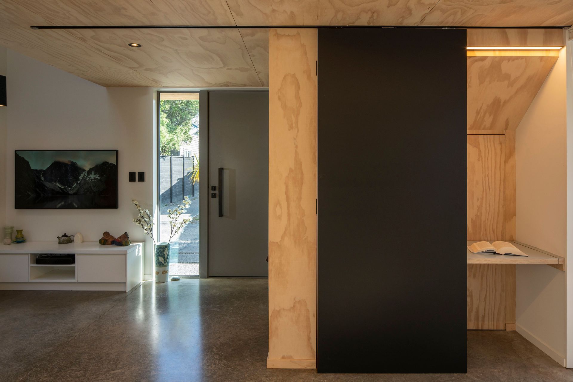
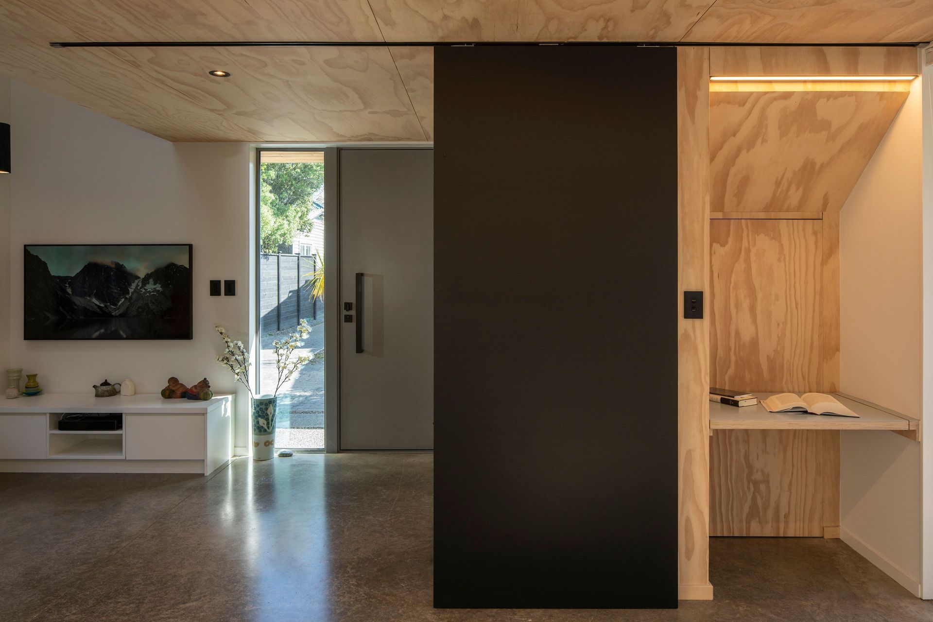
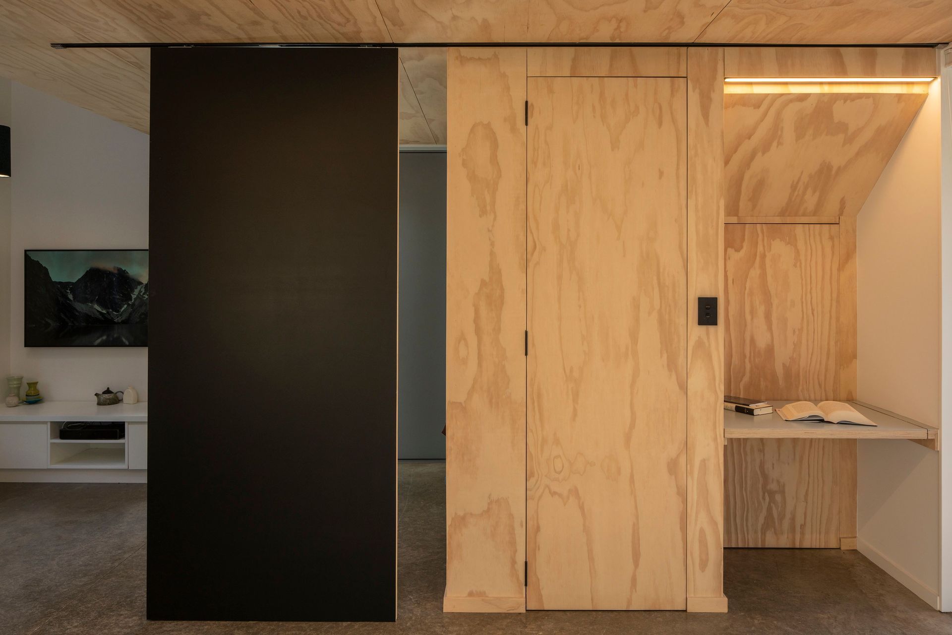
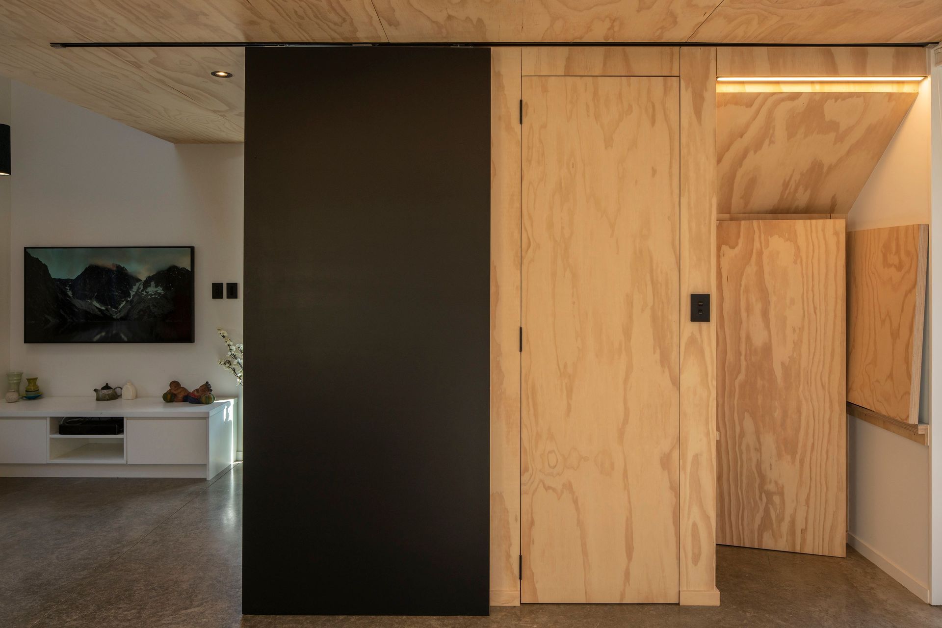
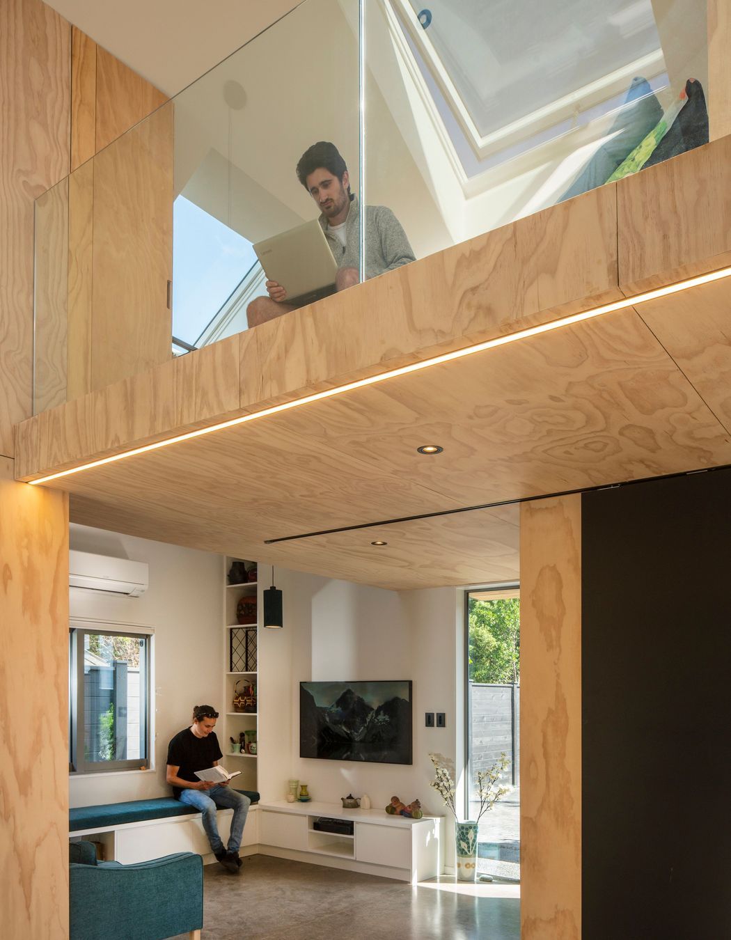
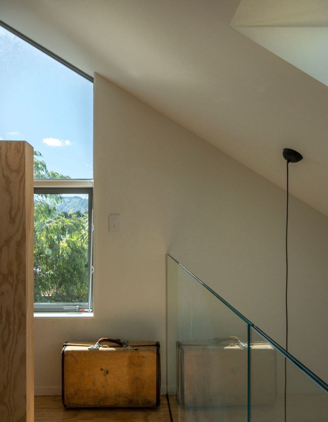
The layout pushes all the functions to the extremities of the plan, freeing up the centre for flexible occupation. Located in each corner, expressed plywood elements sit within the larger envelope. They either enclose private space, such as the bathroom, or comprise/contain custom joinery pieces that can convert the central area depending on the activity at hand, ie allowing the dining room to double as a classroom (with blackboard). Above, a 12m2 mezzanine provides a loft bedroom tucked into the space created by the steep apex of the building’s angular roof planes. With a pleasant outlook it provides a sunny retreat in which a digital nomad can work when the ground floor is otherwise occupied.

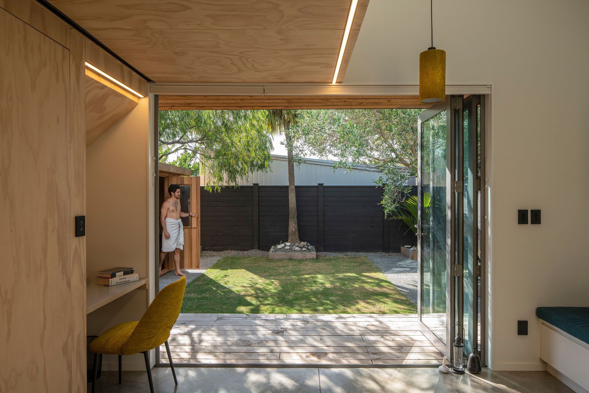
Large bifolding doors open onto a timber deck which, teamed with sunny lawn, works to extend the cube’s living space physically and perceptually. Clever landscaping, new planting and a staggered fenceline facilitate privacy between the two new ‘backyards’ without shutting the properties off from one another.

This former garage punches above its diminutive footprint, both in the feeling of space, the functionality therein, and the service to its wider family. The redeployment of a seldom-used storage space has been a creative way of downsizing without the need to leave a desirable location. More than this, though; a close family unit can continue to enjoy the family home, and a younger generation can step into property ownership despite today’s limited housing opportunities.

First Light Studio Ltd
Te Aro, Wellington

Professionals used in
The Cube

About the
Professional

We are First Light.

Good design can change your world and our planet.

We’re using design to solve problems and drive change - big and small - for families, businesses and communities.

We represent the next generation of architects and designers who truly care about our living and built environments, and the people they serve.

Let’s build a brighter future together.

At ArchiPro we recognise and acknowledge the existing, original and ancient connection Aboriginal and Torres Strait Islander peoples have to the lands and waterways across the Australian continent. We pay our respects to the elders past and present. We commit to working together to build a prosperous and inclusive Australia.