About
Thompson Park Apartments.
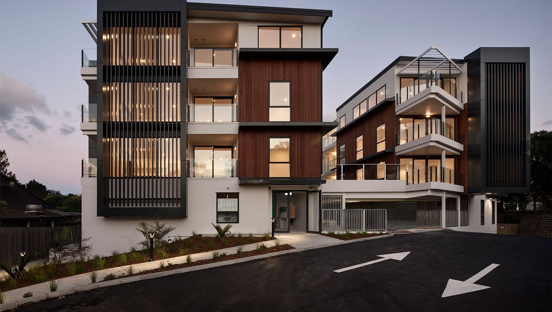
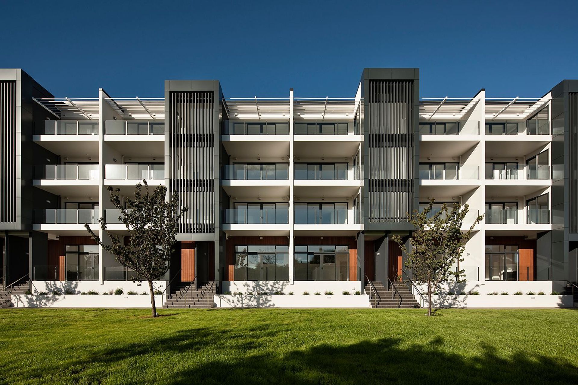
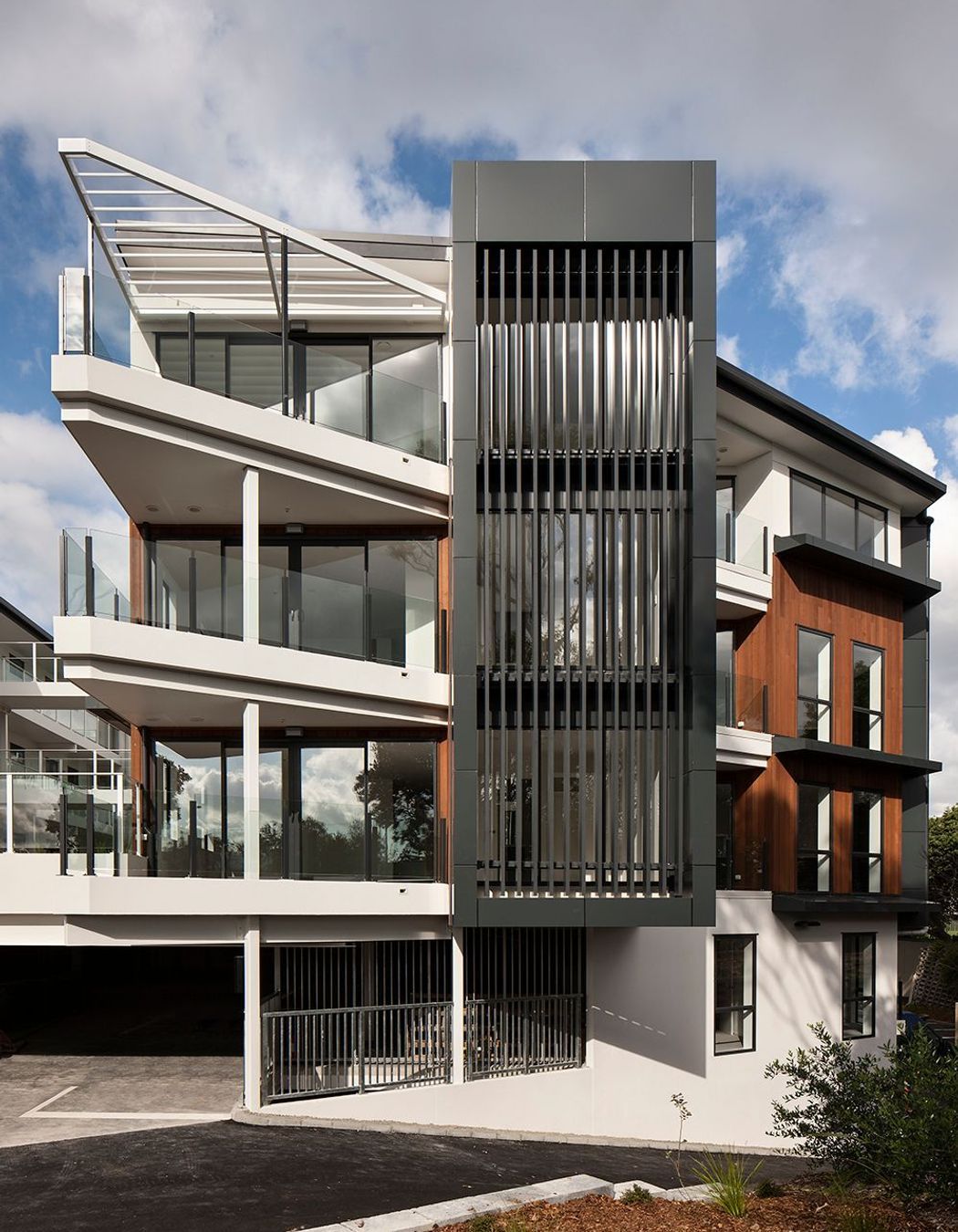
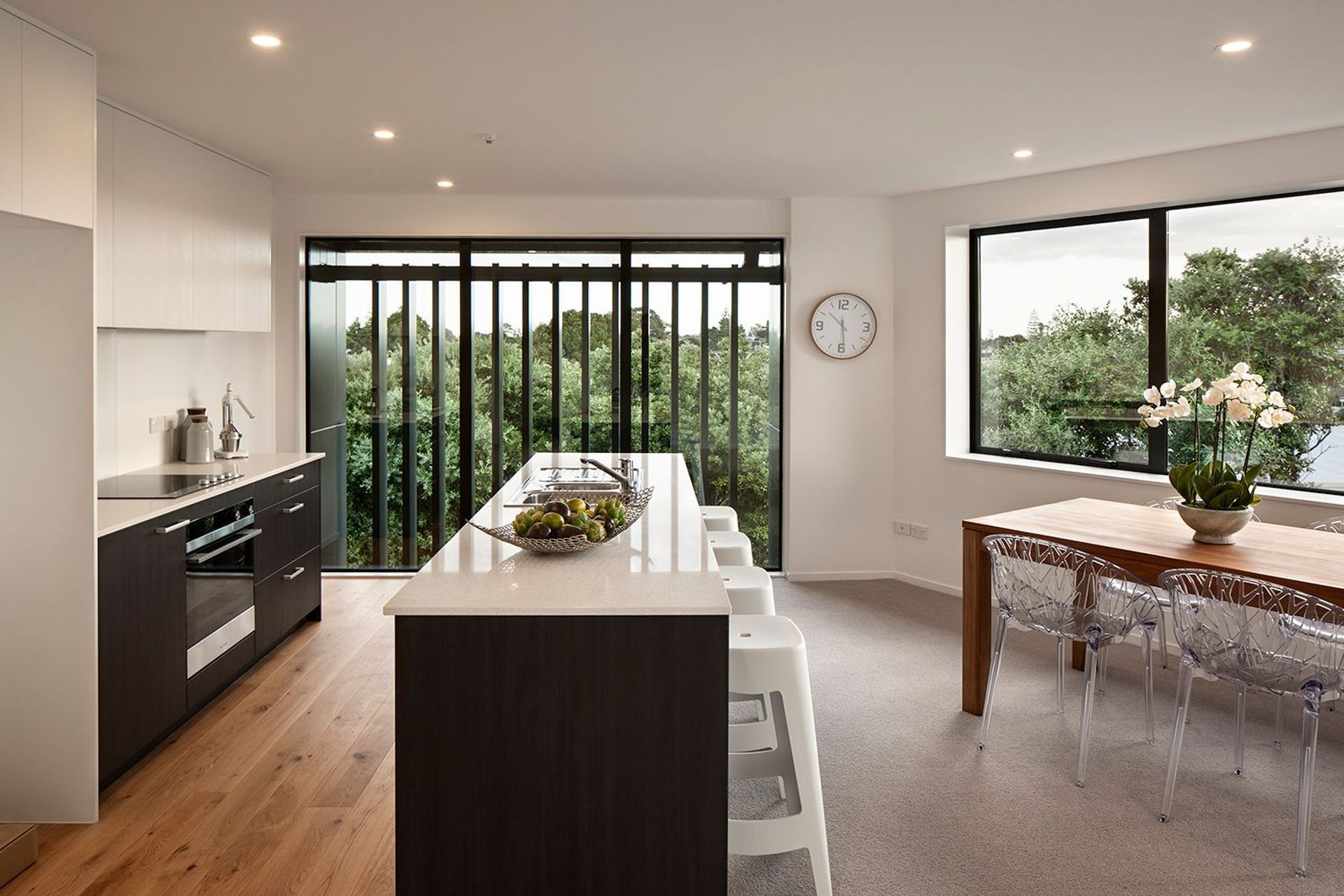
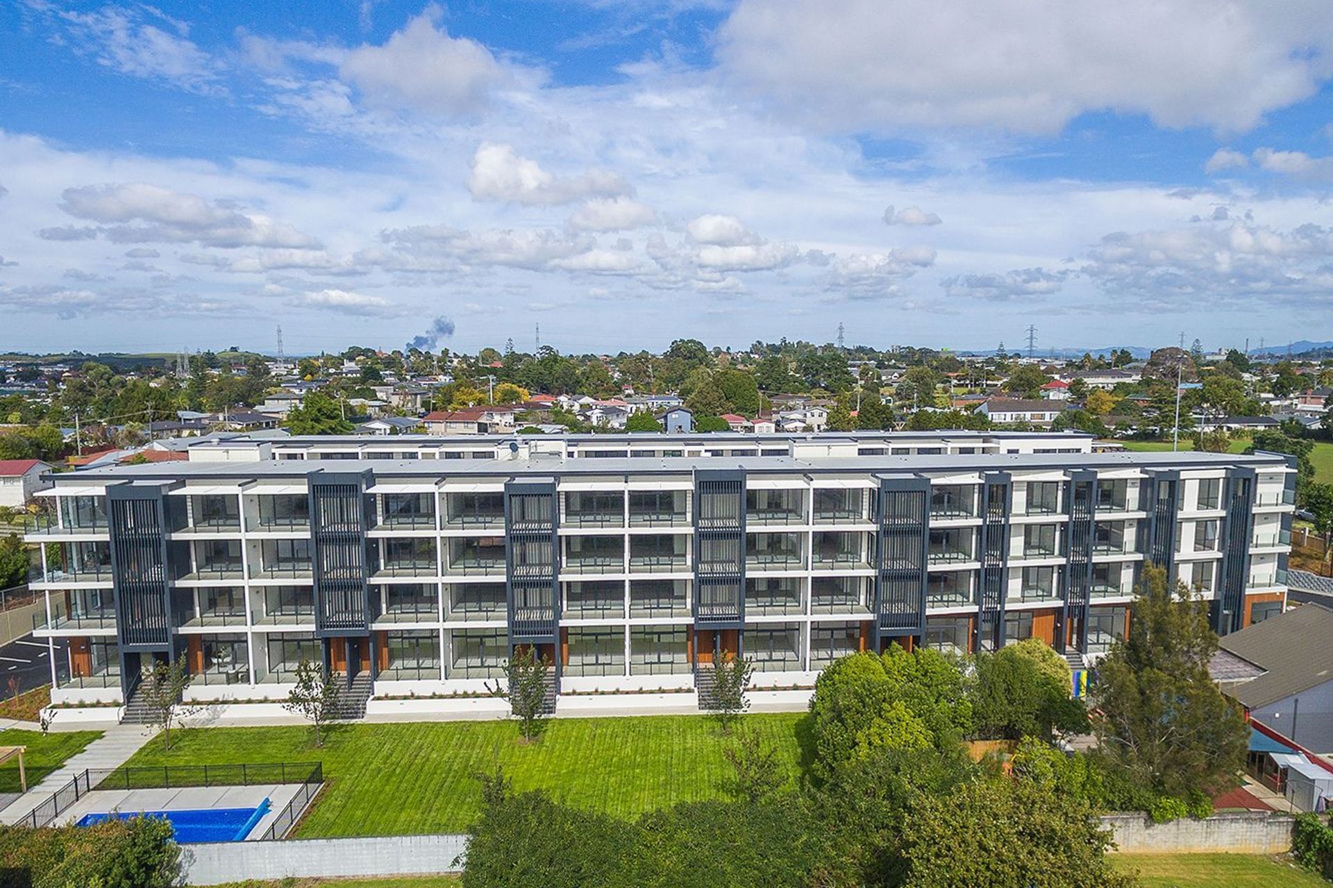
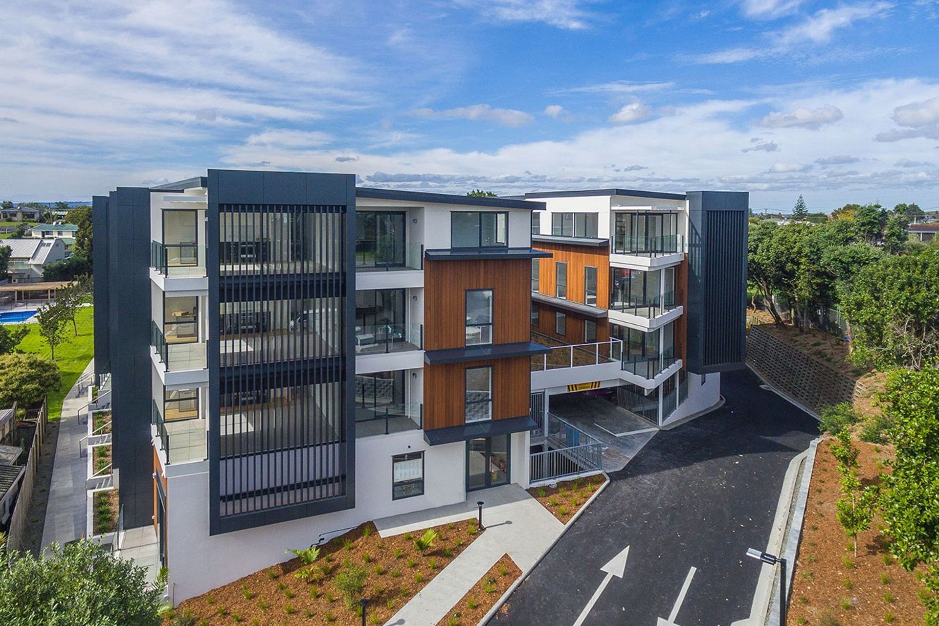
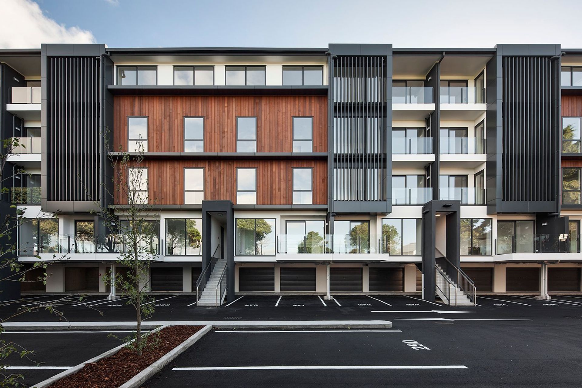
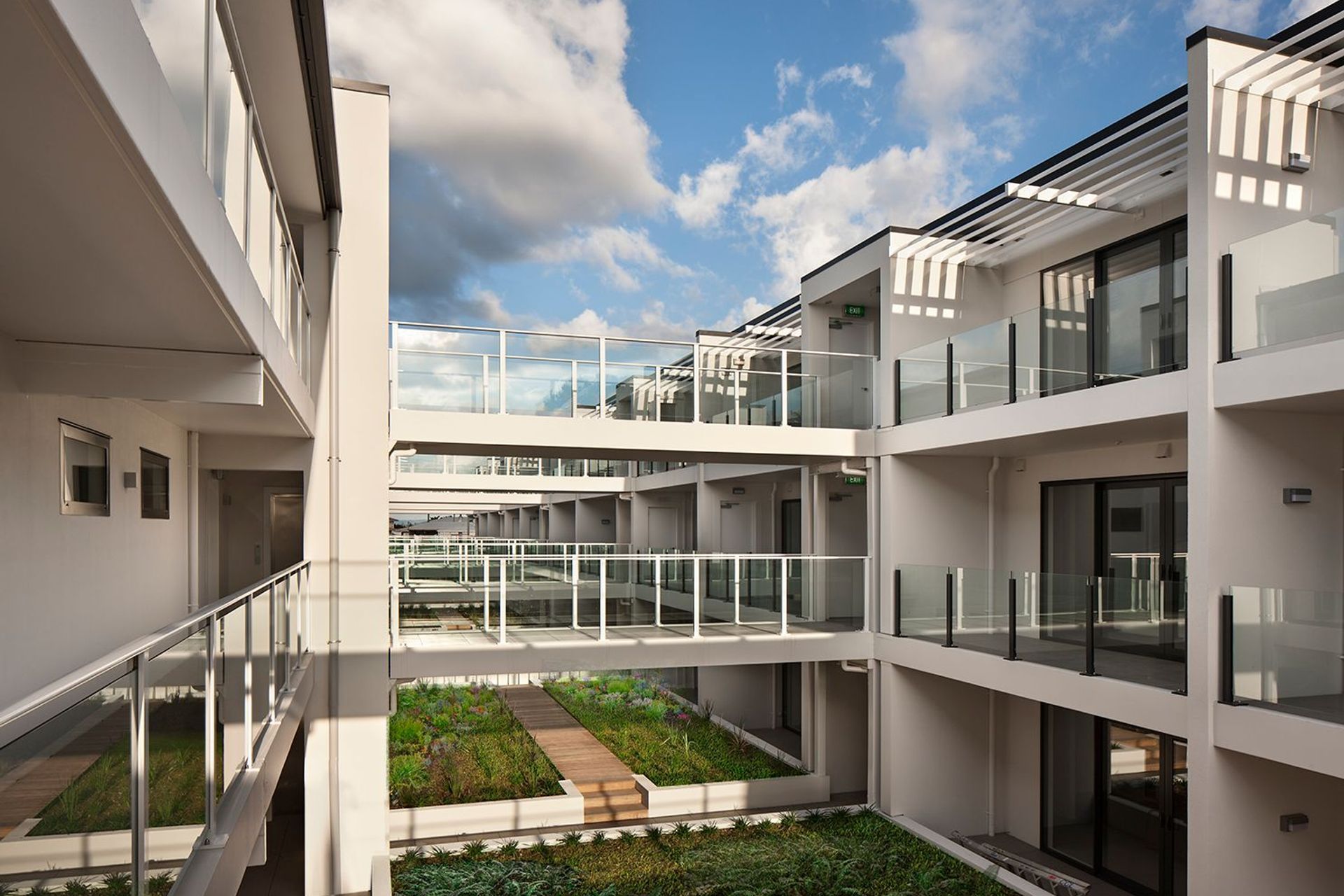
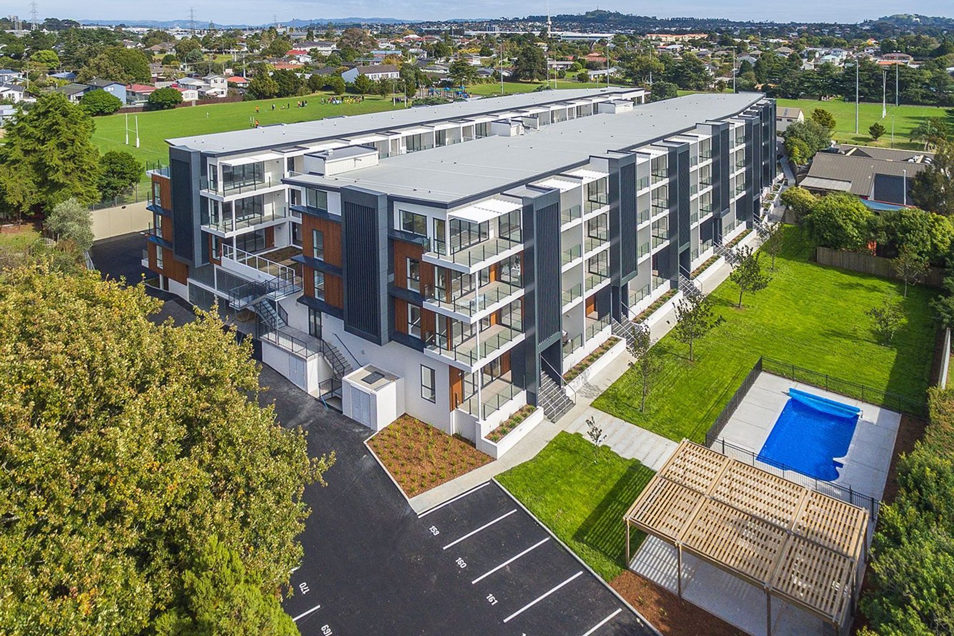
ArchiPro Project Summary - Thompson Park Apartments features sustainable adaptive re-use, offering 104 one and two-bedroom apartments with generous balconies, a shared landscaped courtyard, and modern finishes, all designed to enhance community interaction and maximize natural light.
- Title:
- Thompson Park Apartments
- Architectural Designer:
- Creative Arch
- Category:
- Residential/
- New Builds
Project Gallery

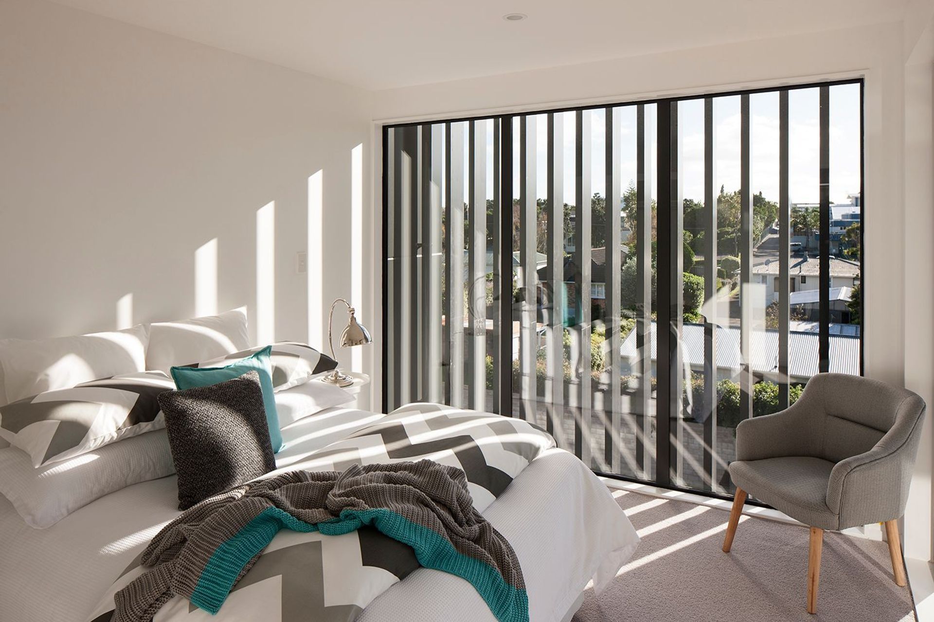
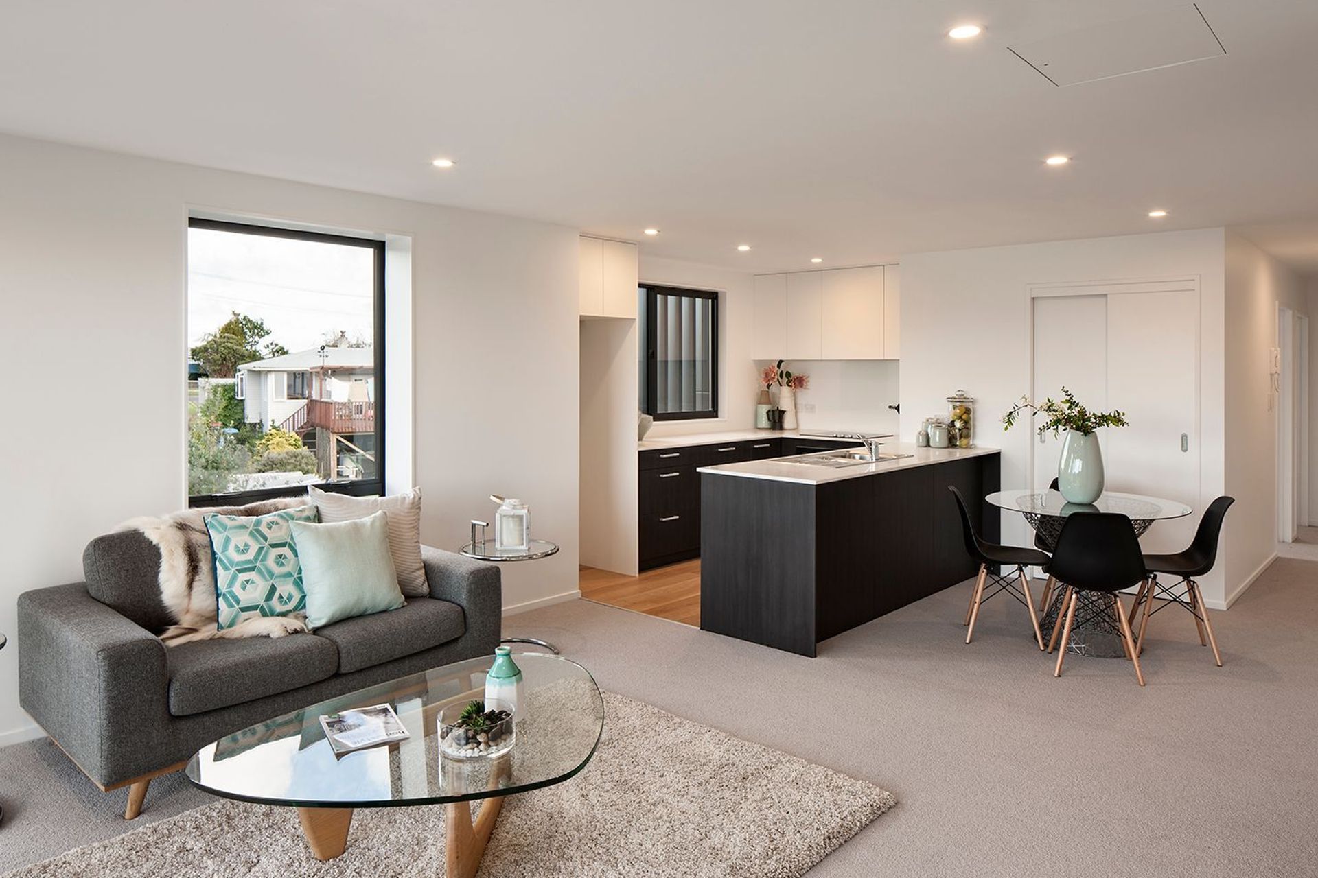
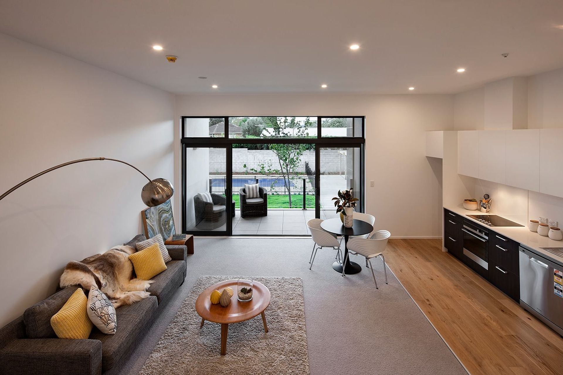

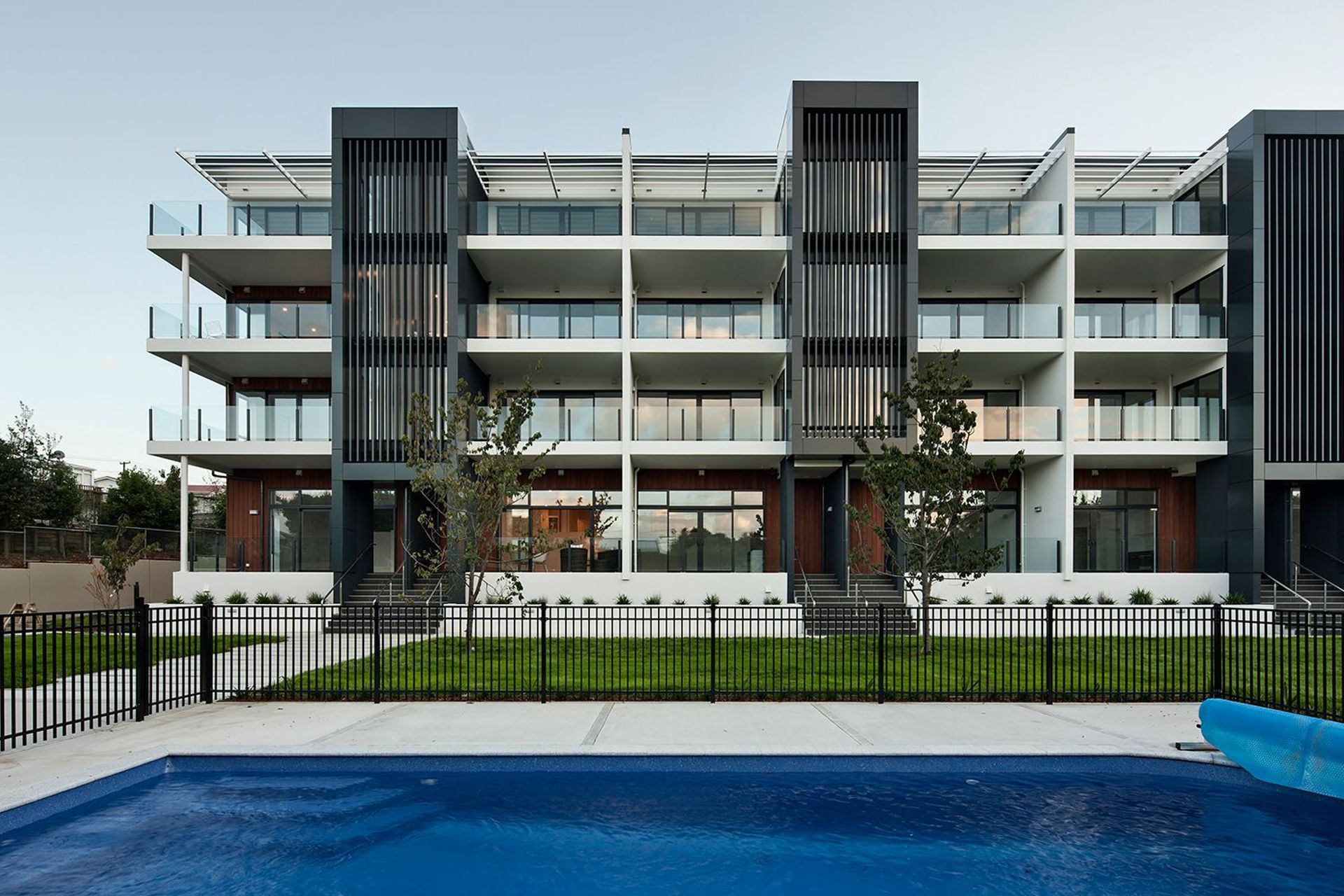



Views and Engagement
Products used
Professionals used

Creative Arch. Creative Arch is an award-winning, multi-disciplined architectural design practice, founded in 1998 by Architectural Designer / Director Mark McLeay.The range of work at Creative Arch is as diverse as our clients, encompassing residential homes, alterations and renovations, coastal developments, sub-division developments, to commercial projects.The team at Creative Arch are an enthusiastic group of talented professional architects and designers, with a depth of experience, from a range of different backgrounds and cultures. Creative Arch is a client-focused firm committed to providing excellence in service, culture, and project outcomes.Client service is our first priority. Our guiding principle is to always listen and understand our client's needs and requirements. We view each client's architectural project as unique and deserving of an innovative plan and tailored design approach.Any design project is a complicated creative undertaking with a multitude of tasks and issues to be resolved.We believe in collaboration. Experience teaches us that the most successful architectural design projects are the ones when the client is committed to excellence and teamwork. We work alongside clients through the complete process from initial briefing to developing the design, through to the consenting process, and to construction and final completion.
Founded
1998
Established presence in the industry.
Projects Listed
43
A portfolio of work to explore.

Creative Arch.
Profile
Projects
Contact
Other People also viewed
Why ArchiPro?
No more endless searching -
Everything you need, all in one place.Real projects, real experts -
Work with vetted architects, designers, and suppliers.Designed for Australia -
Projects, products, and professionals that meet local standards.From inspiration to reality -
Find your style and connect with the experts behind it.Start your Project
Start you project with a free account to unlock features designed to help you simplify your building project.
Learn MoreBecome a Pro
Showcase your business on ArchiPro and join industry leading brands showcasing their products and expertise.
Learn More