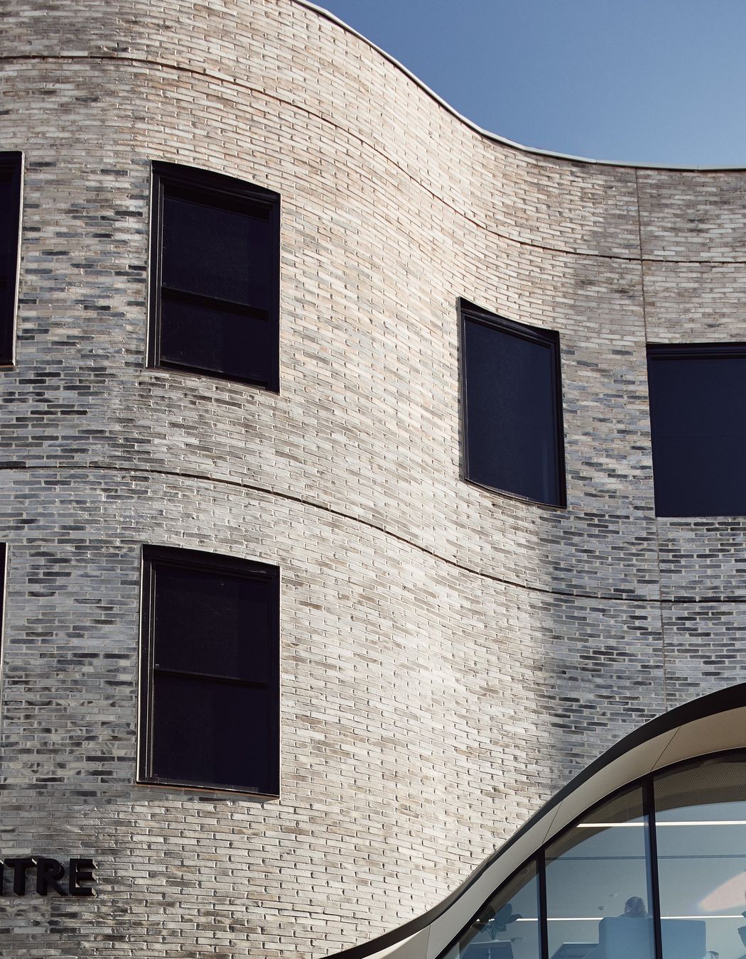
A curved veil of Petersen bricks reflects the innovation in MLC’s new Nicholas Learning Centre.
MLC’s Nicholas Learning Centre for Years 7 and 8 is the first project emerging from the 2015 College Masterplan, which will cement MLC’s position as a leading innovator in education.
Designed by McIldowie Partners, it’s located between MLC’s primary and secondary schools in Kew, recognising this progression through the campus and providing a natural bridge into higher school activity. It’s also about creating a new campus heart, or gathering space, bringing previously separated Year 7 and 8 students together, and developing a small community where students are at the centre of their learning space.
And what an outstanding space McIldowie Partners has delivered.
A critical part of the development process involved close consultation, via workshops, with teachers and students, to strengthen a sense of identity and ownership over the spaces. “It wasn’t only about engaging directly with and responding to MLC’s needs. It was about empowering the staff to understand and leverage the potential of the spaces in their teaching practices,” says John McIldowie, Associate, McIldowie Partners.
In line with the student-centric focus, the design intent was to create a flexible and highly adaptable building. “There is no one single state of the building, it’s always in flux. It’s designed to give maximum flexibility across its lifespan so it can be reconfigured to adapt to changes in pedagogy, the way MLC wants to teach, and changes in the program of the building,” John explains.
The centre contains four levels, but only three to the naked eye: half a level at the south end is for administration, and a half at the north, on the top floor, is a roof garden for outdoor learning. Years 7 and 8 each have their own floor of 10 learning spaces, or home rooms, broken down into a series of pods–or a cluster of five classrooms–creating smaller pastoral care communities. Each floor has different learning spaces, with different furniture in each, giving students a choice over how and where they work. Glass sliding doors link rooms and can be opened or closed as needed. This ambitious, innovative design enables users to shift between different modes of learning, supporting a diverse range of teacher and student needs.
The building runs north-south, so its façade has two markedly different sides. One sits beside the school oval and has a textured façade of Petersen bricks forming a curved veil, softly scribed along the east. It is a pure creative genius, though posed a huge engineering feat.
The brickwork curves in two directions–not something a brick does naturally–and folds back on itself. Getting the structure to support it was a challenge. Curved steel was used as formwork for the bricks, and positioning it accurately was nail-biting. But it worked beautifully.
The brickwork links the range of building types and materiality on the MLC campus, referencing and reinterpreting the older buildings. John and his team designed a gradient of bricks in pale and progressing tones to bring warmth and connectivity to the campus context. “The decision to grade the bricks from dark to light also created a lightness in this heavier side to the building, material interest, and something that changed and captured light in different ways,” John explains.
The natural colour variation in Petersen’s handcrafted bricks made them perfect for tasks. “The graduation of the brick is really aided by the Petersen handmade brick – the whole manufacturing process of that brick lends itself to something like this because there were colours in certain bricks that referenced the colour below and vice versa.”
“It was nice to be able to use the Petersen bricks as the main material of the building - they’re a beautiful brick in and of themselves – the texture and quality, and the variation within them. They have a beautiful tactile, handmade material quality to them that made them the obvious choice,” John continues.
The result is nothing short of spectacular. “The façade reflects the school’s desire for innovation, with innovation literally displayed on the façade through the brickwork,” John reflects.
The western façade is a stark contrast to the east, opening onto a redeveloped garden setting designed in collaboration with landscape architects Taylor Cullity Lethlean. Deep balconies step back inside to create a lower building profile, while glass panels and sliding doors create an indoor/outdoor feel, encouraging outdoor learning in the new garden space. Being the new cultural heart of the school, it’s quite playful. A series of four-metre high colourful triangular battens create a positive way for students to interact with the building: They can rotate them, so the facade changes in response to its users. “With the battens, the building becomes interactive and playful because and as you move past the building, even without the battens moving, your perspective of colour can shift,” John comments.
The design’s innovation is exciting and inspiring. The real story of success will be how the design influences student learning, and early reports from the school indicate students are enjoying the space. In any case, John and his team are to be congratulated. Delivering a Learning Centre that is both aesthetically innovative and functionally ambitious is more than a mark of success – and for that McIldowie Partners is right to be proud.
Architect: McIldowie Partners
Product: Petersen D51, D71, D72 and D98 bricks
Builder: McCorkell Constructions
Landscape Architect: Taylor Cullity Lethlean
Photographer: Peter Bennetts


