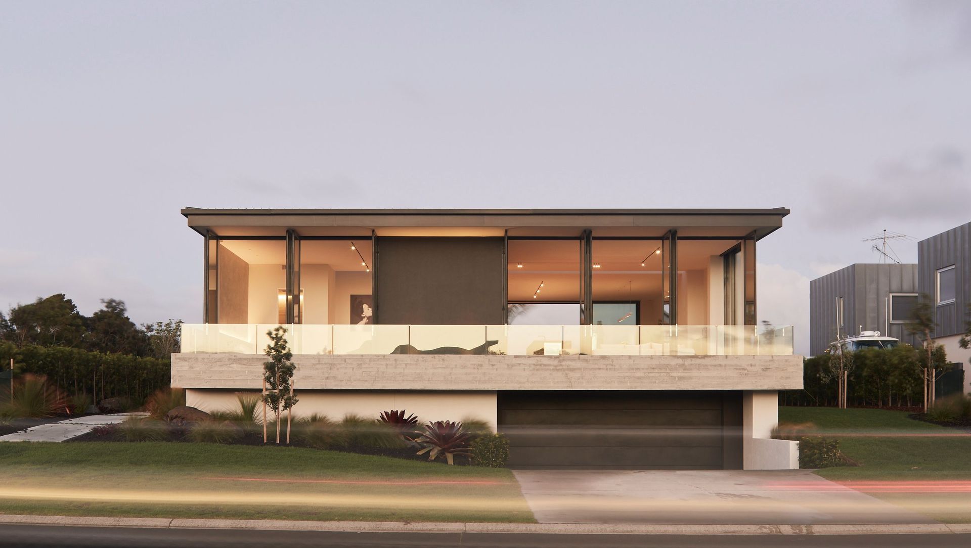
Designed for an expat living in New York, this home needed to function both as a holiday home for family and friends and as an eventual full-time residence once the family returns to New Zealand.
“The brief called for a large, open-plan house that would allow for easy, year-round entertaining for both small, intimate gatherings and larger-group parties. Design-wise, the client wanted a modern home that incorporated all of the living areas onto one level,” says architect Gavin Donaldson.
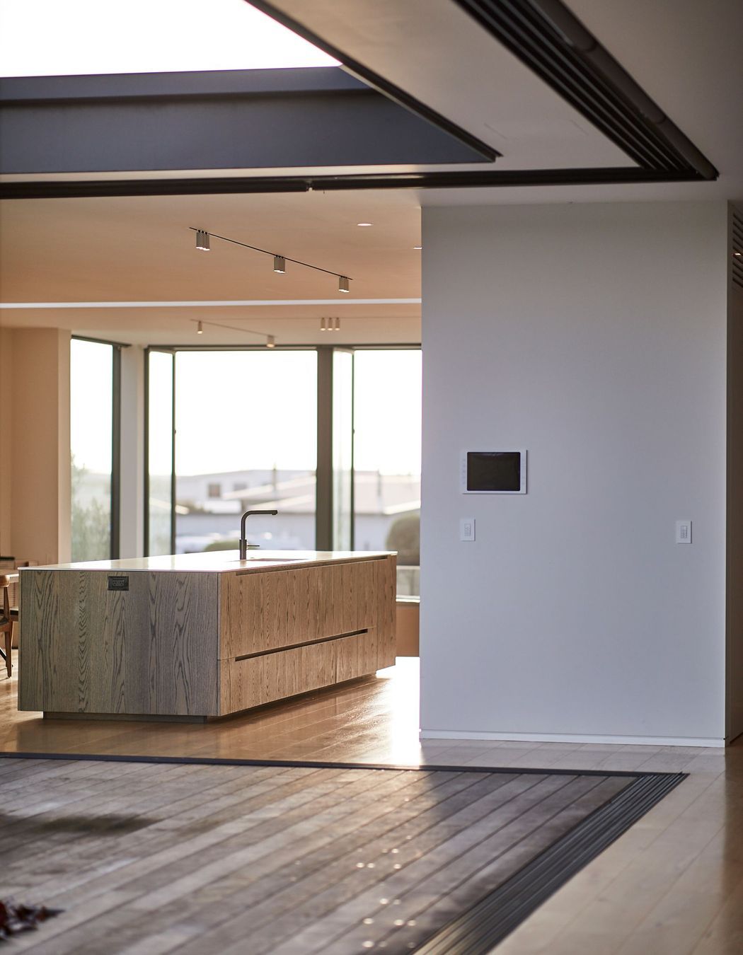
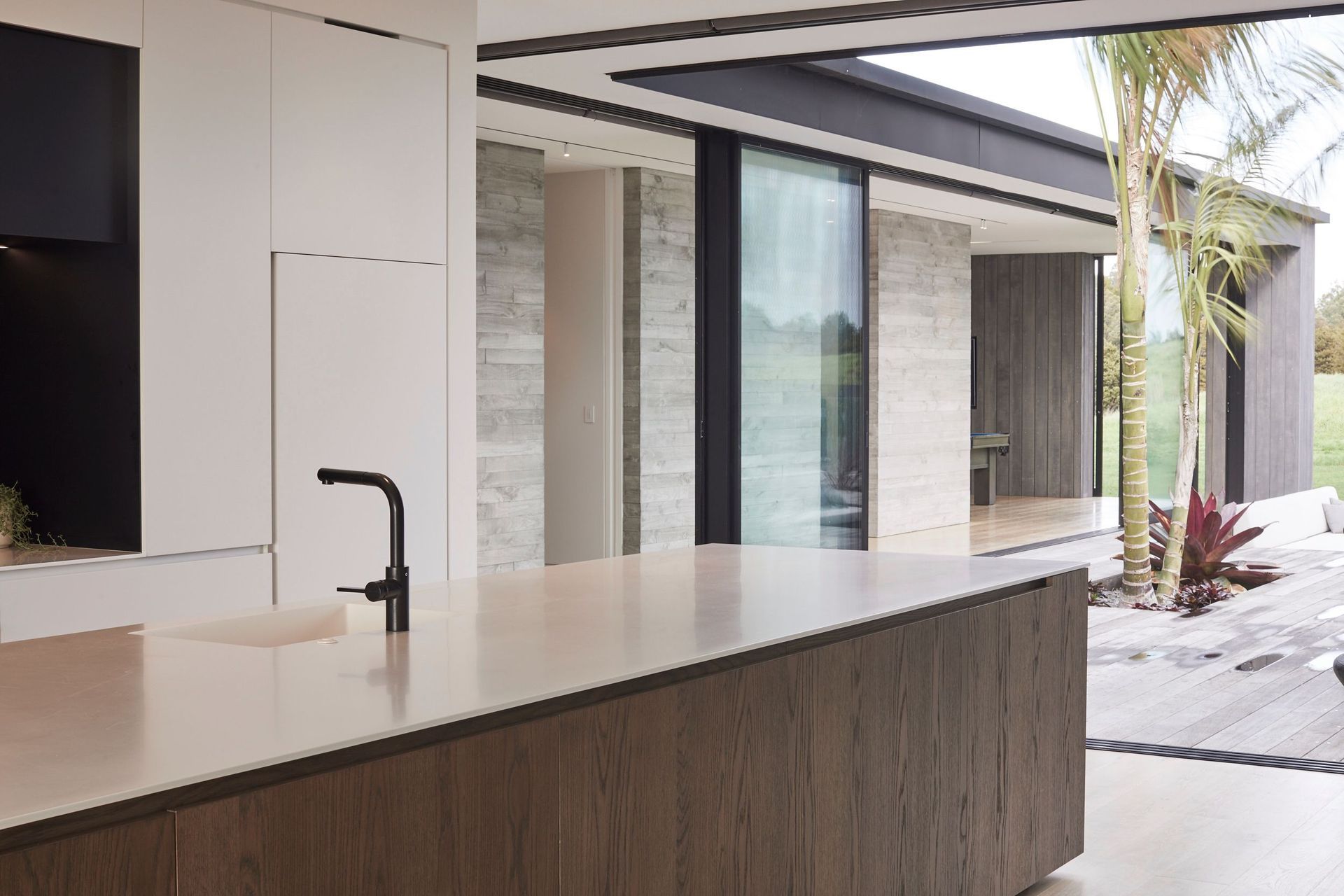
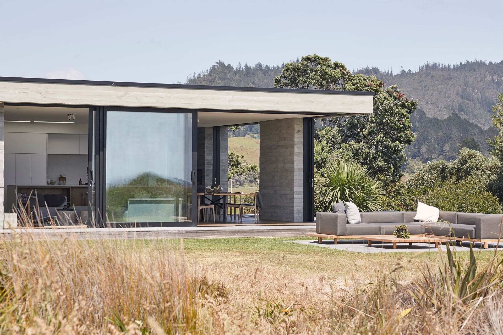
“It was important to the client that the design created a level connection between interior and exterior spaces with large sliding panels allowing flexibility to all areas of the house. The design also had to make use of as much of the site area as possible.”
The site, which backs onto the Omaha Beach Golf Club, is orientated east to west and slopes upwards from the street to the western boundary.
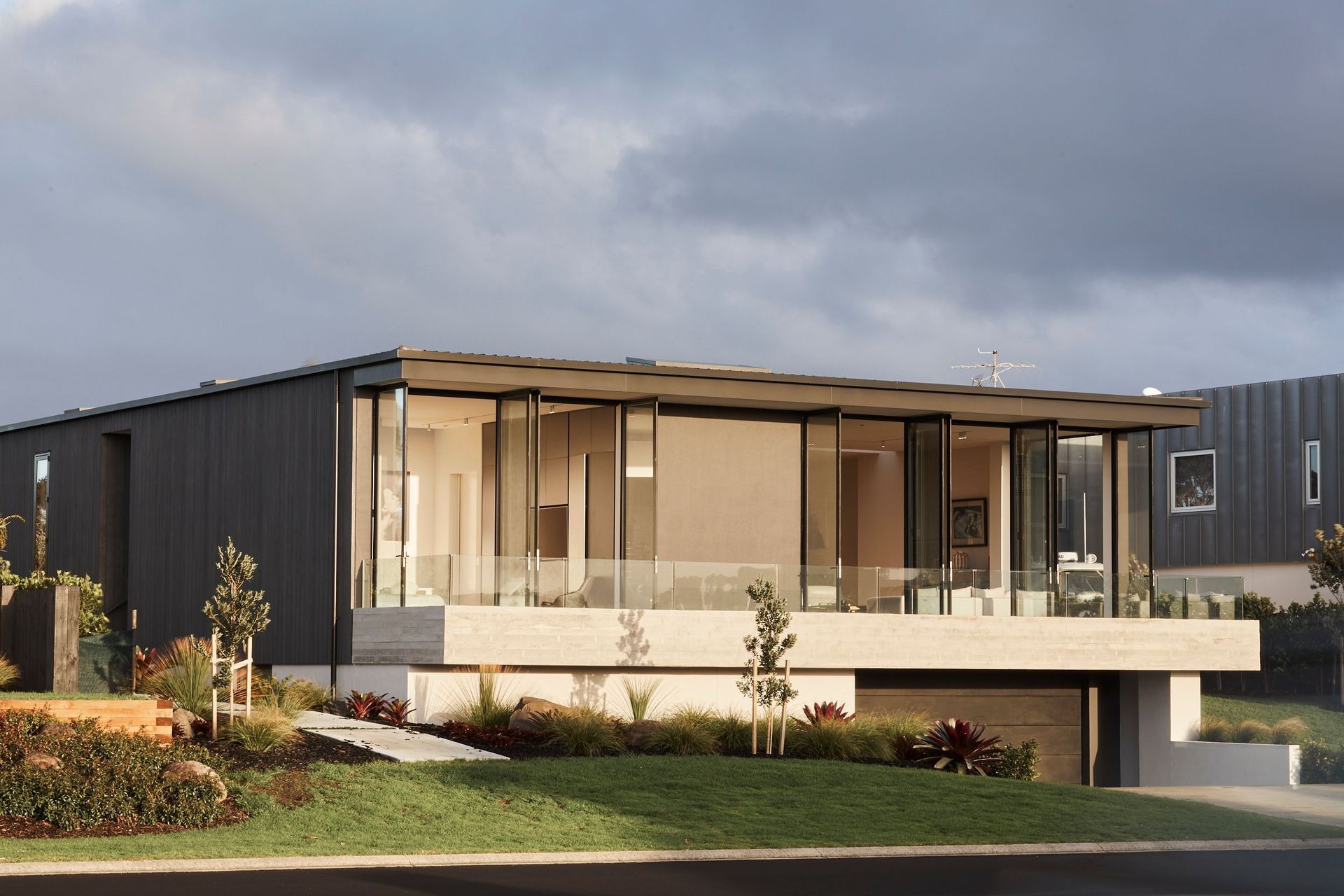
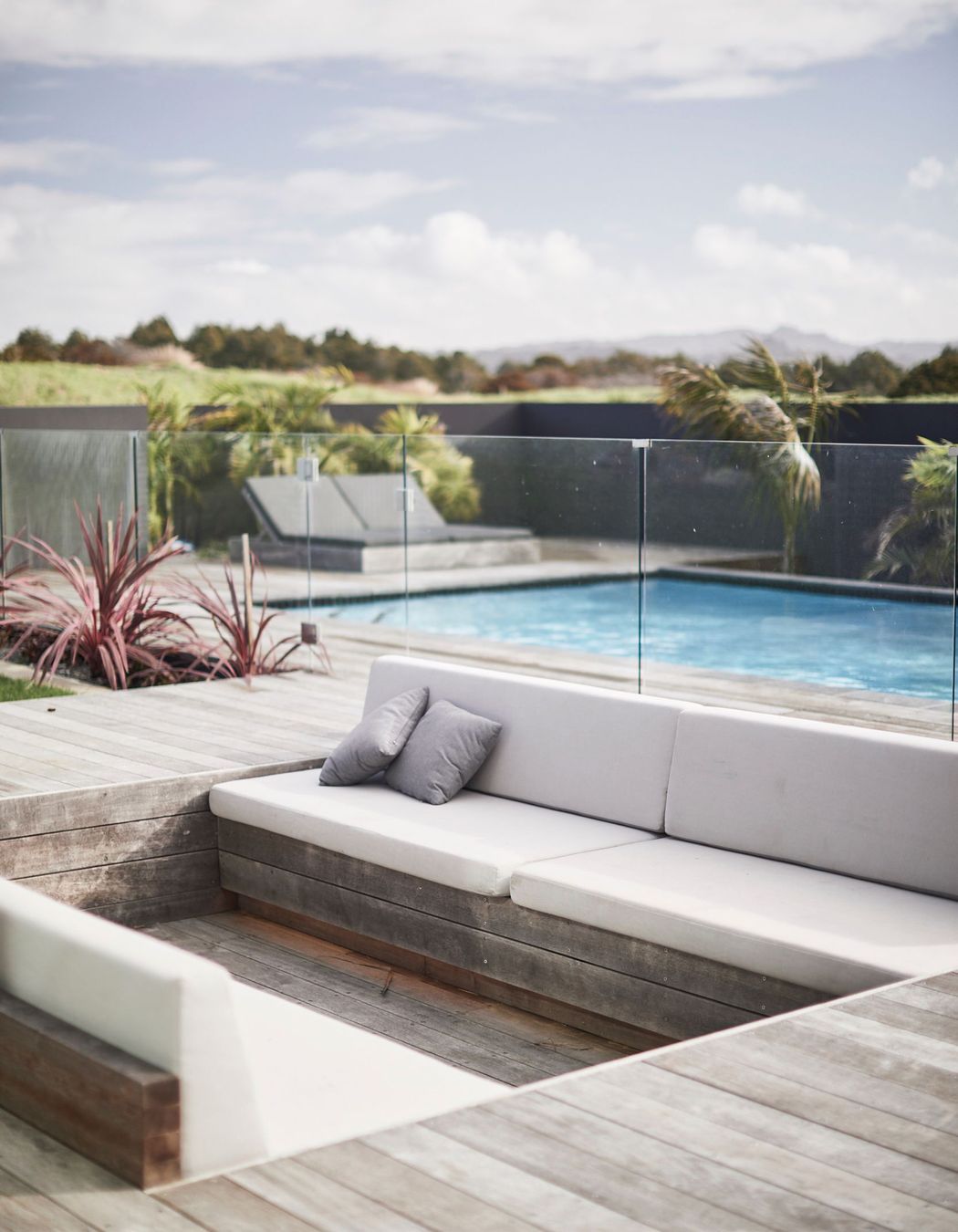
“The topography of the site allowed us to set the level of the main floor at the same height as the highest point of the property. This meant we were able to fully maximise the entire rear half of the site and create a real connection between the house and the large outdoor entertaining area—just as the client had requested.
“The lounge and master bedroom are set three steps below the level of the floor plate—resulting in a 3.5m ceiling height—in order to increase the interior volume to the eastern/street side of the house.”
Across the rest of the house the ceiling height is three metres, says Gavin, which, coupled with the generally oversized dimensions, creates the sense of an expansive interior volume.
“Luckily, the site itself threw up no real constraints, other than the standard building setbacks, so we were able to make full use of the width and depth to really deliver a home of generous proportions throughout.”
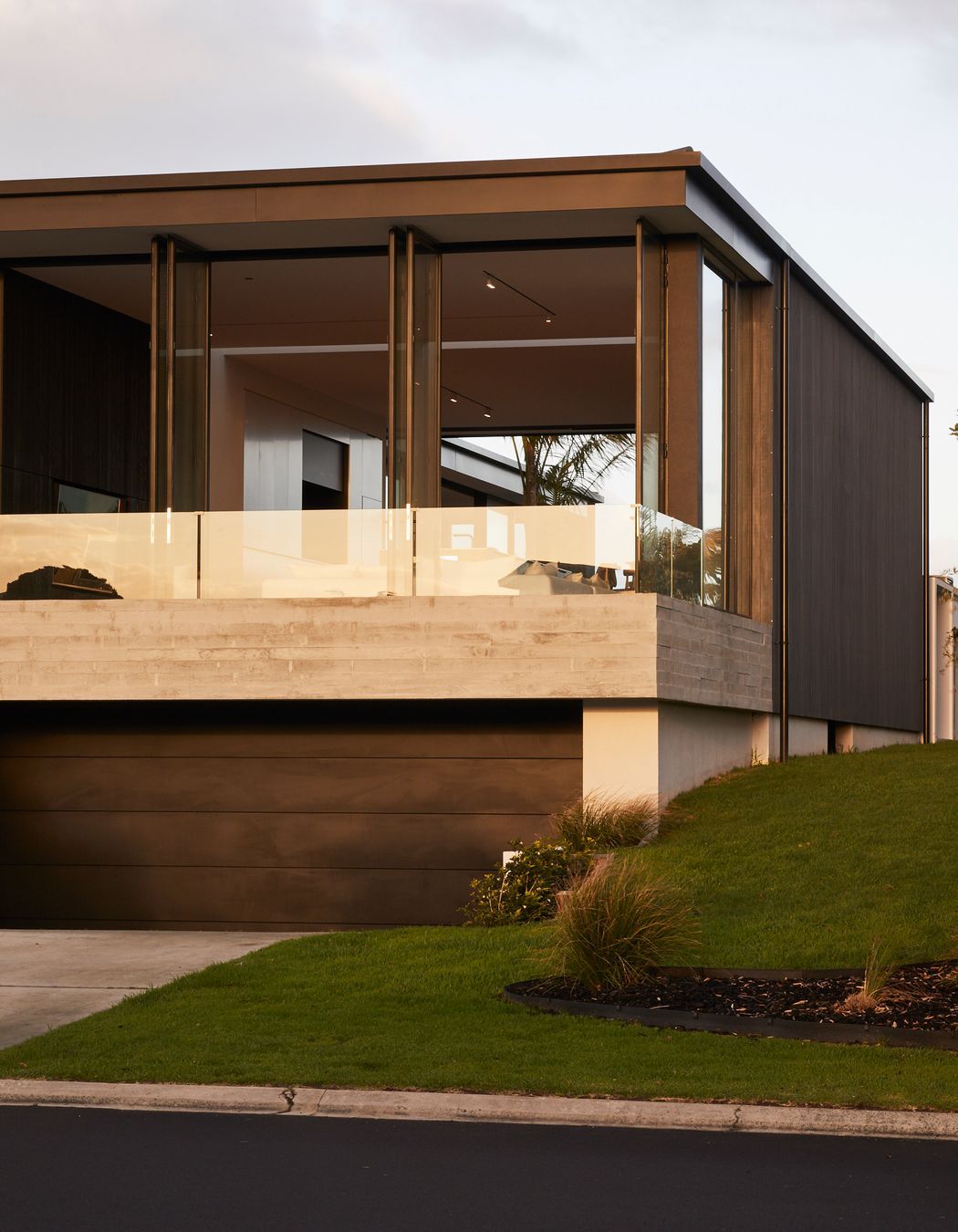
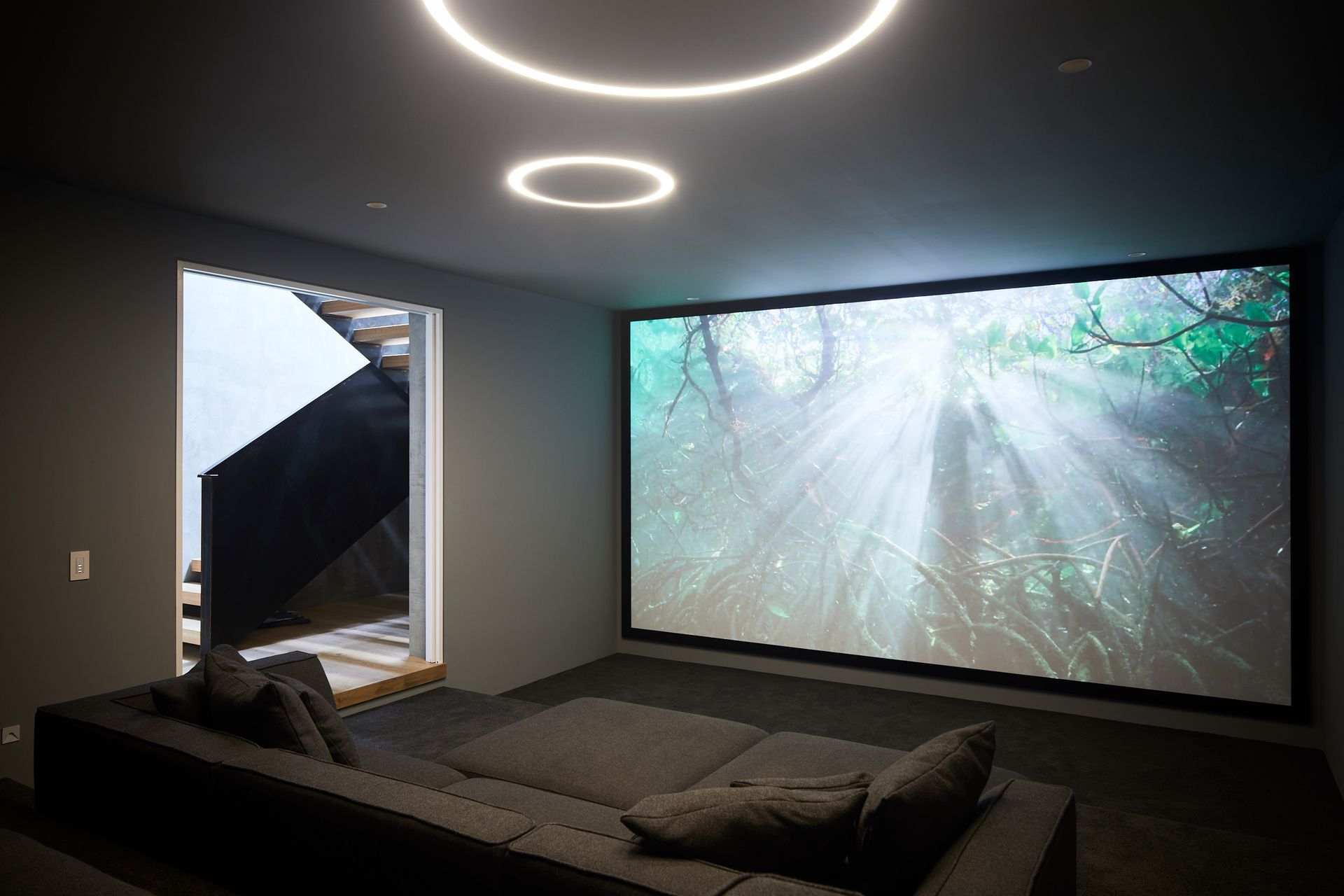
The natural fall of the site also meant that the architect was able to position the garage under the house, freeing up valuable square meterage, as well as including a basement media room, all while maintaining a high level of privacy from the street and the neighbours.
“The typical, default design along that side of the street is to build a two-storey structure as tall as possible to allow for limited ocean views over the rest of Omaha’s rooftops from the top level. What was important to the client was the connection with the outdoor spaces, so we decided early on in the design process that the loss of that connection, coupled with the size constraints that would be created by having upper decks over spaces below, wasn’t worth the resulting ocean view.
“Both neighbouring properties, to the north and south, were already built on. As such, we designed the interior layout and window location in response to those existing structures. This meant the design became very much about the east-west axis, with the focus being directed toward the western aspect, with its outlook to the golf course and mountain range beyond.
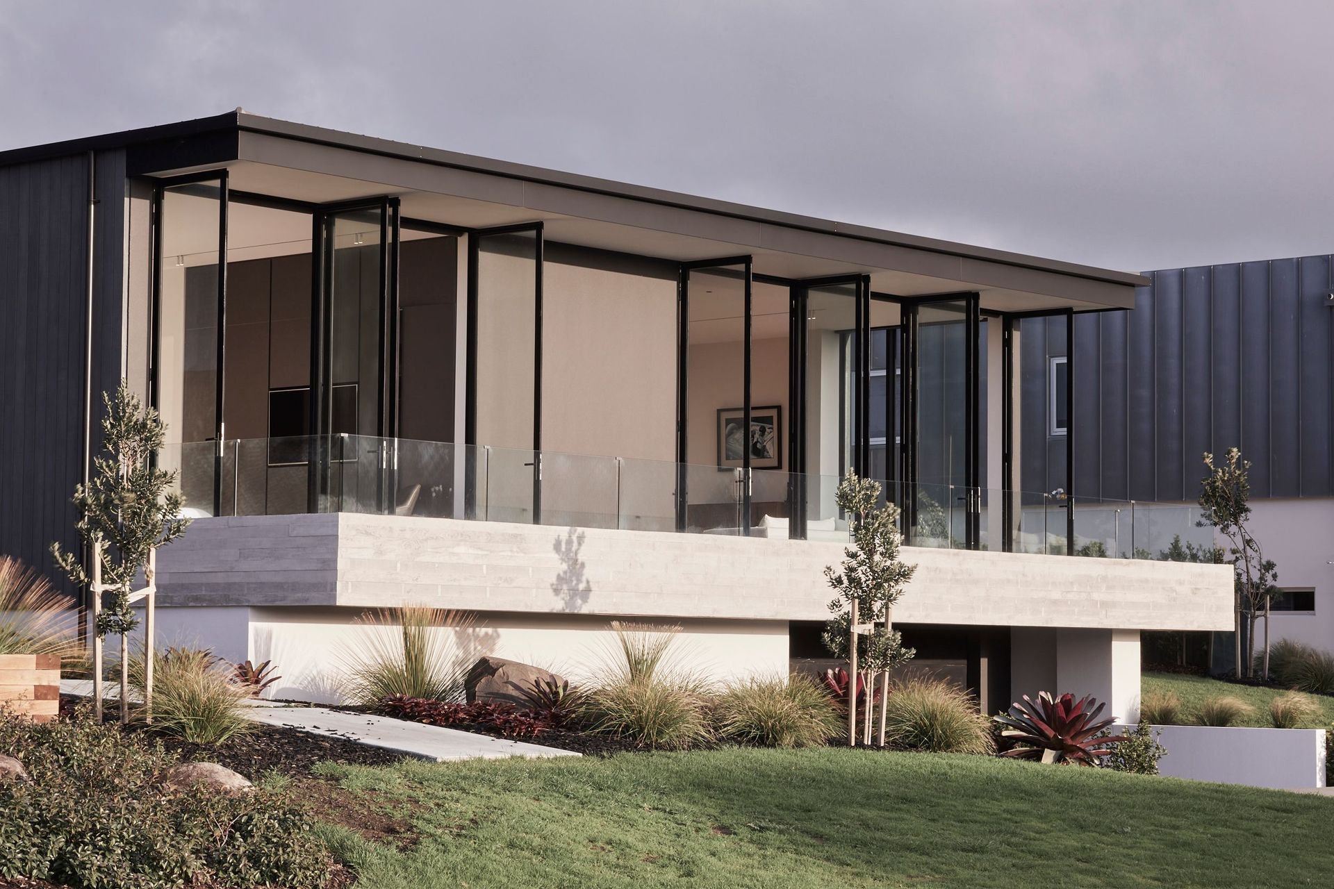
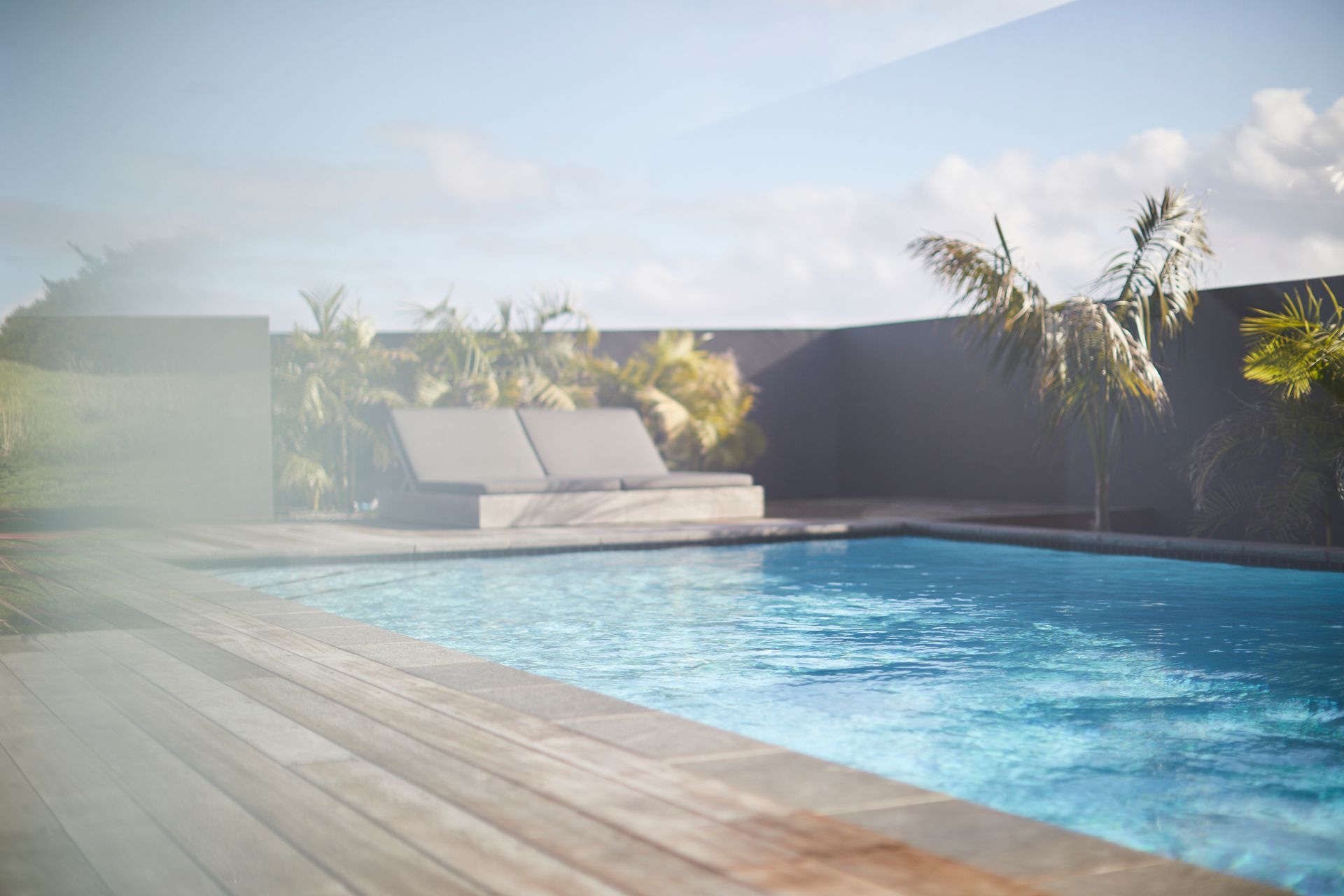
“It was this aspect that resulted in the creation of the private, west-facing courtyard and which also largely dictated the height for the entire main level floor plate. The east-facing section of the house has no side windows, however, the generous ceiling height and floor-to-ceiling glazing, ensures the outlook, while not coastal viewing, captures ample morning sun. Likewise, the elevation above the road creates privacy.”
As the house’ immediate use is as a holiday house—and given the coastal environs—the materials used had to be low maintenance, says Gavin.
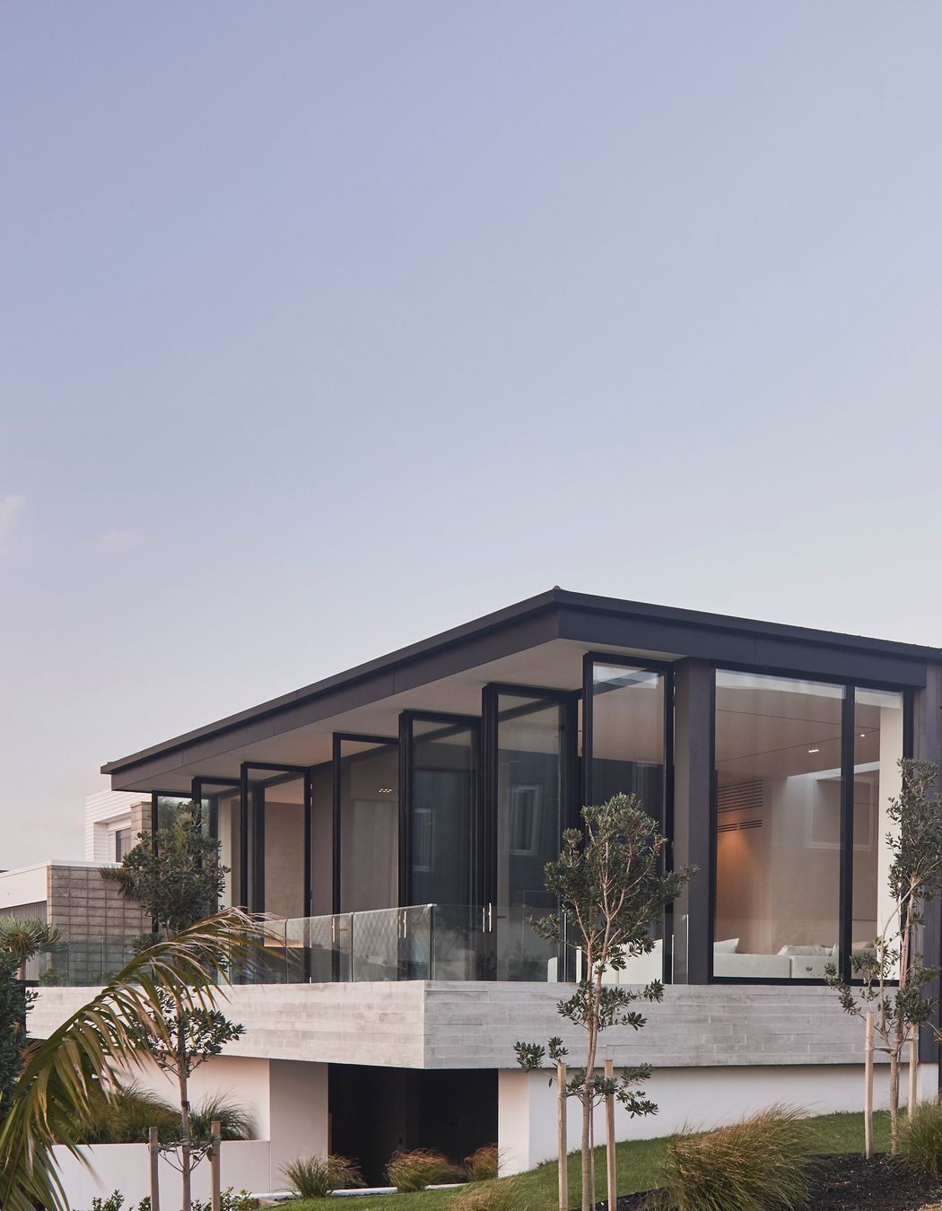
“The material palette developed as the design developed. Once we had worked out the overall layout of the house, it was agreed that both the eastern and western faces would be largely glass with aluminium fascia boards.
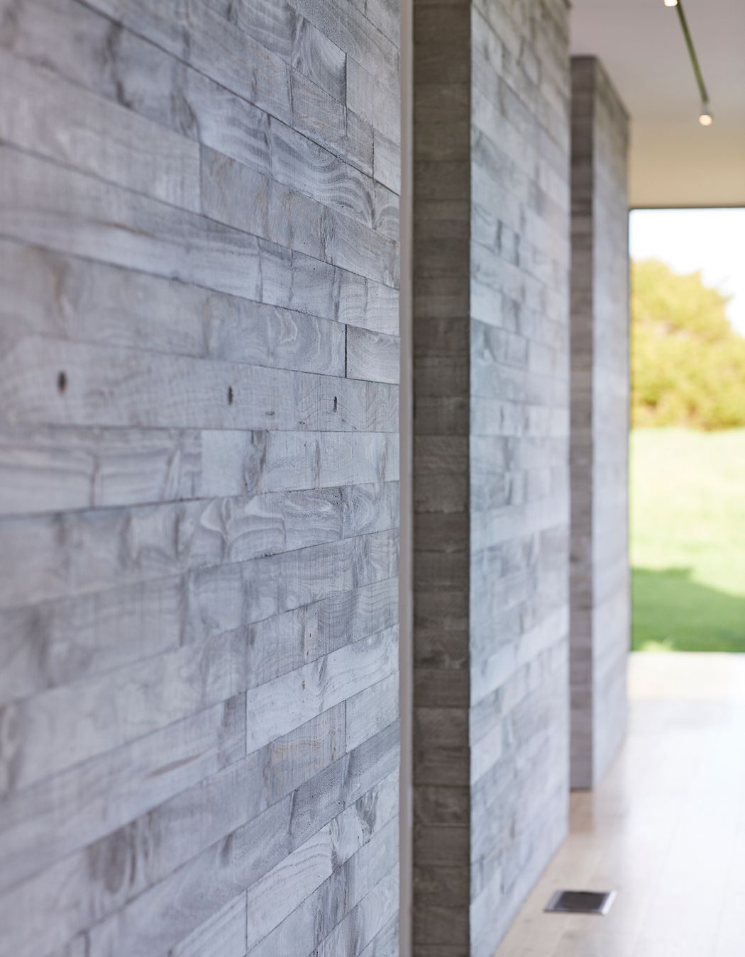
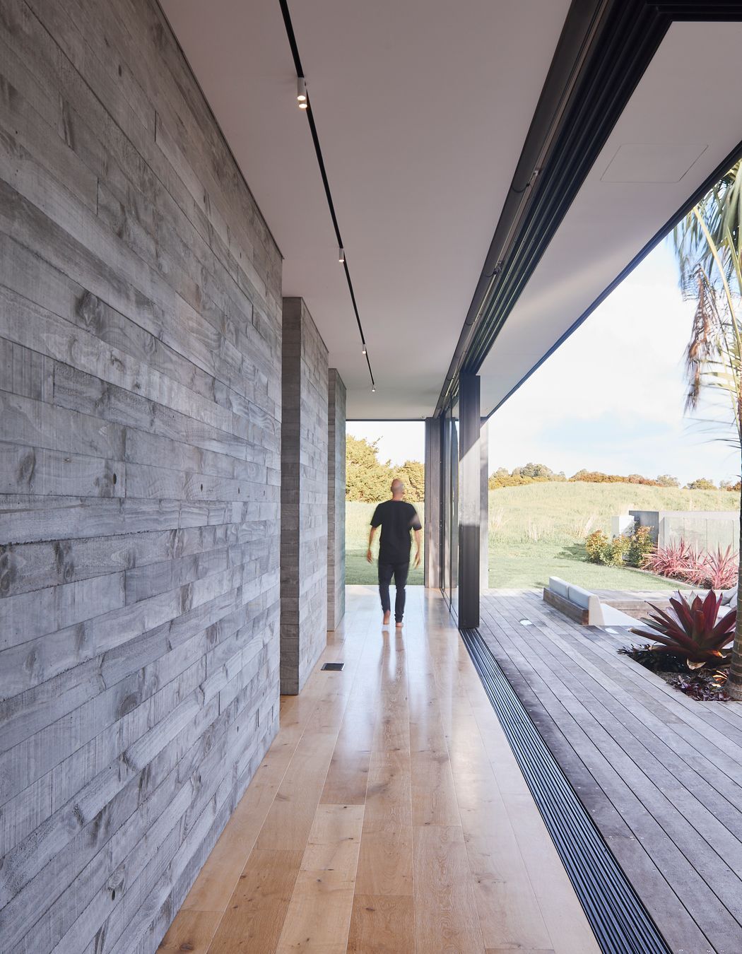
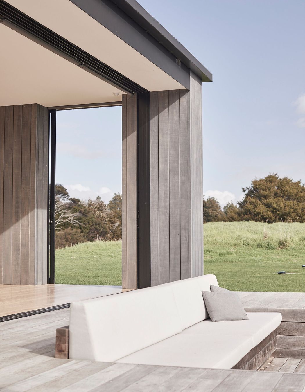
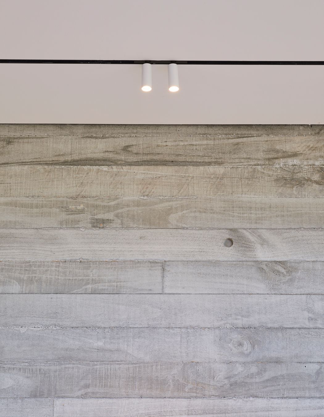
“Accoya vertical shiplap cladding was used on the north- and south-facing walls to counterbalance the harder materials and to fade over time. The board-formed in situ concrete boundary beam, along the eastern facade, adds a textural element and contrasts the vertical lines of the 3.5m-high steel doors behind.”
Gavin says they chose the Accoya shiplap cladding for a number of reasons. Firstly, because the client wanted a material that would last and Accoya offers a 50-year warranty and, secondly, because of the 3.5m internal ceiling height, they required a shiplap product that was available in 4.5m lengths with no joins, which Accoya could accommodate.
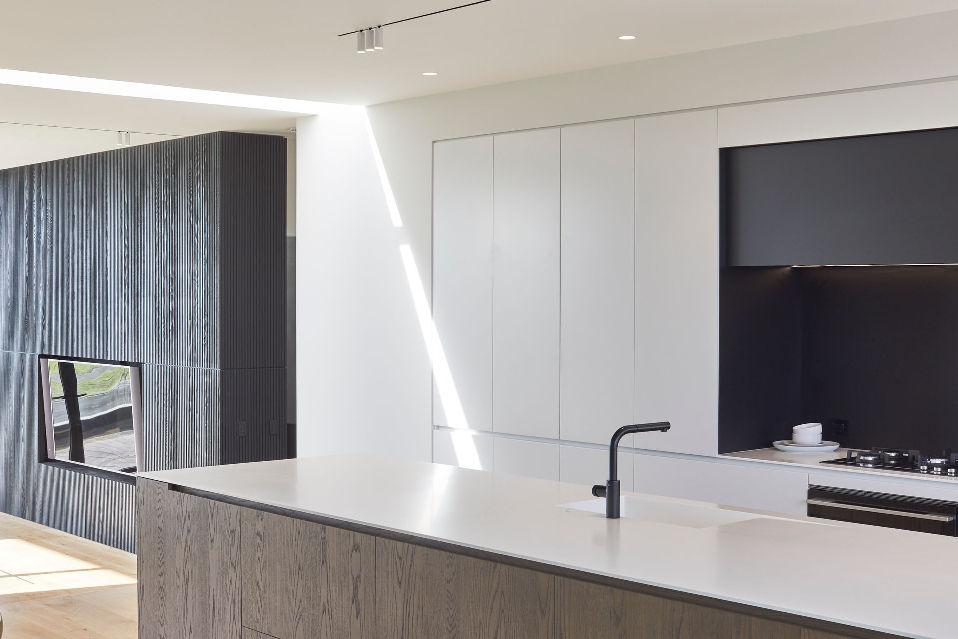
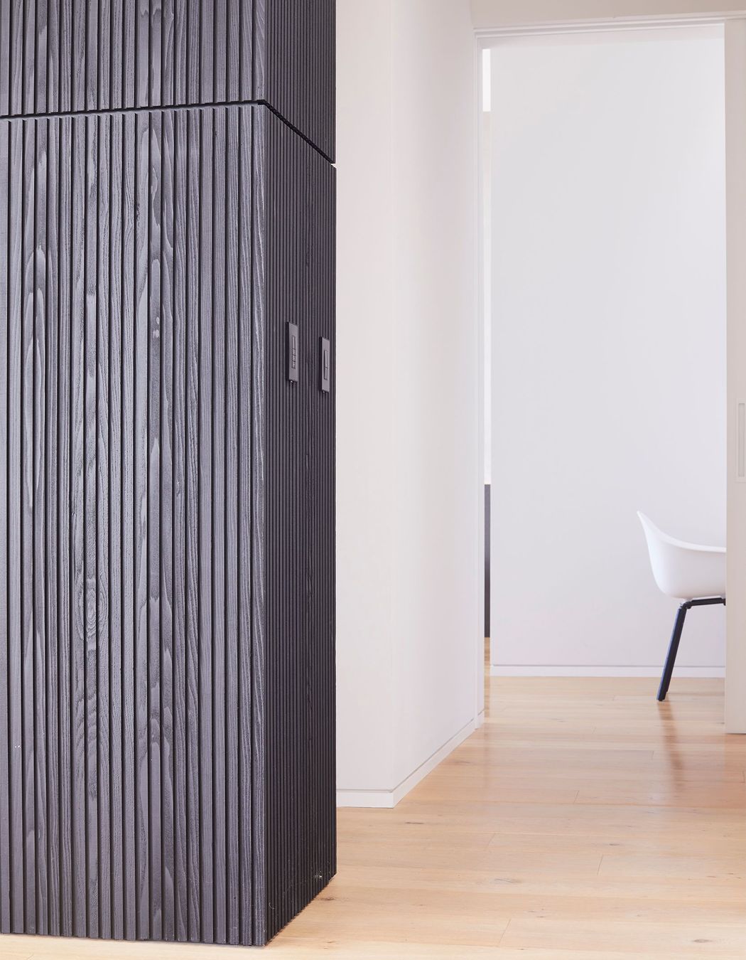
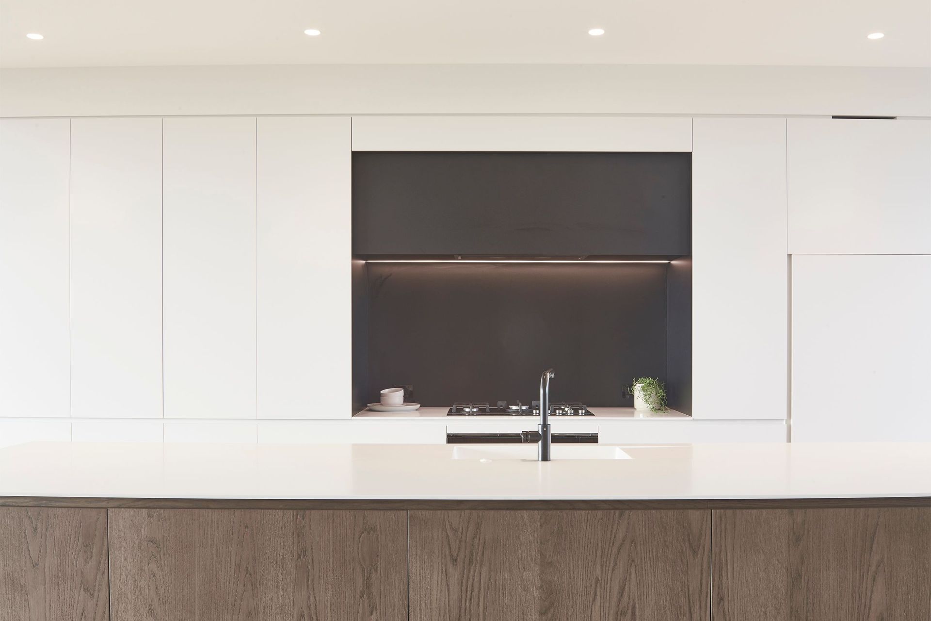
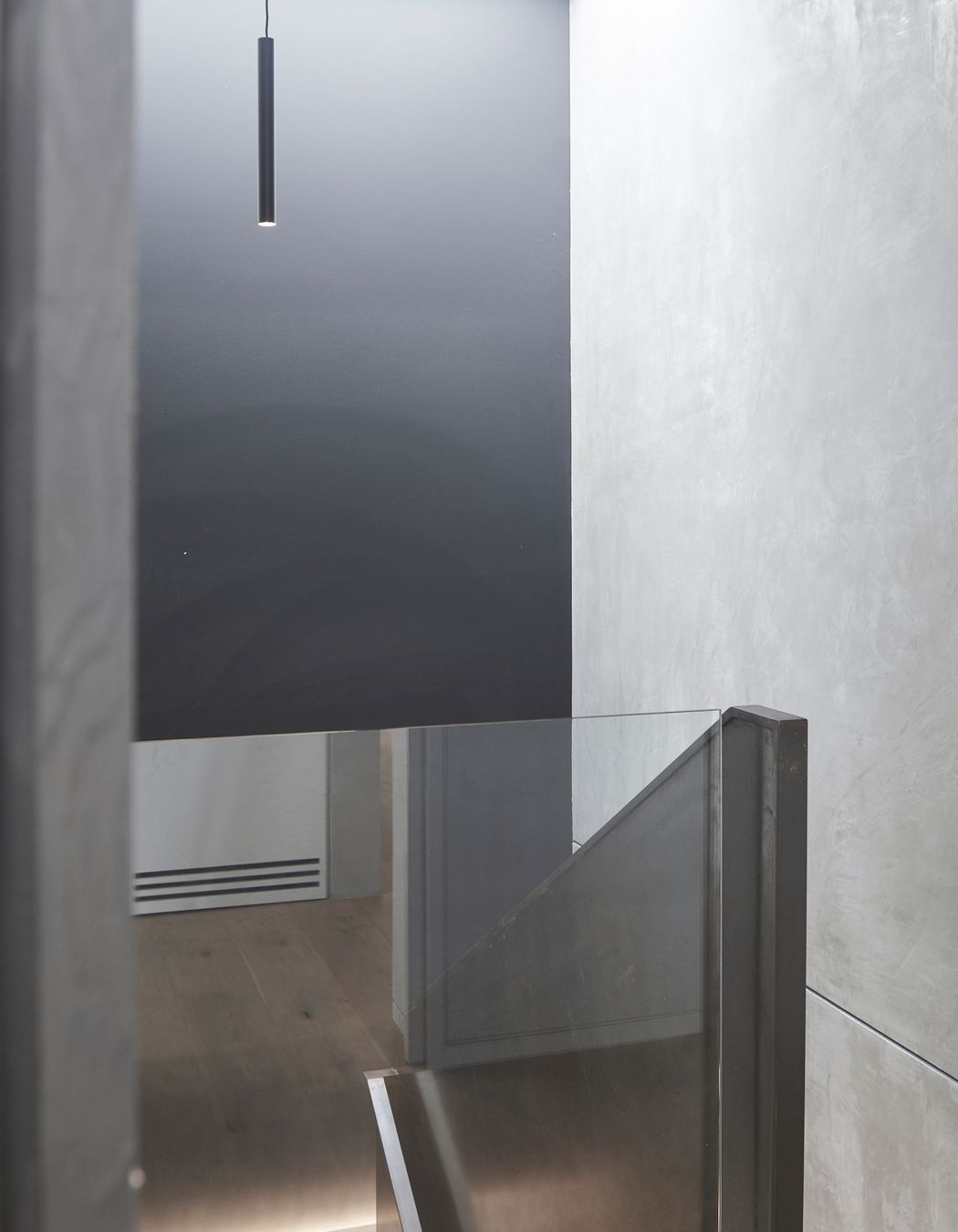
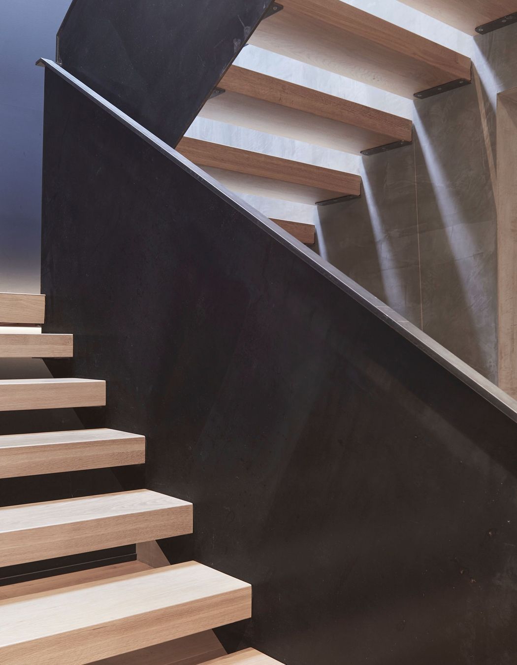
Internally, the material palette echoes the exterior with timber set against the harder insitu concrete and crisp white walls.
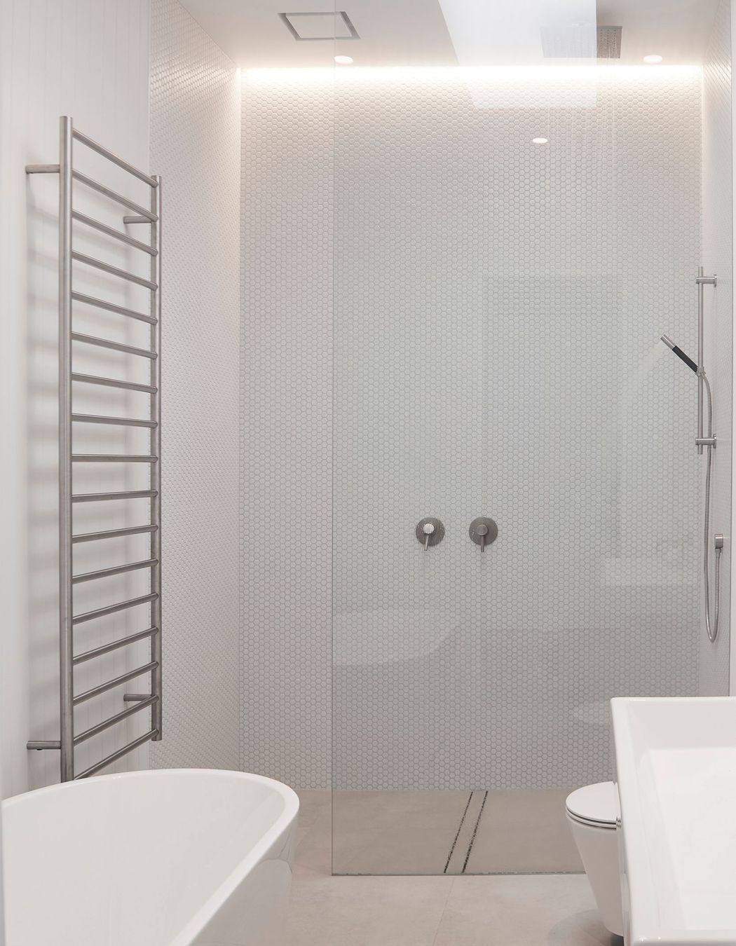
“At the end of the day, the house has to function as both a relaxed, family home and as a house suitable for entertaining—and accommodating—large groups of friends. The programme incorporates a mix of ‘party zones’ and quiet spaces. Each guest bedroom enjoys a private ensuite and has direct access to the courtyard off the hallway. Circulation corridors ensure an easy transition from space to space and between indoors and out, ensuring the client’s brief is ably met.”
Built by - Mint Builders Ltd
Kitchen by - Cronin Kitchens
Words by Justin Foote.
Photography by Matt Quérée
