The Elegance of Origami
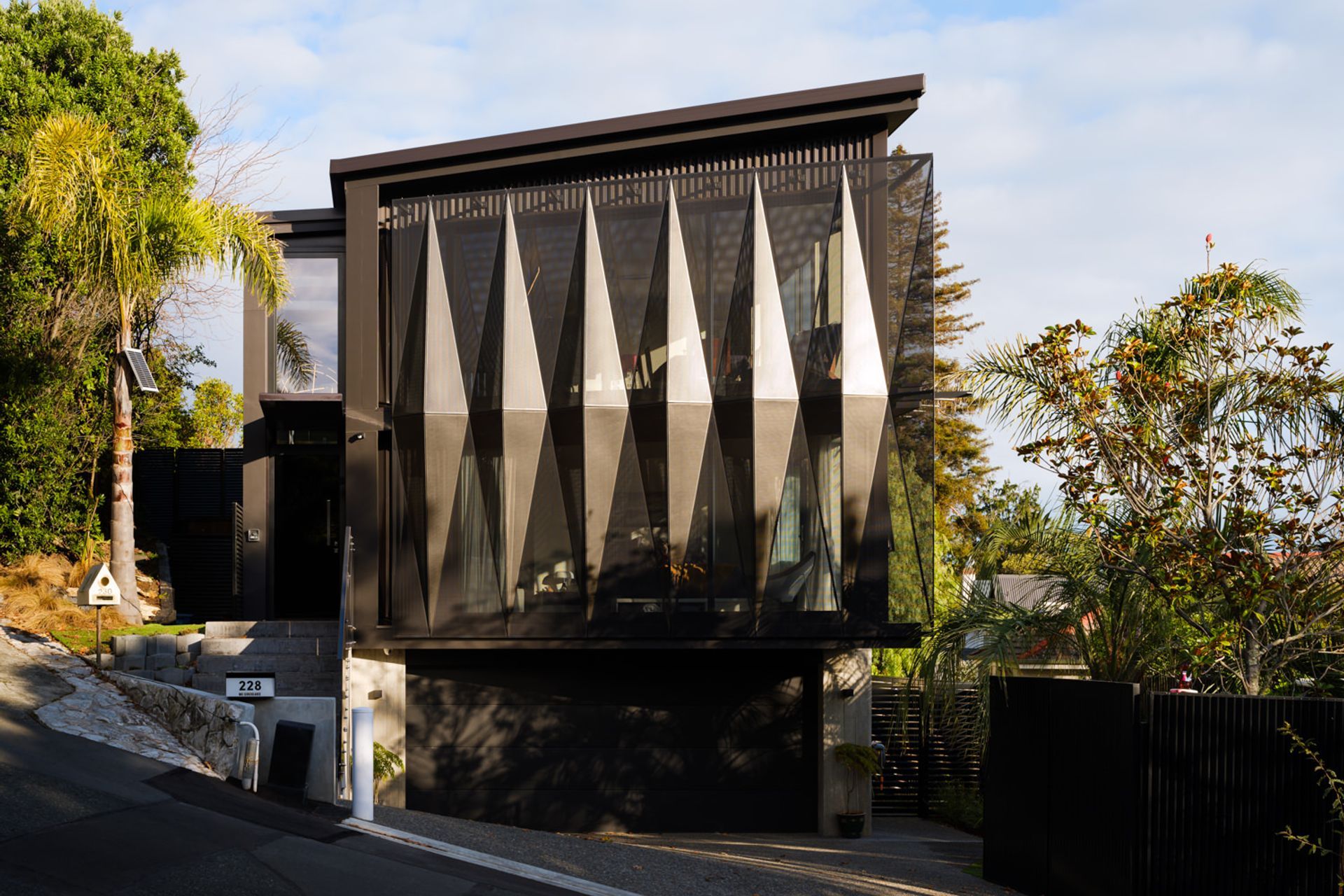
In a densely populated area of Nelson, a clean-lined, elegant vertical home addresses the challenges of a tight site to deliver abundant light-filled spaces with outstanding views and privacy from the street.
Once part of a larger parcel of land, the steep section nestles into a landmark pocket of lush vegetation under the Grampians on a hill overlooking Nelson city towards the port.
An active retired couple intent on downsizing had built their home several properties up the hill about a decade ago. Although they were enthused by the area and views, they weren’t sure if the 331m2 site lower down could provide the elevation and amenities they required. Before they purchased, they invited Simon Hall of Jerram Tocker Barron (JTB) Architects to give his verdict.
“It was a an exercise in meeting all the wants and needs this generation likes and can afford on a small site including a nice, low-maintenance modern house with three bedrooms above double car garaging with a basement, swimming pool and a lift as well for accessibility,” says Simon. “The challenge is how you put all this on the land without completely consuming it and maintaining outdoor amenity.”
On the upside, the mature trees gave an established feel to the site and his clients could obtain sign-off for resource consents from the existing owners.
Much of his focus was on addressing issues around light, shade and privacy from the street in an interesting manner. His strategy was to provide a stacked stair at the back for vertical circulation up through three storeys and a lift at one end.
“It’s like a saddlebag attached to the main building form with all the services and bathrooms to the rear and views from the living areas and bedrooms in front.”
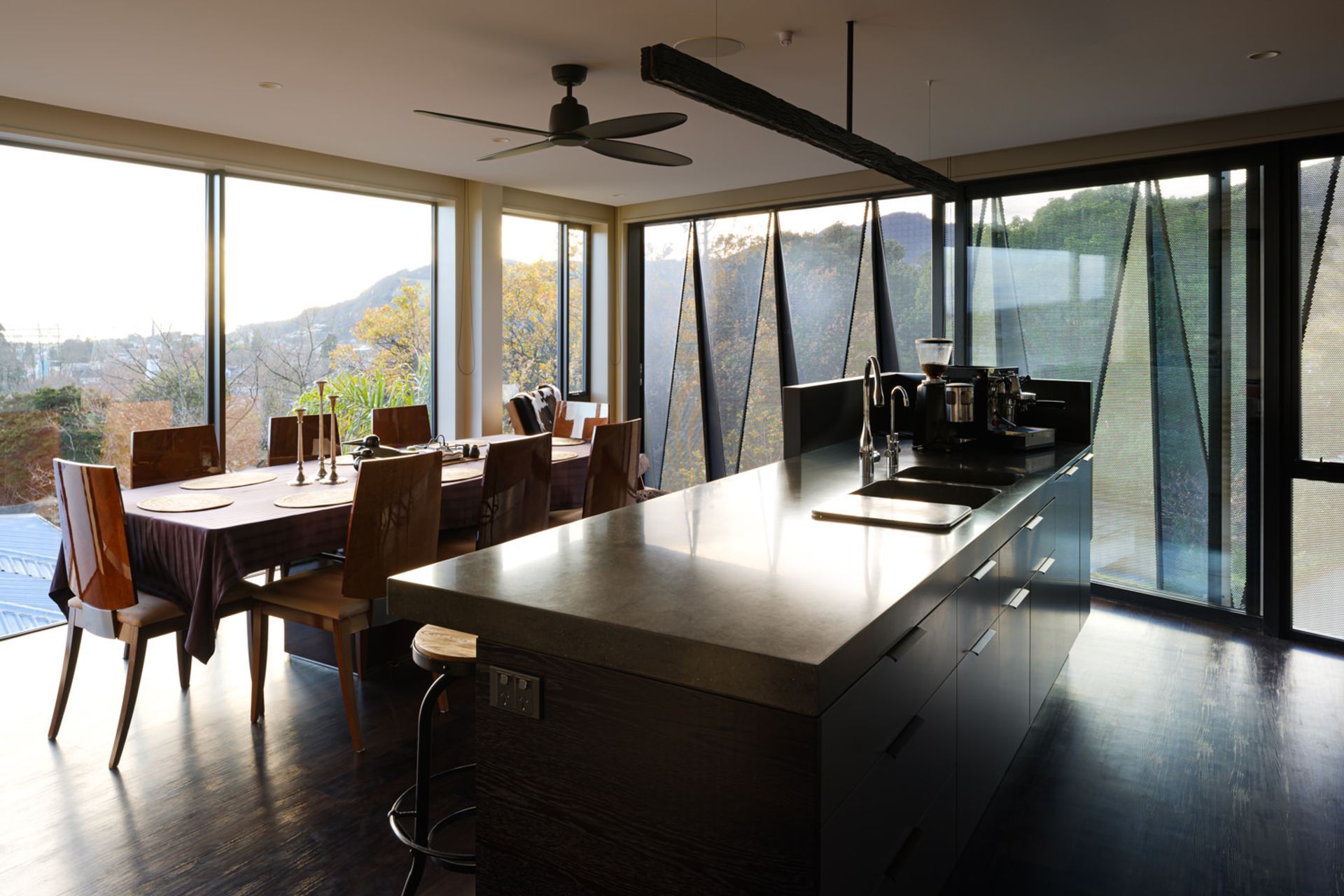
Going up three storeys with expansive floor to ceiling glass on each floor maximised light and created a generous feeling of open space inside.
“Because of the views and mature vegetation, you don’t feel like you’re among a lot of houses. It’s like living in an apartment. The trick was accentuating the views while at the same time, providing privacy.”
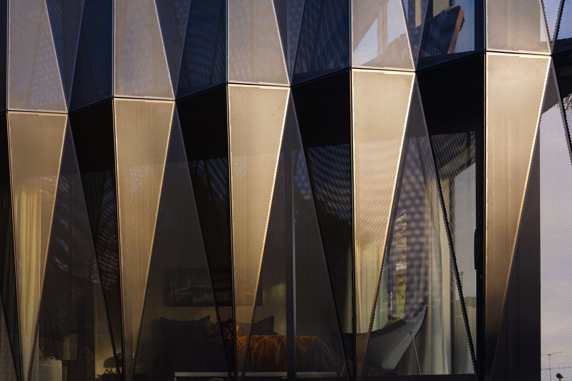
Geometric shade fins made from perforated powder coated aluminium, custom punched and folded like origami, maximise privacy and provide a unique architectural feature to the street façade. A louvred screen on the poolside deck off the lounge visually buffers the adjoining property.
Vertical construction over three floors effectively separates the main living from an independent guest studio the couple has used for Airbnb accommodation next to the double garage, laundry and lift on the ground floor.
Two bedroom suites on the mid-floor include a spacious master bedroom that opens to the street, catching grandstand views east over the trees to Tasman Bay. The spare bedroom gains a poolside view, opening to the courtyard on the north-west corner; the ultimate covered entertaining space for summer. Living spaces on the upper level cantilever out over the pool area, which is embedded in a pre-cast concrete basement.
The building has a dark, austere flavour, constructed of shuttered pre-cast concrete to the first floor with a timber frame structure clad in Colorsteel and touches of black cedar around the courtyard. JTB struggled to find a supplier for the pre-cast work so the builder, IMB Construction put in extra effort to complete it themselves.
Interiors draw on that rich aesthetic with dark, charred oak joinery and “quite heavy, earthy tones”. The kitchen has an industrial flavour featuring an expansive linear pendant in a rustic charred timber. The idea of permeability on the exterior is reinforced in a perforated screen in the stairwell.
Defining the entry, a cantilevered canopy leads to a large door opening onto a double-height space highlighted by pendant lighting.
Simon enjoyed the process of making the house very comfortable and functional for a couple who spend a lot of time at home entertaining. “It was rewarding seeing them happy with lots of light, heat and amenity.”
He says, the benefit of going up three storeys means you can stack a lot more in. “From a design aspect they’re really elegant. You can create more interest with a three-storey building. Two levels can be quite blunt, their proportions often can look square and blocky.”
For Simon, the project reasserts his belief that you don’t need a big site.
“You shouldn’t be deterred by small, tricky sites. Good opportunities come from them. If you work them hard, they are a lot more rewarding.”
Words by Vicki Holder
Photography by Jason Mann Photography
