Putting the instinct and emotion into commercial interiors
Written by
21 September 2026
•
8 min read
There is a peculiar contradiction at the heart of commercial interior design. The more people a space needs to consider, the less a designer can ever really know about any one of them.
Designing a home is an intimate undertaking. Over weeks, months and sometimes years, the rhythms of a client's life reveal themselves through conversations about everything from how they cook, their morning selfcare routine, to where they leave their keys when they get home from a long day. There are preferences and peculiarities to indulge, rituals to accommodate, personalities to draw out. The designer comes to know, in sometimes forensic detail, who they are designing for.
Commercial design replaces all of this intimacy with the rather soulless spectre of the user. An imagined person who must somehow stand in for everyone and no one. The users' habits are unknowable. Their specific tastes and idiosyncrasies are irrelevant and what they will truly think and feel when they encounter the space designed for ‘them’ can only ever be guessed at. There are, as Smac Studio founder Shona McElroy puts it, “a flow of strangers who'll never meet, all experiencing the same room differently at once.” In some respects, the commercial interior designer is a little like an artist. They hope that their work evokes a certain response, but once the work leaves the studio, it takes on a life of its own and anything is possible.
‘A flow of strangers’ is a lovely description of what is, when you think about it, an almost impossible brief. How do you create intimacy for someone you don't know? Comfort for hundreds of different bodies? An emotional response that feels instinctive when almost every practical requirement of the project – durability, accessibility, wayfinding, maintenance, regulation – demands something considerably more calculated?
Perhaps, the solution and resolution is found not in the things that are calculable and quantifiable, but rather in the abstraction of instinct.
“What stays the same [between residential and commercial interior design] is the instinct underneath it all,” McElroy says. “Texture, warmth, the tension between soft and architectural materials that feel considered rather than decorative. Good design still has to earn an emotional reaction regardless of typology.”
Emotion in commercial interiors can easily become another line in a brief: an atmosphere prescribed alongside the number of workstations, accessibility requirements and square metres of storage. Warm. Welcoming. Aspirational. Luxurious. Words expected to somehow materialise through the correct combination of furniture and finishes.
Yet feeling is not something that can simply be applied to an interior once all the serious problems have been solved. As McElroy so astutely points out, the emotional reaction needs to be earned, which is precisely where the instinct - the artistry - of good design comes into its own.
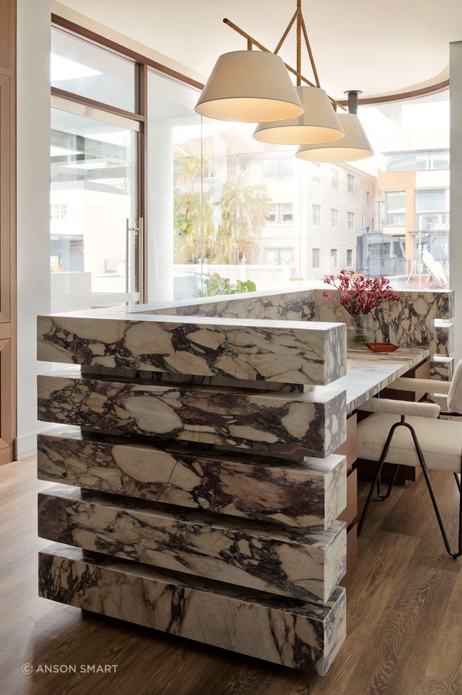
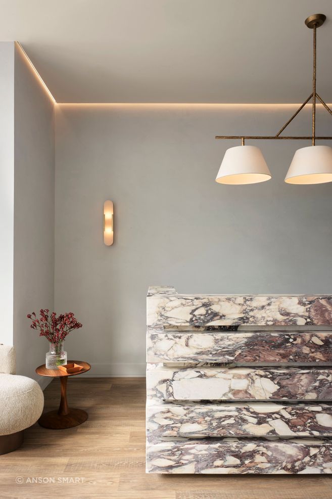
At Ray White's Rose Bay boutique, the practical requirements were particularly constrained. With an internal width of just 3.2 metres, the interior was a tiny 24 meters square. This walk-in-wardrobe sized space needed to accommodate a large television screen displaying renders of apartments being sold off the plan.
More interestingly, the people for whom McElroy was really designing the space weren’t the client at all. They were prospective buyers she would never meet, being asked to imagine themselves inside a home they had never seen.
“So the brief stops being ‘what does this person love’ and becomes ‘what will make a stranger feel confident and excited enough to buy an apartment off a floor plan.’”
The key word and line of thinking here is feeling - and not even how they feel about the space they’re physically standing in, but a space that doesn’t yet exist. Commercial design is anything but easy.
The tiny interior unfolds as a journey through reception, waiting area and meeting table, each performing what McElroy describes as “a different psychological job” as a buyer moves through the room. The obligatory television is surrounded with subtly bronze tinted mirrors, giving the decidedly unromantic piece of sales equipment an elevated sense of elegance, while the mirrors create the illusion of space by bouncing light around the small yet perfectly formed space.
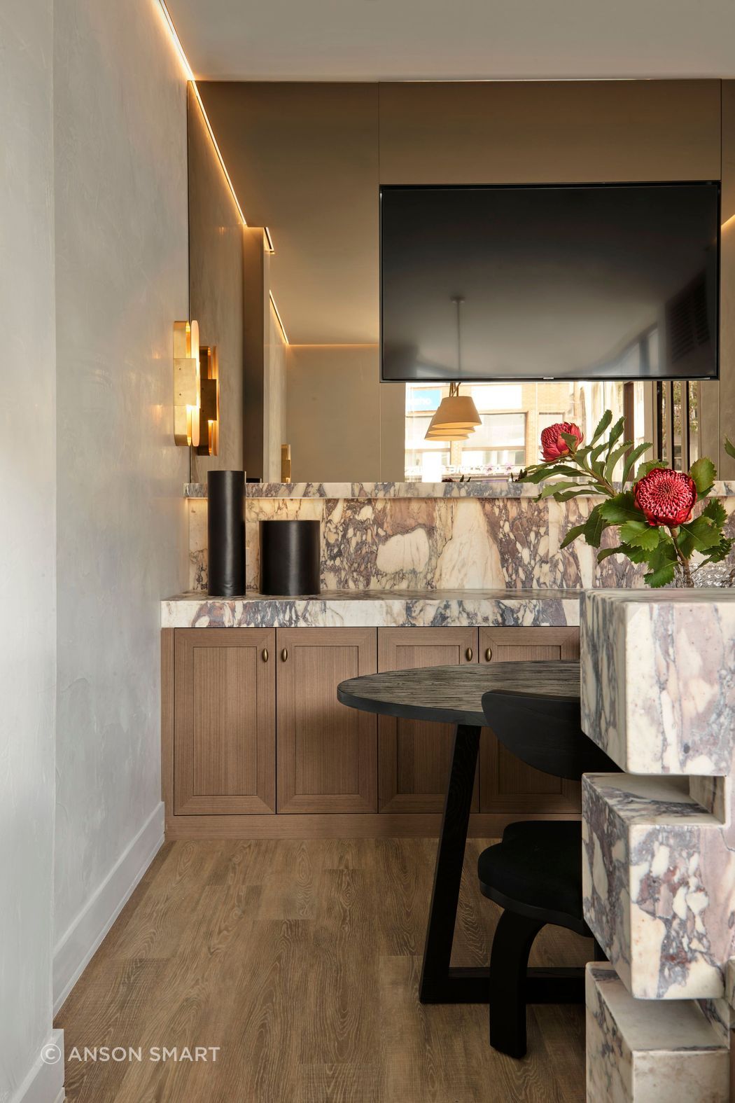
The use of Viola marble throughout makes the room read more like the guests future home than an office, with McElroy leaning into the inherent emotional connotations of material and form to imbue the space with aspirational sophistication and a sense of solidity and permanence.
Warm timber and a curved custom couch further enhance the narrative that this is not a Ray White office but a hint of what the client’s client home and future lifestyle could be.
Seen in this context, McElroy's observation that “a commercial space is doing PR whether you like it or not” feels particularly astute. Every material, she argues, is quietly saying something about the business occupying the room. Yet that doesn't necessitate an interior that reads like a three-dimensional brand guideline.
“The best brand storytelling in interiors is never literal. I'm not interested in slapping a logo colour on a wall and calling it done,” she says. “What I'm actually doing is translating the feeling a business wants people to have, not the branding itself, into materials, light and the way a space unfolds as you move through it.”
Instinct, of course, can sound suspiciously like another word for doing whatever the designer feels like on the day, with no restrictions or limitations whatsoever.
However, this couldn’t be further from reality. In fact, some of her most expressive decisions have emerged from circumstances in which her options were actually quite limited, again due to the very real constraints of available space.
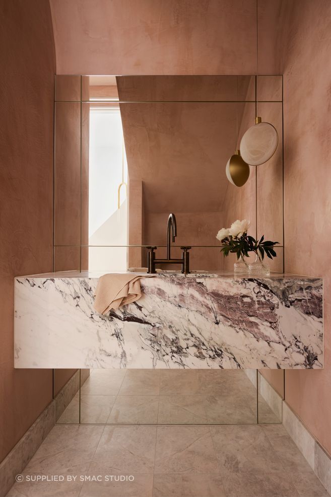
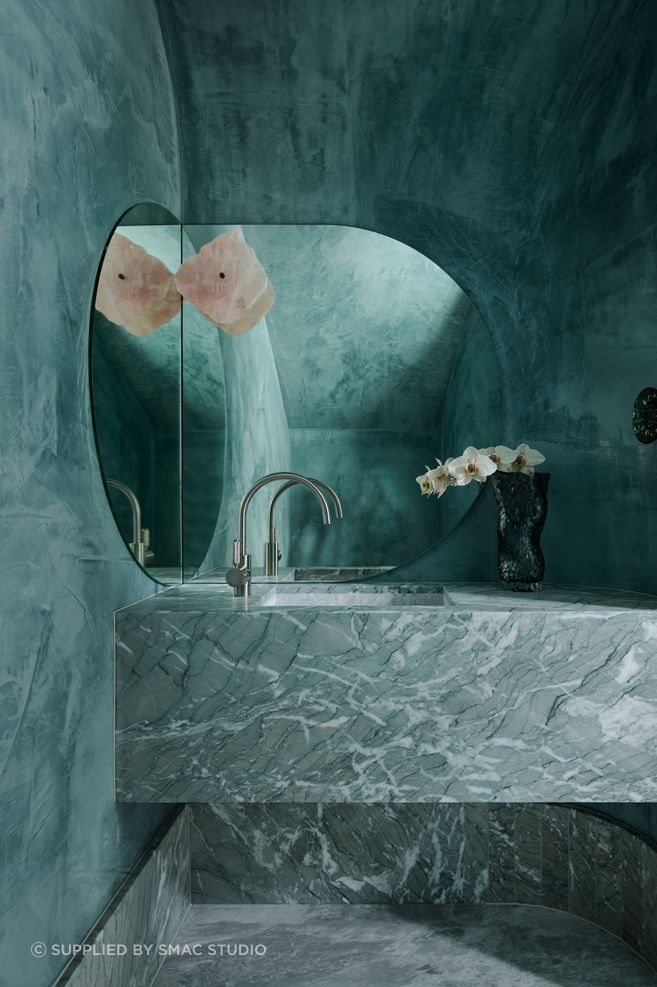
While not commercial projects, the powder rooms in Mirror Image and First Blush offer excellent examples of the creative opportunities that arise when there’s little room for maneuvering.
Positioned beneath staircases, McElroy responded with contoured plywood drenched in bold colour. Not only does this solution disguise the awkward proportions, it also creates a moment of unexpected delight, like a treasure discovered in the bottom of a jewelry box.
These two rooms, constrained as they are, have become two of the studio's most photographed rooms, proving that sometimes the most interesting outcomes are the result of creativity, instinct and determination not to settle colliding with the immutability of physical conditions.
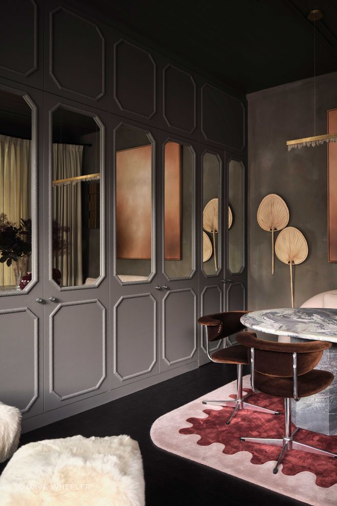
Another immutable constraint designers often have to grapple with is time - specifically not having enough of it. Designed in two days and fitted out in two weeks, McElroy's former Paddington studio tested her creativity and instinct, and her ability to develop a strong concept and commit to it.
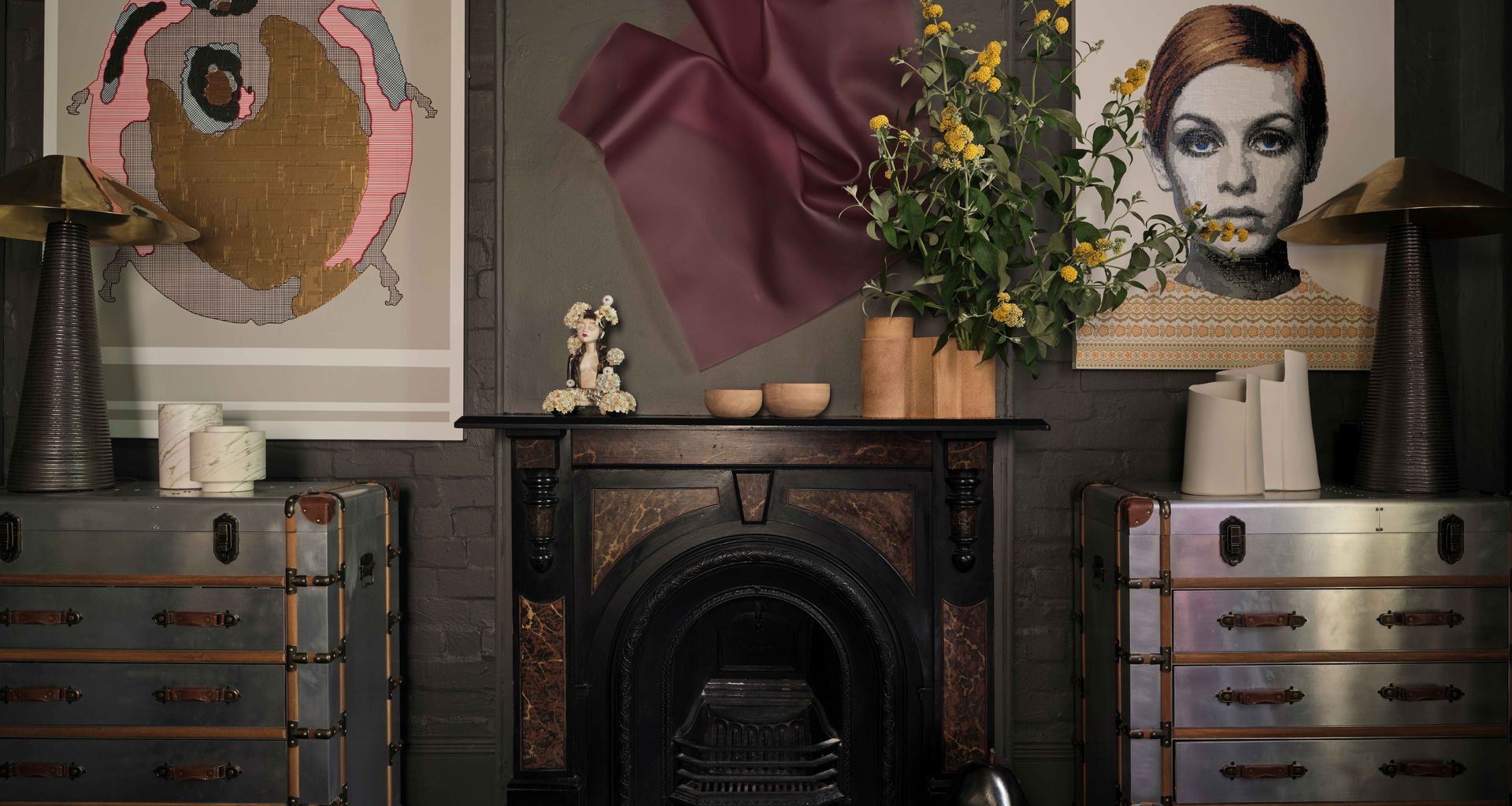
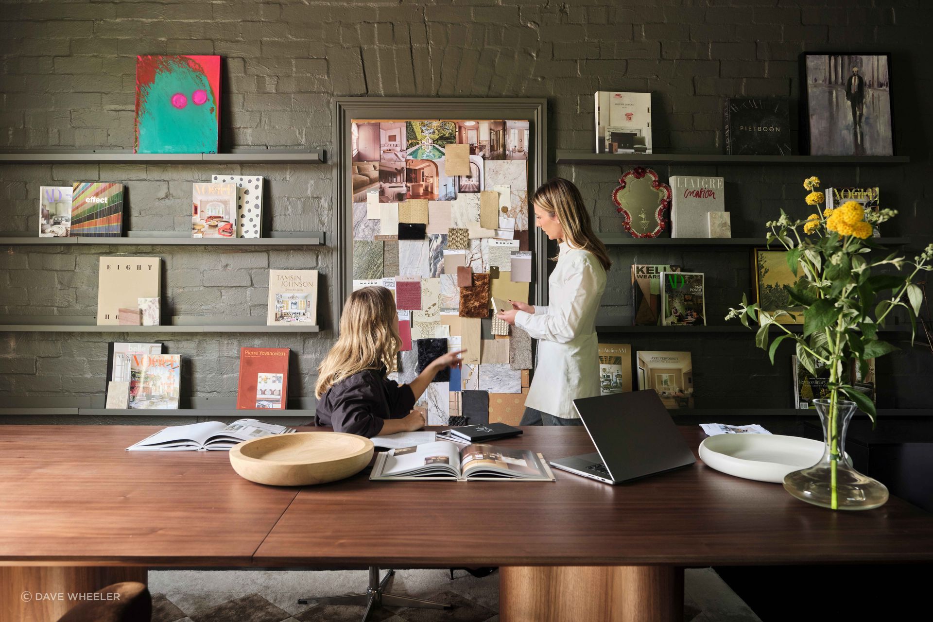
“I painted the walls and ceiling a dark green-grey and went full burgundy in the bathroom, because I wanted it to feel like a boutique or a bar, not a workplace.”
Marble, velvet, timber, layered artwork and feature lighting followed. Cabinetry concealing the air conditioning and kitchenette was fitted with recessed mirrors, visually stretching the 25-square-metre floor plate and pulling the greenery of the street inside. McElroy calls it “a very homey sleight of hand, just solving a very commercial problem.”
More than being a space in which McElroy could push the boundaries, the studio demonstrates that a work place can be richly layered and visually interesting at the same time as professional and practical.
“There's a real misconception that workplaces need to stay safe and pale to feel professional, and I think that's outdated now,” McElroy says. “People do better work when a space feels considered and a bit joyful.”
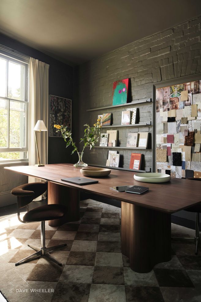
The Paddington renovation also provided a very pertinent lived experience learning curve. Located in a heritage building, it came with all the quirks and features - and frustrations - that simply need to be embraced when it comes to heritage anything.
These spaces are charming, without doubt, but the practical modern-day requirements such as efficient storage and even access for trades can cause a headache and be their own form of workout. A narrow spiral staircase “sounds charming until you're carrying an armful of marble samples up it.”
It’s the sort of detail that brings the esoteric whimsy of infusing a space with atmosphere back down to reality. But sometimes you need these very real moments to realise the true impact of design.
In this case, the realities of access gave McElroy pause to consider even more closely the importance of balancing function with beauty to ensure that when you reach the top of the stairs, you find everything you need and there’s a place for everything.
Perhaps that is where the two sides of Smac Studio's practice most meaningfully meet. Not in an aesthetic that makes commercial spaces look more like homes, but in an understanding that the experience of an interior is simultaneously emotional, sensory and stubbornly practical.
McElroy is now interested in testing that thinking elsewhere. Restaurants, small hotels and spaces that sit somewhere between hospitality and workplace appeal because they are, in her words, “places where the emotional experience is the entire point.”
For more inspiration, explore of Smac Studio's award-winning work via their ArchiPro profile.