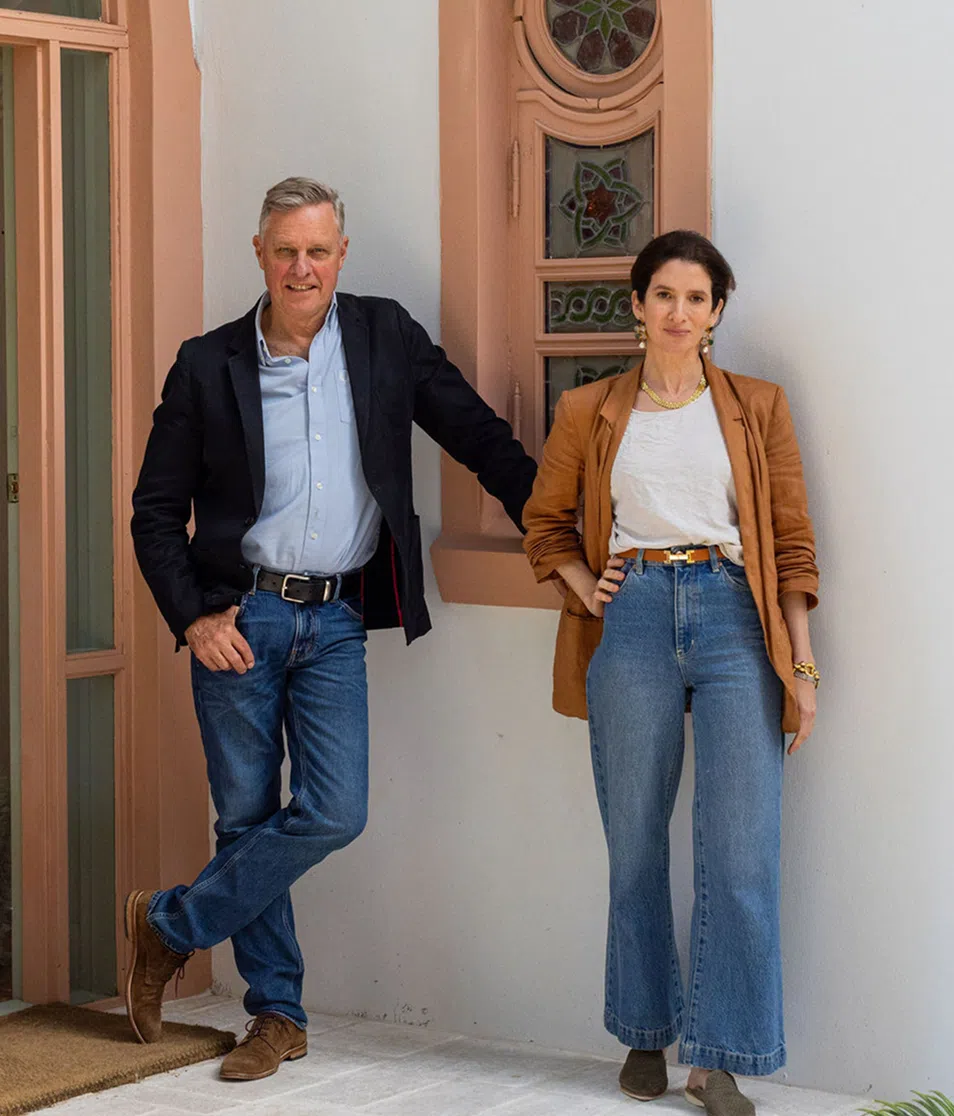

A double portrait in mixed media: YSG’s The Gentleman

featuring YSG Studio

© Anson Smart
© Anson Smart
YSG Studio logo
  • 259.0K profile views
  • 69 saves

What happens when two distinct personalities become the subject of a single architectural portrait? In Sydney’s Potts Point, Yasmine Ghoniem of YSG Studio draws on the cultural histories, artistic interests and everyday rituals of a scholarly and cultured professional couple to create a home that is so much more than a reflection of its inhabitants, becoming a character in its own right.

Visit Website

The design maxim that a home should reflect the people who inhabit it is one that we often take for granted because it seems so obvious. Of course a designer is going to draw on their clients’ tastes, habits, harmless peccadilloes, shared histories and nuanced ways of living as a source of initial inspiration. But, sometimes, on very special occasions, when an exceptionally talented designer crosses paths with clients who are entirely open to and embracing of this notion, what happens is a sort of design alchemy that transforms a thoughtfully designed space into a distinct character in and of itself.

In The Gentleman, a 95-square-metre Art Deco apartment in Sydney’s Potts Point designed for a professional couple who share a deep appreciation for art, music and history, Yasmine Ghoniem of YSG Studio has taken the client as the source of inspiration to its zenith point. Weaving the threads of their shared passions and individual stories together with her deft design approach, the apartment reads as a double portrait rendered in three dimensions.

© Anson Smart

© Anson Smart

Built in 1929, the apartment had undergone almost a century of alterations, many of which had obscured the clarity of its original Art Deco architecture. Having lived there for six months before engaging YSG, the owners were acutely aware of its literal shortcomings. With each of them being over two metres tall, the proportions of the existing interior were far from fit for purpose, and no doubt caused more than one or two expletives when they forgot to duck while walking from one room to the next. Another pain point was the cumbersome joinery and awkward transitions between rooms which throttled the potential of the home to be the joy-filled space, alive with music and glimpses of Sydney Harbour, that the clients recognised it could be.

Where art, history and pragmatism collide 

For Ghoniem, the challenge was twofold. How could she reconcile the very real physical access issues present at almost every threshold with the building’s heritage protections? And how could she work with the Art Deco character of the apartment while infusing it with the personality and soul of her clients? The solution to the first challenge, while deceptively simple, is perhaps not one many would consider owing to the intricate fiddliness of the process and the fact that it seems almost too obvious.

“We also needed to raise the internal doors to accommodate our two tall clients,” says Ghoniem. “This involved carefully removing the decorative internal door architraves (all heritage) and dark timber doors. Raising the height of these openings, we clad the architrave bases with an exaggerated minimal skirting height crafted from traditional Australian Red Cedar (complementing the coppery shade of the original front door). The intact architraves were re-instated above this detailing, as were the timber doors that we raised upon a matching timber datum to fit the taller dimensions (painting them a space enhancing white).”

© Anson Smart

© Anson Smart

With the risk of physical injury resolved, her attention turned to the orchestration of light, space, people and place. Unlike newly built apartments, the grand dames of the 20s and 30s are not known for their open spatial planning and abundance of natural light. This is partly to do with the limitations of construction materials and technologies available at the time, and also the fact that the way we live today has evolved. Today, the kitchen has become the social heart of the home when it was once considered a purely utilitarian space. As a result, it also means that the flow between public and private spaces has to have more freedom.

Yet neither Ghoniem nor her clients were interested in flooding the spaces with light, white, brightness. What mattered was atmosphere. And who better to look to than Johannes Vermeer, whose mastery of light and shadow was a particular fascination of the couple.

© Anson Smart

© Anson Smart

At The Gentleman, Ghoniem channels Vermeer’s delicate, poetic approach to the humble, everyday moment through an evocative yet restrained palette of colour and materials. She has also opened the aperture of the modest floor plan just enough to create a sense of spatial cohesion, while understanding that to fully appreciate light, there must be shadow. It’s about finding that pitch-perfect moment of tension and release, guiding the eye and the body through space with the invisible hand of design.

Redrawing a line and playing with light 

When it came to reconfiguring the spaces, the approach started with stripping back in order to start with an almost blank canvas. “Essentially the shell of the home – floors and walls (including the chamfered edges on corners) – had to be retained for heritage reasons,” Ghoniem says. “We stripped a near-century of discordant owner interventions to reinstate clarity, enhancing the apartment’s original Deco codes and planes that include elegant chamfered detailing on support columns (a feature incorporated across custom surfaces).”

In practical terms, this looked like removing the ceiling bulkheads, introduced by previous owners to accommodate downlights, and replacing them with slender, stepped cornices that speak directly to the original character of the apartment. Cumbersome hallway joinery has also been replaced with a flush floor-to-ceiling solution that provides all important storage without crowding the passage and disrupting sightlines.  

© Anson Smart

© Anson Smart

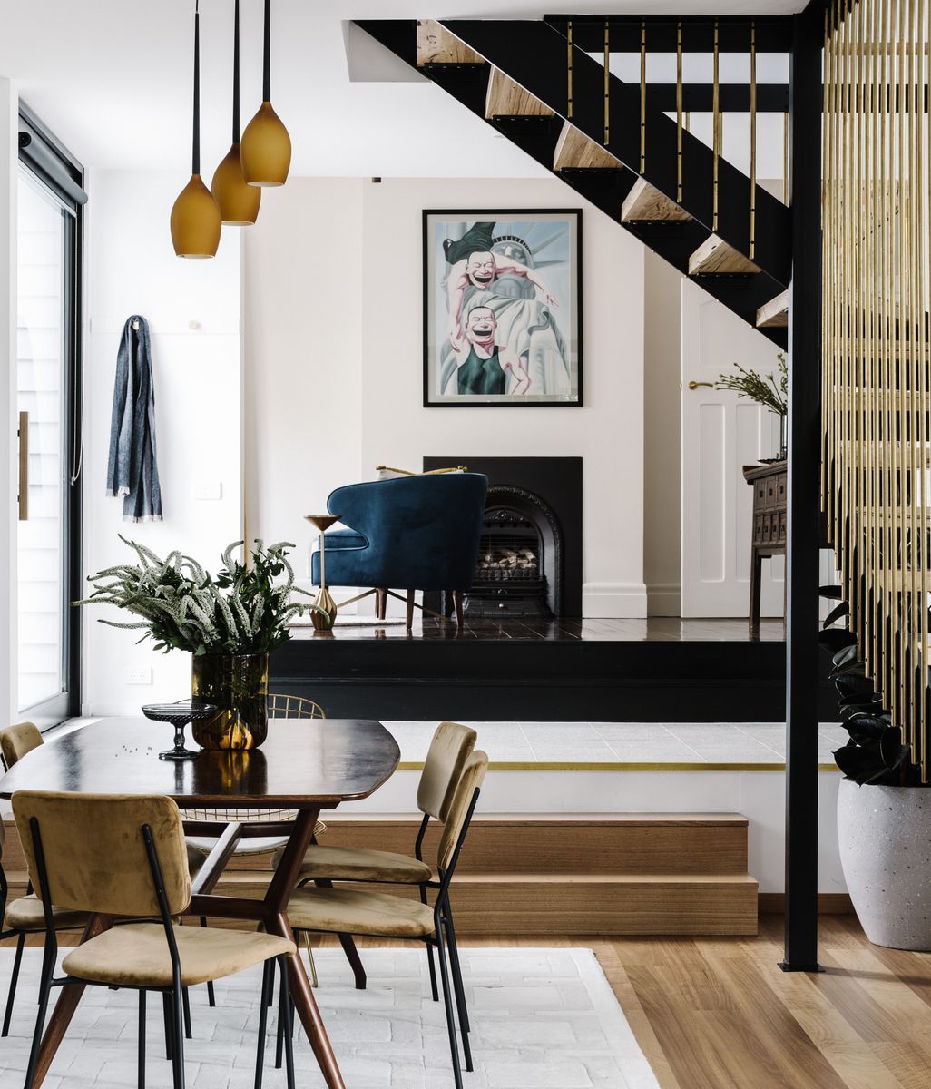
In the dining room, Ghoniem makes the type of clever structural move she’s known for that seemingly creates extra space from thin air. By partially demolishing the bathroom wall to create an angled bulge in the dining room, laundry appliances could shift from the kitchen into their rightful place in the bathroom. The angled bulge was embraced, becoming a design feature with the introduction of a timber banquette whose chamfered edges follow the geometry of the wall. In another clever spatial play, the narrow threshold opening that once enclosed the dining space was expanded, allowing soft north-west light to stream through the space and into the hallway beyond.

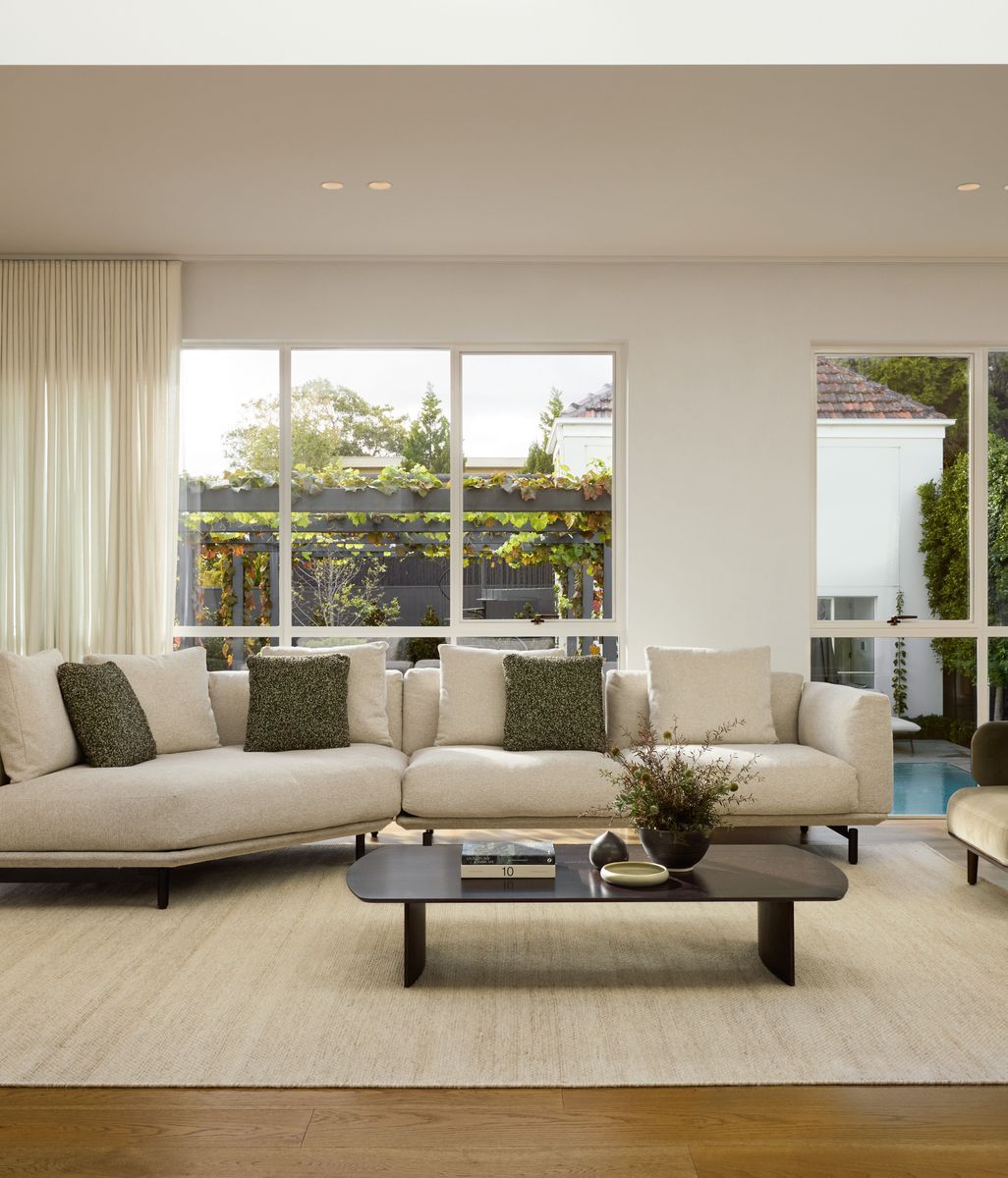
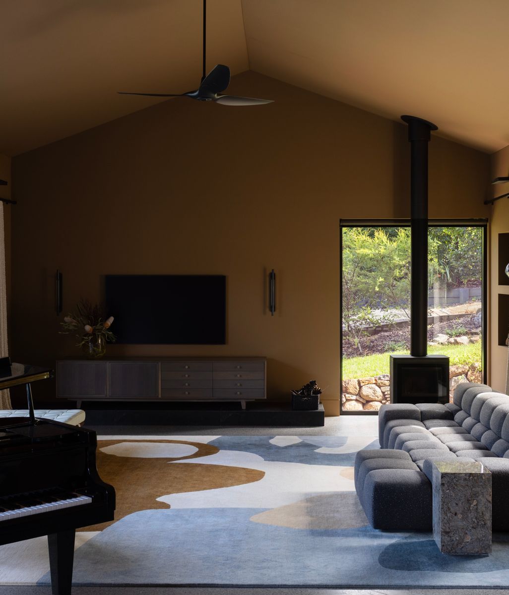
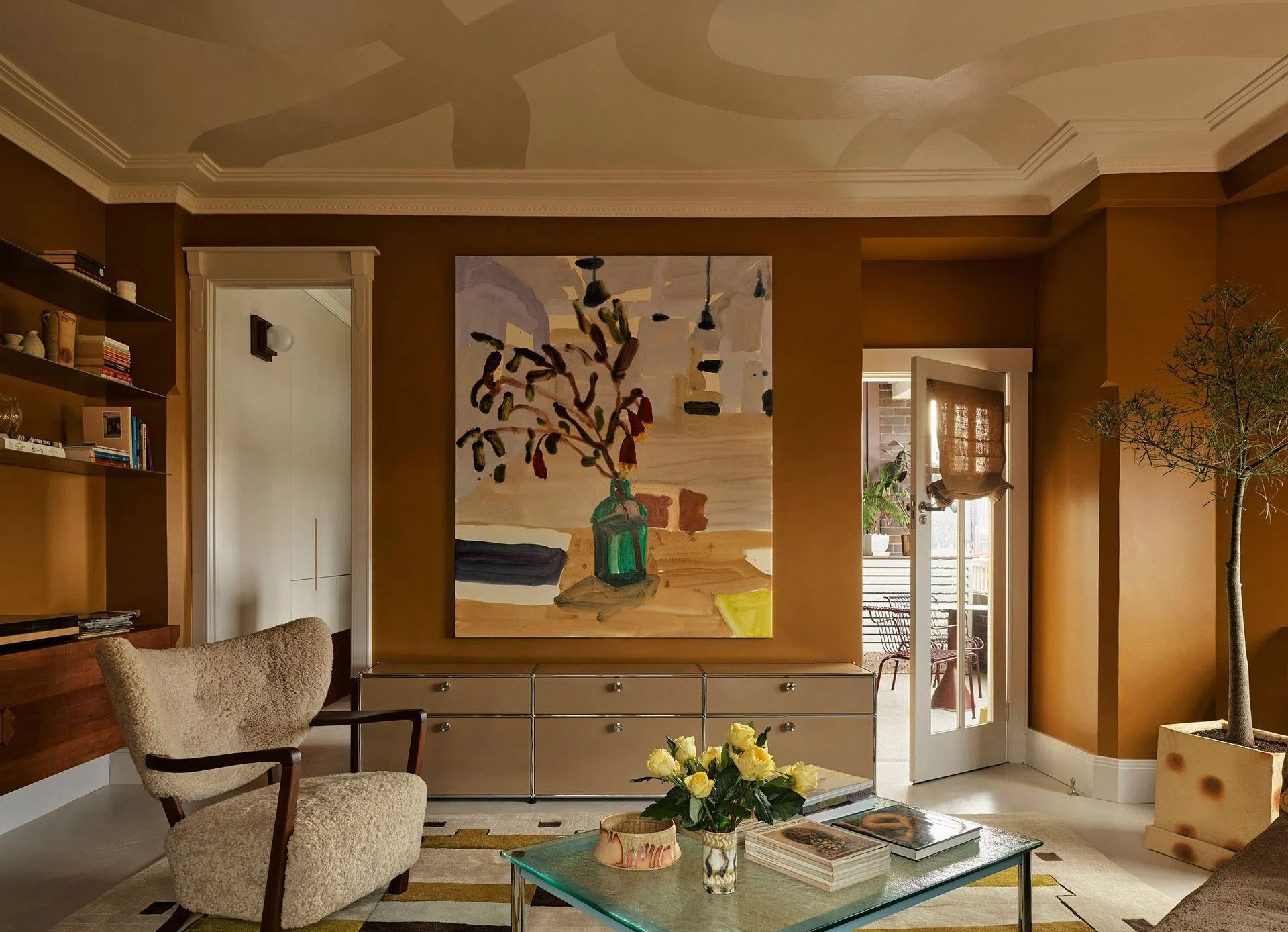
The influence of Vermeer is most evident in the colour and material palette, which emerges particularly strongly in the living room – if you know what you’re looking for. Saturating the walls in a warm, rich toffee and lime-coating the original herringbone floors in lead white, Ghoniem succeeds in striking an elegant balance between contemplative brooding and delicate ethereality. 

© Anson Smart

Throughout the home, the subtle nods to Vermeer, music and Deco show up in unexpected places. Anchoring the living room is a custom rug which introduces a playful reference to the couple’s love of both music and the Dutch Master. Its undulating piles of ivory and cinnamon recall piano keys, albeit in a rather abstract form, while yellow ochre speaks to Vermeer and “the yellow cocktail music” of F. Scott Fitzgerald’s Jay Gatsby. Meanwhile, Vermeer’s ultramarine blue finds its way into the composition via the ikat upholstery of the piano chair. There’s something rather special about the way these very personal references to painting and music come together in such a surreptitious, if you know, you know way. It's Pianissimo, not Fortissimo.

A little history woven into the details

The final narrative thread of this home, and perhaps the most personal, was that of cultural heritage. “One client wanted to add subliminal references to his Bosnian/Croatian ancestry,” Ghoniem says. “The apartment features the geometric design motifs found on ancient woven ćilims. We introduced this pattern via marquetry on the custom dining table; and beneath the glass surface corners, assorted timber species including Curly Maple, Fiddleback Blackwood and Huon Pine were intricately carved into cross shapes.

The butterfly pulls of the lounge’s custom timber credenza replicate these cross symbols in a rotated format. Jacquard fabrics adorning the dining chairs and banquette base, plus the primary suite’s windows and bed bolsters also feature tessellations of these patterns.” Once again, another moment of ‘if you know, you know’. 

© Anson Smart

© Anson Smart

Ghoniem’s ability to understand and see her clients for who they are beyond the surface, translating their character and personalities so subtly and seamlessly into her interiors without ever so much of a hint of pastiche, is what has led to her being recognised as one of Australia’s leading designers. Given this, and how much more depth and resonance a space has when it is so deeply personal, it’s not surprising that this approach has become a core ethos of the practice in recent years.

Yet Ghoniem’s interest in “subtly uncovering the intricacies of their heritage to express them uniquely” is balanced by her equally considered response to the character and history of the building itself. In The Gentleman, stainless steel moments are found throughout, “from furniture legs and frames to joinery pulls and slim shelves floating across the lounge’s wall.” This gesture is both a tip of the hat to the Deco era’s post-war obsession with modernity, technological innovation and Hollywood glamour, and a unifying material that serves to visually connect one space to the next.

Even the bathroom has quiet echoes of the Jazz age, distilled through Ghoniem’s thoroughly contemporary, Australian-based, globally gazing lens. Its Jacaranda-lilac walls, terrazzo floors flecked with jade and amethyst, and a honey-toned marble vanity exude warmth and luxury. Combined with amber glass panels that recall the rippled glazing that once appeared in the apartment entry doors, this compact bathroom has a jewellery-box-like quality. 

© Anson Smart

© Anson Smart

At the opposite end of the apartment, the master bedroom offers a completely different atmosphere to the layered richness of the public spaces. It's as if, in this room, we’re seeing another aspect of the apartment's own character. Here, a milk-chocolate ceiling cocoons the room, while the lead-white walls recede into calm stillness, creating a sense of space. Yet, Art Deco details can still be found by keen eye. Note the custom timber bedhead that picks up the chamfered geometry of the original structural columns that stand proudly beside the custom joinery. Not to mention the steel pulls that dot the suite’s joinery, drawing the eye to the decorative woodgrain patterns of their painted American Oak fronts.

© Anson Smart

© Anson Smart

While the bedroom may be the subtlest, most restrained room in the apartment, perhaps it is in this quieter, more private space that we come closest to understanding the two men behind the many cultural references and personal histories woven throughout the apartment. Not simply what interests them, but something of how they choose to live. Intentionally. Thoughtfully. Peacefully.

Read as a whole, what Ghoniem has created is a third character, an active participant in and witness to the lives of the couple who live here. Yes, it is a reflection of each of their multifaceted personalities and shared histories, interpreted through her own creative sensibility, but somewhere along the way, the apartment has become a gentleman, with his own particular temperament, eccentricities and sense of occasion. And one suspects the two gentlemen who call him home wouldn't have it any other way.

Discover more of YSG's clever, characterful work on their ArchiPro profile

Next Article

Keep scrolling
Five sofas that invite you to sink into