Colour without apology: When colour stops behaving like decoration
Written by
31 July 2026
•
4 min read
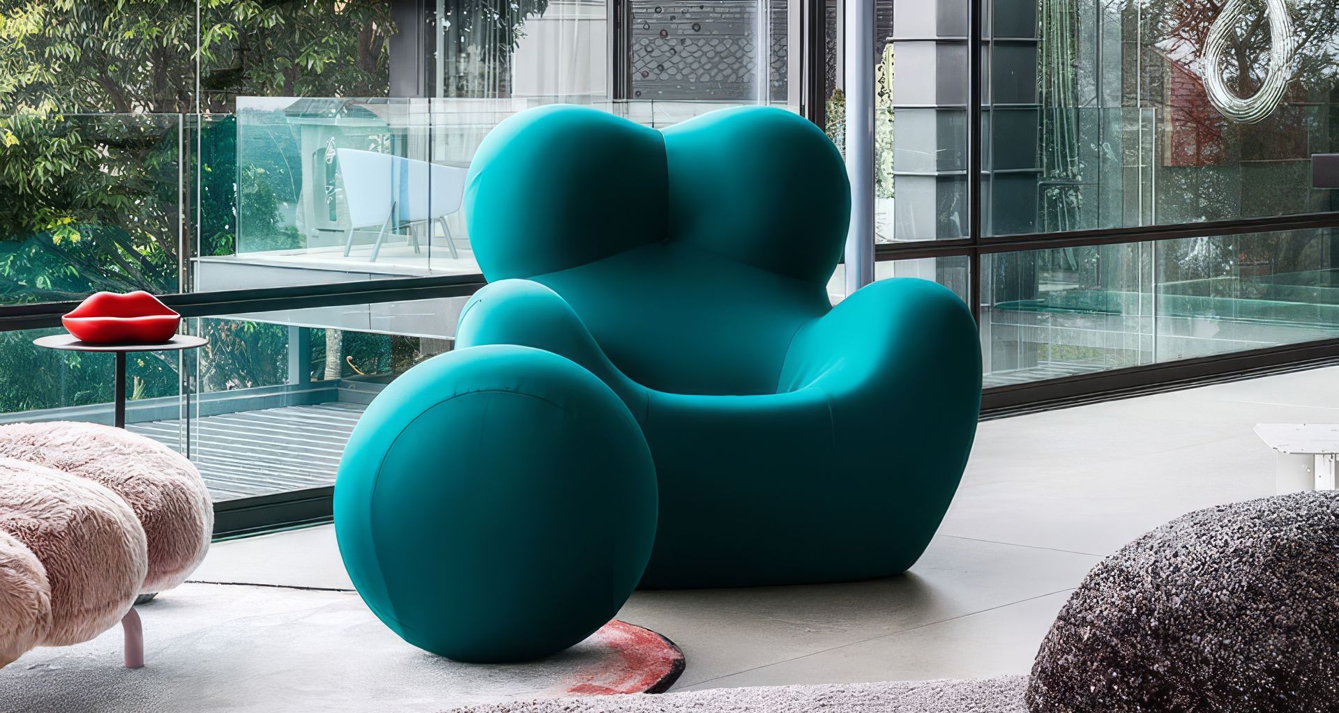
Muted, neutral palettes have long dominated contemporary interiors. Their appeal is understandable. They create calm, place emphasis on form and texture, and allow natural materials to hold attention without distraction.
Yet a growing number of interiors are making a convincing case for something more saturated. These spaces are not necessarily loud or maximalist. Often, there is only one significant moment of colour. The difference is that it has been given enough presence to shape the room around it.
One idea keeps returning: colour becomes more interesting when it stops behaving like decoration.
A red tiled wall, a green basin or a translucent blue bench can do more than brighten a restrained room. Given sufficient visual weight, each can establish the atmosphere, organise attention and tell the surrounding materials how quiet or expressive they need to be.
The comfort of neutrality
Neutral interiors are not without interest. Subtle shifts in stone, timber, plaster and wallpaper can create depth through texture and proportion. Their restraint allows natural light to reveal differences that might otherwise be overlooked.
Colour has often sat outside that conversation. It is frequently introduced once the larger decisions have been made, through objects that can be replaced when tastes change. In this role, colour remains an accessory rather than part of the design.
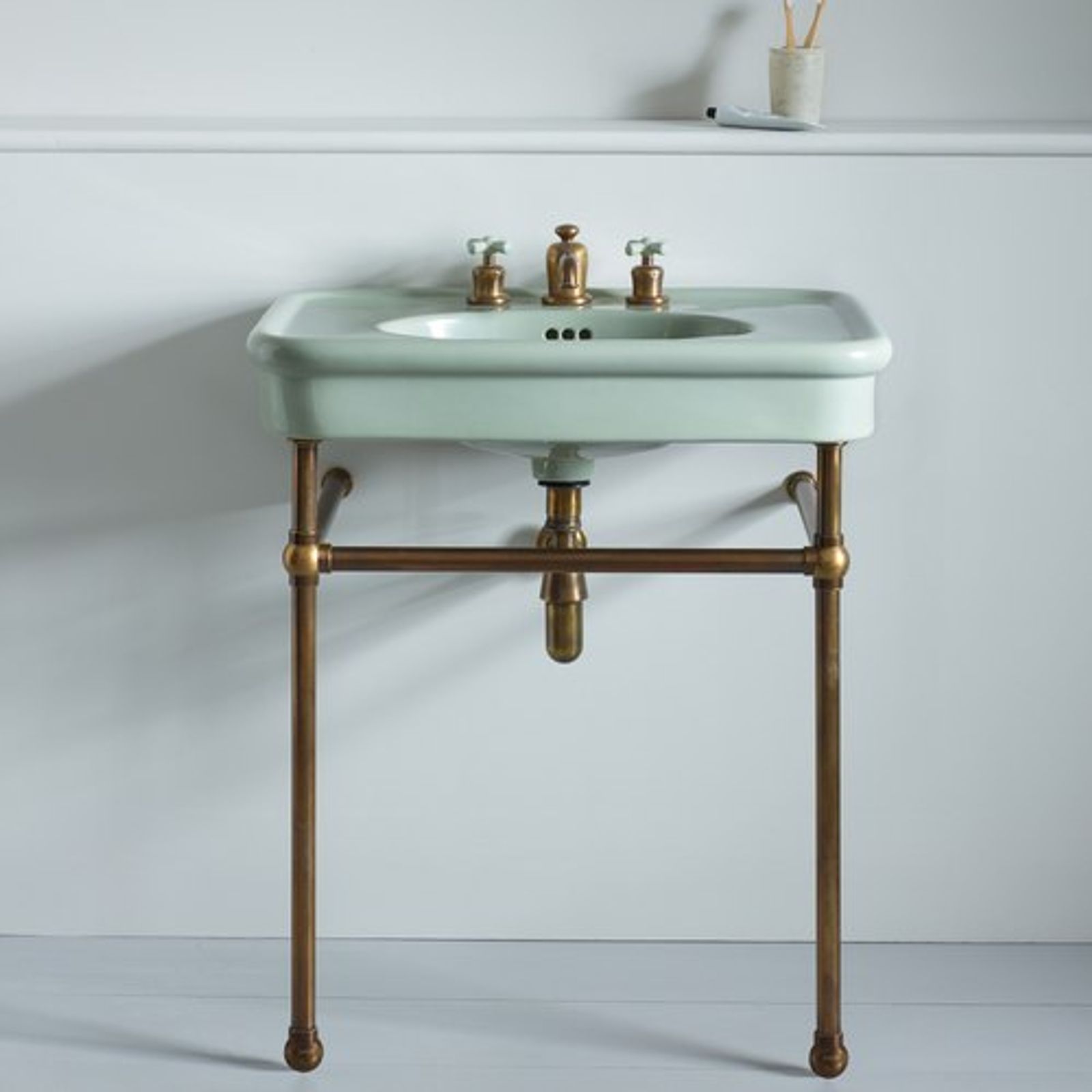
The Rockwell Basin on Basin Stand from The English Tapware Company challenges that assumption. Offered in Sherbet Yellow, Willow Green and Powder Blue, the basin cannot be separated from the room around it. It is connected to the plumbing, positioned within the plan and encountered as part of the bathroom itself.
Its colour does not arrive at the end to enliven an otherwise complete interior. It becomes one of the decisions around which the interior develops.
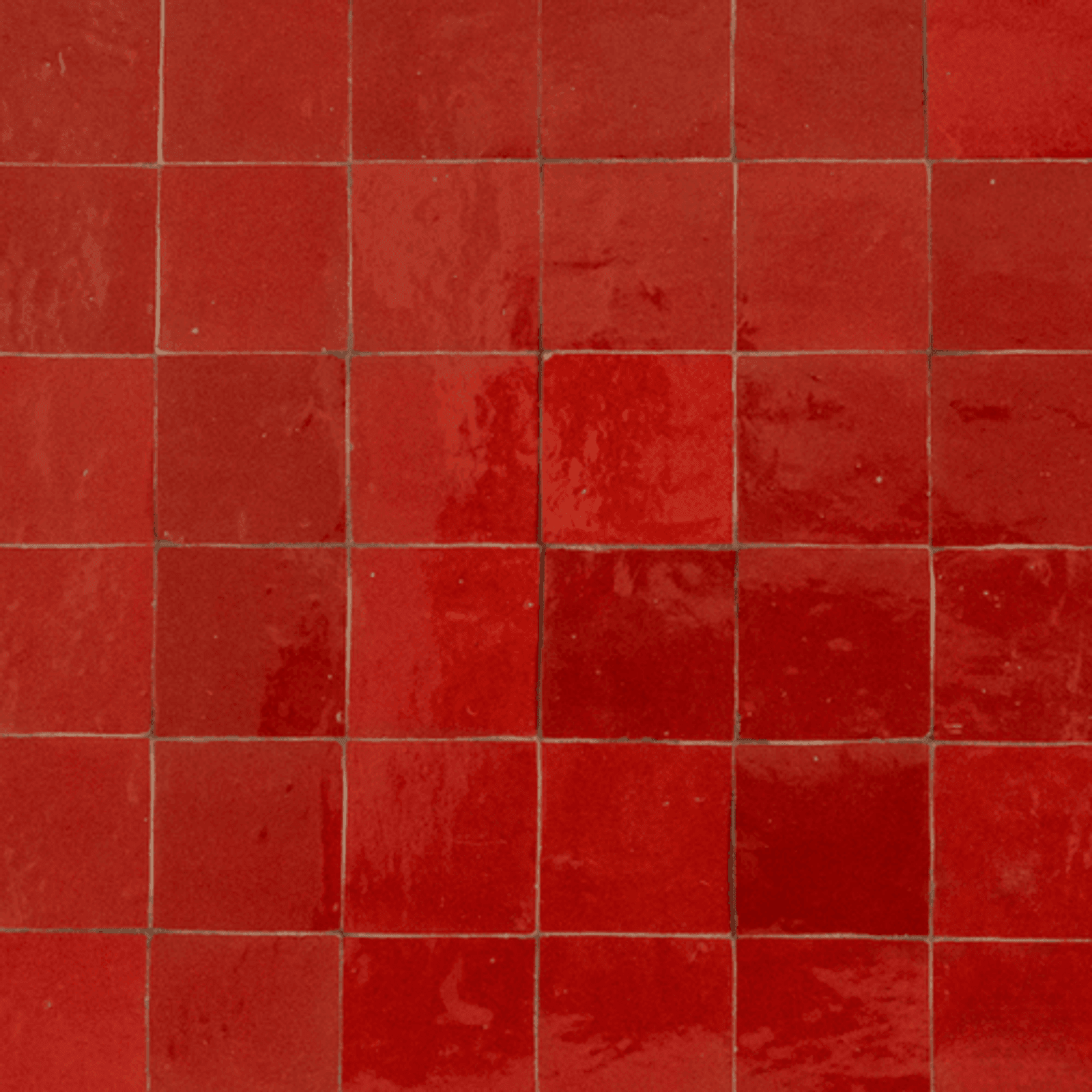
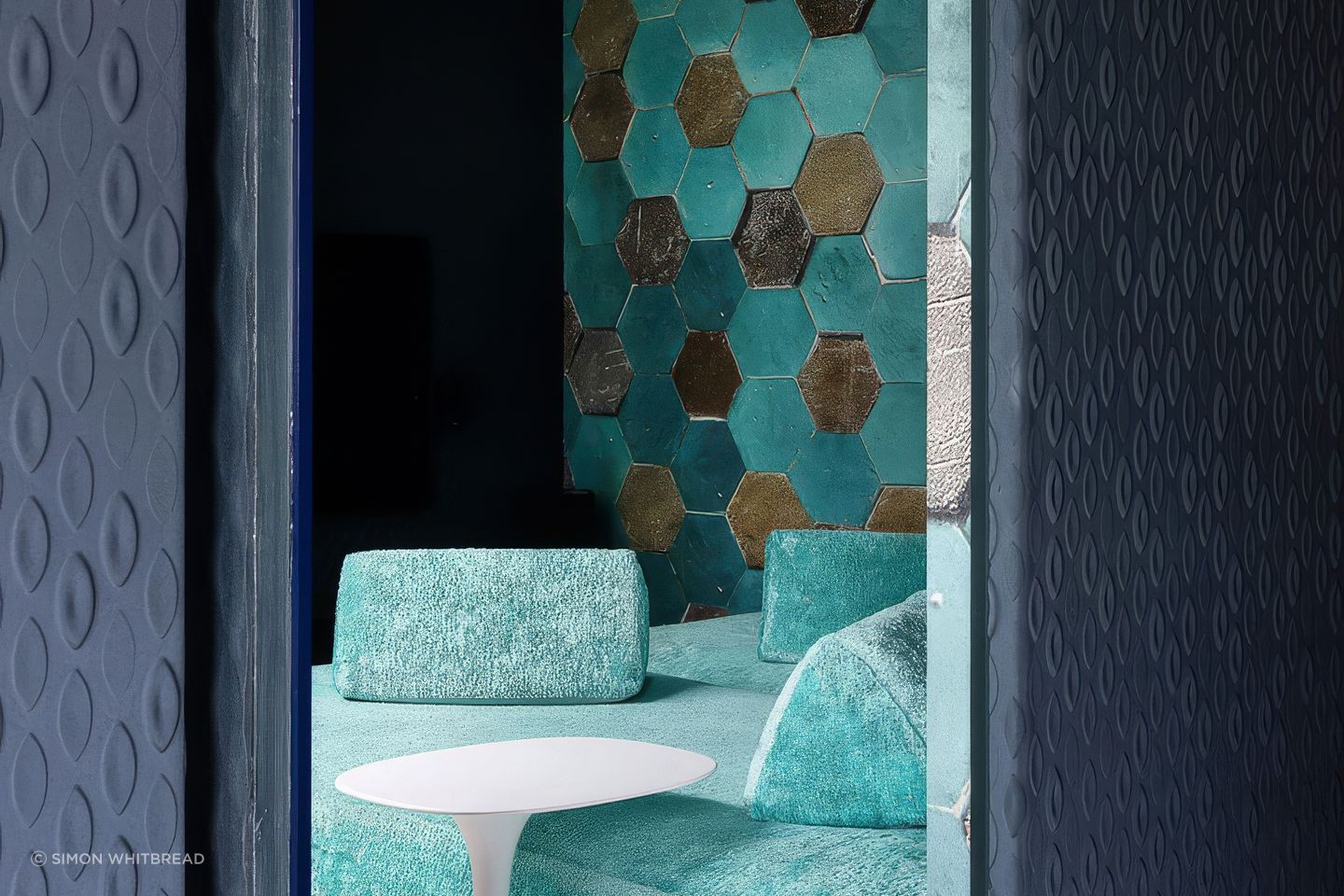
The Moroccan Zelige Chilli Terracotta from Byzantine Design has a similar sense of commitment, although the effect is different. Repeated across a wall, the red becomes less like an accent and more like an atmosphere. Variations across the handcrafted surface allow the colour to shift with the light, preventing it from becoming a perfectly uniform field.
Both examples demonstrate how saturation gains nuance once it is attached to material, texture and place.
Colour is never just a hue
A response to colour is rarely about hue alone. The same blue can feel dense or weightless, while red can appear earthy, glossy or theatrical depending on the material carrying it. Light, texture, transparency and scale all change the emotional register of a colour. Seen through this lens, saturated products become studies in how material shapes perception.
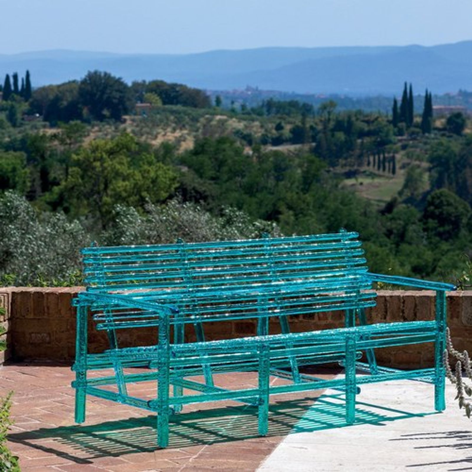
The Edra A’mare Bench, available through Space Furniture, pushes this idea further. Its translucent blue polycarbonate structure appears somewhere between furniture and solidified water. Light passes through it, reflections move across it and the surrounding room remains visible.
Blue is clearly present, yet it does not carry the visual weight normally associated with such a saturated object. The bench borrows from its environment rather than simply sitting against it.
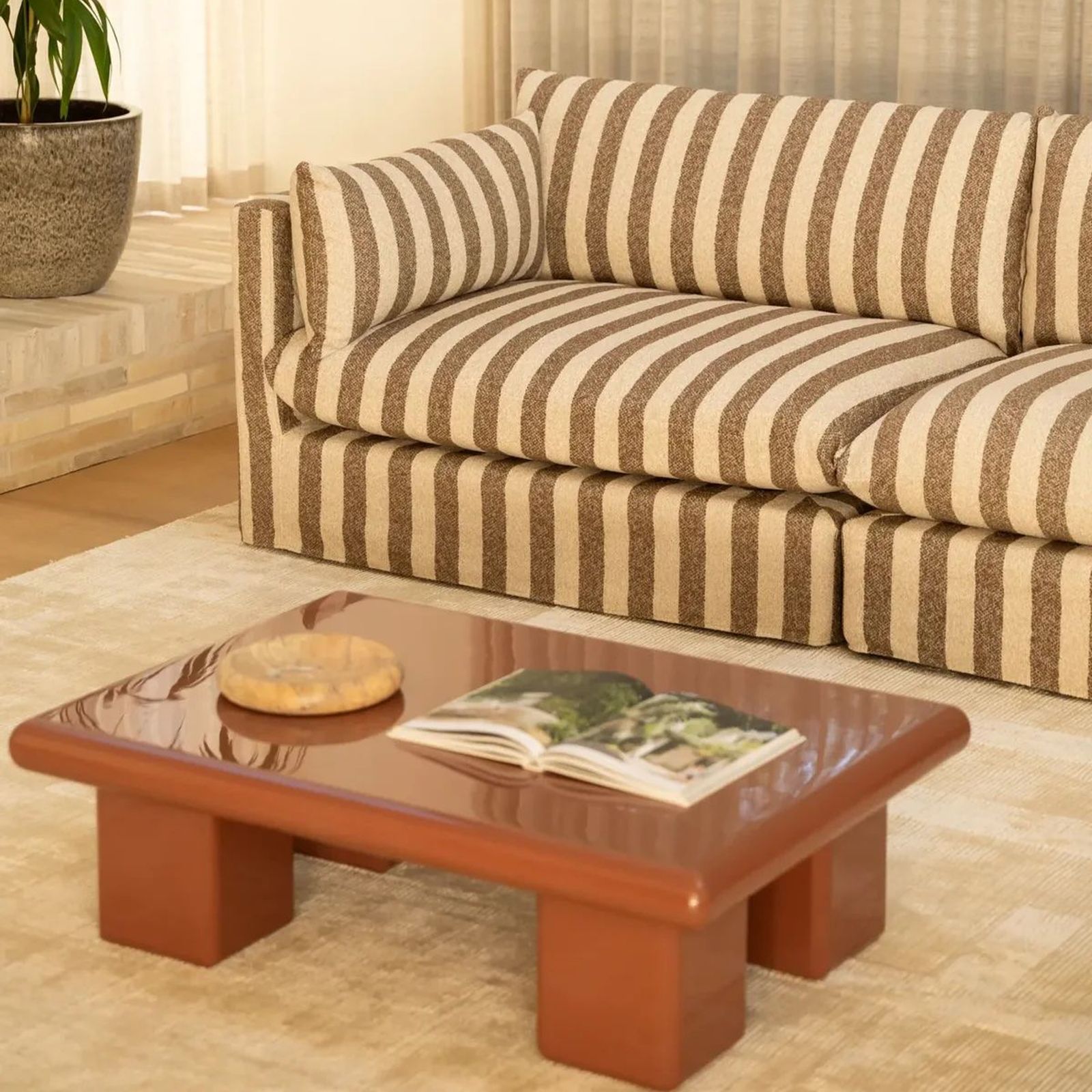
That transparency is distinctly different from the Toto Coffee Table in Brick from RJ Living. Here, terracotta is concentrated across a broad, high-gloss form. The colour appears grounded and substantial, while the reflective surface prevents it from becoming static.
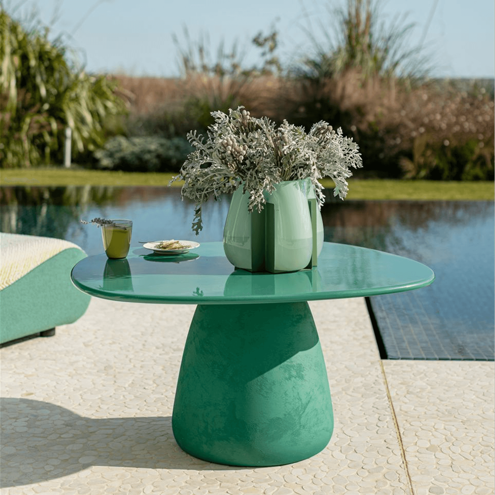
The Kino Pedestal Table from Roche Bobois presents another expression. Its green matte ceramic surface absorbs rather than reflects light, allowing the colour to remain strong without becoming overly polished.
Colour itself is only part of the equation. Its effect depends on the surface through which it is experienced.
A shifting point of view
The value of these examples does not lie in rejecting neutral interiors. Restrained materials continue to play an important role, giving saturated elements the visual space they need.
Stone, timber and muted upholstery can provide the setting in which a coloured object feels intentional rather than excessive. The resulting interiors are often highly edited. They allow one element to lead and trust the rest of the room to respond.
This is the distinction between colour as embellishment and colour as presence. It does not need to be scattered through cushions, artwork and accessories to make a room feel complete. Nor does it need to cover every surface to feel confident.
Seen together on ArchiPro, these products reveal colour in several different states: permanent, imperfect, transparent, reflective and matte. Moving between these materials and ideas makes it easier to understand not only what appeals, but why it might work within a particular space.
Whether colour enters through a single object or sets the tone for an entire room, explore ArchiPro’s collections of bathroom basins, wall tiles and designer furniture. Compare how colour behaves across different materials and forms, and find a more considered starting point for your space.